Zoo is a Paris-based design studio founded in 2013. We provide creative and art direction in the fields of art, design, cultural institutions and brands. We believe in strength of plain ideas and in necessity of a clear language. Feel free to contact us, it will be a pleasure to meet you.
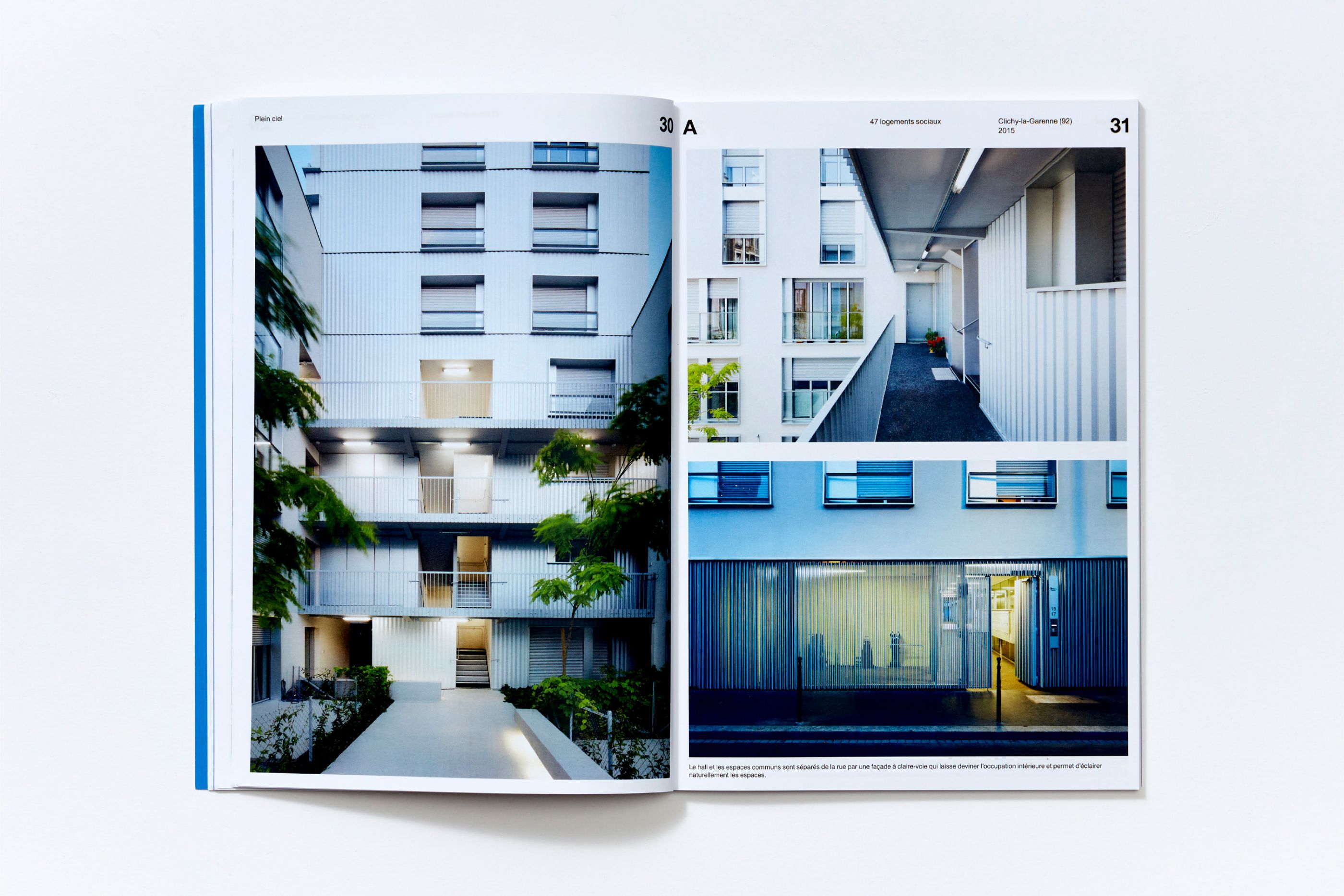
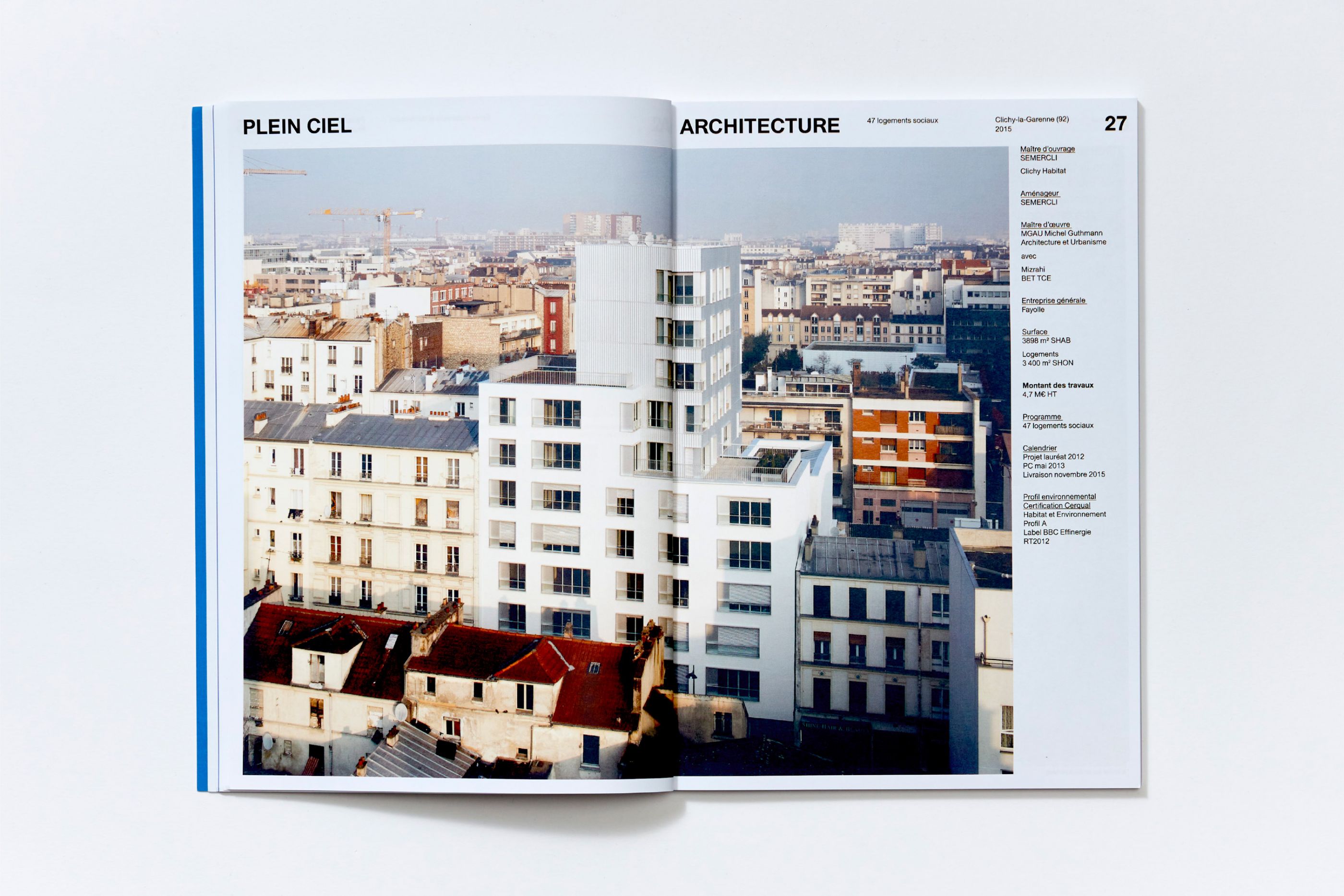
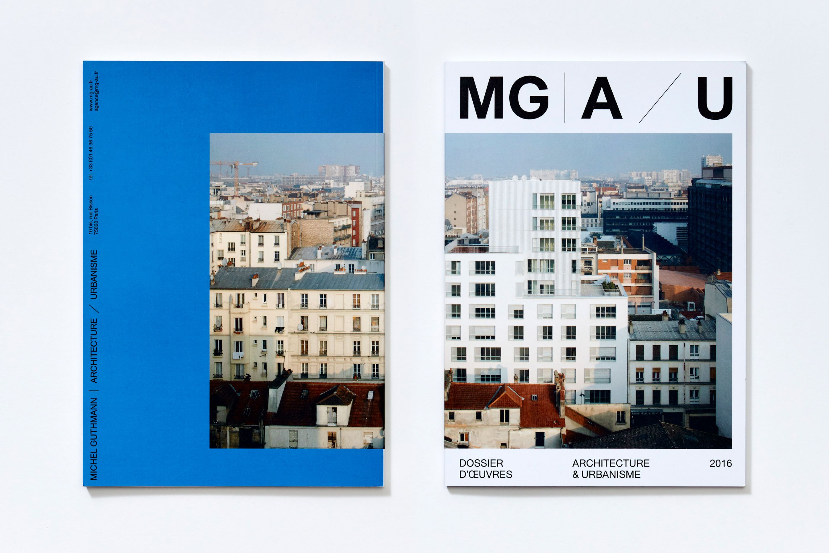
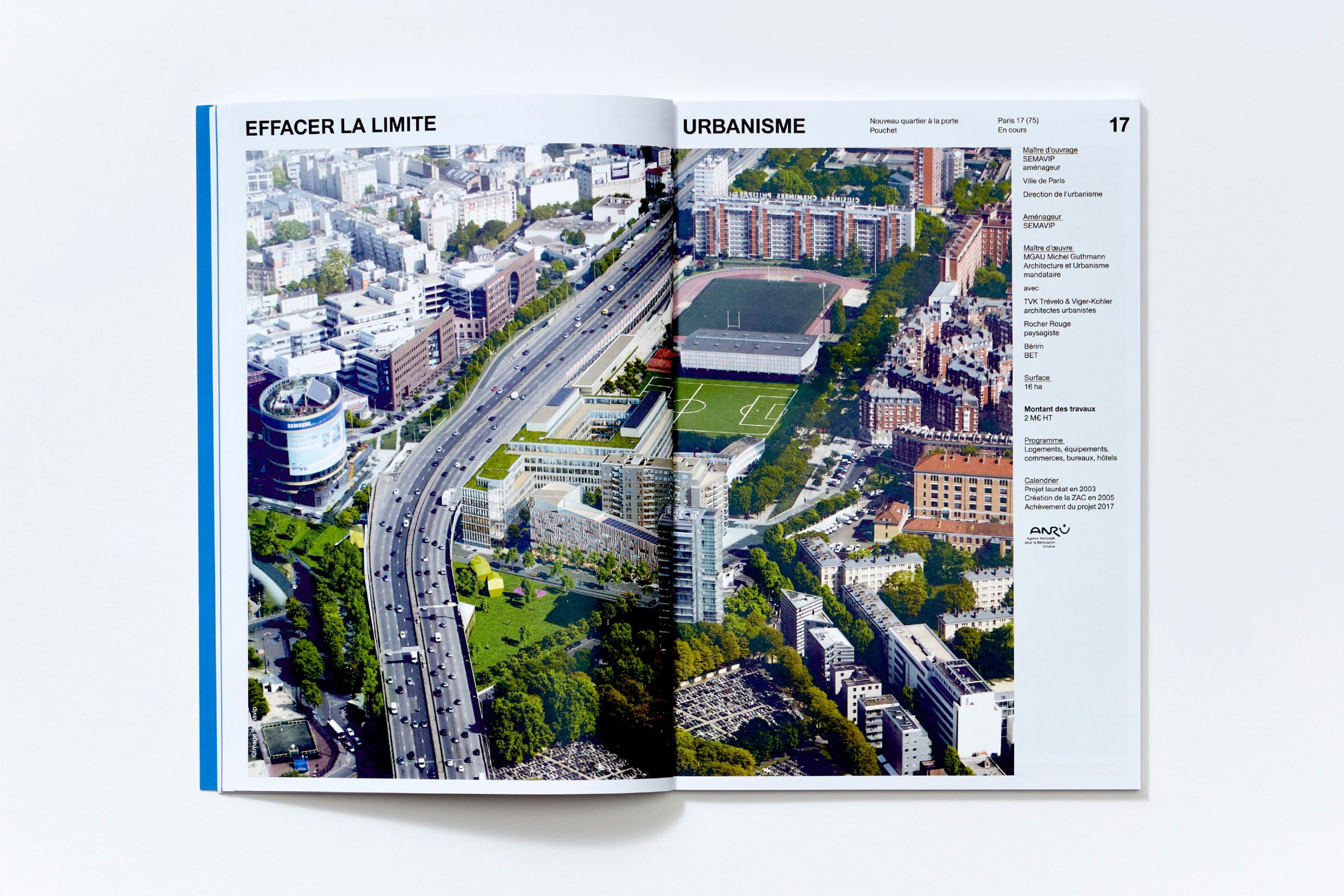
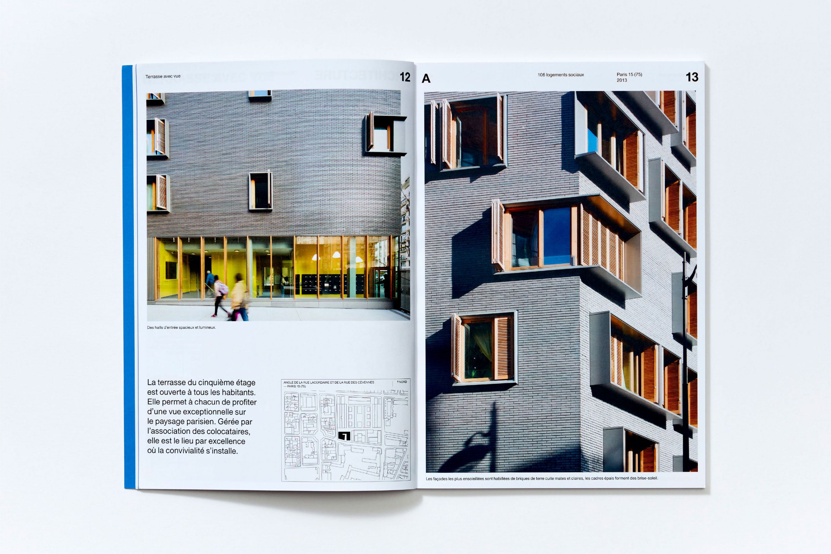
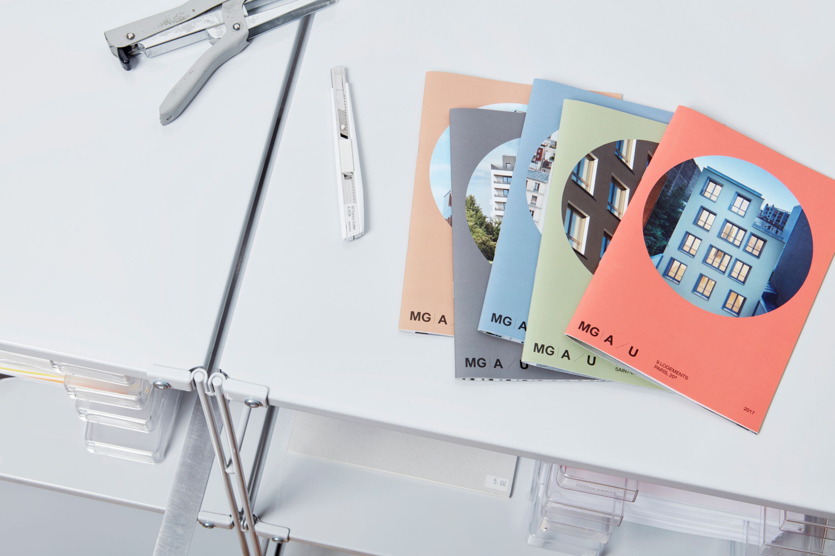
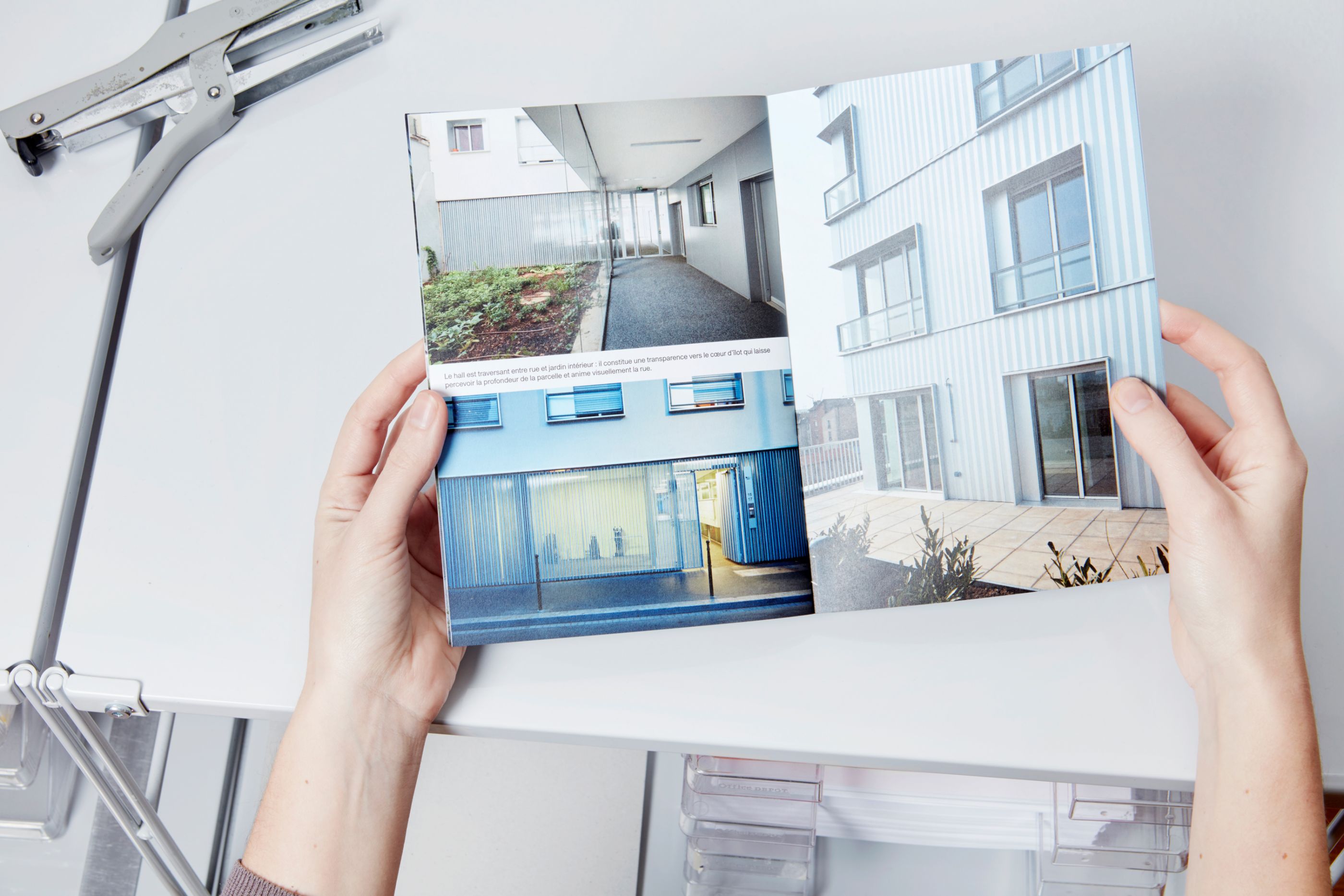
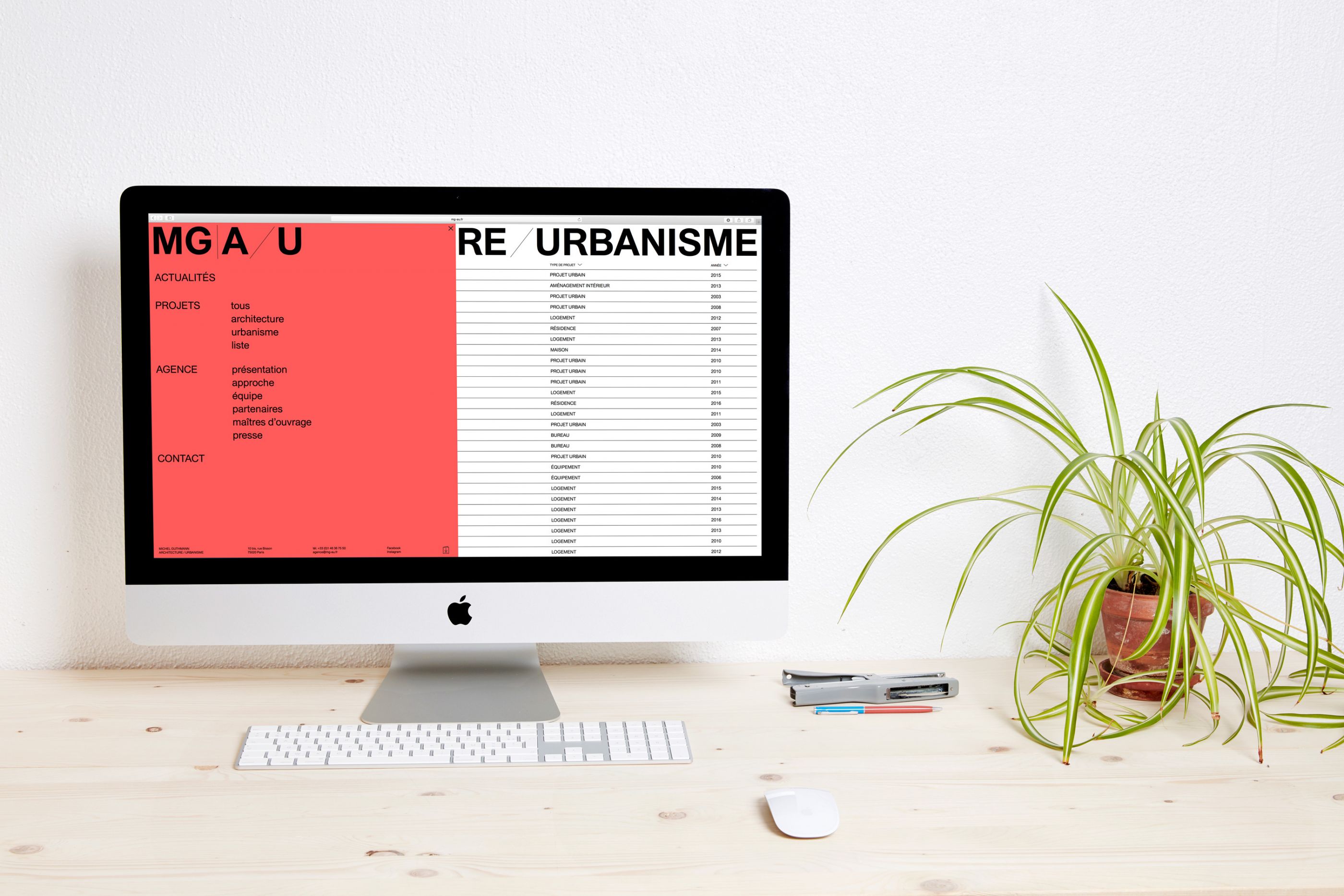
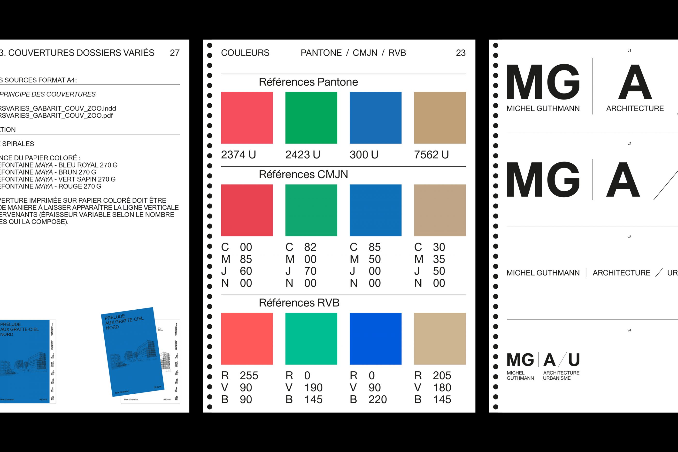
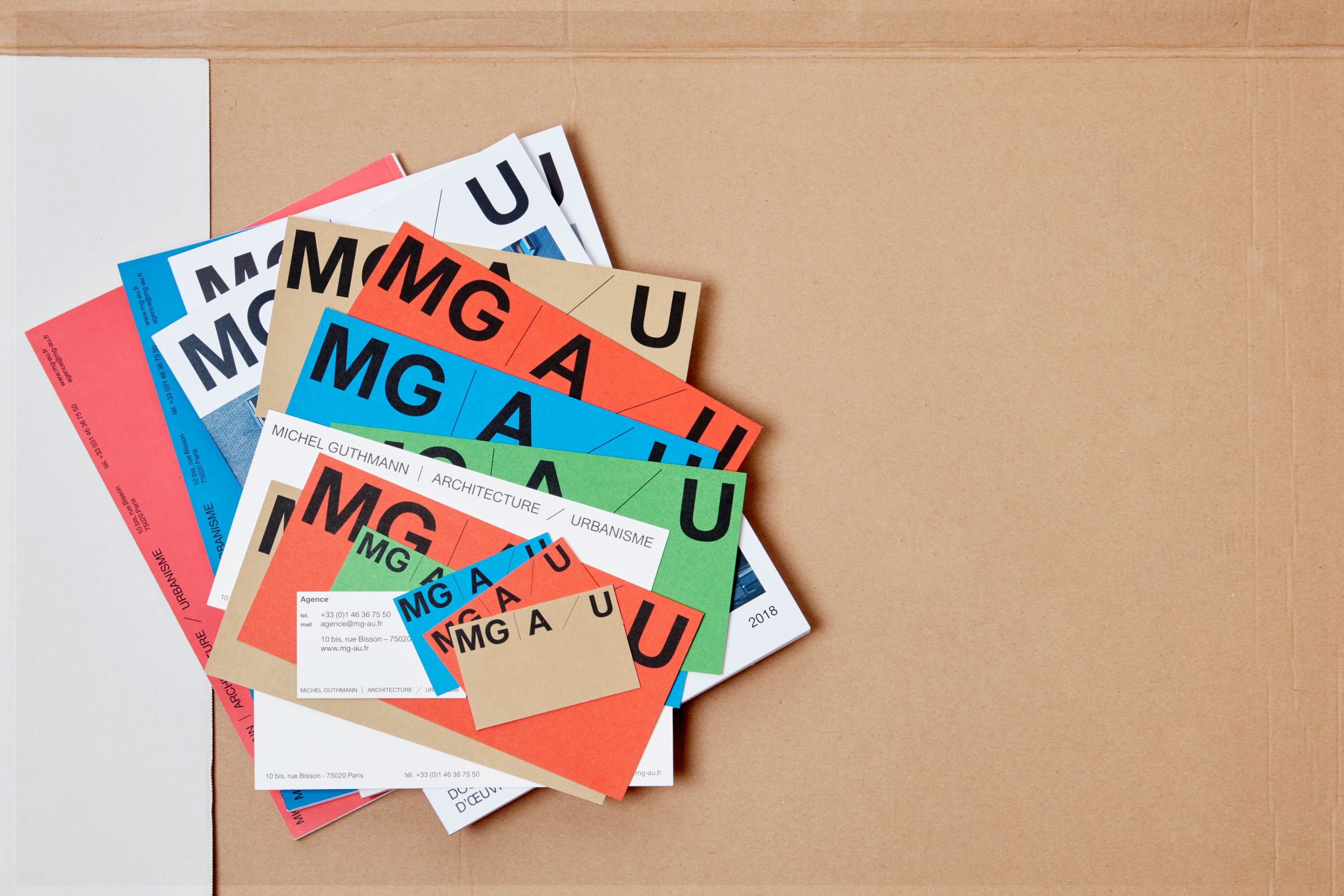
MGAU
/
Michel Guthmann Architecture Urbanisme
2016–2019
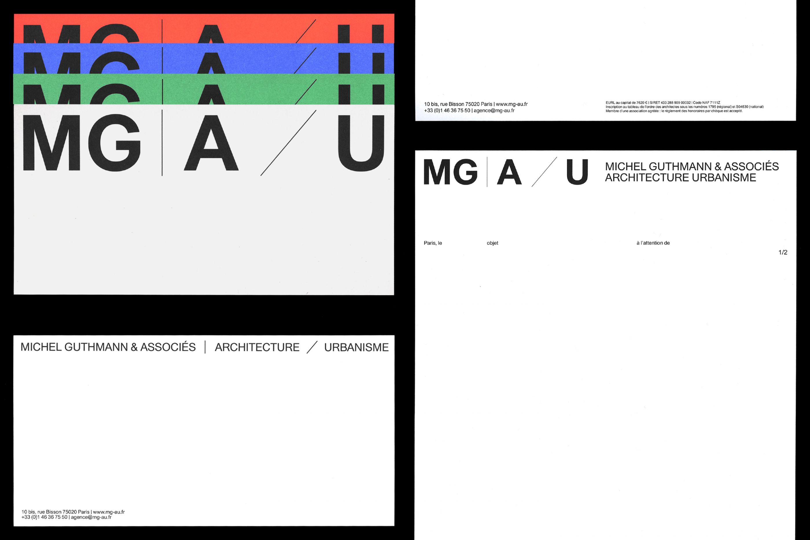
Logotypes, stationery, portfolios, various templates, website, etc.
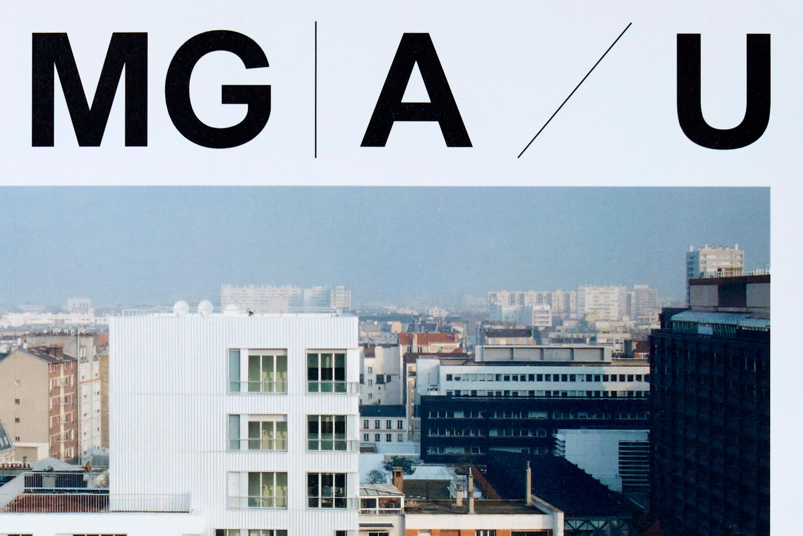
We designed the visual identity for MGAU, an office for architecture and urban design in Paris. The core of the identity is to generate rich and varied solutions through the use of simple and recurring tools. In the manner of the office’s practice.
Centre Pompidou
/
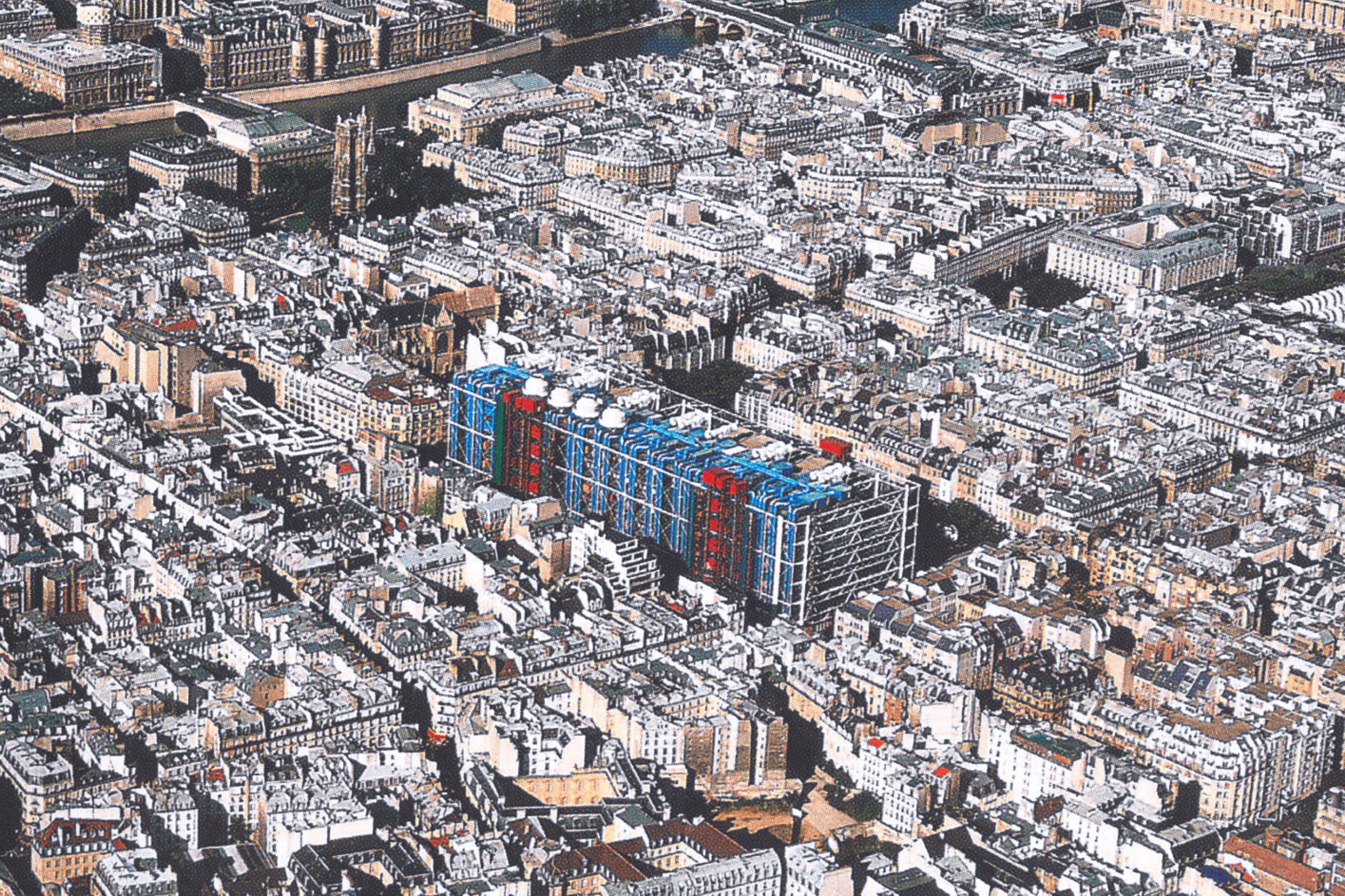
Centre Pompidou
2025
Art Direction, Visual identity, Type design, Guideline, campaign, print, digital
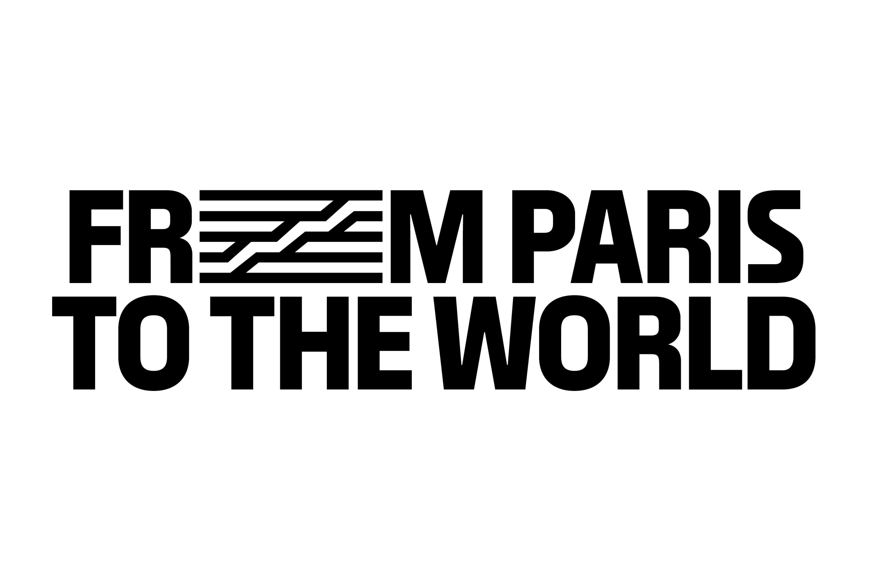
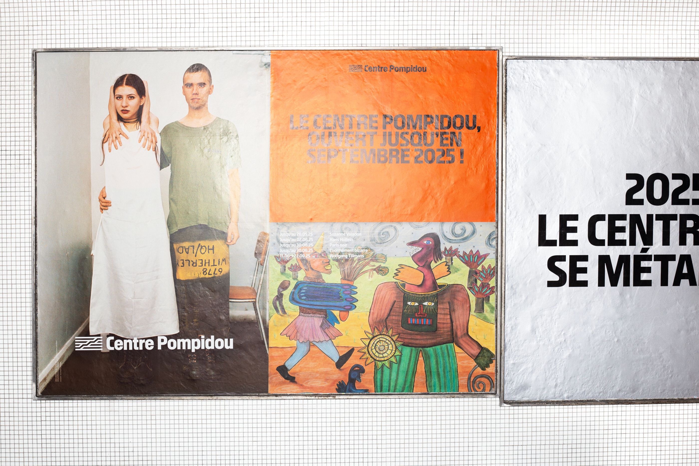
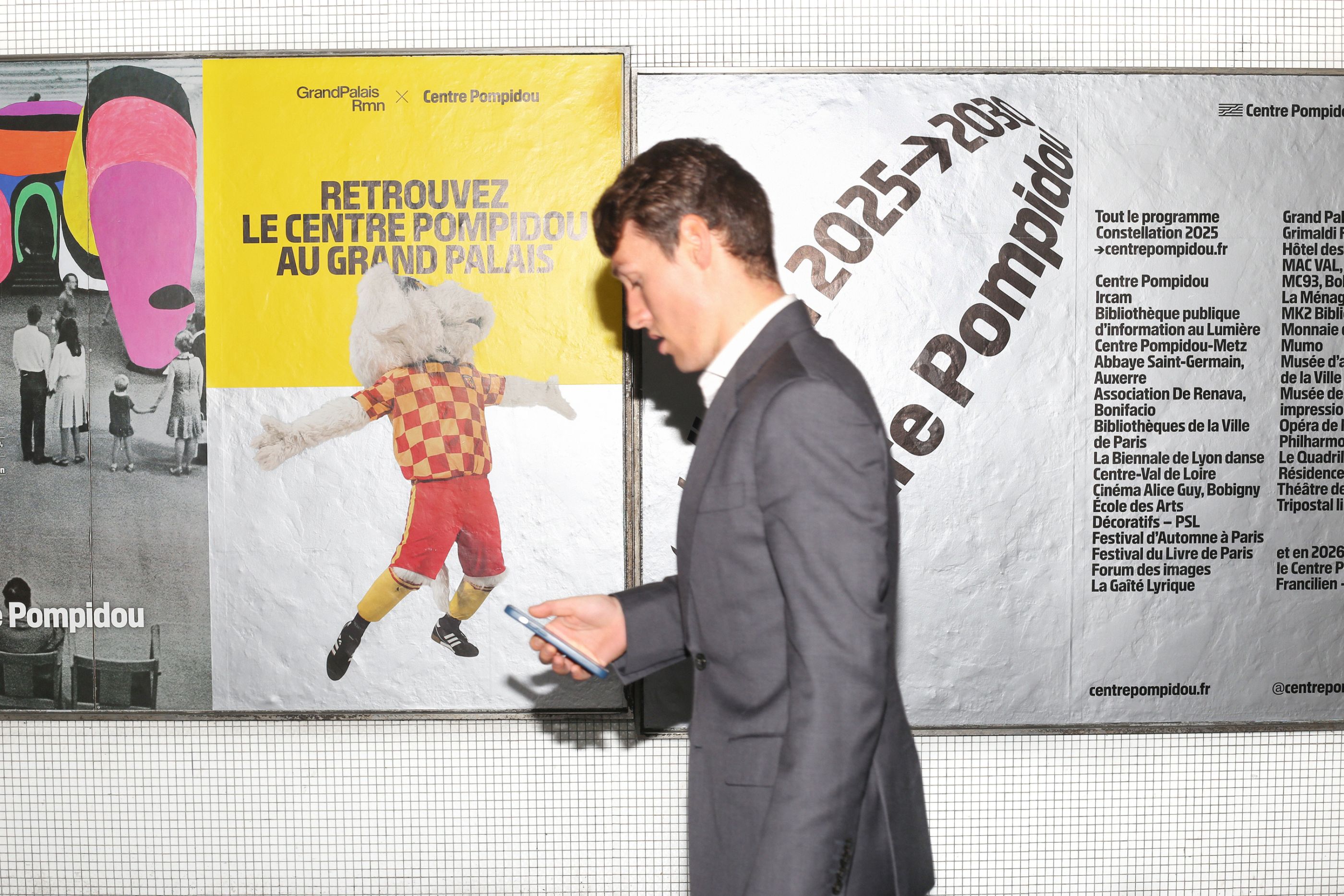
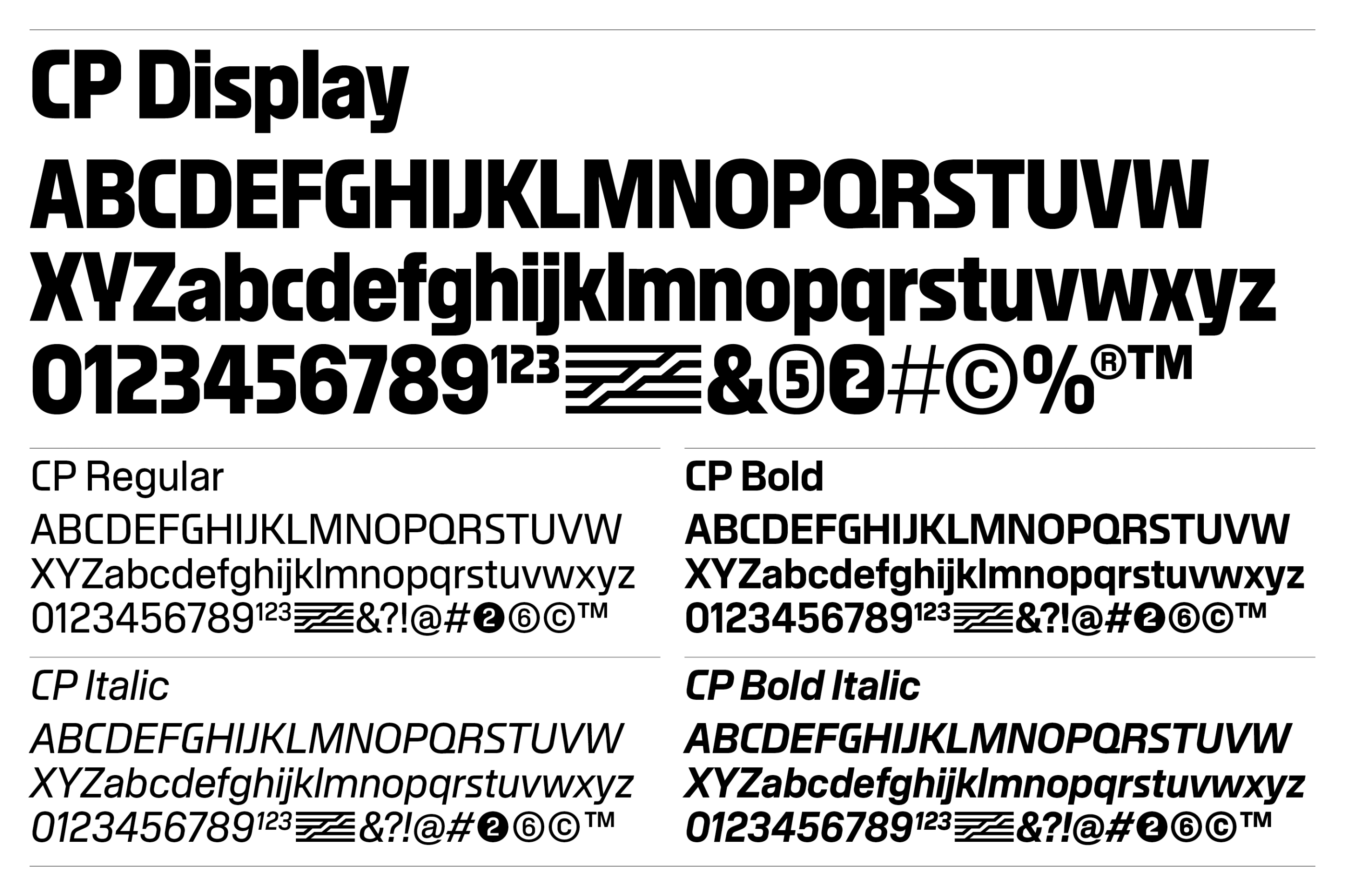
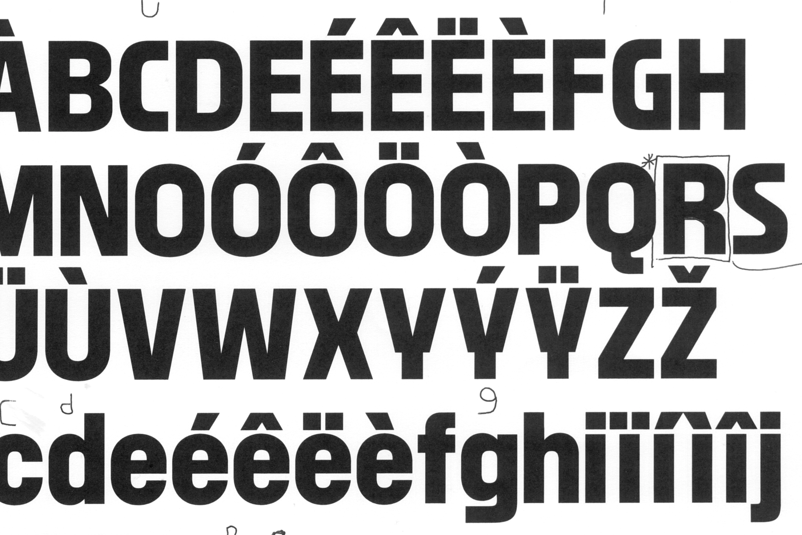
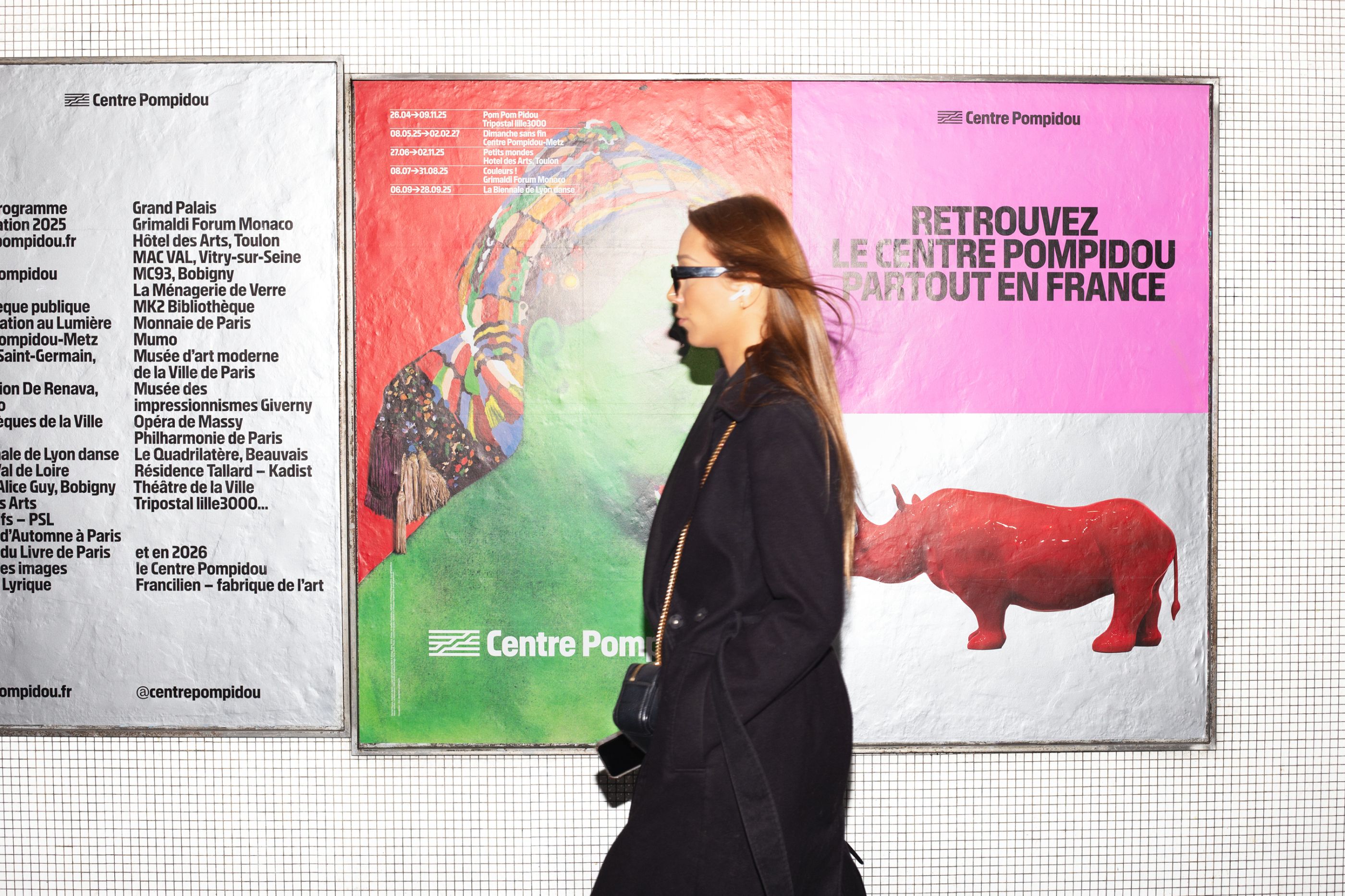
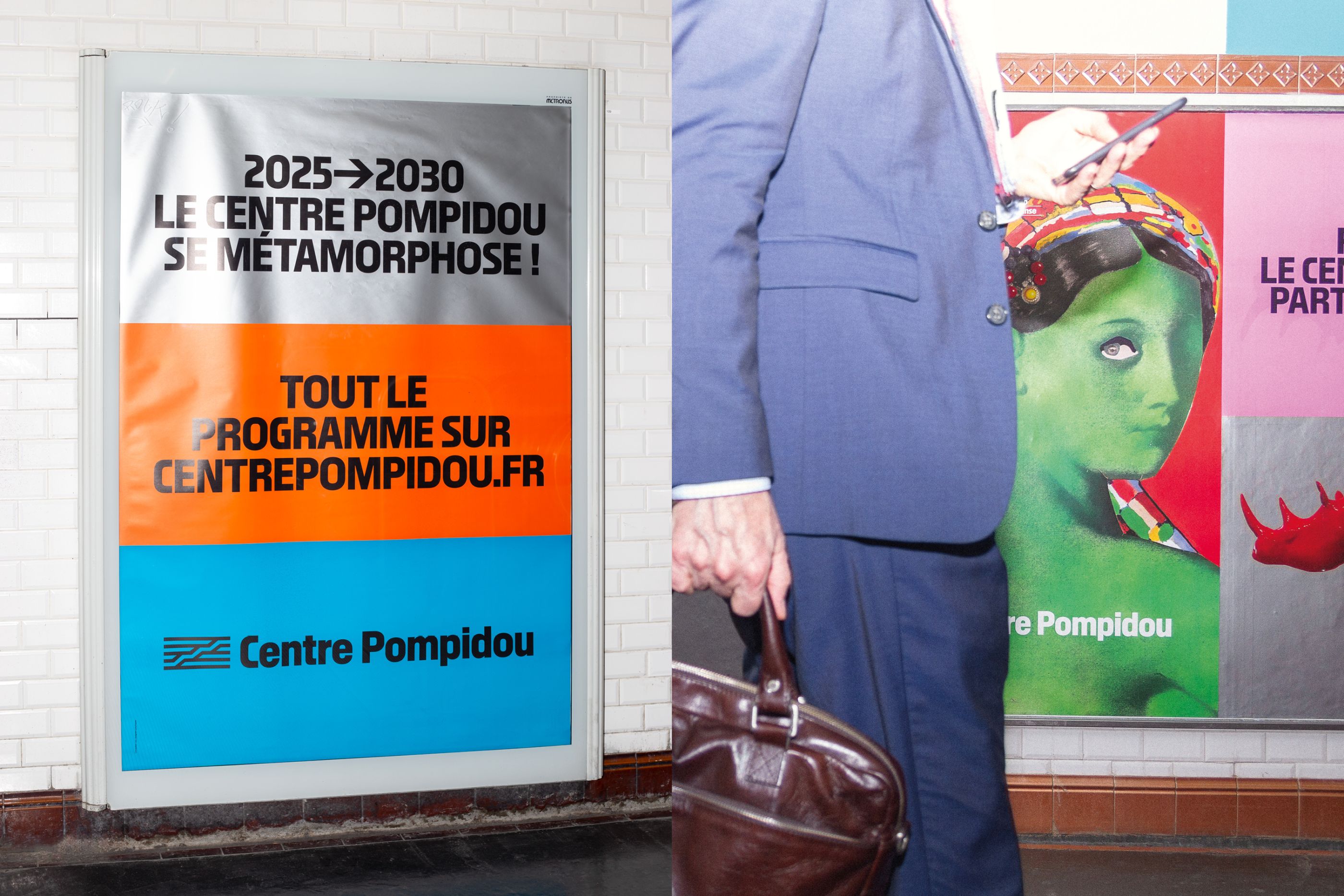
Zoo has won the international competition for the rebranding of the Centre Pompidou’s global visual identity. With a bold, expressive, and unifying language, our proposal reaffirms the museum’s positioning, reflects its commitment, and strengthens the brand’s international influence. The exclusive CP Family typeface, custom-designed by Zoo, offers a contemporary take on the Centre Pompidou’s typographic evolution. It embodies key elements of the building’s iconic architecture—its visible pipes, modular structures, and playful, monumental form—while continuing a distinct typographic heritage defined by geometric letterforms and condensed characters.
Musée d'Orsay
/
Musée d'Orsay
2023
Art Direction, Visual identity, Type design, Guideline, campaign, print, digital
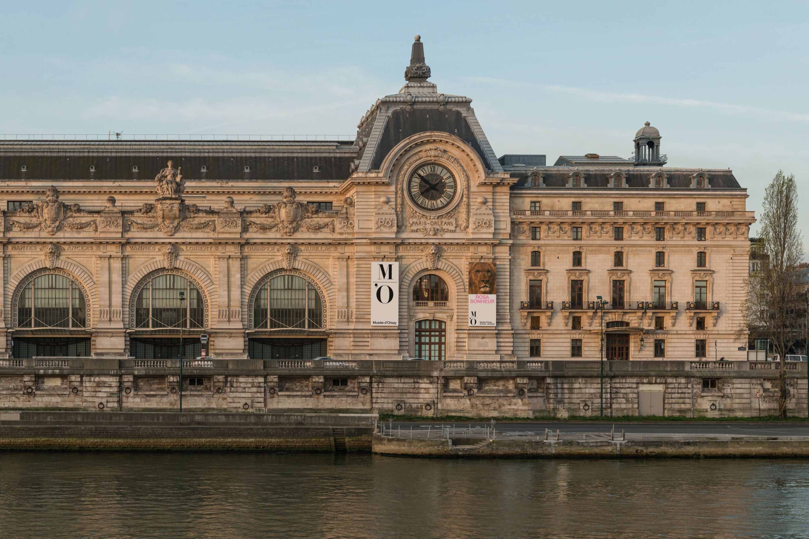
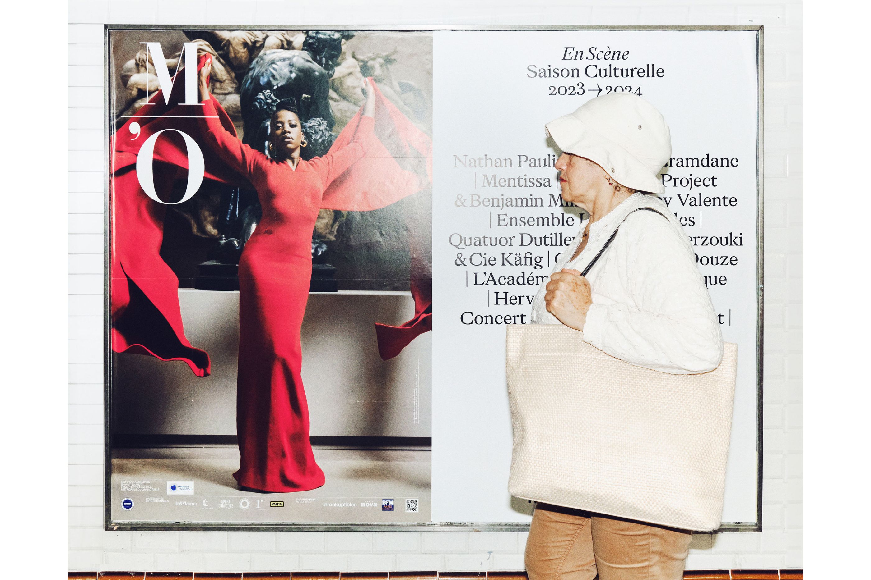
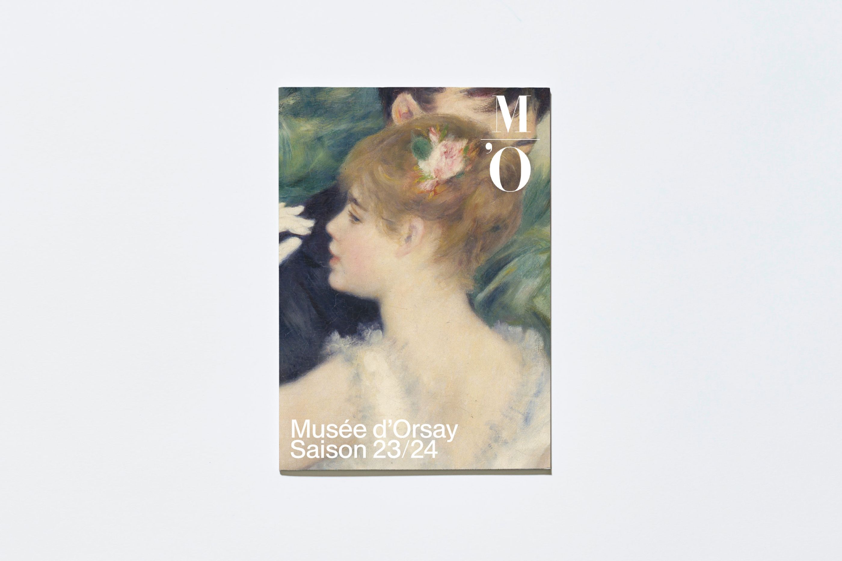
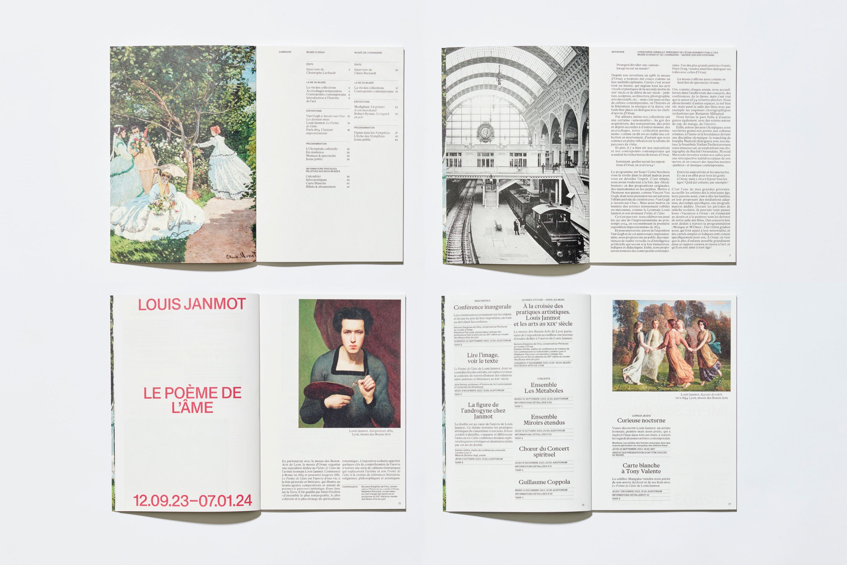
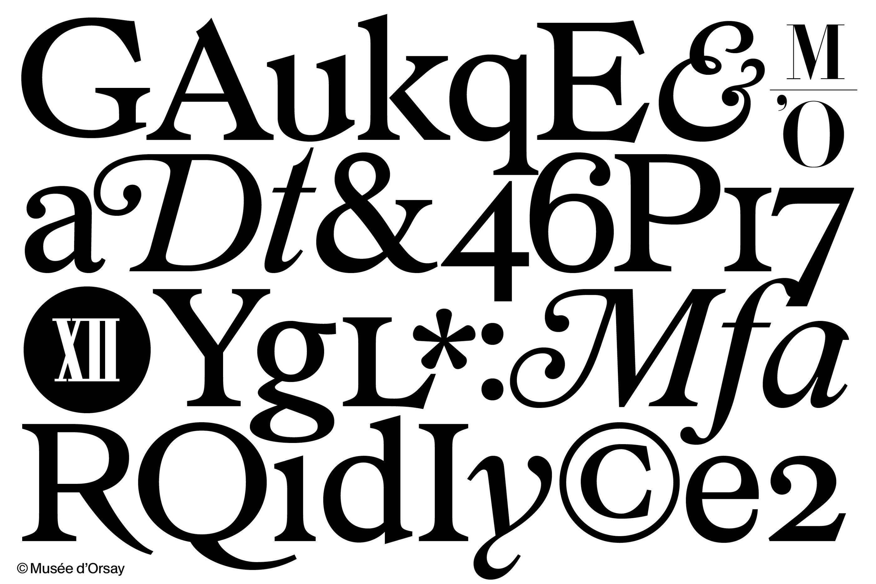
The Musée d'Orsay is dedicated to artistic expression from the period 1848-1914. With an annual attendance rate of 3.5 million, it is one of the world's most prestigious cultural institutions. We won the contract for the complete overhaul of its visual identity, in partnership with Designers Unit for the signage. Our project promotes a contemporary interpretation of the museum's artistic expressions, by defining a clear, readable and engaging visual language. We defined a global, coherent approach for all print and digital communication media, including signage. We designed an exclusive, bespoke typeface: Orsay Elzevir. This typeface is a contemporary reinterpretation of the typographic evolutions from La Belle Époque, and conveys the energy of the artistic period to which the Musée d'Orsay is dedicated.
Whatvr Fanzine
/
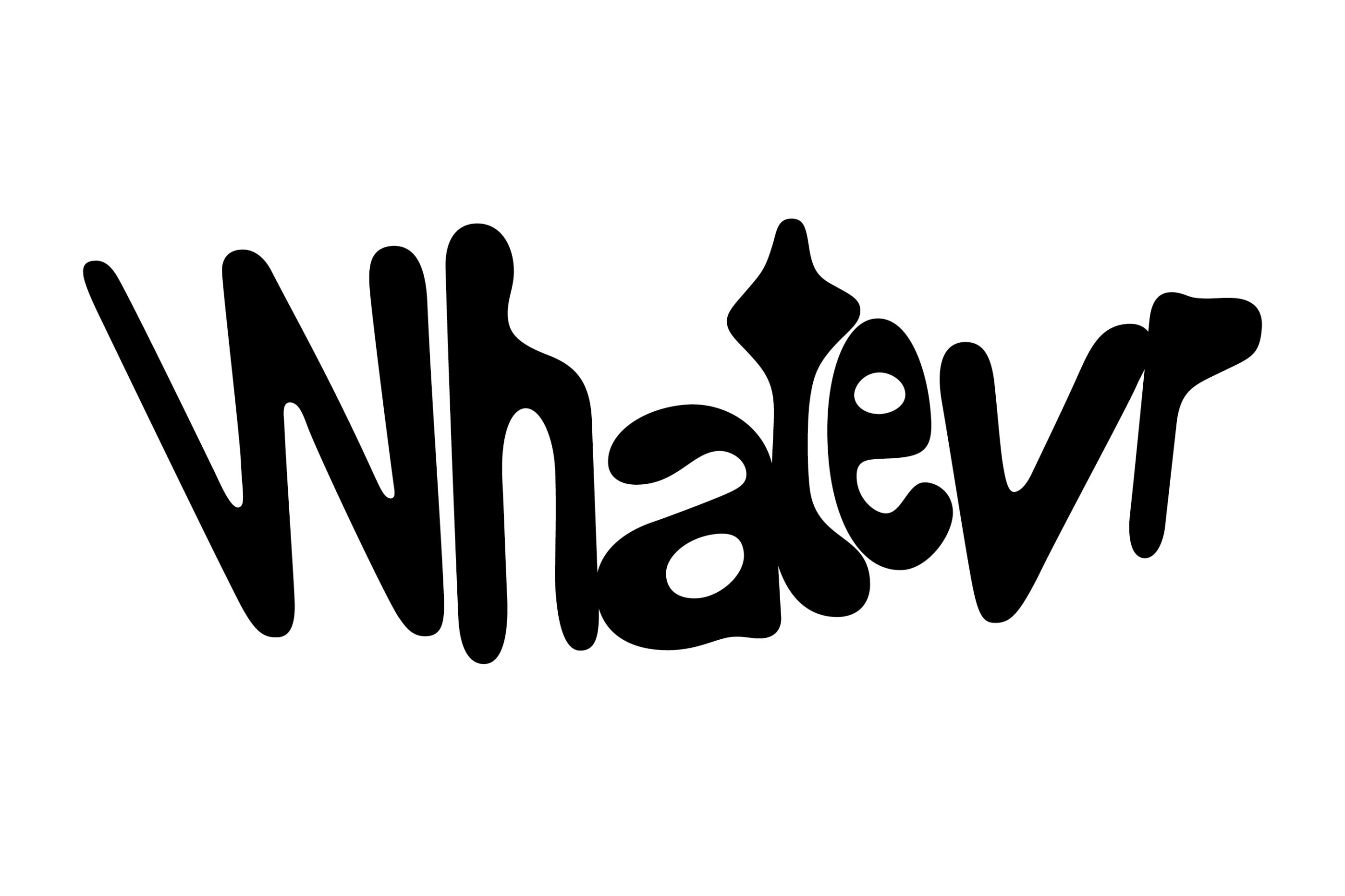
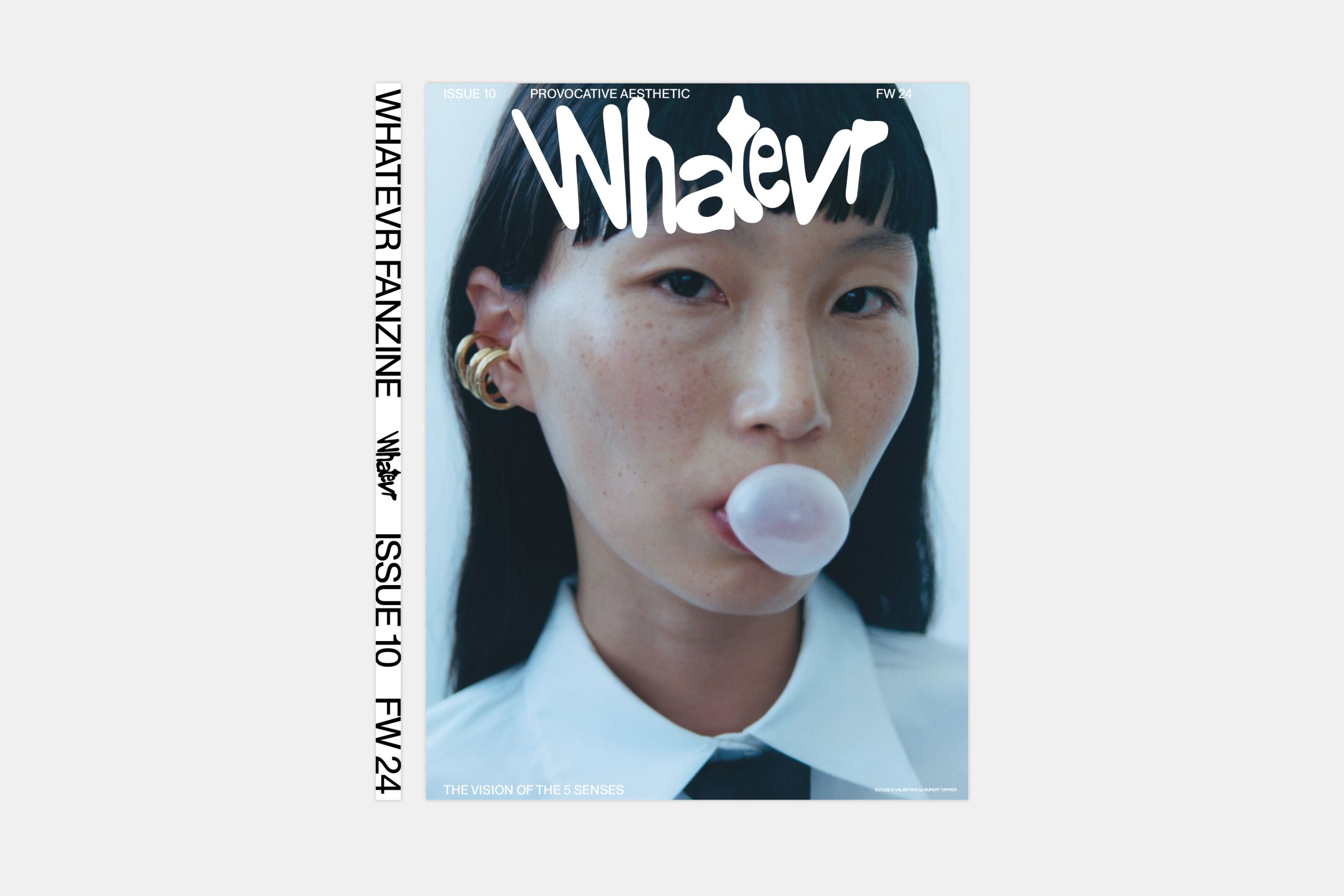
Whatevr Fanzine
2023
Editorial design, type design, editing, logotype
Global rebranding of Whatevr Fanzine. Whatevr takes an offbeat, sometimes cheeky look at the social issues we all face, to which the only answer seems to be: whatever.
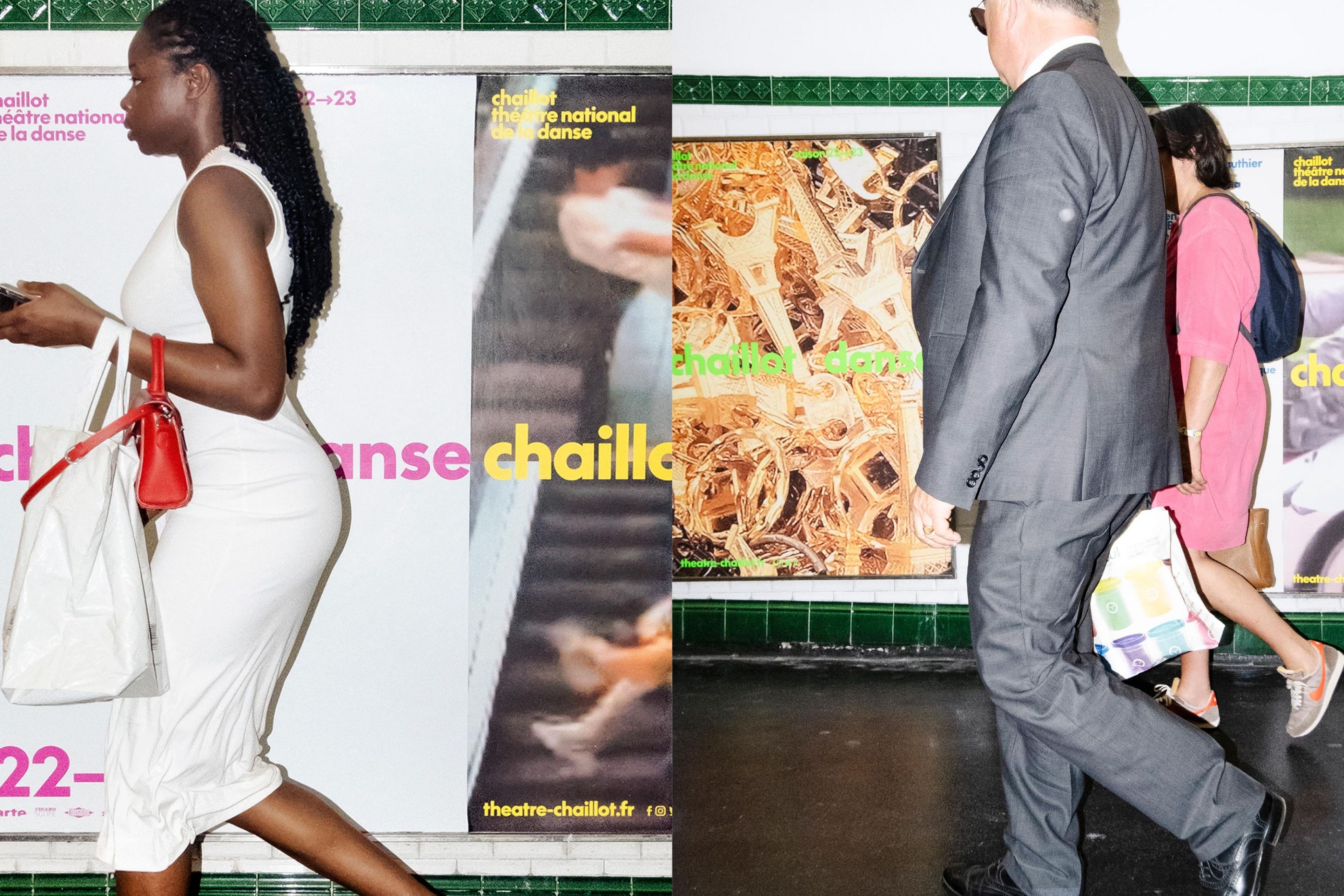
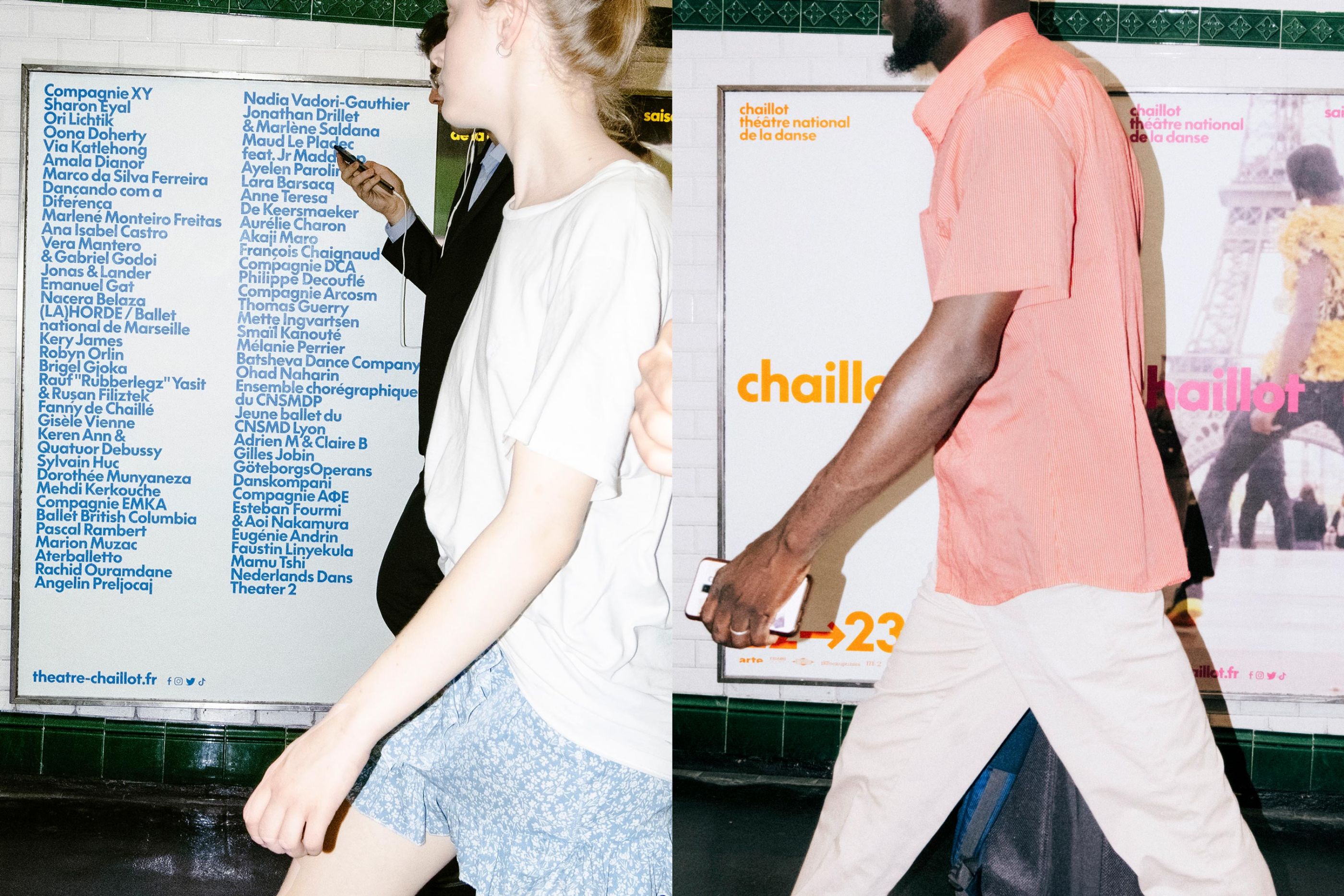
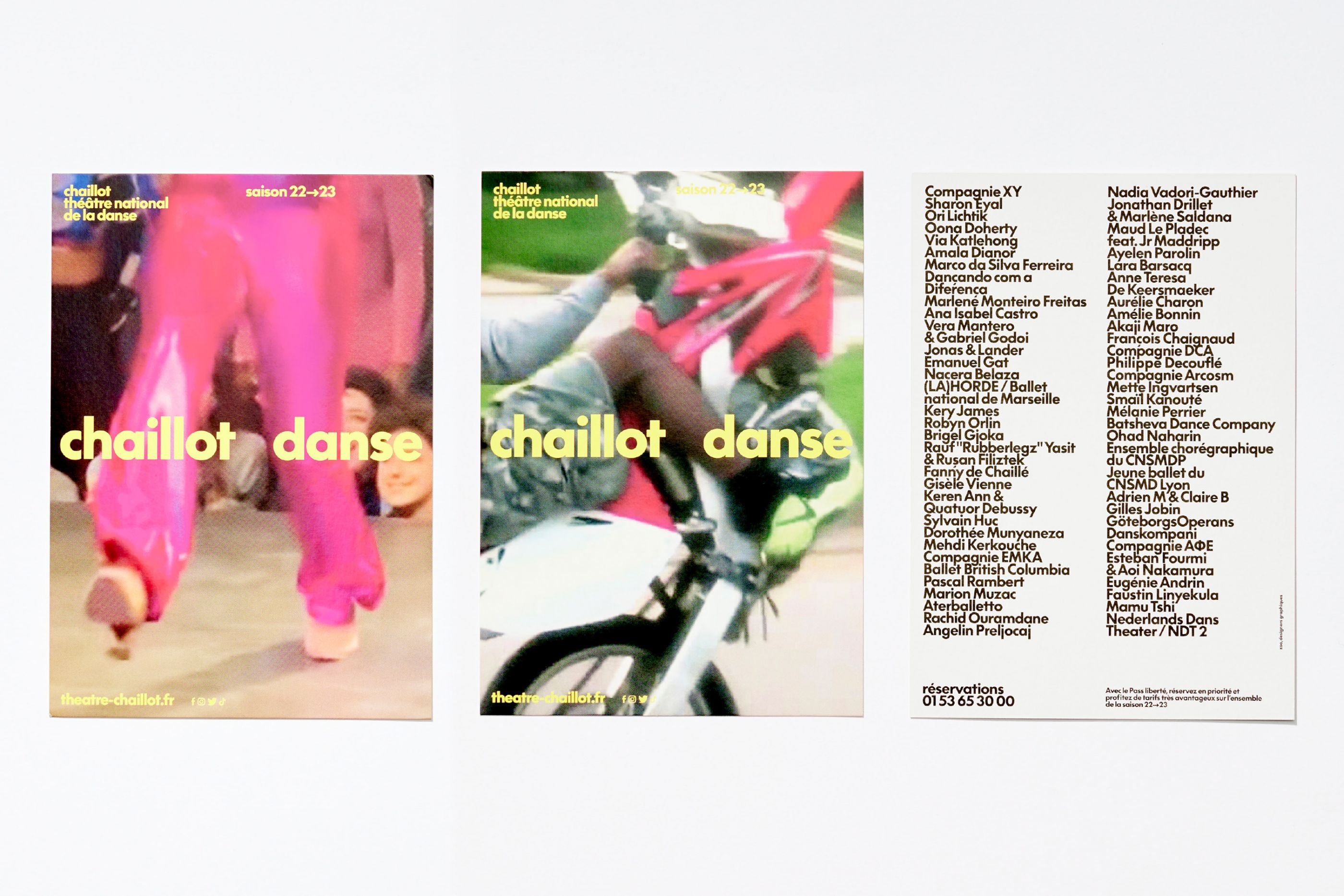
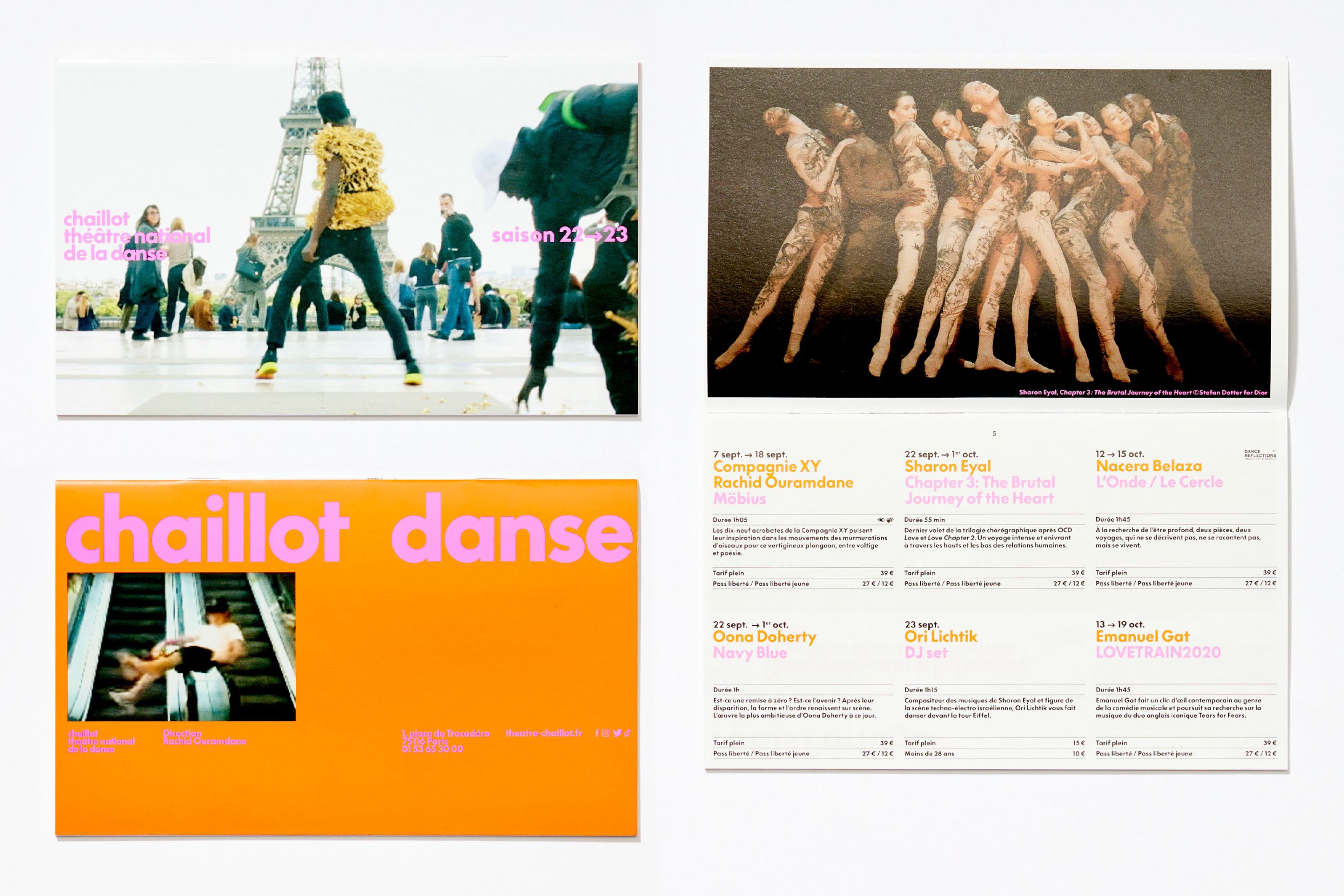
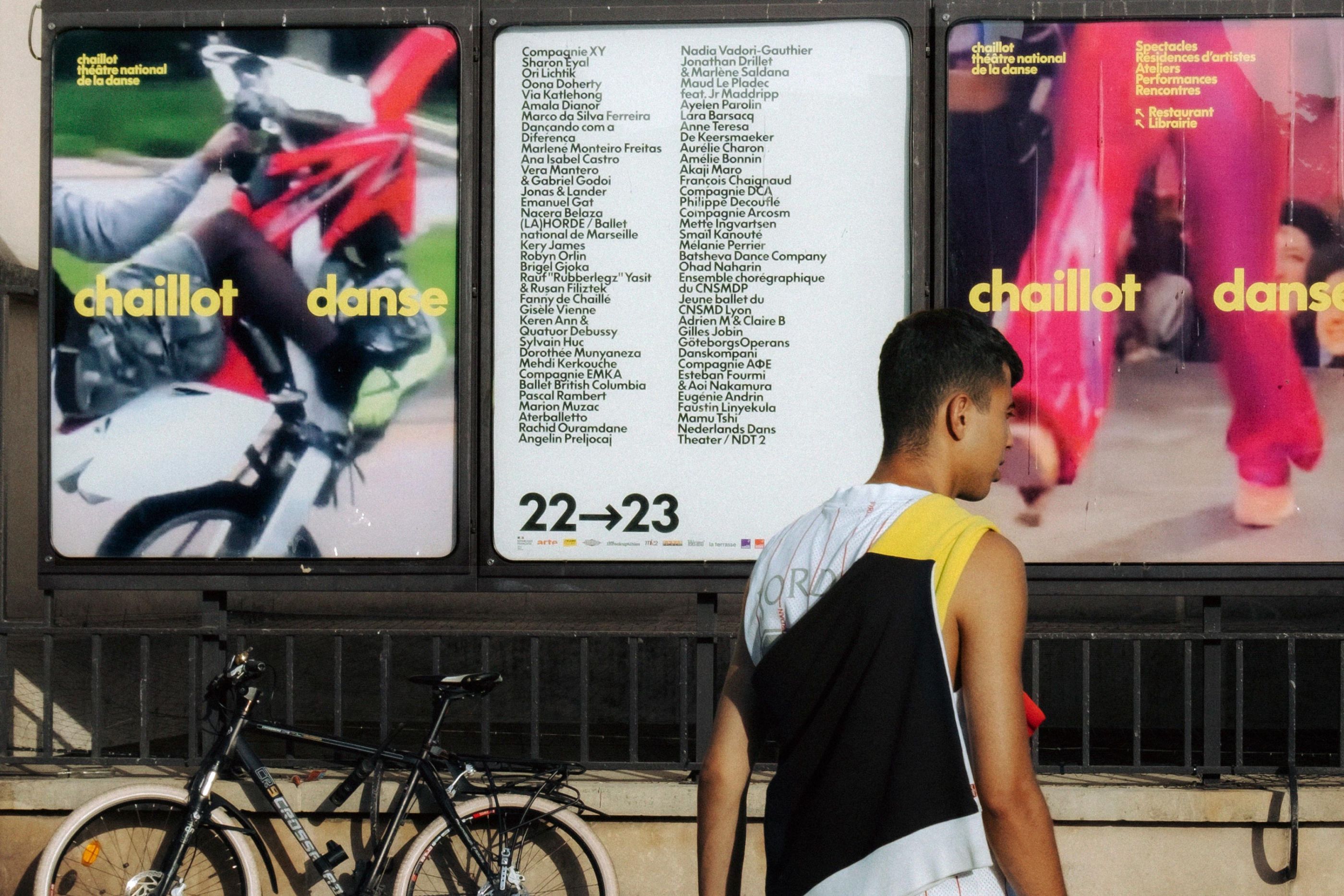
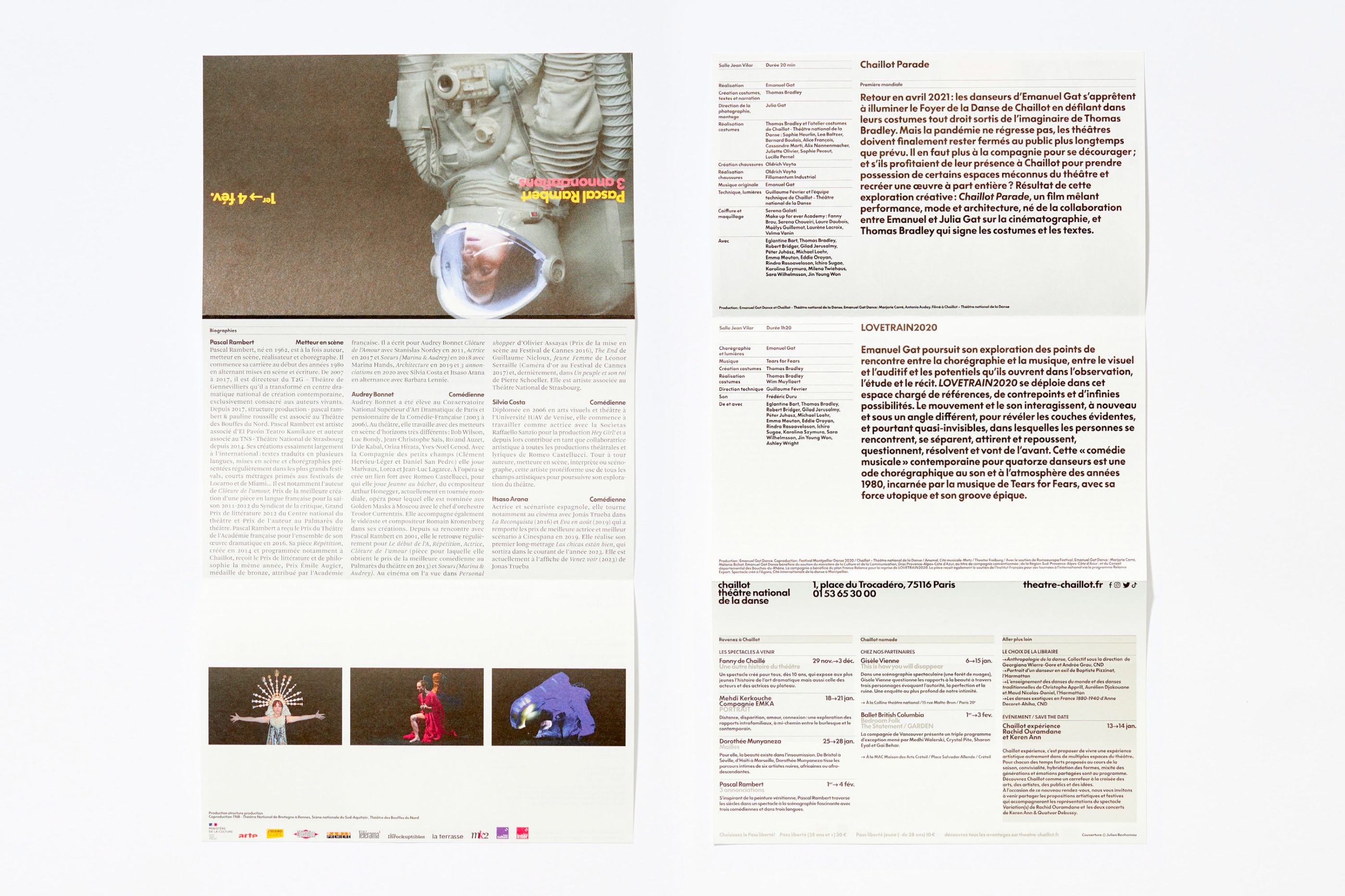
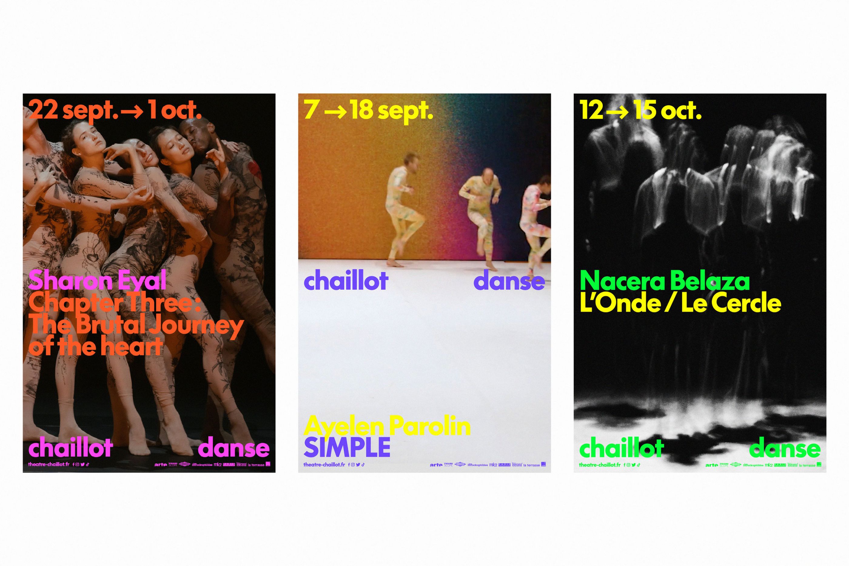
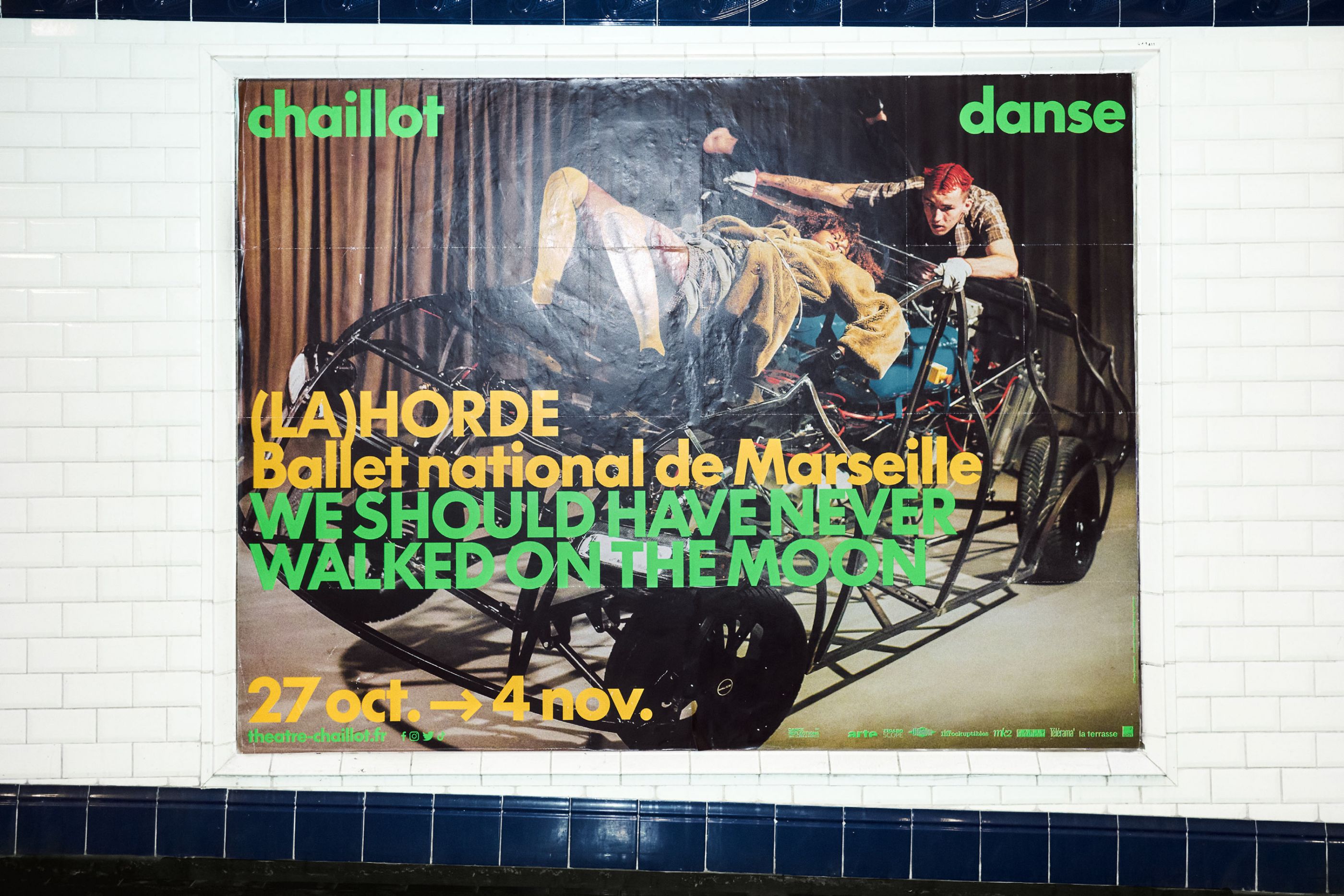
Chaillot, théâtre national de la danse
/
Chaillot Théâtre nationale de la Danse
2022-2025
Art direction, global visual identity, print, digital, video, motion, signage
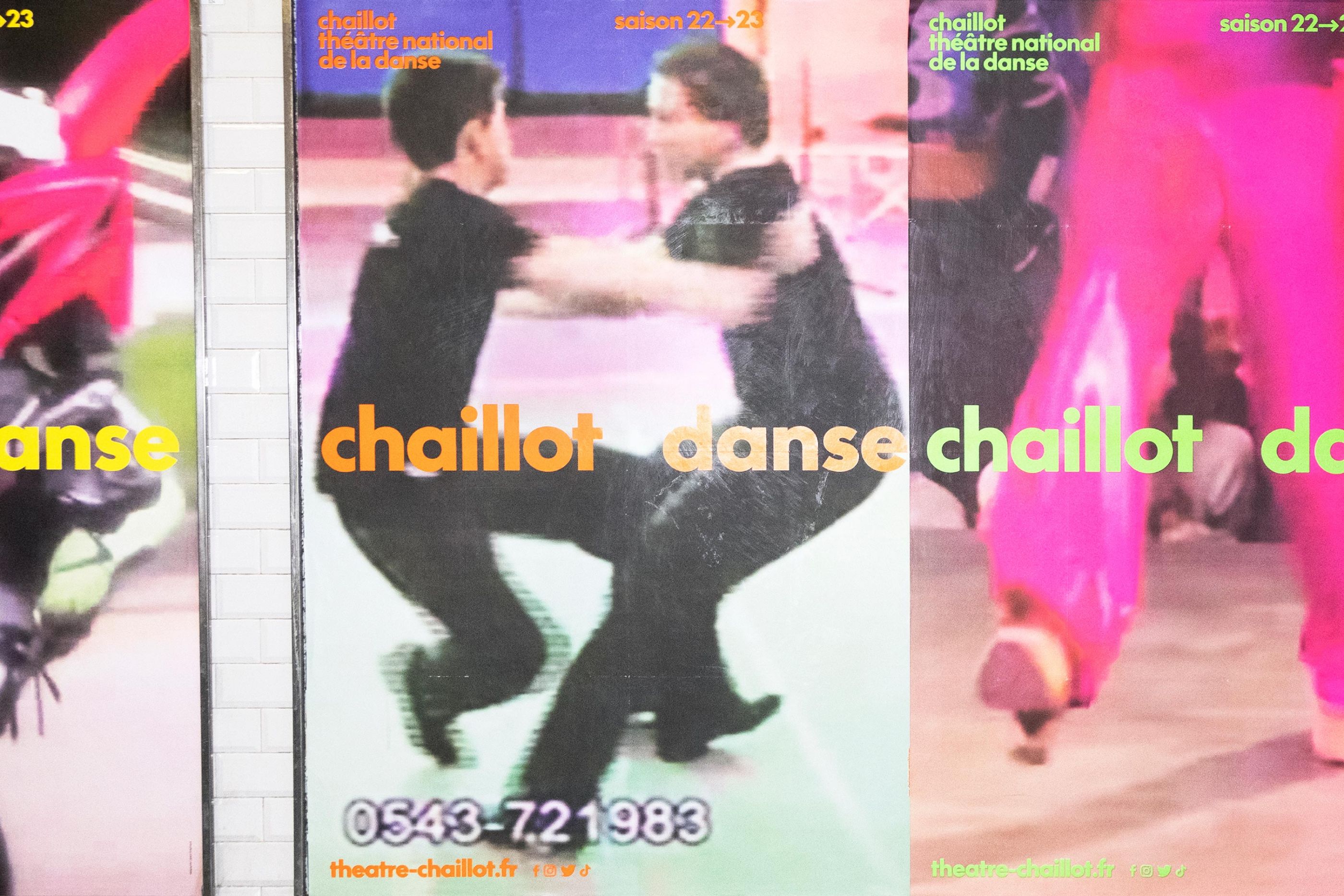
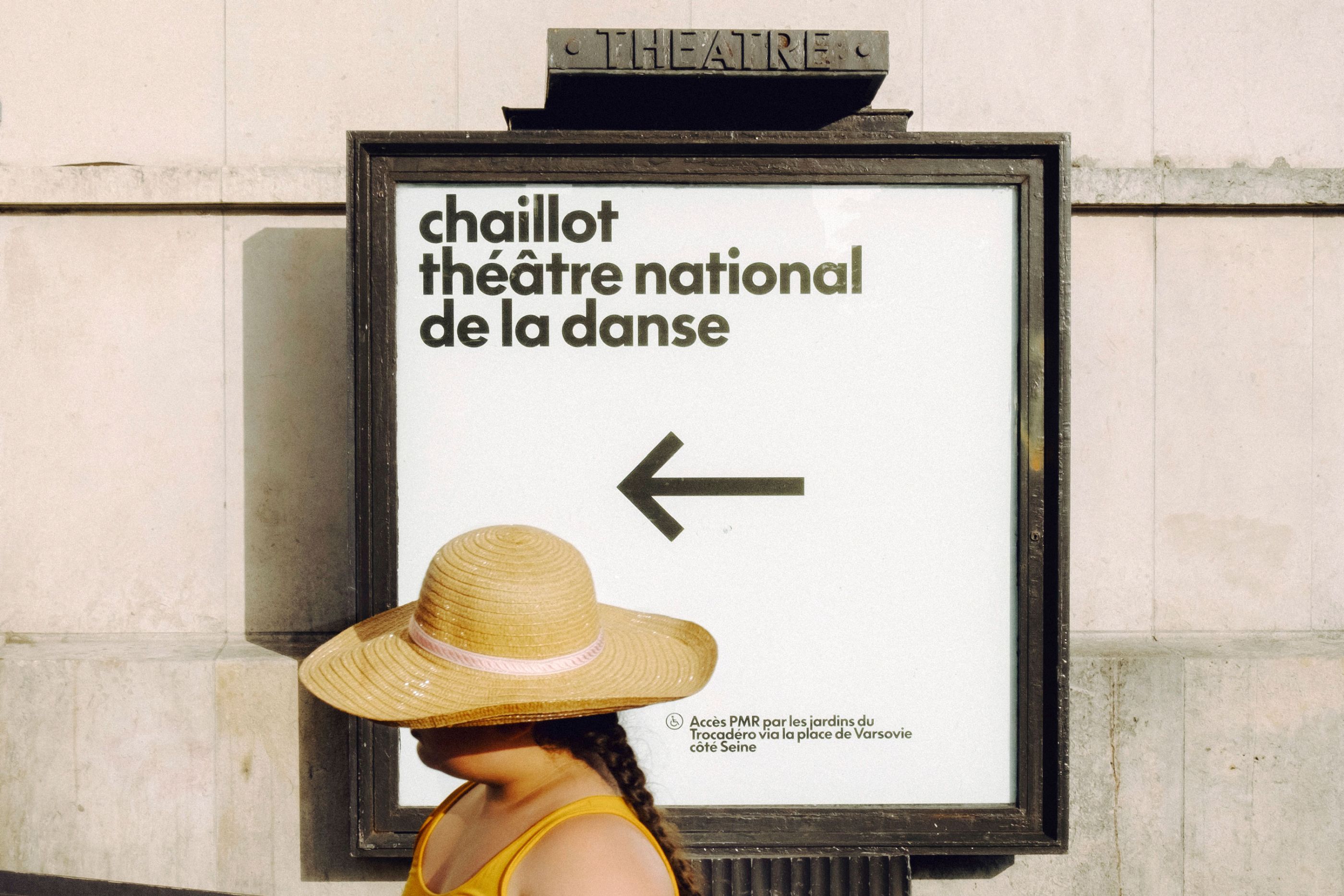
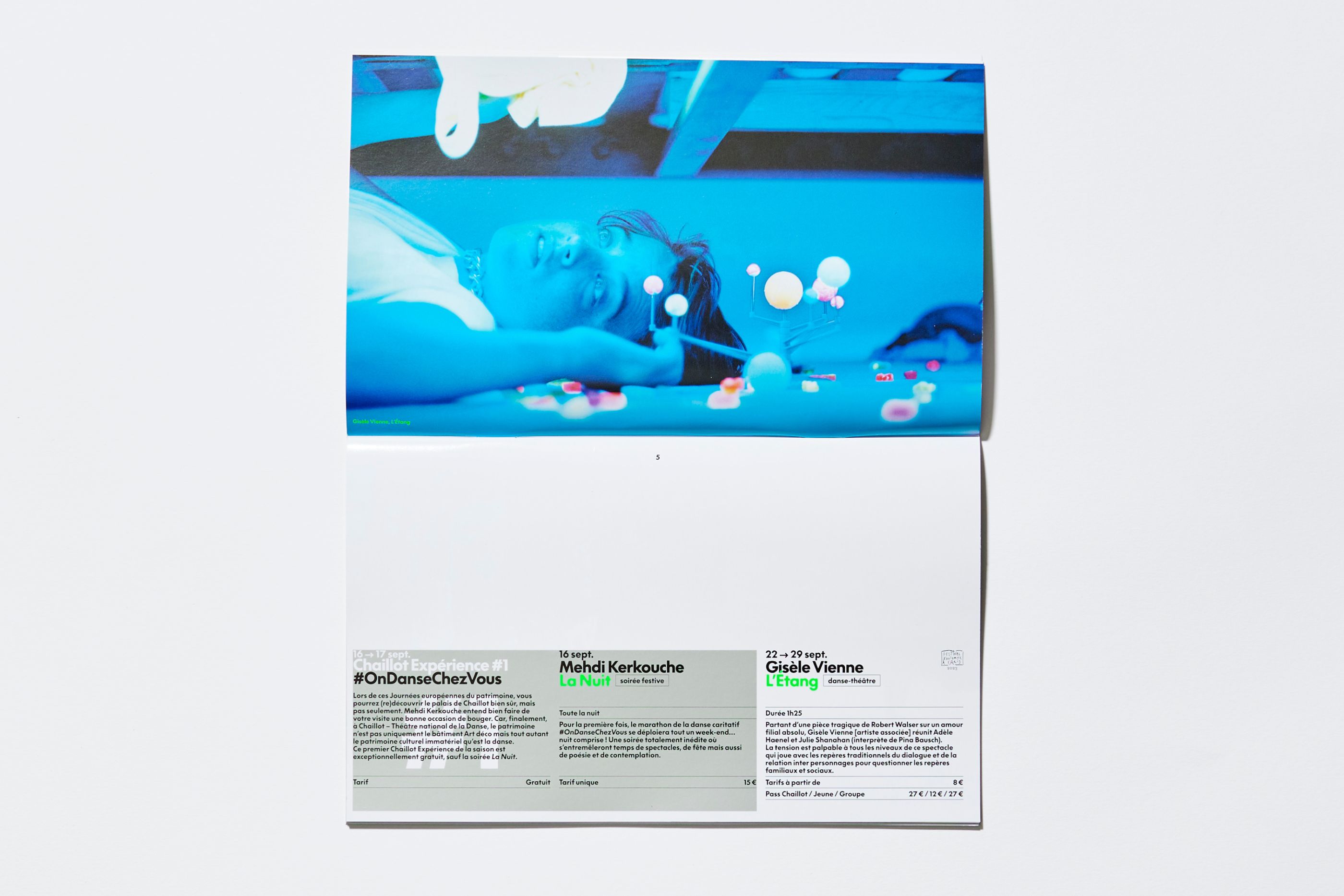
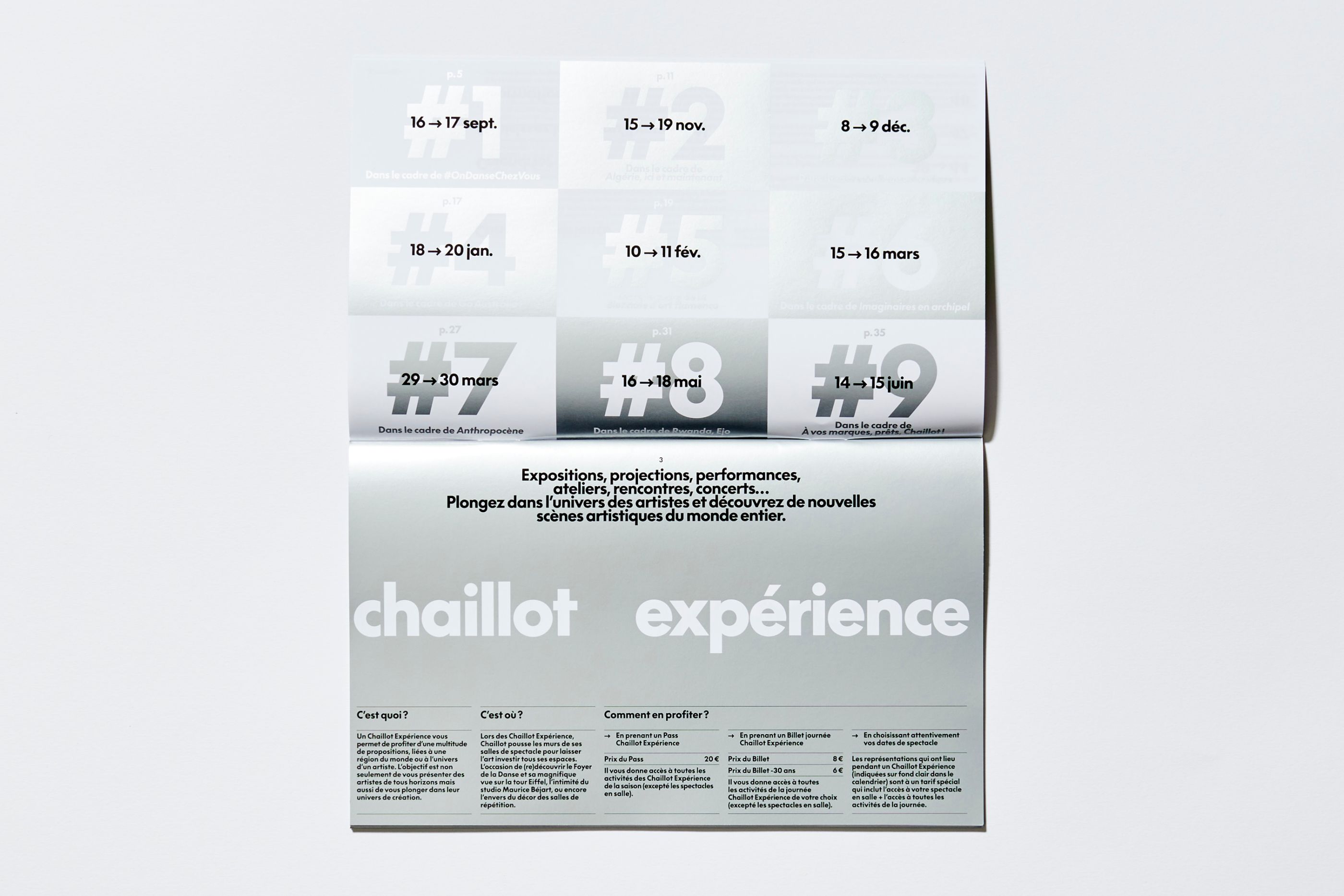
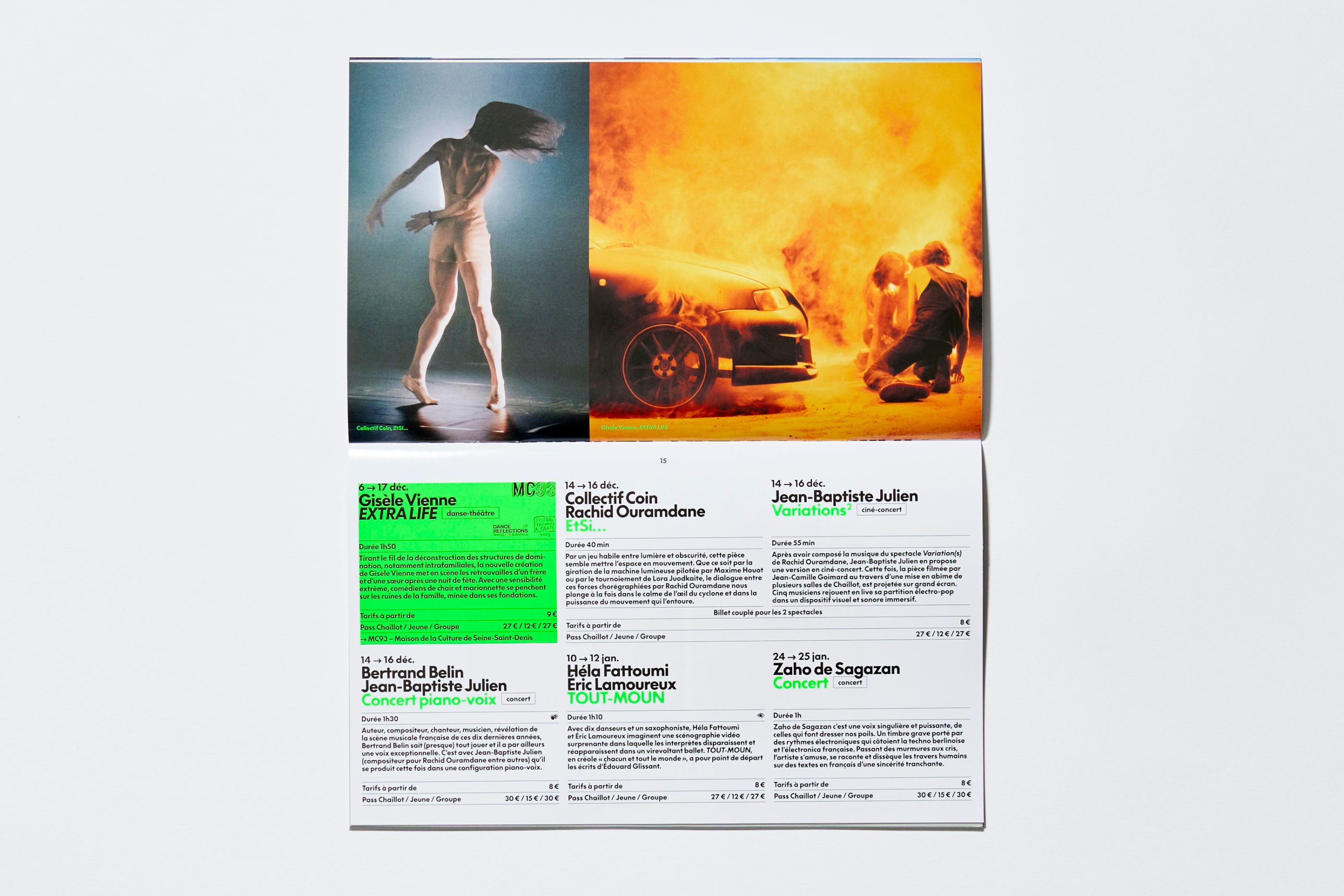
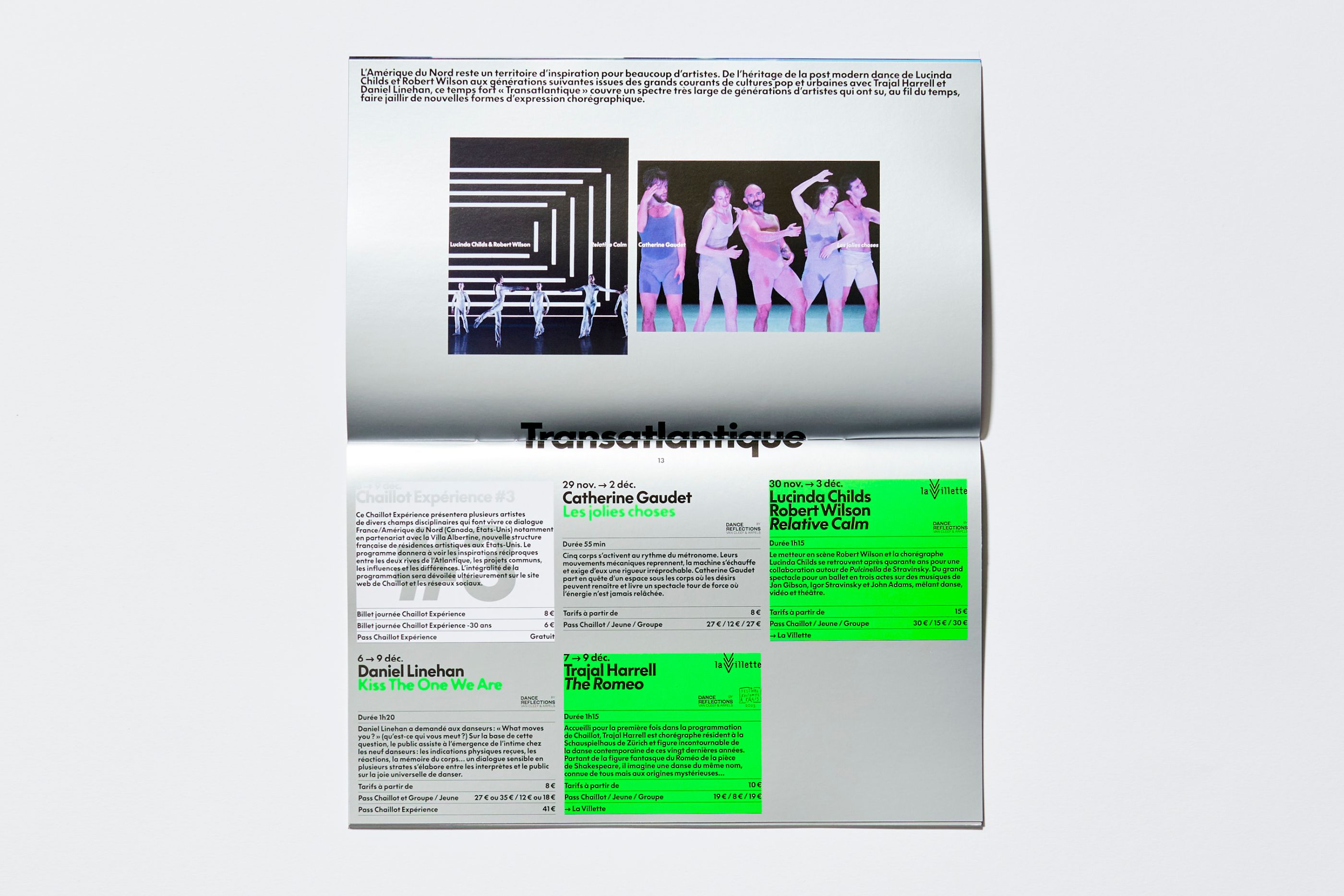
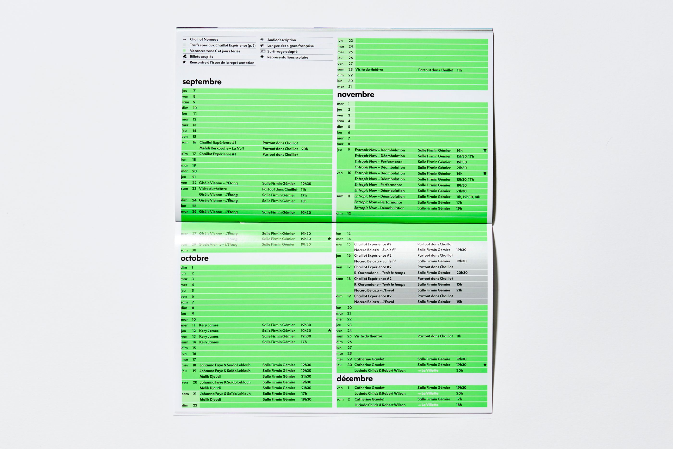
Chaillot commissioned us to propose a global overhaul of the institution's visual identity. Inspired by the new director Rachid Ouramdane, the programming is intended to be more radical and aimed at a wider, younger and more varied audience. We have thus proposed a generous and engaging register that desacralizes the institution. The typographic system is all-purpose, clear and rational. It provides Chaillot with a more accessible image. We have developed an iconography based on amateur images. They are taken from everyday life and highlight the banality of the body in movement. The new visual identity attracts the attention of broader audiences by simply showing that dance is everywhere.
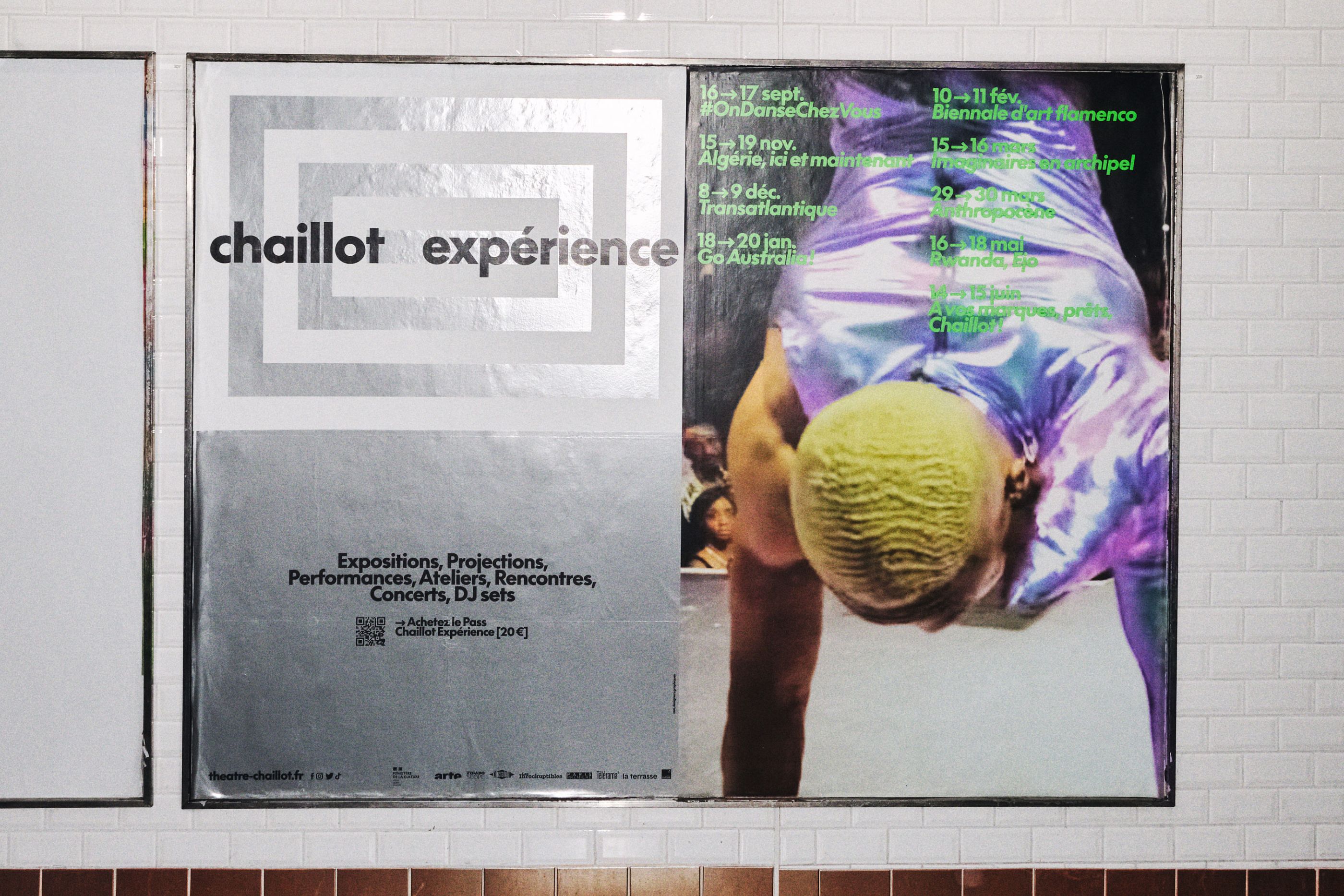
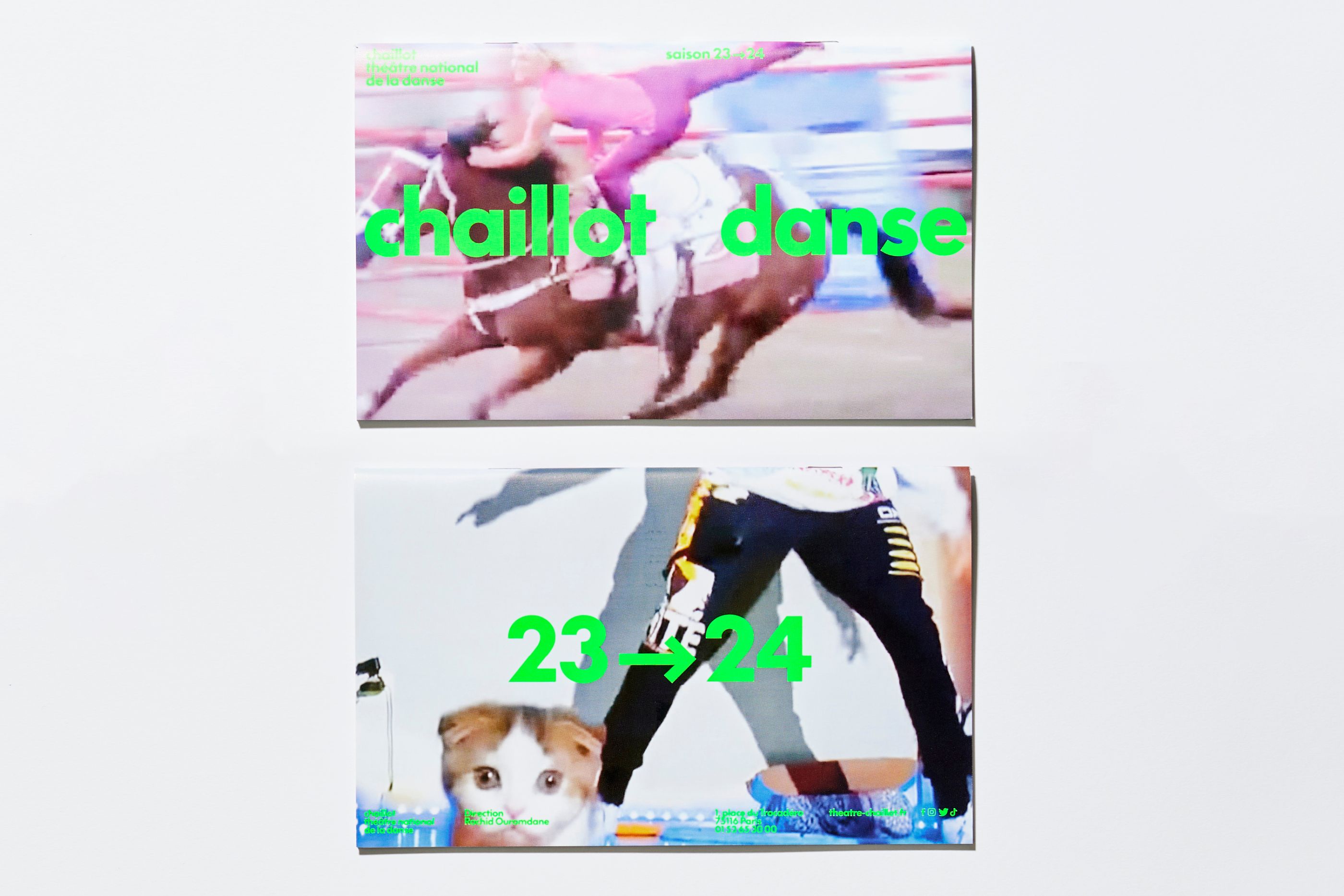
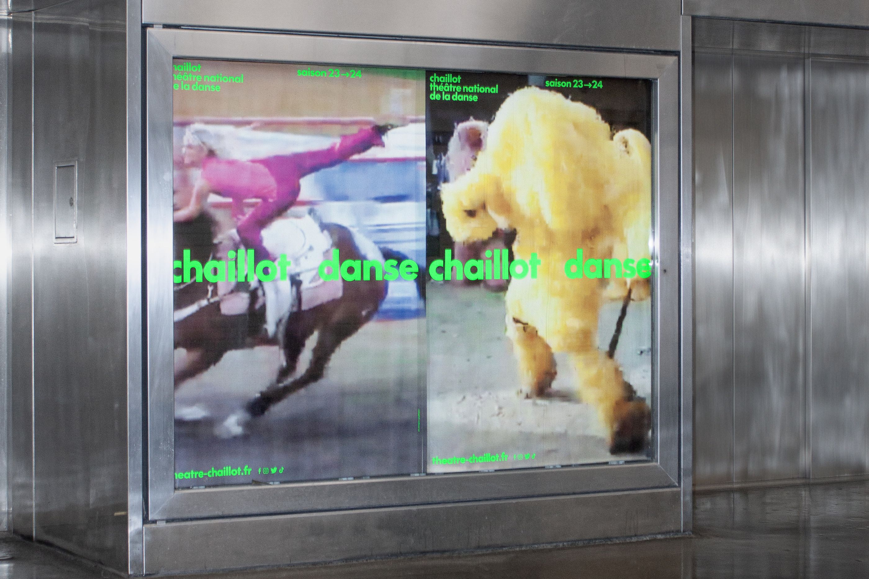
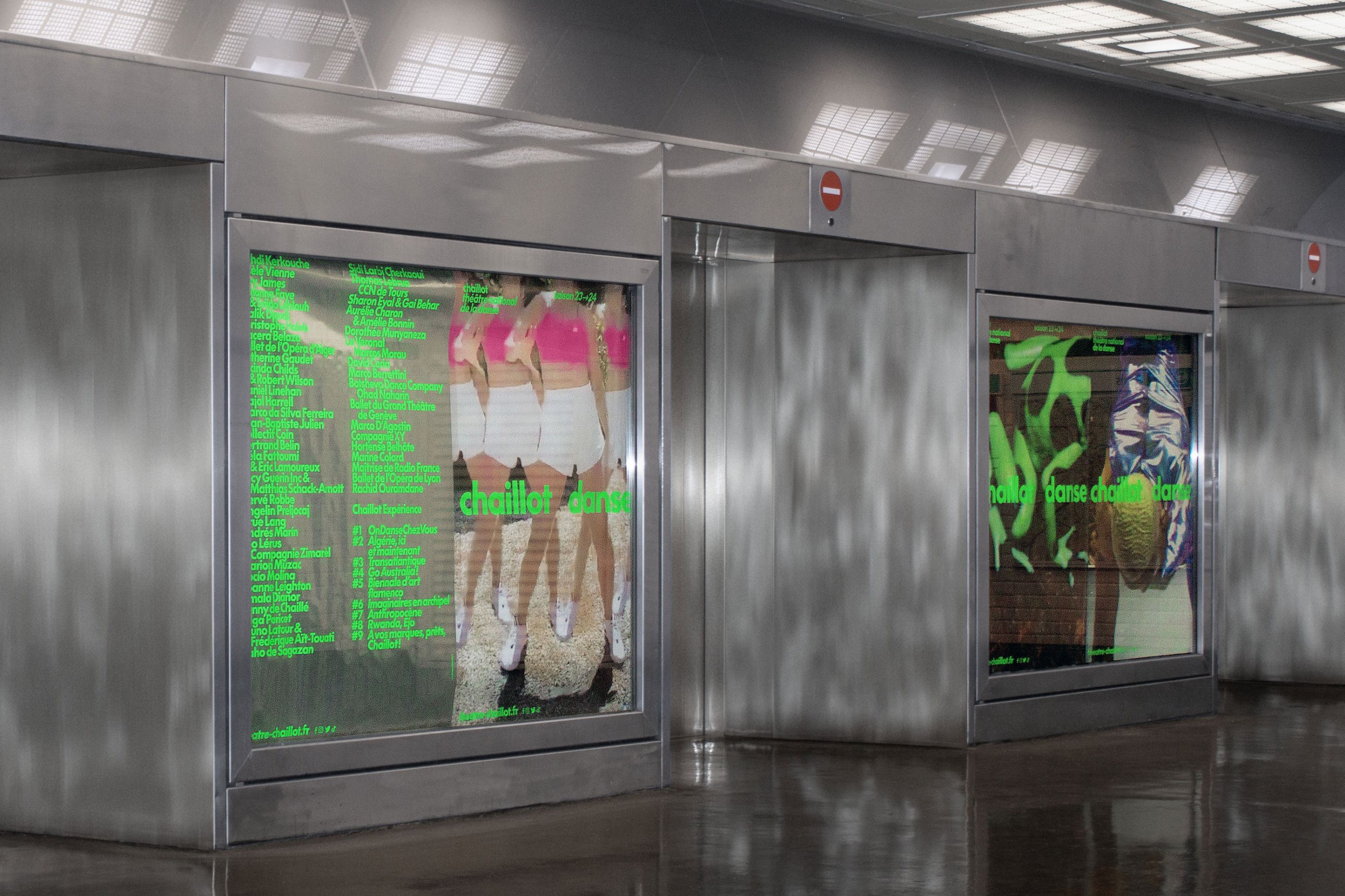
Chaillot Danse, Campagne 23–24
/
Chaillot - Théâtre national de la Danse
2023
Art direction, campaign, print, digital, video, editorial
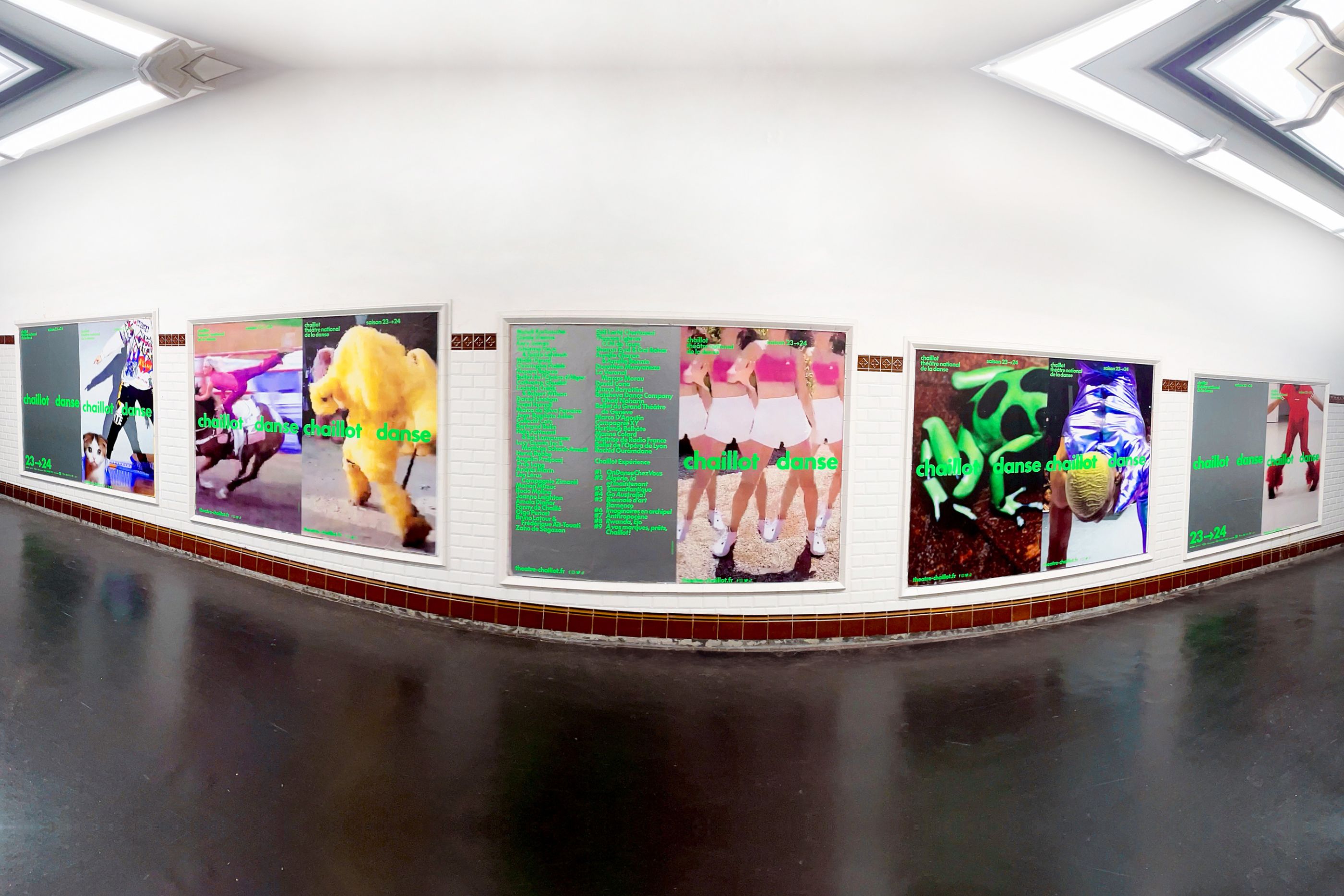
Following on from the global overhaul of its visual identity, we designed the campaign for the 23-24 season of Chaillot, Théâtre national de la Danse. Amateur images of bodies in motion are set against a surprisingly digital chromatic tone: a combination of mirror ink and neon green.
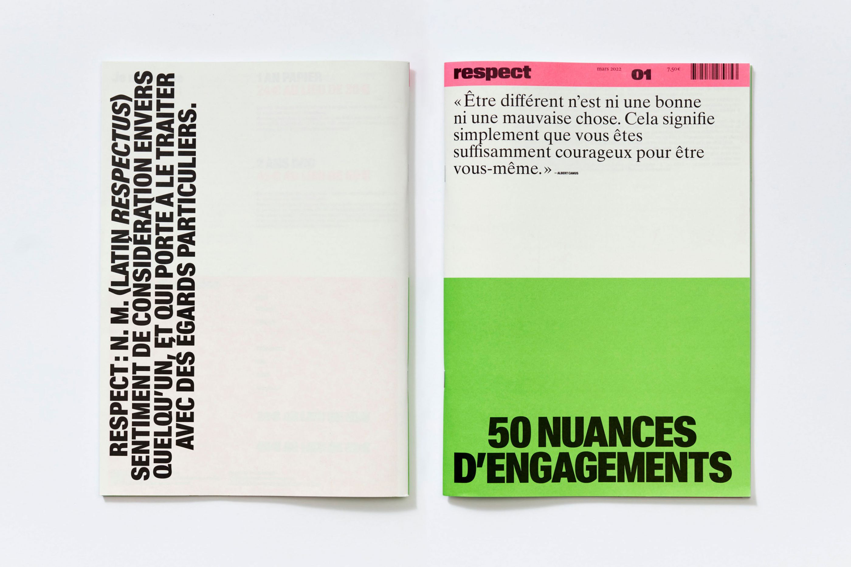
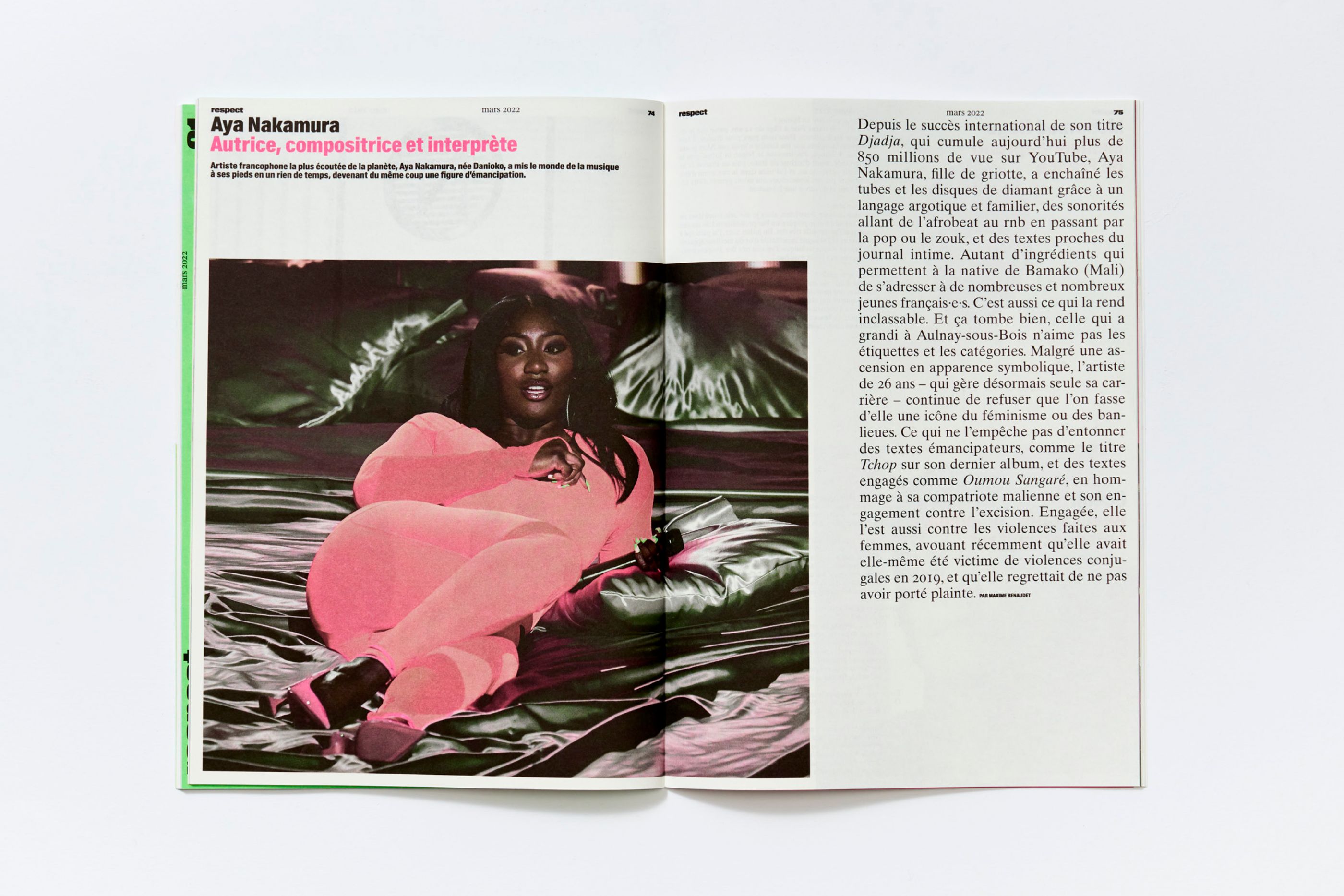
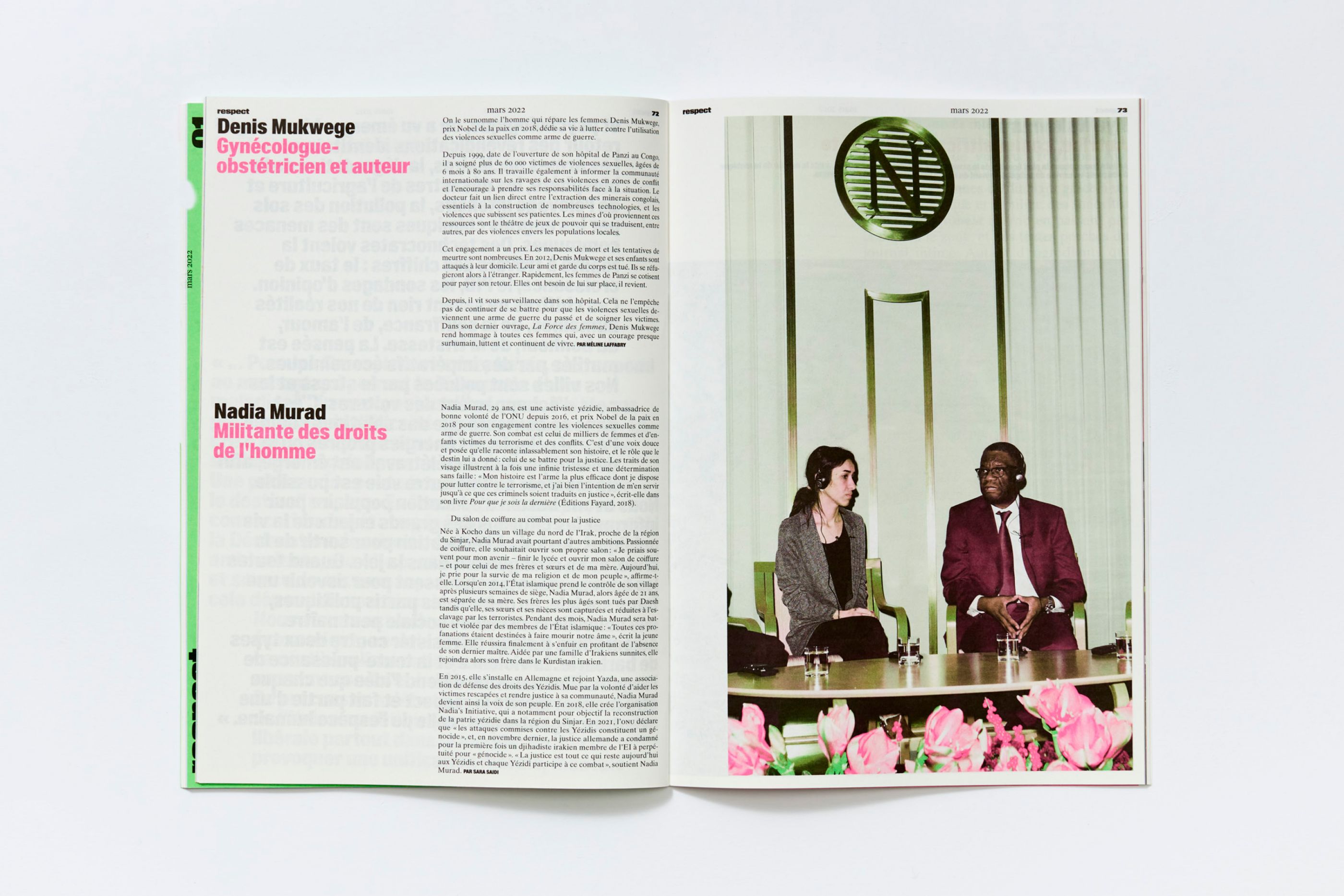
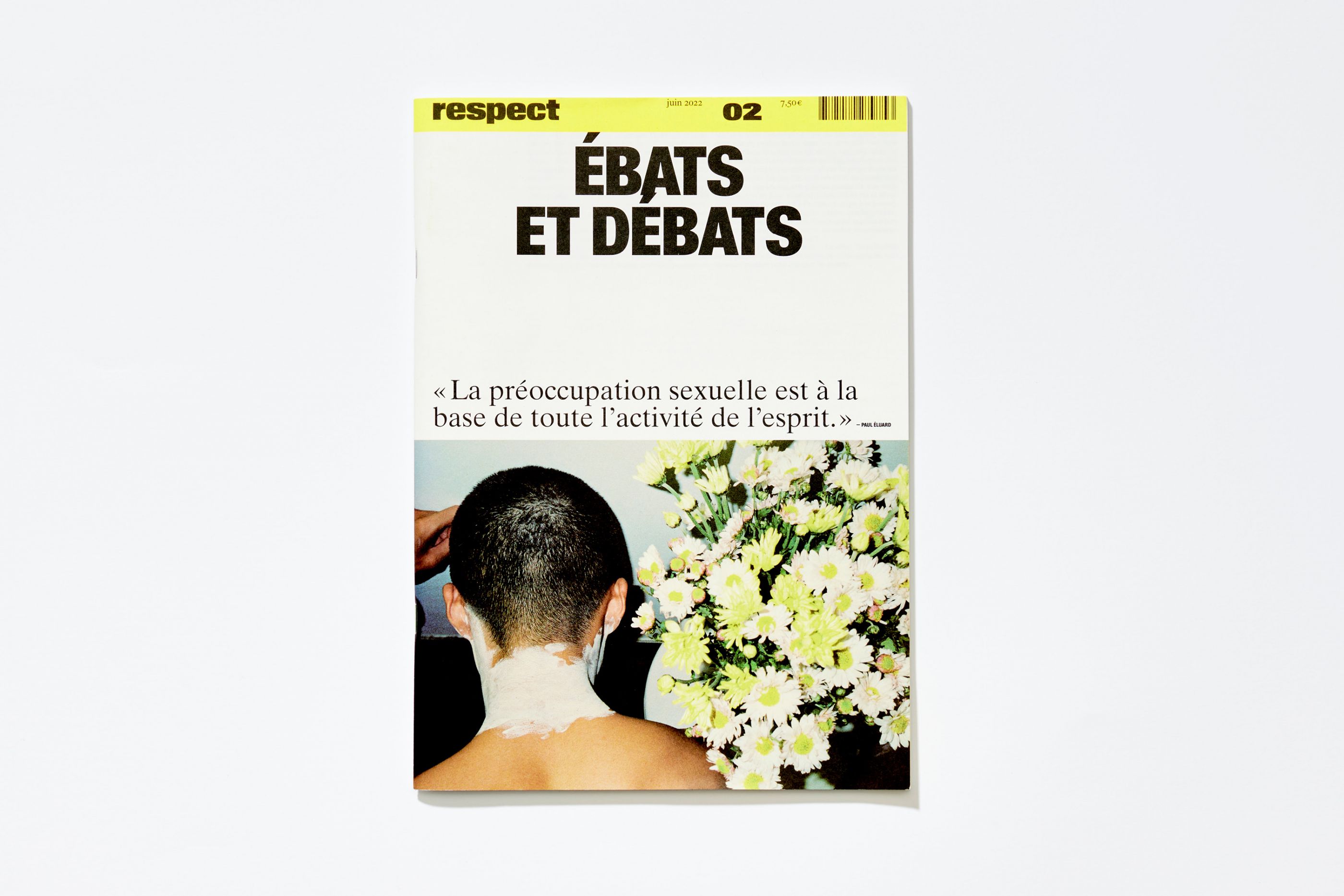
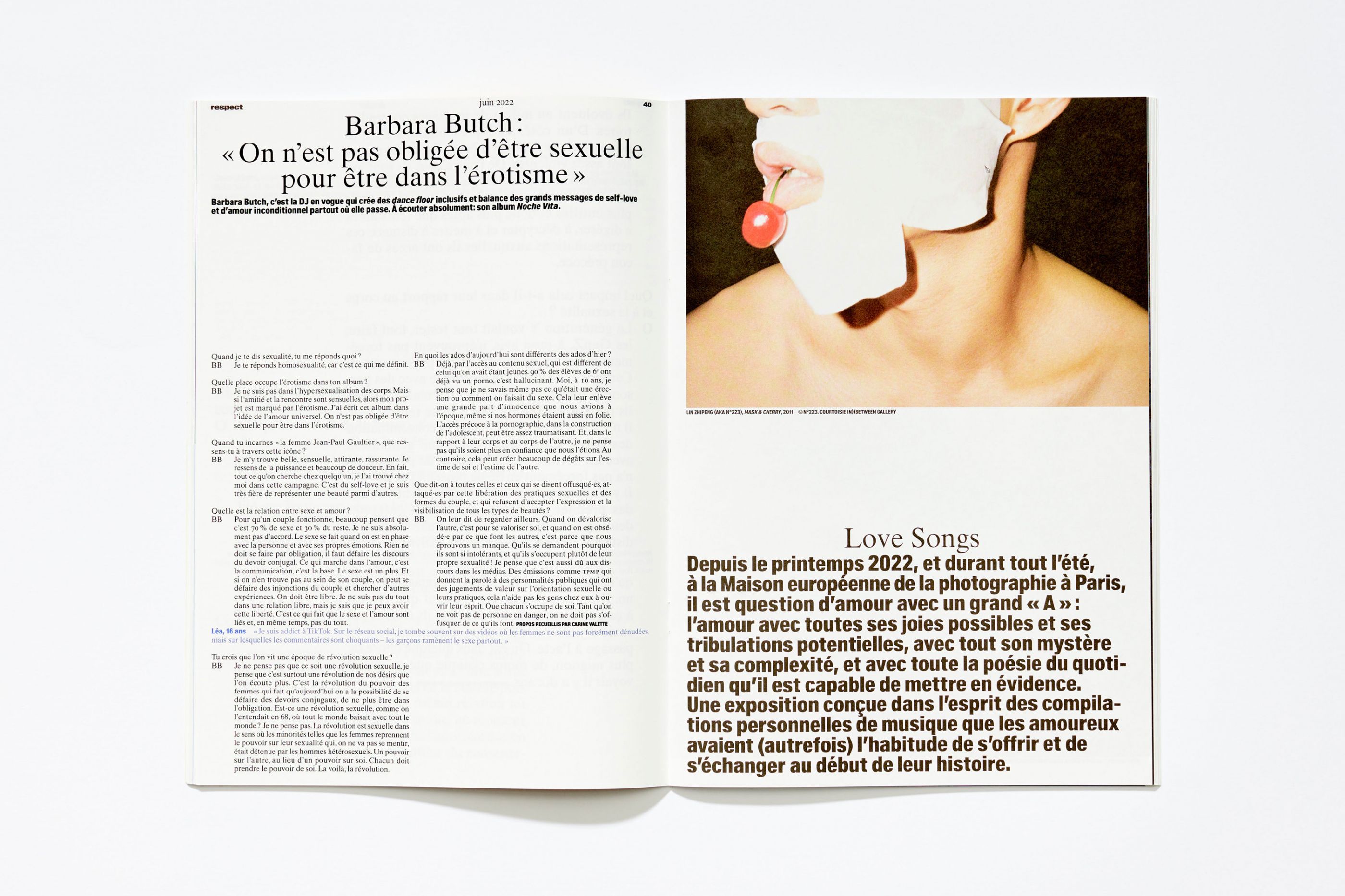
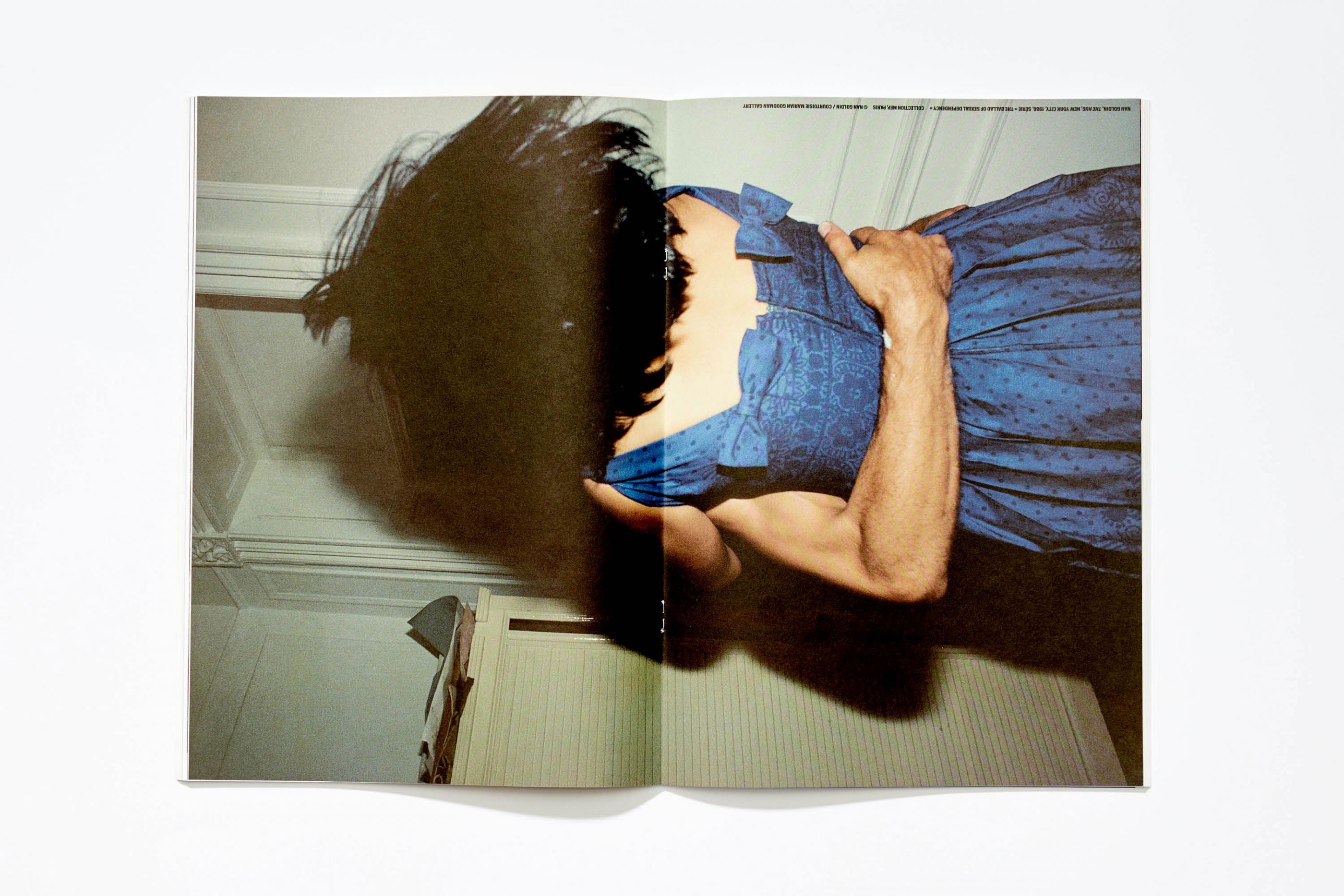
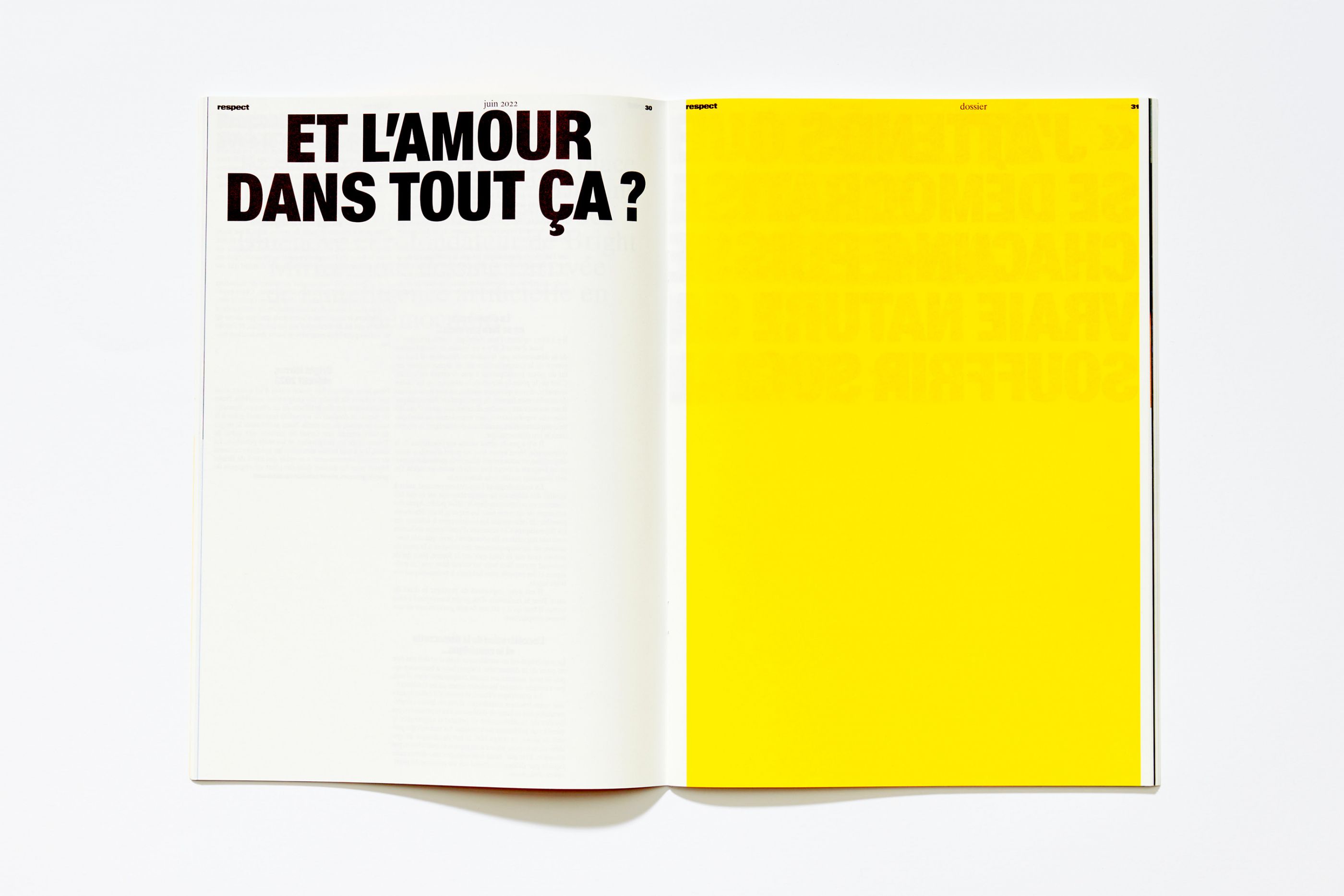
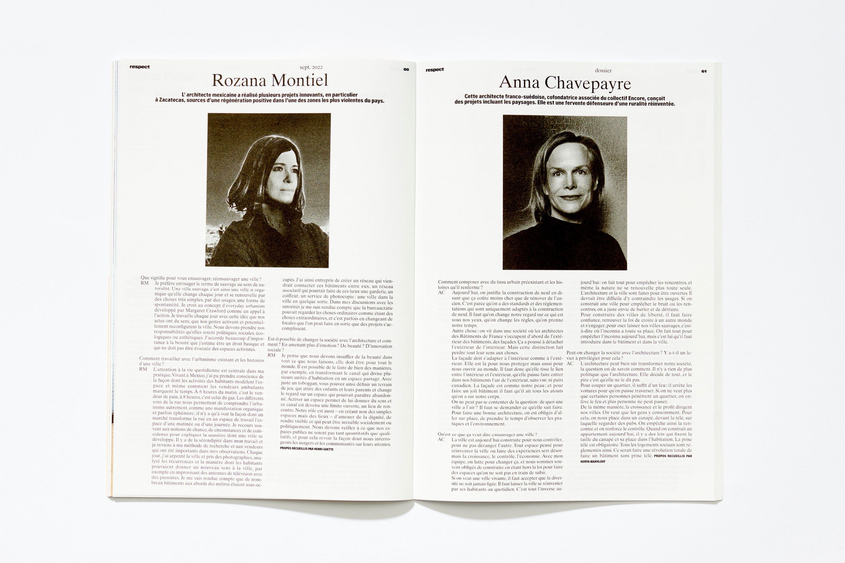
Respect
/
SOS Group
2022
Art direction, visual identity, editorial design, logotype, type design
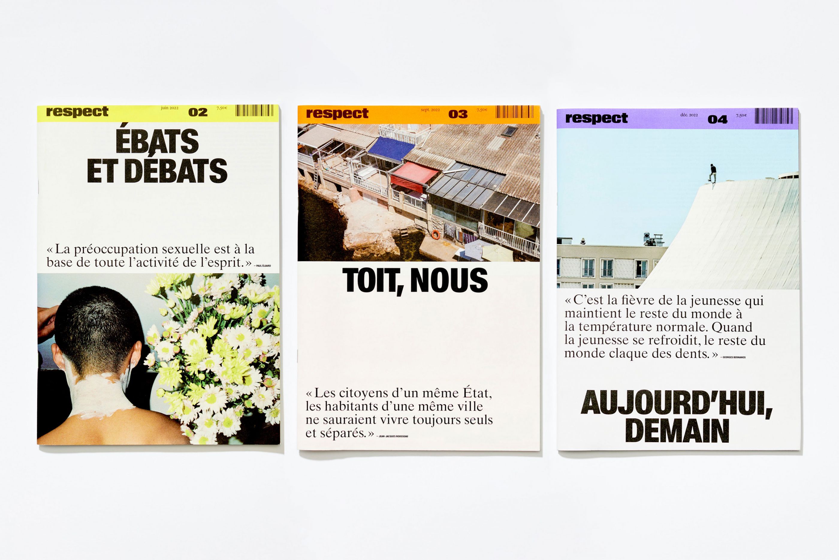
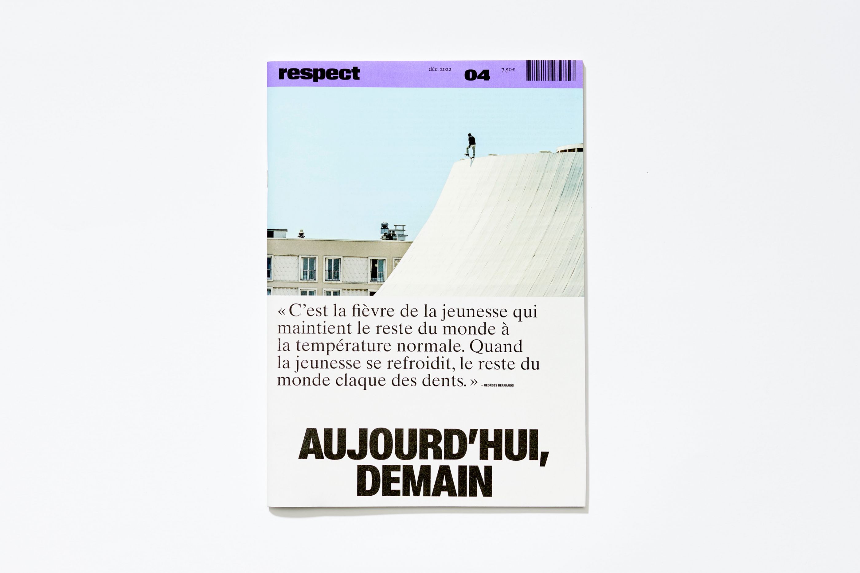
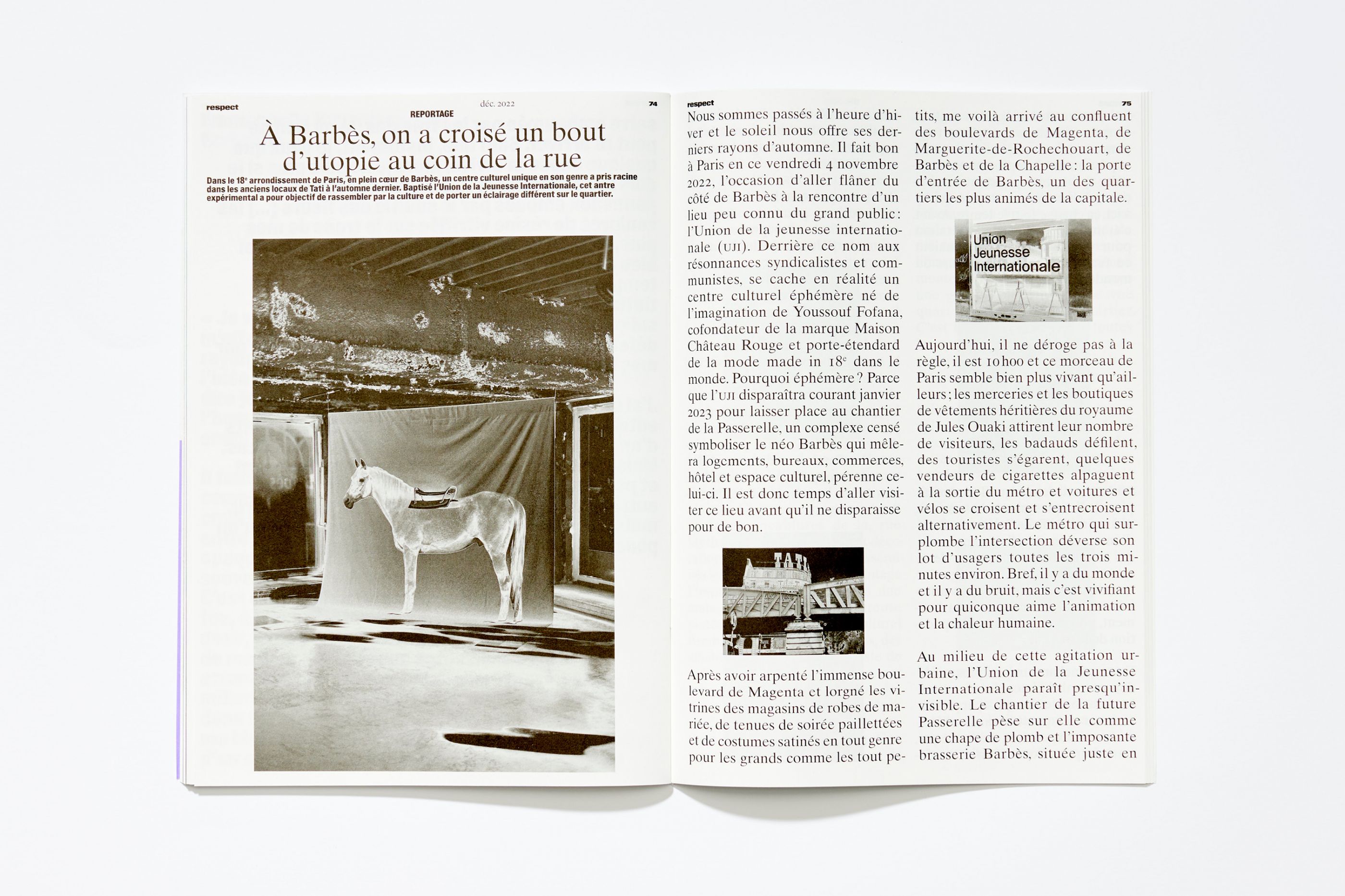
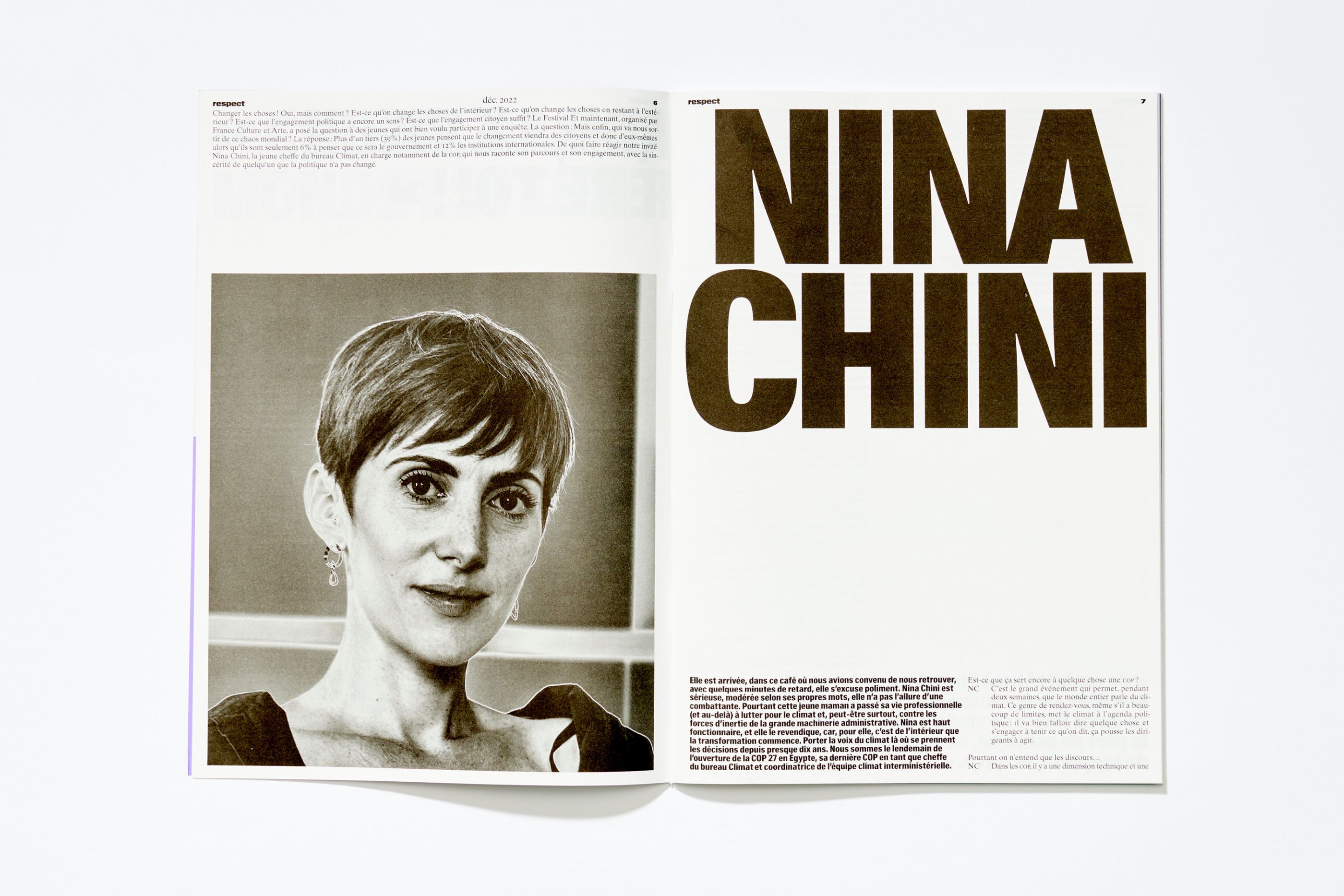
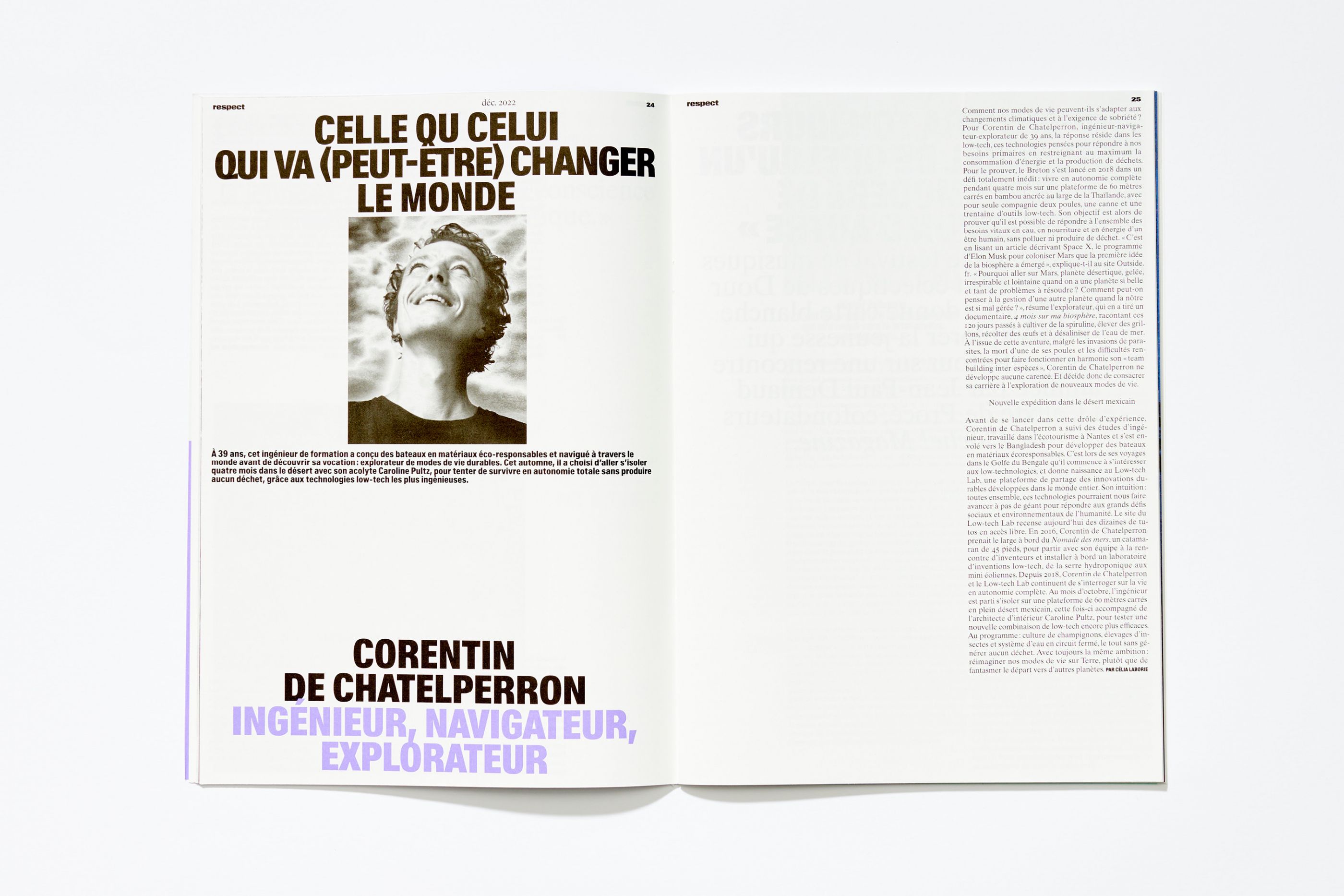
Respect is a media that advocates action journalism and the promotion of an urban, social and mixed voice. Launched in the spring of 2022, it shows how everyone can act on the evolution of society on an individual basis and highlights reconciliatory initiatives. By setting up a tone close to that of the manifesto, we imagined a global design for the visual identity of the media, which is expressed in both print and digital.
ChartierDalix
/
Chartier Dalix
2022
Website, art direction, motion
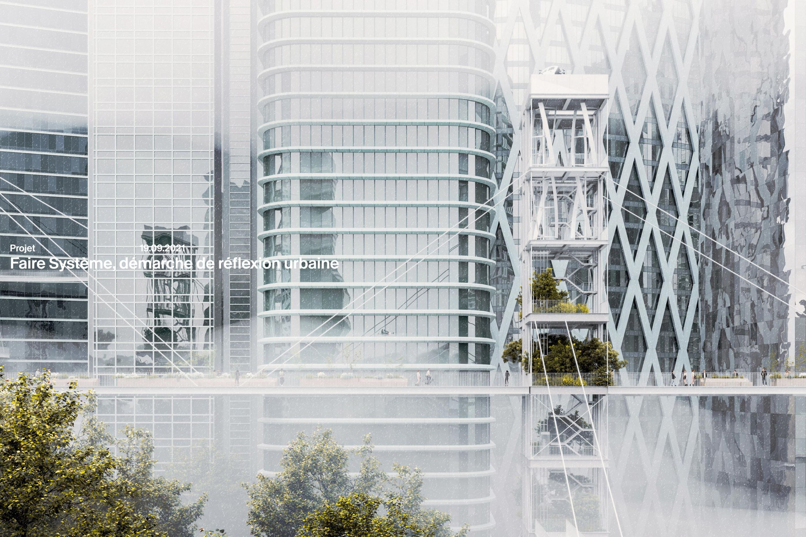
We designed the website of ChartierDalix, an architecture agency. Founded by Frédéric Chartier and Pascale Dalix in 2008, the agency now has over 90 employees. The website is structured around three sections: Projects, Agency and Resources. This last section is specific to the agency's architectural approach, as it presents the different research carried out in relation to the "act of building". Through its practice, the agency aims at exploring the possible evolutions of the built environment.
Code and motion: Julian Garnier
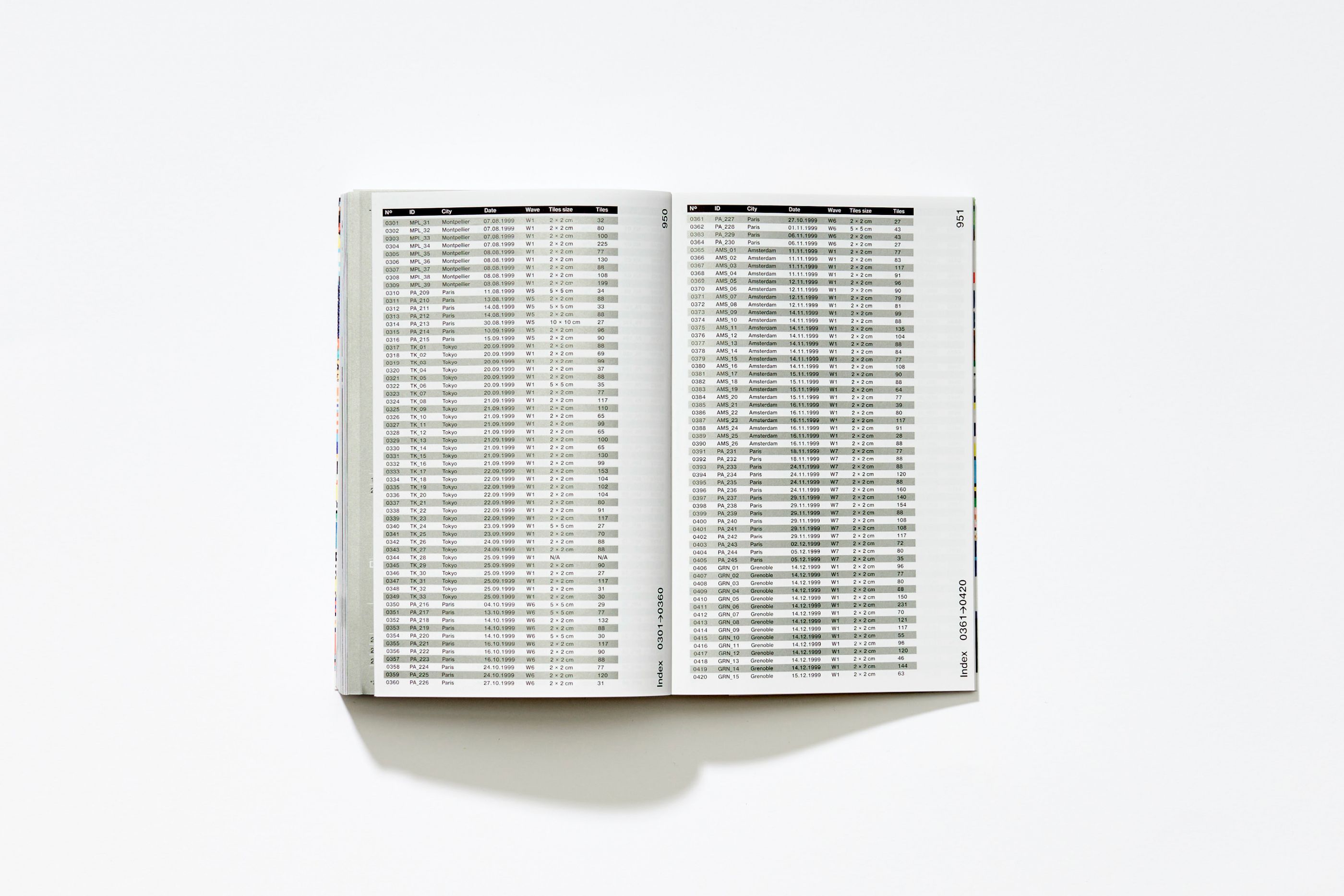
4000, The Complete Guide of the Space Invader
/
Space Invader Studio
2023
Art direction, editorial design
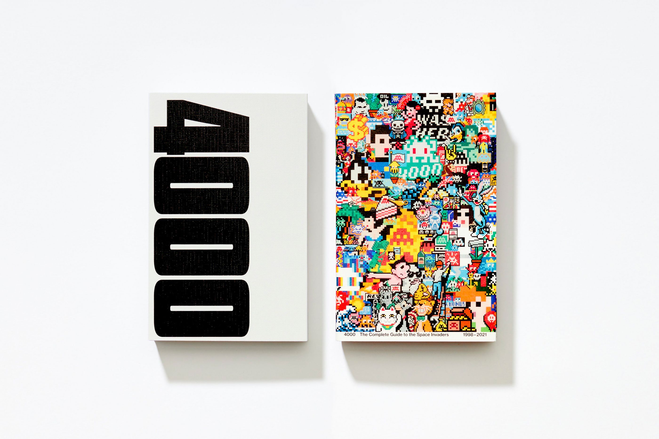
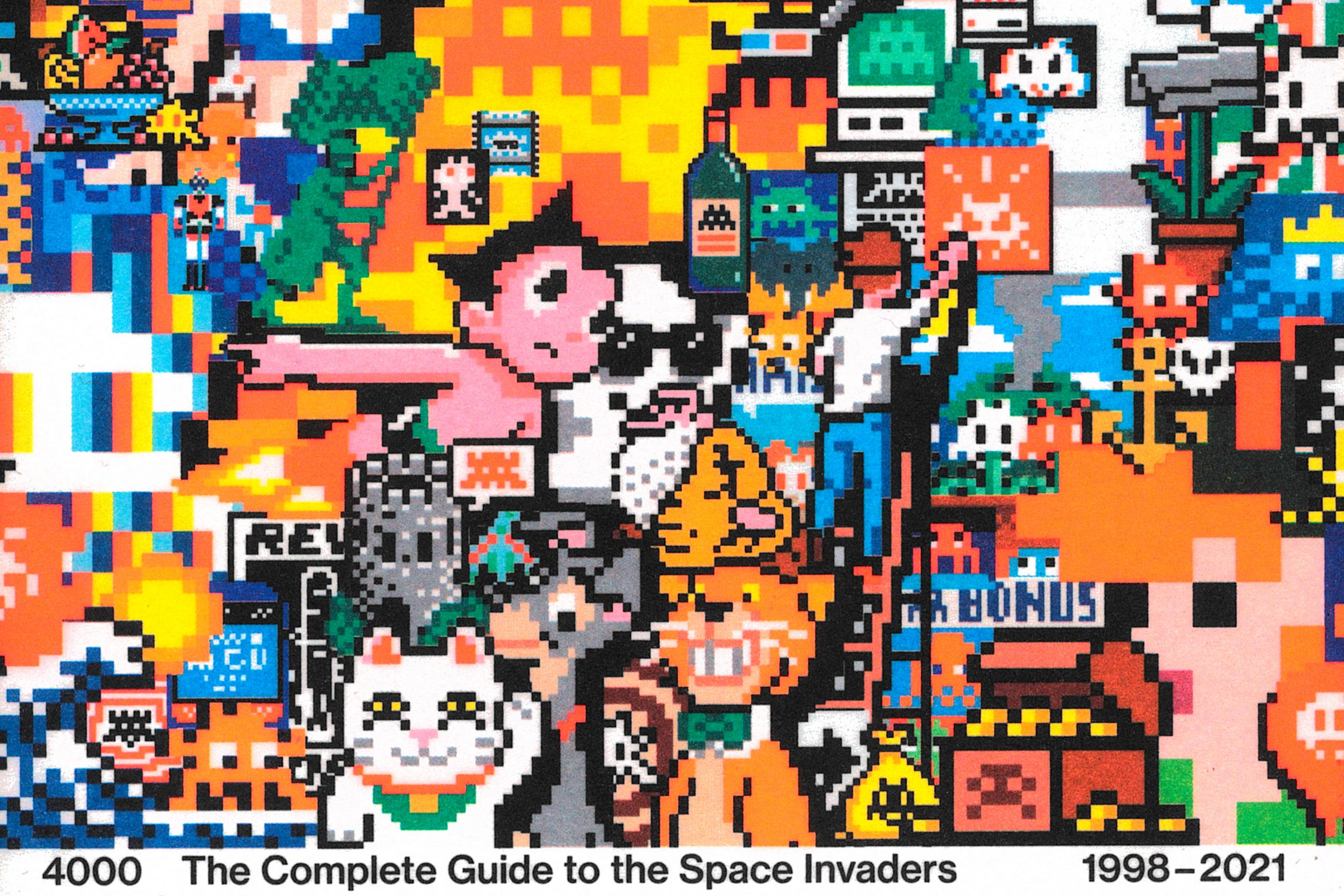
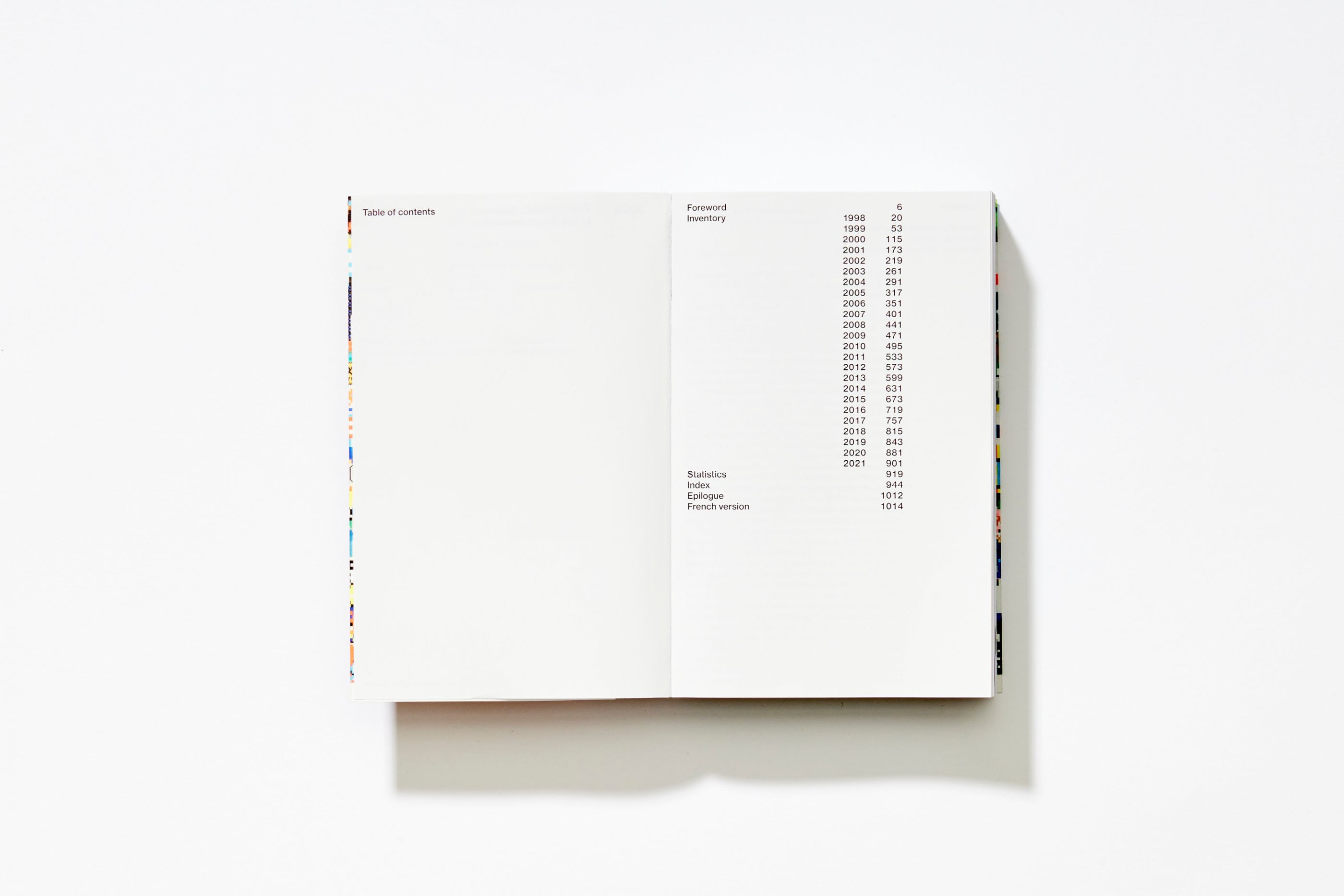
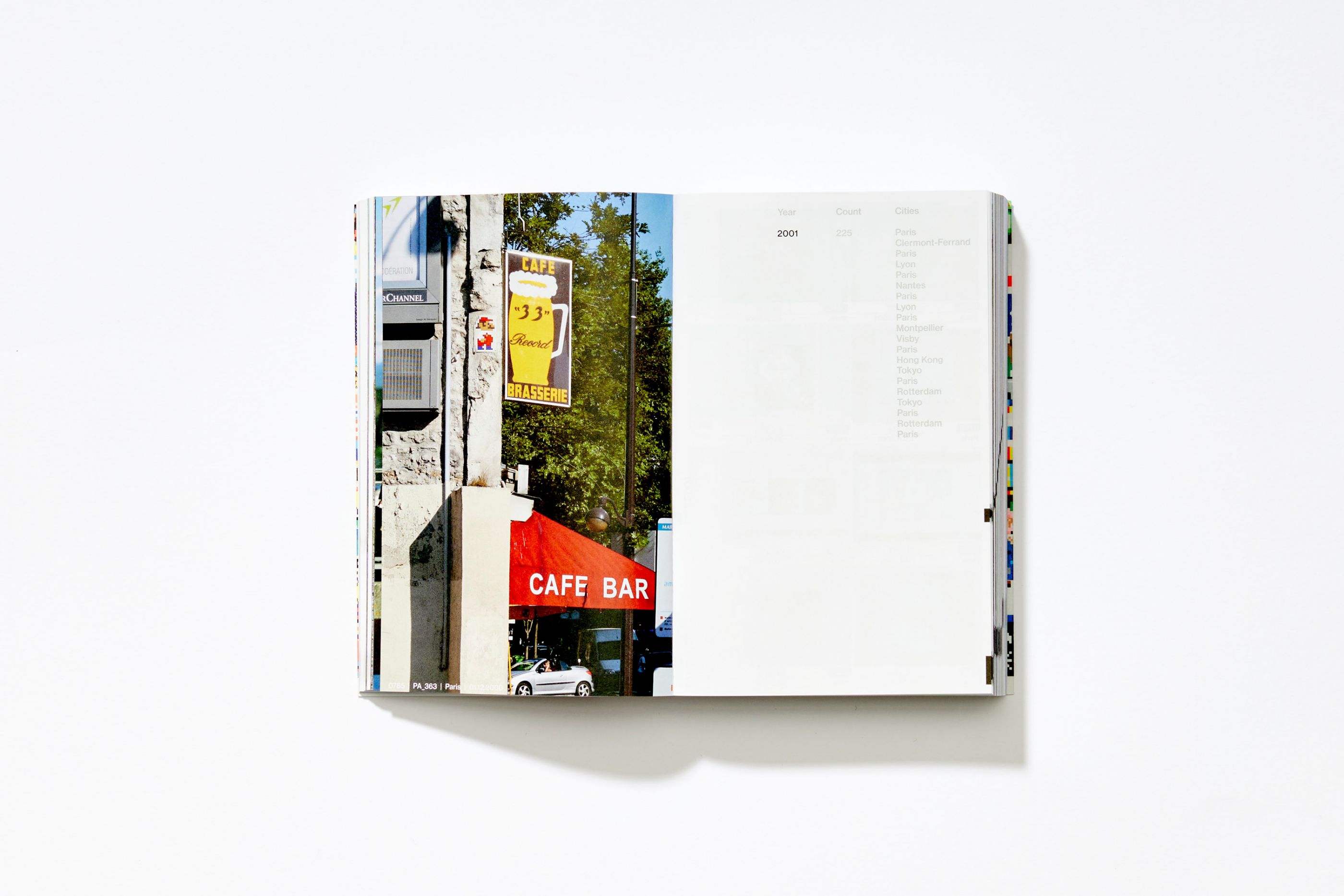
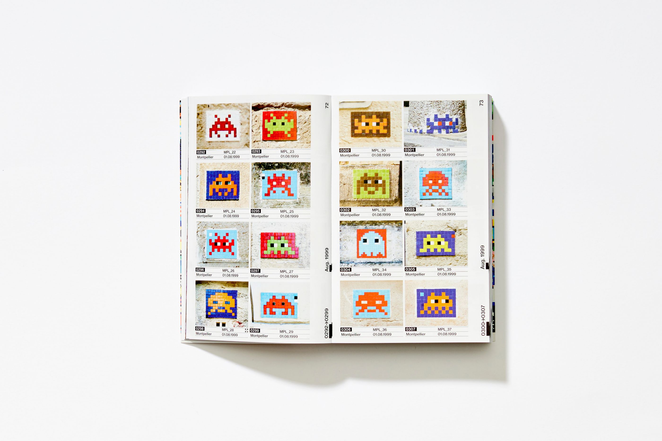
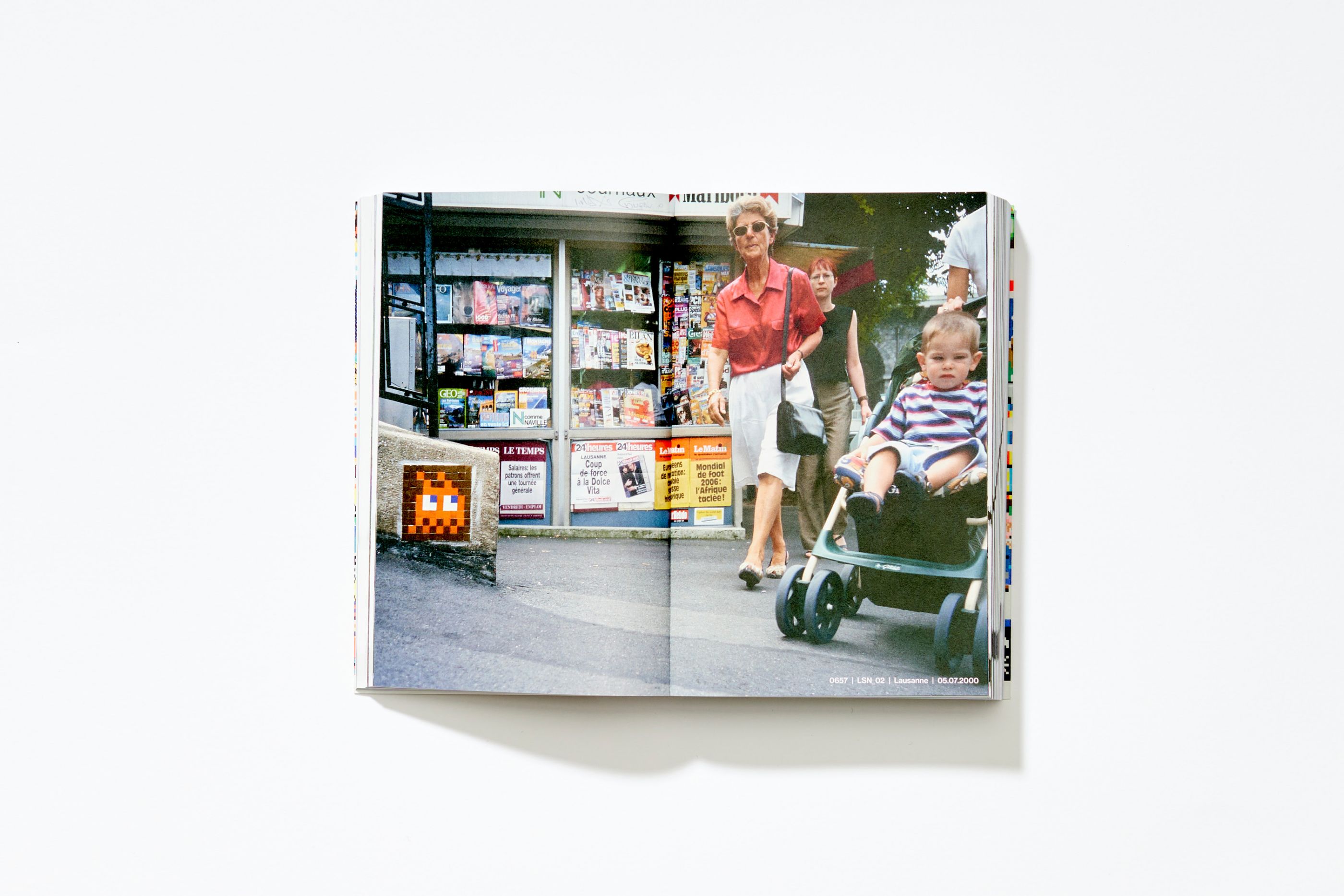
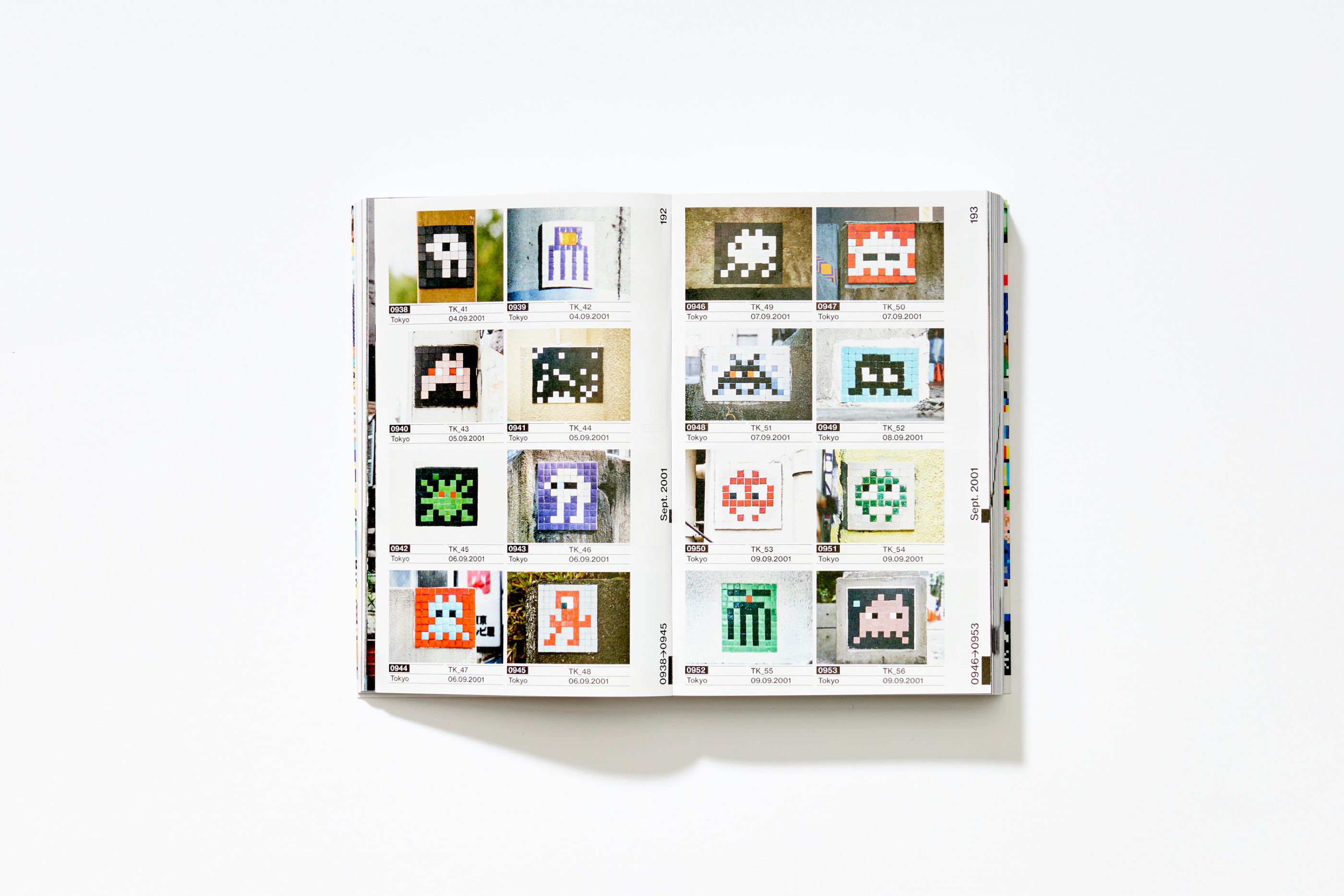
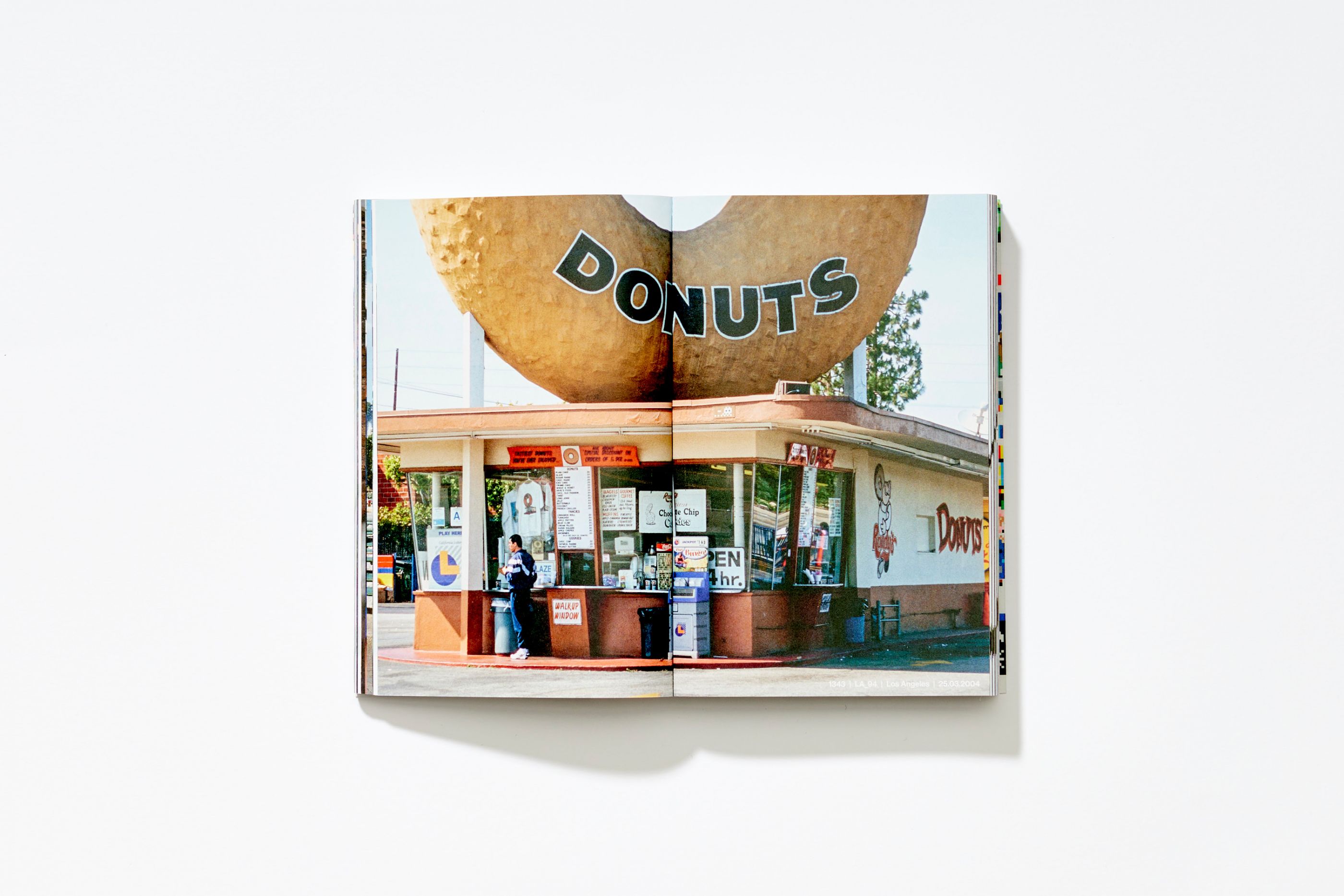
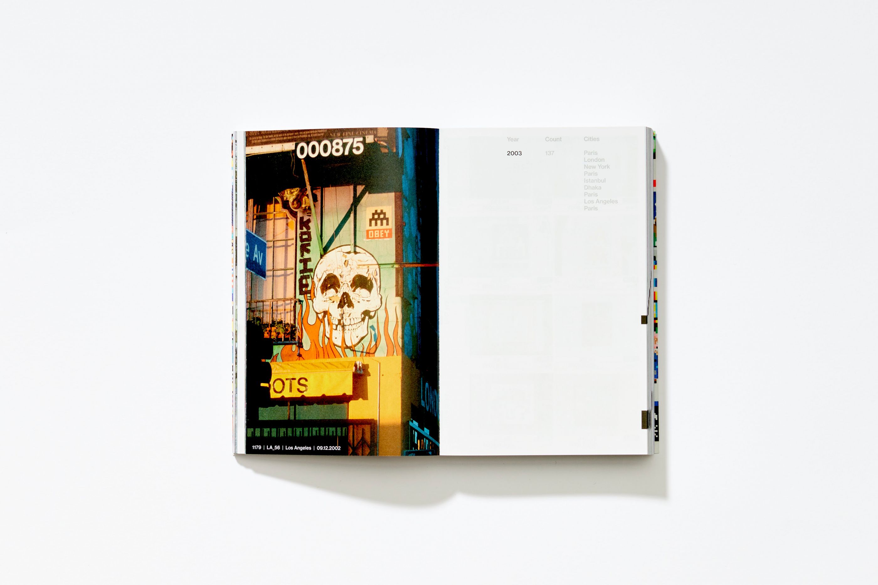
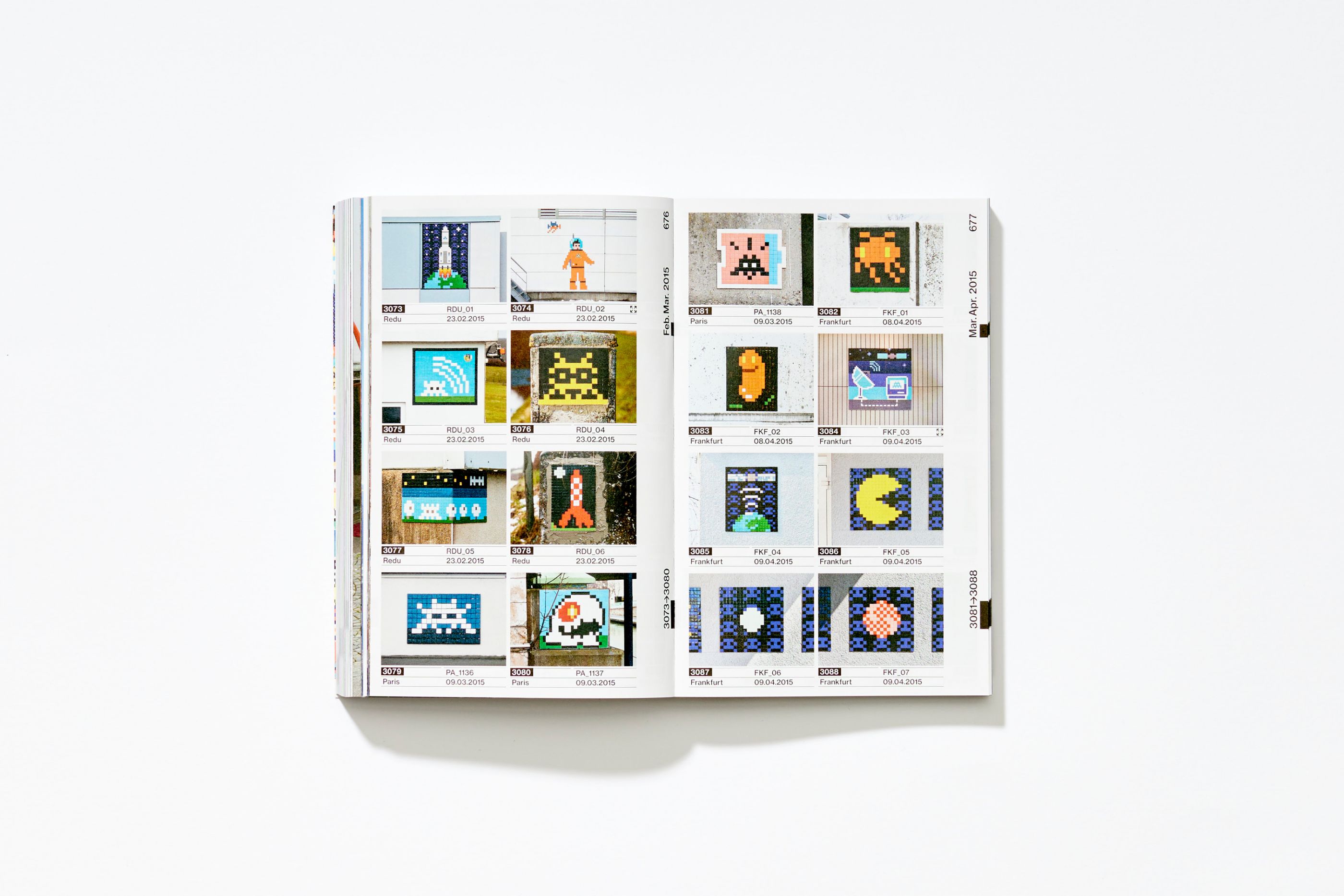
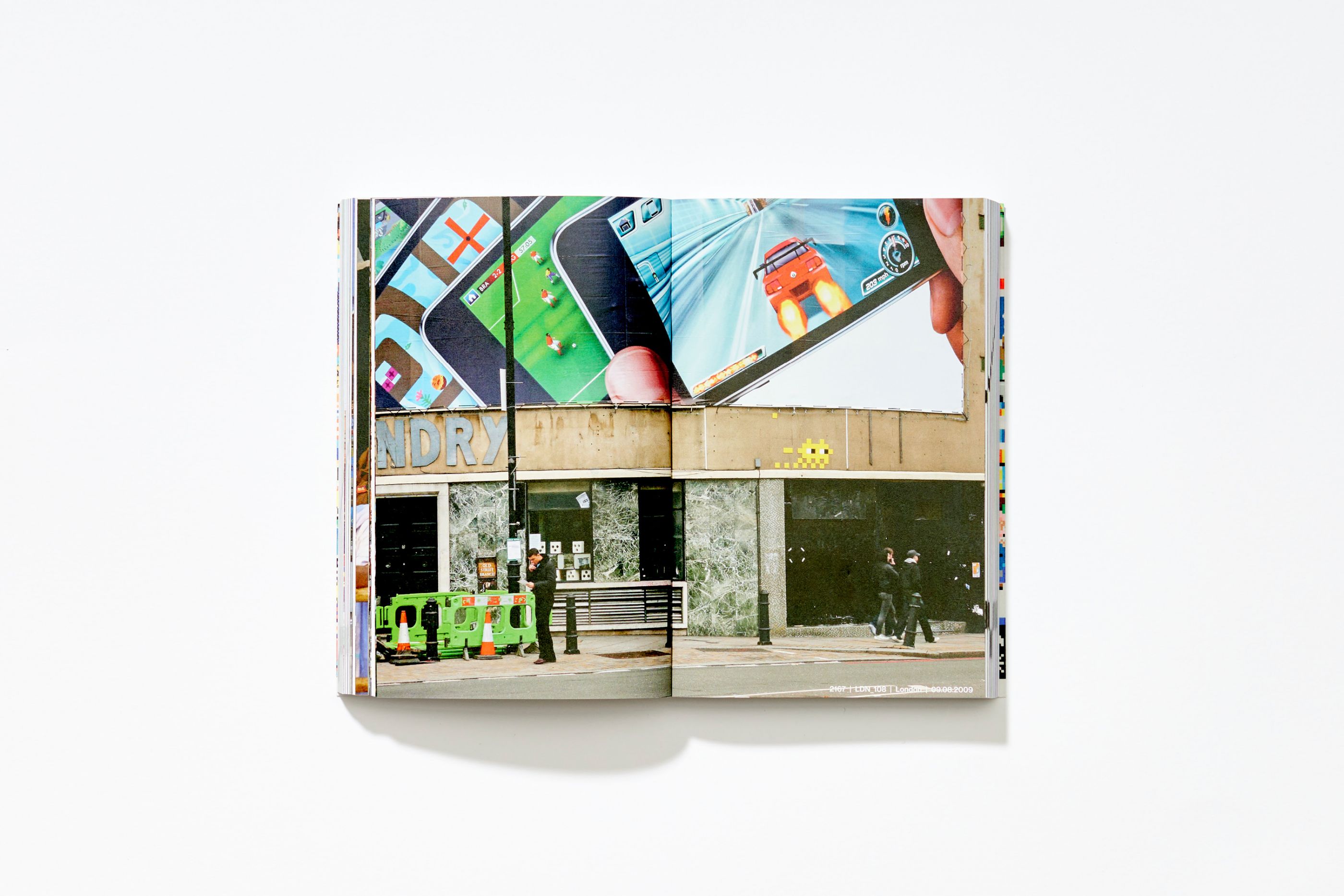
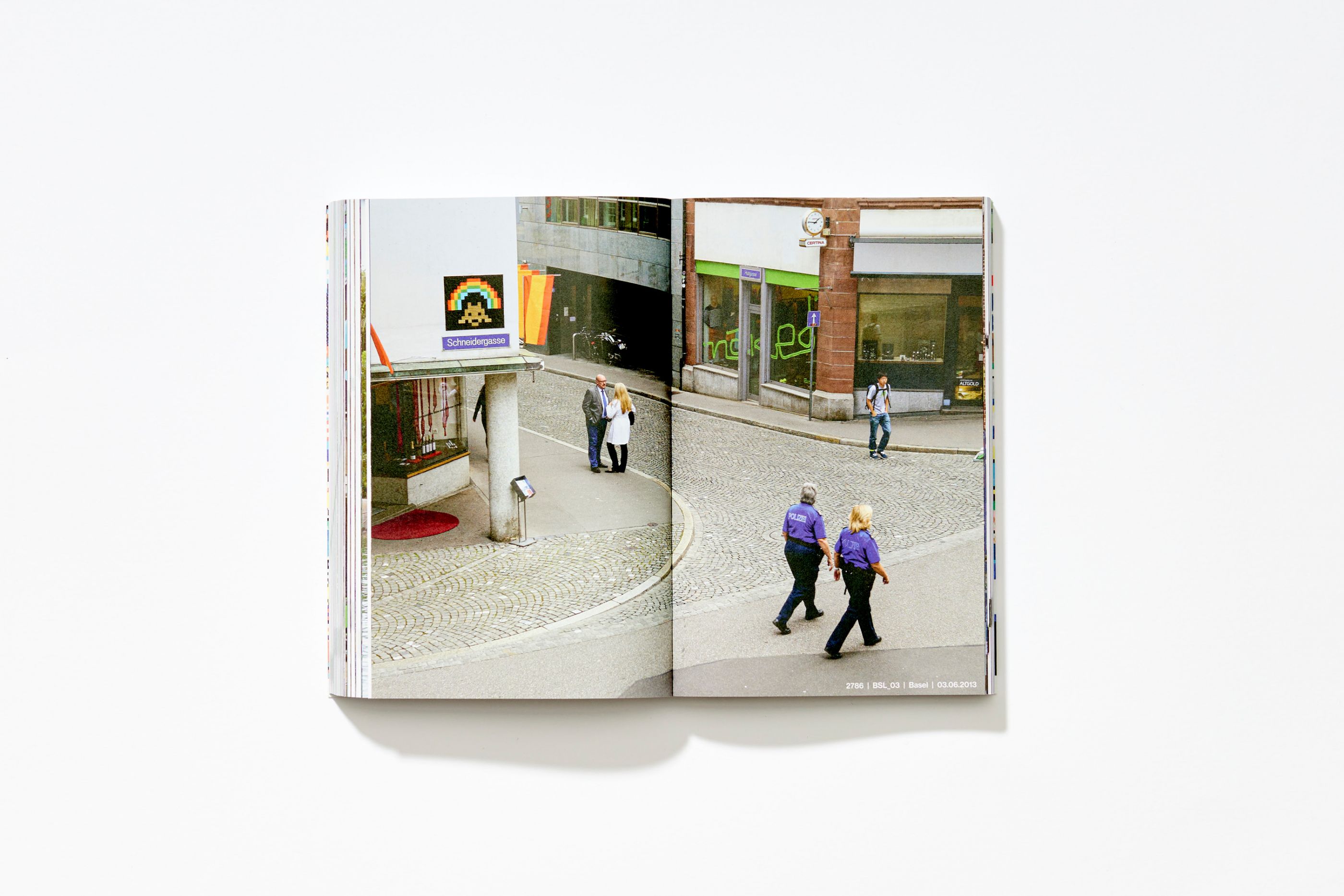
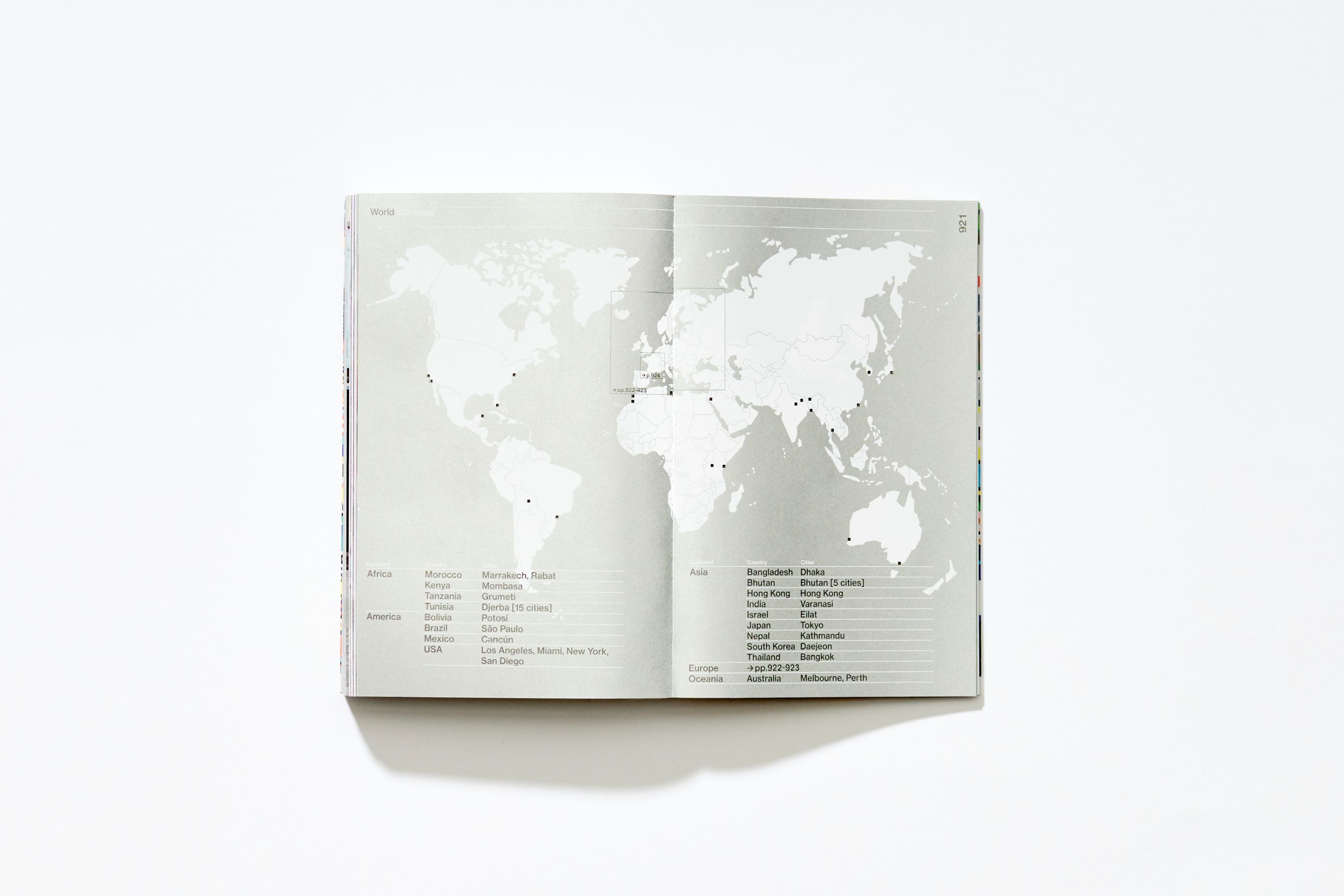
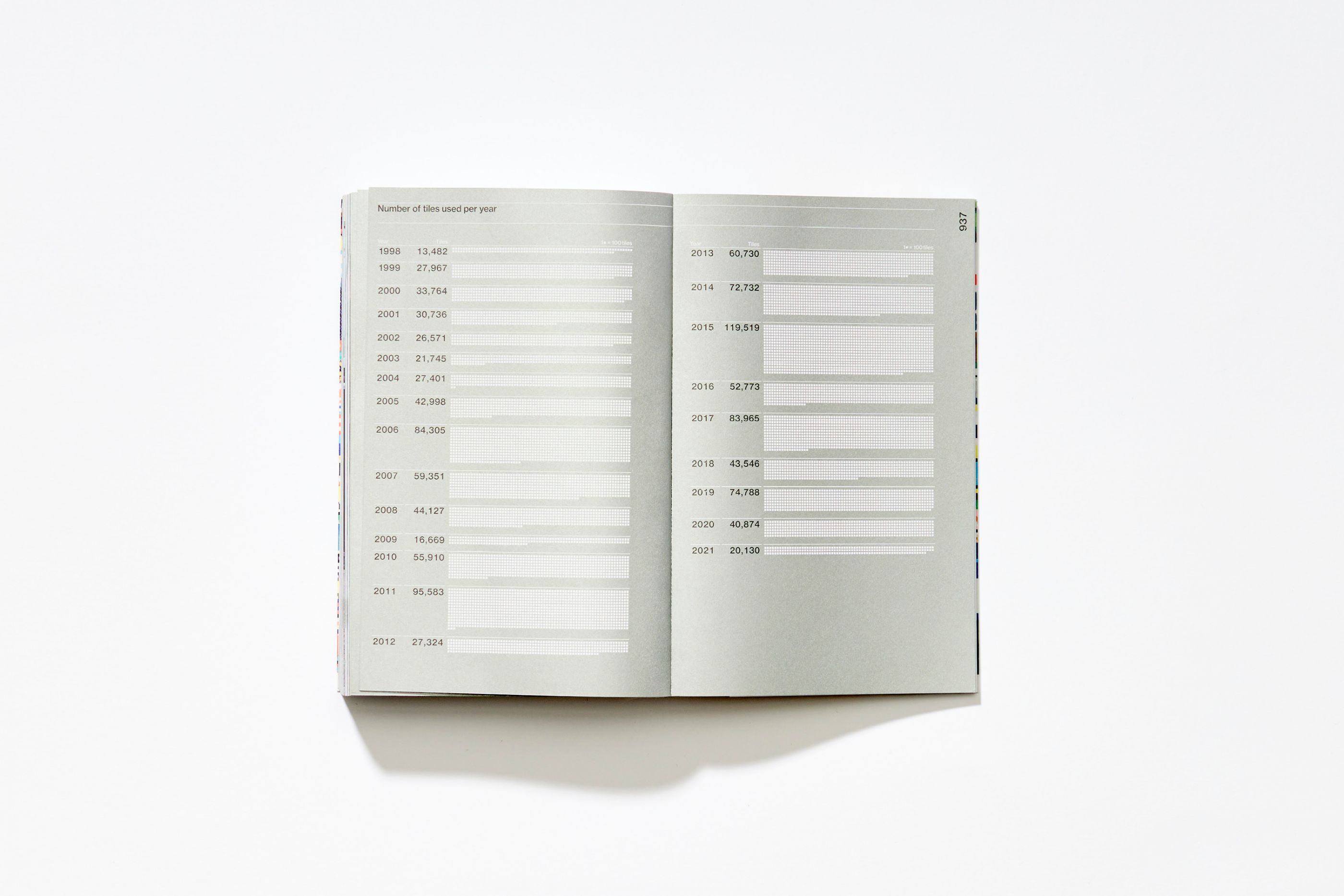
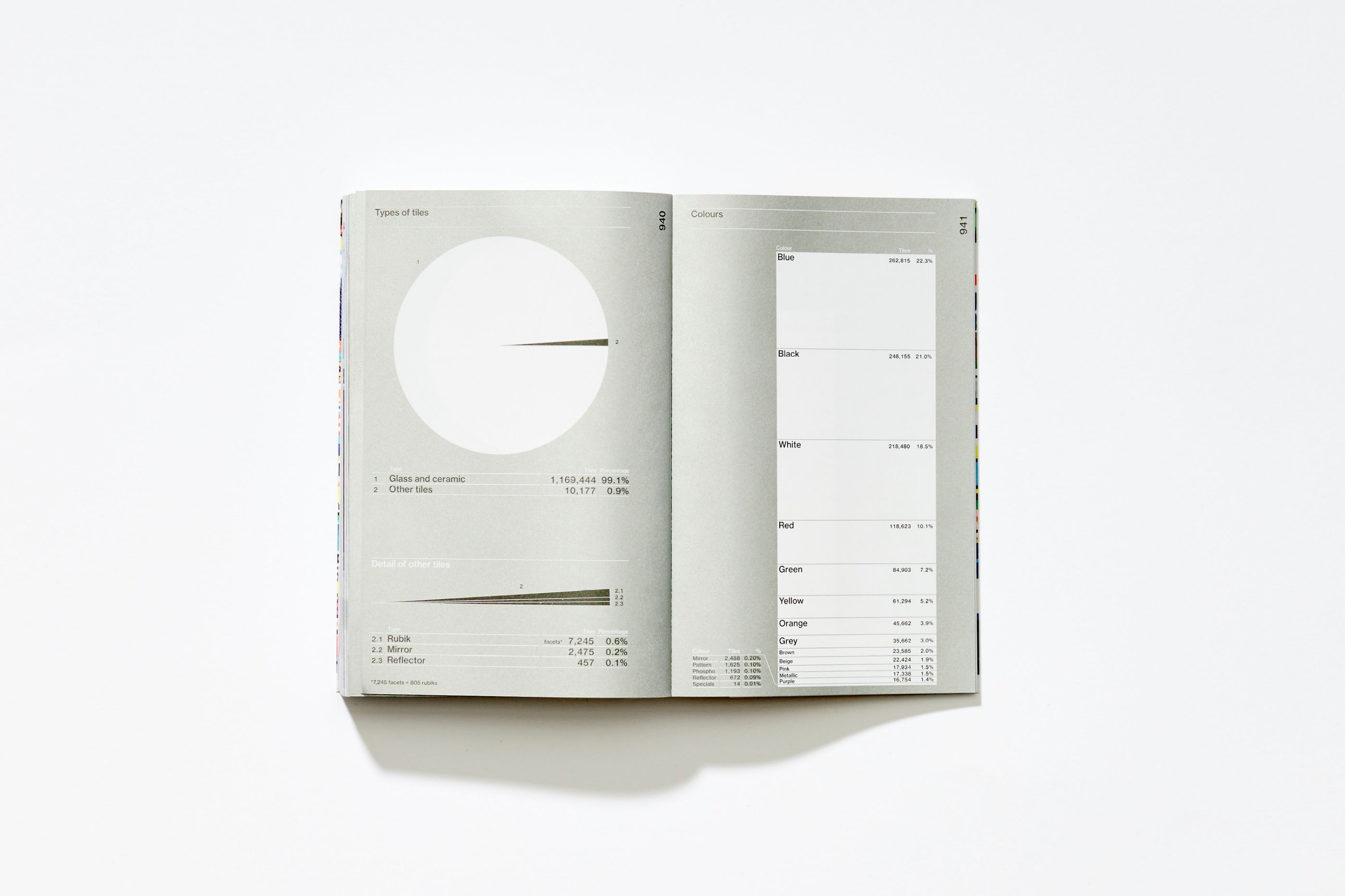
On the occasion of the installation of his 4000th mosaic, the street artist Invader asked us to design an exhaustive guide, a real "bible" of his work: 4000, The Complete Guide to the Space Invaders 1998 - 2021. Using an objective and scientific tone, we developed elegant technical pages presenting the works in a chronological order, with immersive contextual images. We also developed a dedicated index and a "Data" section to report on the artist's methodical work. We conceived the object as a "catalogue raisonné" of 1,024 pages. Particular attention has been paid to the book's cover which, through the use of waxed tearproof paper and fluorescent inks, has already made Invaders 4000 a cult and collector's book since its launch.
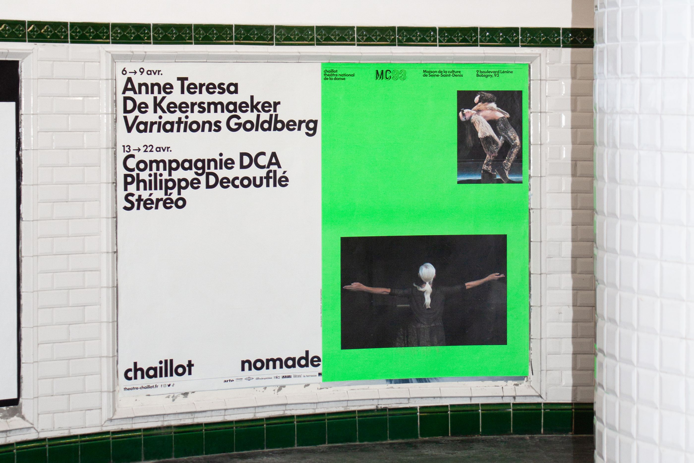
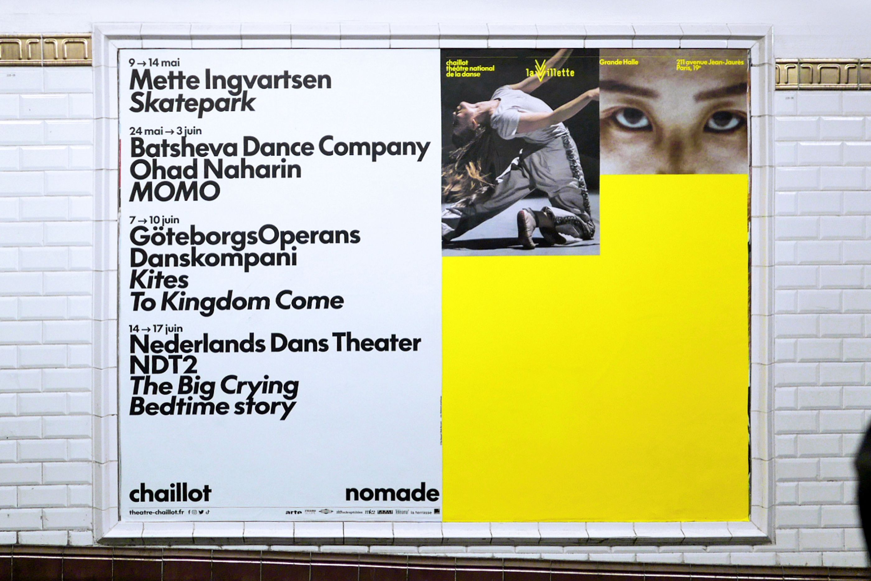
Chaillot Nomade
/
Chaillot - Théâtre national de la Danse
2023
Campaign, video, press, motion
With the Salle Jean Vilar closed for renovation over a long period, Chaillot - Théâtre national de la Danse is offering performances in several partner theaters. We designed and implemented the Chaillot Nomade visual identity on a multitude of print and digital media.
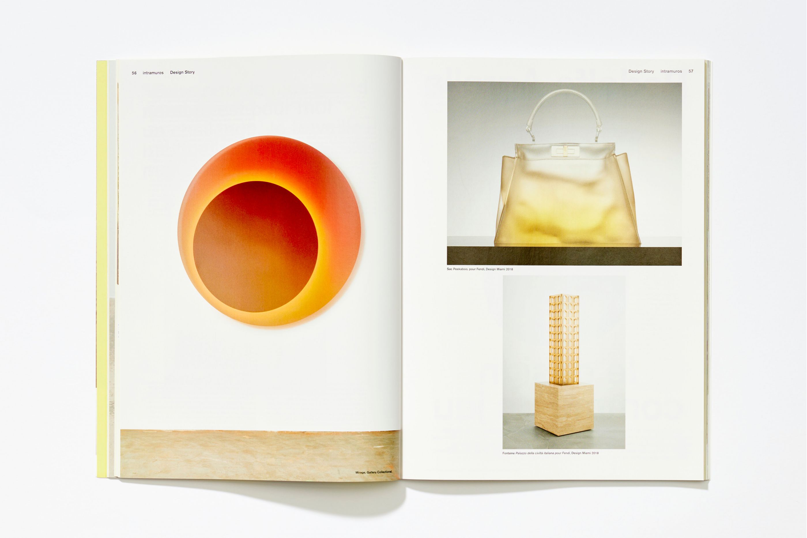
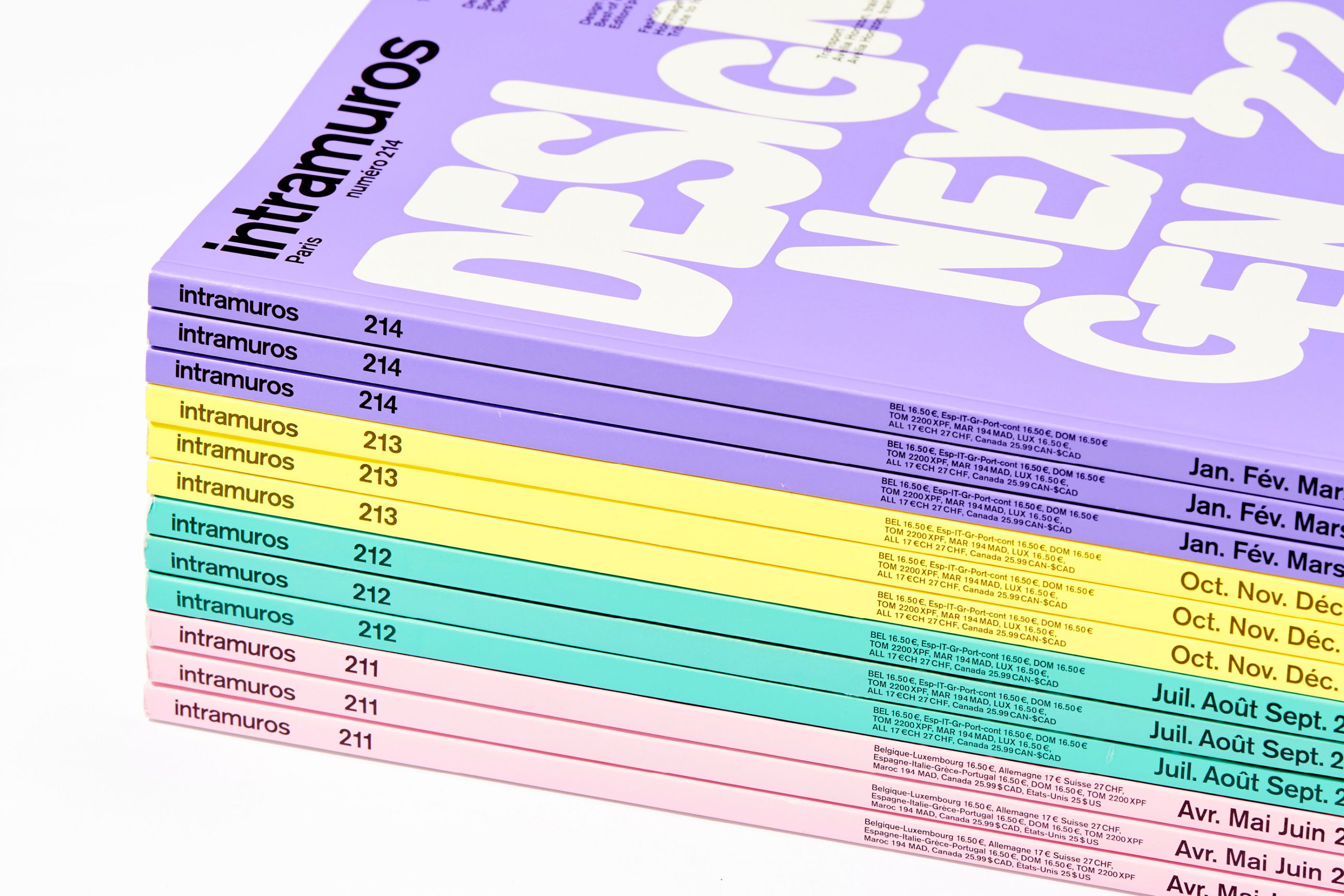
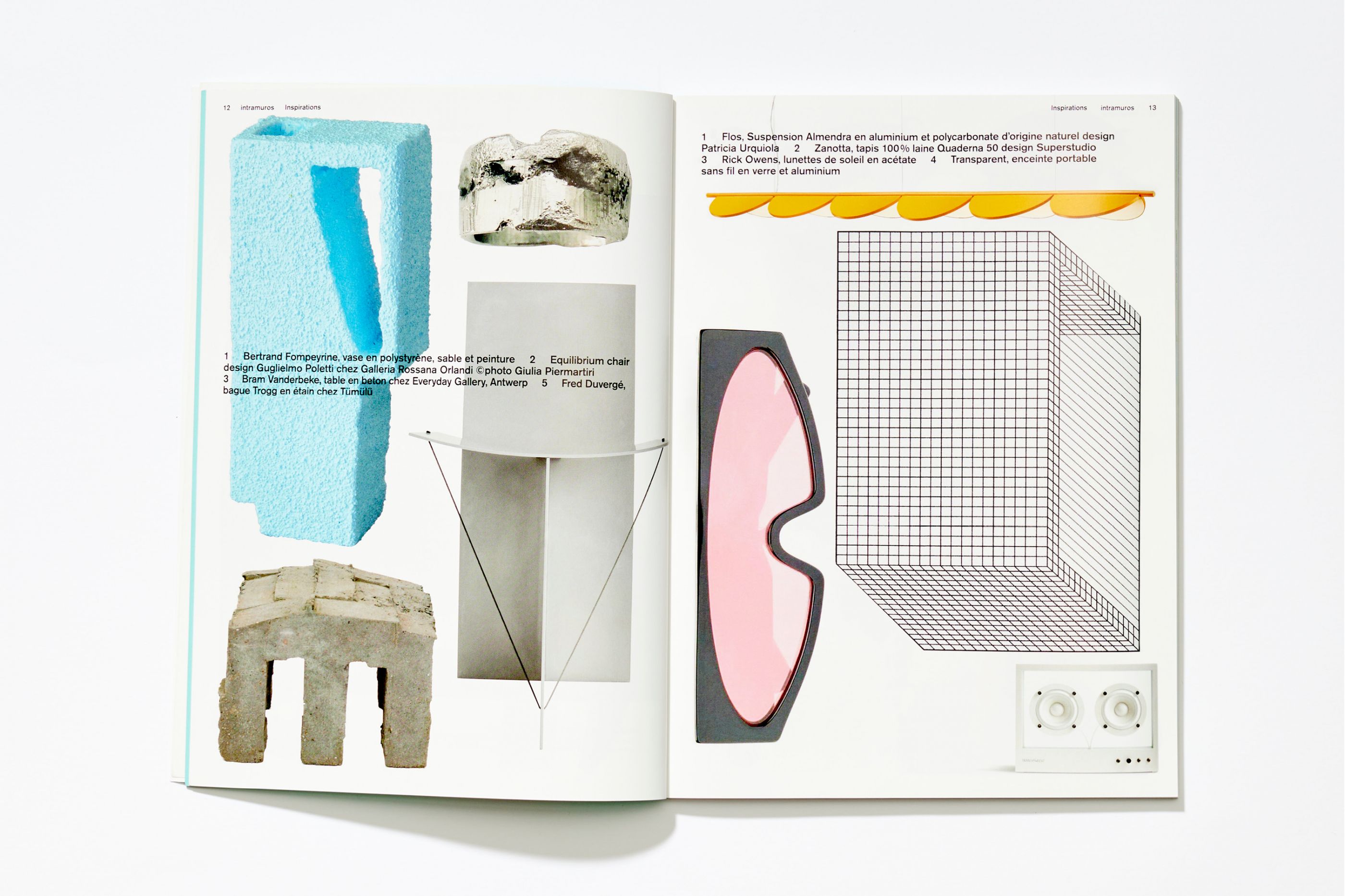
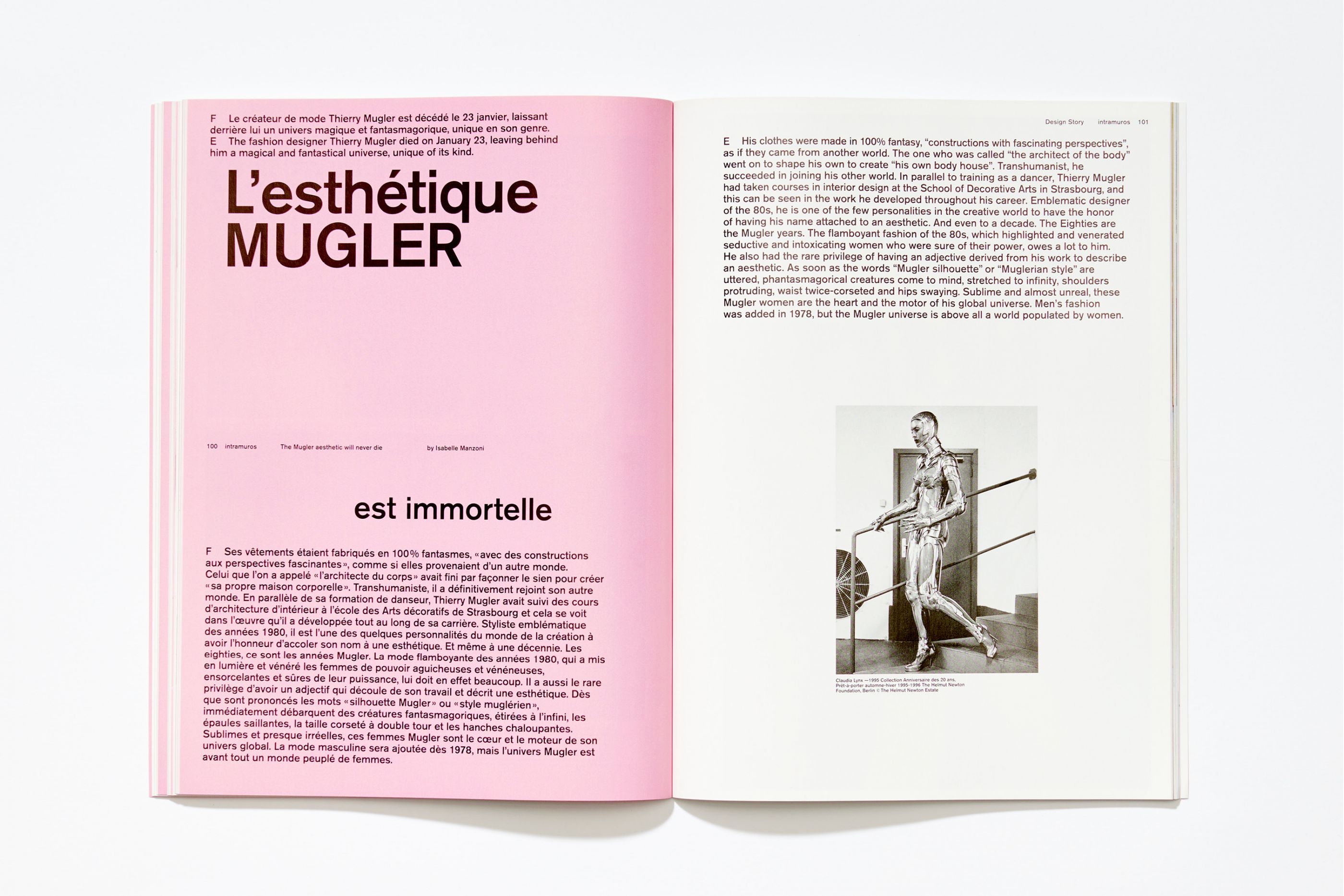
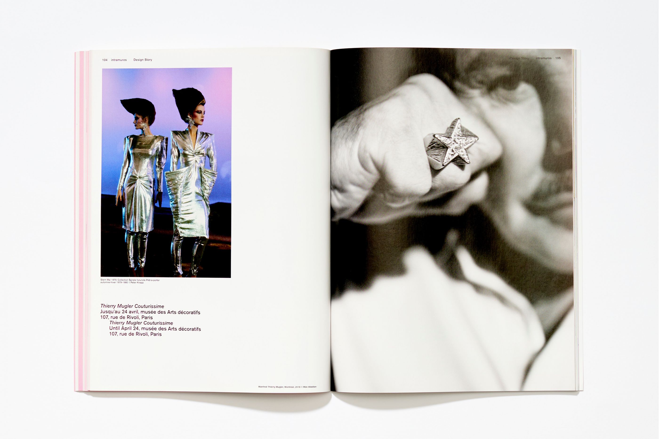
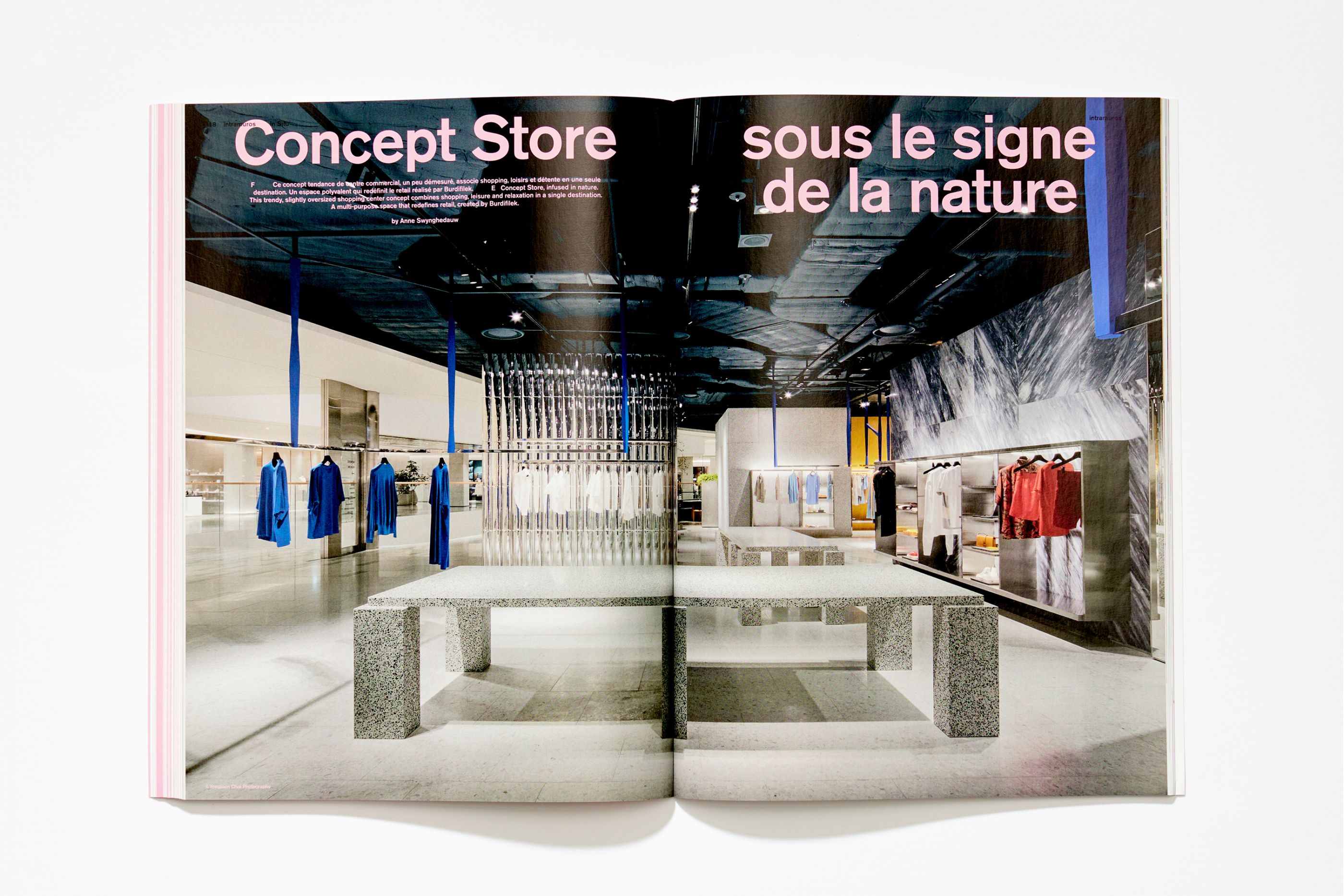
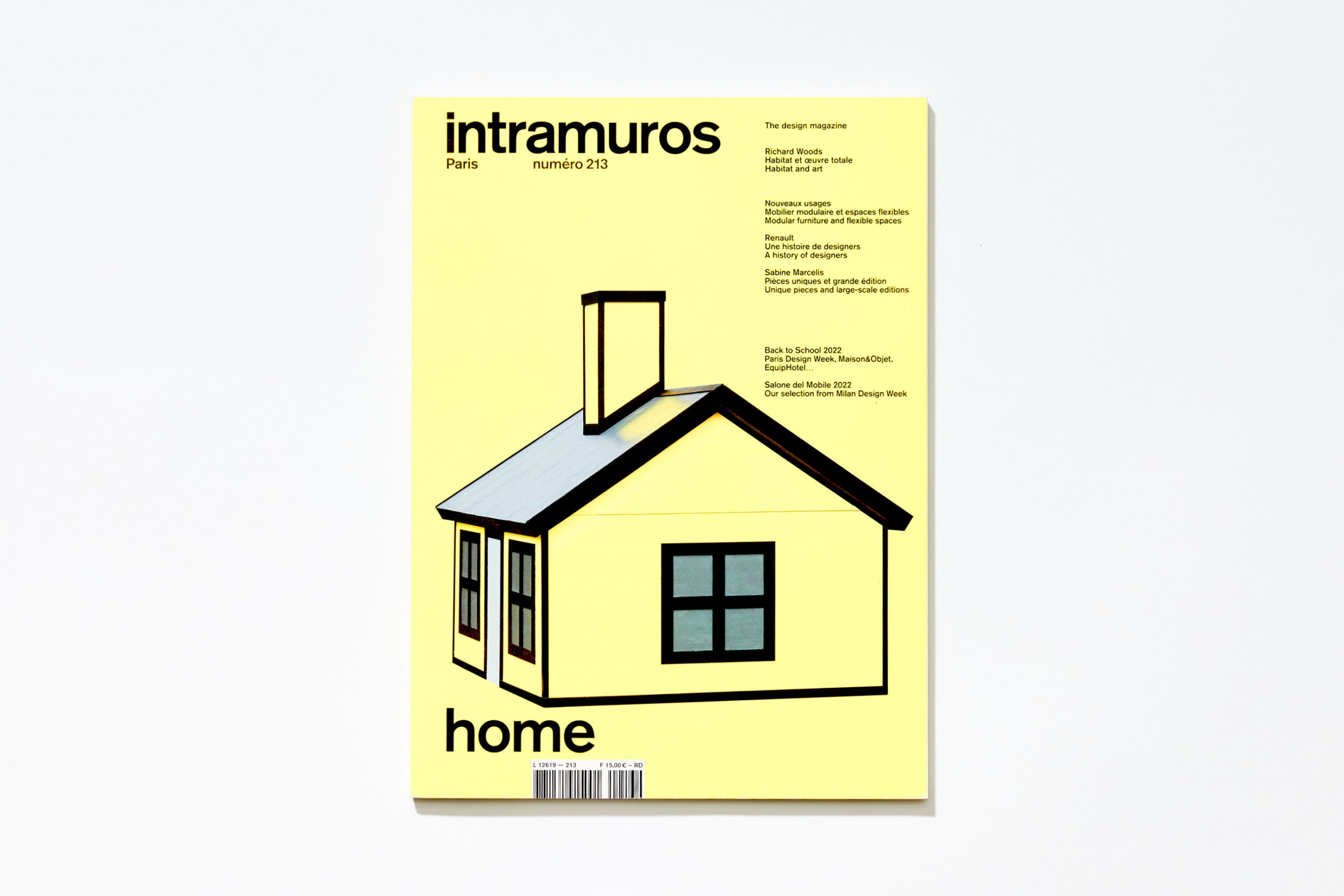
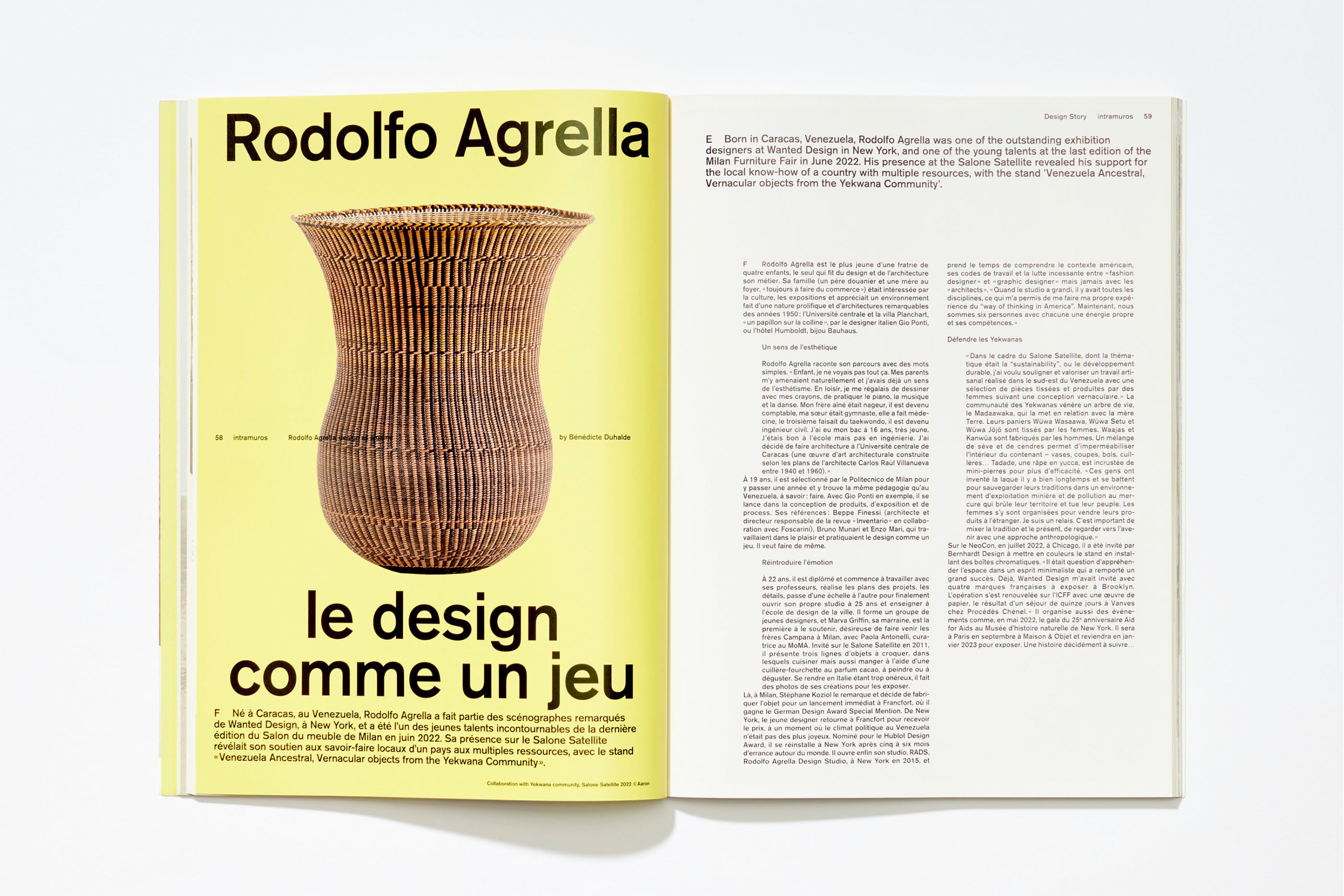
Intramuros
/
Intramuros magazine
2022
Art direction, logotype, editorial design, corporate identity
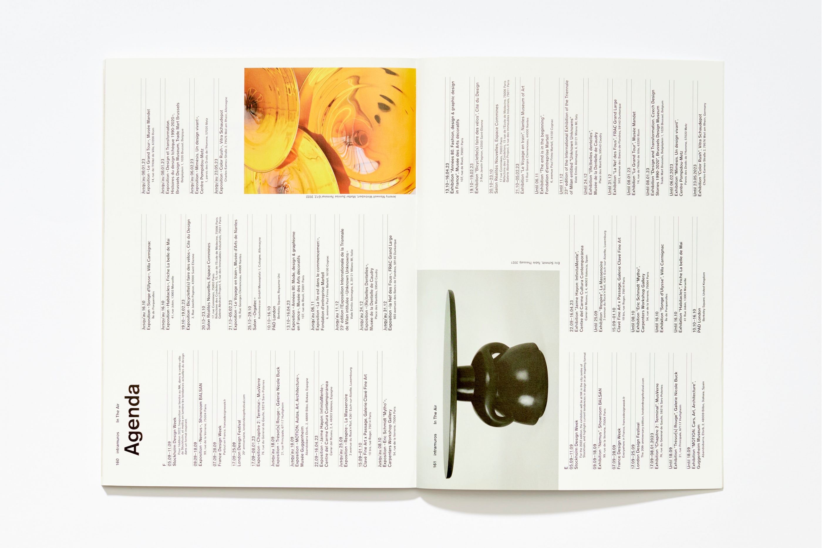
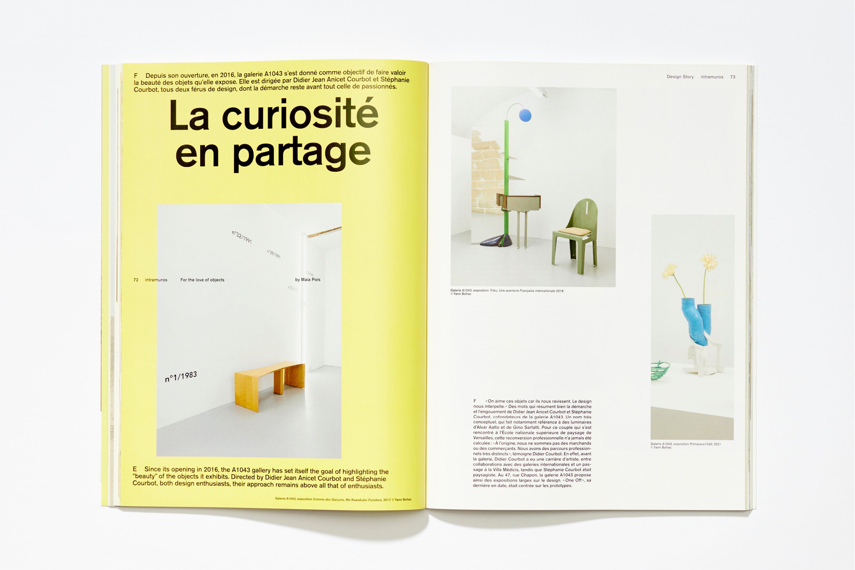
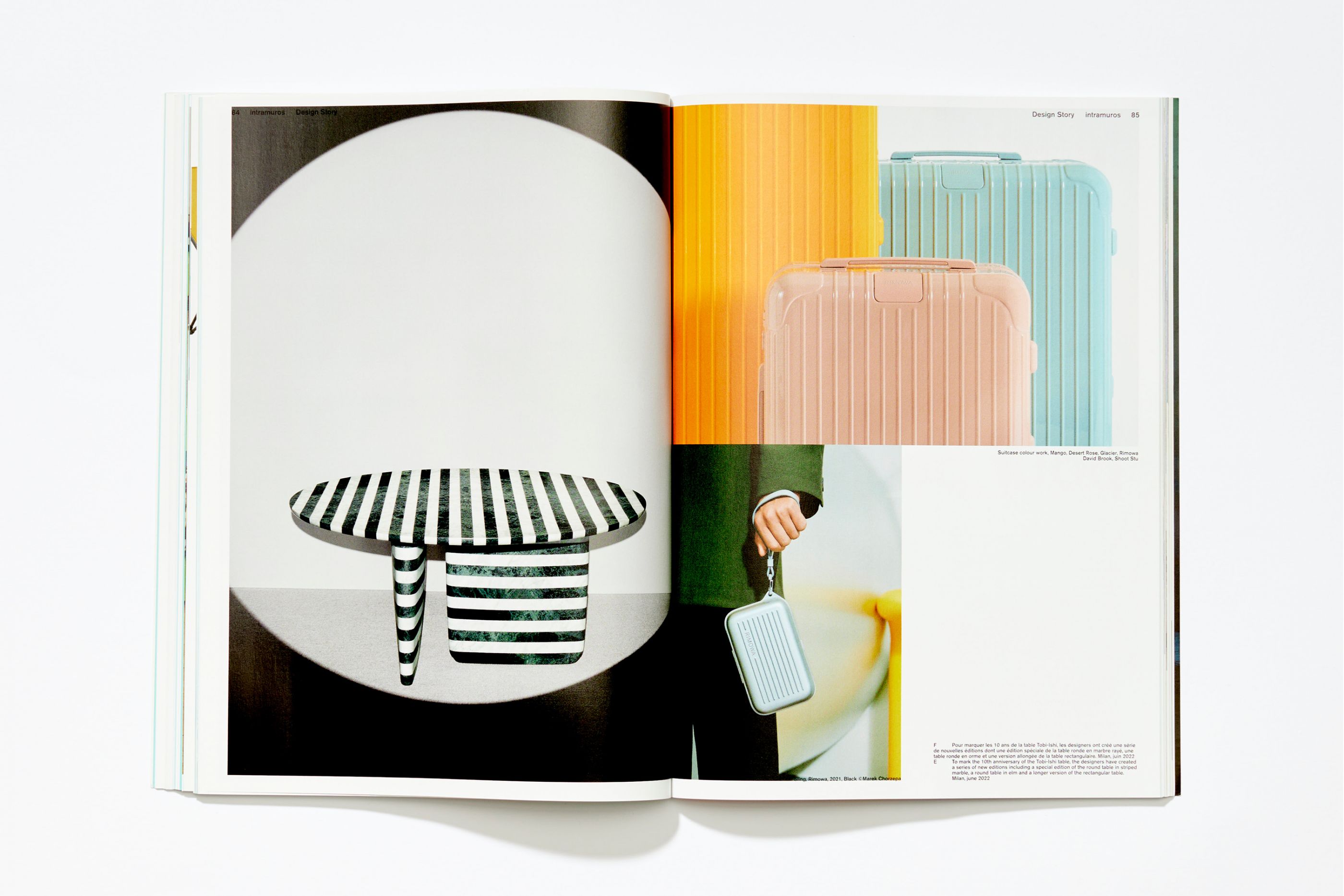
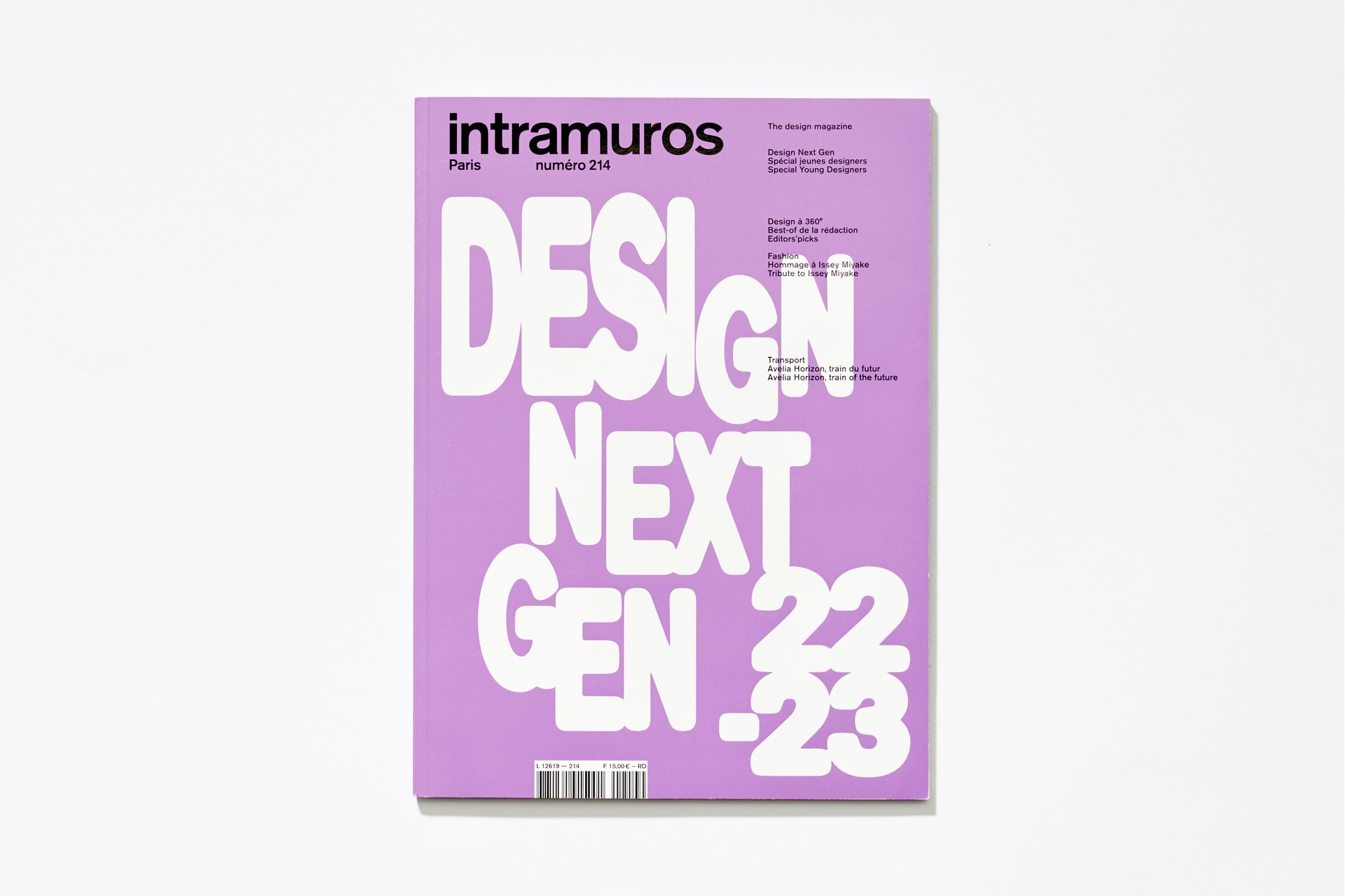
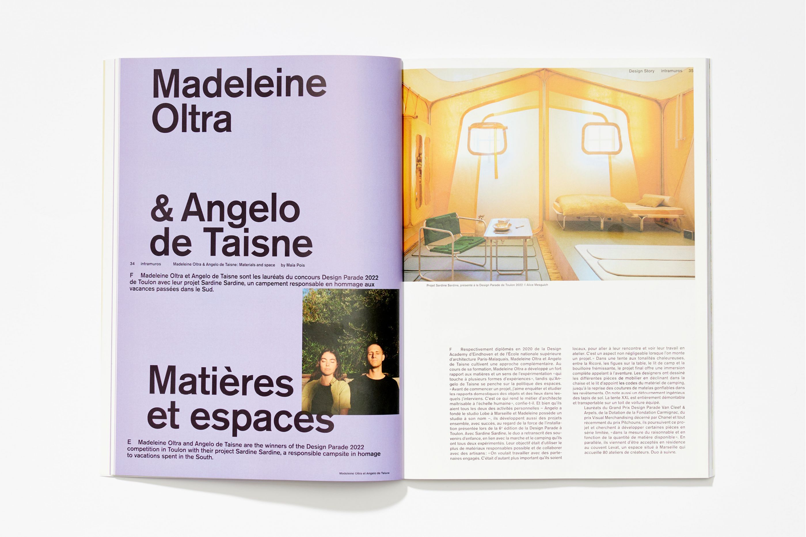
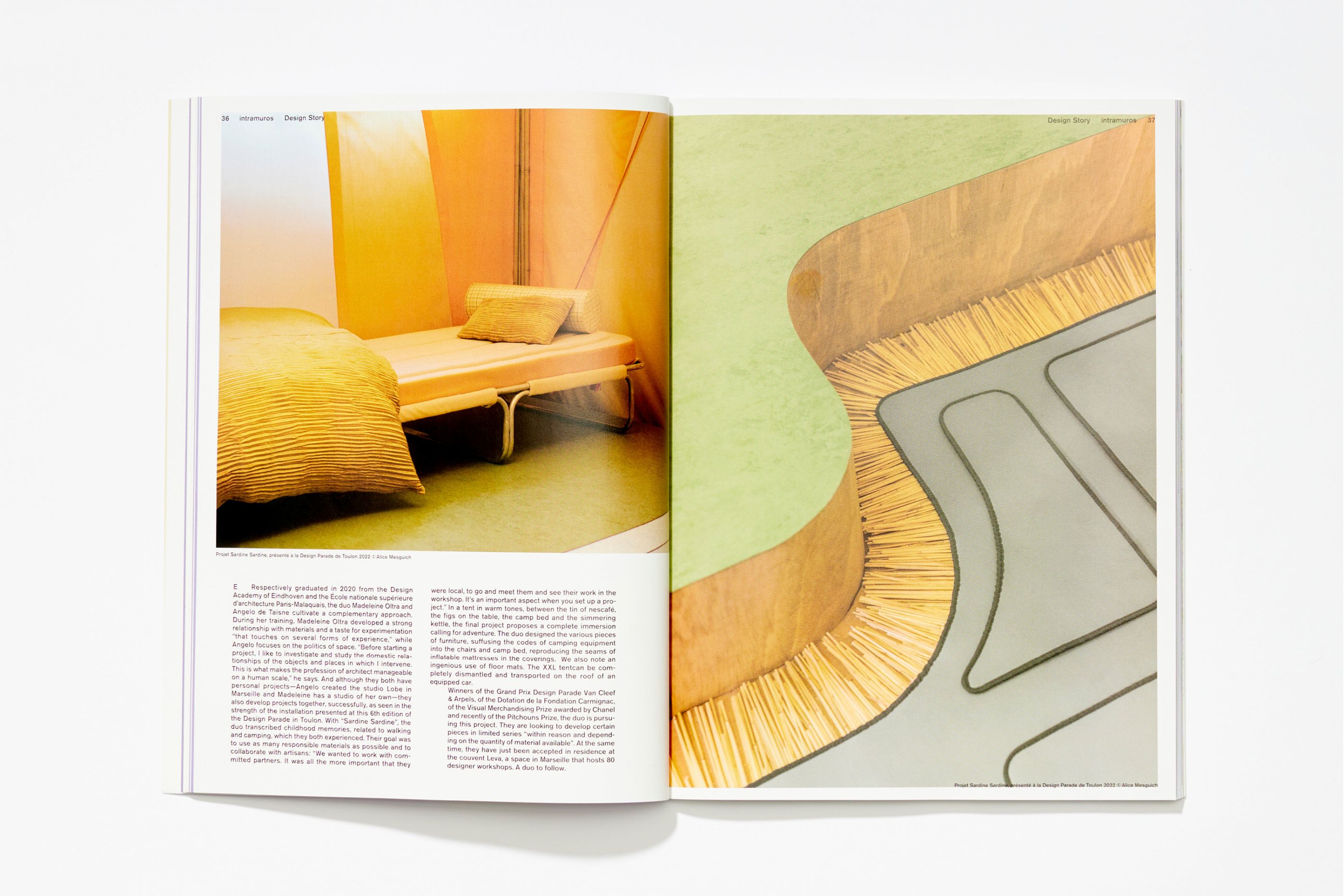
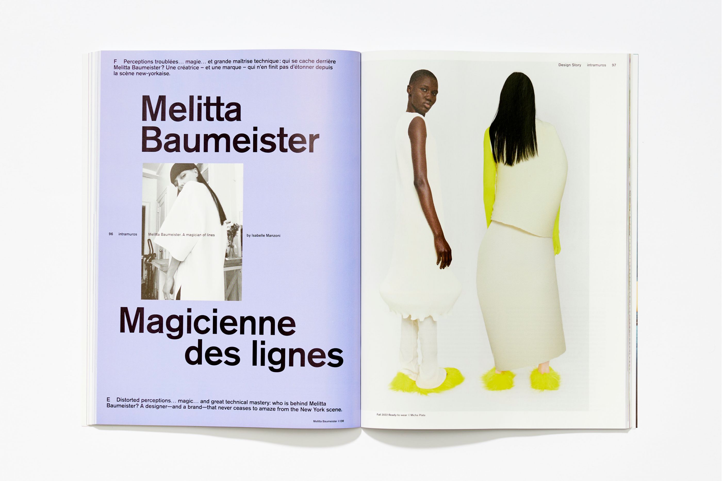
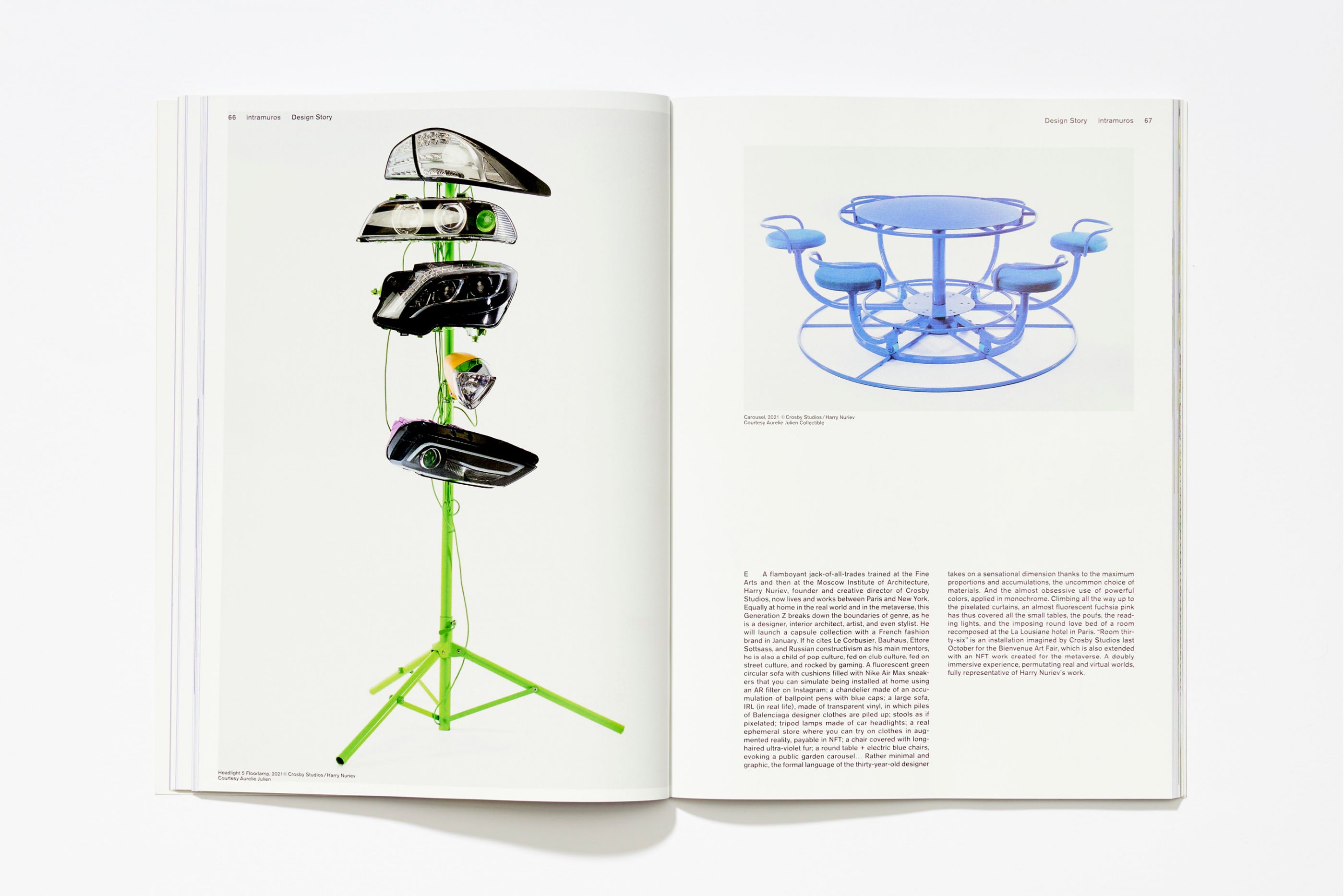
Created in 1985, Intramuros is an iconic French independent magazine dedicated to international design and all its applications in graphic design, interior architecture, industrial creation, but also in fashion and new technologies. Intramuros asked us to propose a complete rebranding of the layout and logo. We defined a hierarchical and spontaneous overall spirit allowing great freedom in the compositions. Through the use of collages, sophisticated page layouts, solid color areas and variations in scale, our concept prioritises the emphasis on content. Typographical rigorism and well-paced iconographic compositions offer a dynamic reading of the magazine.
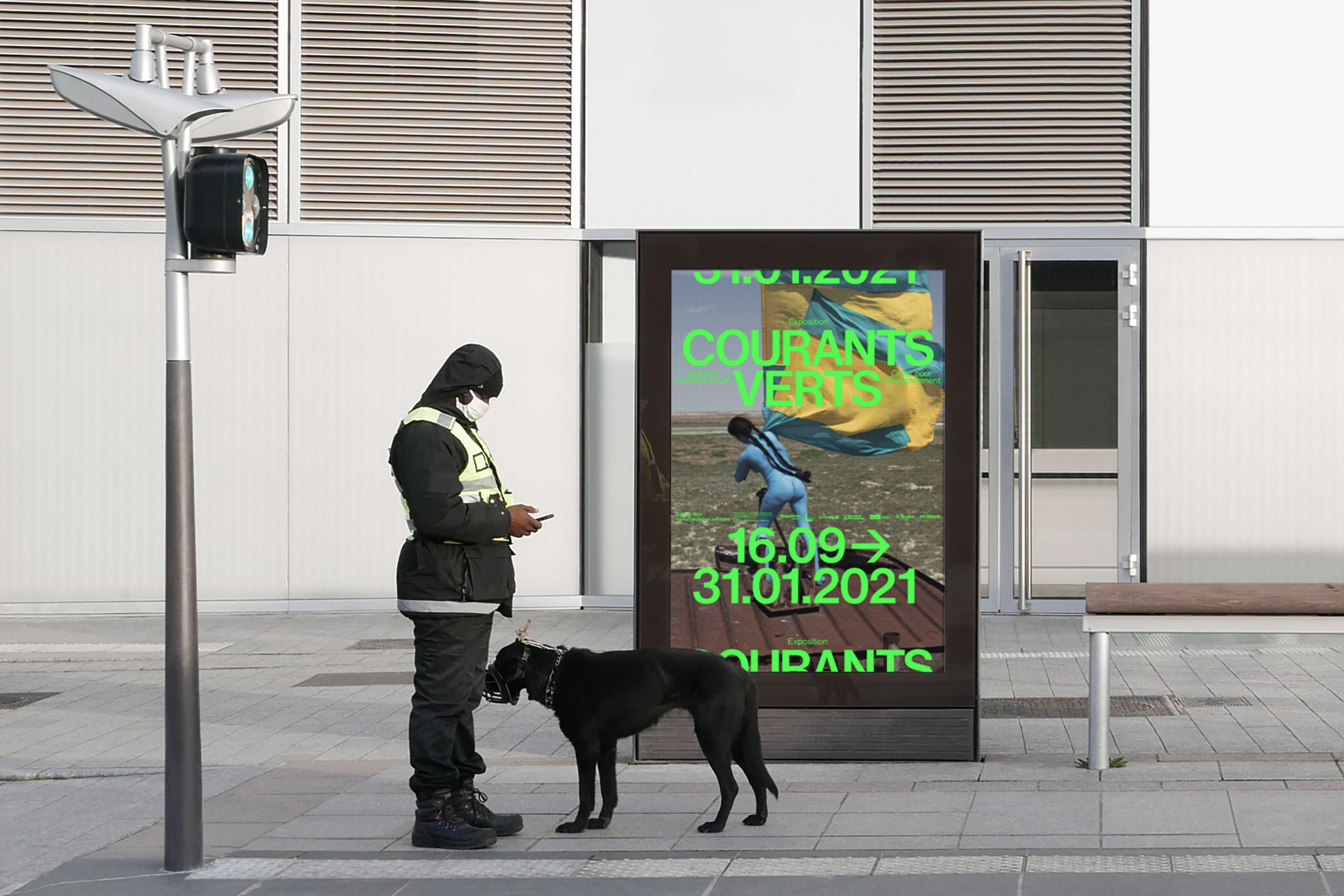
Courants Verts
/
Fondation EDF Group
2020
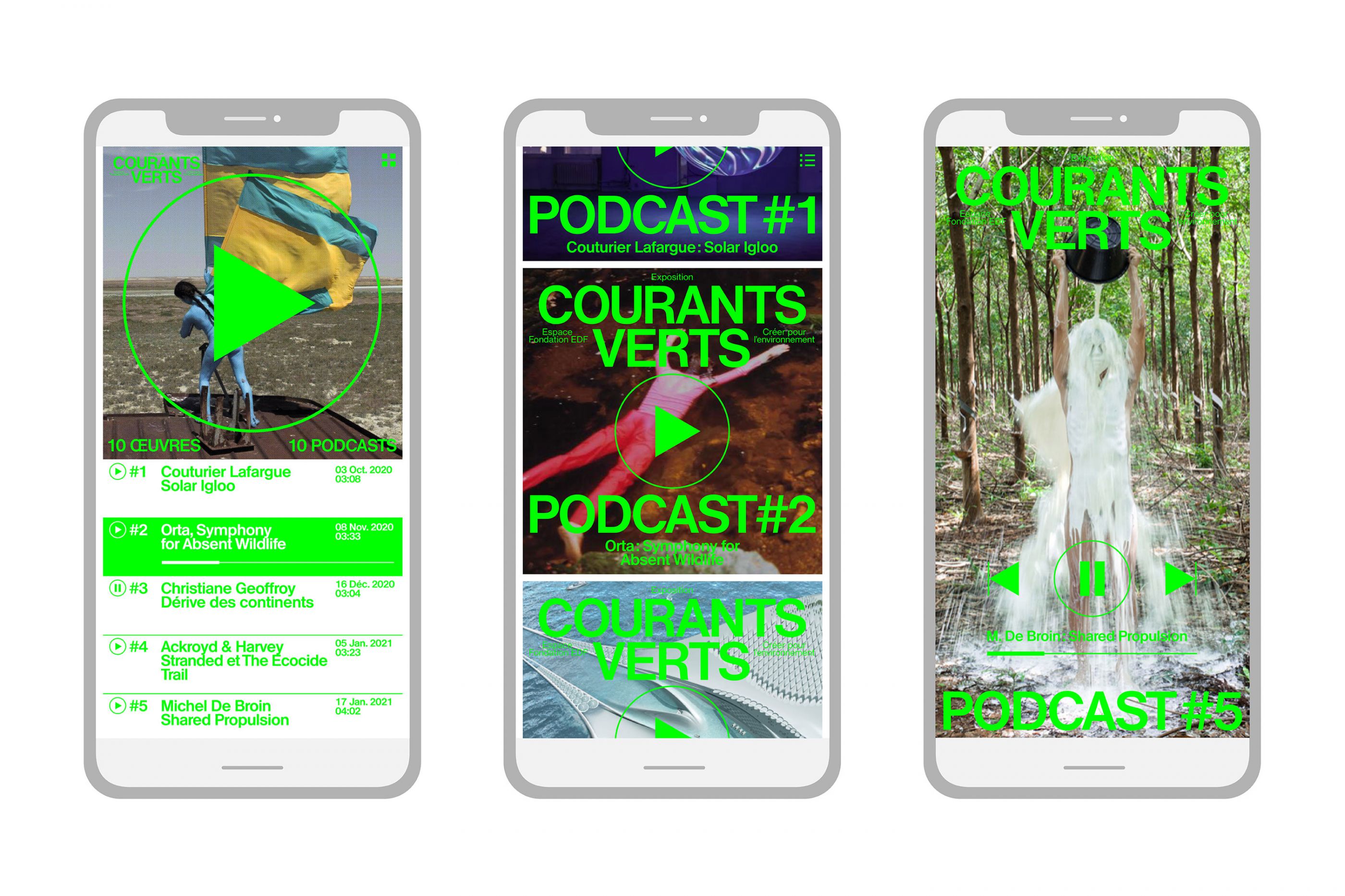
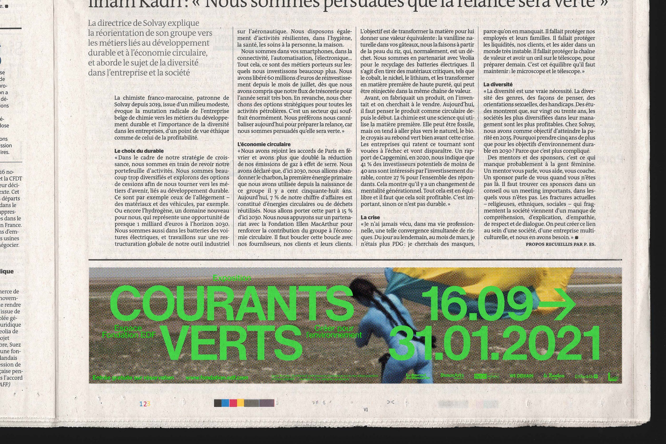
Posters, flyer, display, motion, etc.
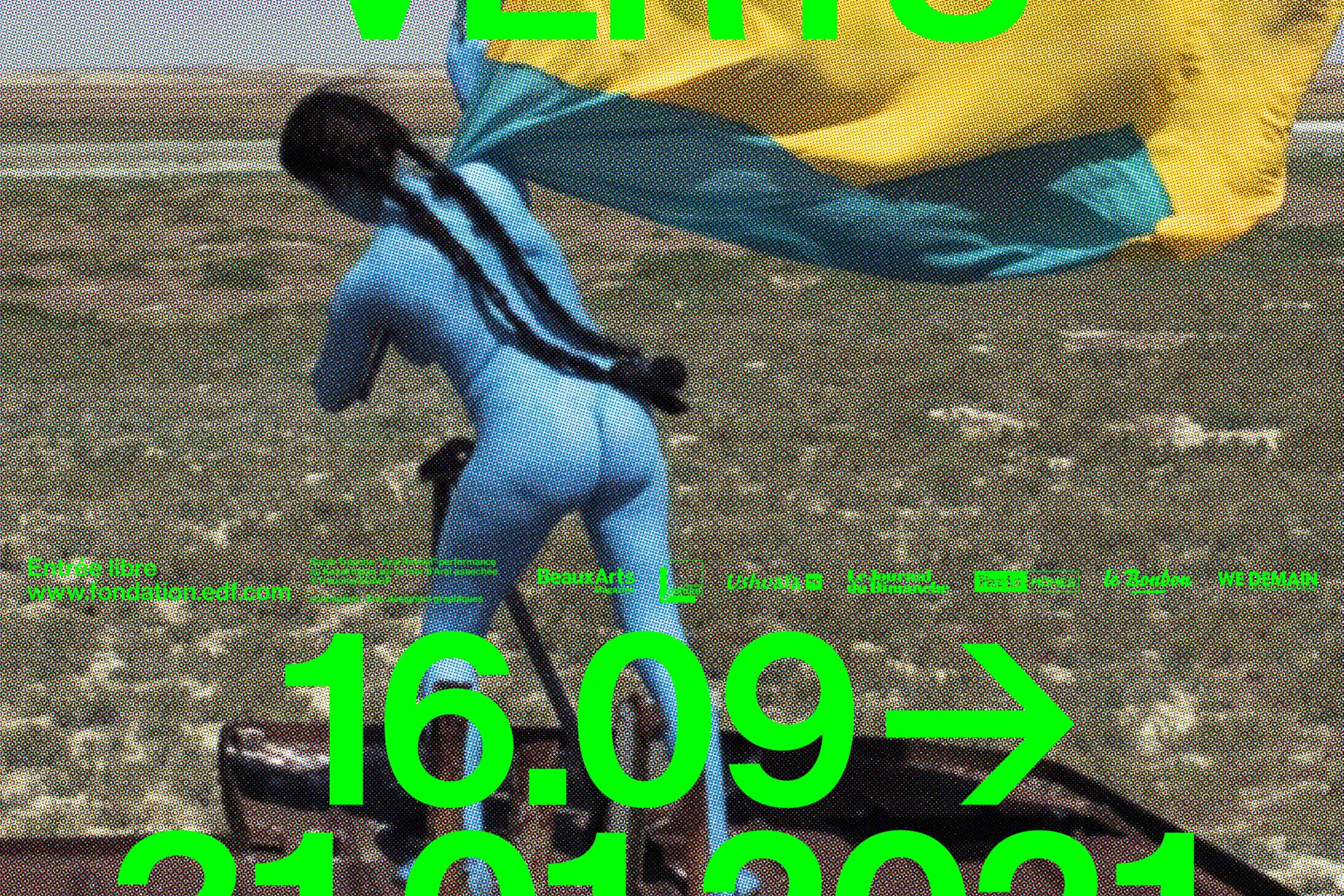
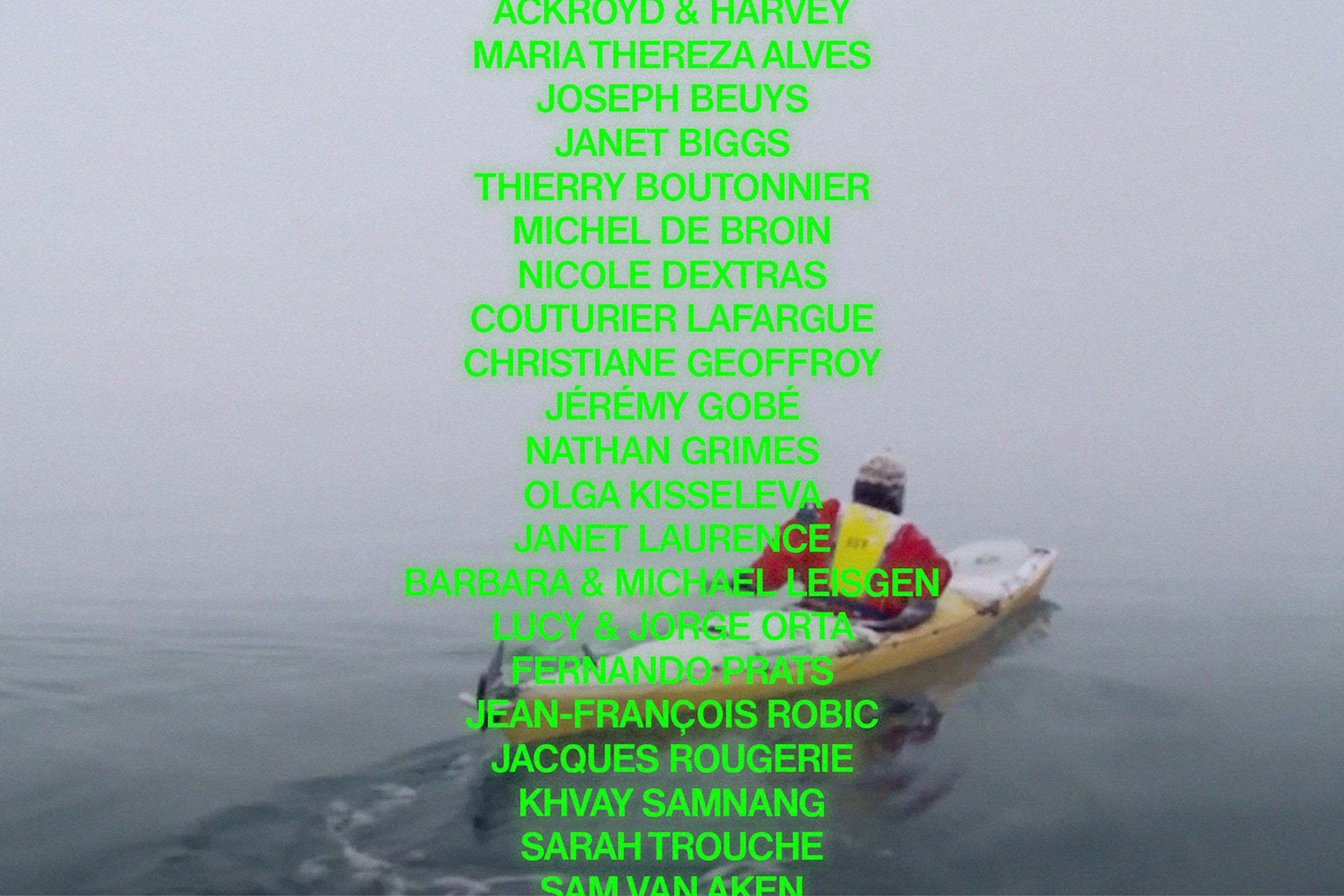
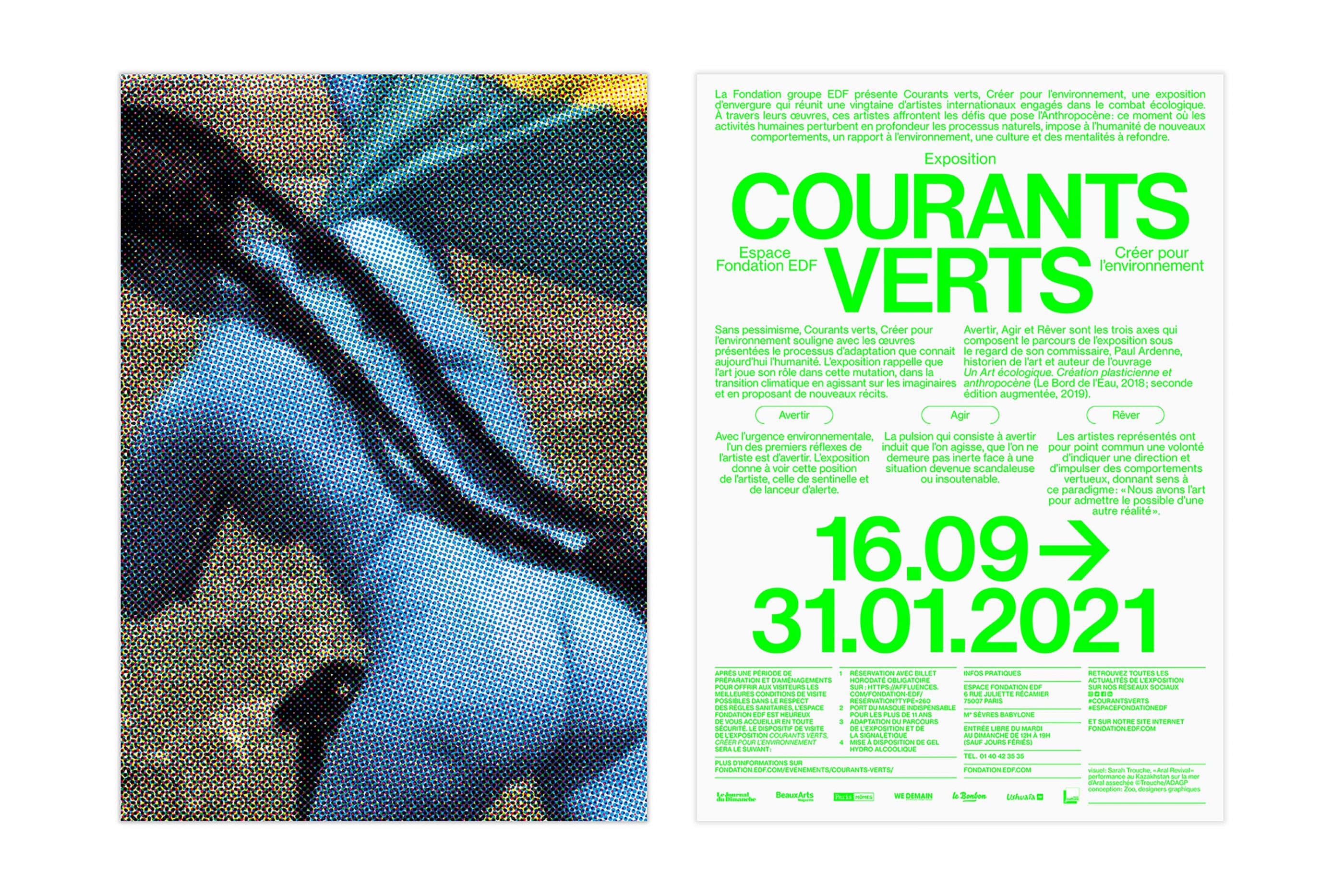
For the first time in France, a large-scale exhibition that brings together international artists committed to the ecological fight: Joseph Beuys, Barbara and Michael Leisgen, Lucy and Jorge Orta, Sarah Trouche, Nicole Dextras, Jéremy Gobé, Nathan Grimes, etc.
We designed the communication campaign for this manifesto exhibition, which reminds us that art plays a role in this climate change by acting on the imaginations and proposing new stories. Curator: Paul Ardenne, image ©Sarah Trouche.
Château d'écouen
/
Château d'Ecouen, National museum of Renaissance
2020
Program, guide, editorial, signage, booklets, etc.
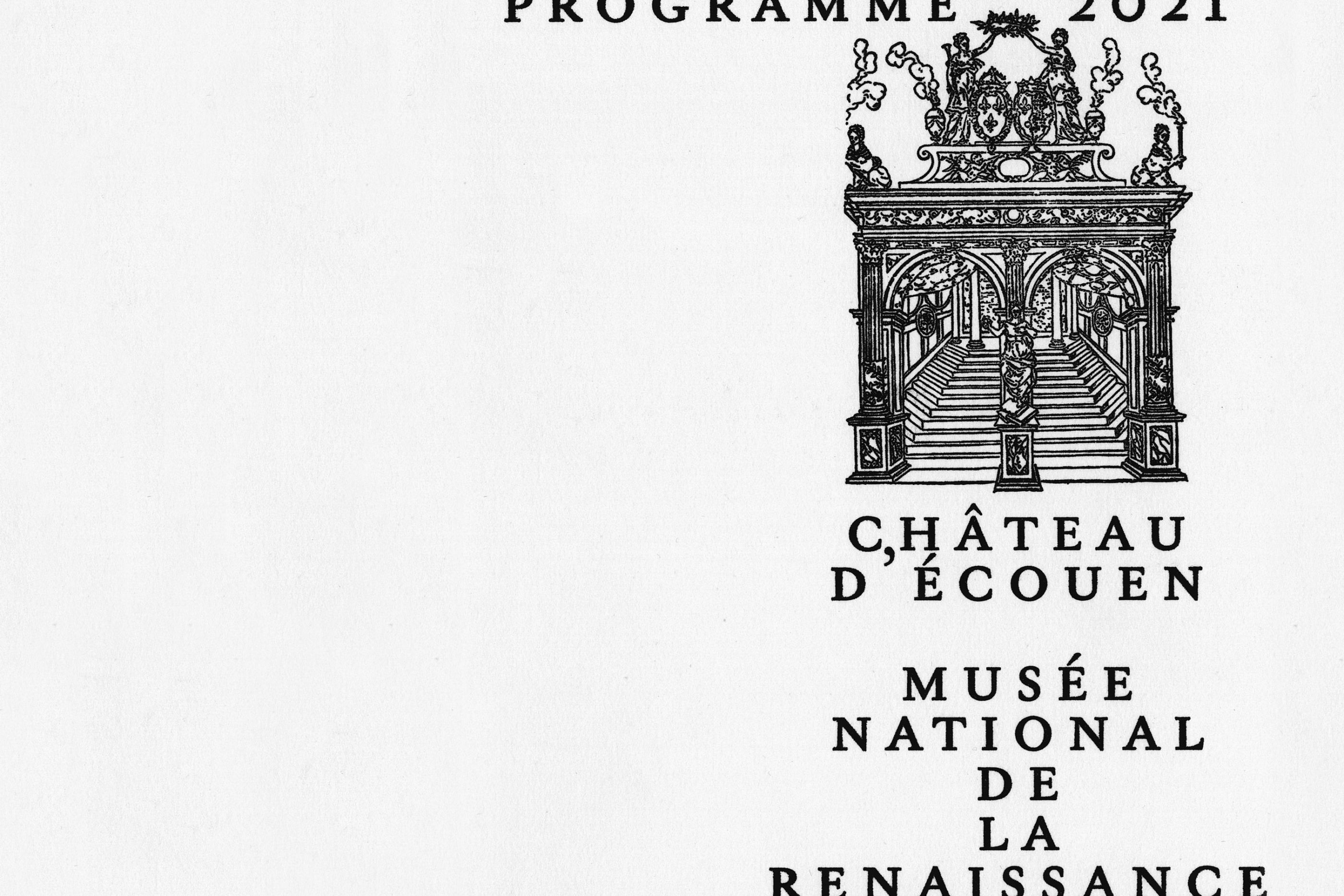
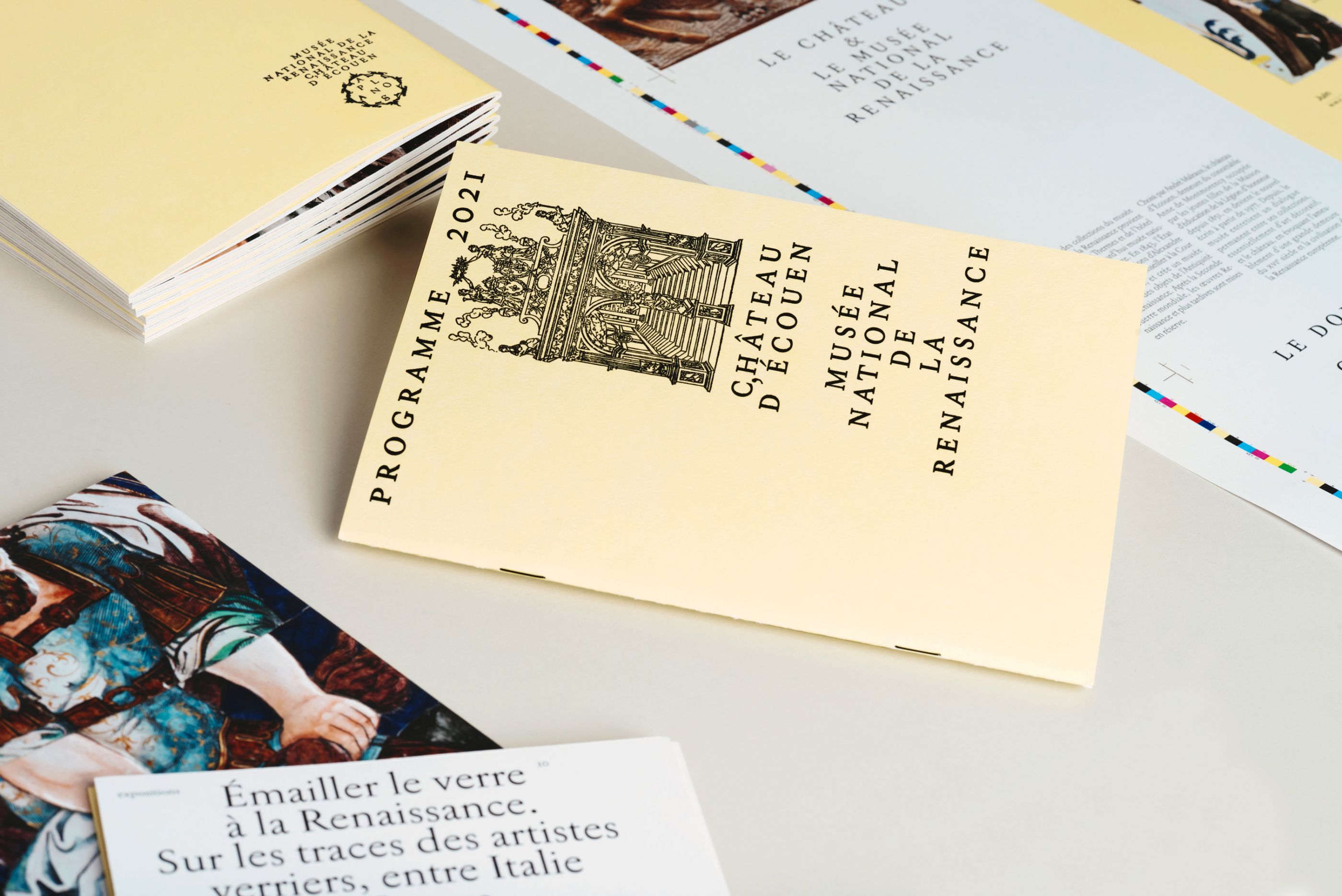
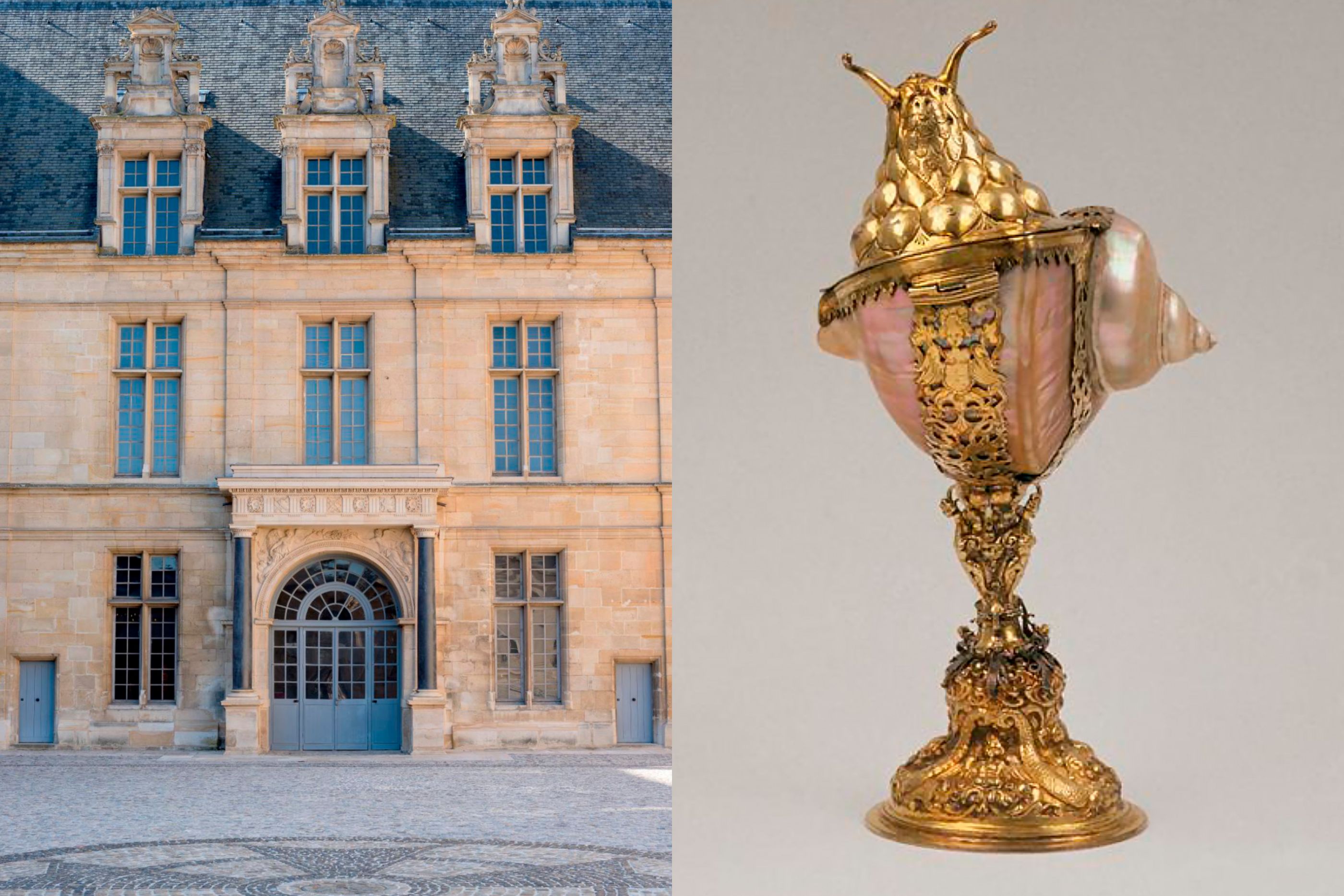
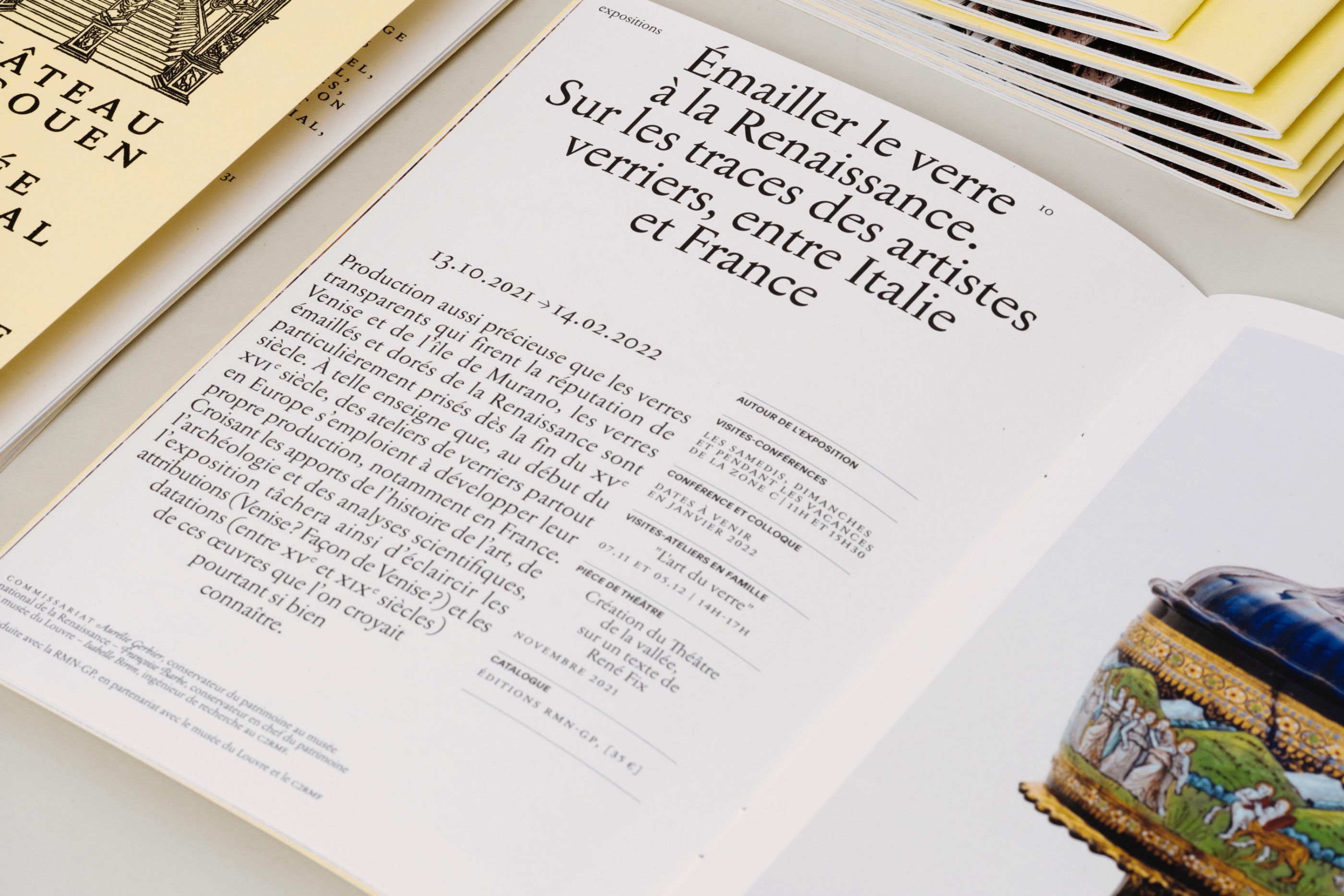
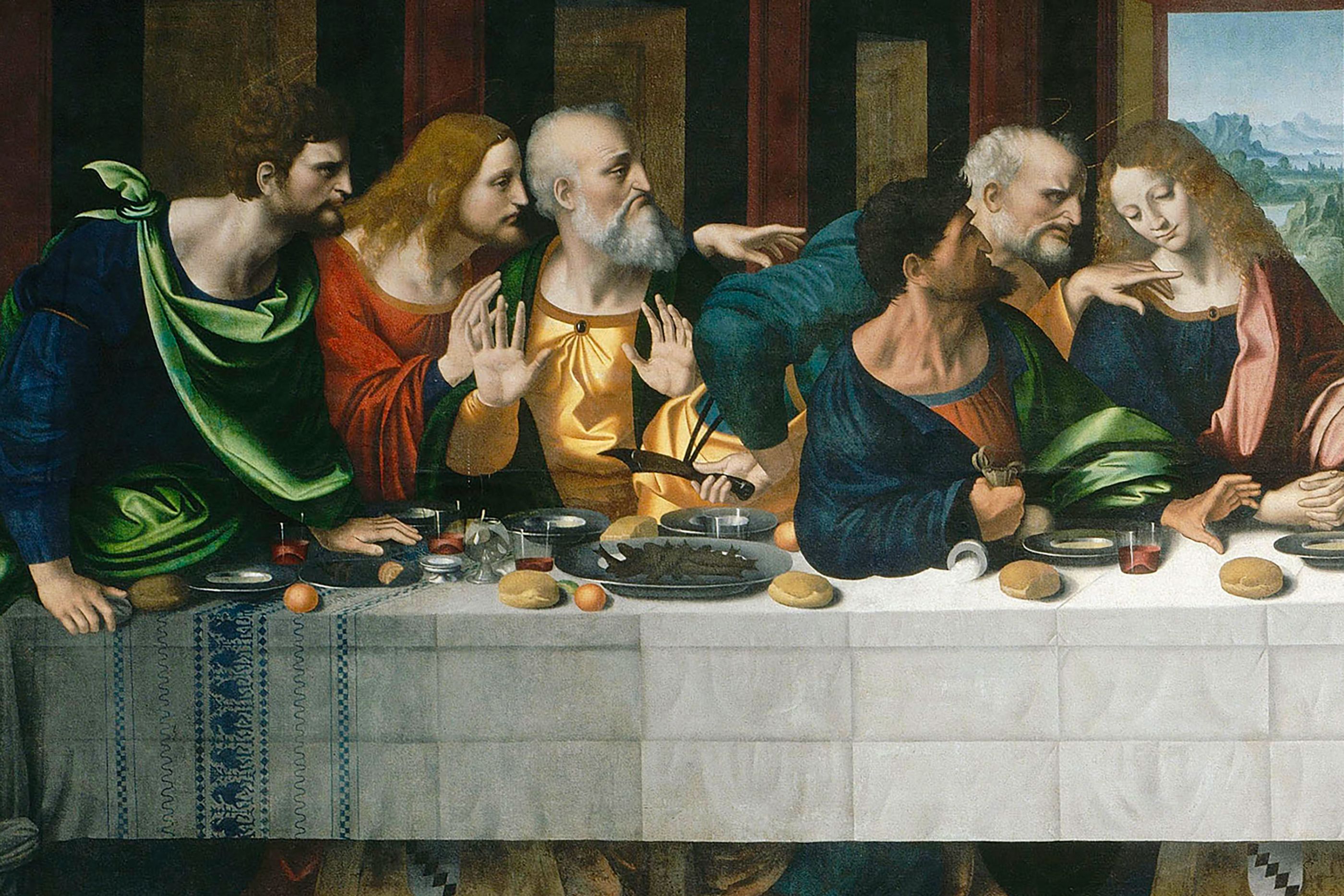
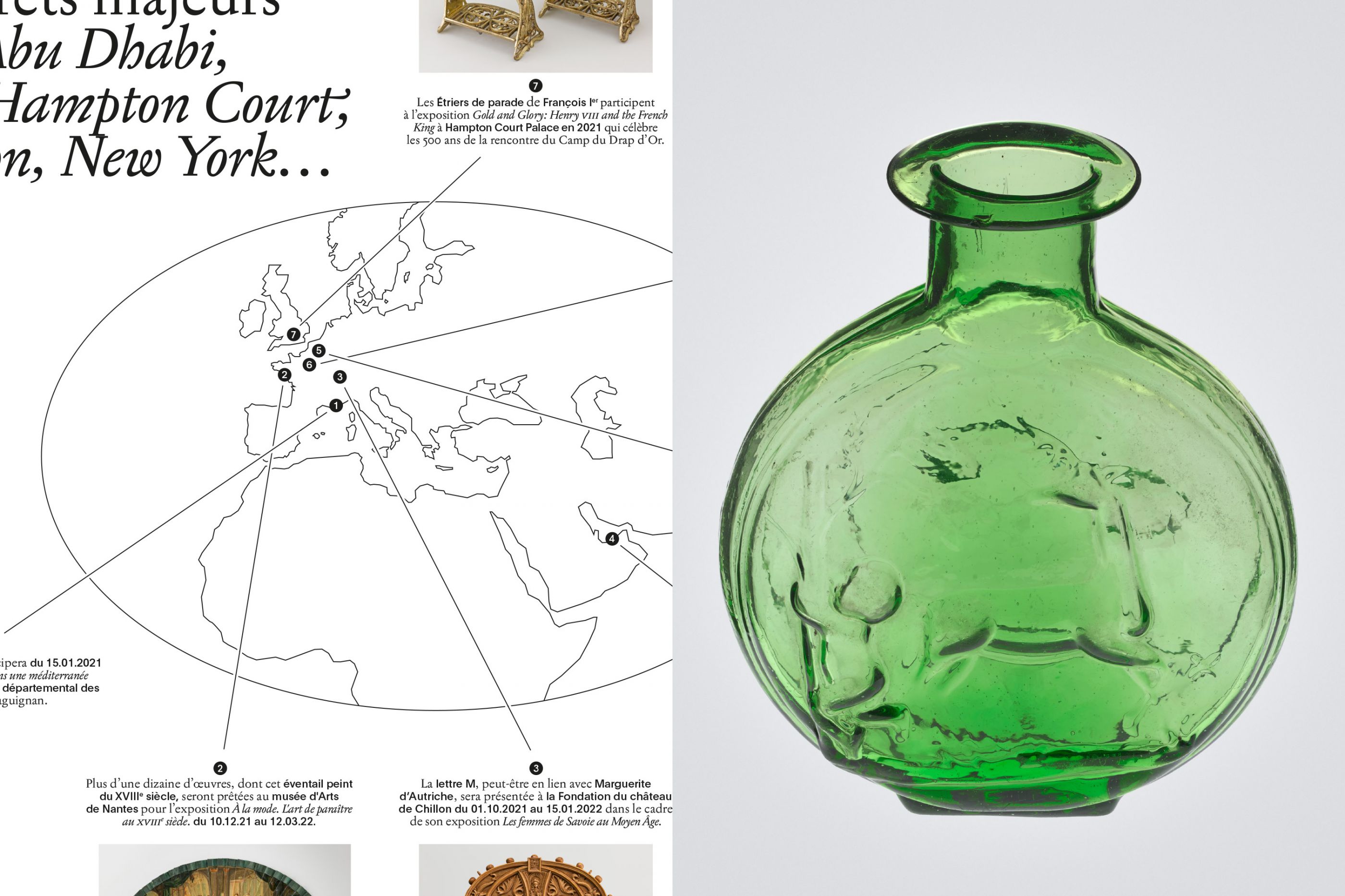
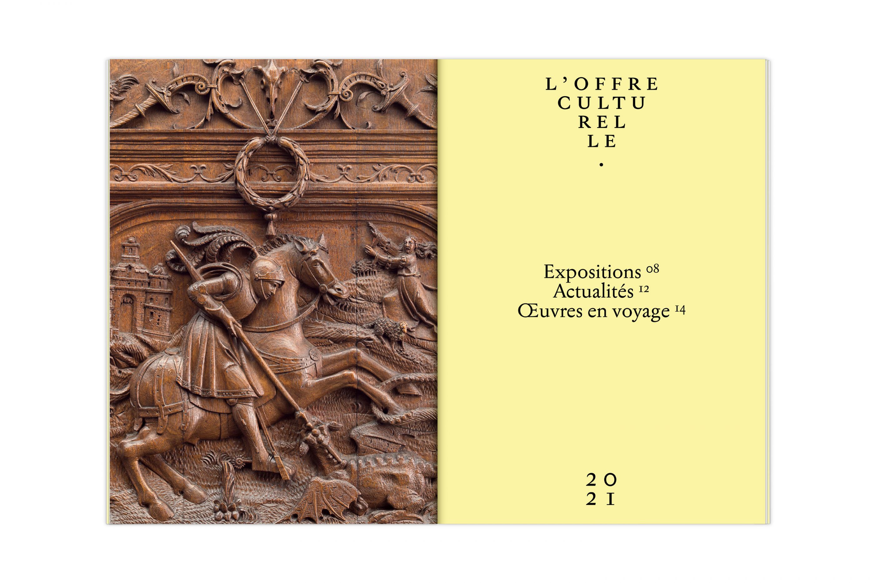
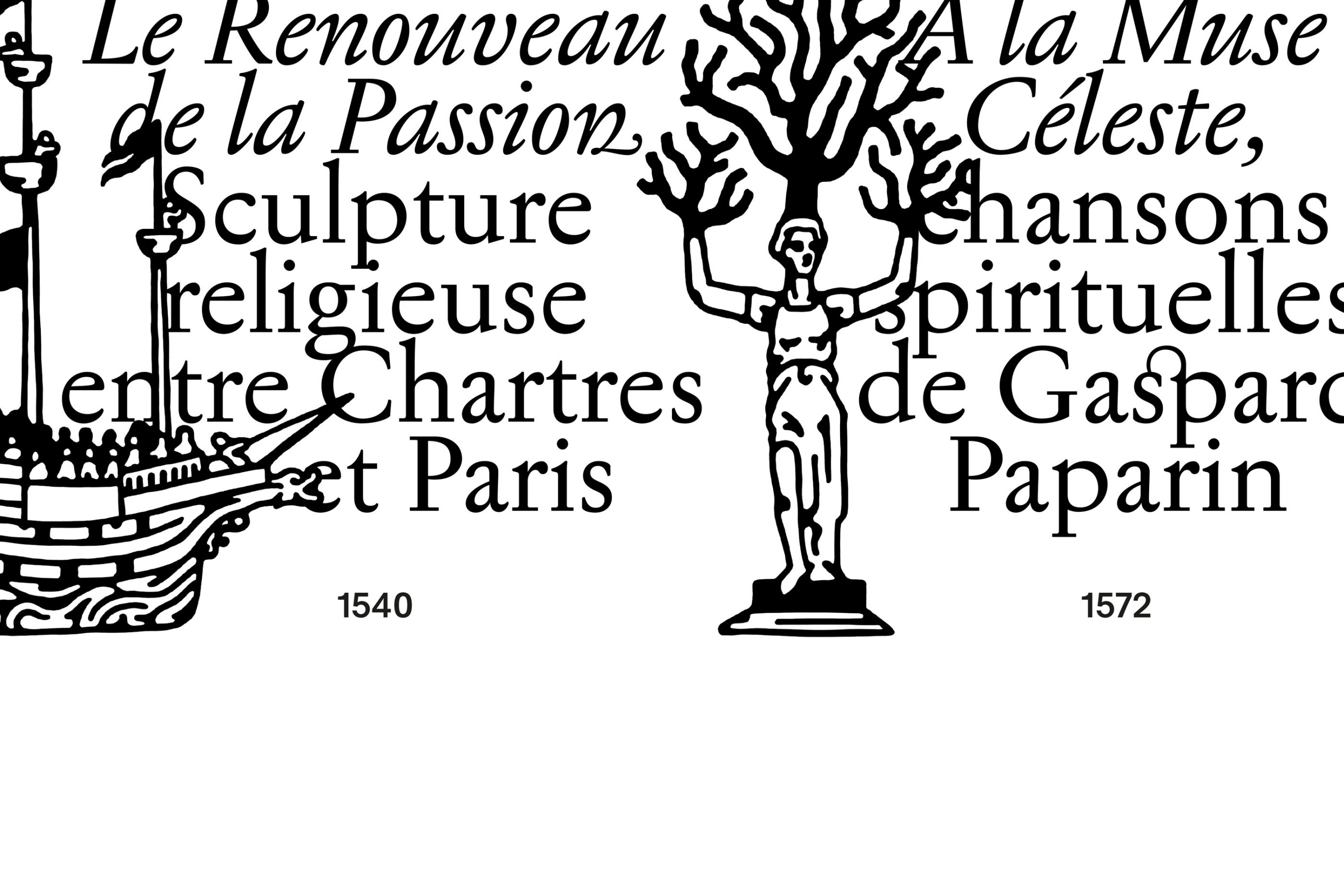
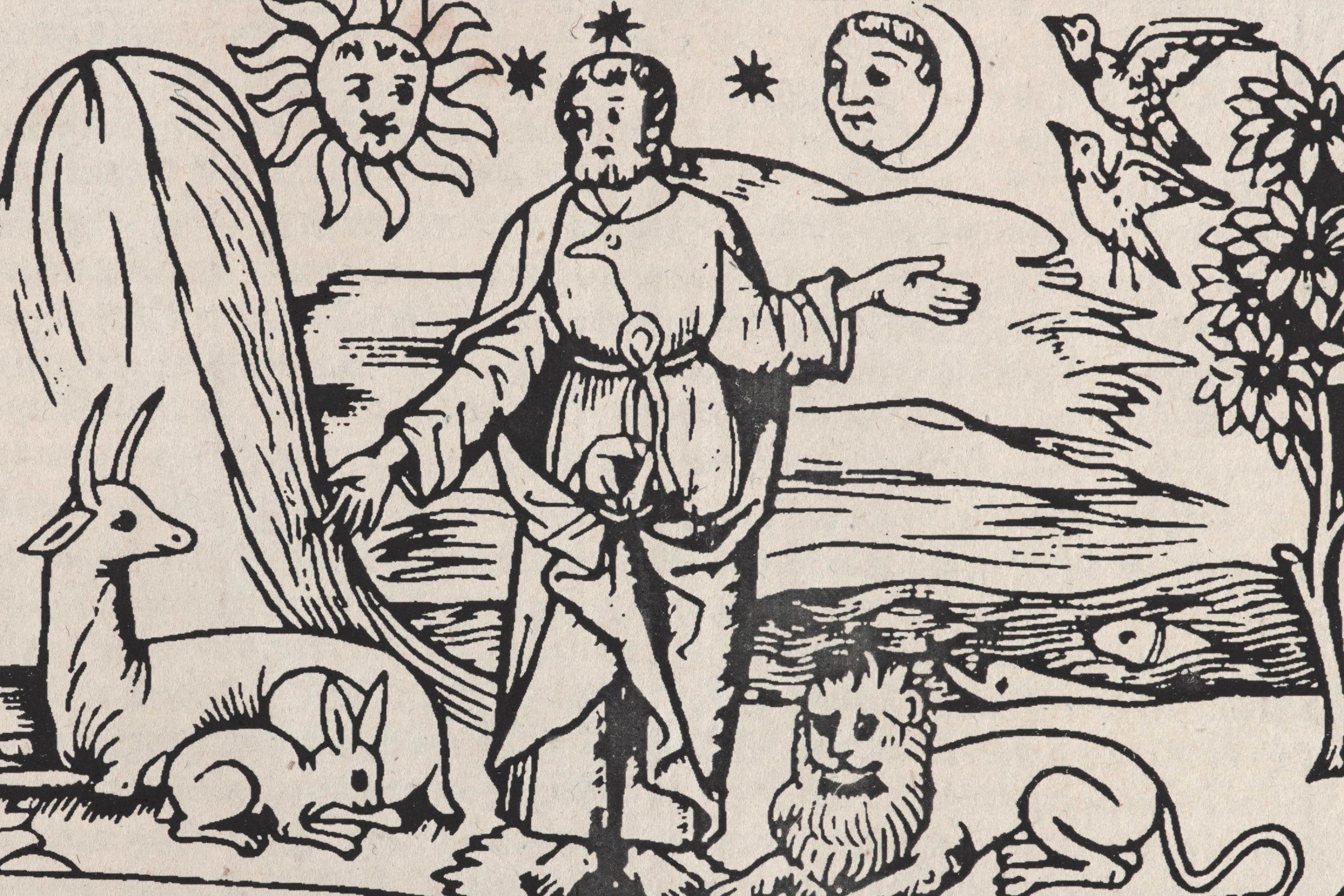
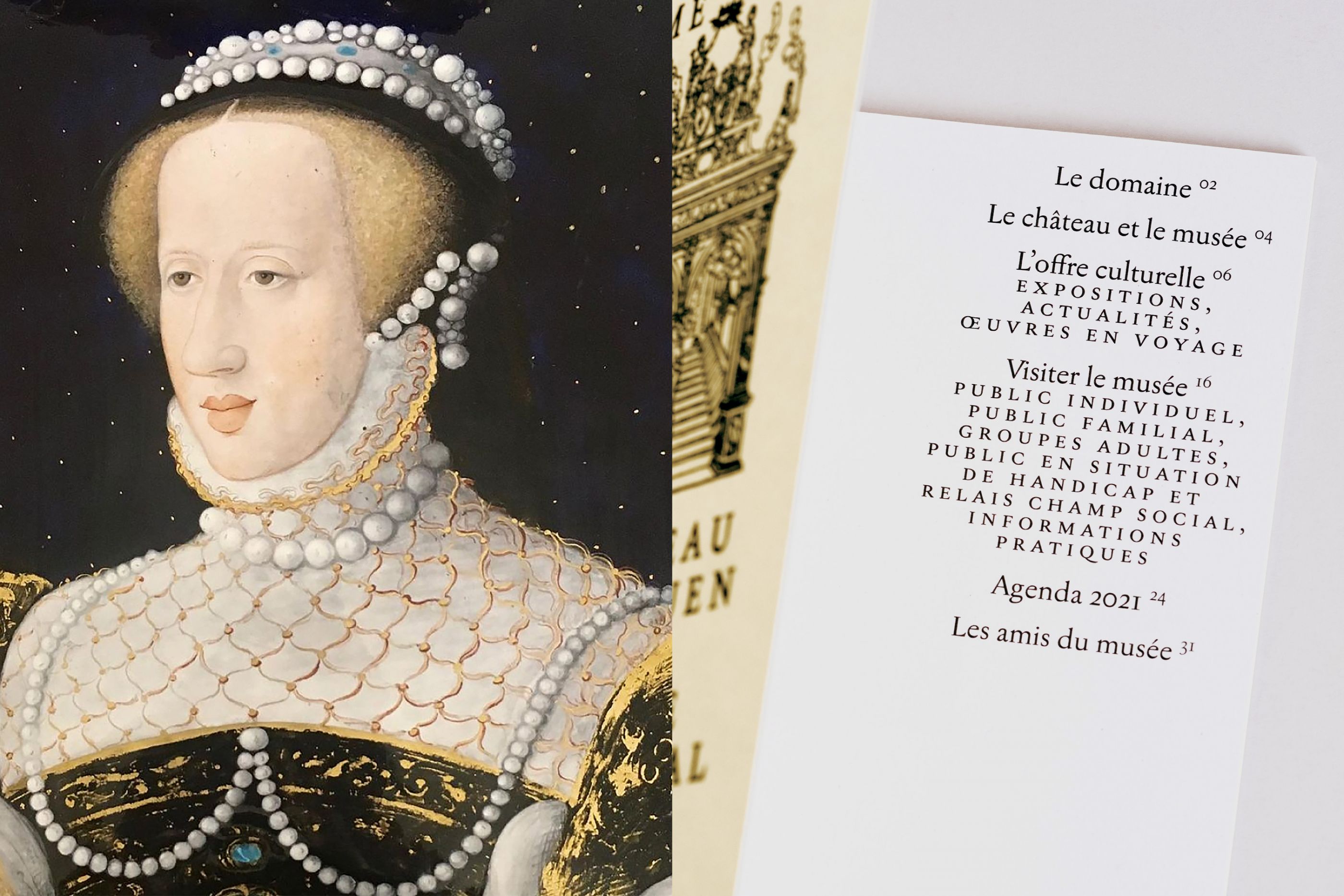
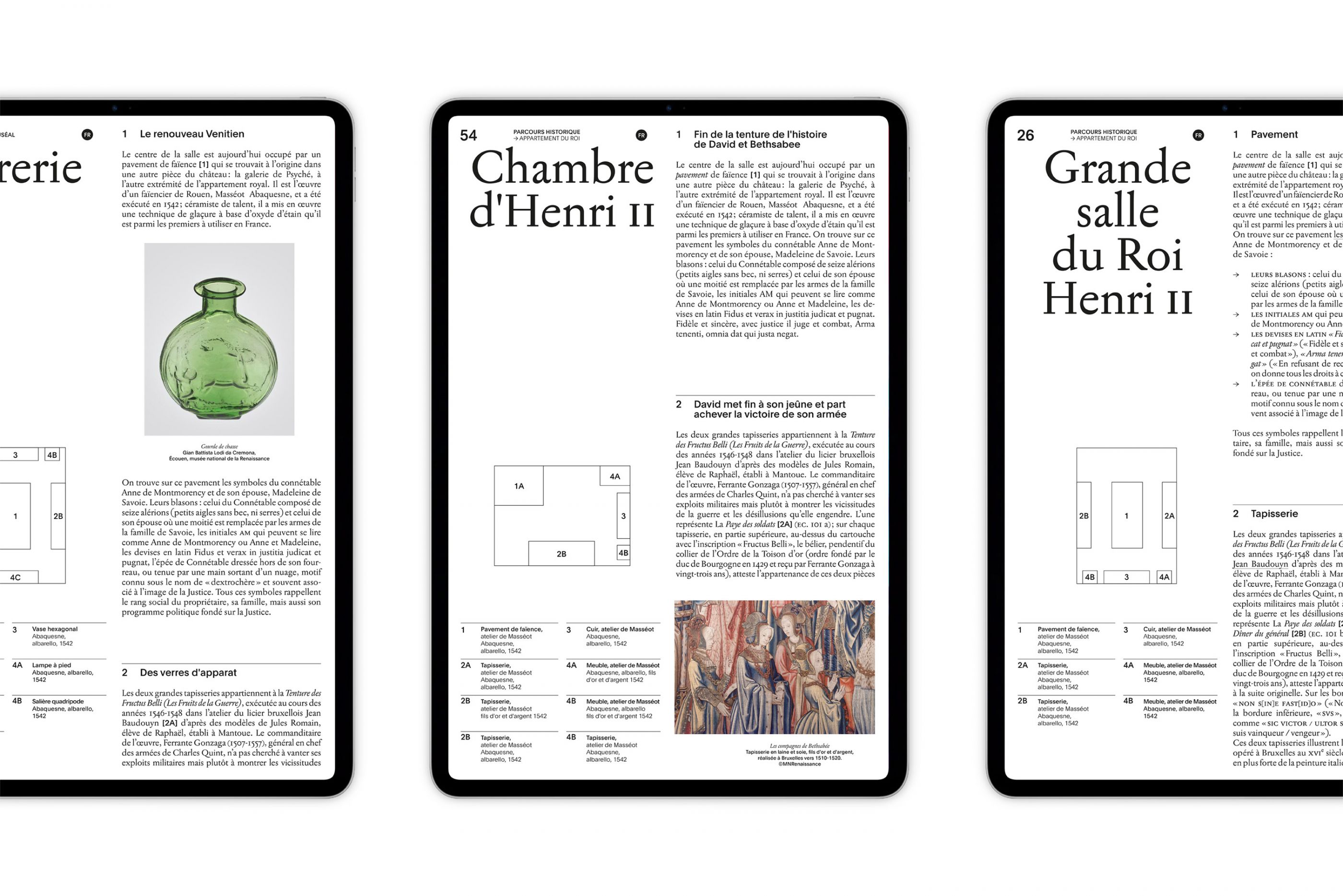
Owned by a great Renaissance lord, Anne de Montmorency, the Château d'Ecouen [located 20 kilometers north of Paris] has housed the National Renaissance Museum since 1977. With all of the internal teams, we have redefined the overall image as well as the visual identity system of this Château-Museum with its exceptional collections: one of the most prestigious decorative art sets of the 15th, 16th and 17th centuries!
We define an assertive visual register that gives this unique cultural institution a tone that is both sensitive and didactic, inspiring and engaging.
pleinsud.art
/
Plein Sud
2021
Art direction, website, motion
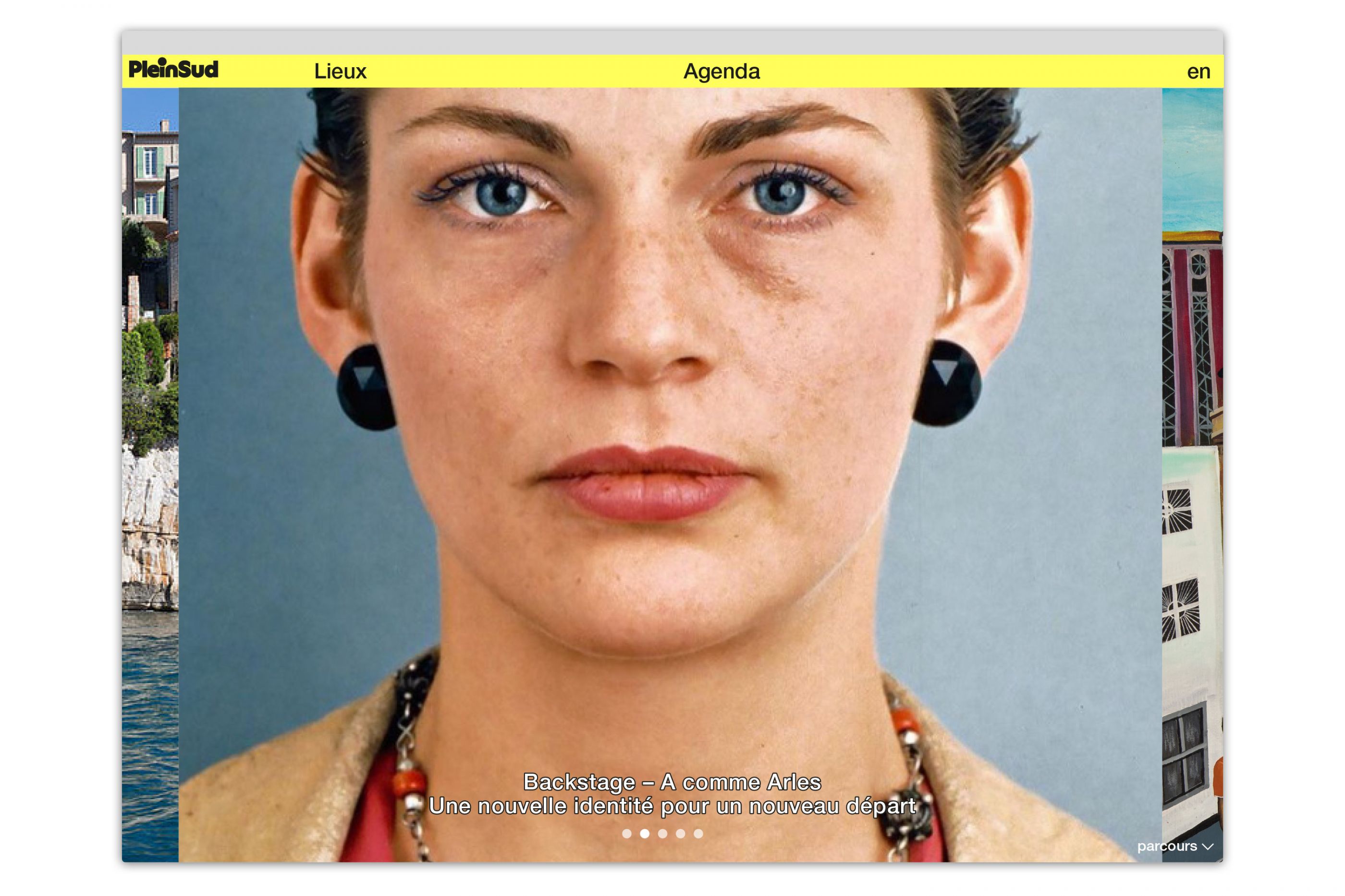
Plein Sud is a network that counts more than 60 places of art, architecture and heritage on the shores of the Mediterranean Sea. We have entirely designed the website of this network, which reports on the latest news in contemporary art in the region. In order to allow each visitor to easily organise their visits, we designed an immersive homepage with quick access to several news items. Navigation is instinctive and visitors can browse tthrough the programme, a list of numerous events or even a map of the region. We focused on functionality. The network's extensive cultural offer is therefore presented in a very organised way.
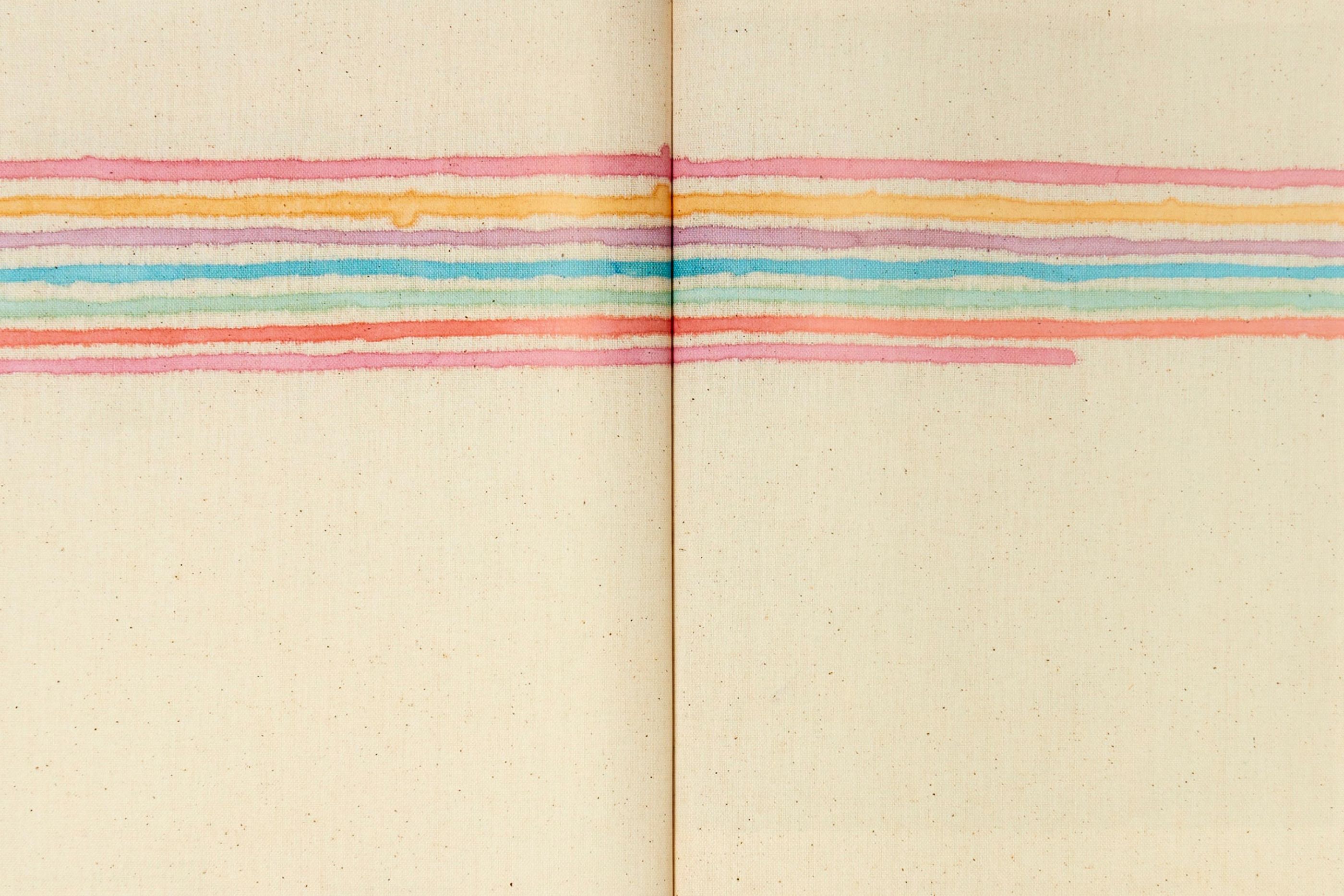
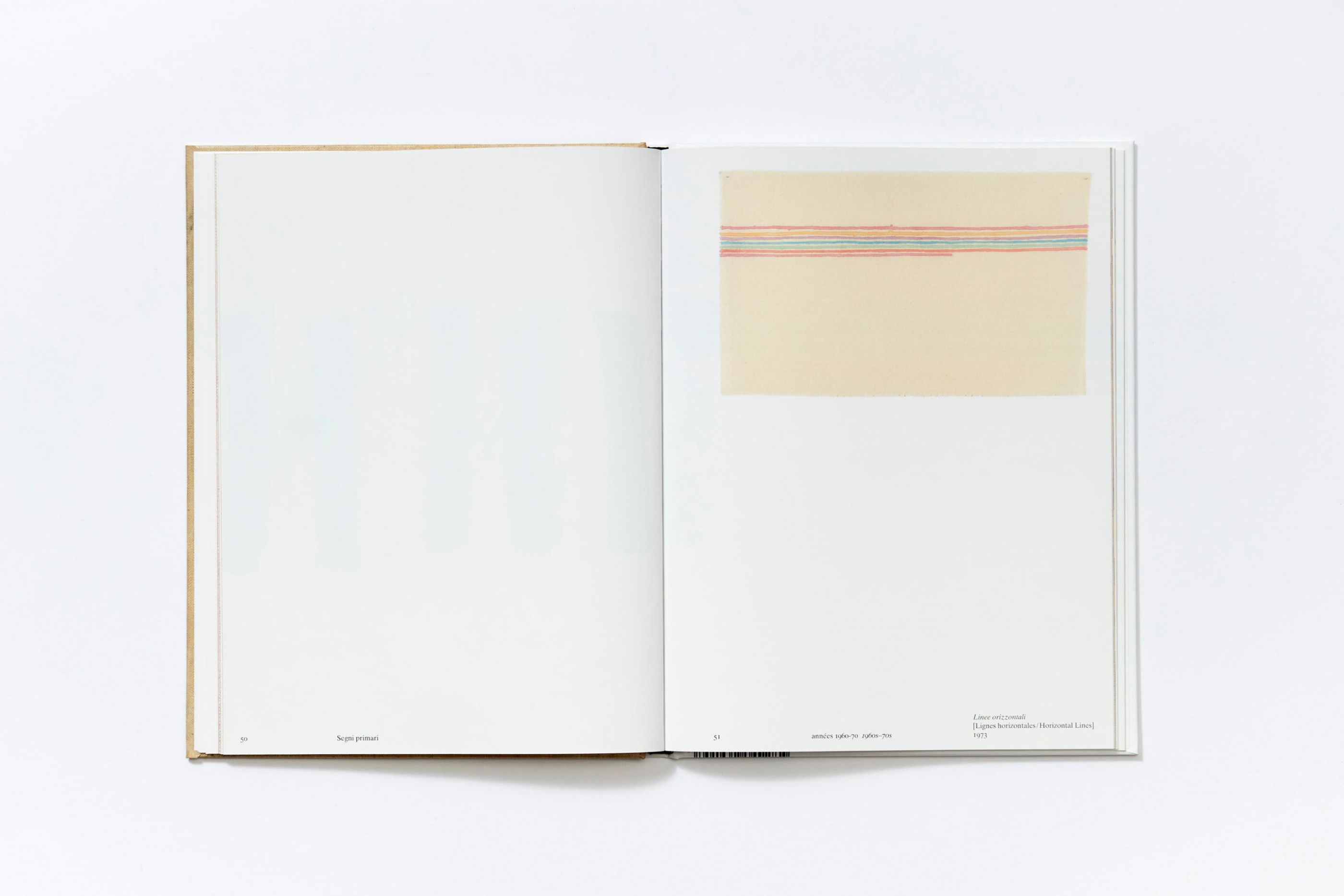
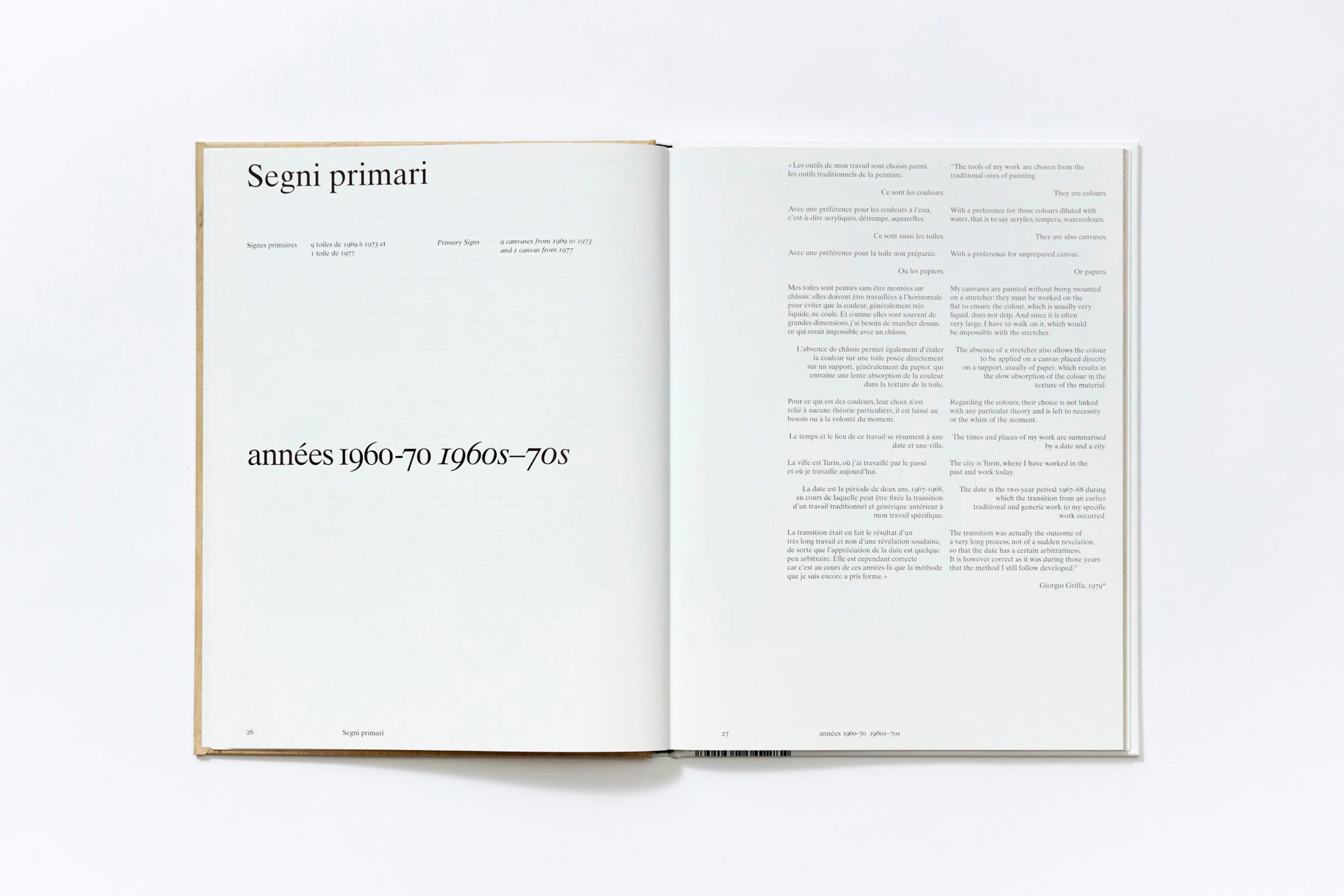
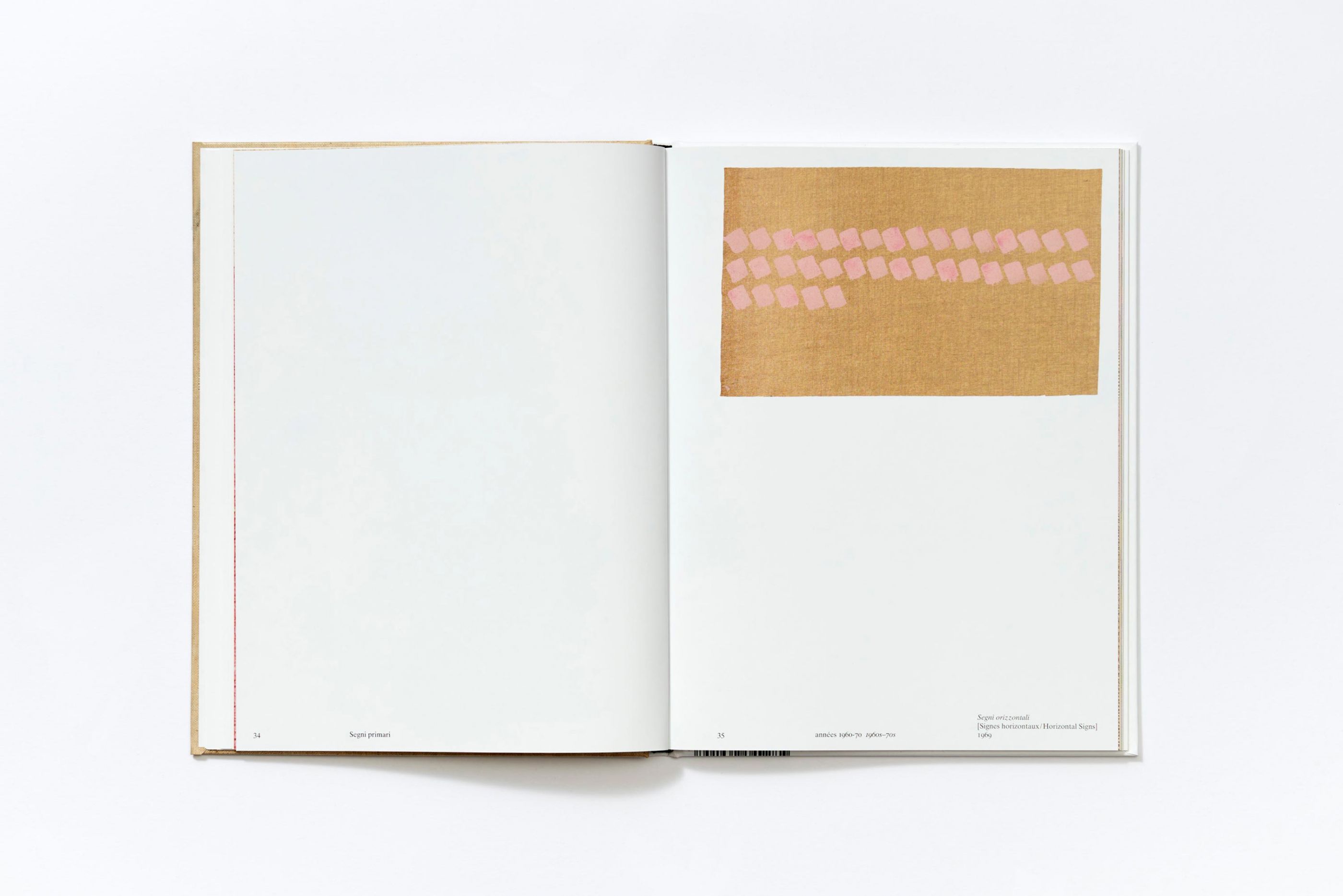
Giorgio Griffa
/
Centre Pompidou
2021
Art direction, editorial design
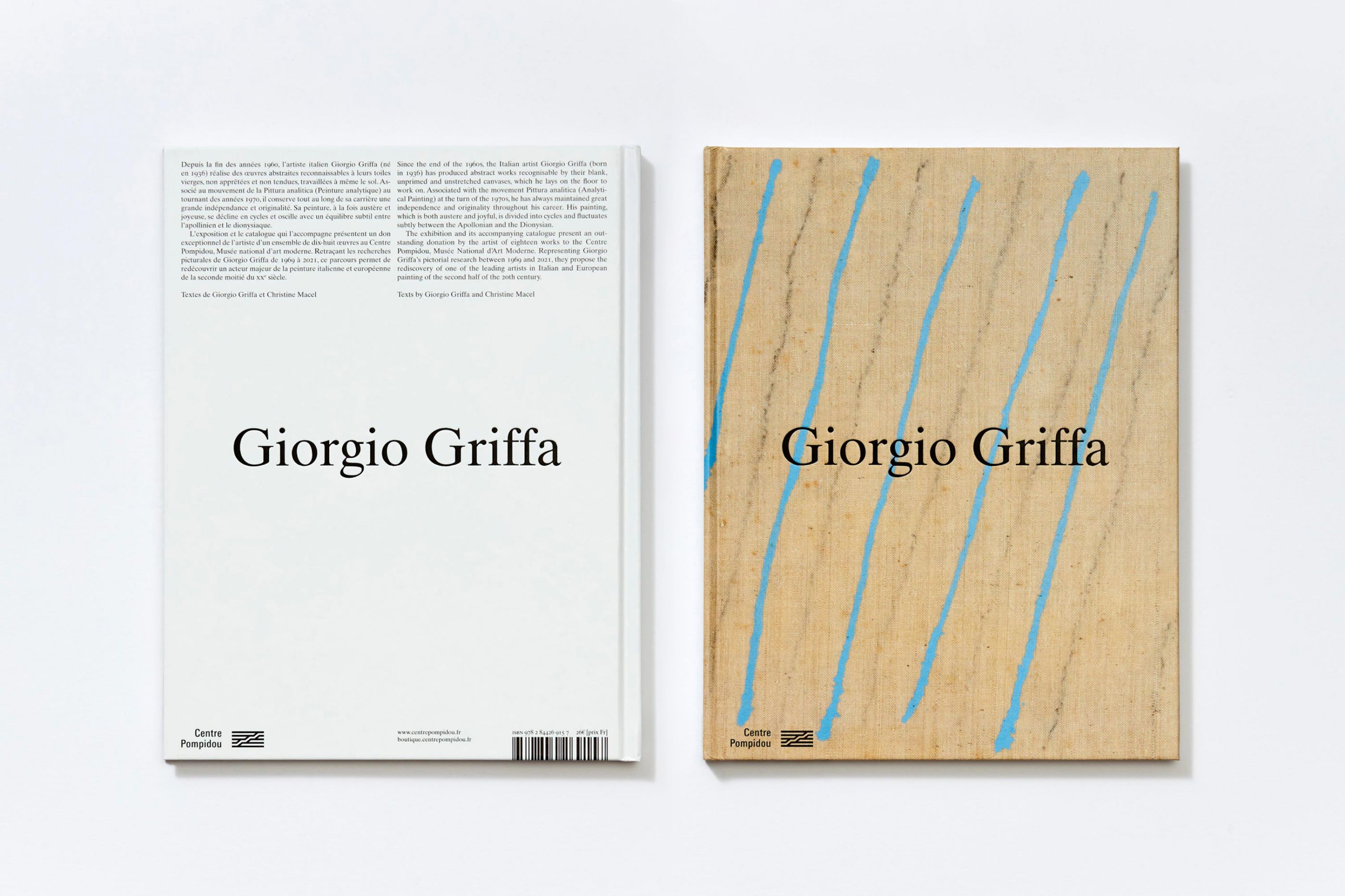
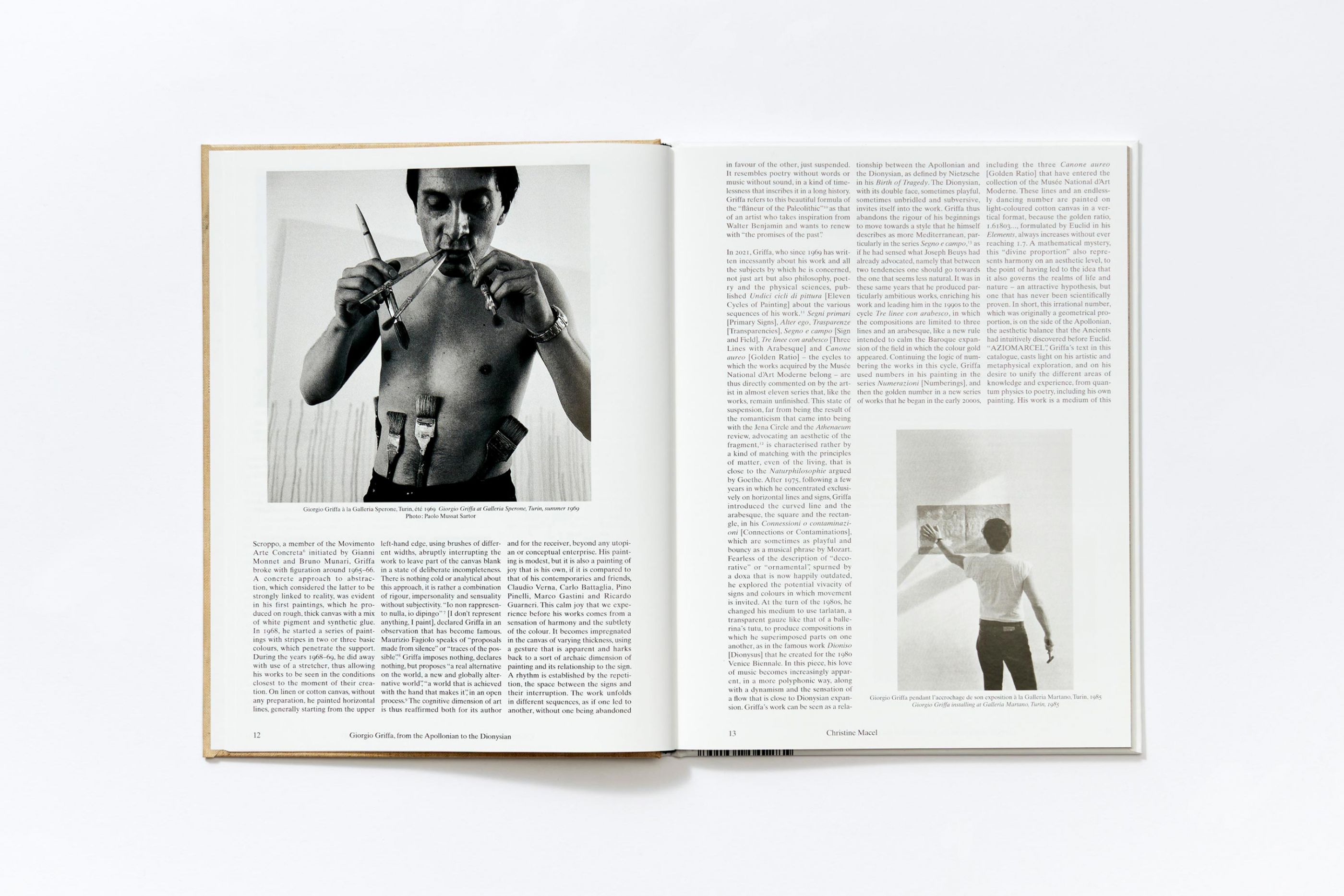
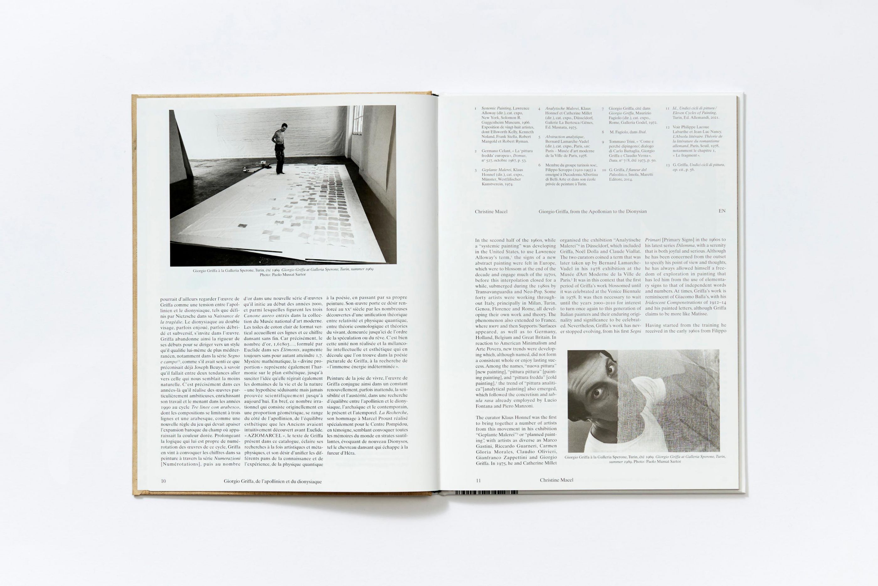
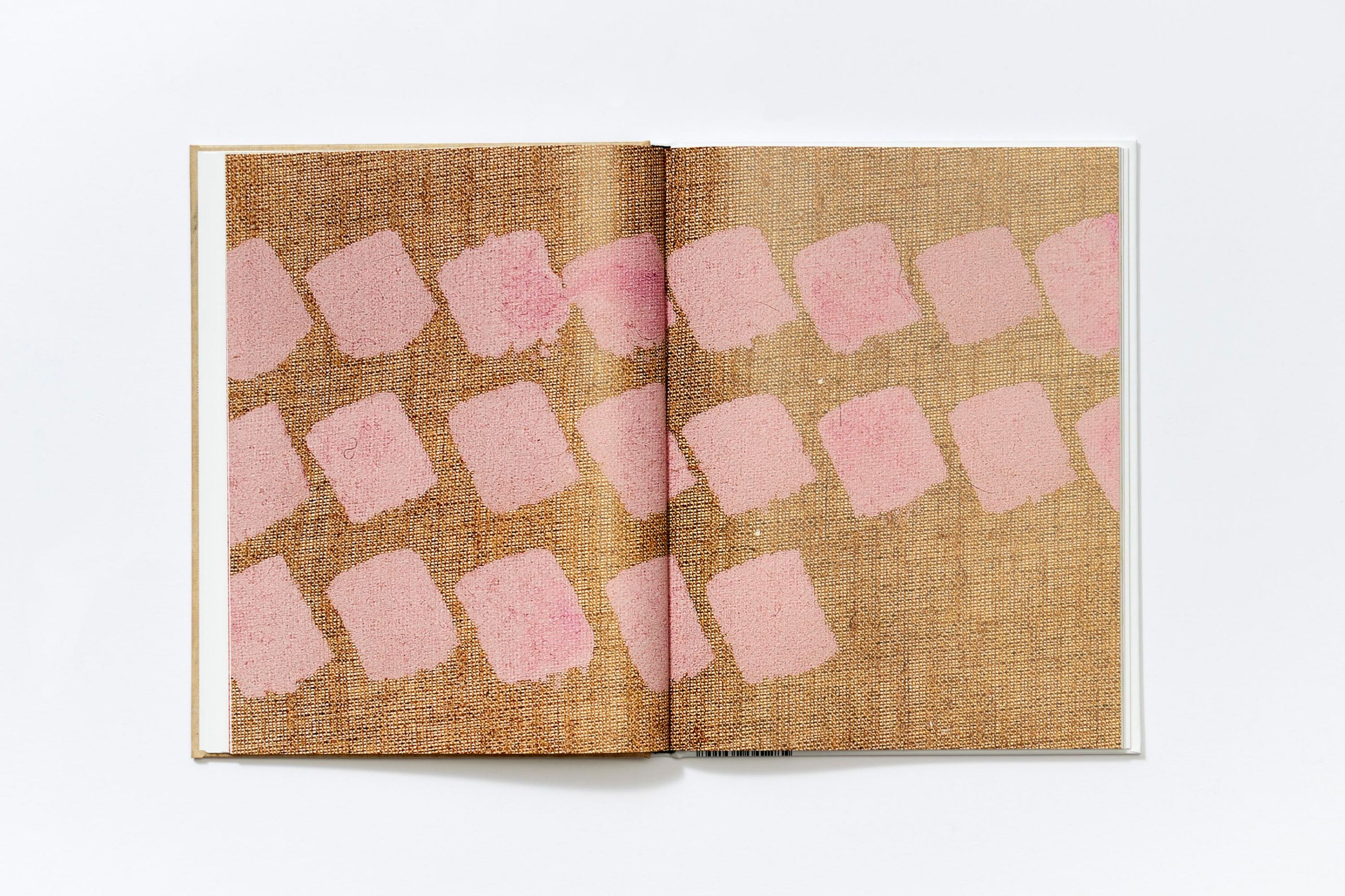
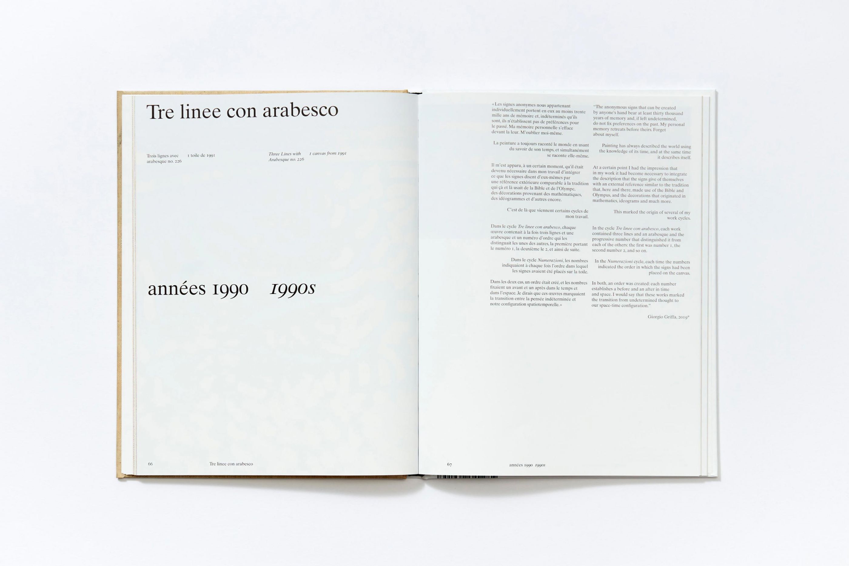
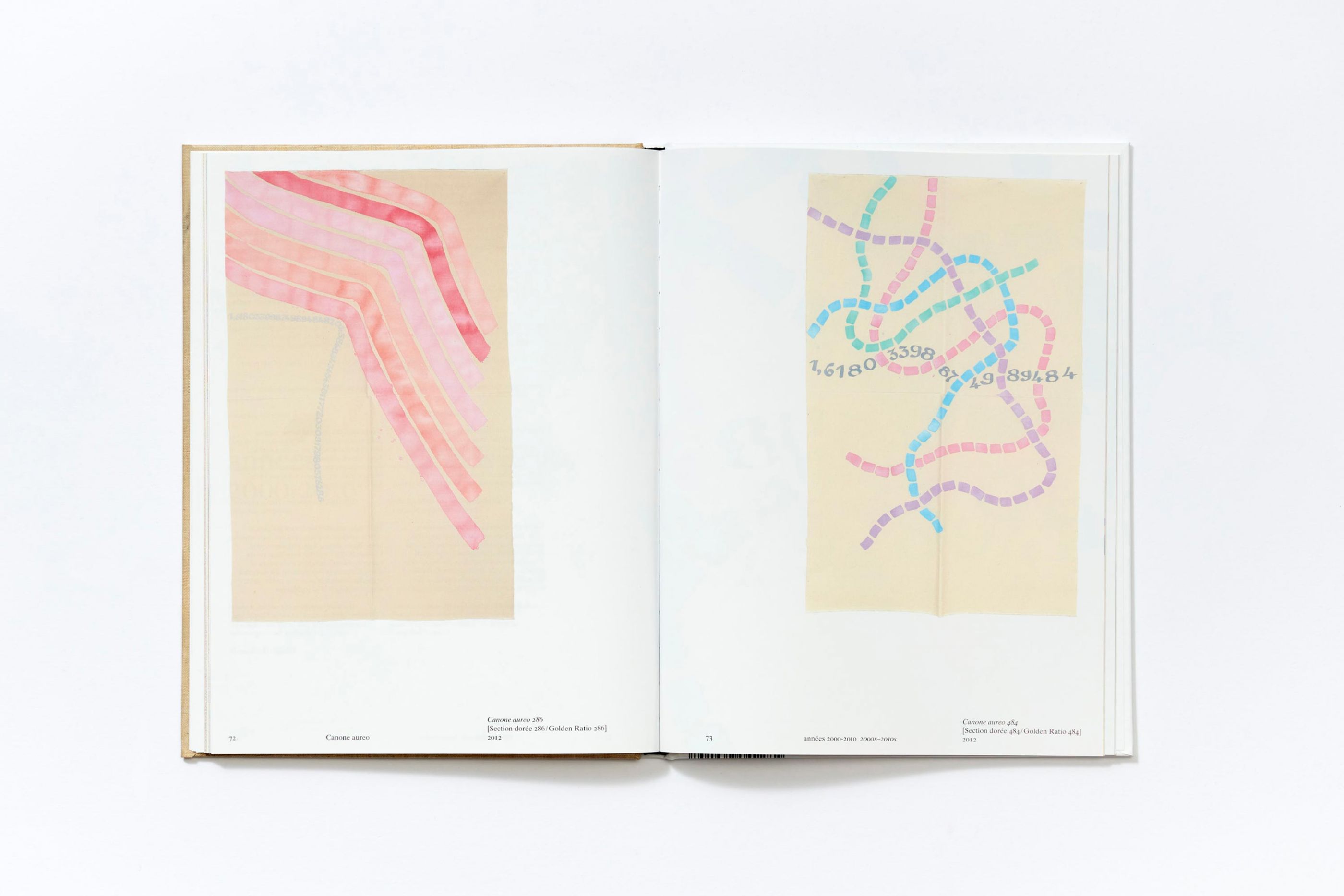
Giorgio Griffa, a leading figure in Italian abstraction in the 1970s, was the subject of an exhibition at the Centre Pompidou in spring 2022. In close collaboration with the exhibition's curator Christine Macel, we have designed this catalogue in the image of Griffa's radical and sensitive work. The catalogue presents a collection of eighteen works donated by the artist to the Museum.
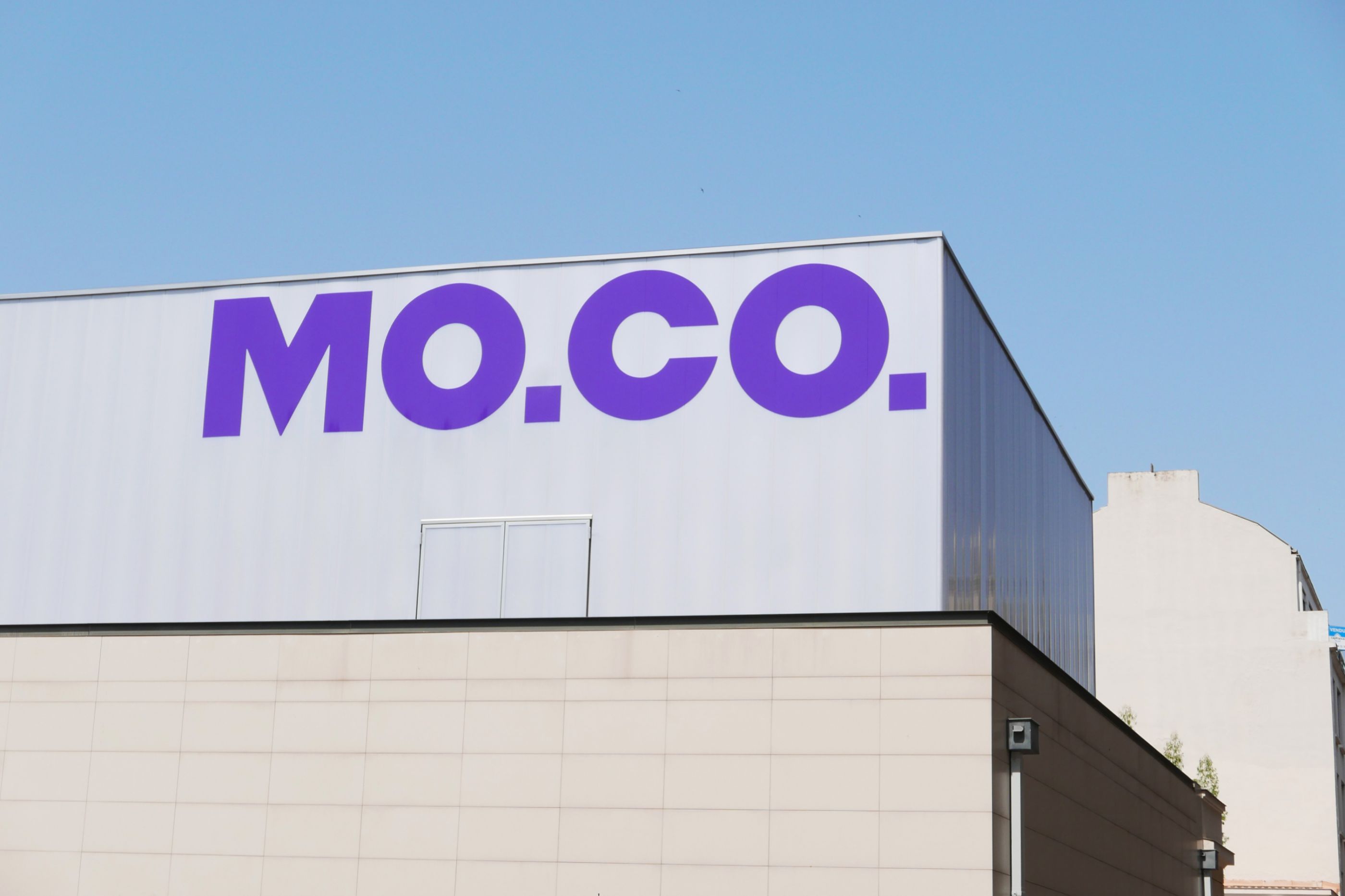
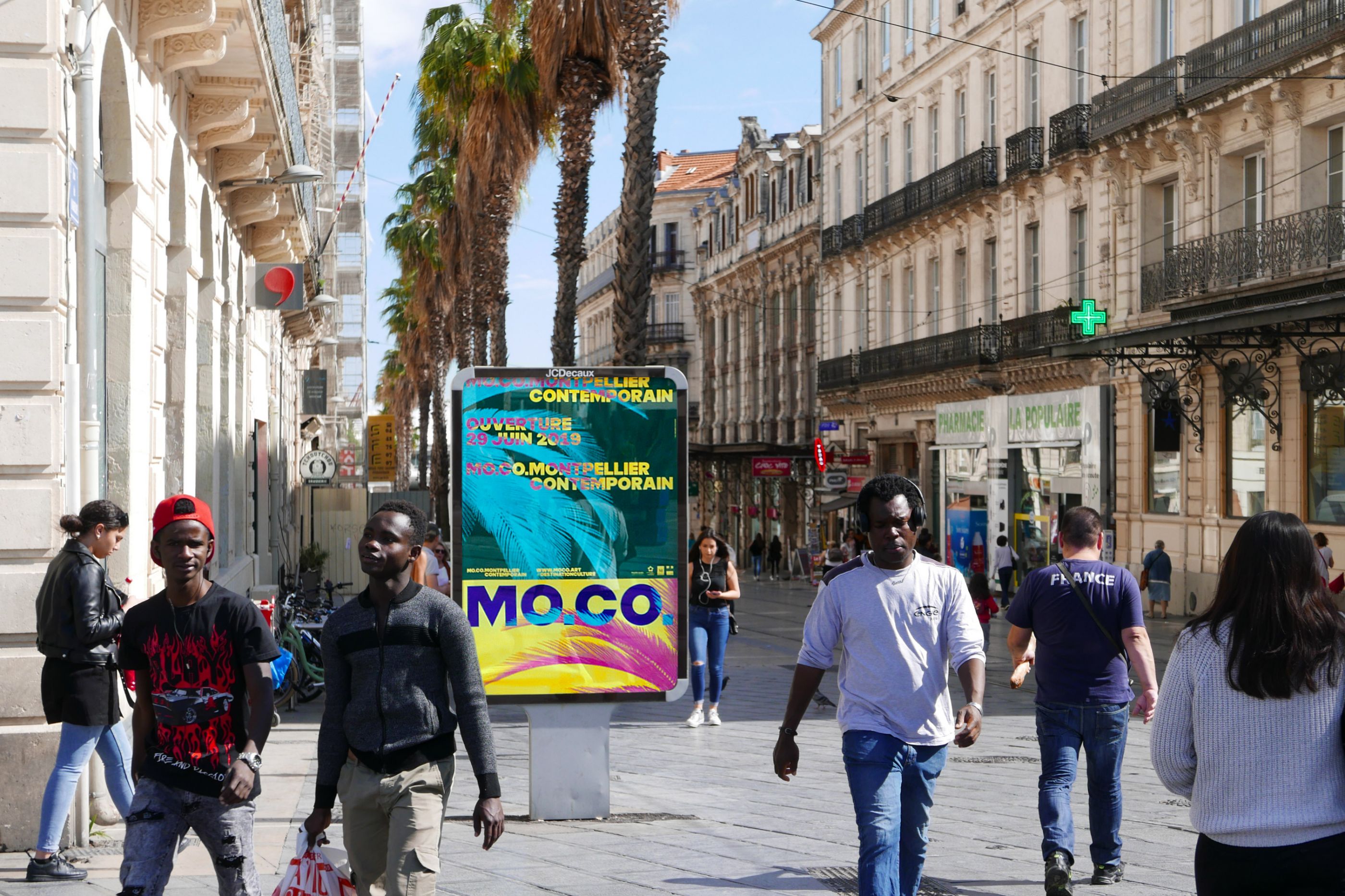
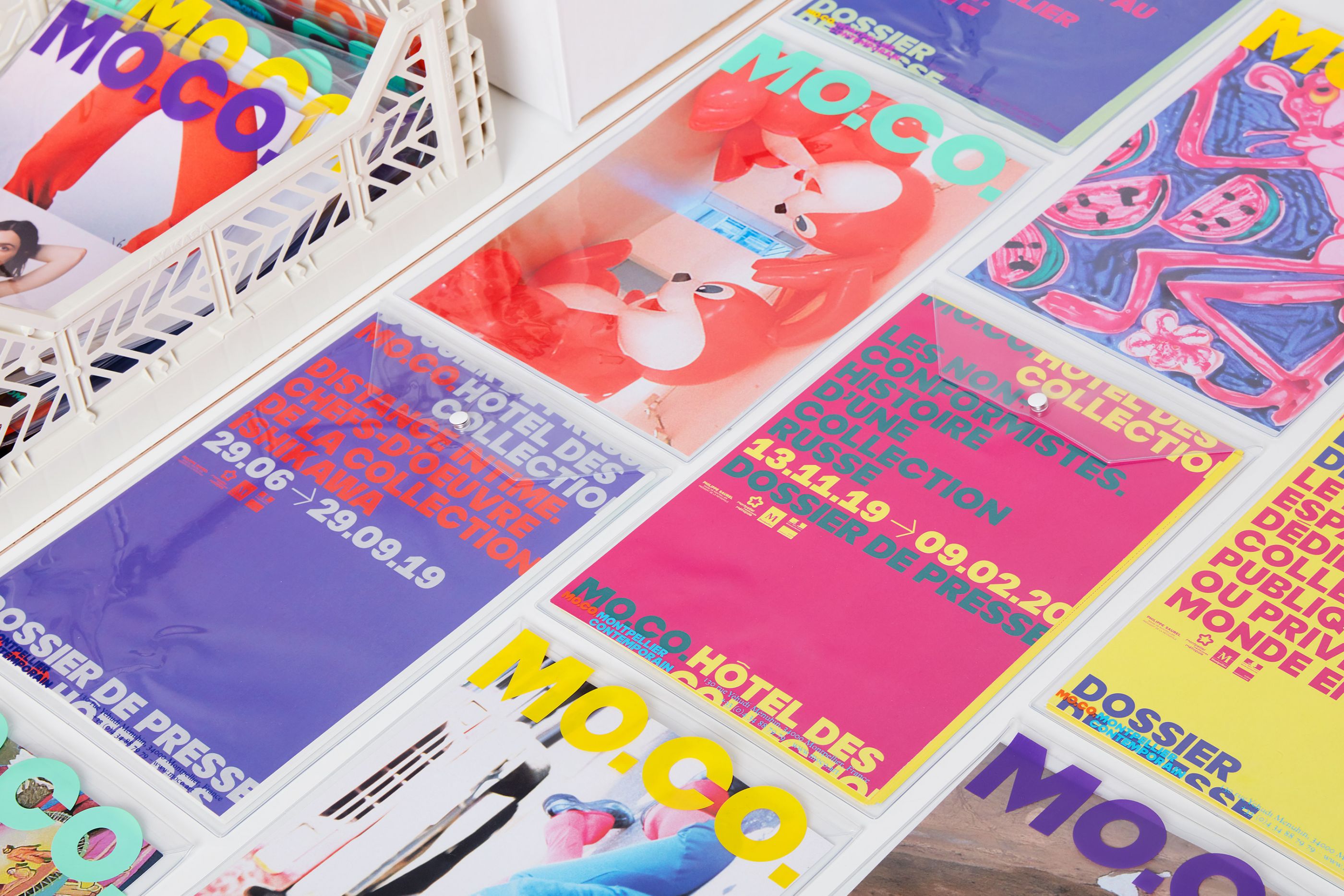
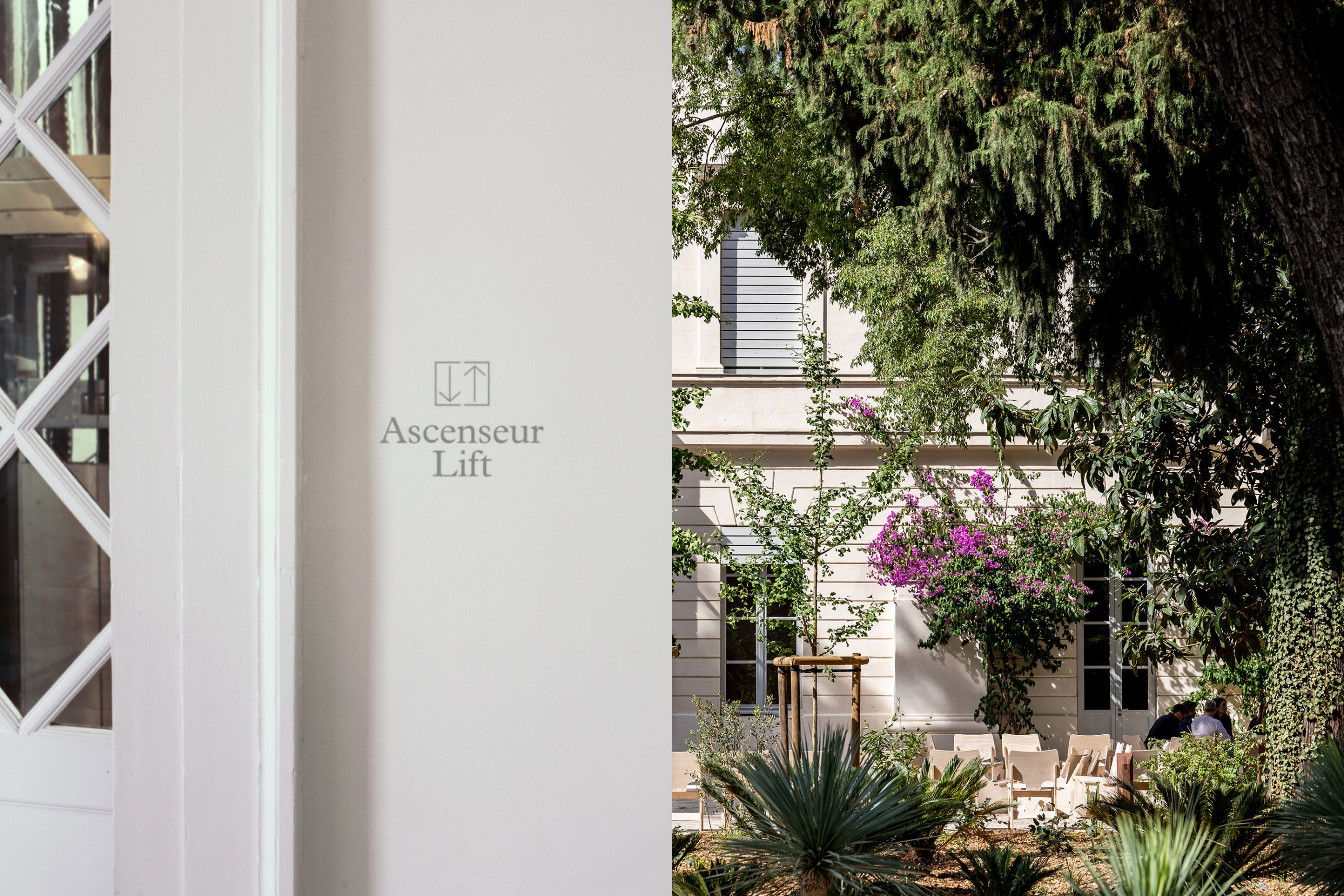
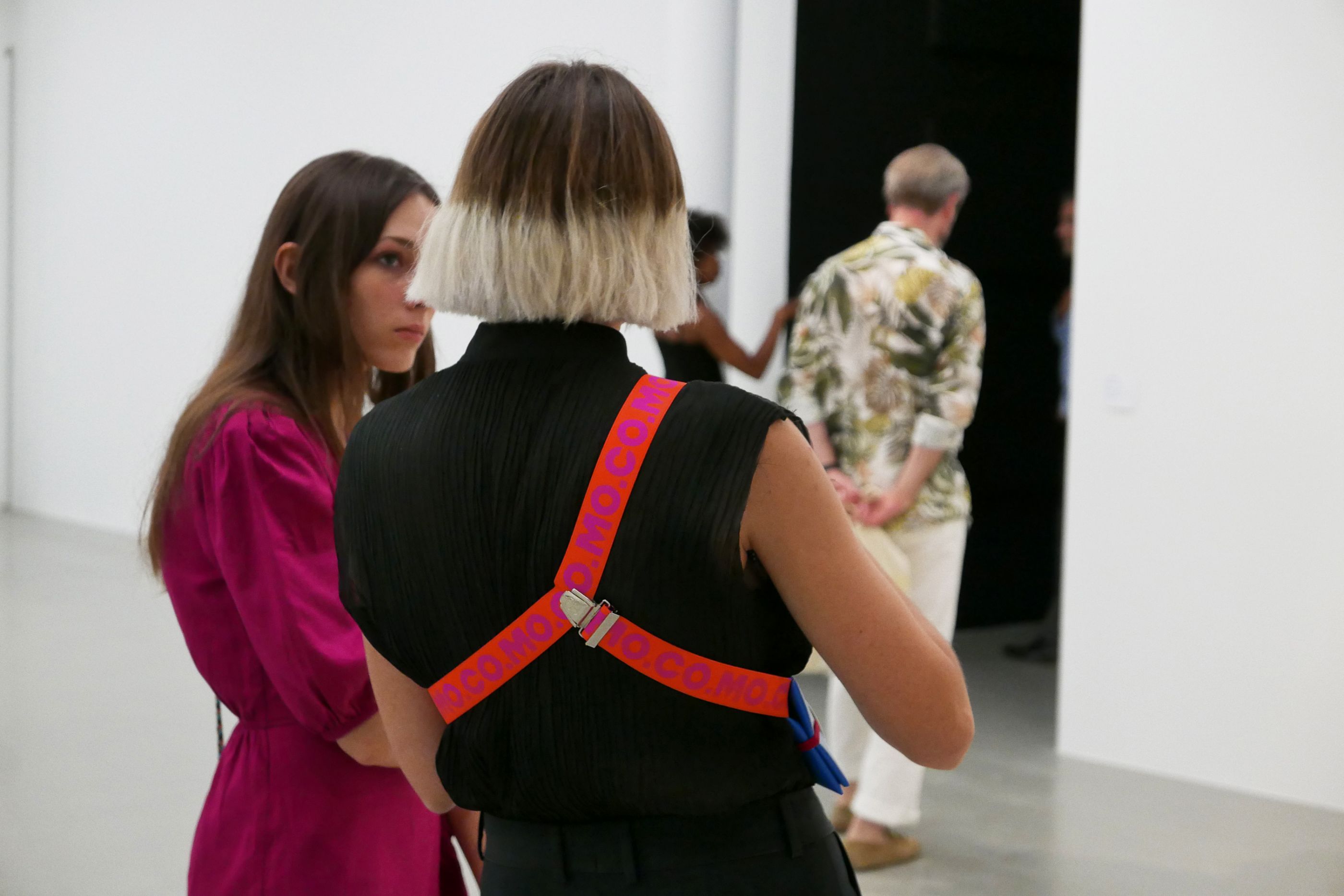
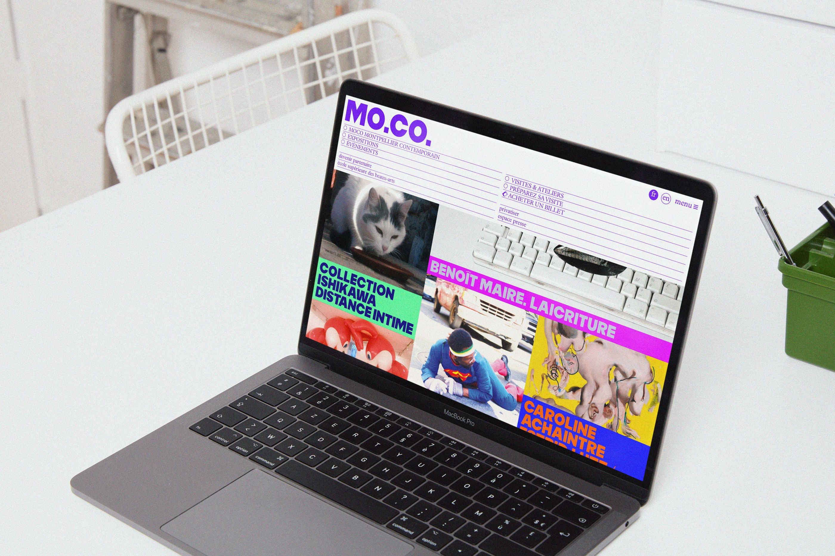
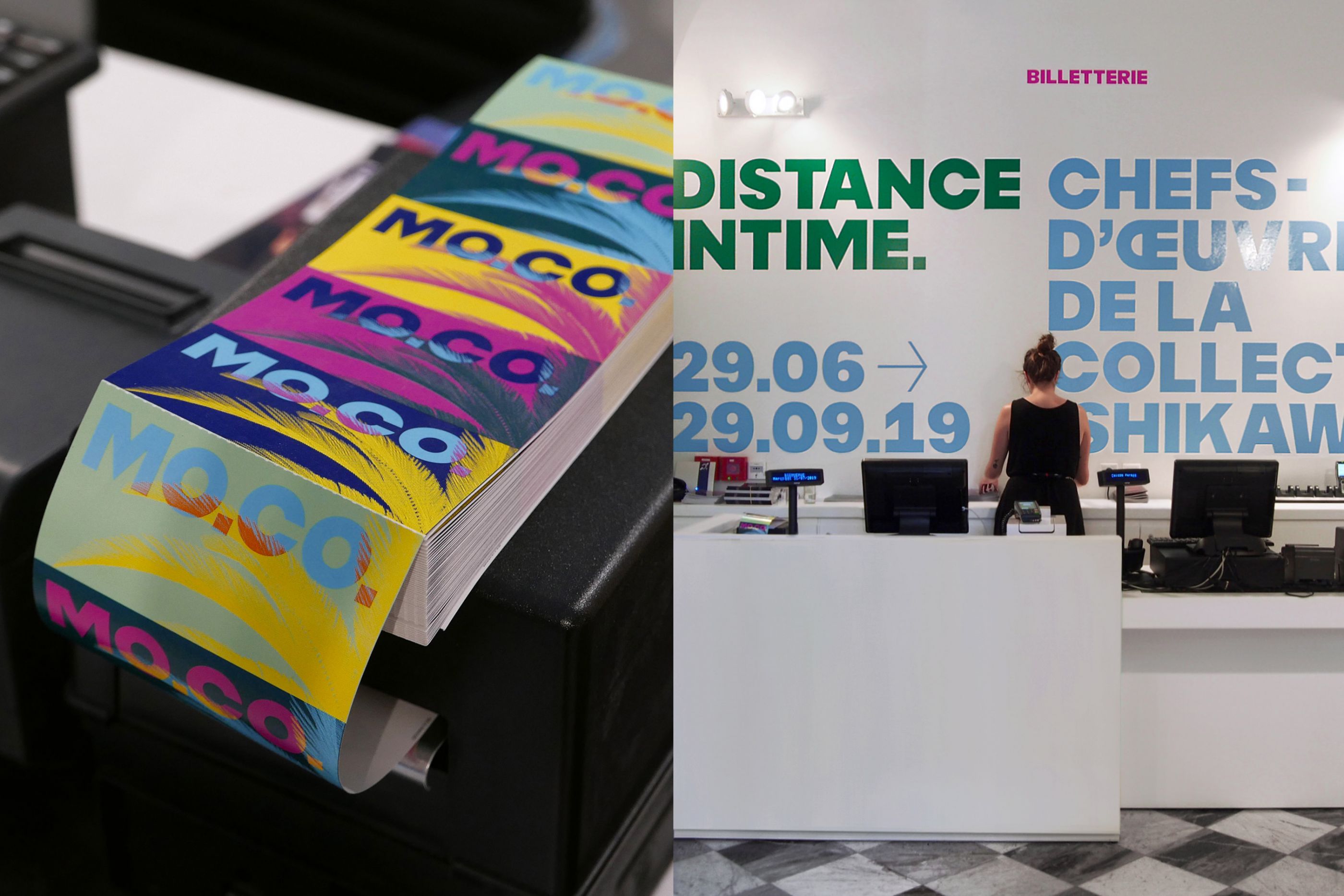
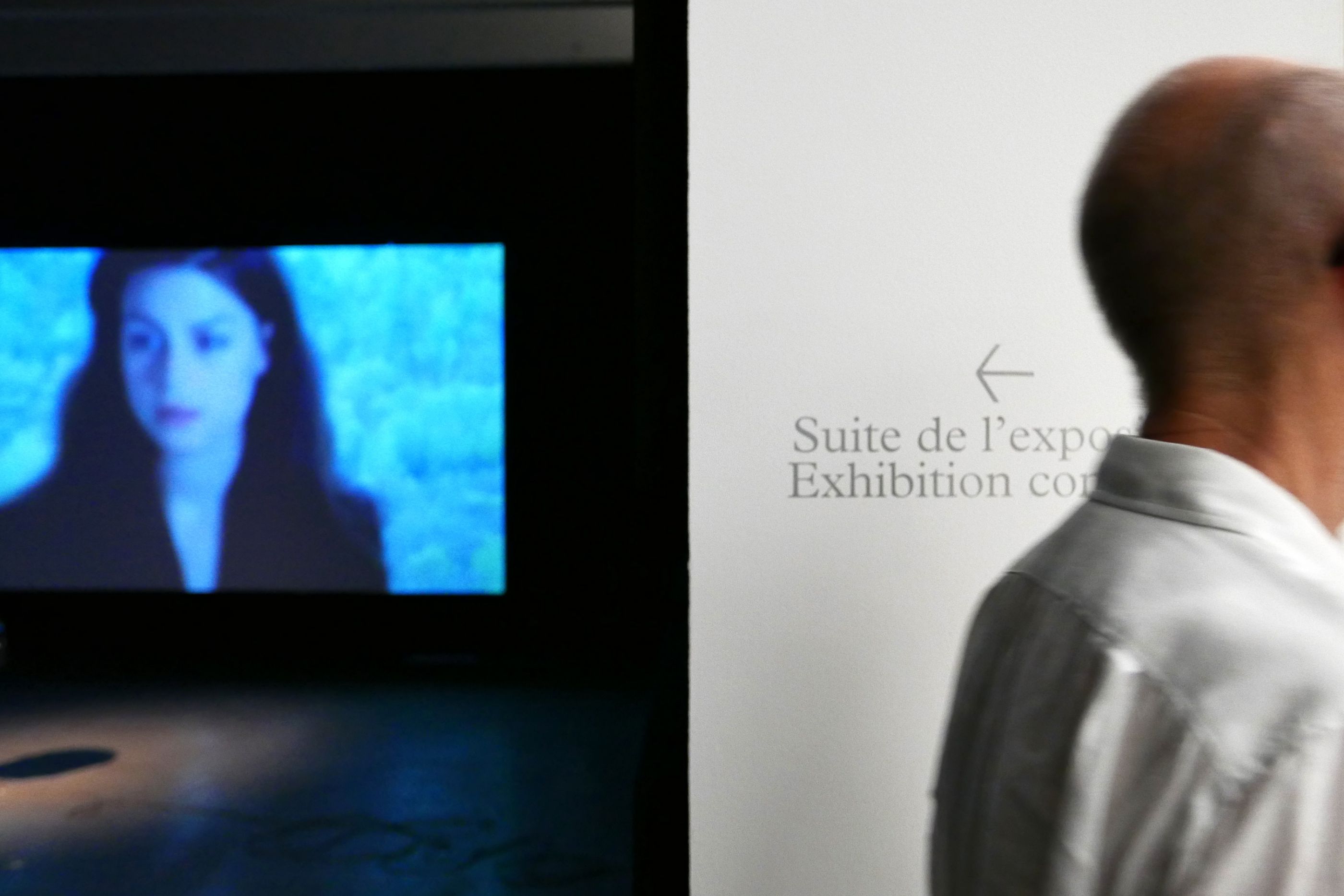
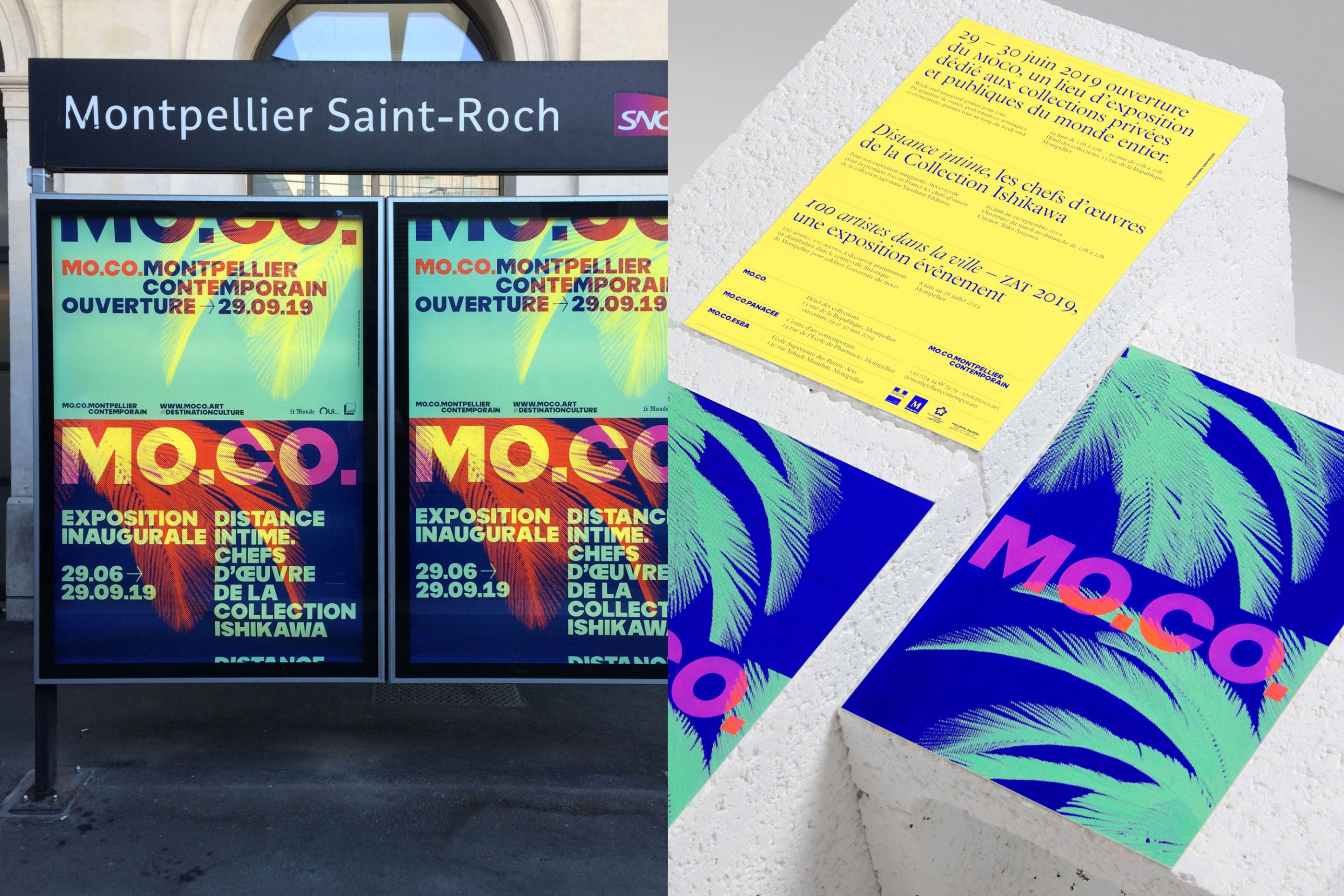
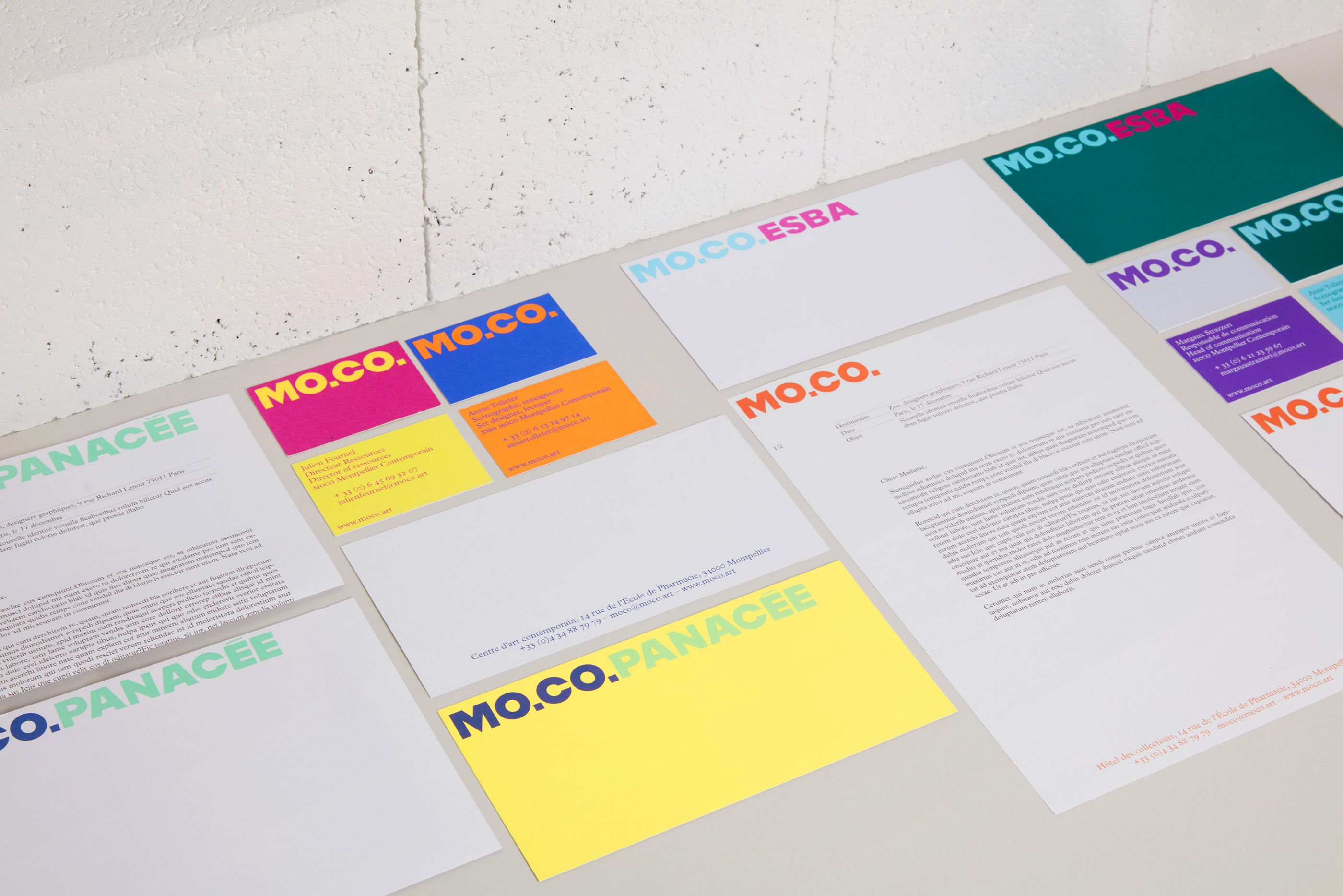
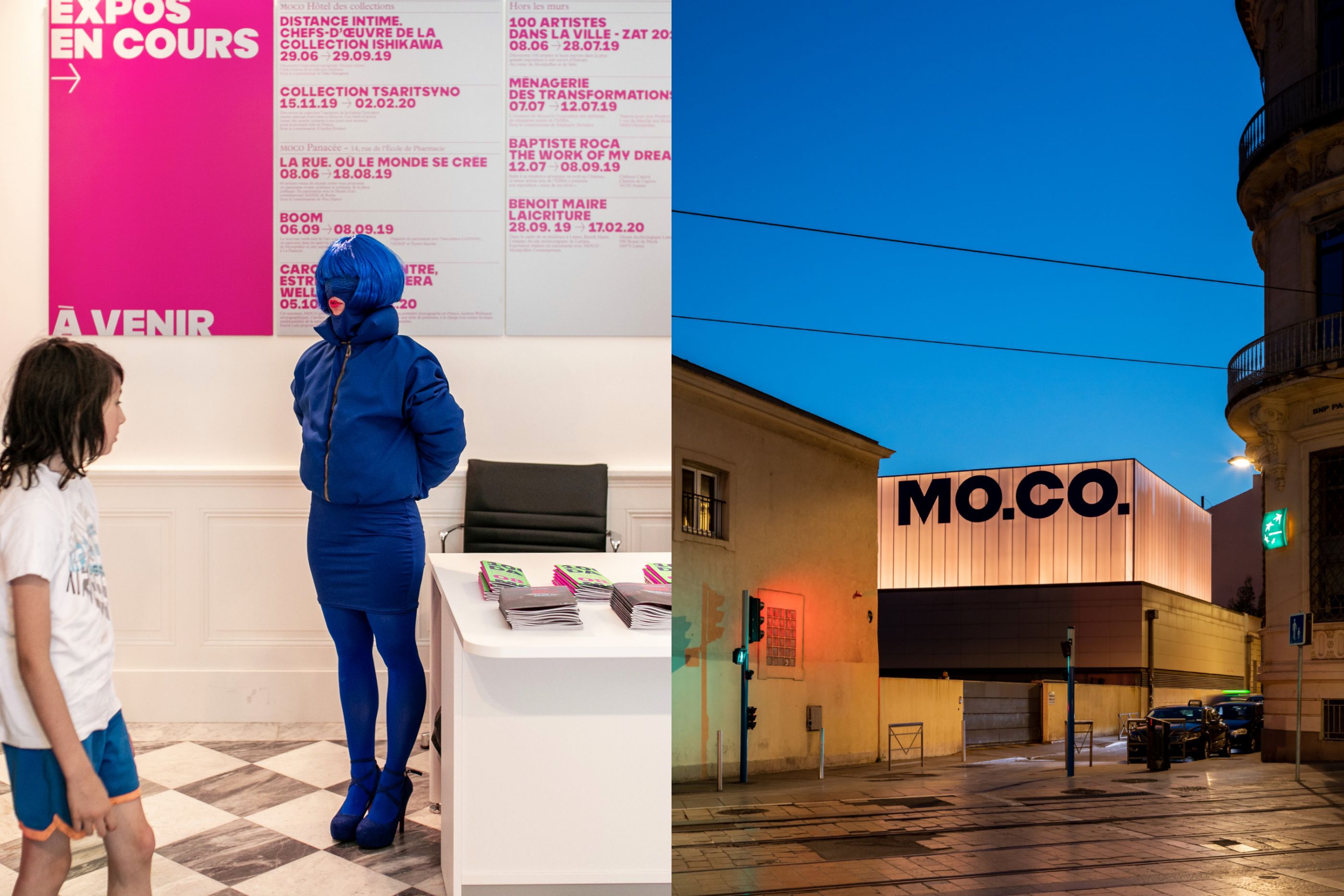
MOCO Montpellier Contemporain
/
MOCO Montpellier Contemporain
2019
Logotype, stationery, gtemplates, guidelines manual, signage, website, posters, leaflets, goodies, etc.
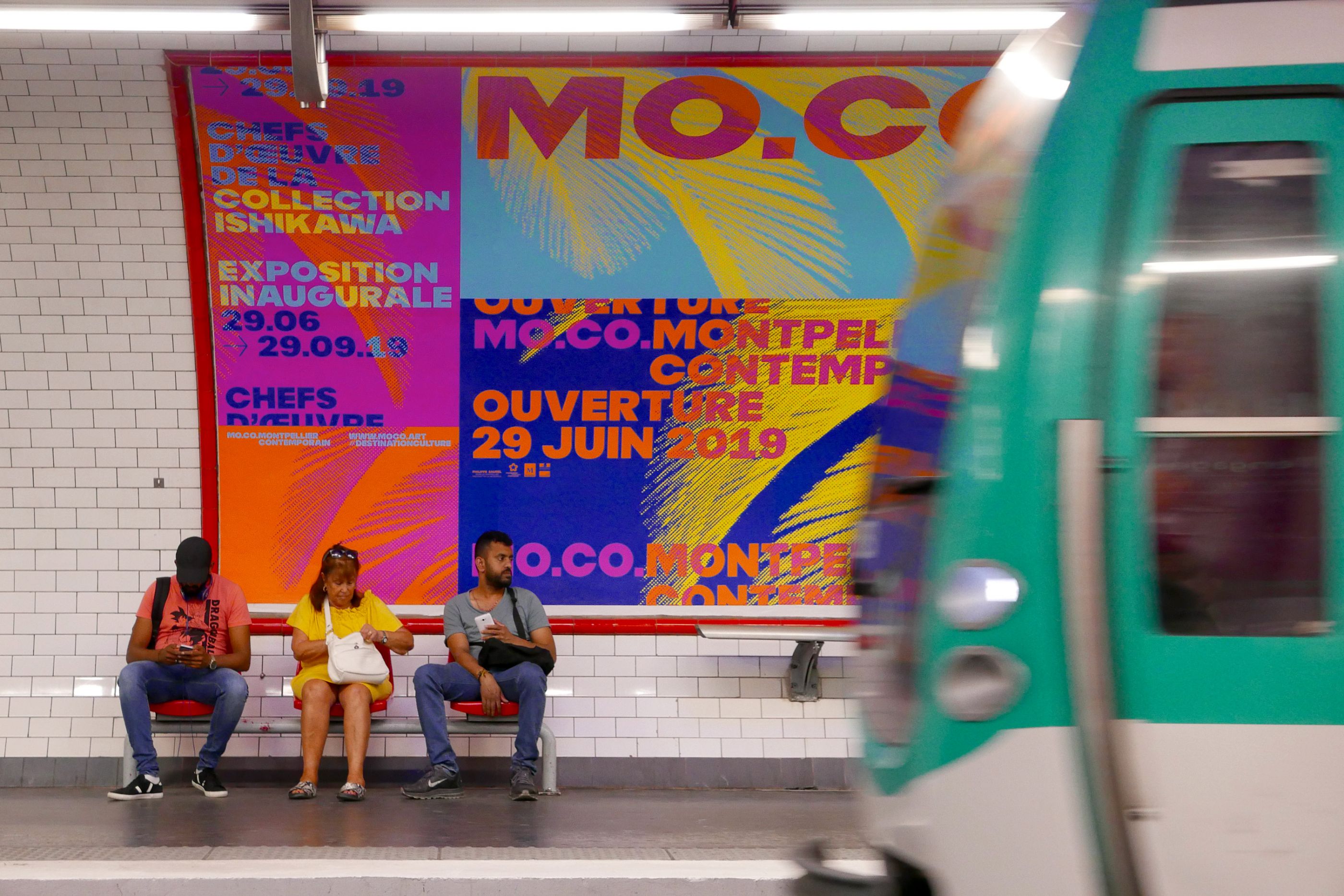
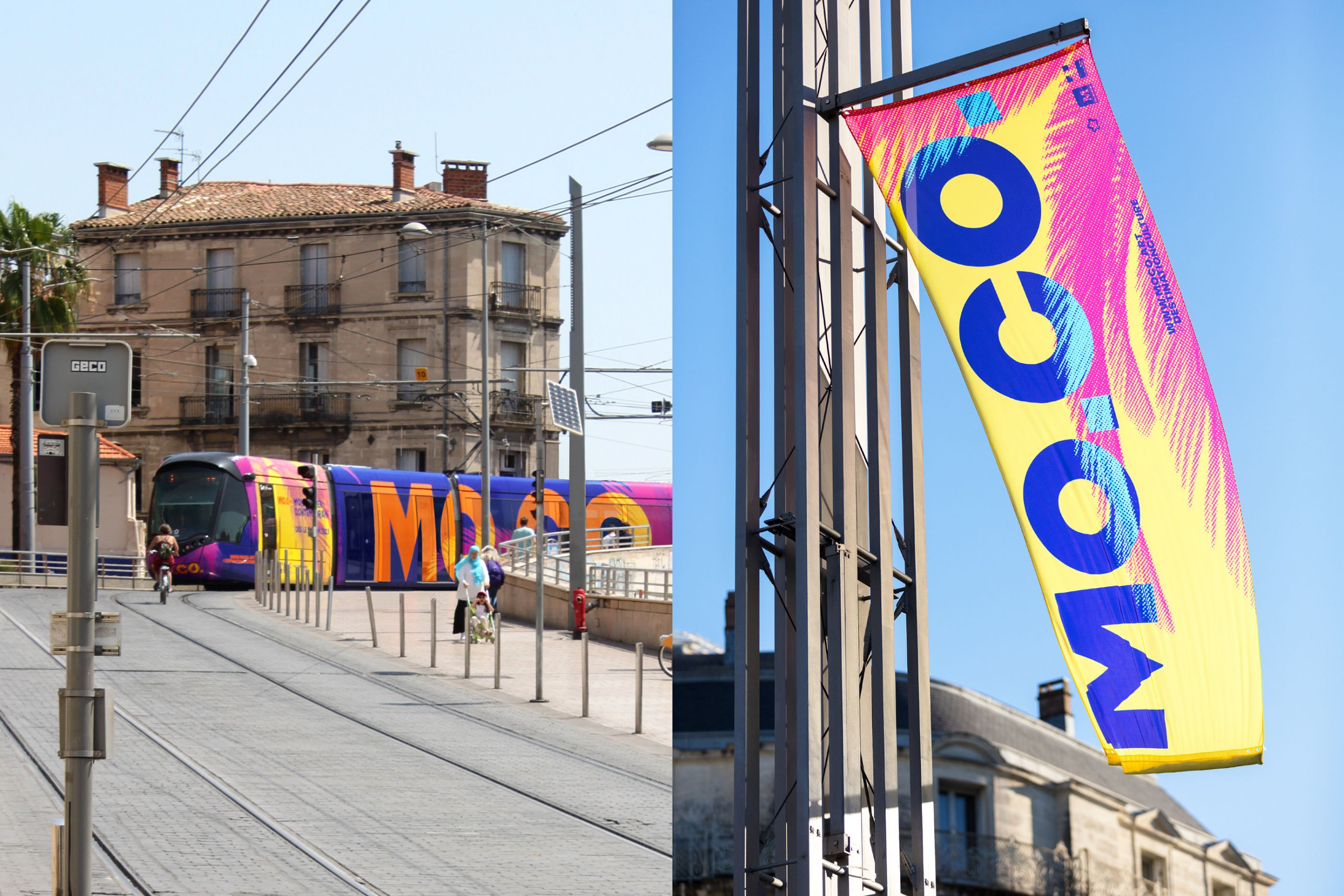
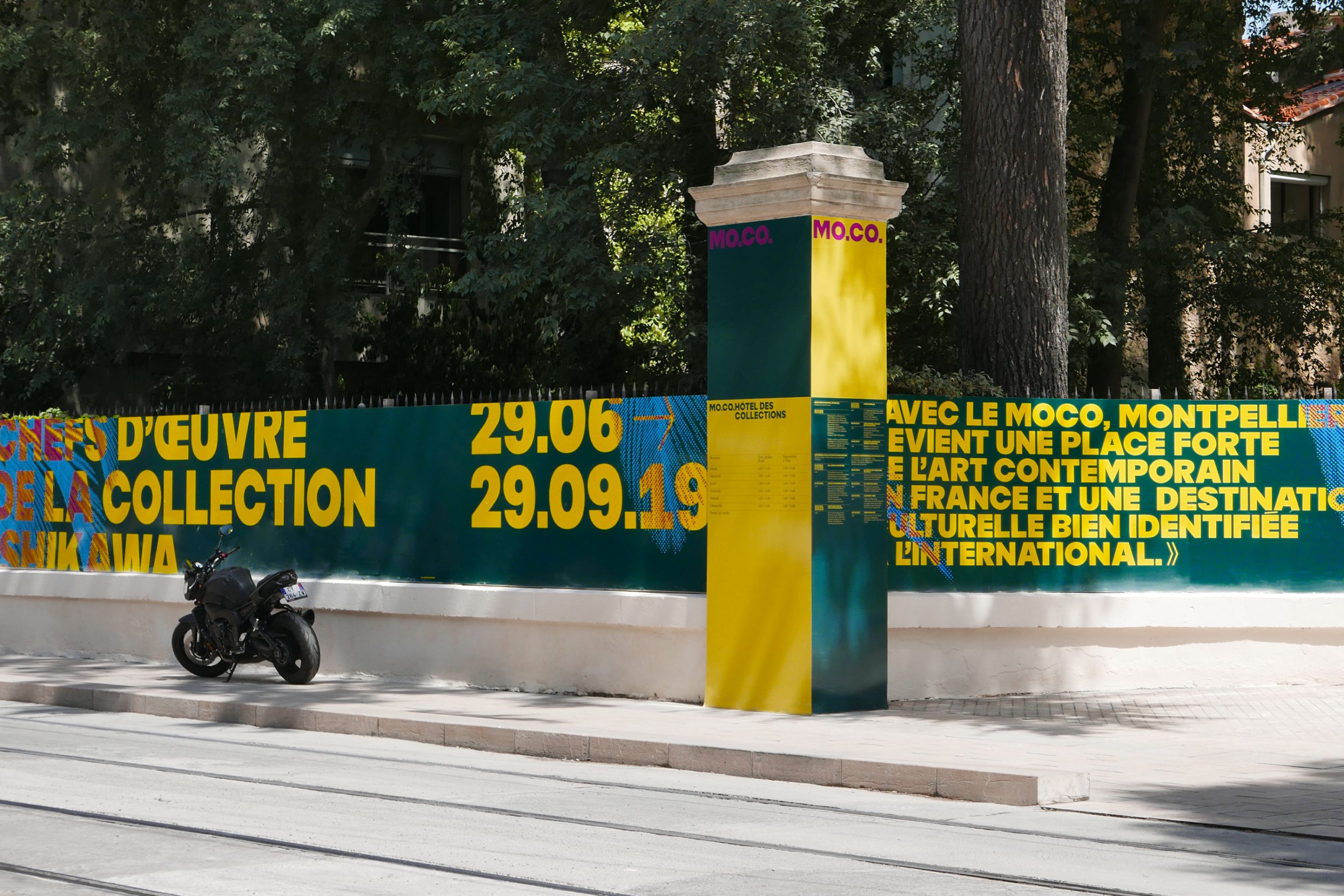
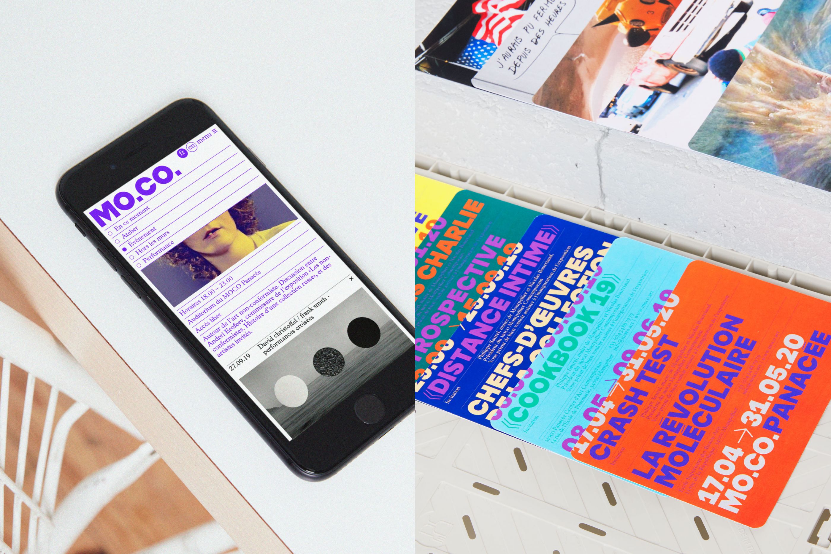
MOCO Montpellier Contemporain is a pioneering artistic project led by Nicolas Bourriaud. It is an artistic ecosystem bringing together the School of Fine Arts - ESBA MOCO -, the contemporary art center MOCO Panacée and the MOCO Hôtel des Collections, new location dedicated to international collections exhibitions. We have designed a global identity system including full graphic guidelines, the signage of the three places, the website and the campaign creatives - local and national - dedicated to the launch of this new artistic institution.
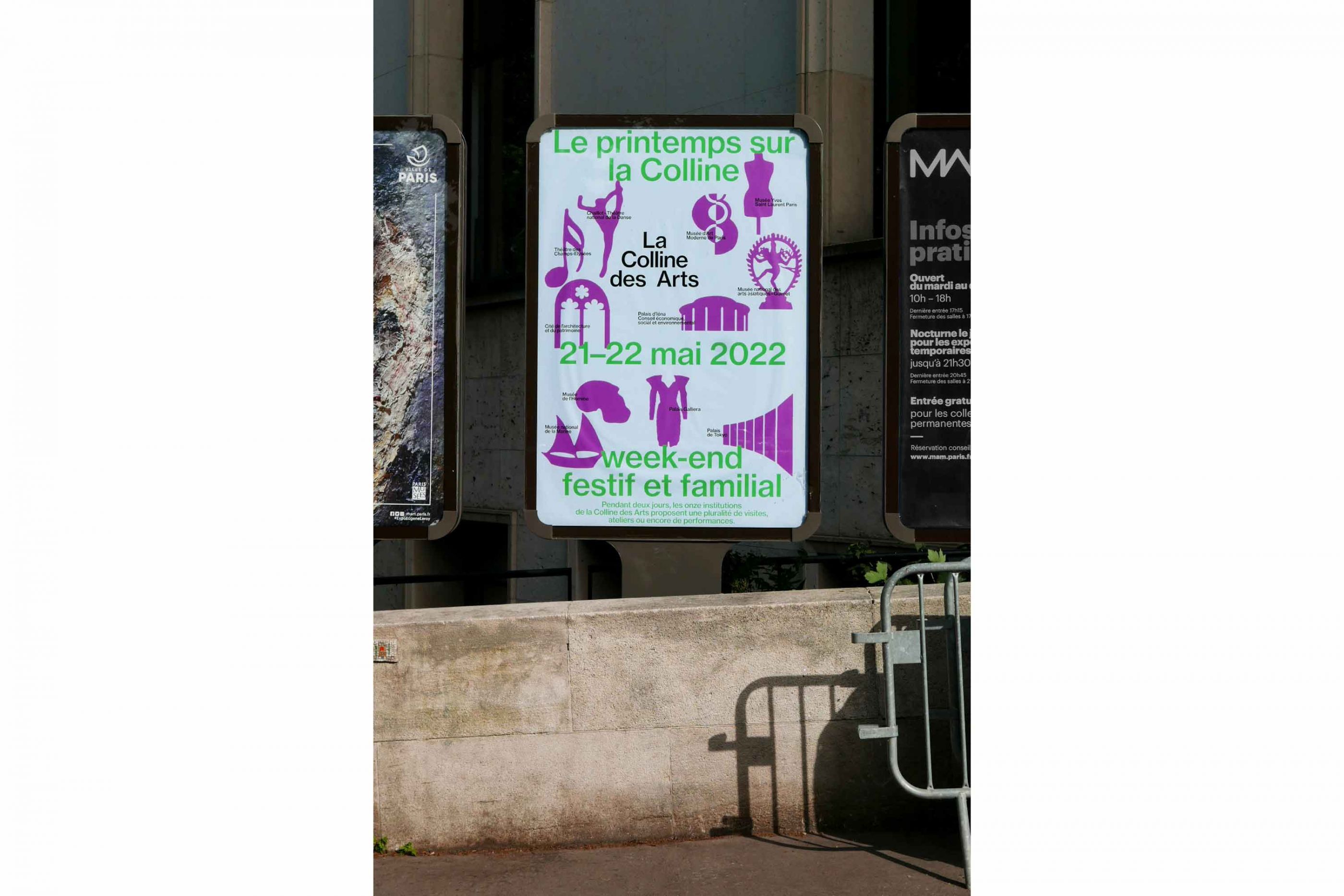
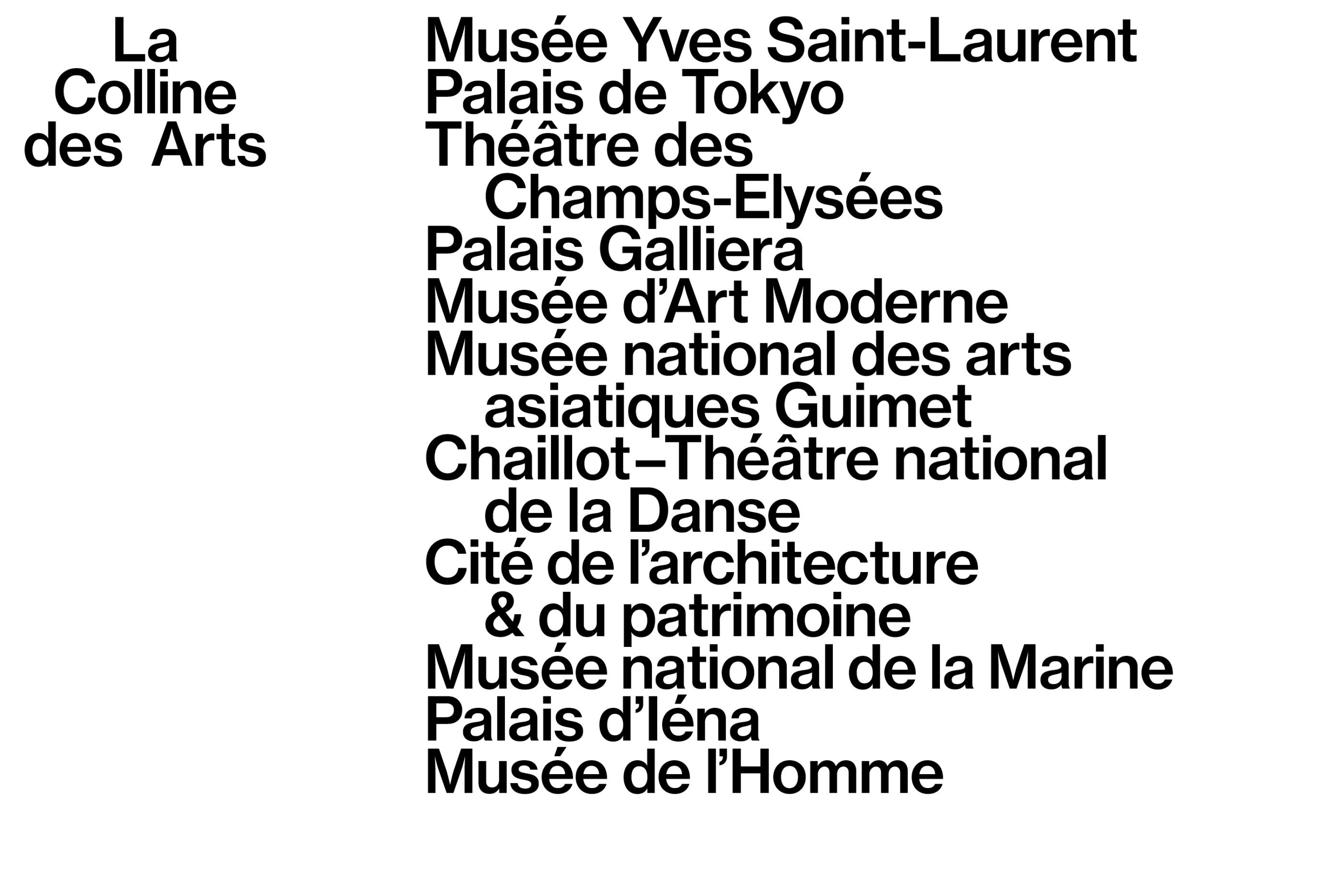
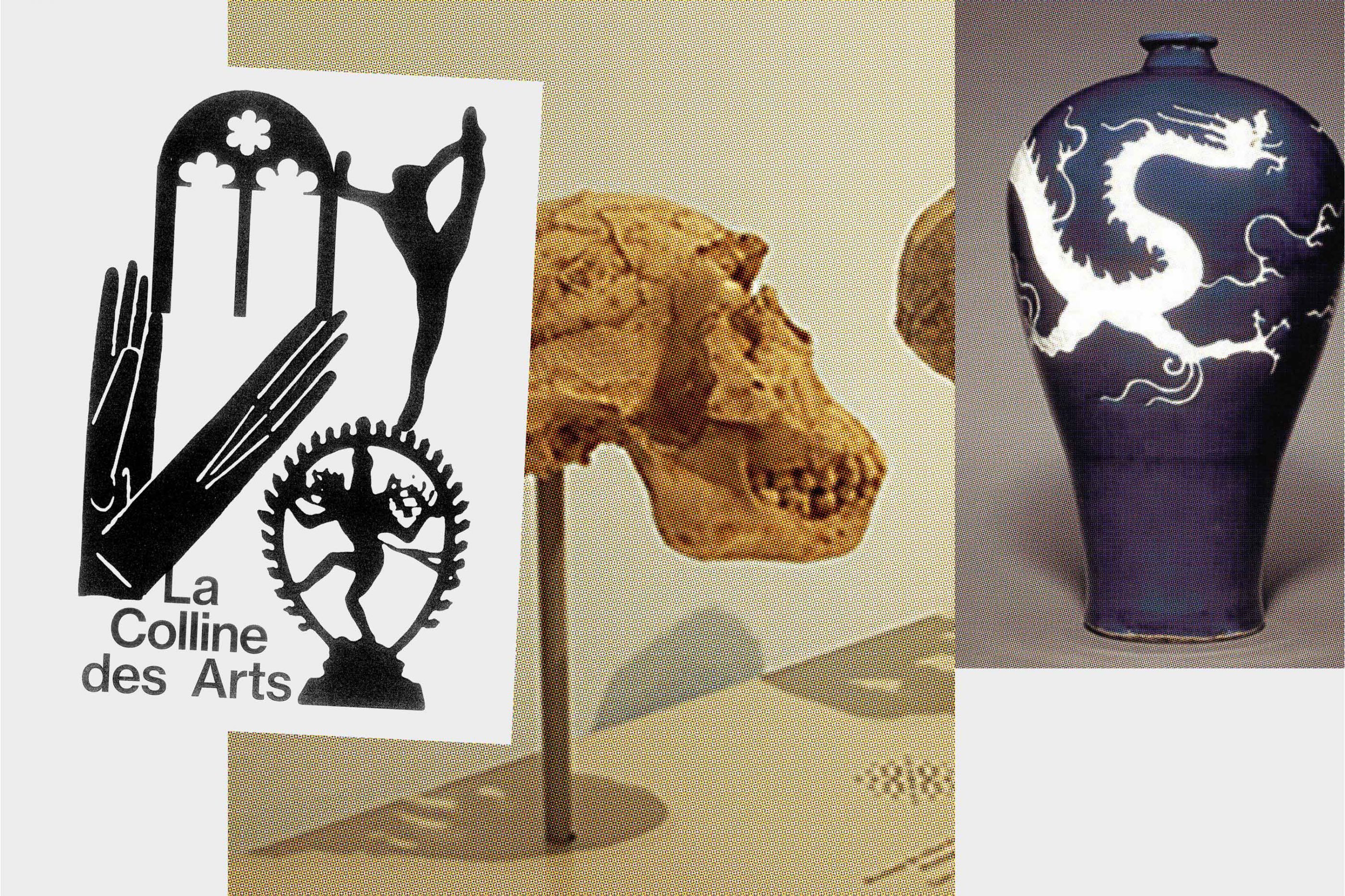
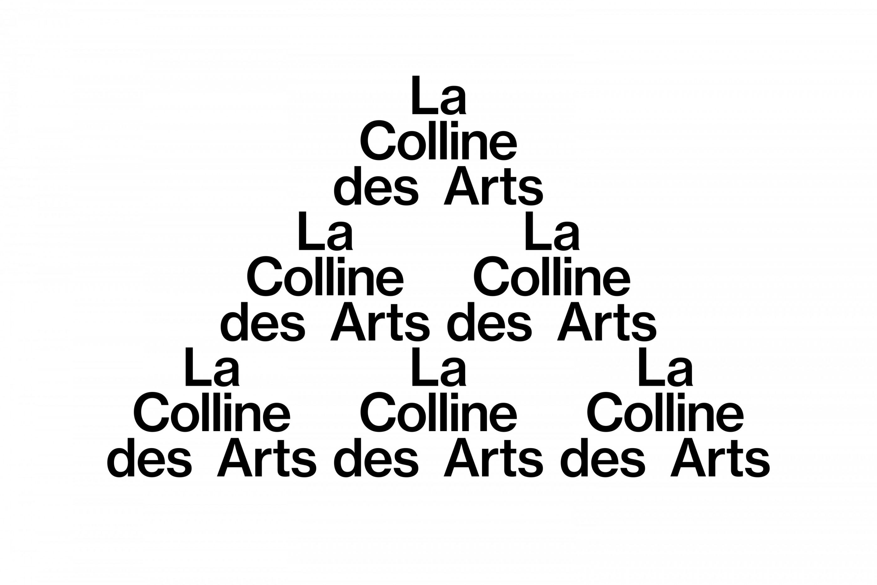
La Colline des Arts
/
11 museums in Paris 16th district
2021-2023
Visual identity, logotype, Print, pictogram
Following the example of Berlin's Museuminsel or Vienna's MuseumsQuartier, eleven cultural institutions located on the Colline de Chaillot have joined forces to form La Colline des Arts network. We designed the logotype and the cartography of this network, as well as various communication campaigns.
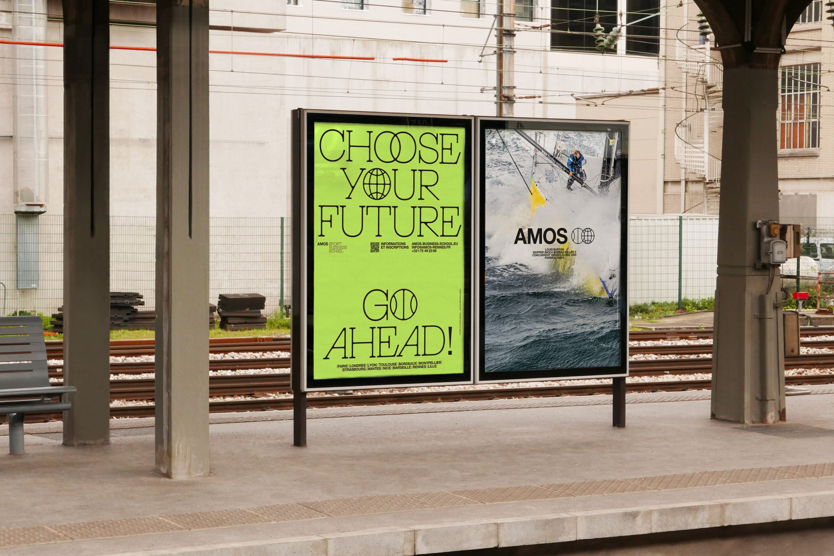
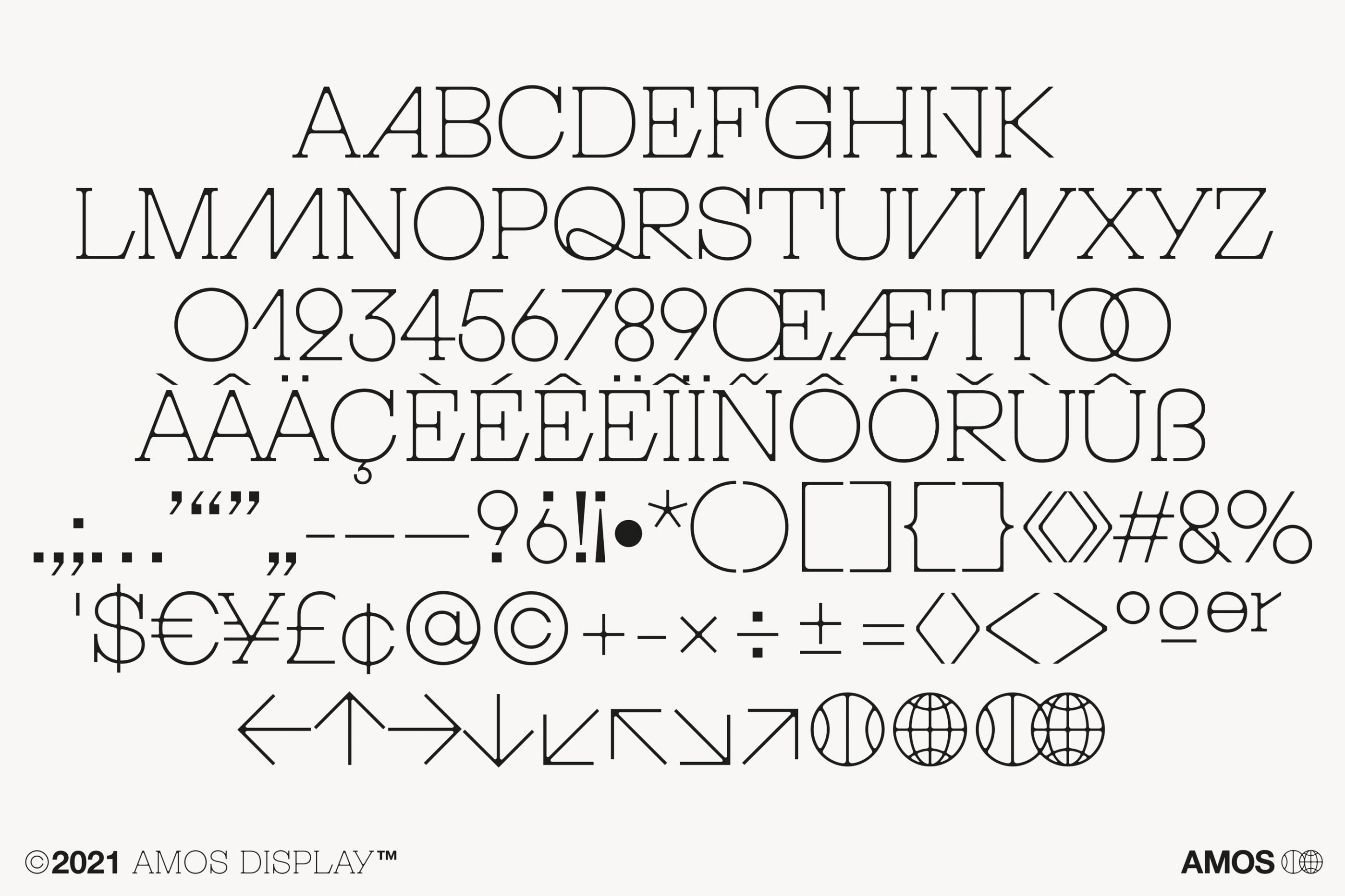
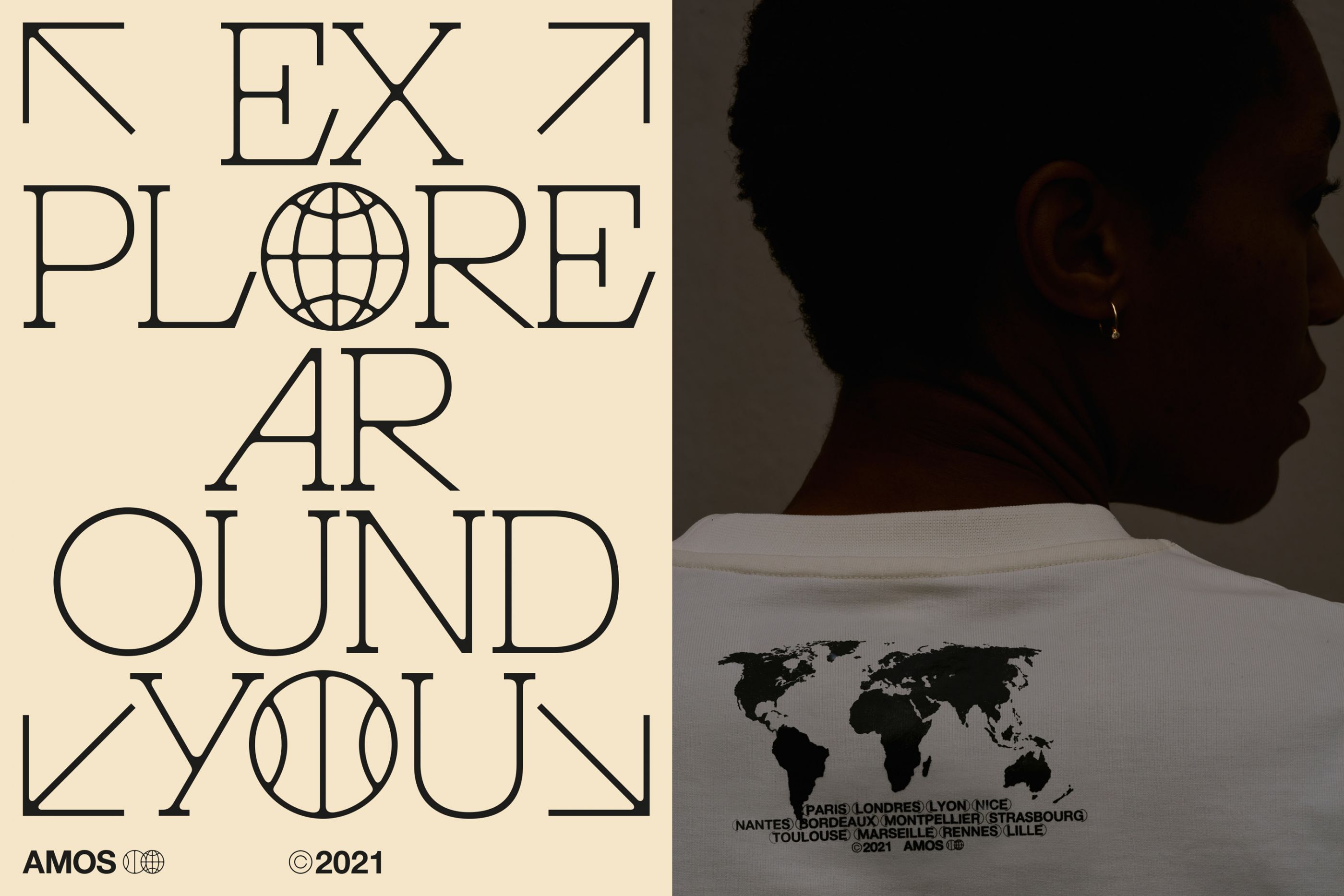
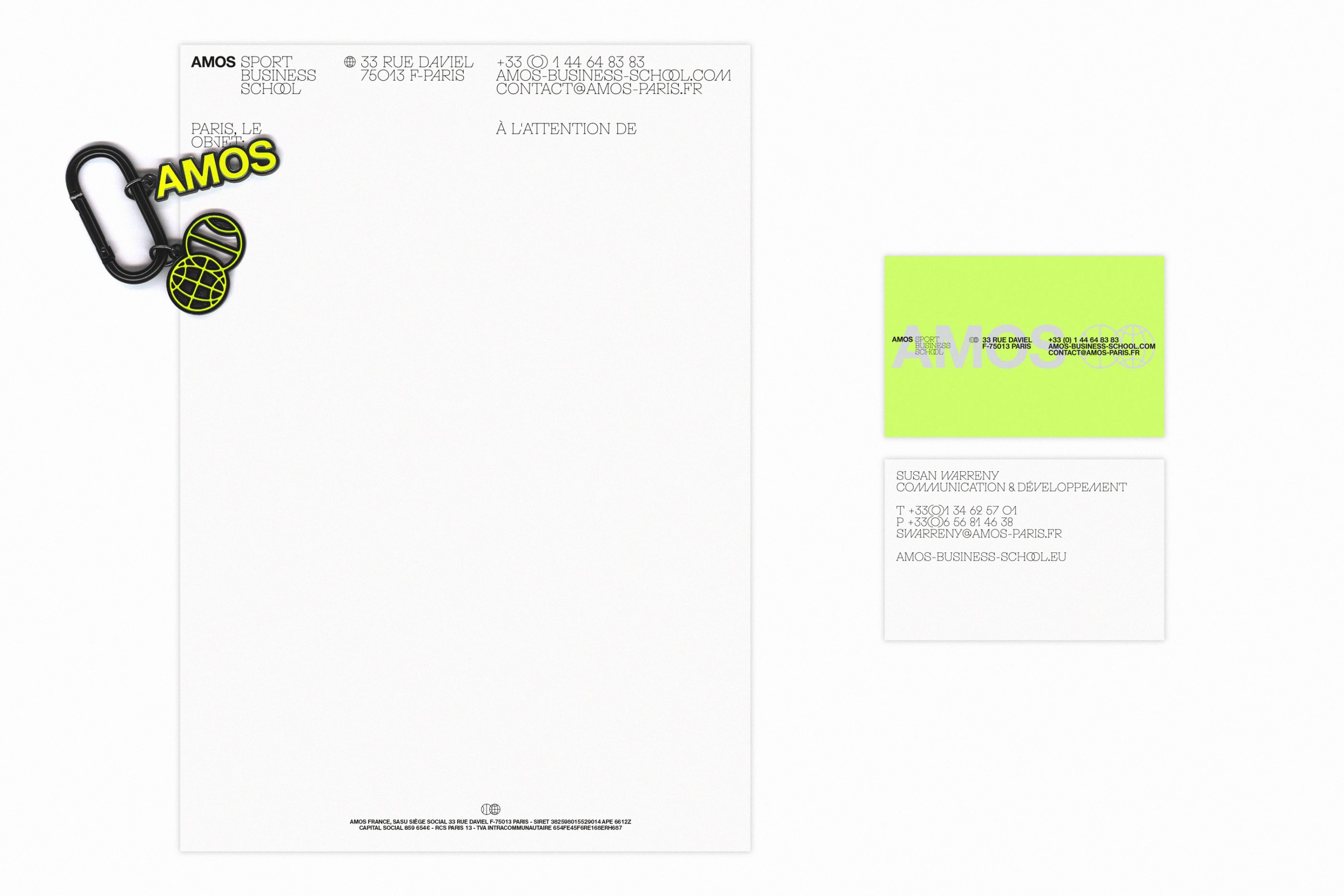
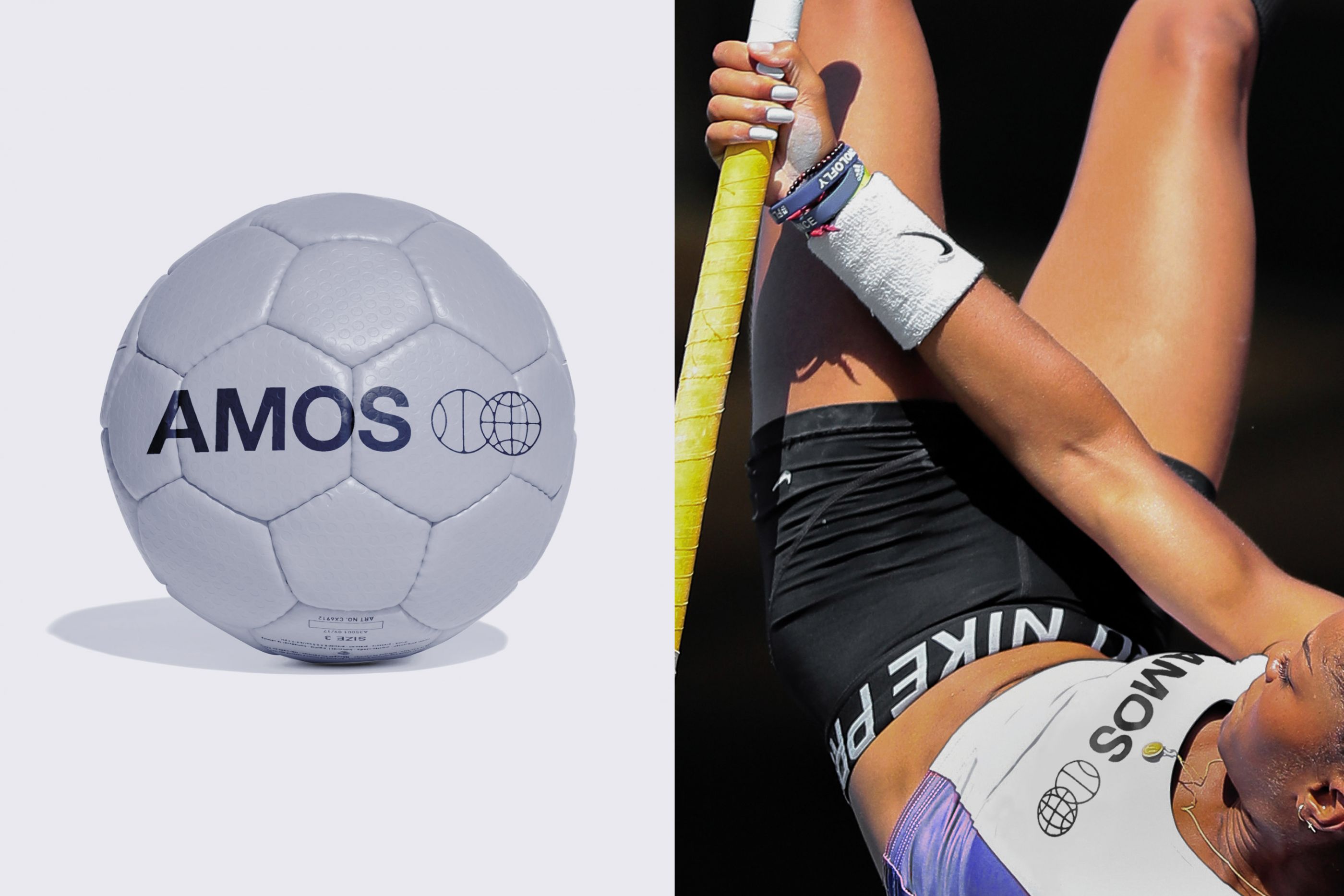
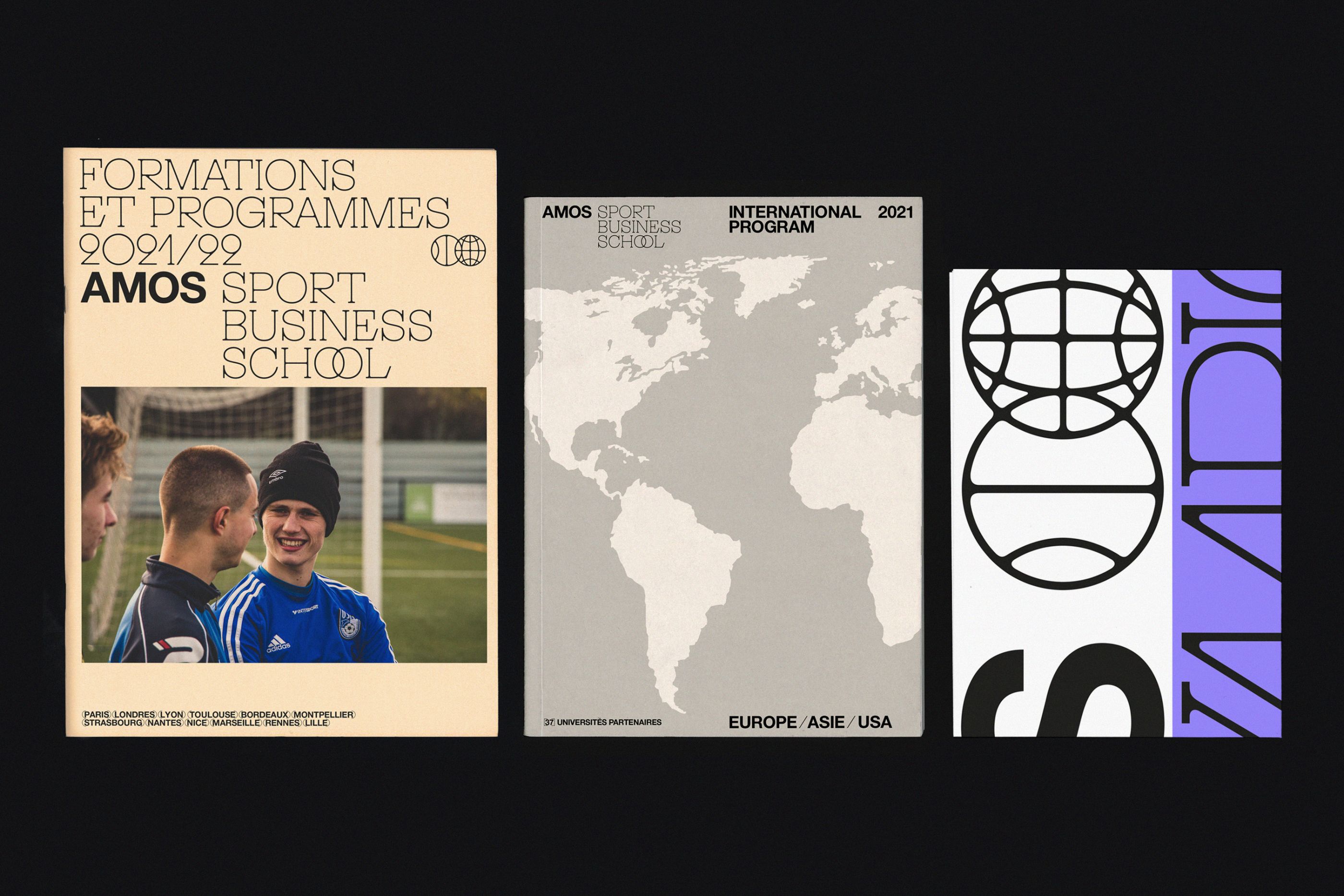
Amos Sport Business School
/
Amos Sport Business School
2021
Logotype, typeface, templates, guidelines manual, posters, leaflets, goodies, etc.
Global redesign and graphic identity of this business school specializing in sports, which has 12 campuses in Europe.
We have developed an exclusive typeface as well as a set of adapted and dynamic communication tools. Our challenge is to redefine an institutional and dynamic tone, in the service of an approach focused on the international scene and aware of the major sporting challenges of the world of tomorrow.
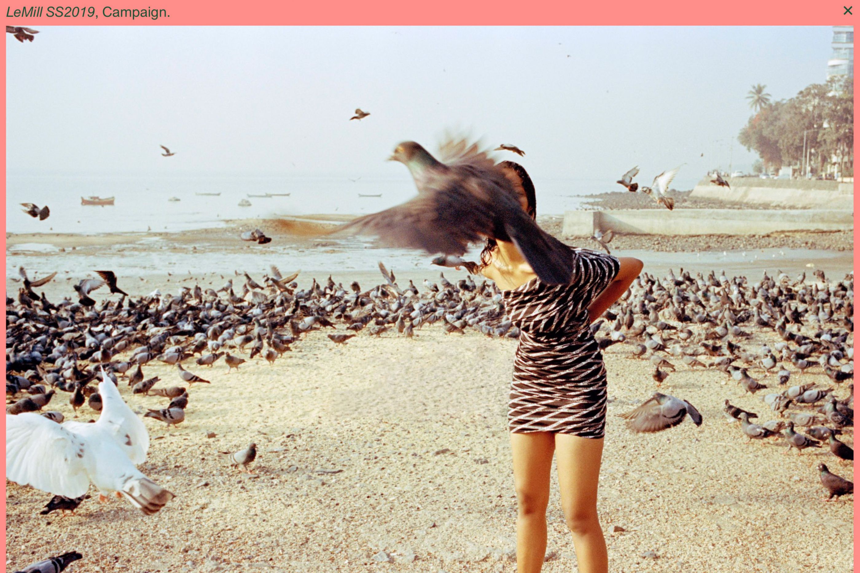
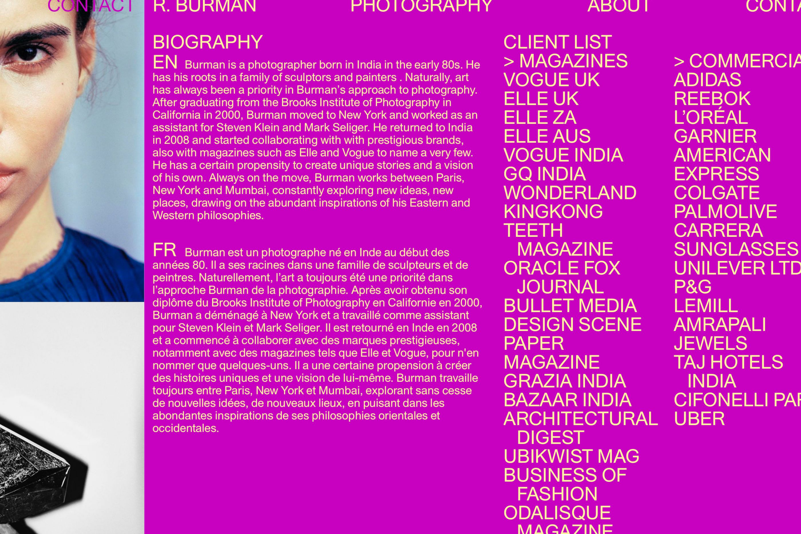
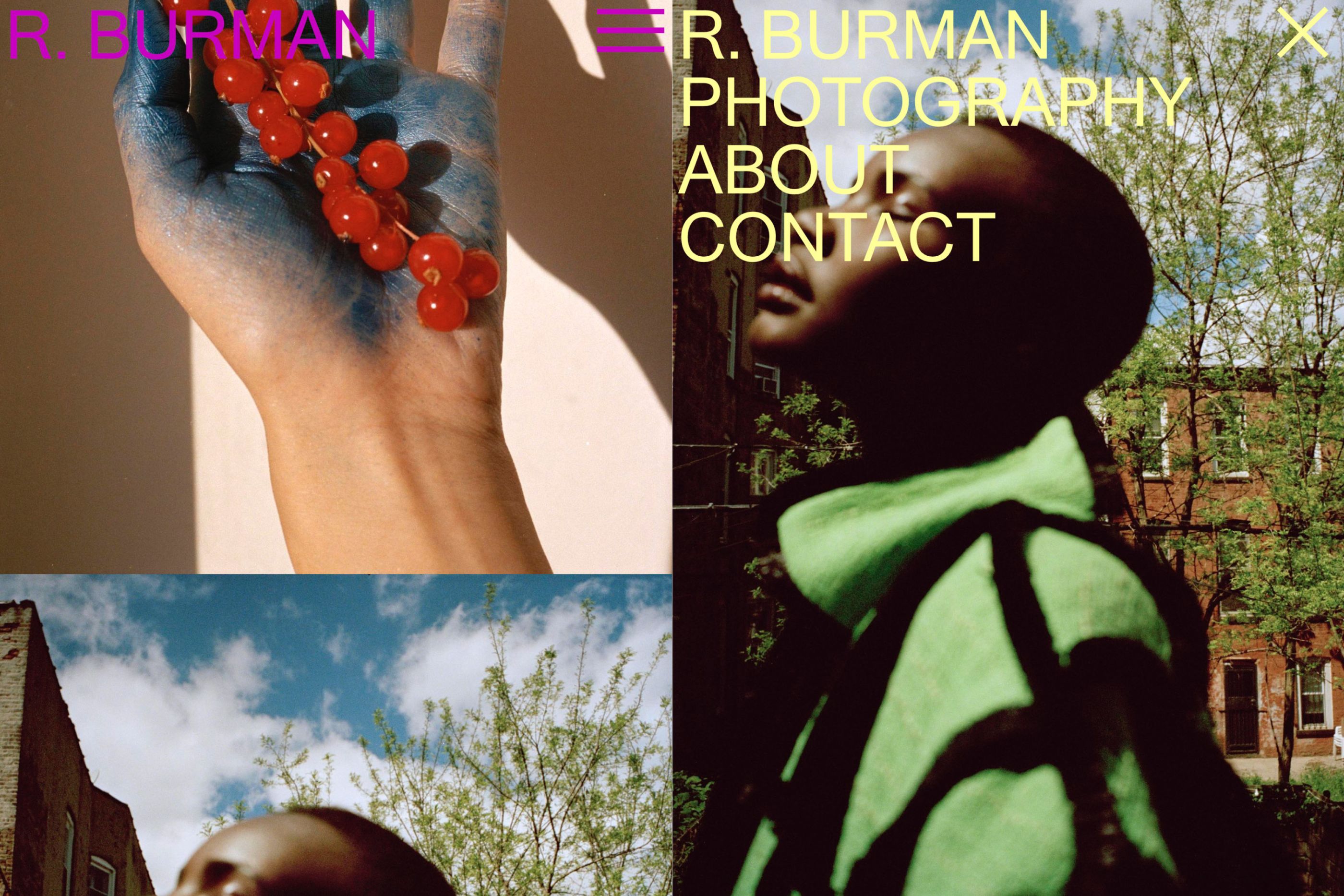
R.Burman photography
/
Rid Burman
2019
Website
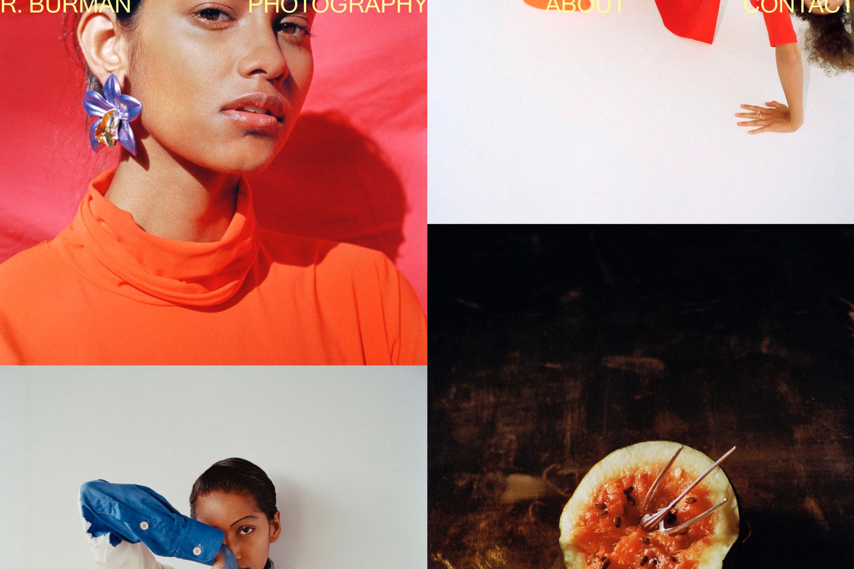
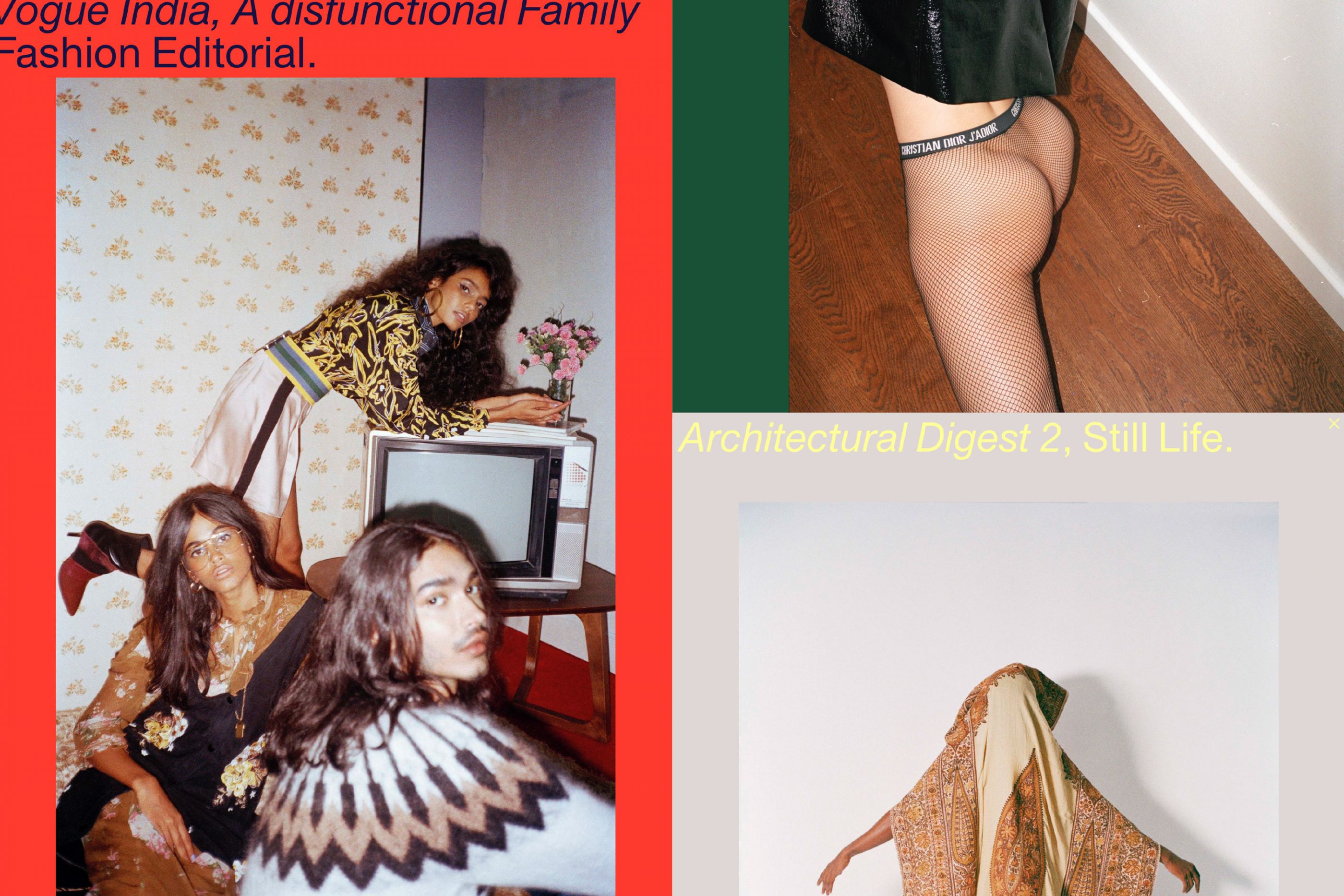
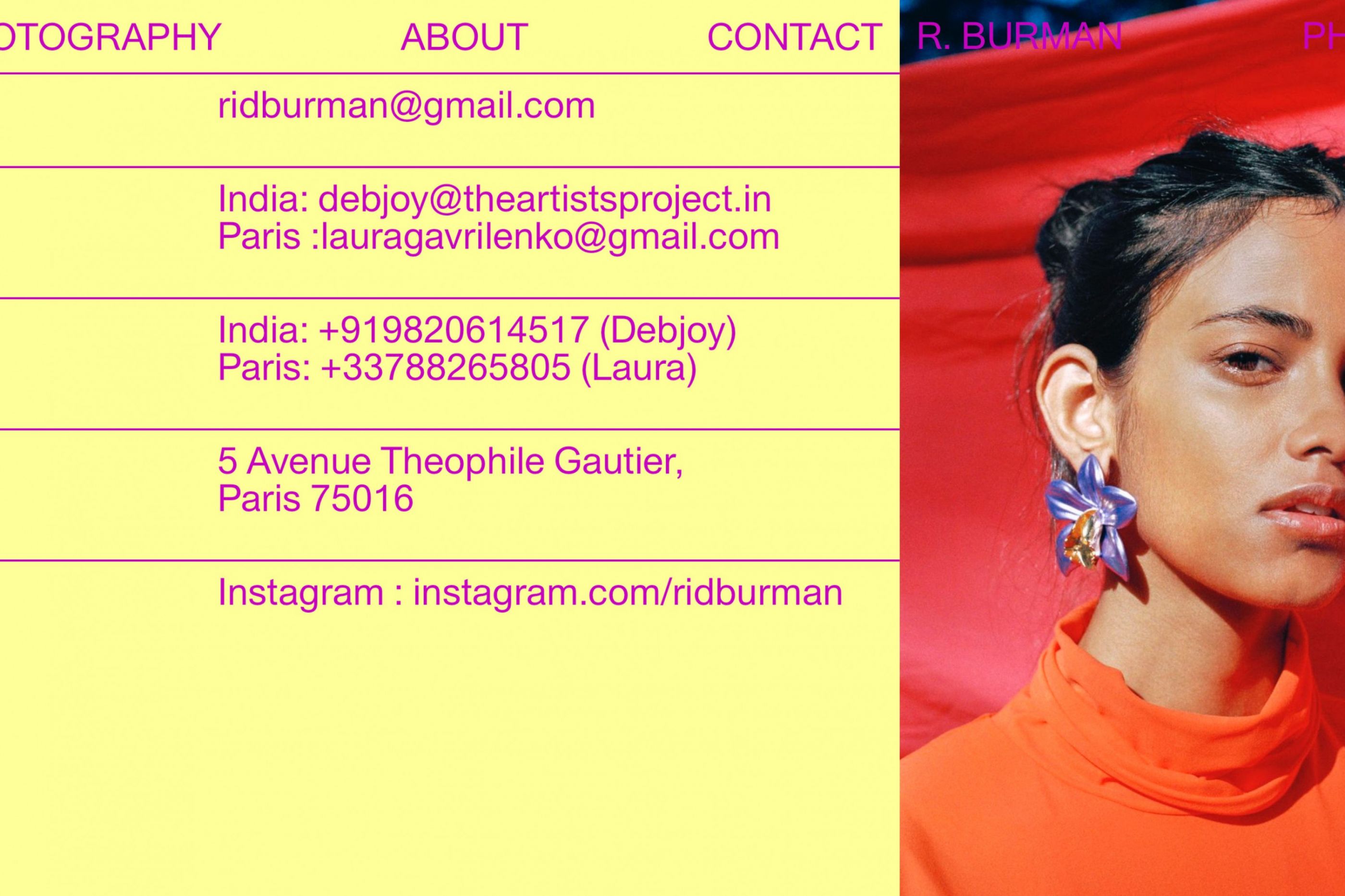
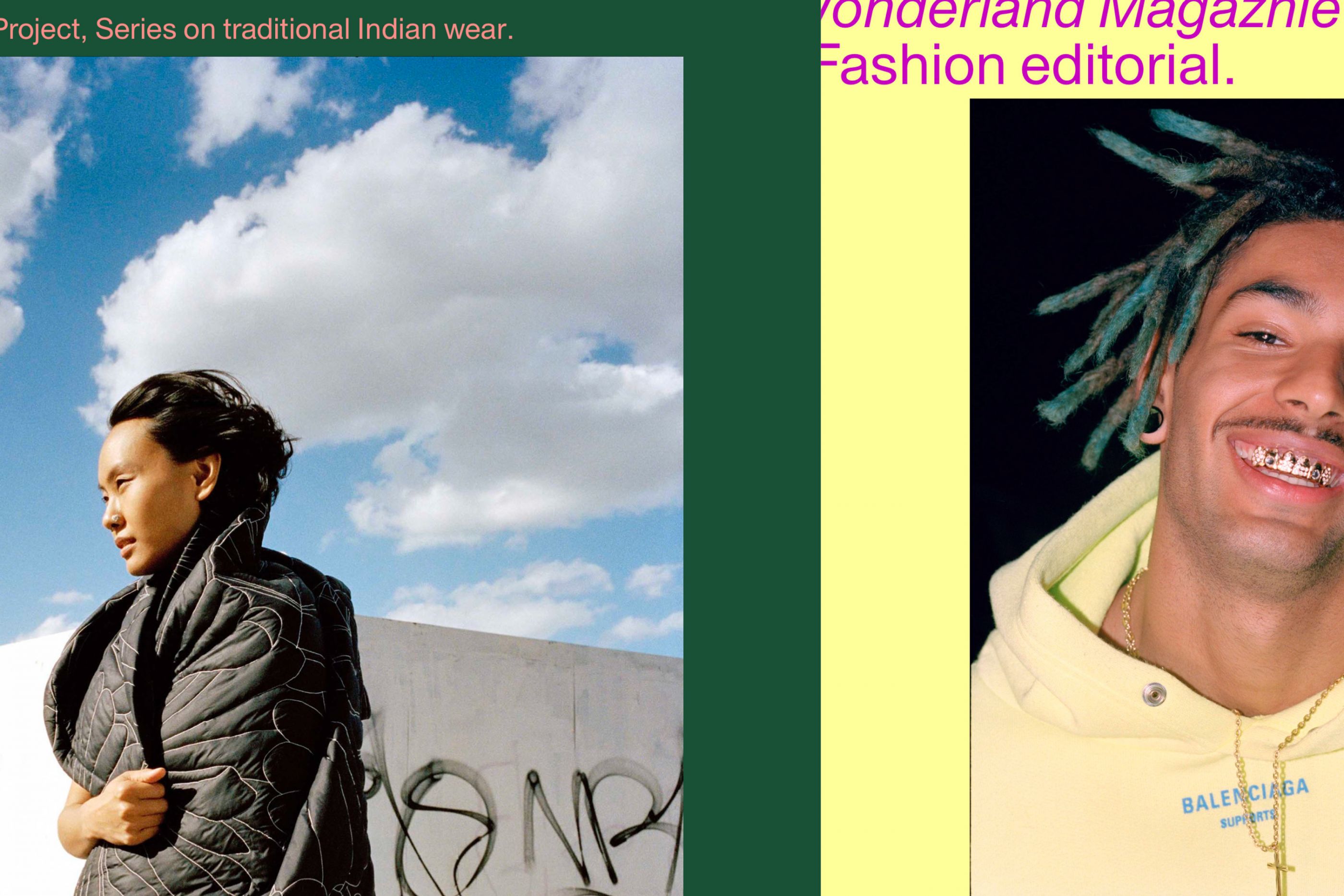
Website for fashion photographer Rid Burman. Always on the move, Burman works between Paris, New-York and Mumbai, constantly exploring new ideas, new places, drawing on the abundant inspirations of his Eastern and Western philosophies. His new website that we designed gives them pride of place. Code by Tristan Bagot.
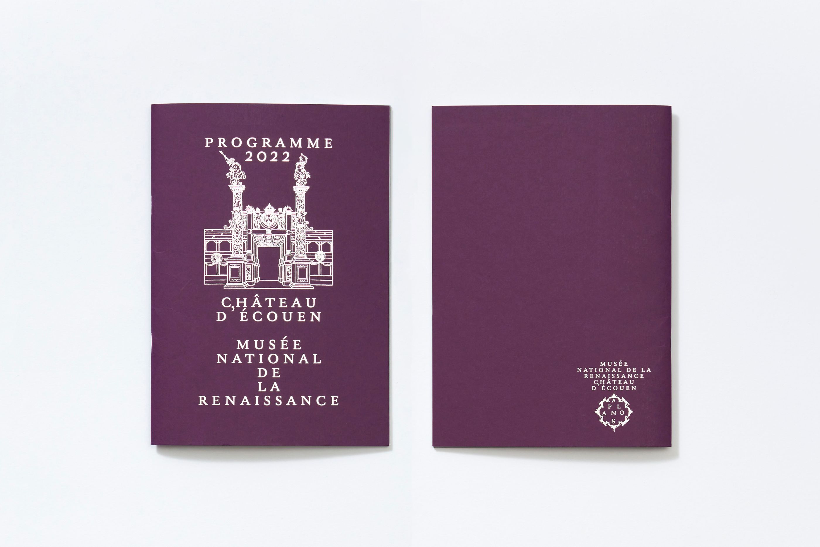
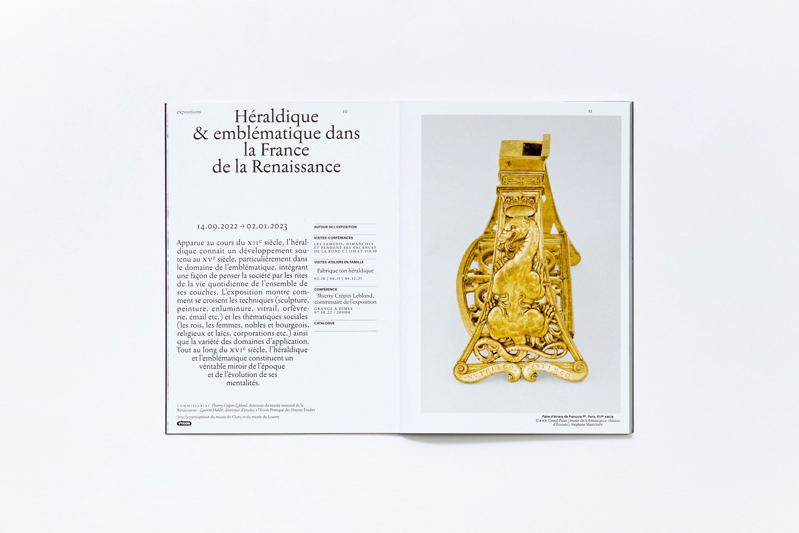
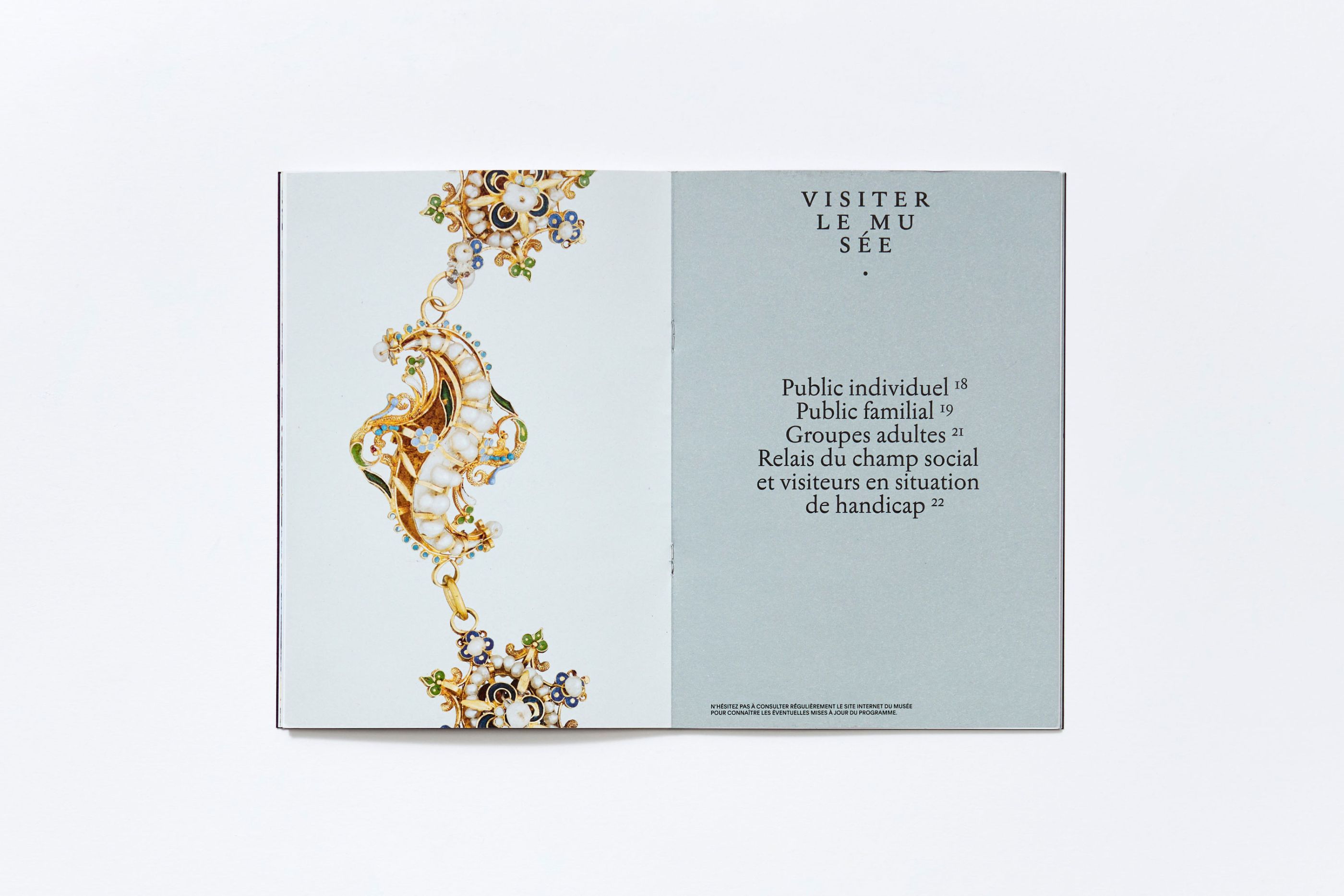
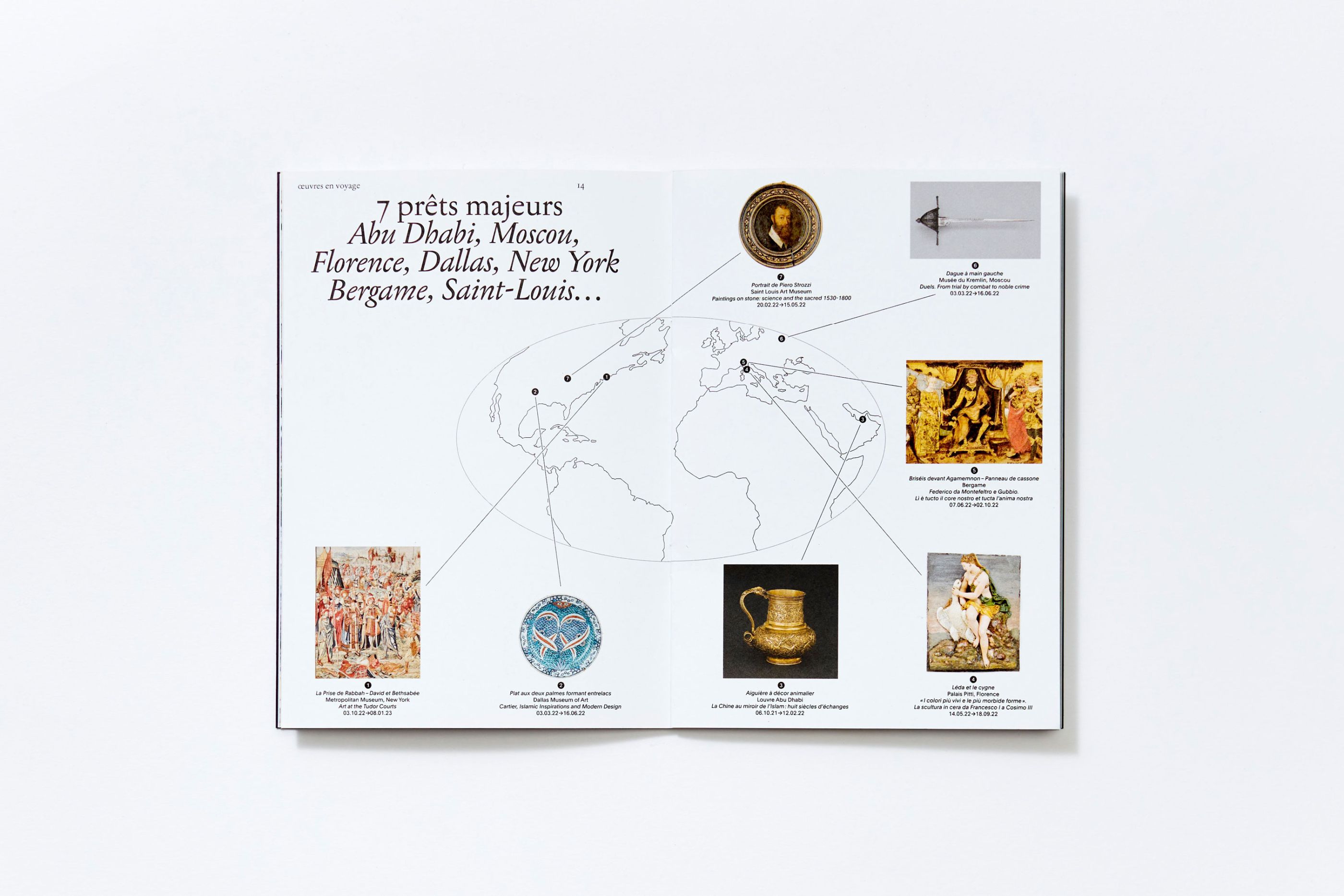
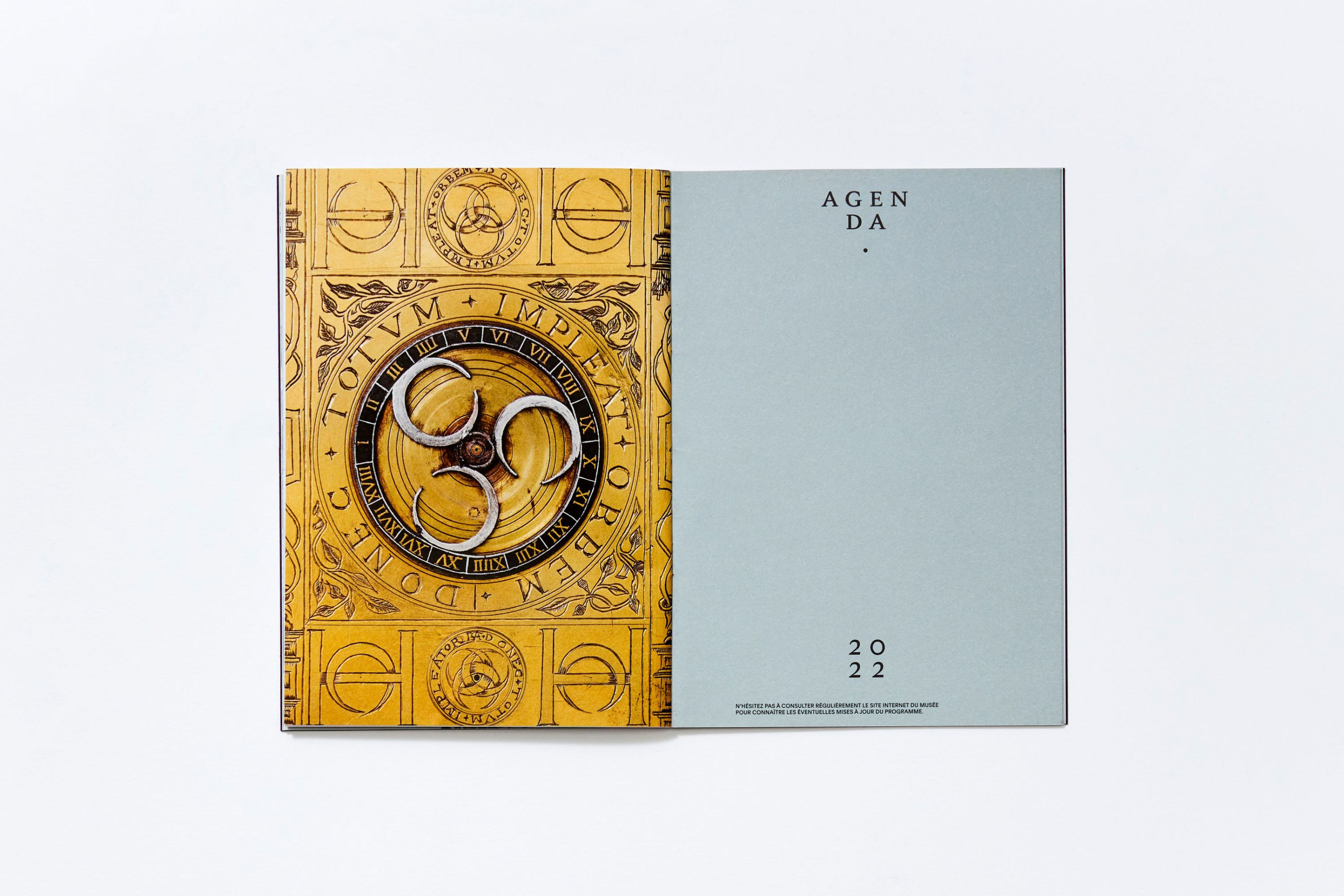
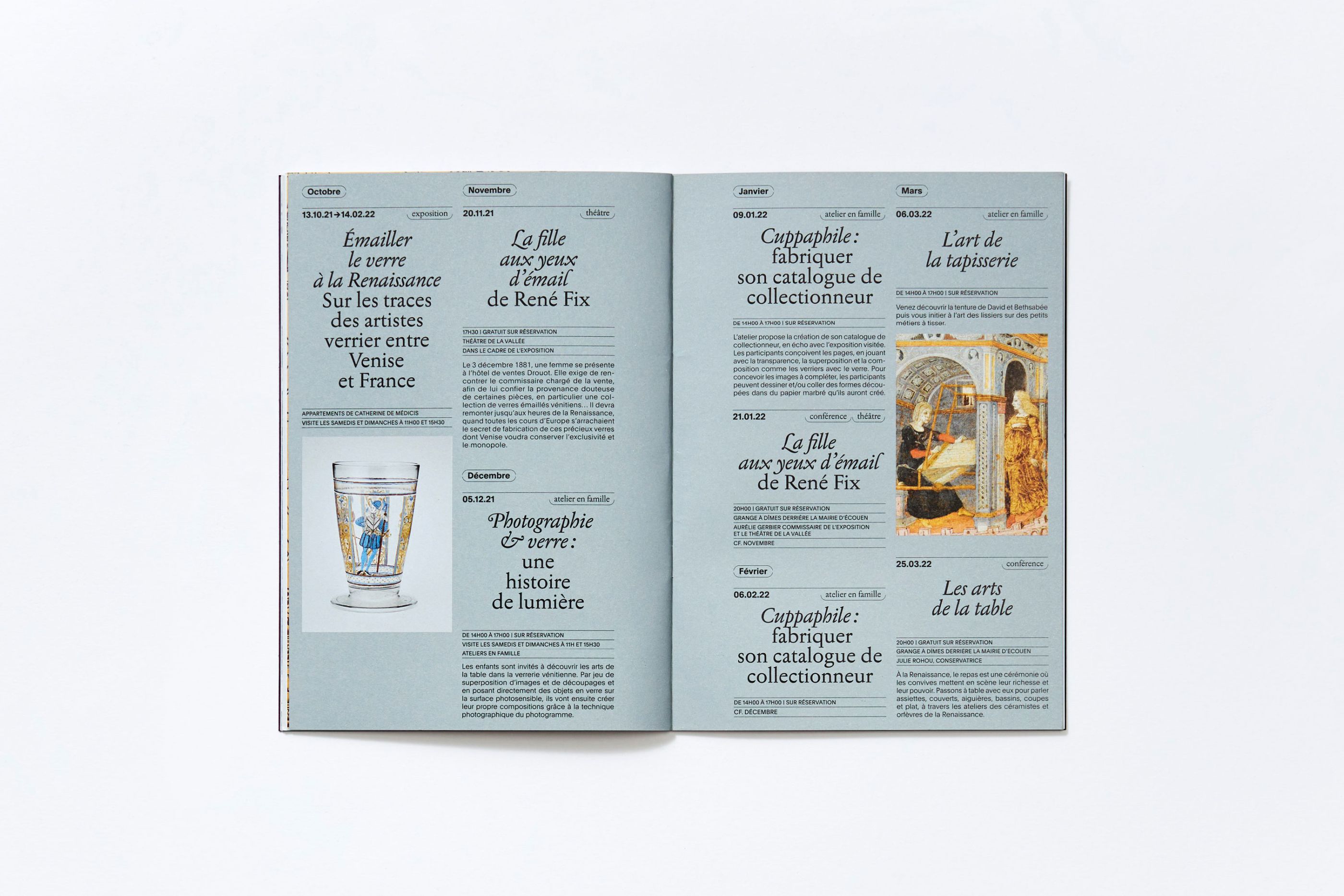
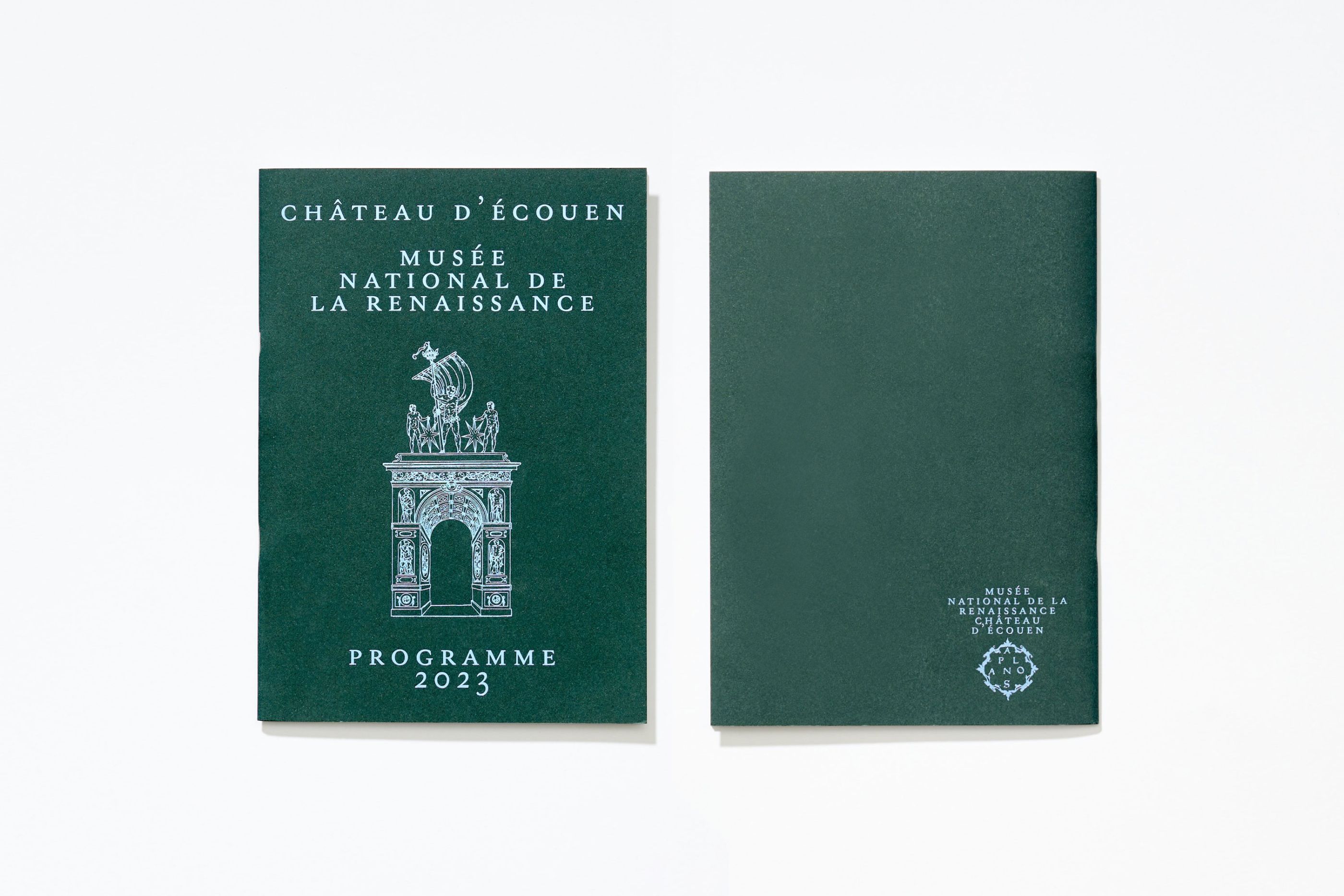
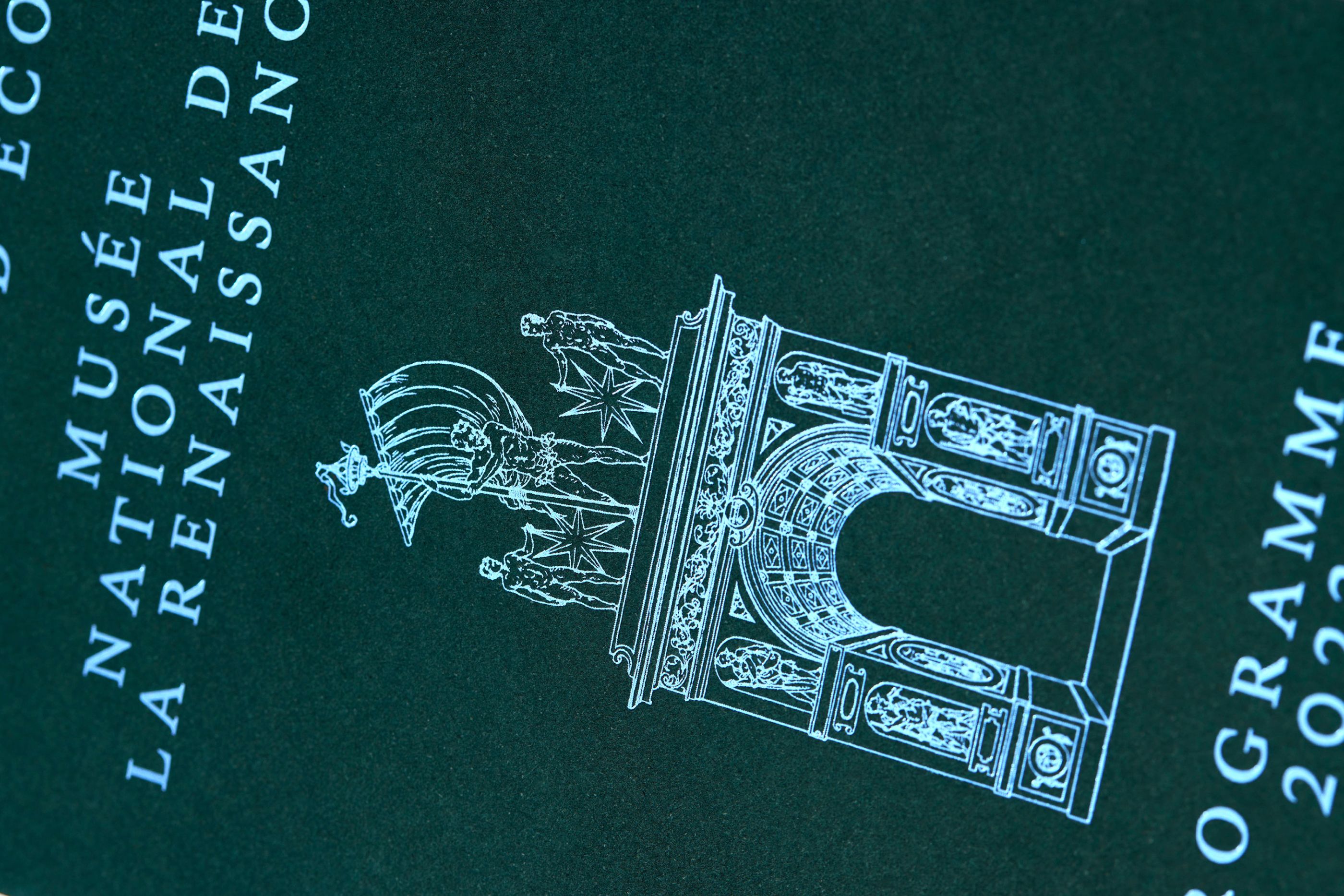
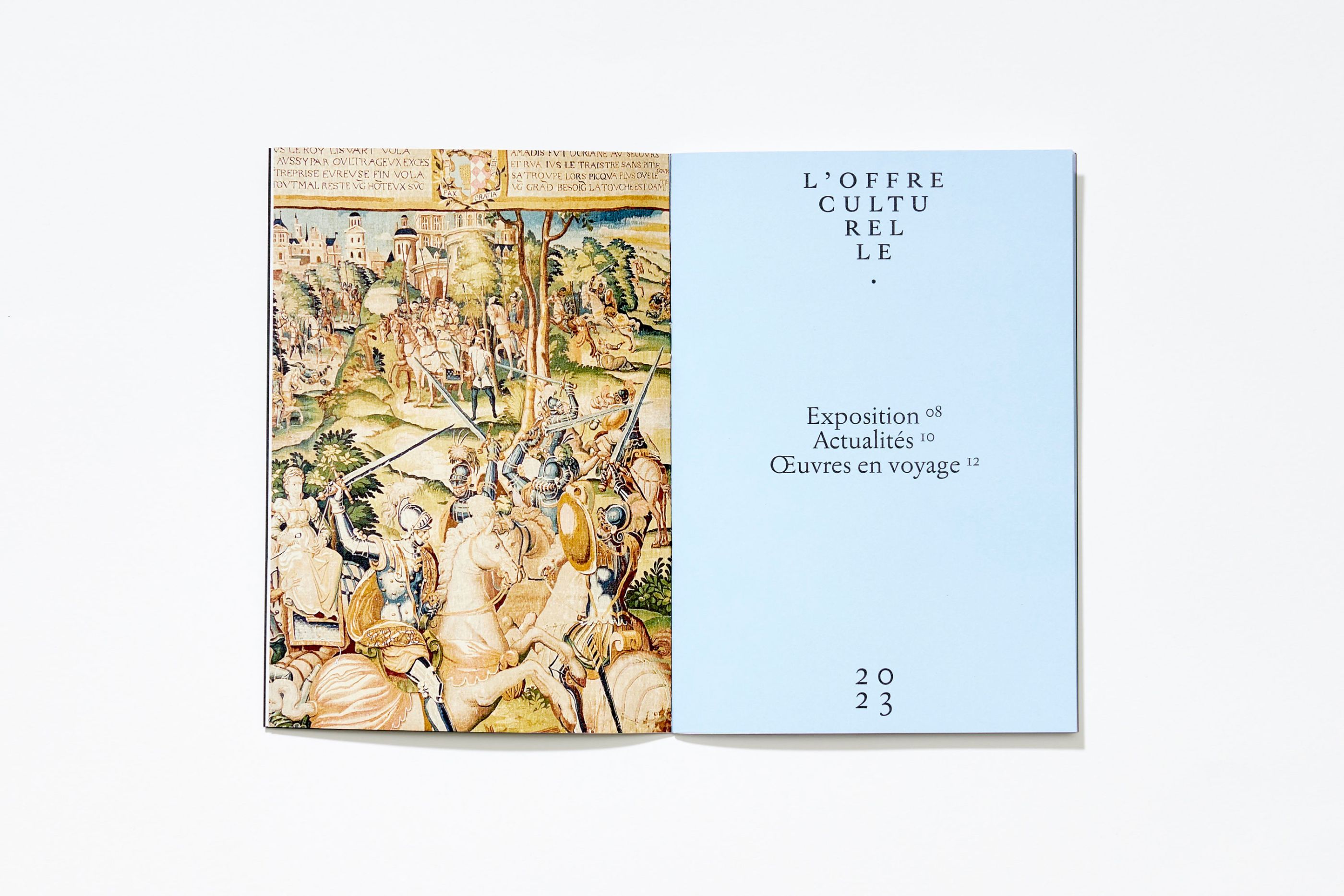
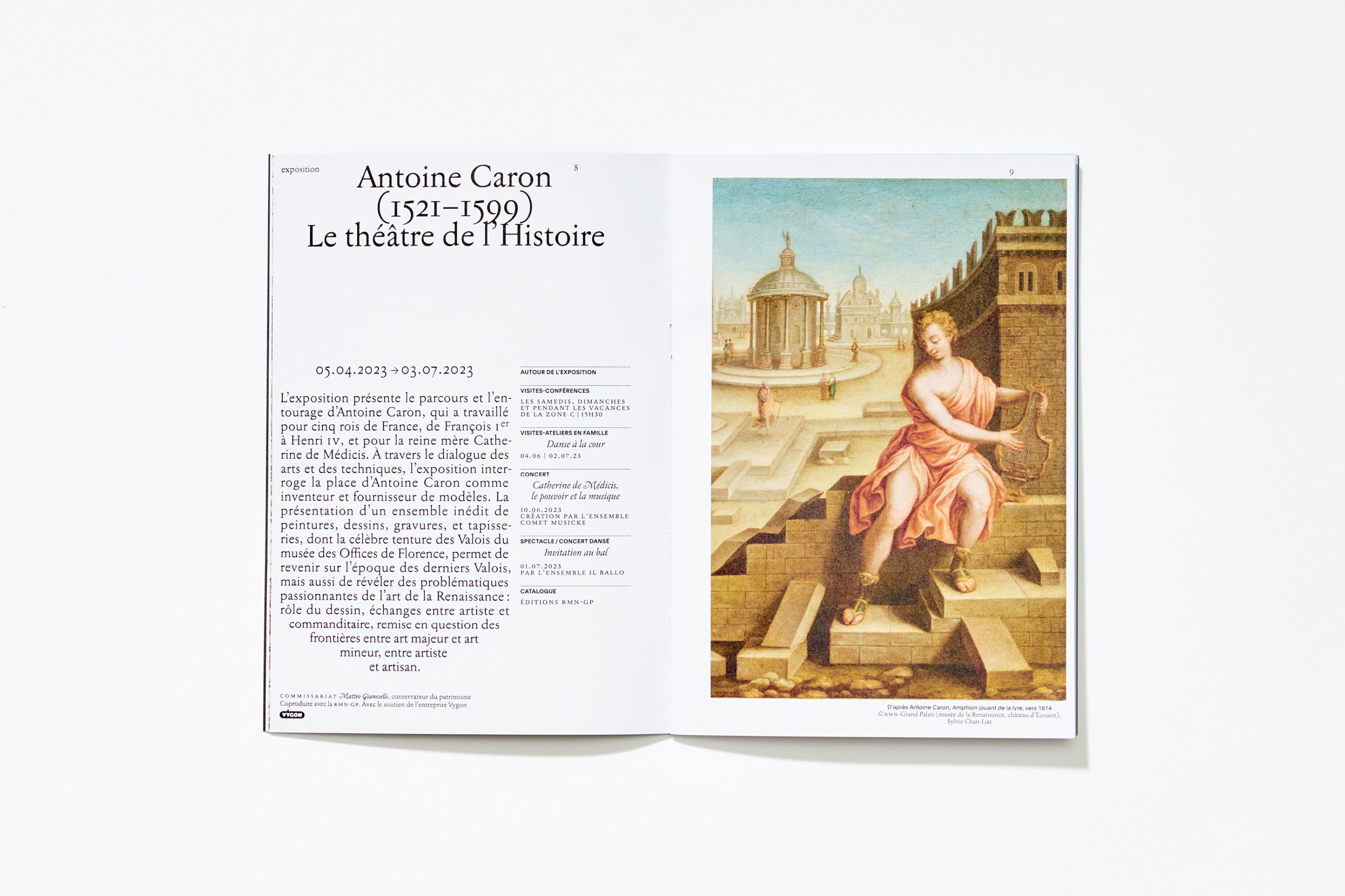
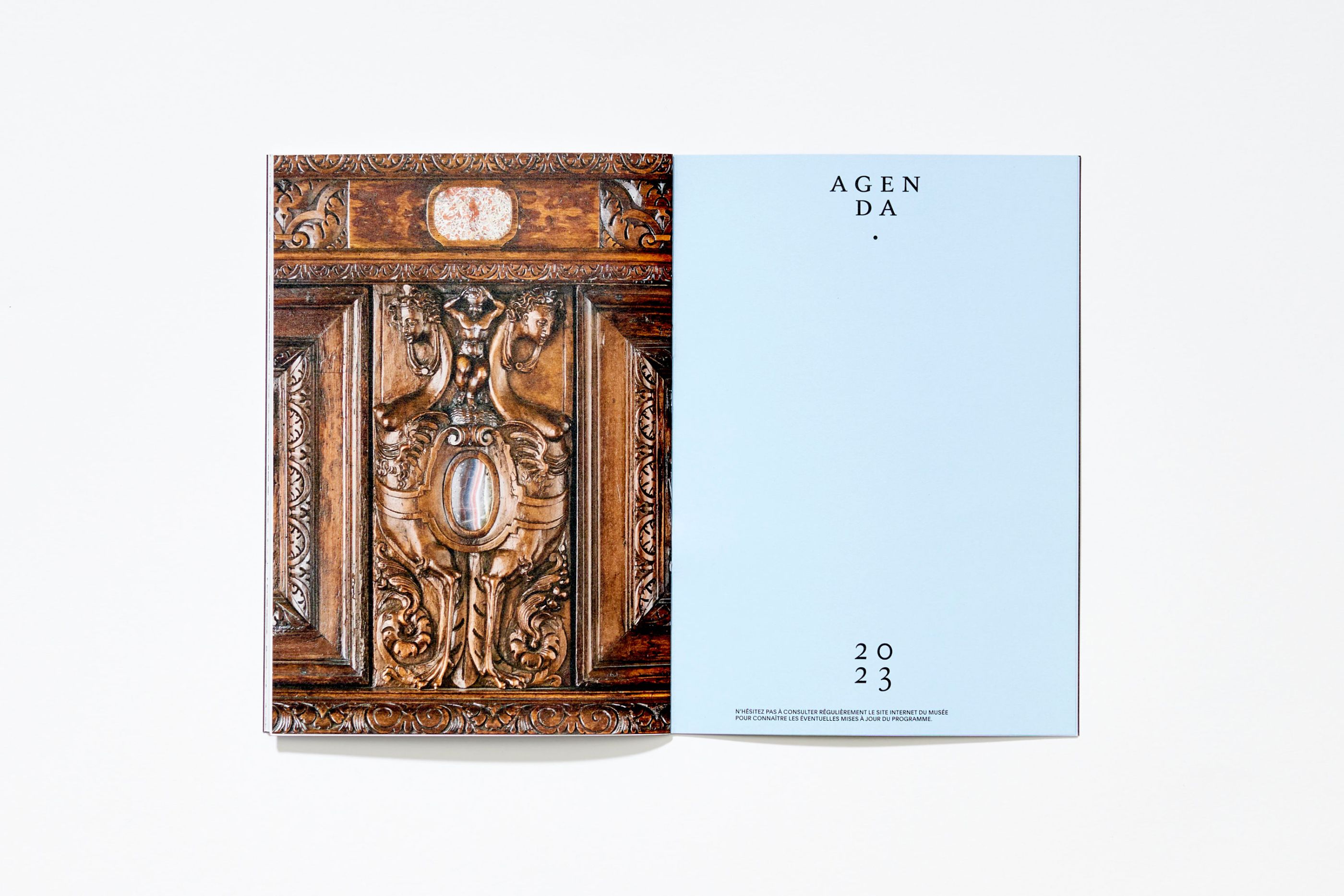
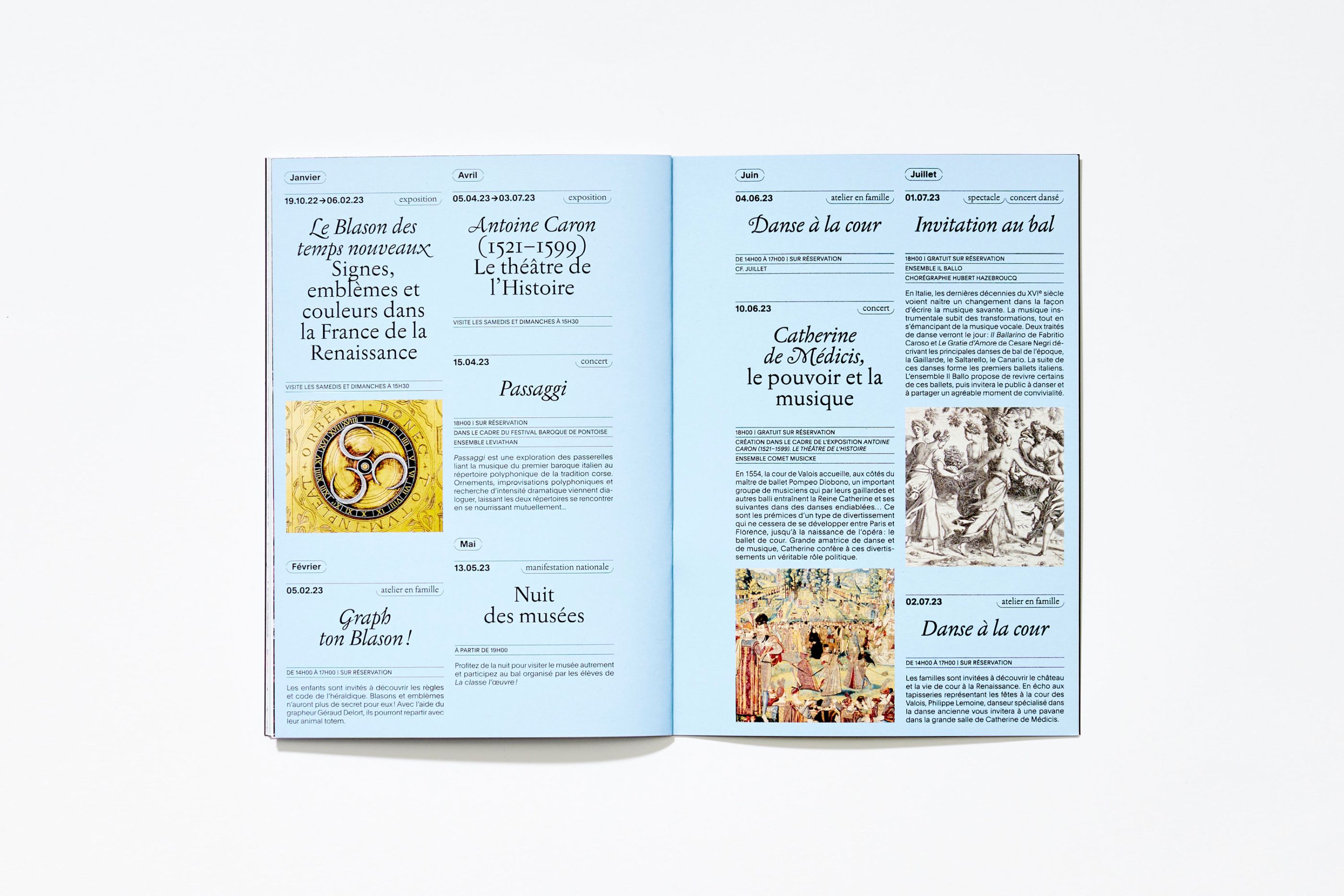
Château d'Écouen, Programs
/
Château d'Écouen, Musée national de la Renaissance
2022–2023
Editorial design
As part of the global redesign of the Château d'Écouen - Musée de la Renaissance's visual identity, since 2020 we have been designing the annual cultural programs for this Château-Musée with its exceptional collections. We have established an assertive editorial and visual register that gives this unique cultural institution a tone that is both sensitive and didactic, inspiring and engaging.
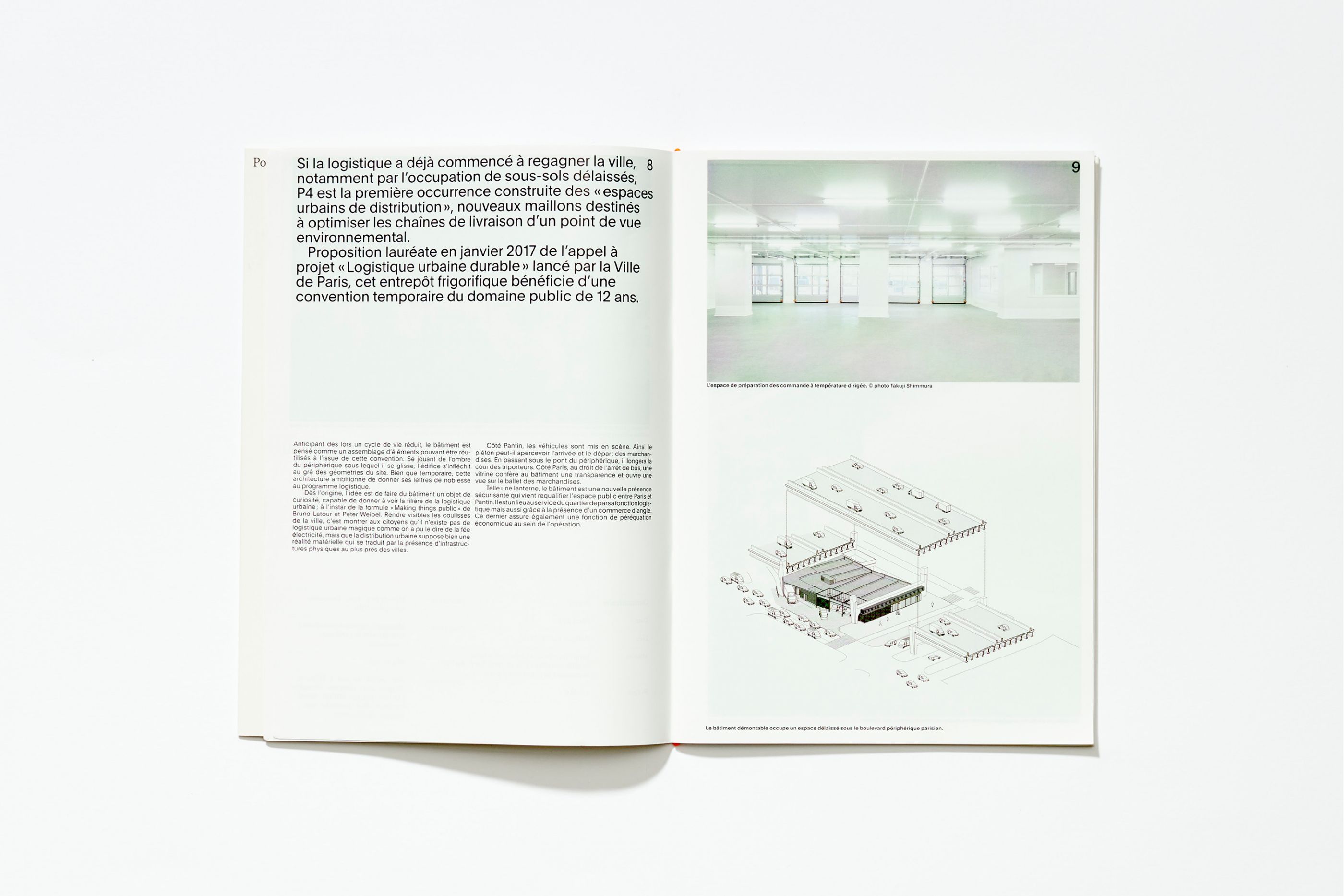
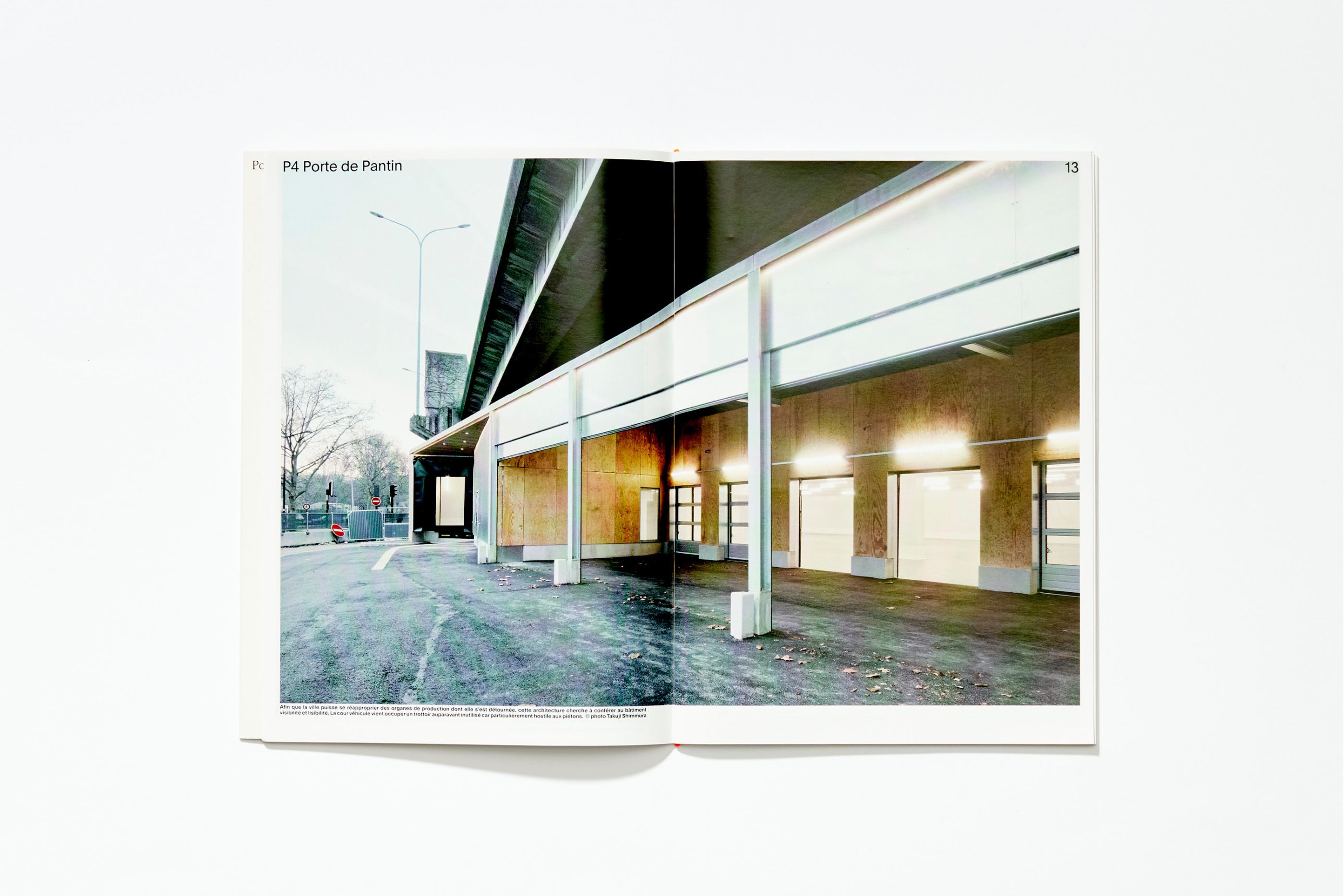
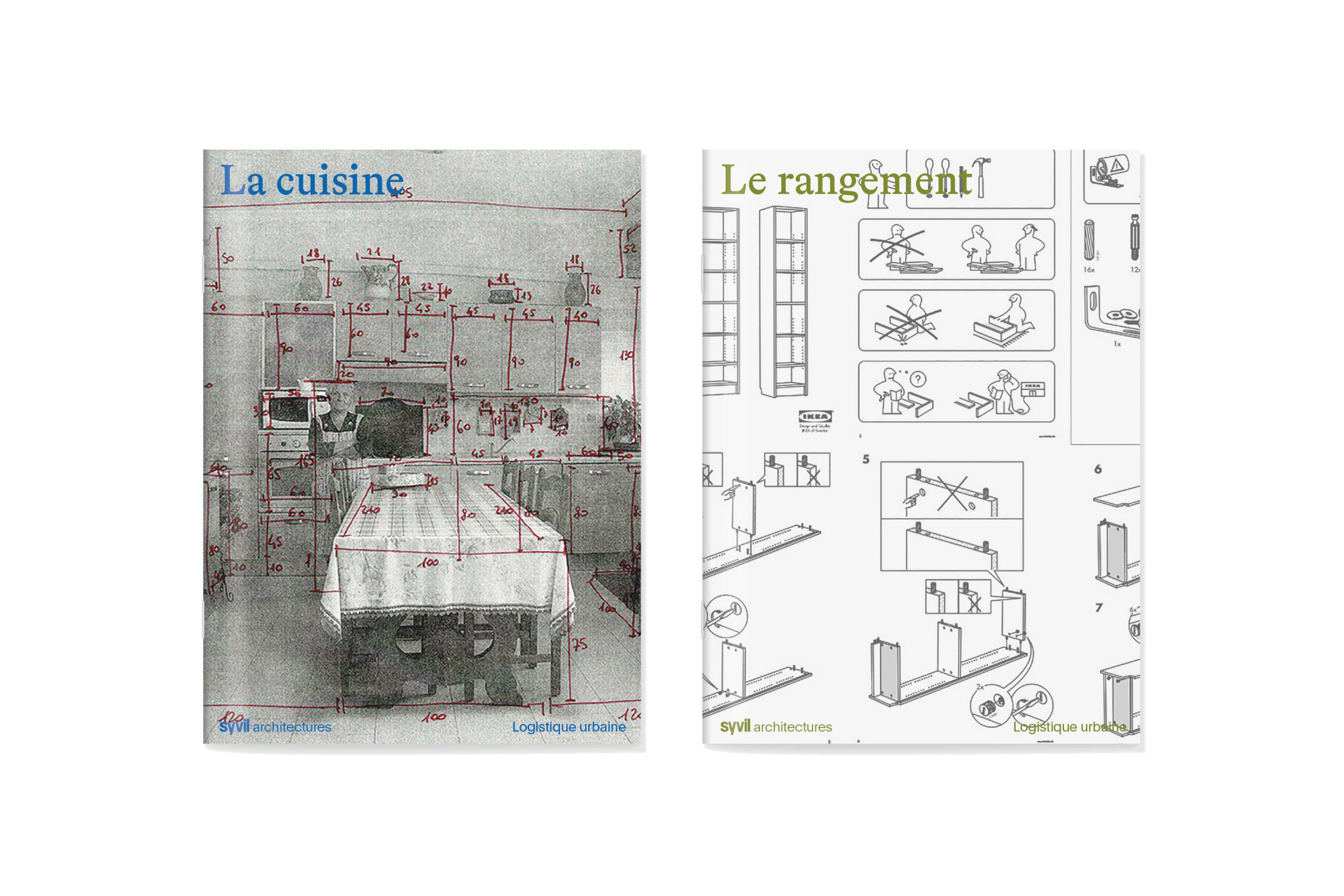
Syvil
/
Syvil architectures
2021
Art direction, visual identity, logotype, print, digital, website, editorial design
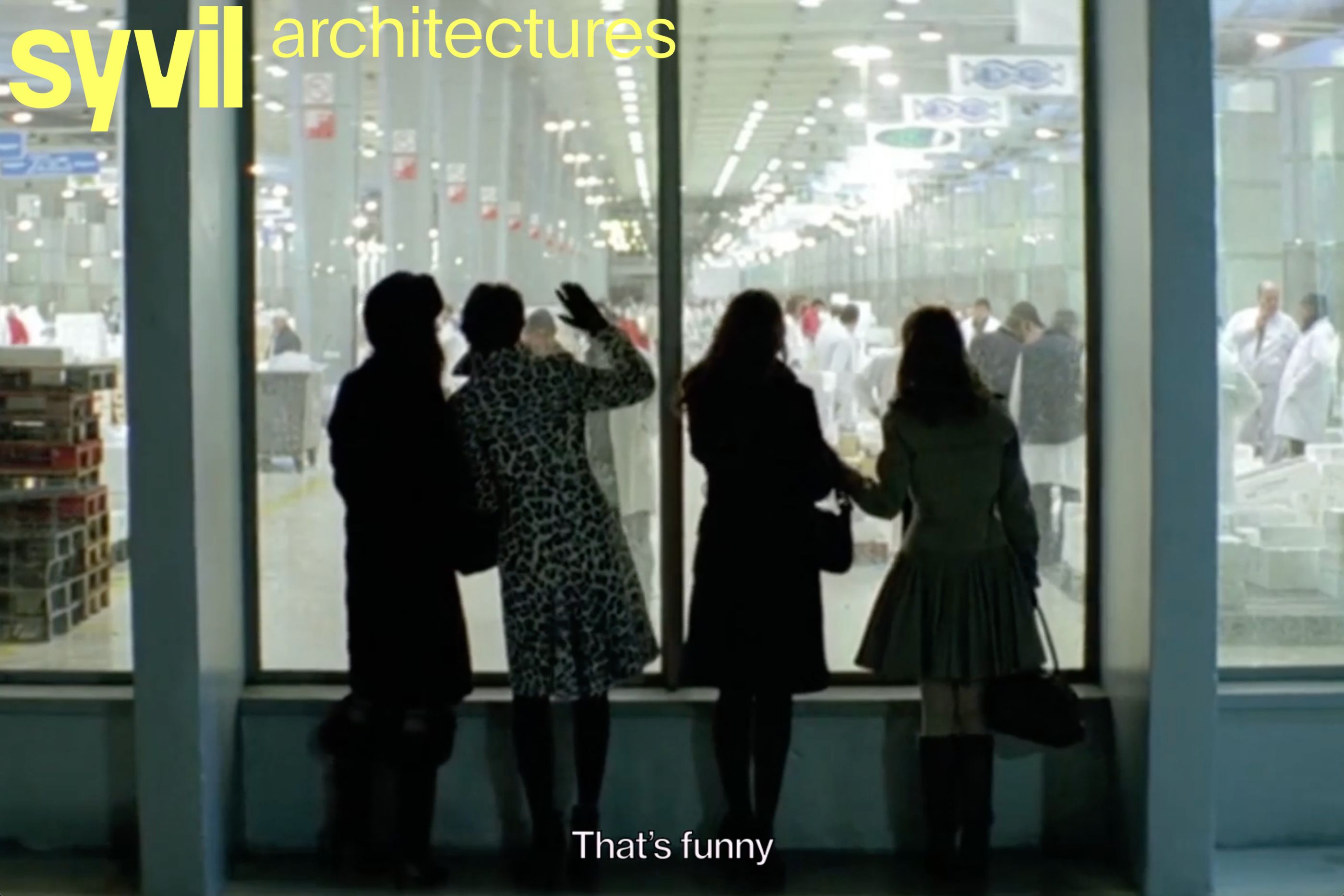
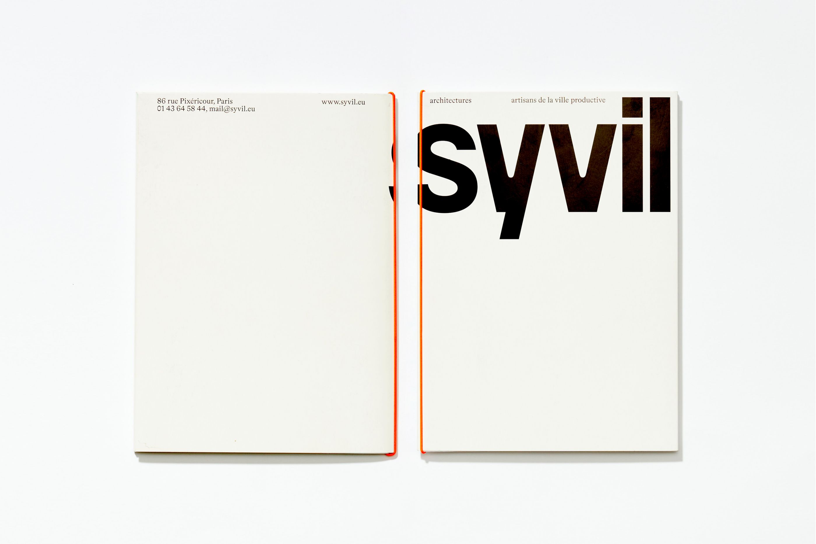
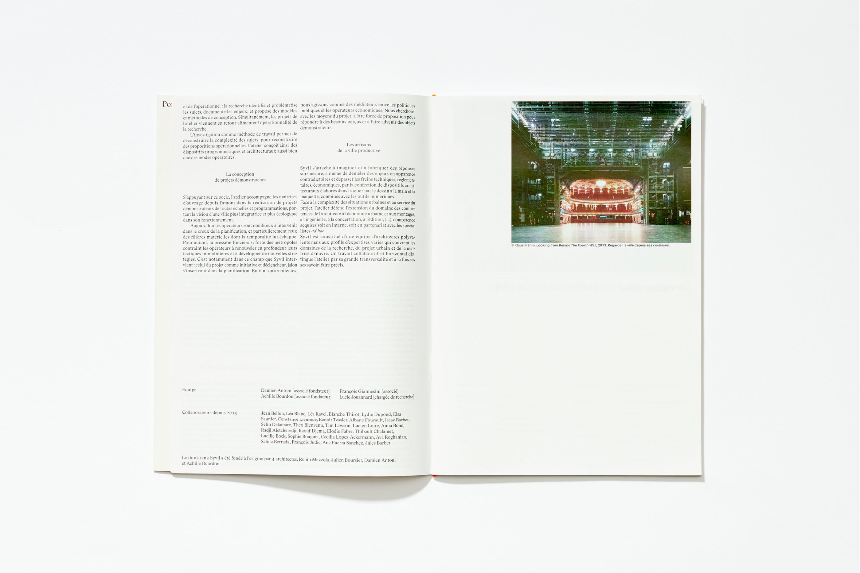
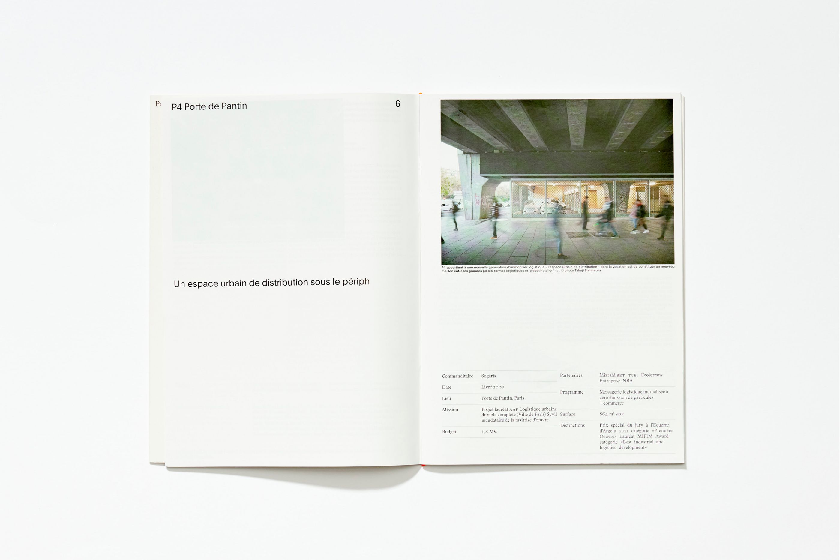
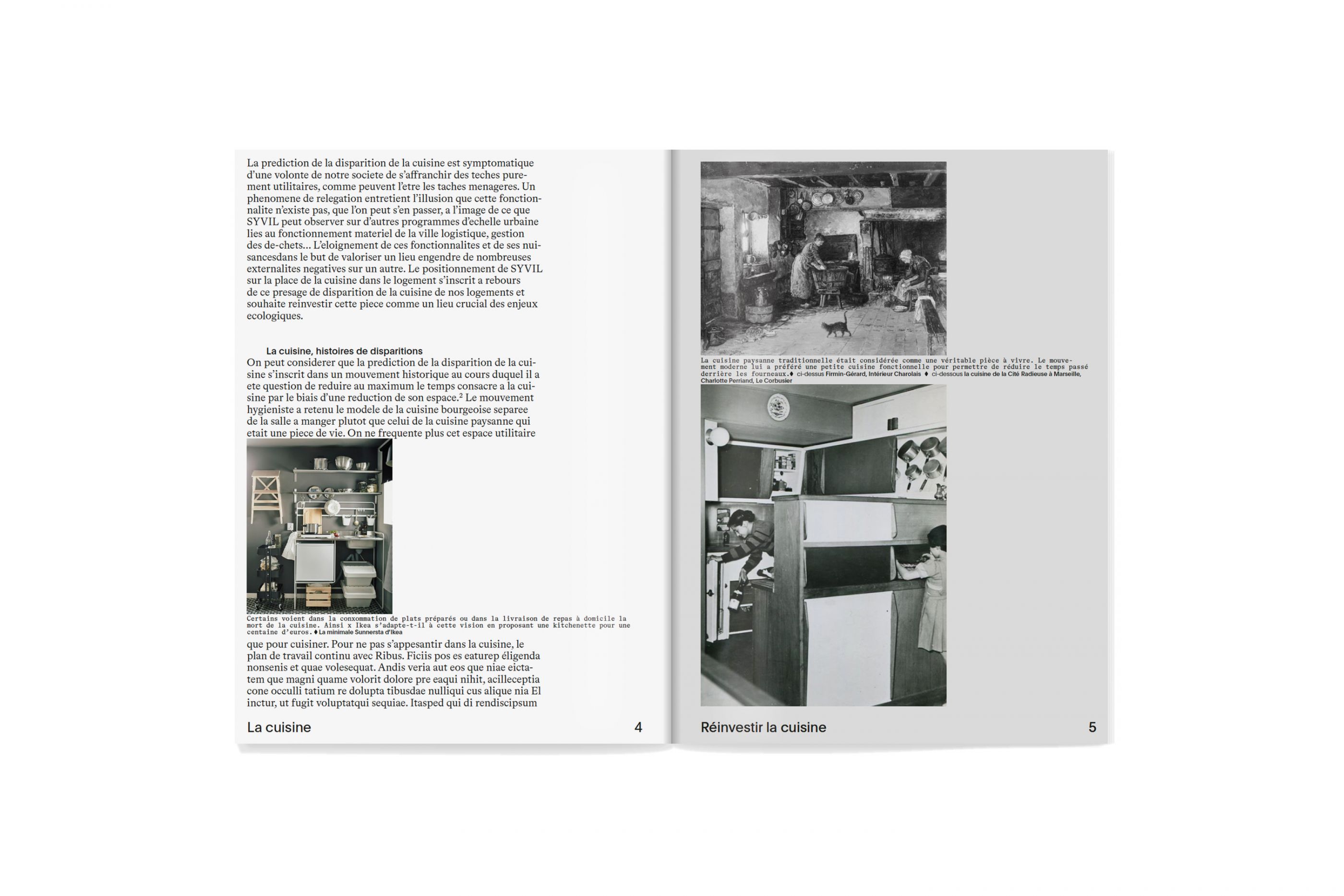
Syvil is a Parisian architecture and urban planning studio founded in 2015, after five years of existence as a think-tank. The studio is the winner of the 2018 Young Architects and Landscape Architects Albums (AJAP 2018) and the winner of the Équerre d'Argent First Work in 2021. Syvil takes a singular look at contemporary cities by choosing to focus on their backstage areas, their backyards and the material channels that enable them to exist. Thus, by bringing together the studio's Research and Project divisions, we developed the agency's new identity and website.
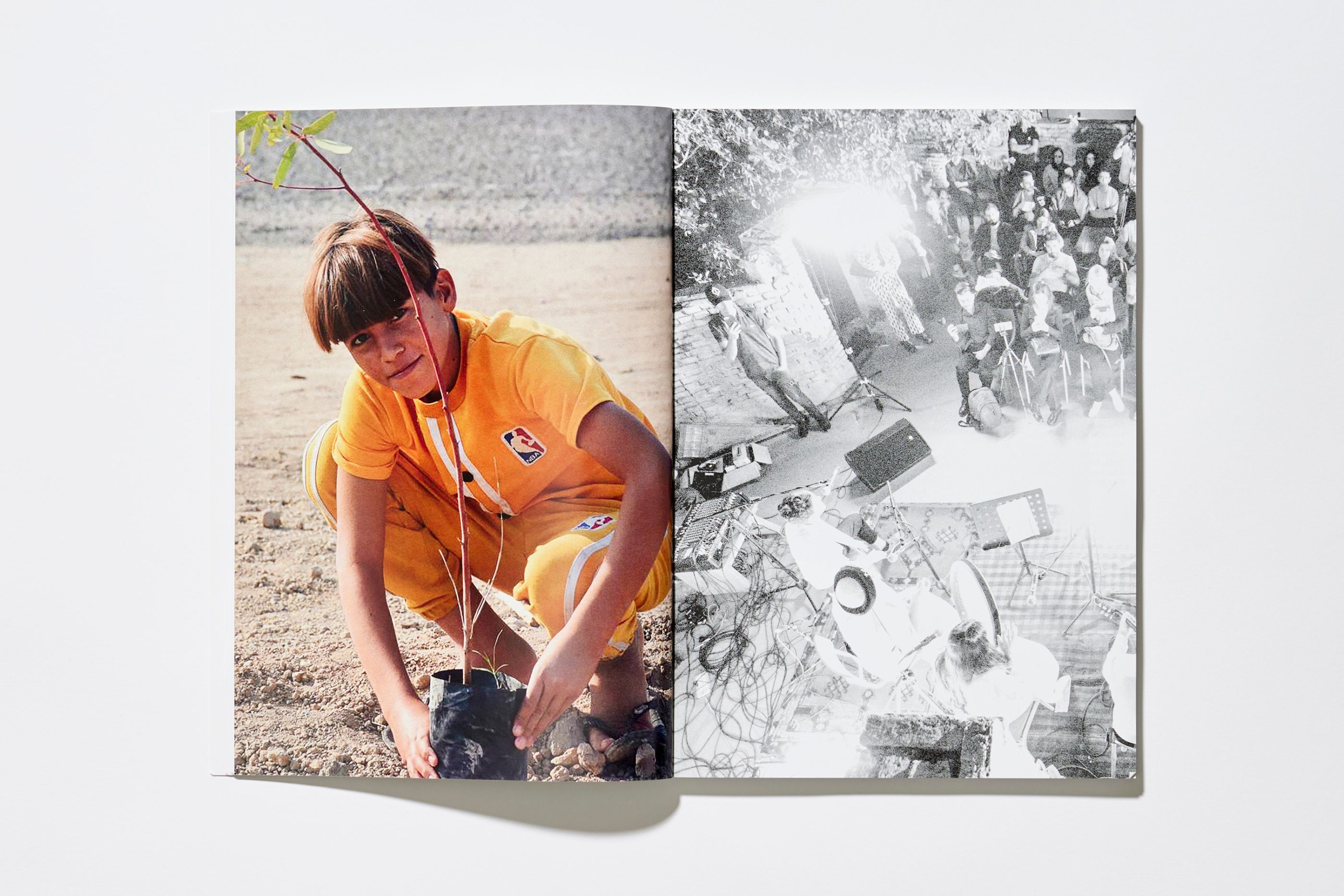
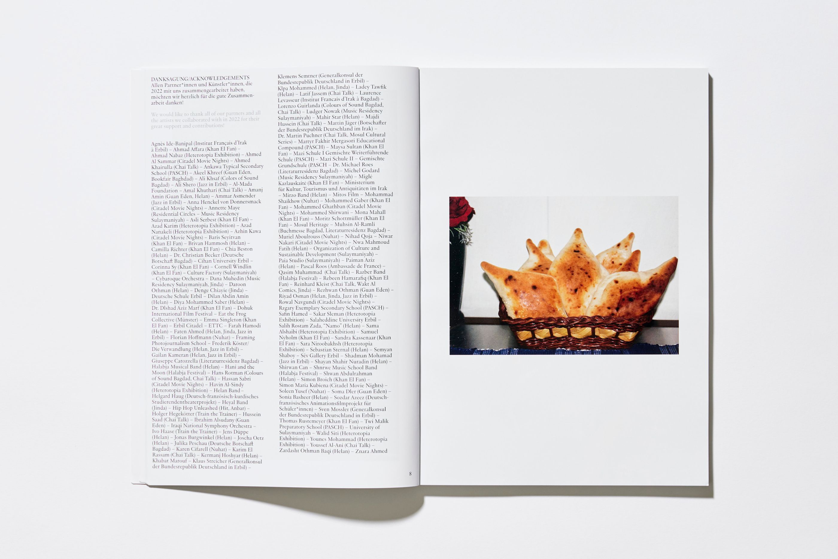
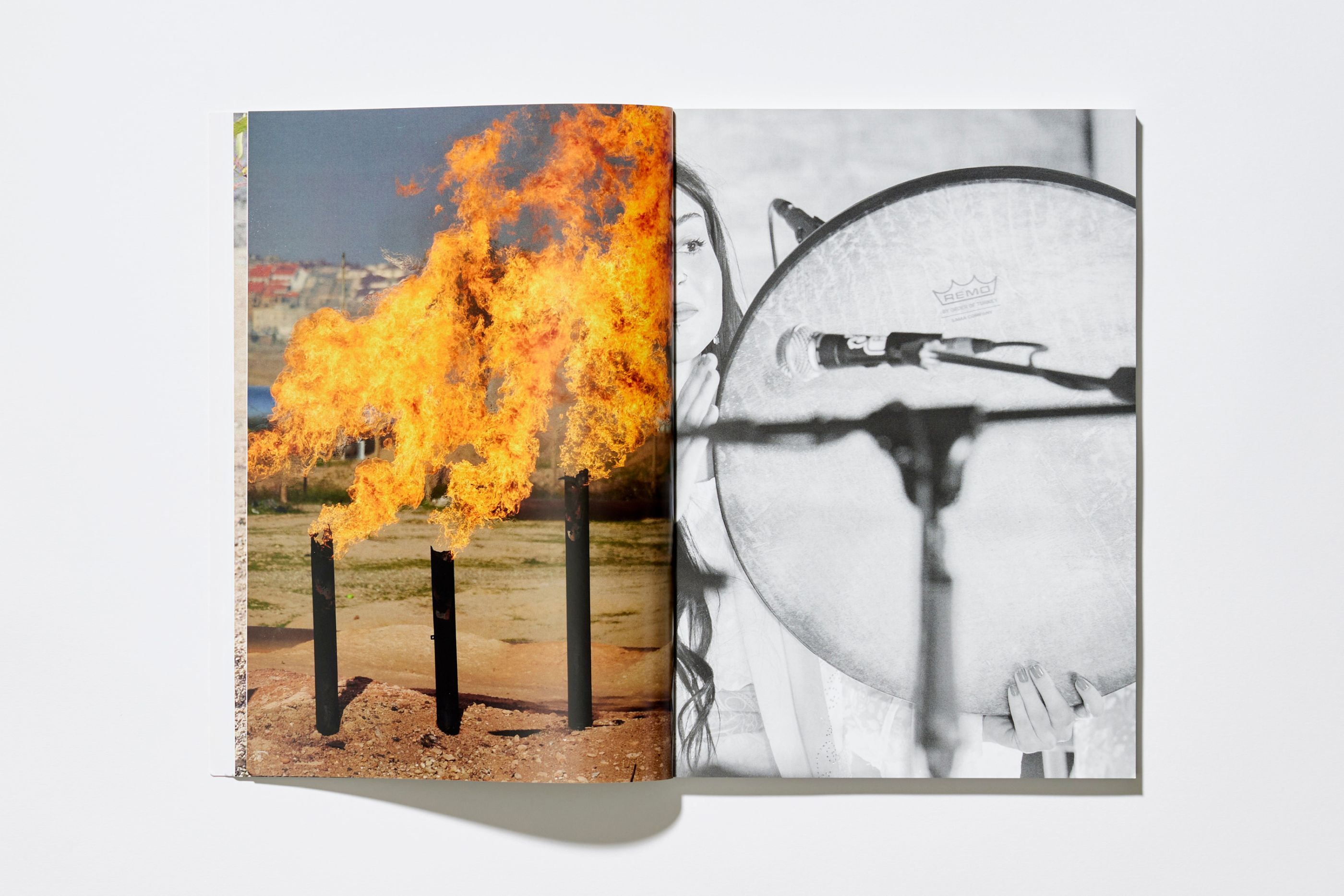
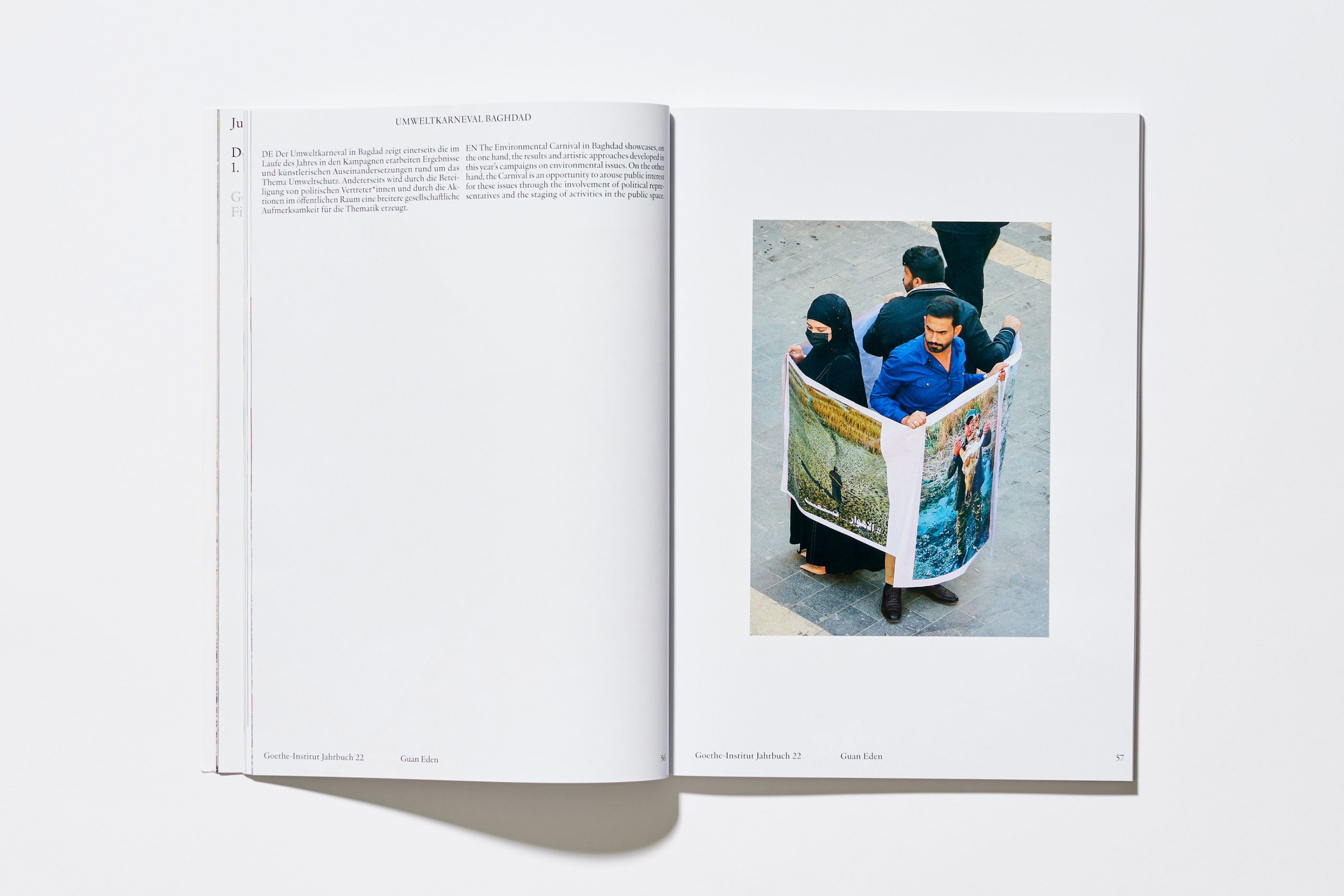
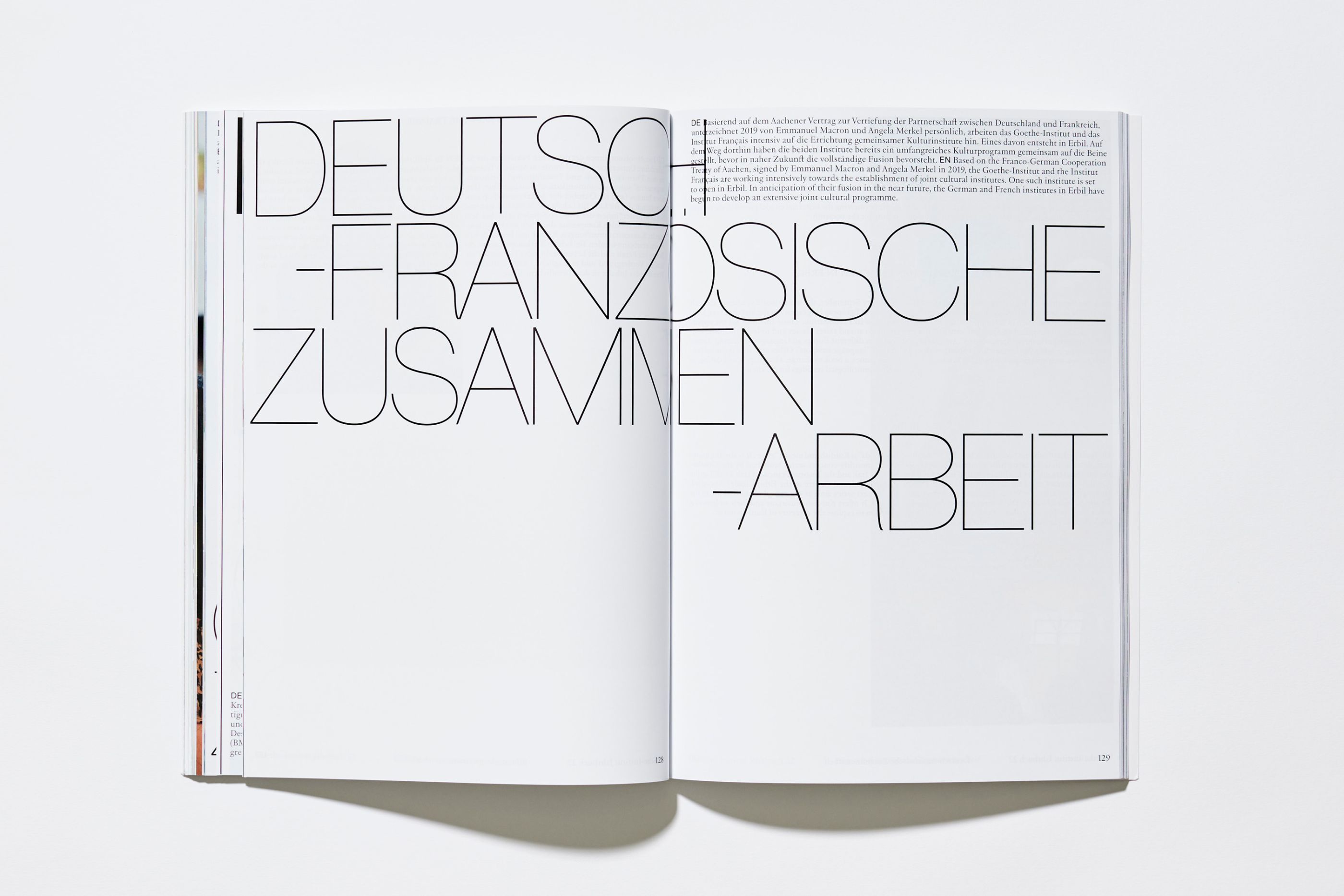
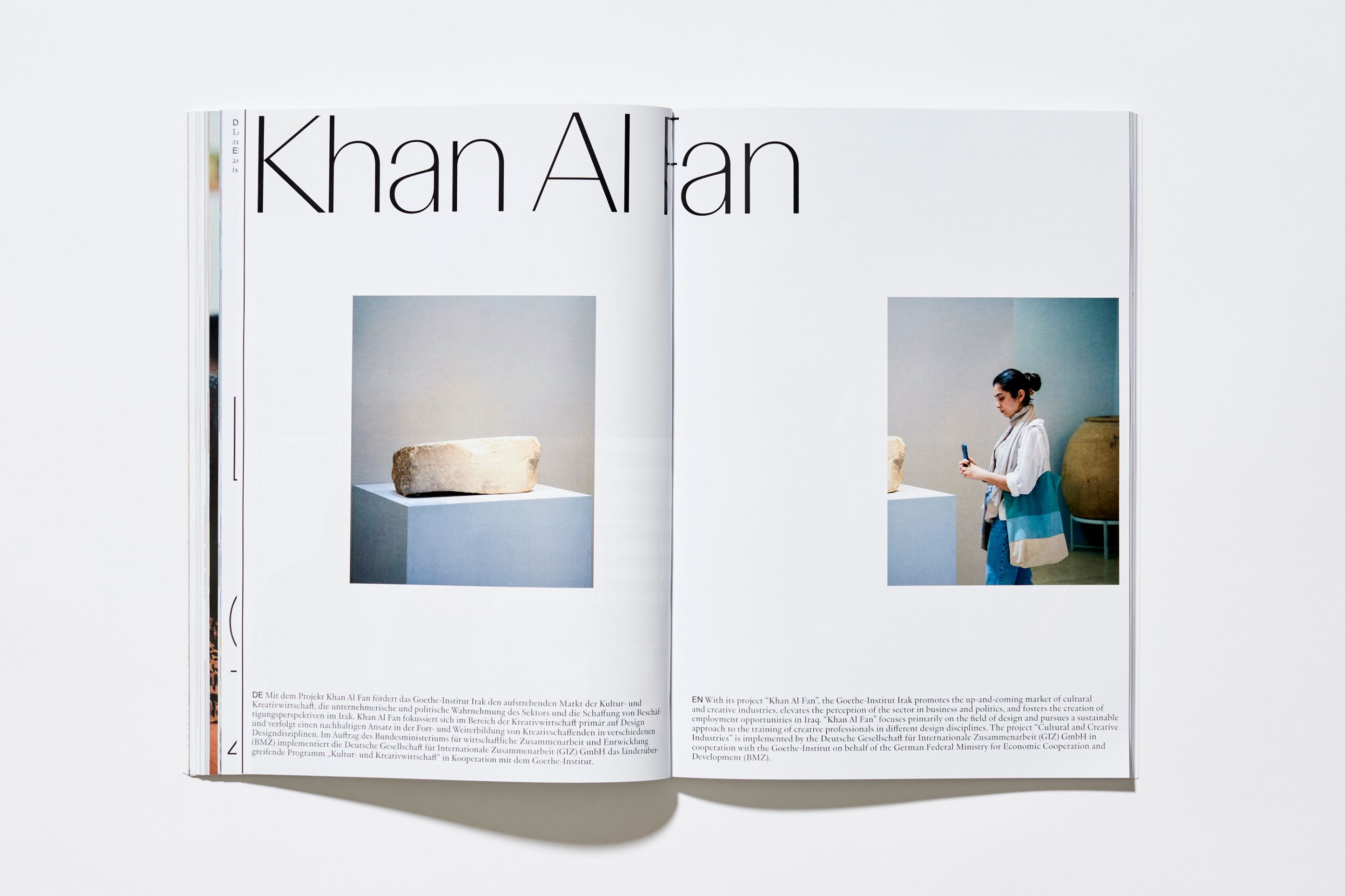
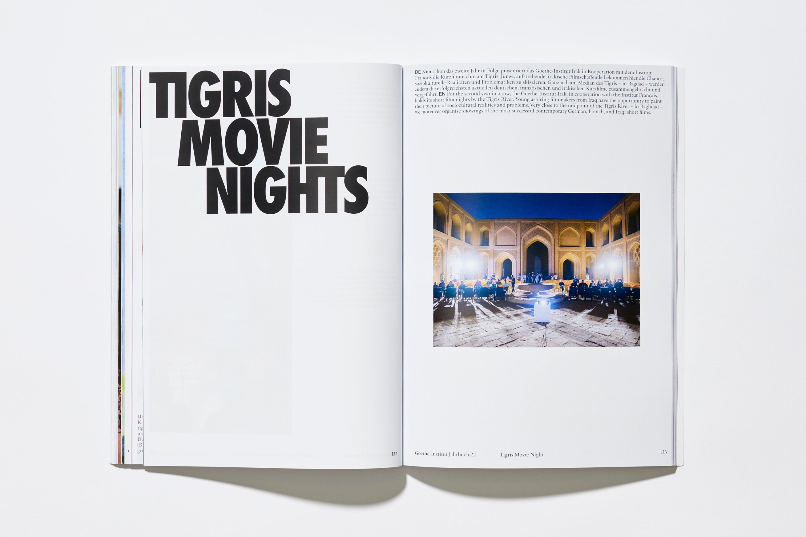
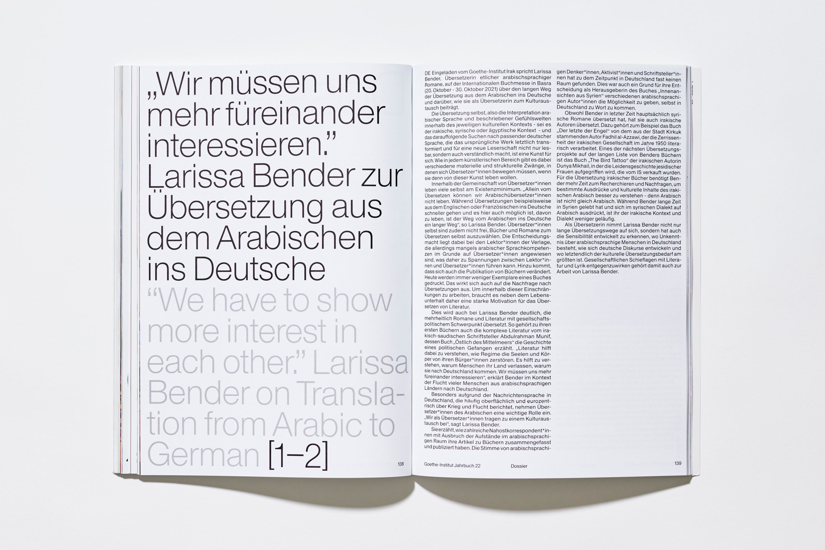
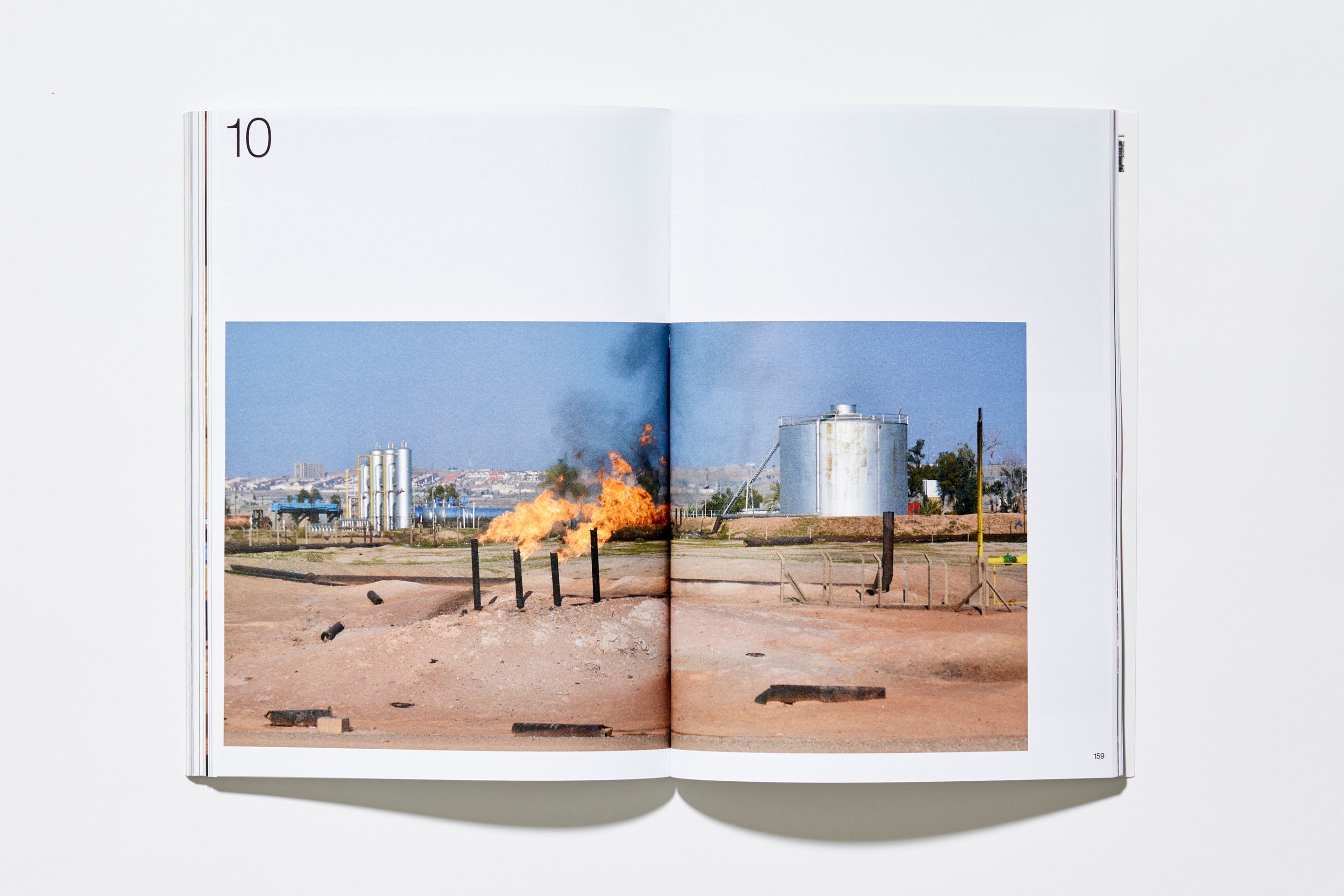
Goethe-Institut Irak
/
Goethe Institut
2023
Design éditorial
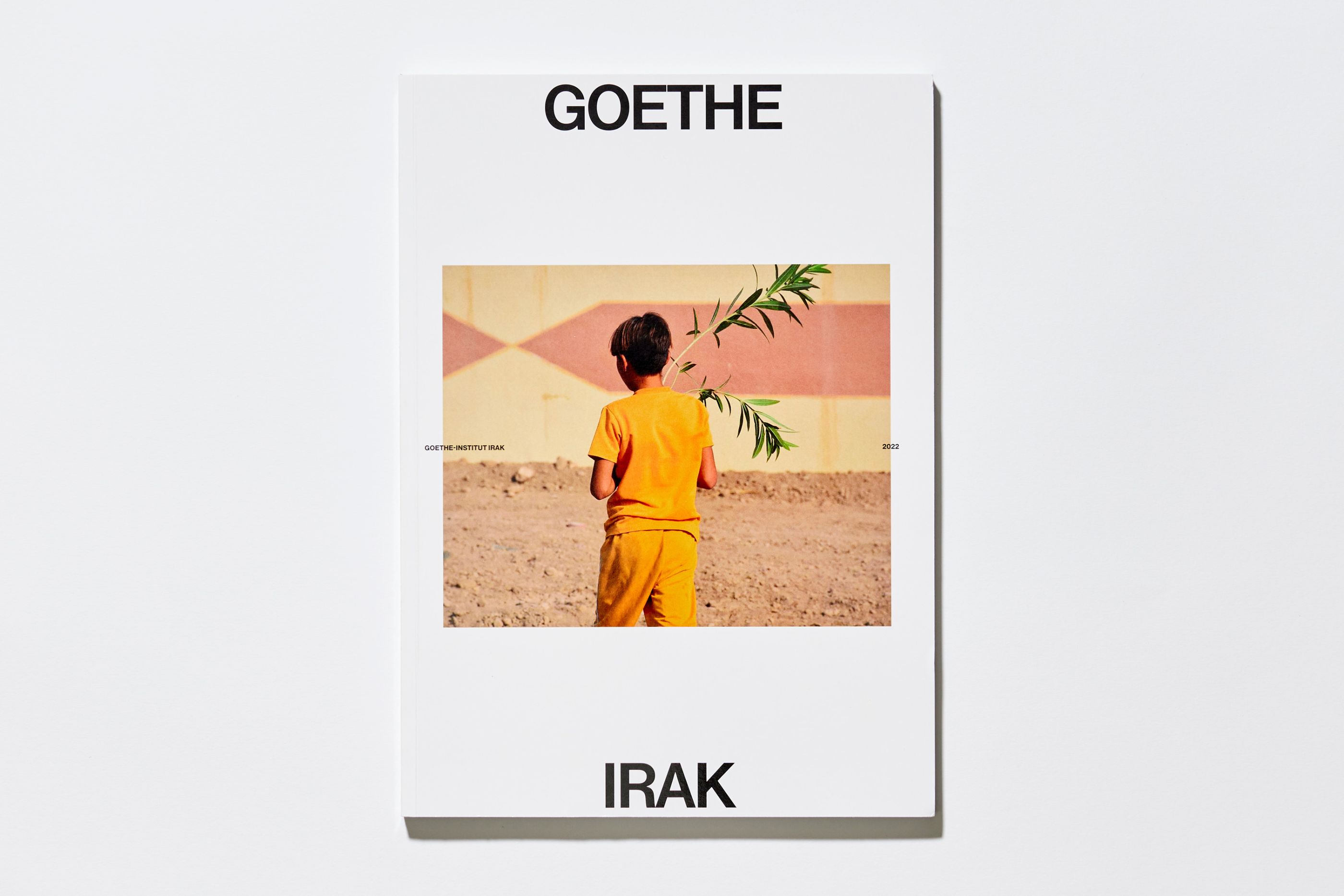
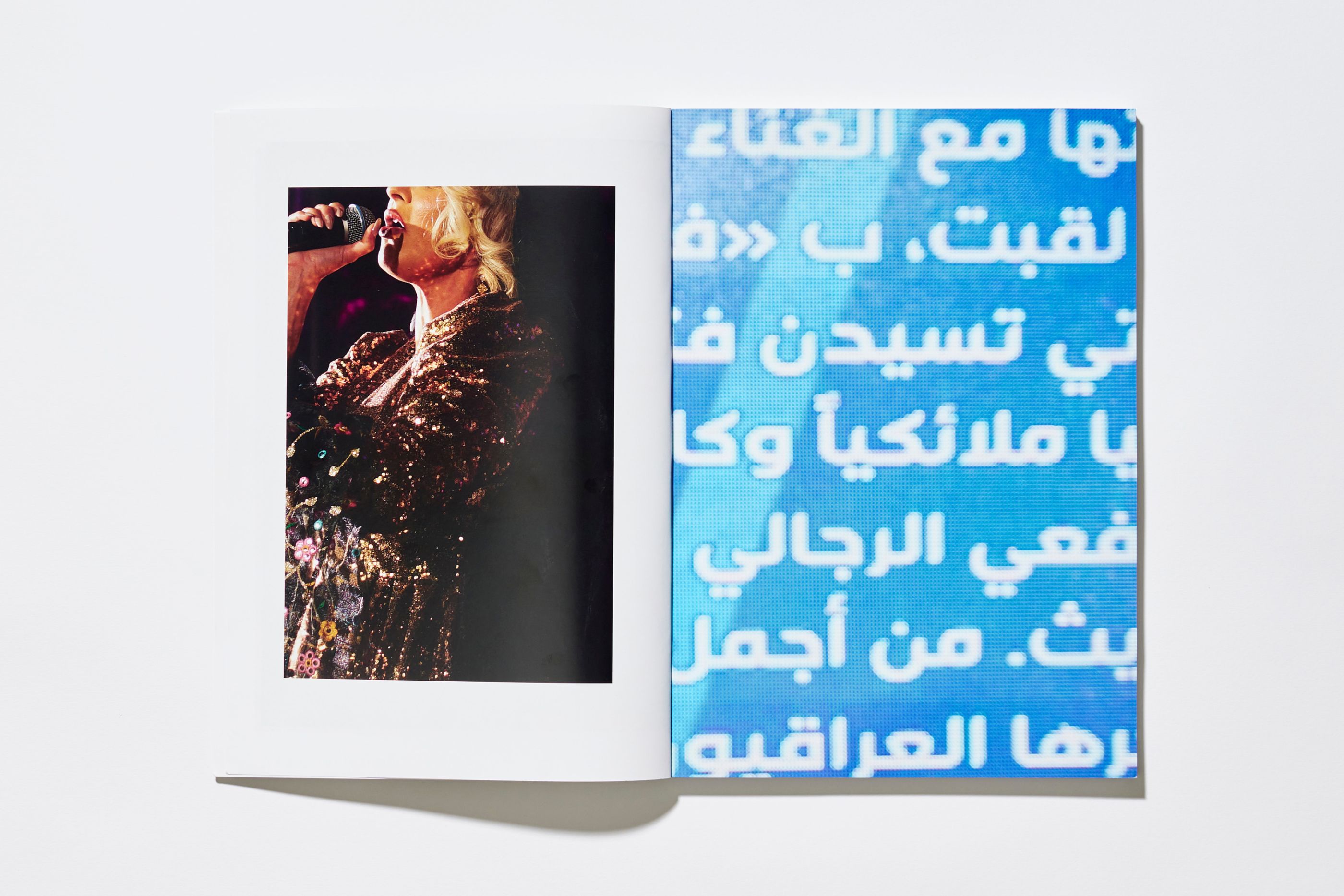
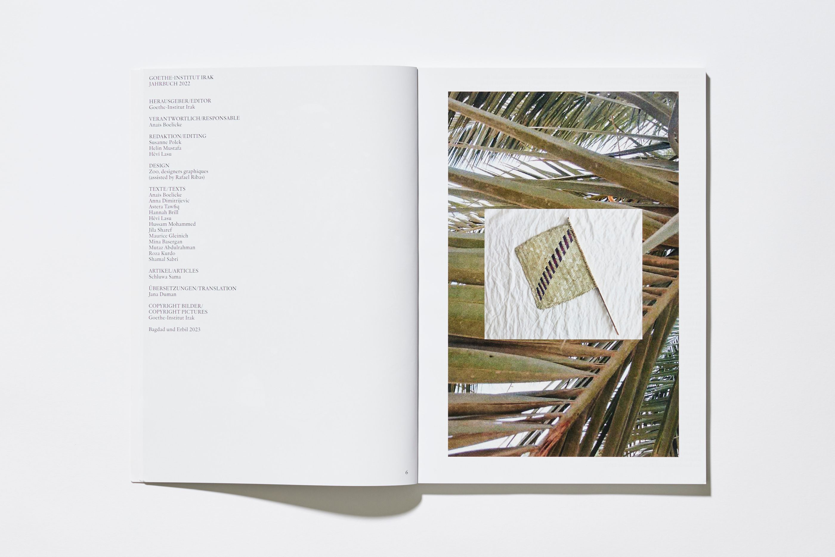
Design of the activity report for the Goethe-Institut in Iraq. We gave this institutional editorial object a more inspiring and rhythmic dimension, in the form of a magazine that expresses Iraq's artistic and cultural vivacity, gives pride of place to images and alternates typographic tonalities.
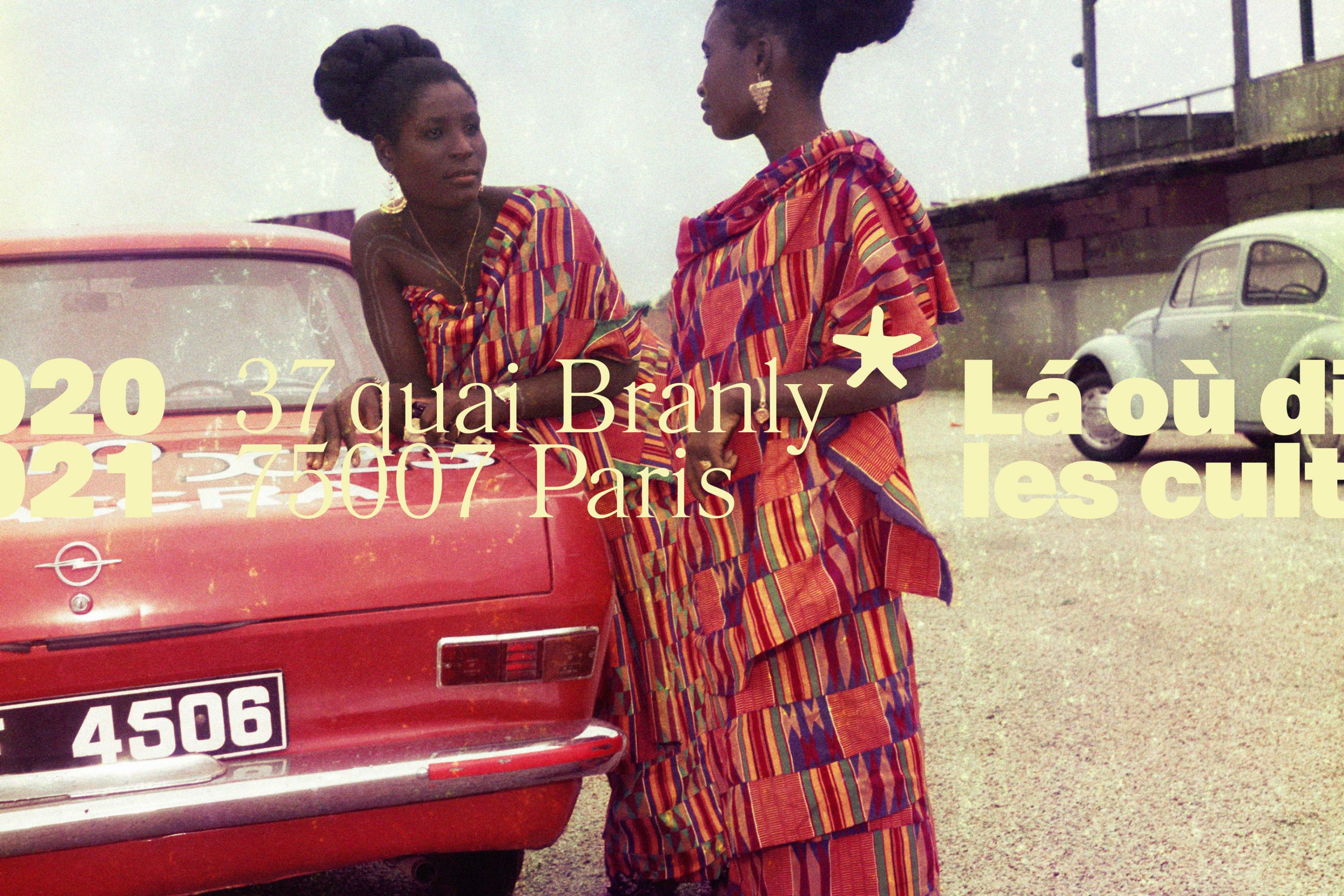
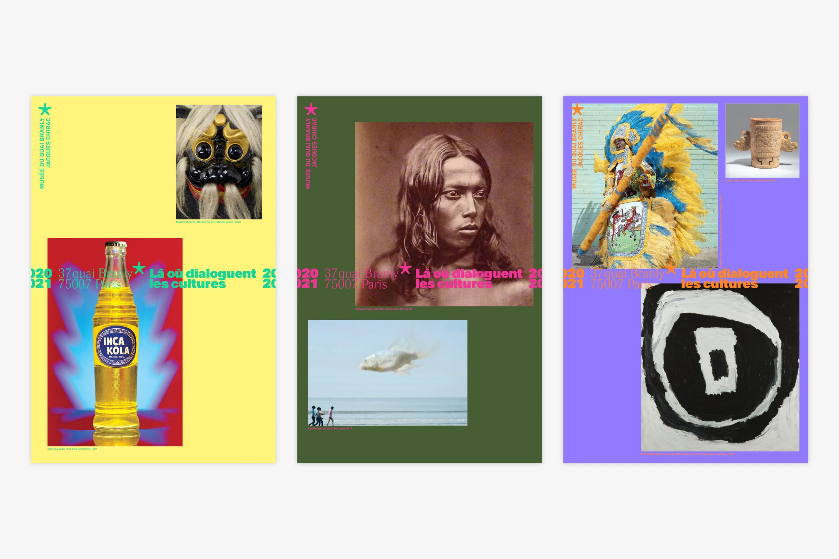
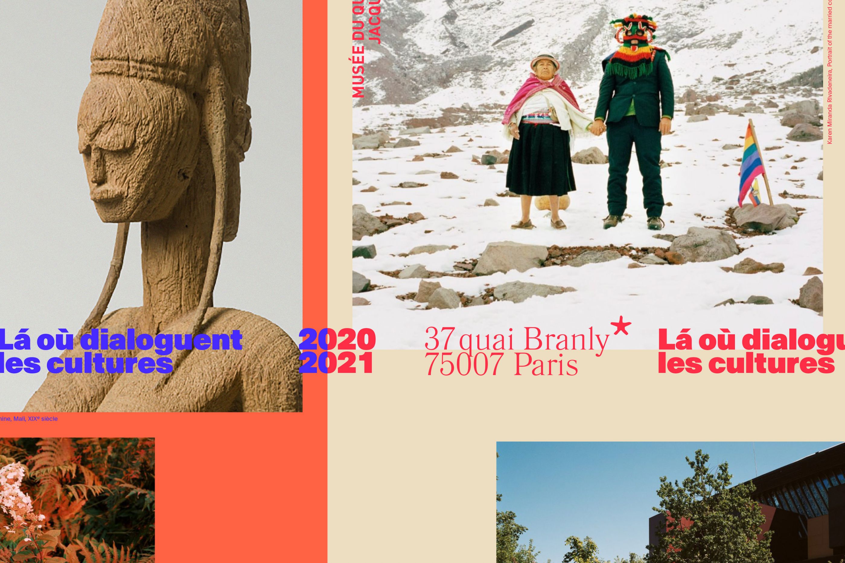
37 Quai Branly, Paris
/
Musée du quai Branly - Jacques Chirac
2020
Restricted consultation, proposal not retained.
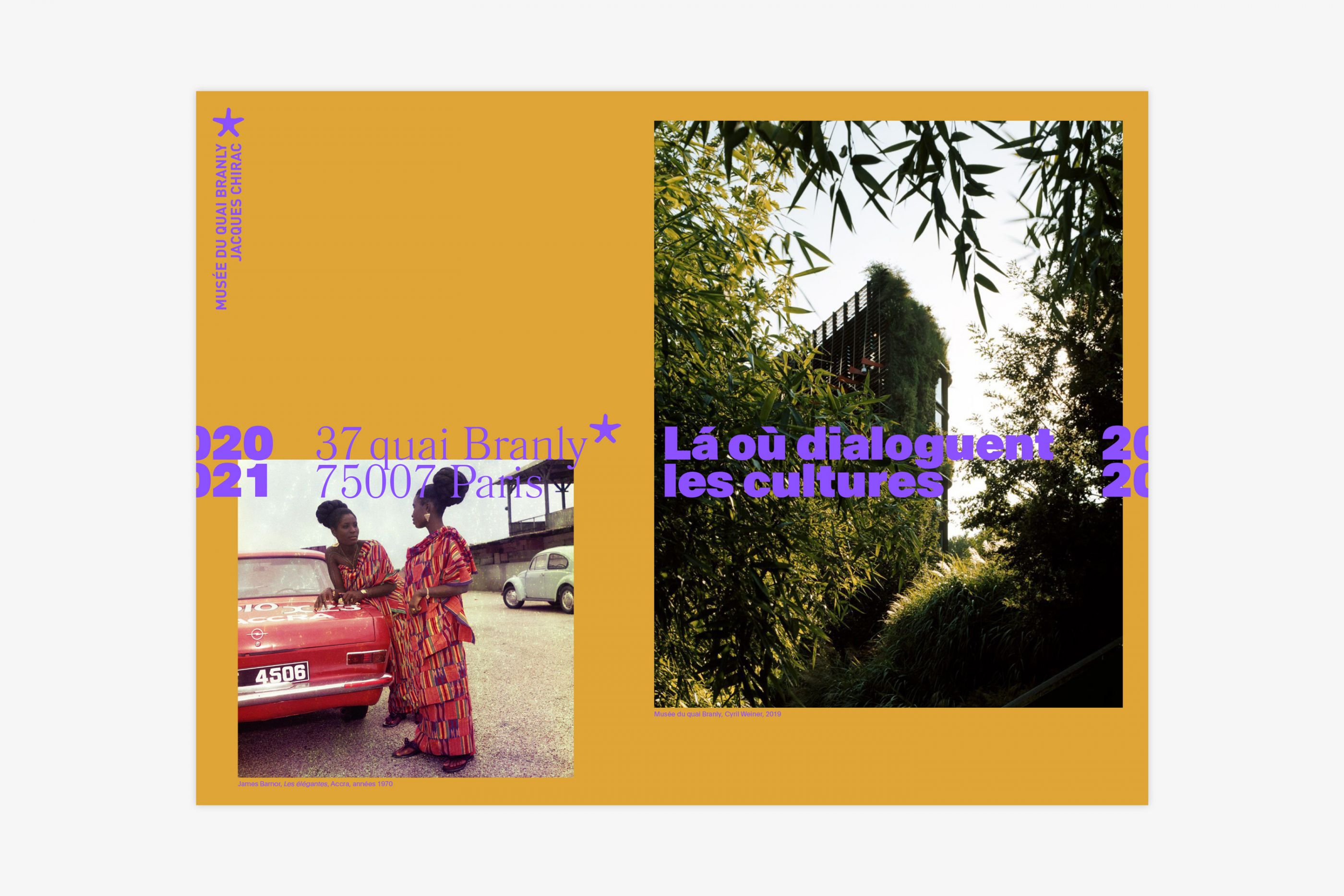
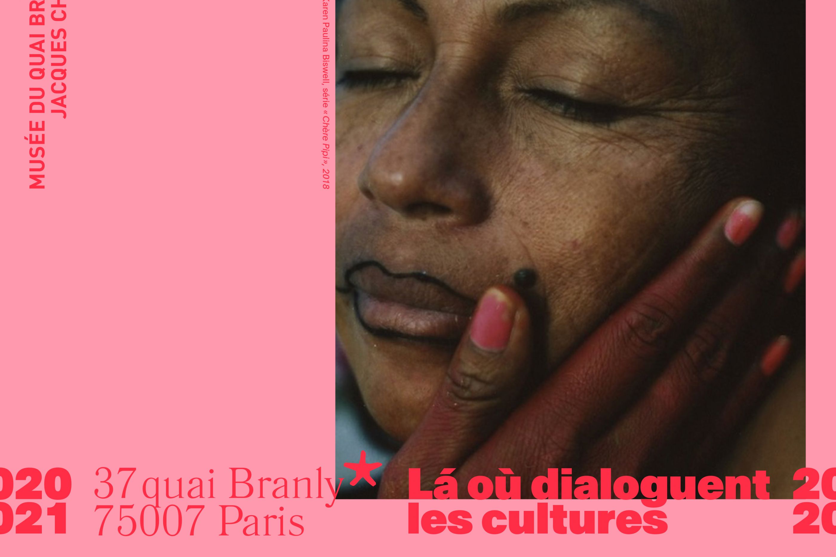
The musée du quai Branly - Jacques Chirac asked us to think about a communication campaign that will give new impetus to this prestigious cultural institution. We have decided to refocus communication on the privileged setting of the museum: the garden and the architecture specific to the identity of the place, in the heart of Paris. We proposed to keep the emblematic hook "Where cultures dialogue" by associating it with the address of the Museum "37, quai Branly, 75007 Paris", as an invitation, a reference to travel and dialogue. Associated with images from five continents, the lush garden, works and objects from all eras, the Parisian address of this institution creates a powerful contrast.
In a more convincing, more human and more lively visual spirit, we have chosen a more transversal approach by showing the incredible richness and diversity of the collections: contemporary art, photography, everyday objects, etc. The idea is to create new links with the contemporary world and current creative disciplines in order to reach a wider, younger and more connected audience.
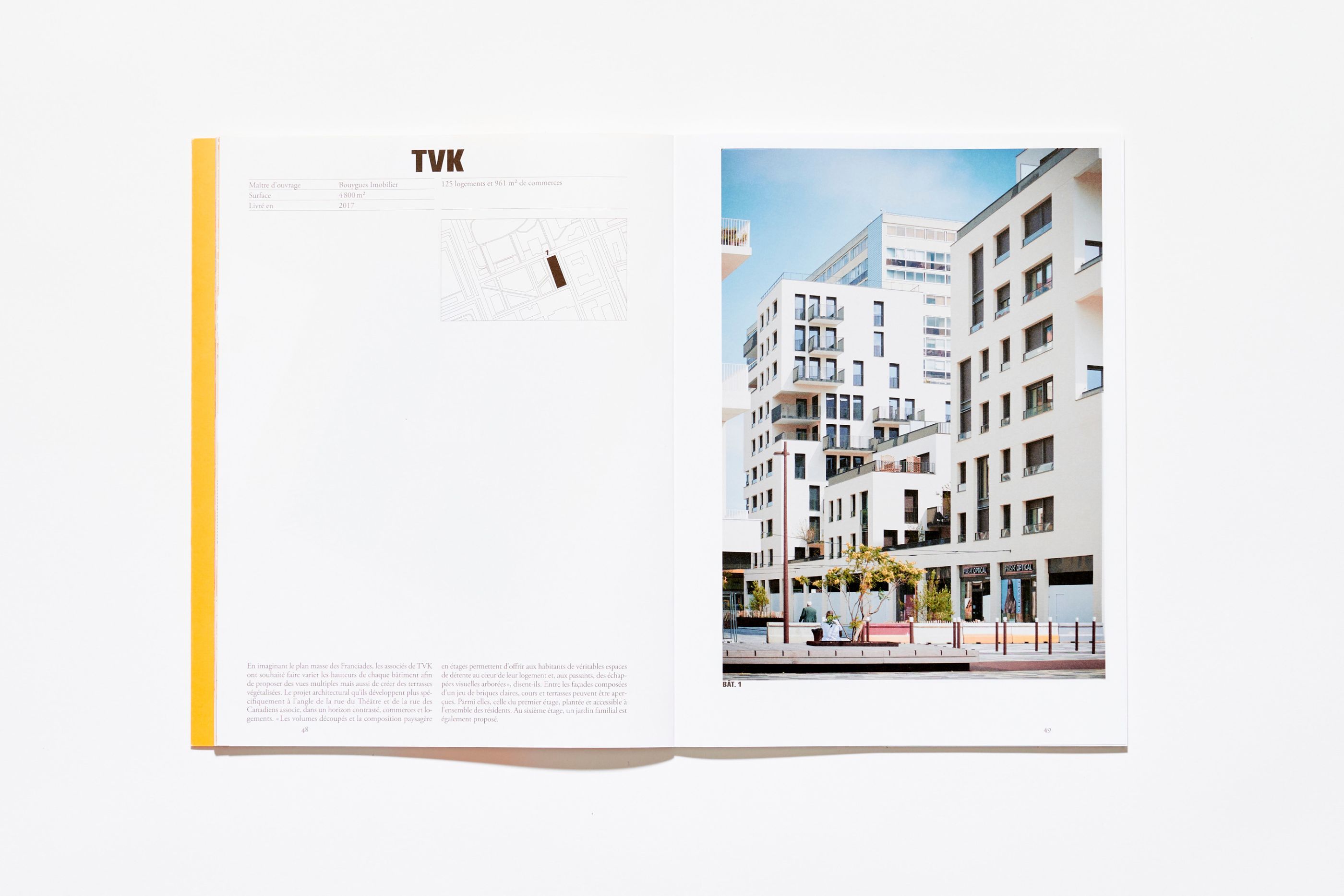
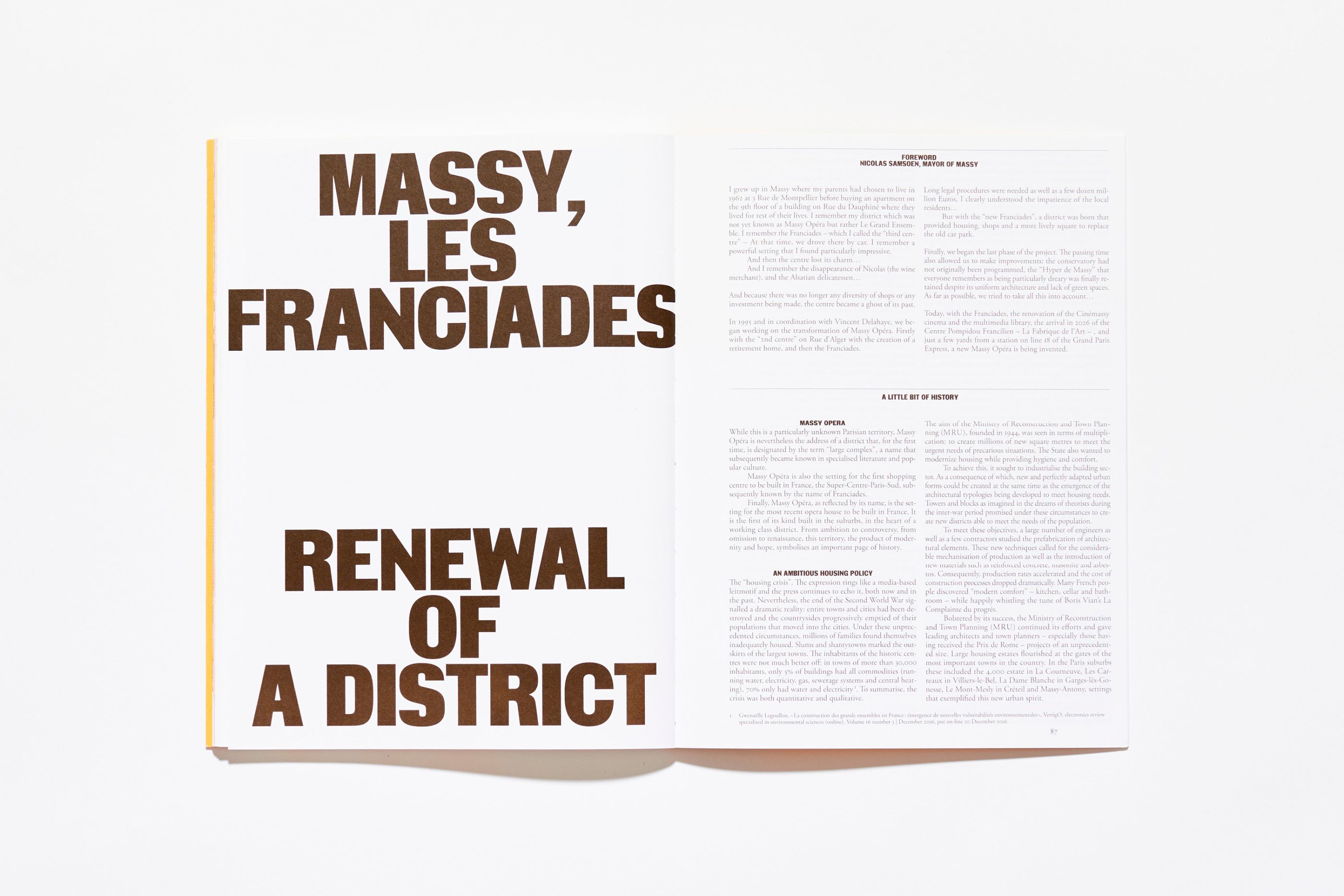
Massy, les Franciades
/
Paris Sud Aménagement, AAM – Ante Prima éditions
2023
Editorial Design, Collection
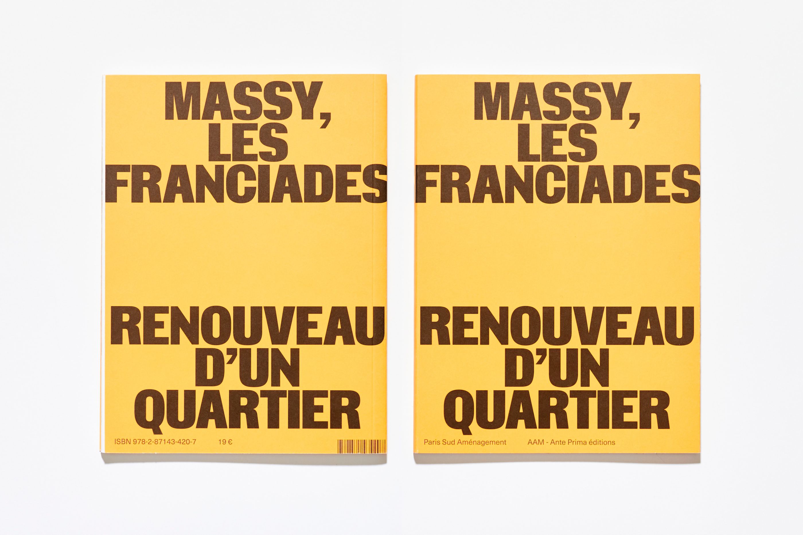
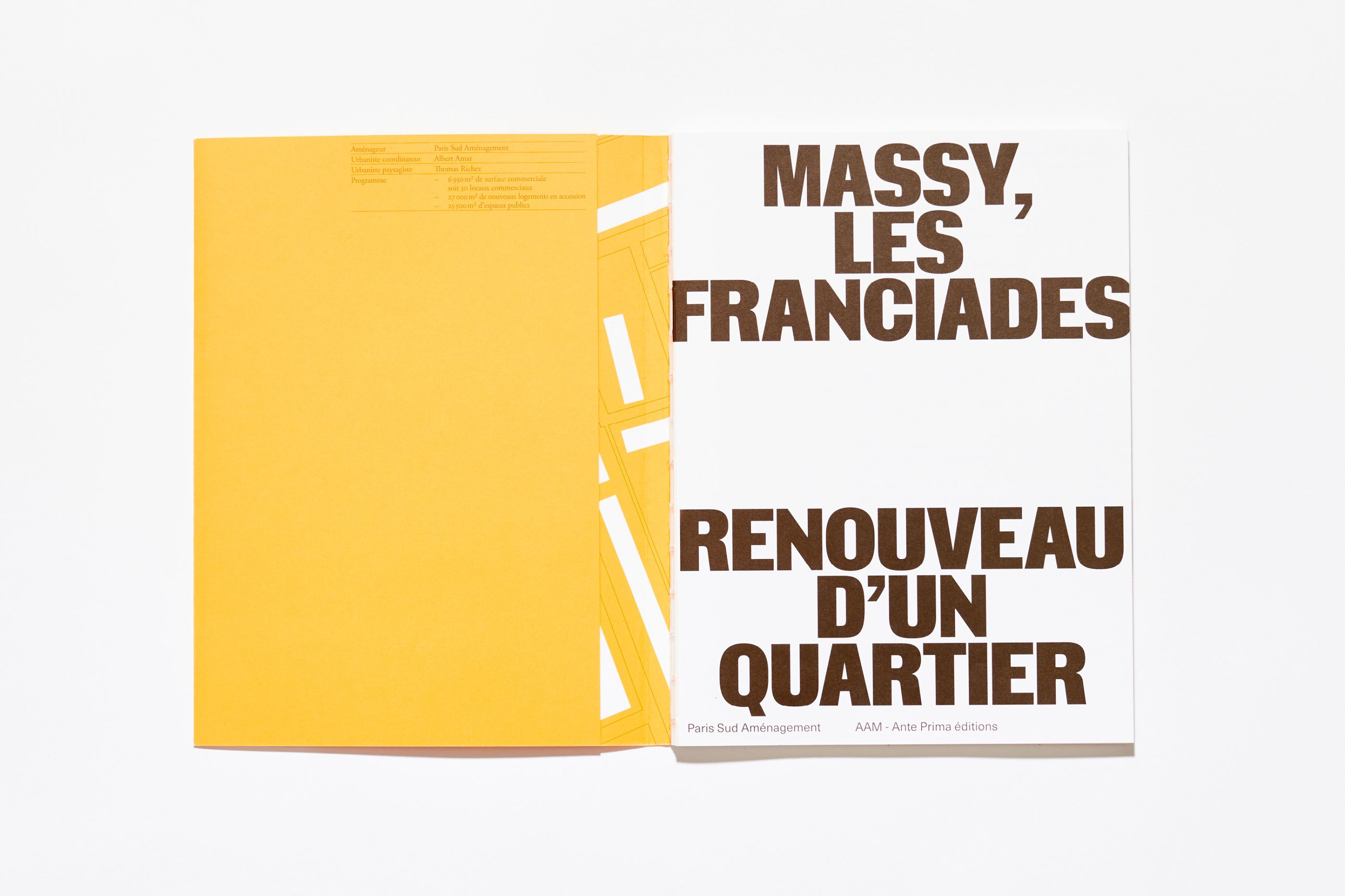
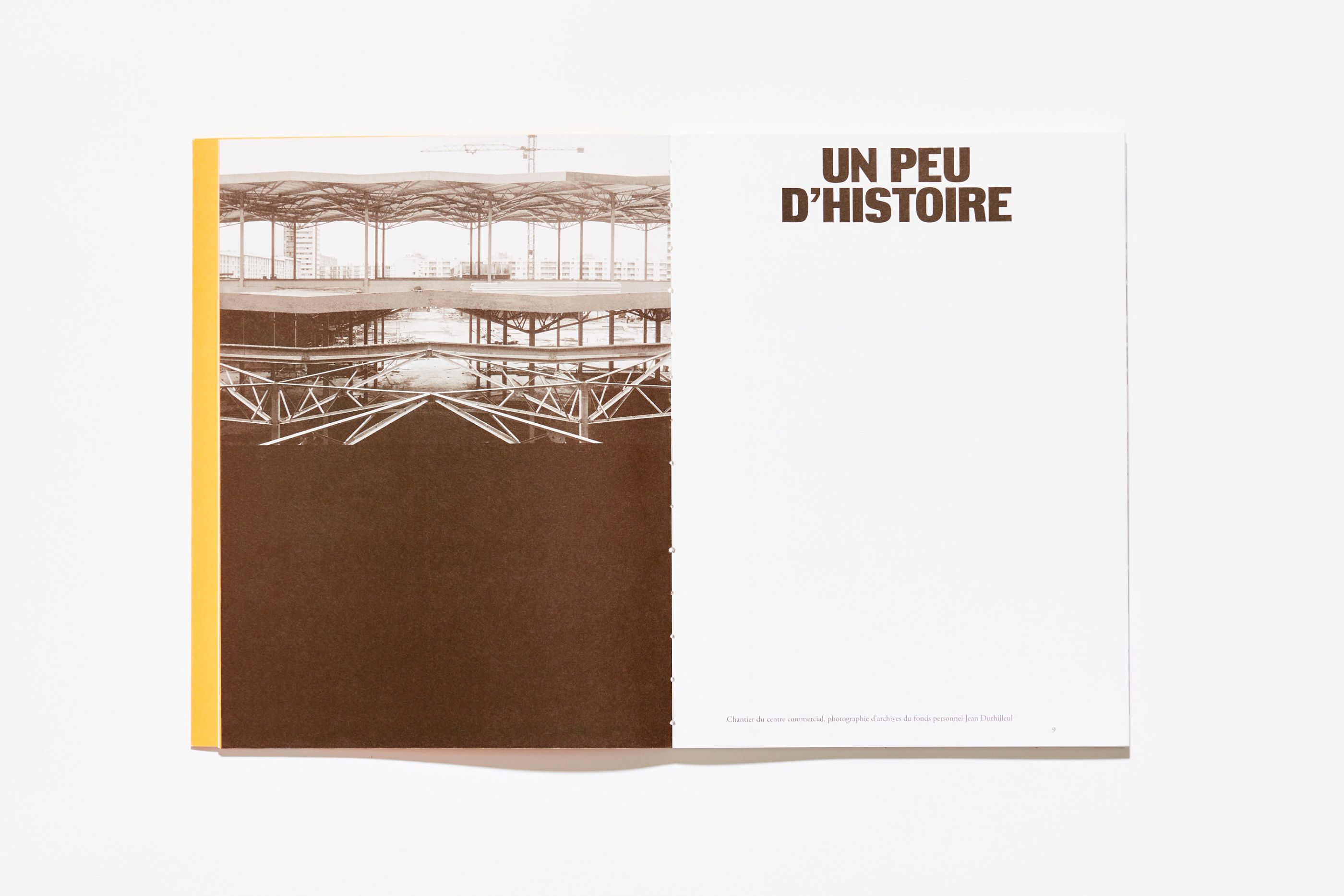
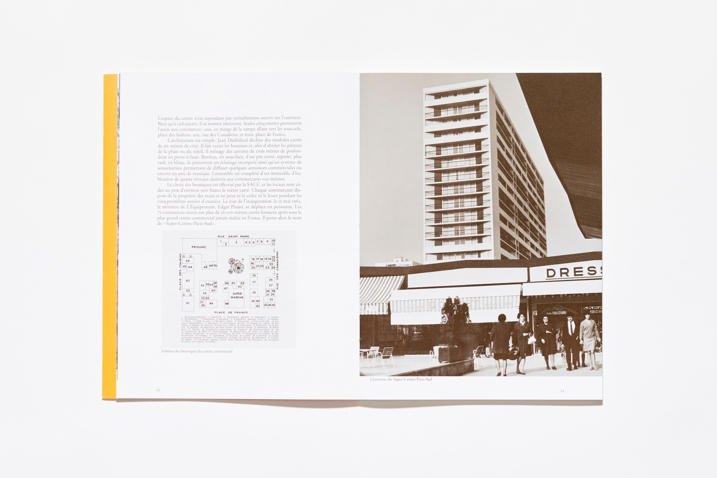
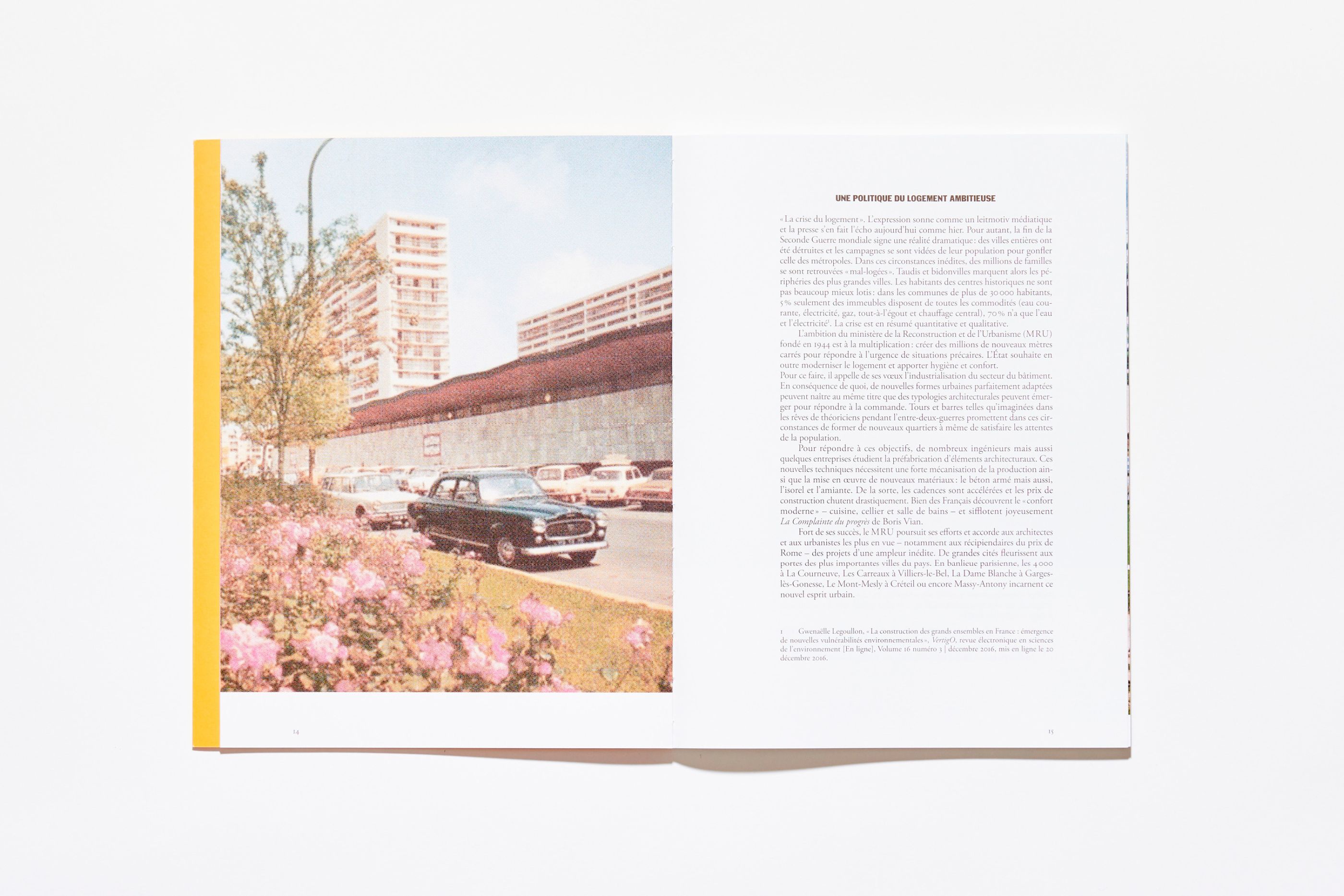
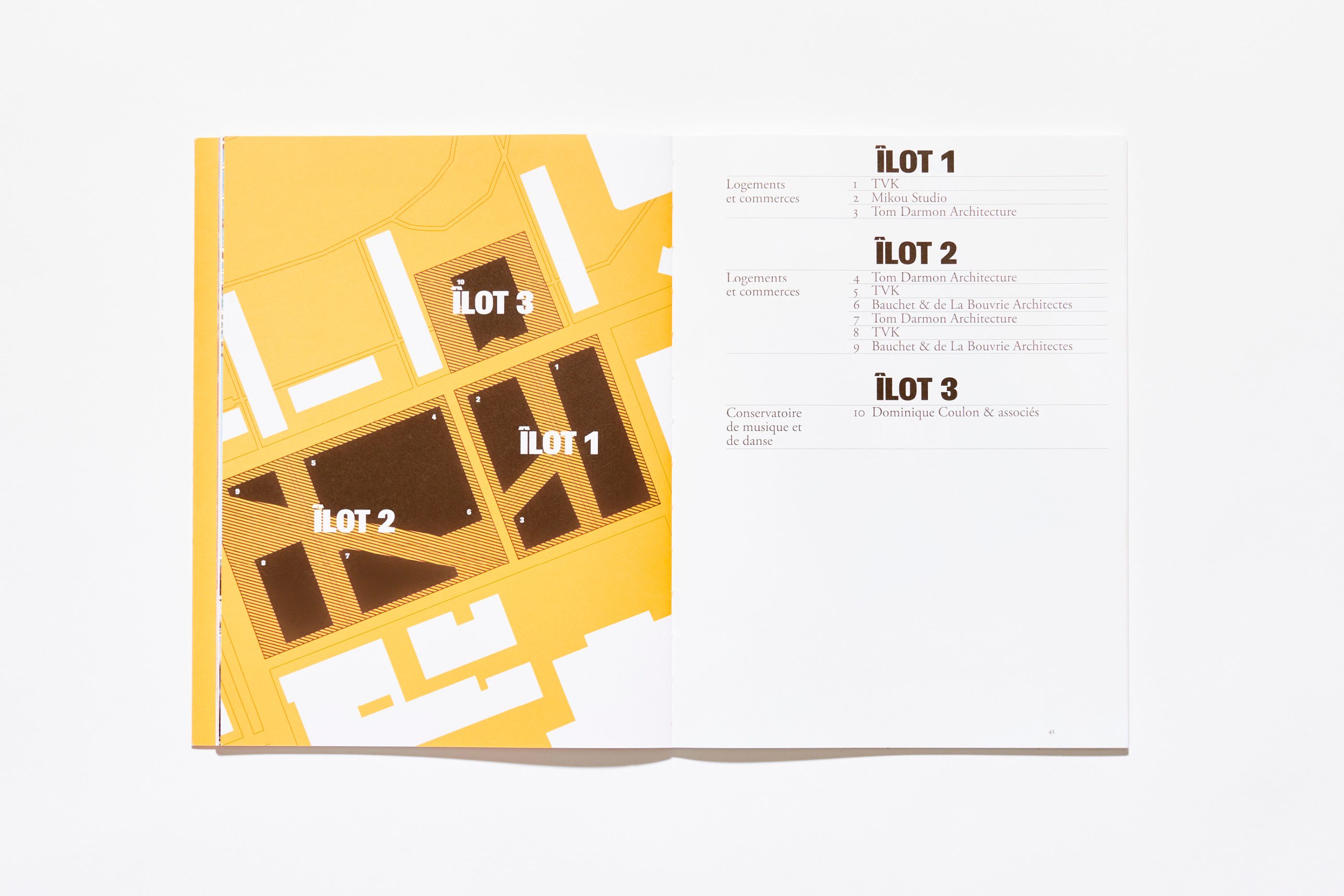
Les Franciades is part of the Massy Opéra district, a "grand ensemble" which is also the site of the largest shopping center ever built in France in the 1960s. We designed this book in collaboration with Paris Sud Aménagement and Editions AAM, as part of a collection of works dedicated to the architectural, landscape and urban evolution of the city of Massy. It tells the story of this district's redevelopment project.
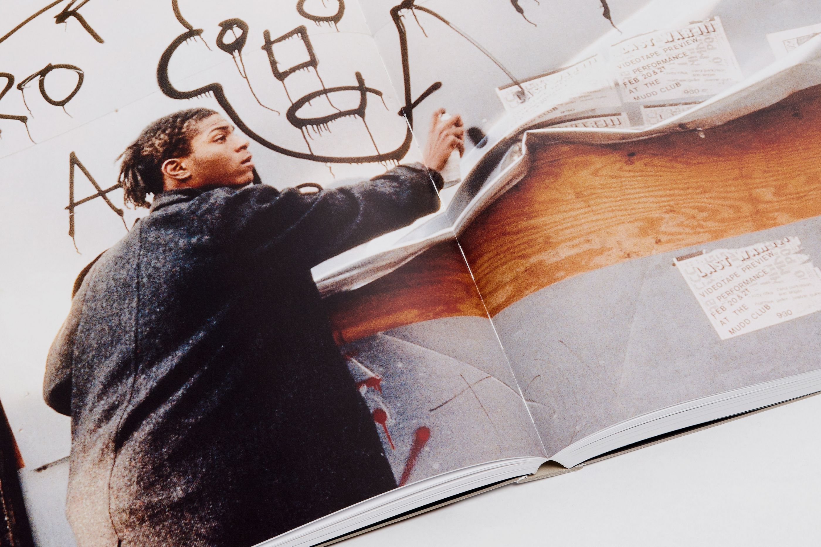
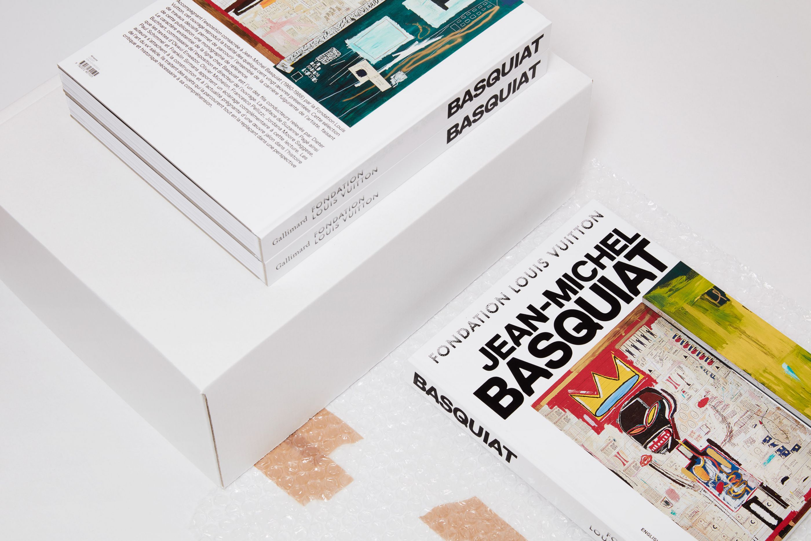
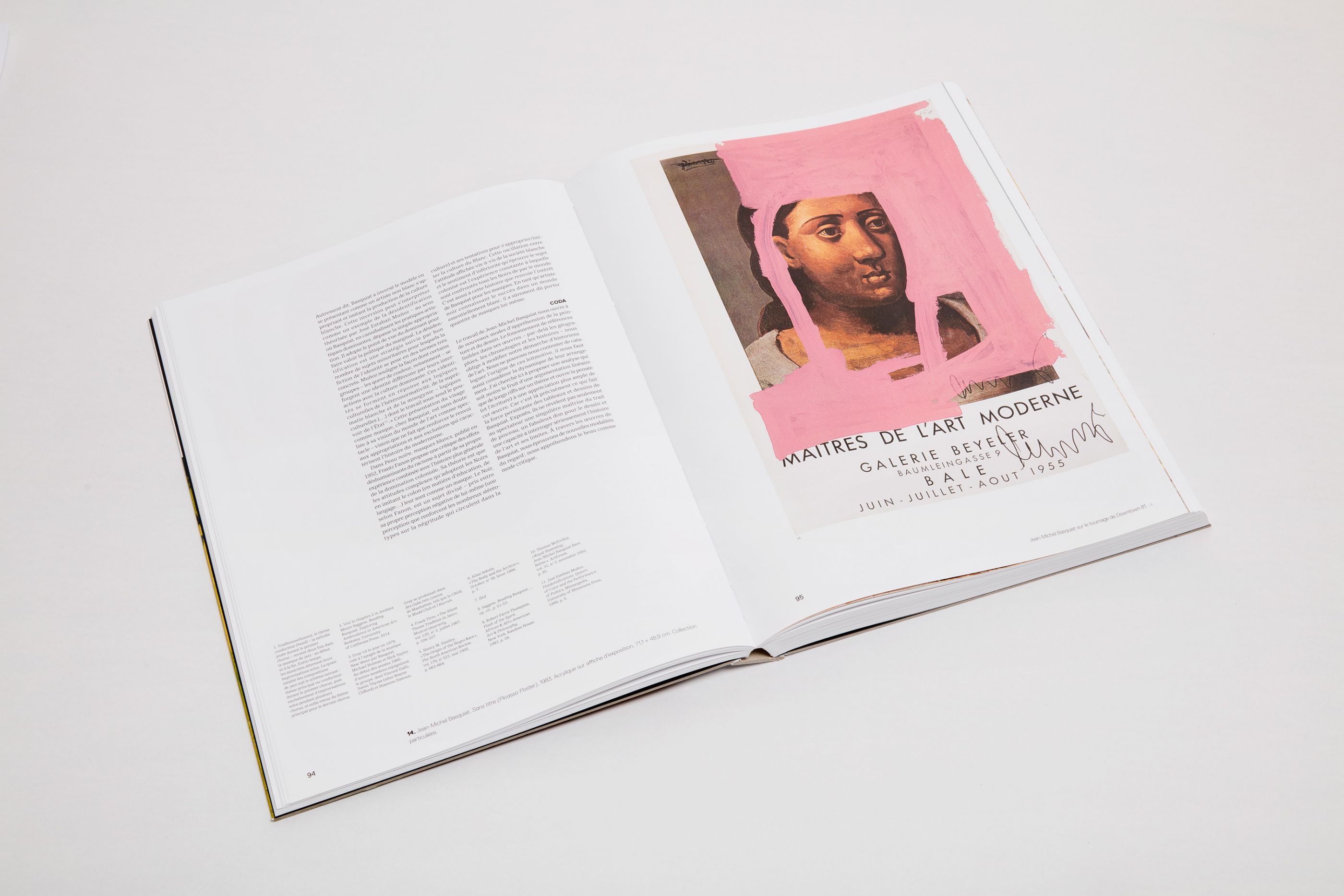
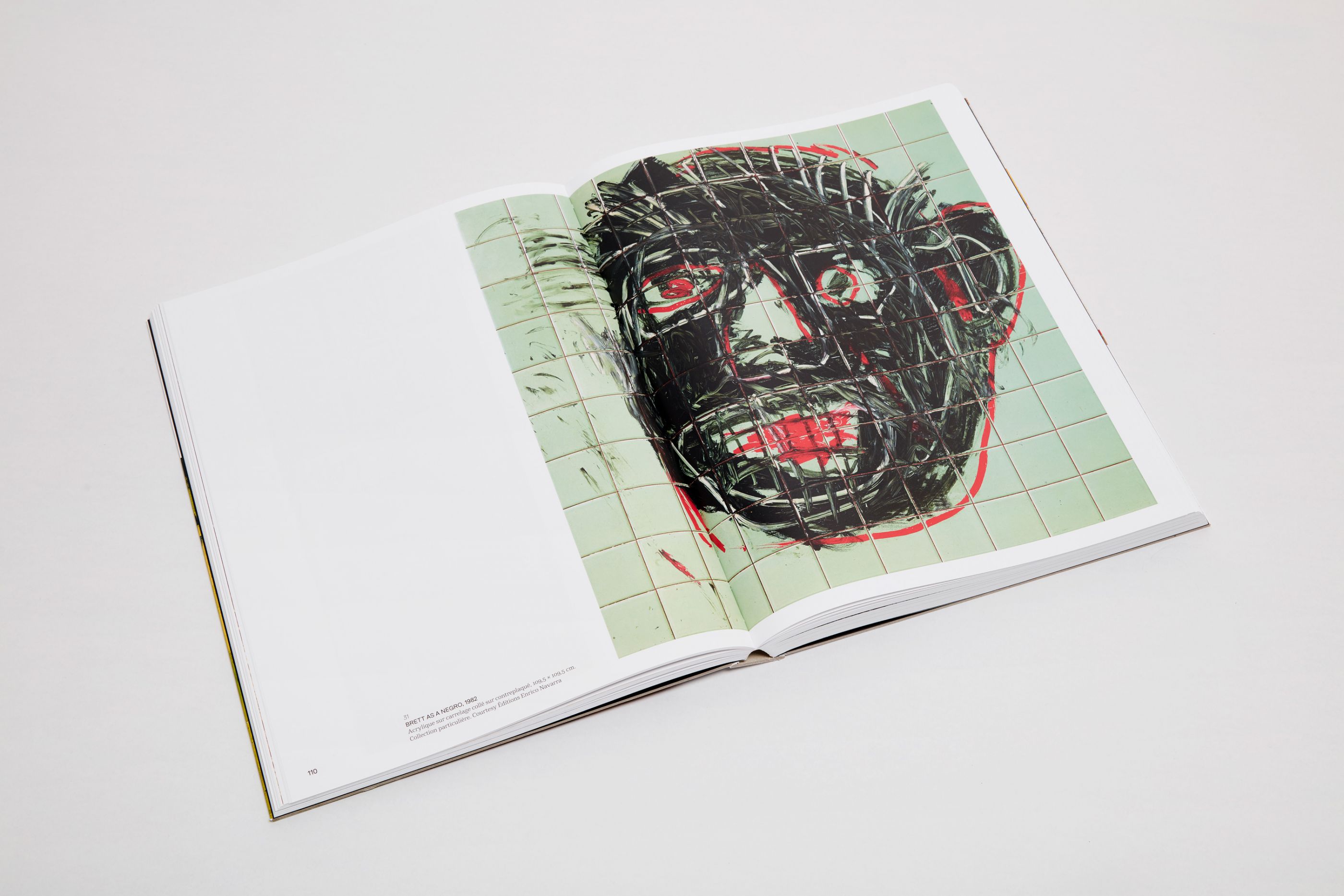
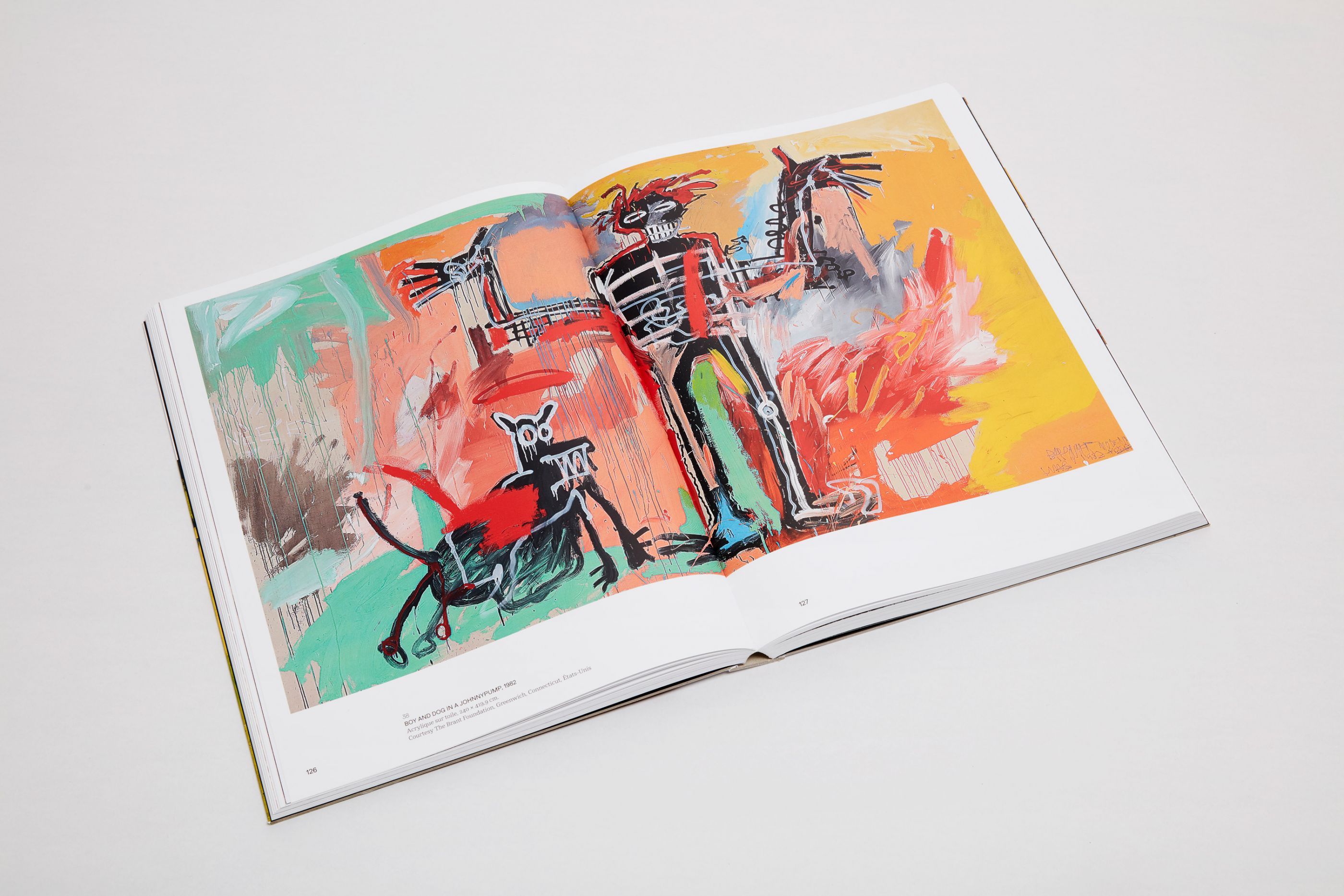
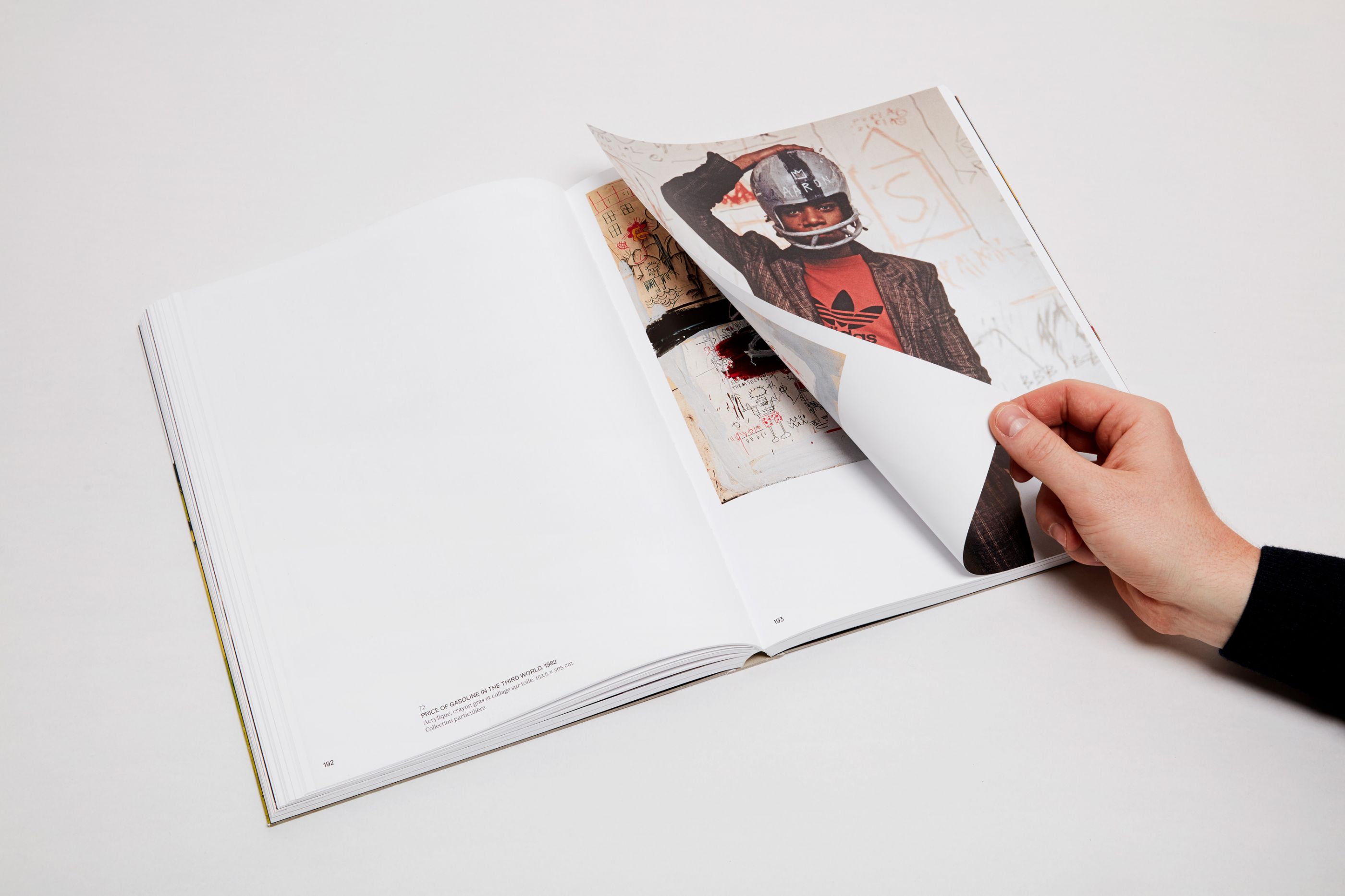
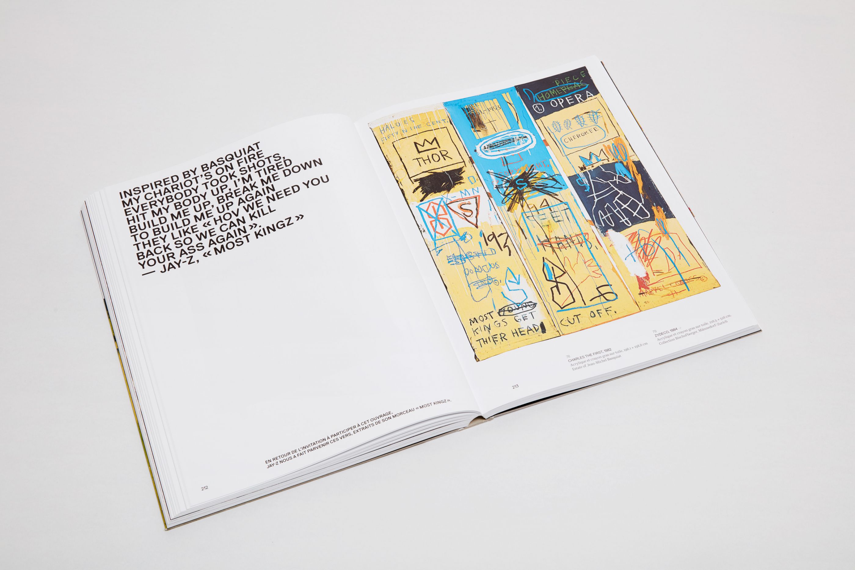
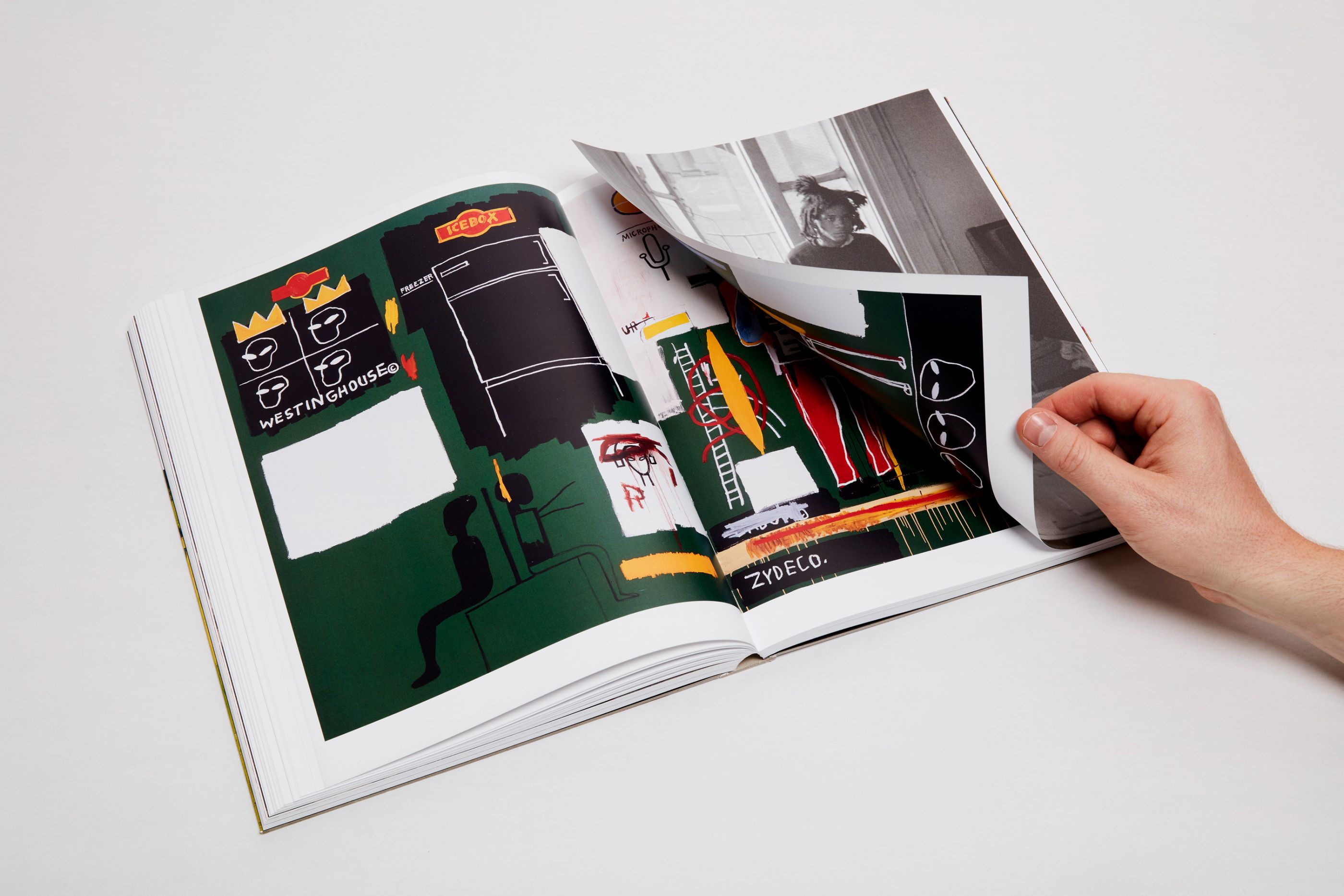
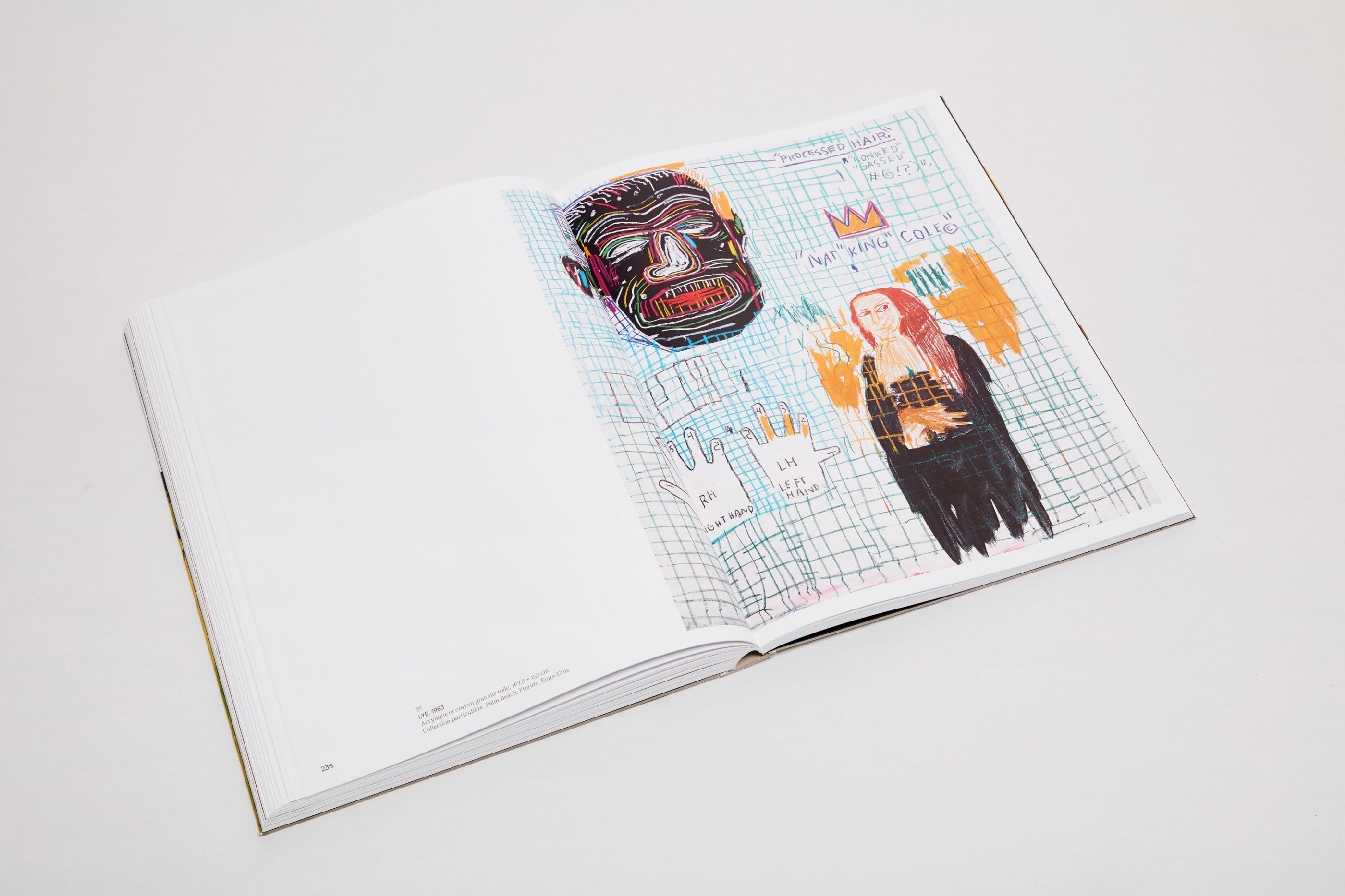
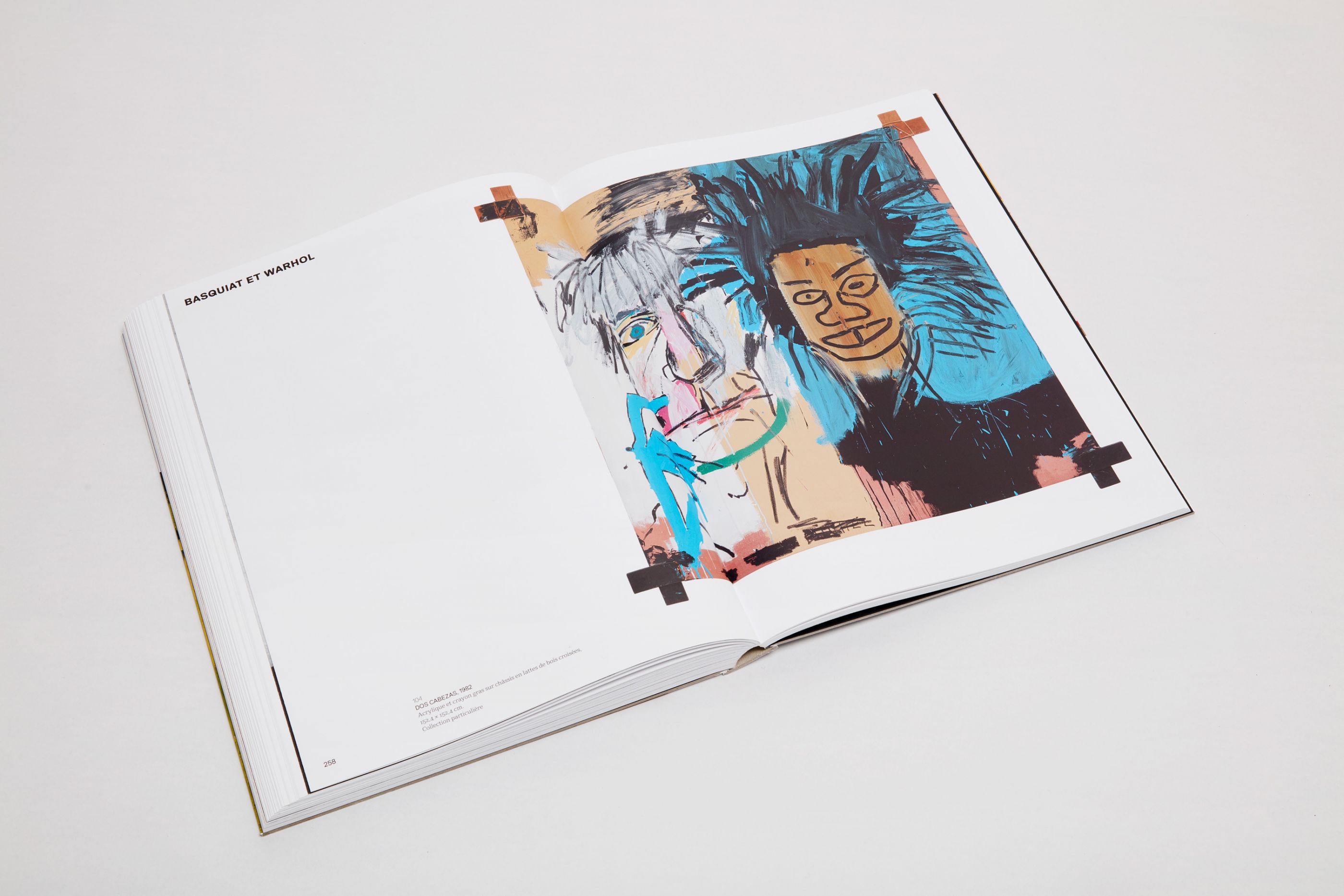
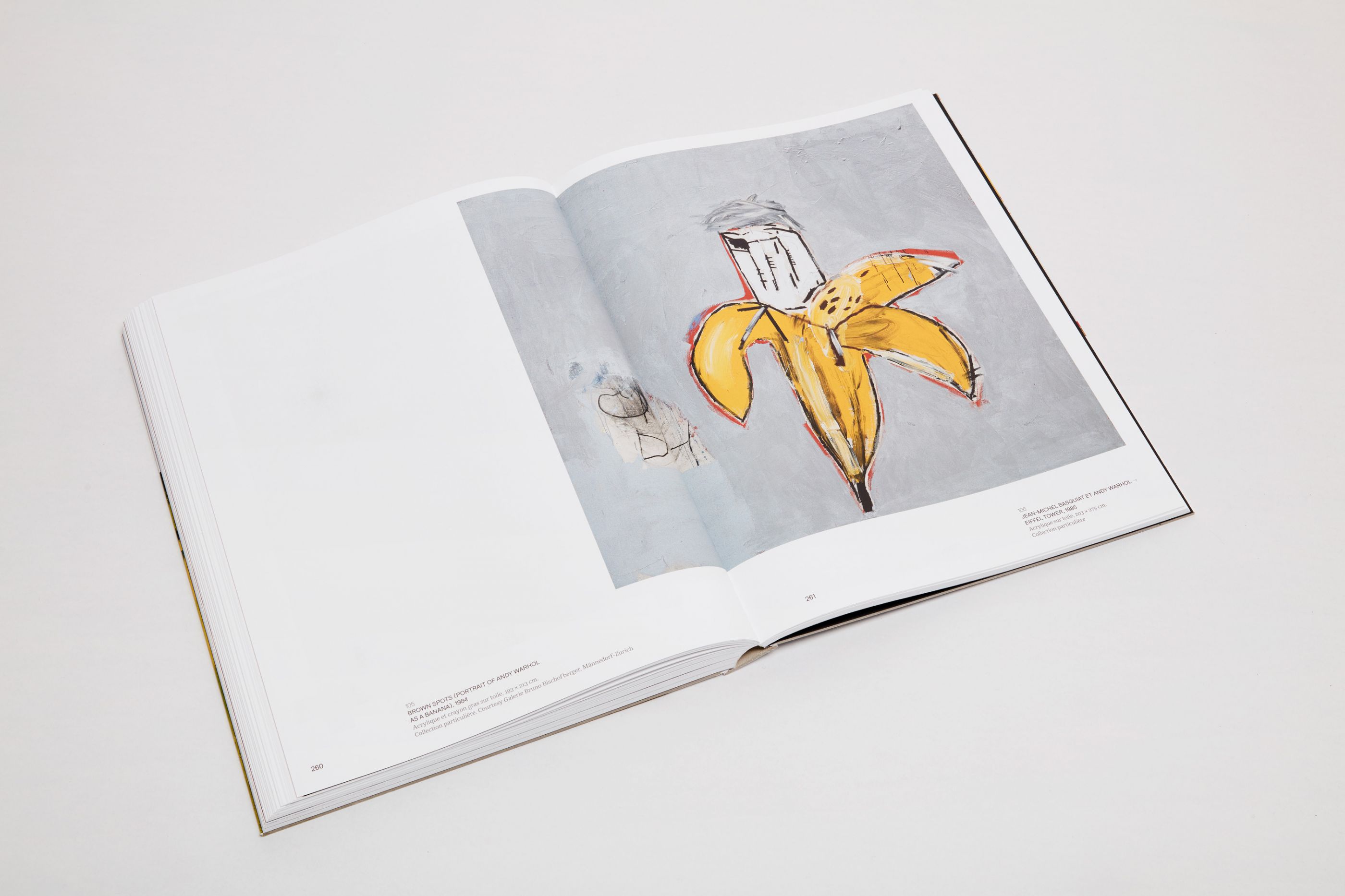
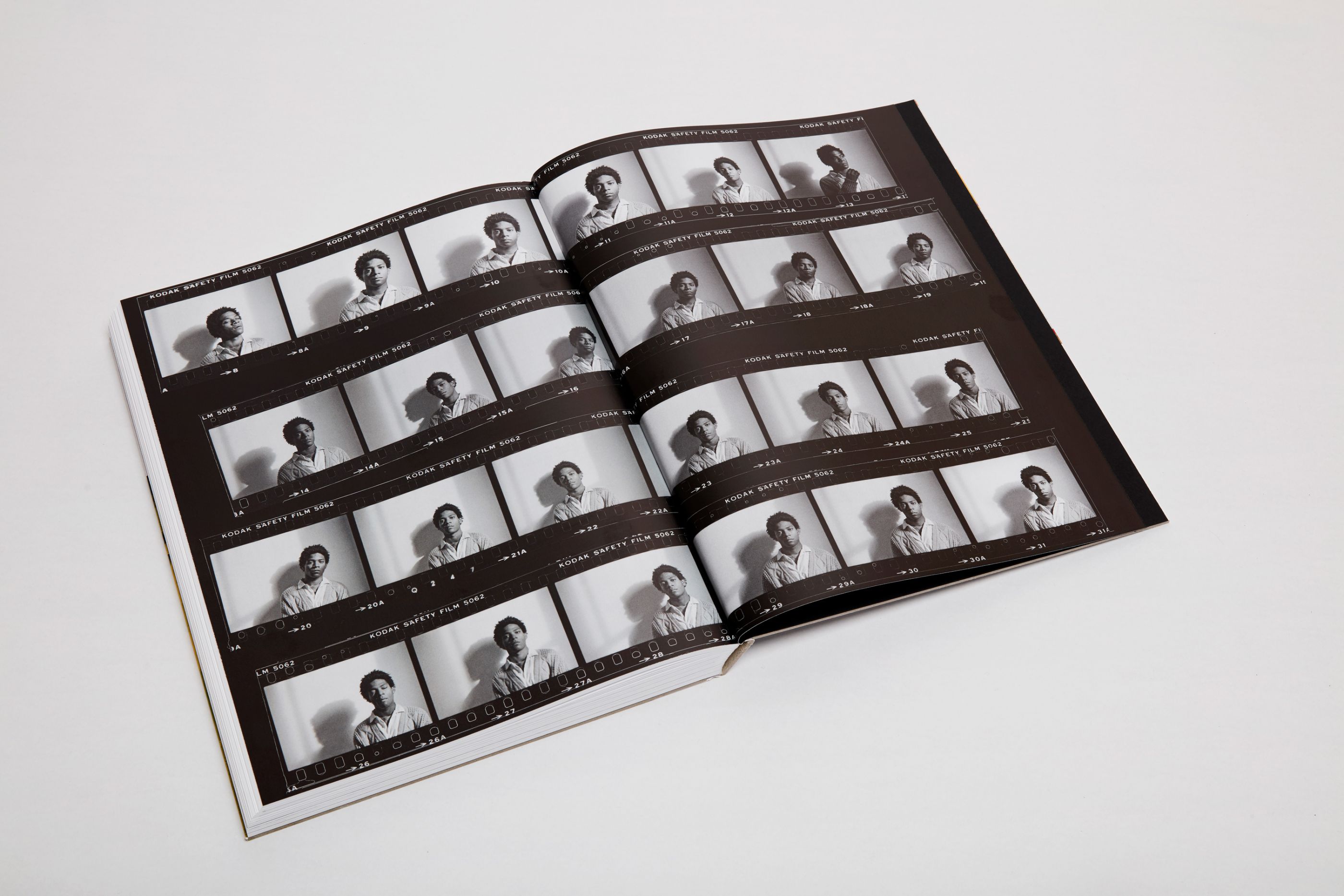
Basquiat à la Fondation Louis Vuitton
/
éditions Gallimard / Fondation Louis Vuitton
2018
24 x 32 cm, 324 pages
Reference catalog designed together with Gallimard publishers for the unique exhibition at the Fondation Louis Vuitton, covering the painter’s whole career, based on 120 defining works. The catalog includes a survey of Jean-Michel Basquiat’s work from 1980 to 1988.
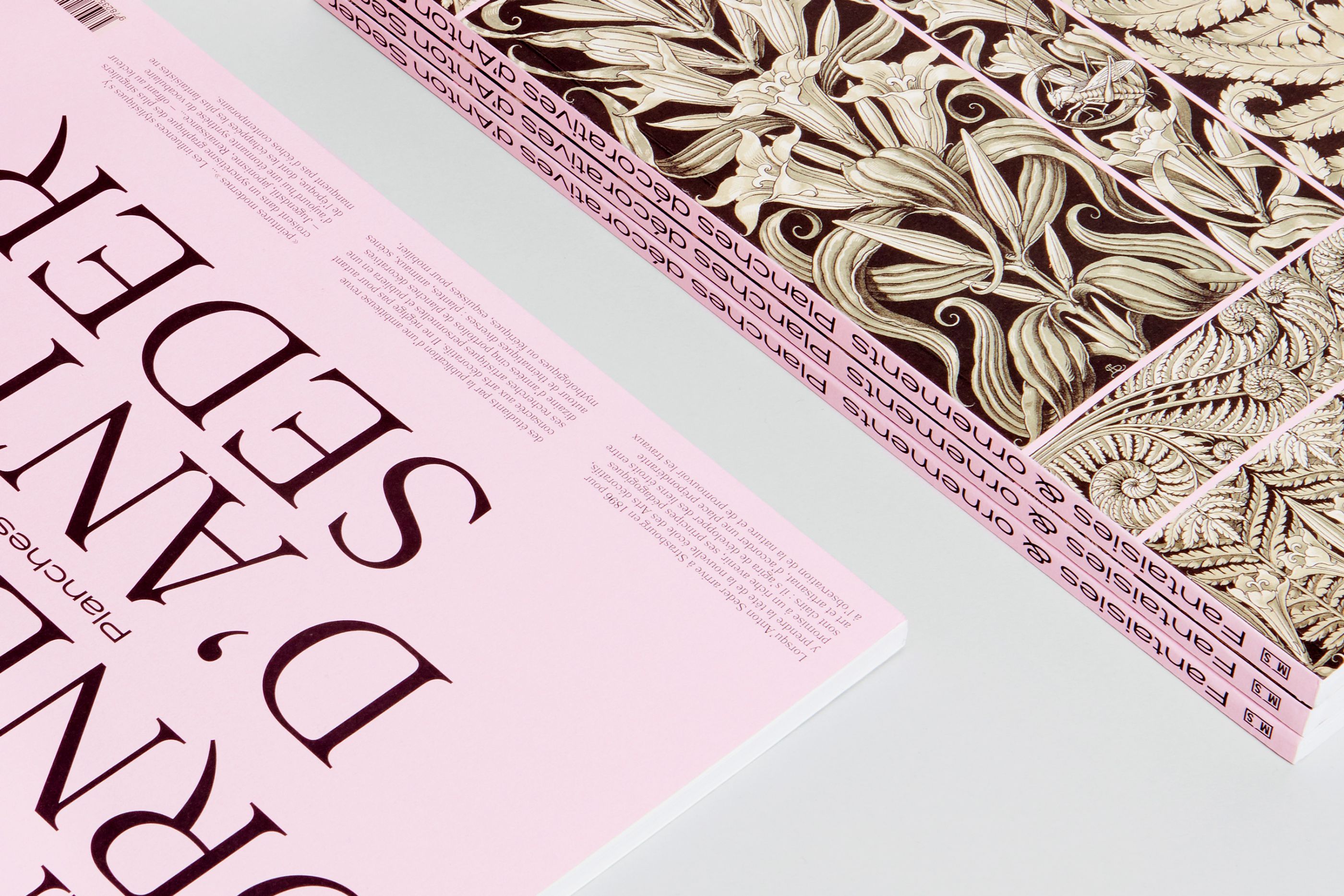
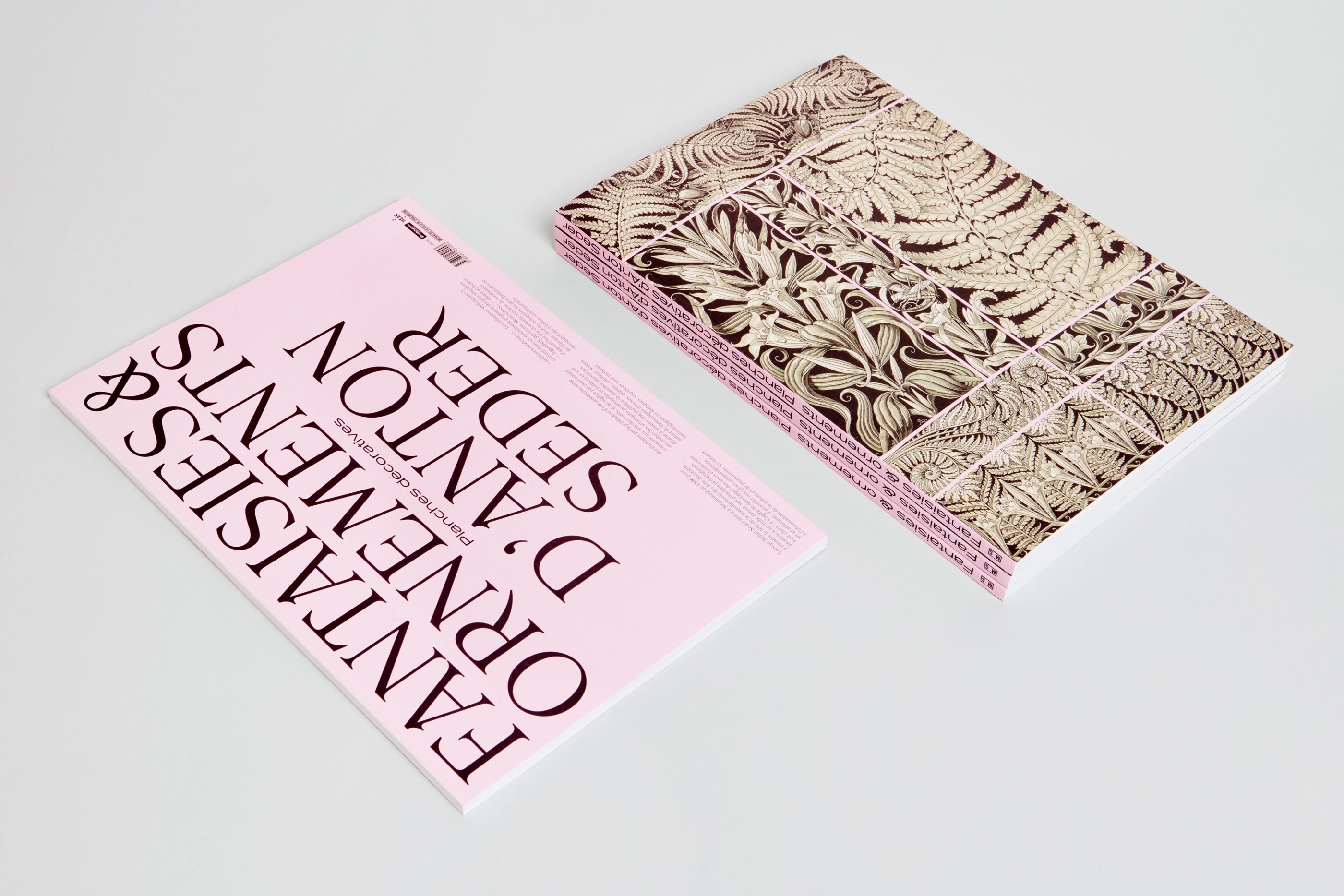
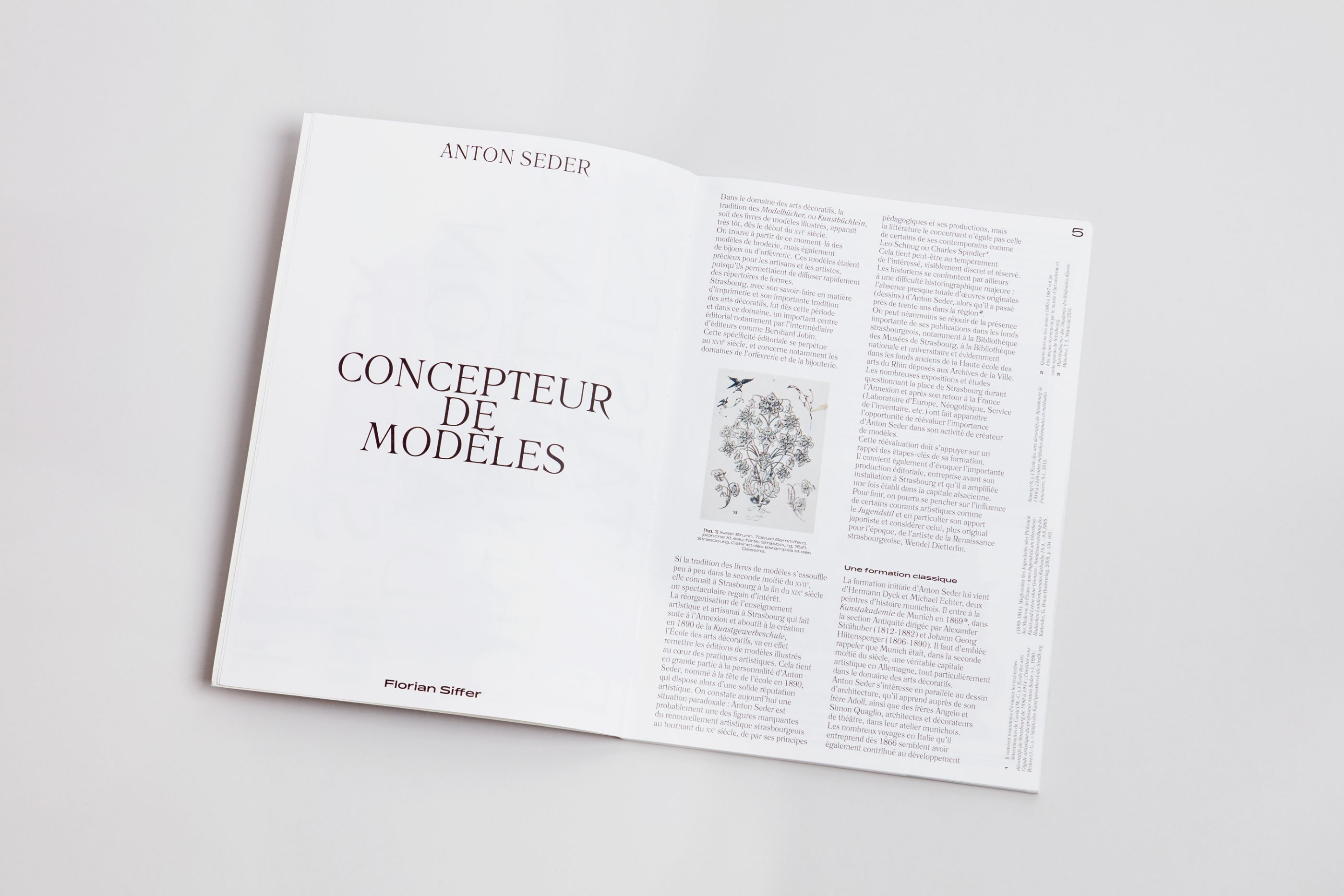
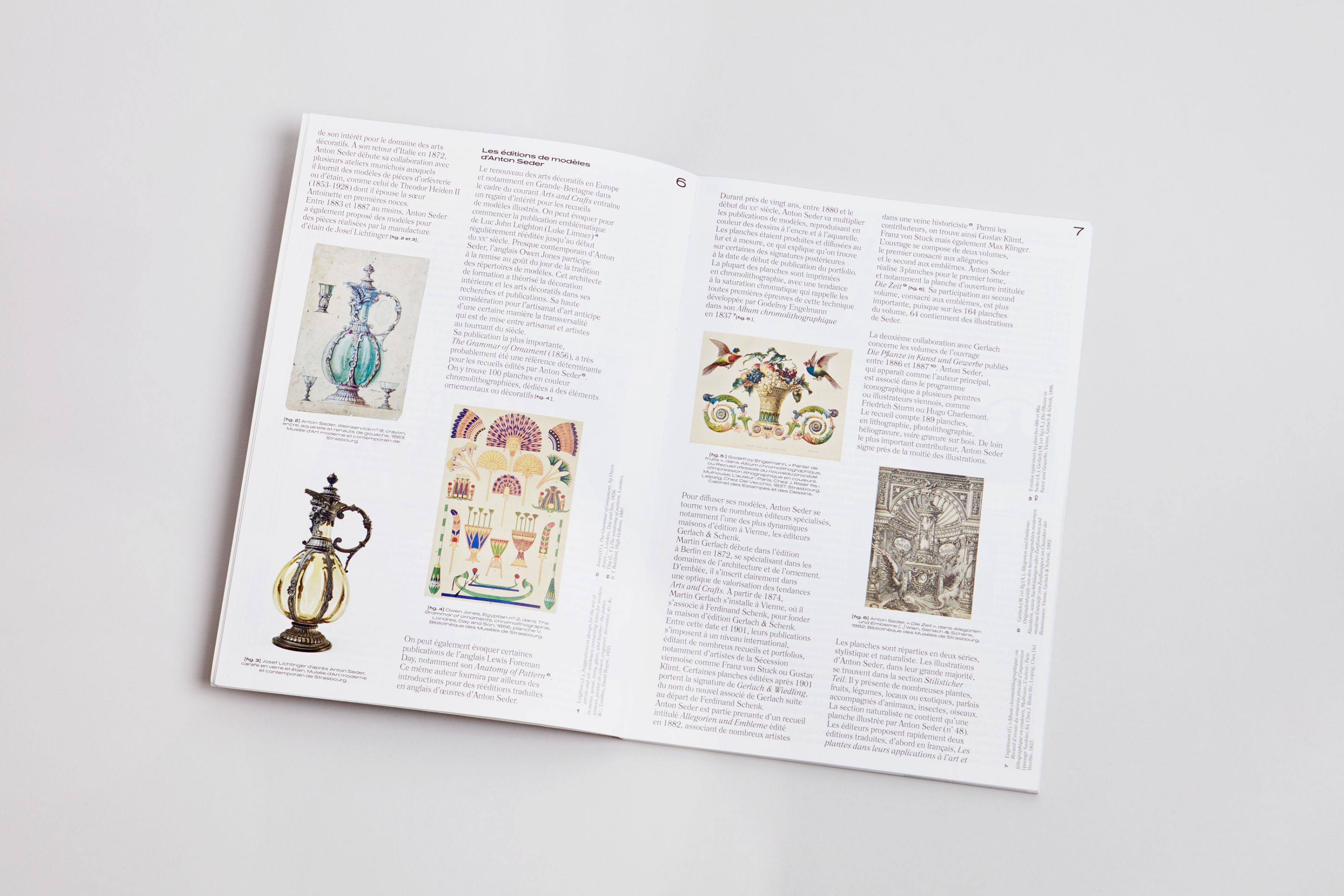
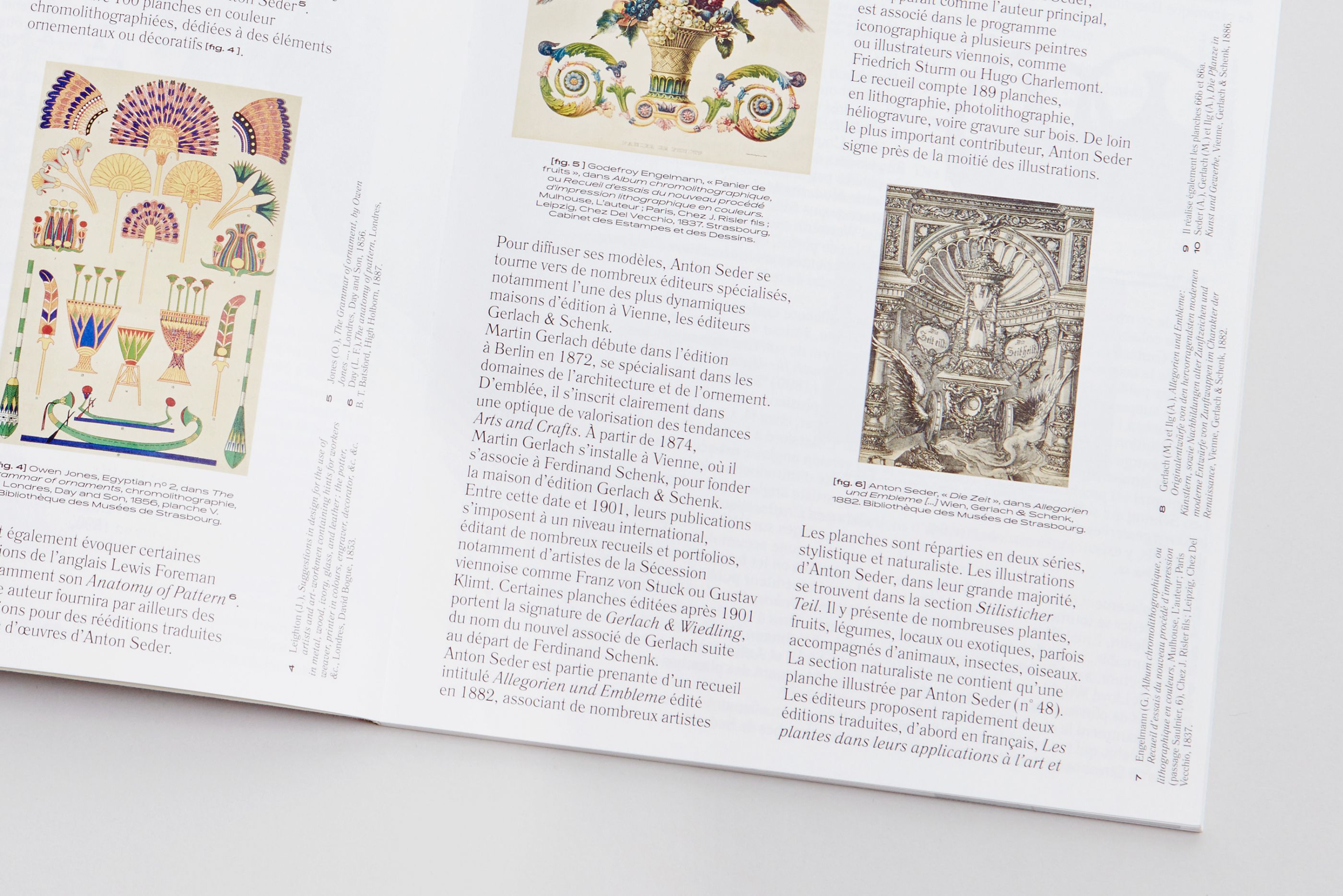
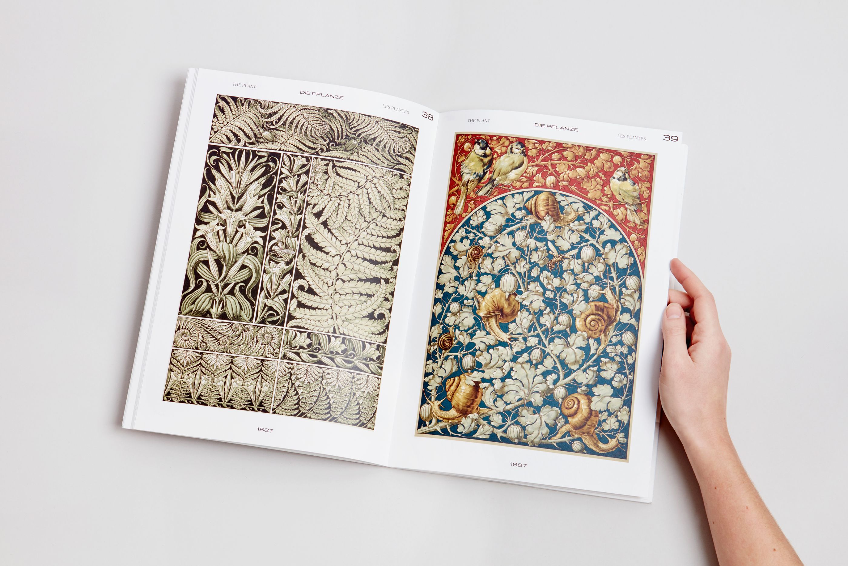
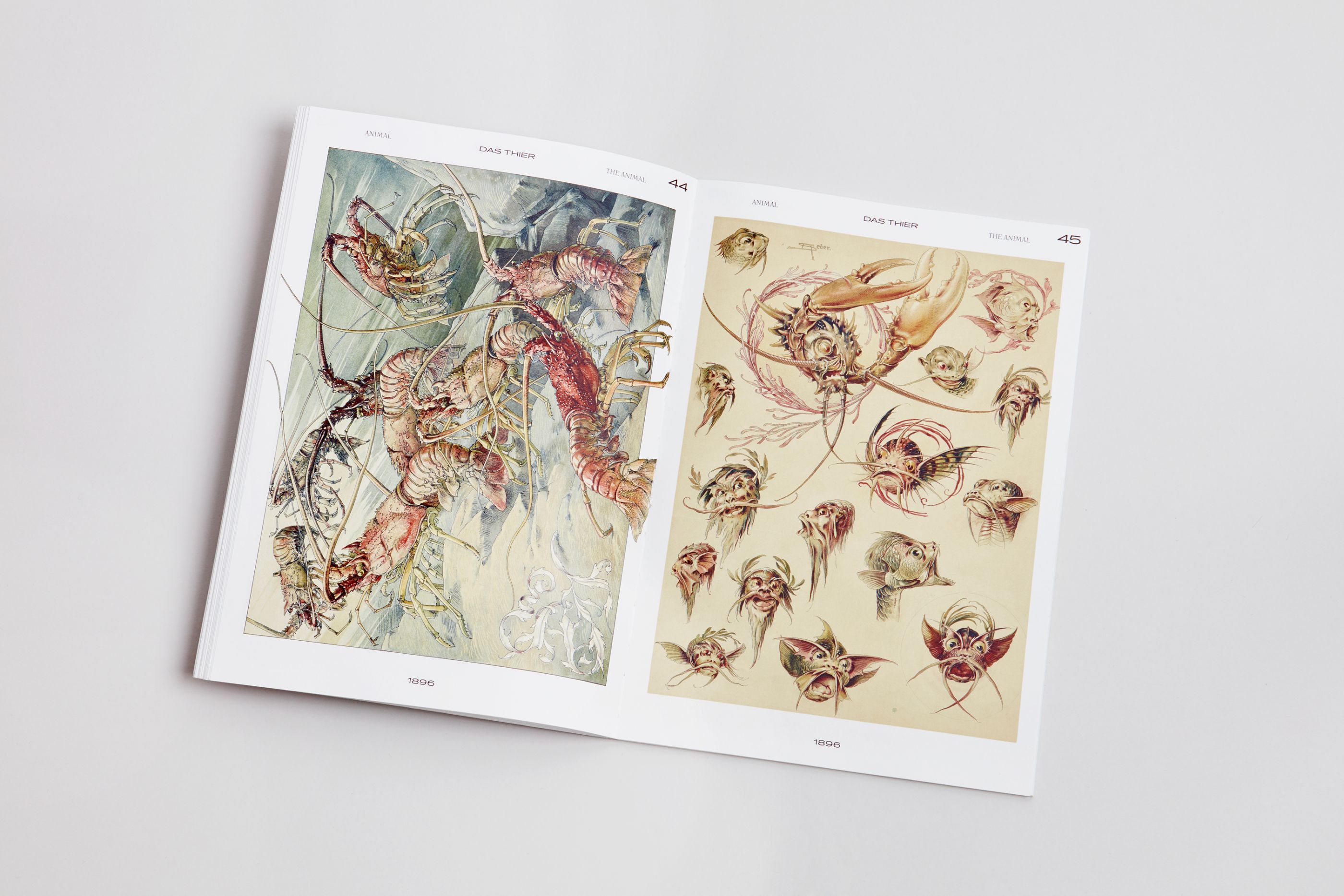
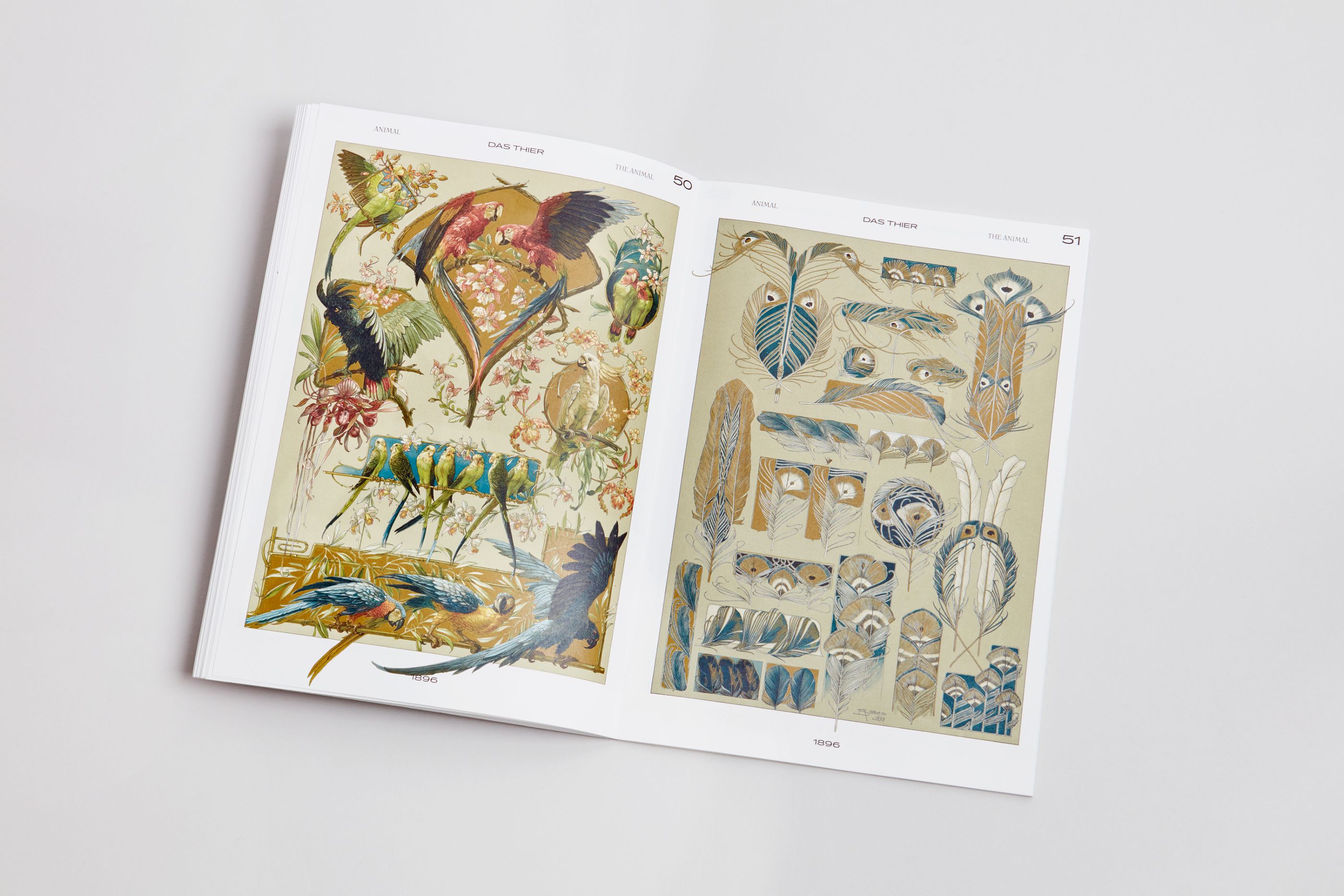
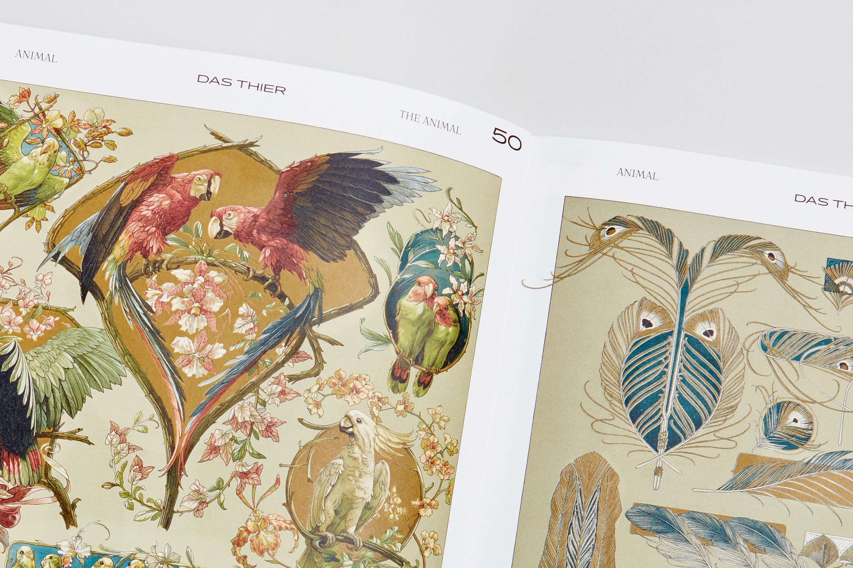
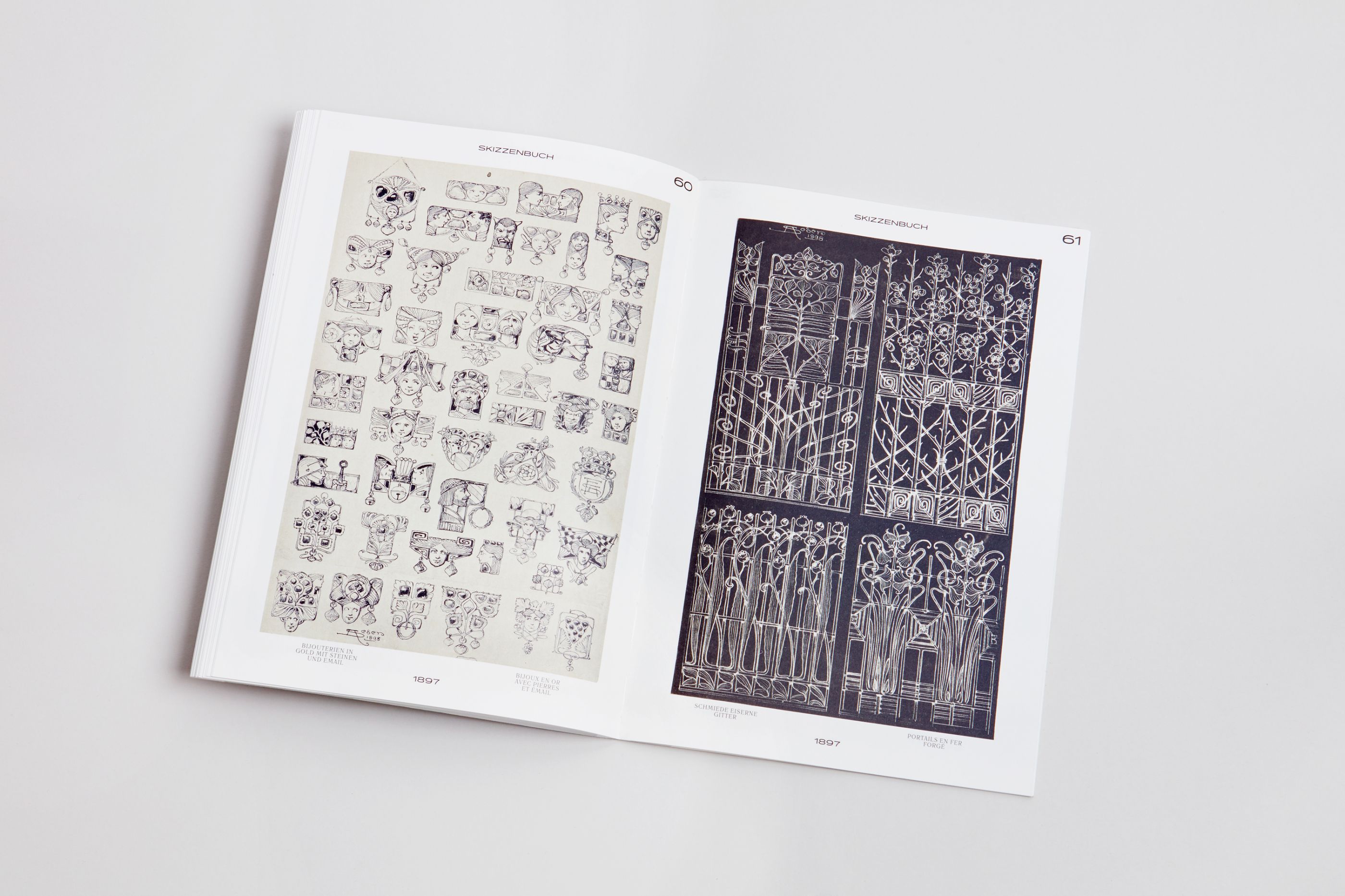
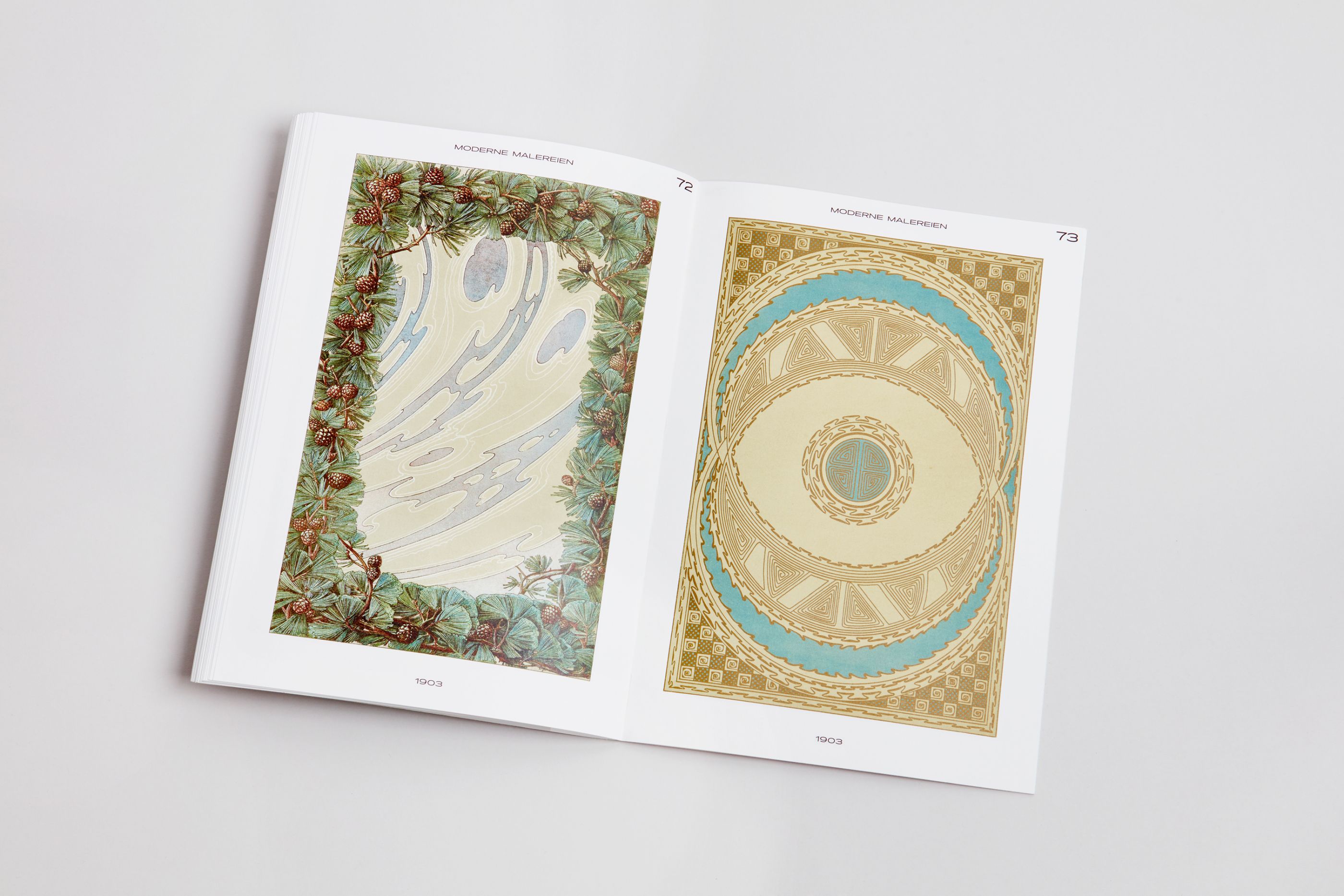
Anton Seder, Fantaisies & Ornements
/
Musées de Strasbourg
2017
23 x 33 cm, 84 pages
On the occasion of «Laboratoire d’Europe, Strasbourg 1880–1930» Musées de Strasbourg publishers asked us to design the book Fantaisies et Ornements, dedicated to an incredible series of decorative sheet created by Jugendstil artist Anton Seder (1850-1916).
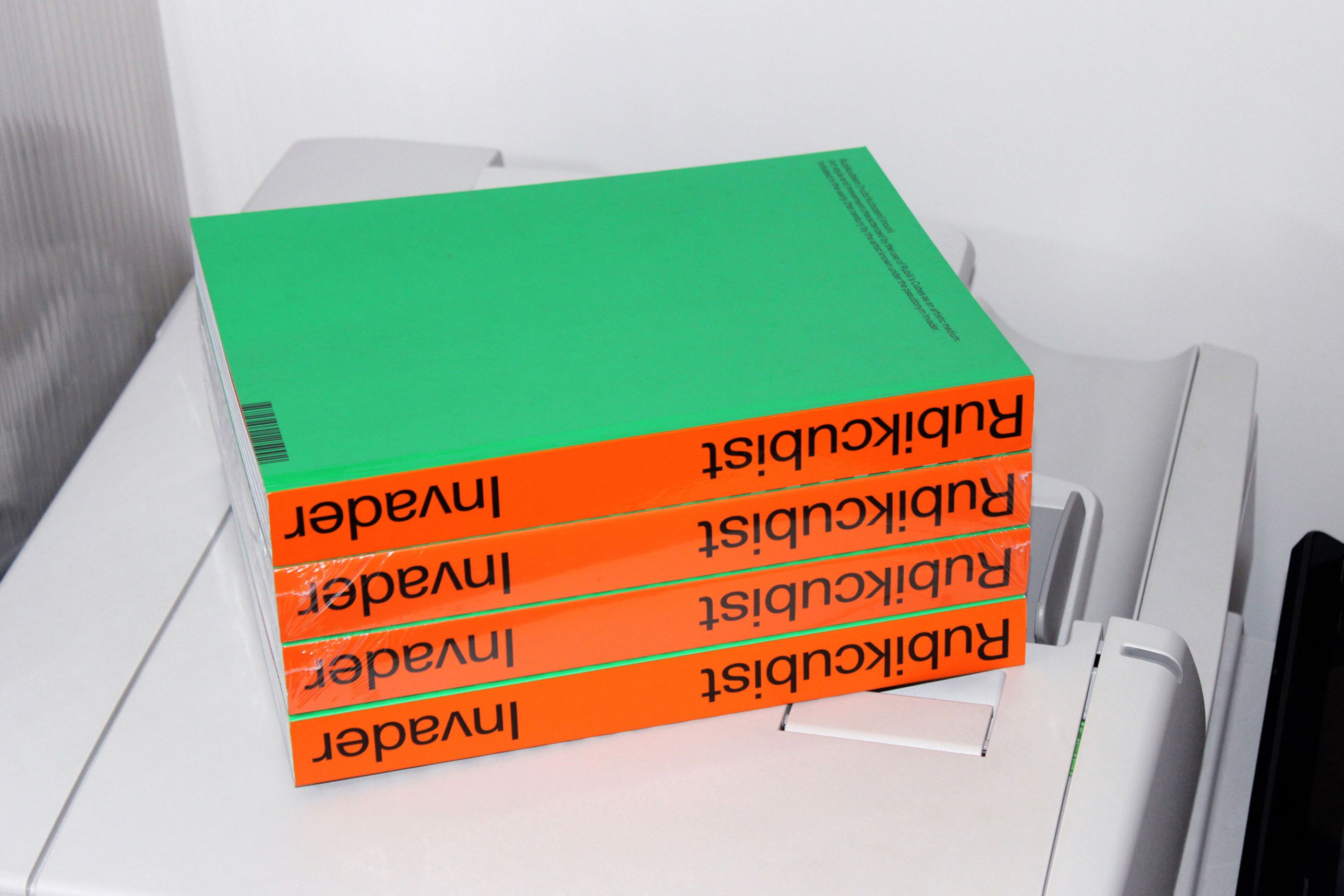
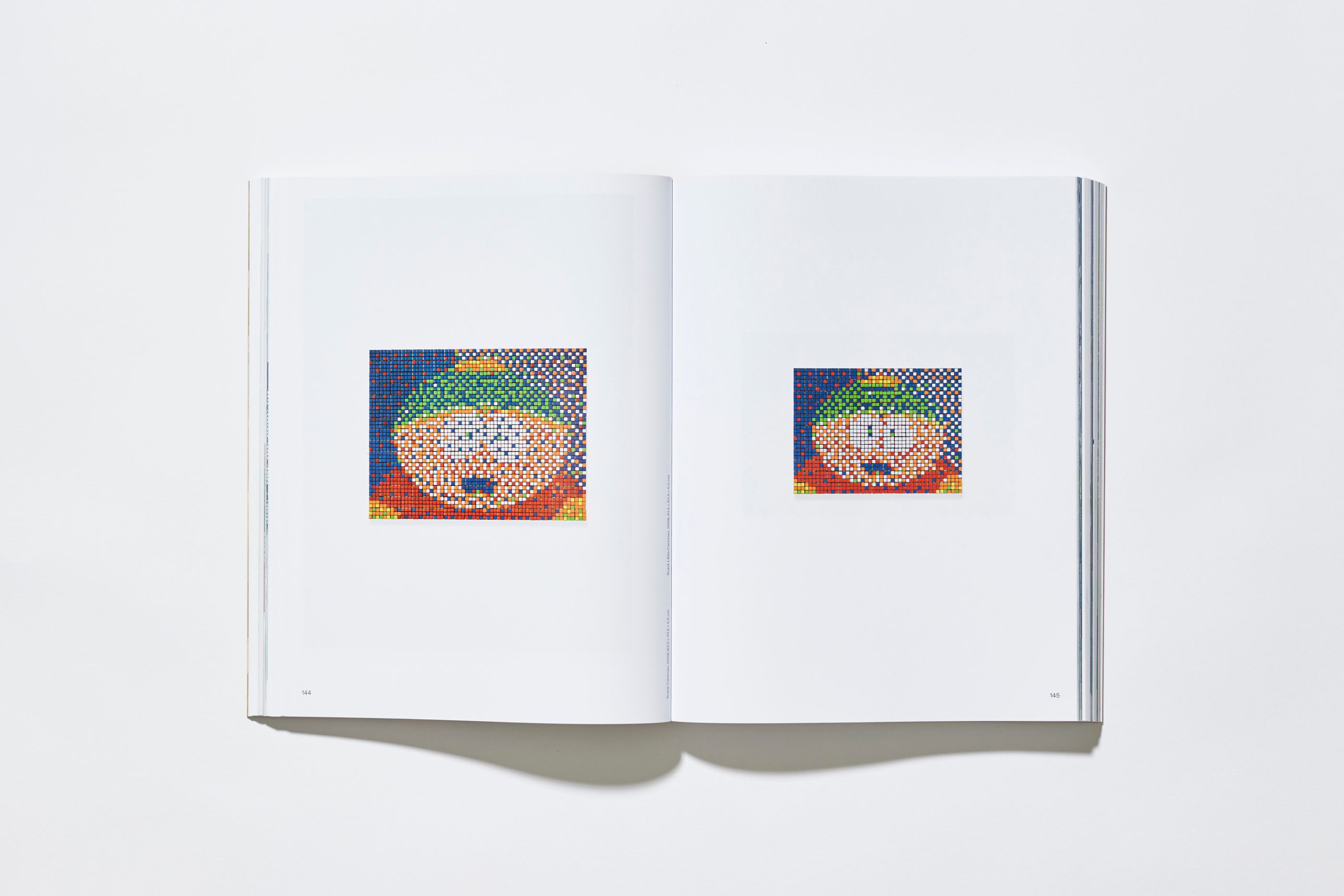
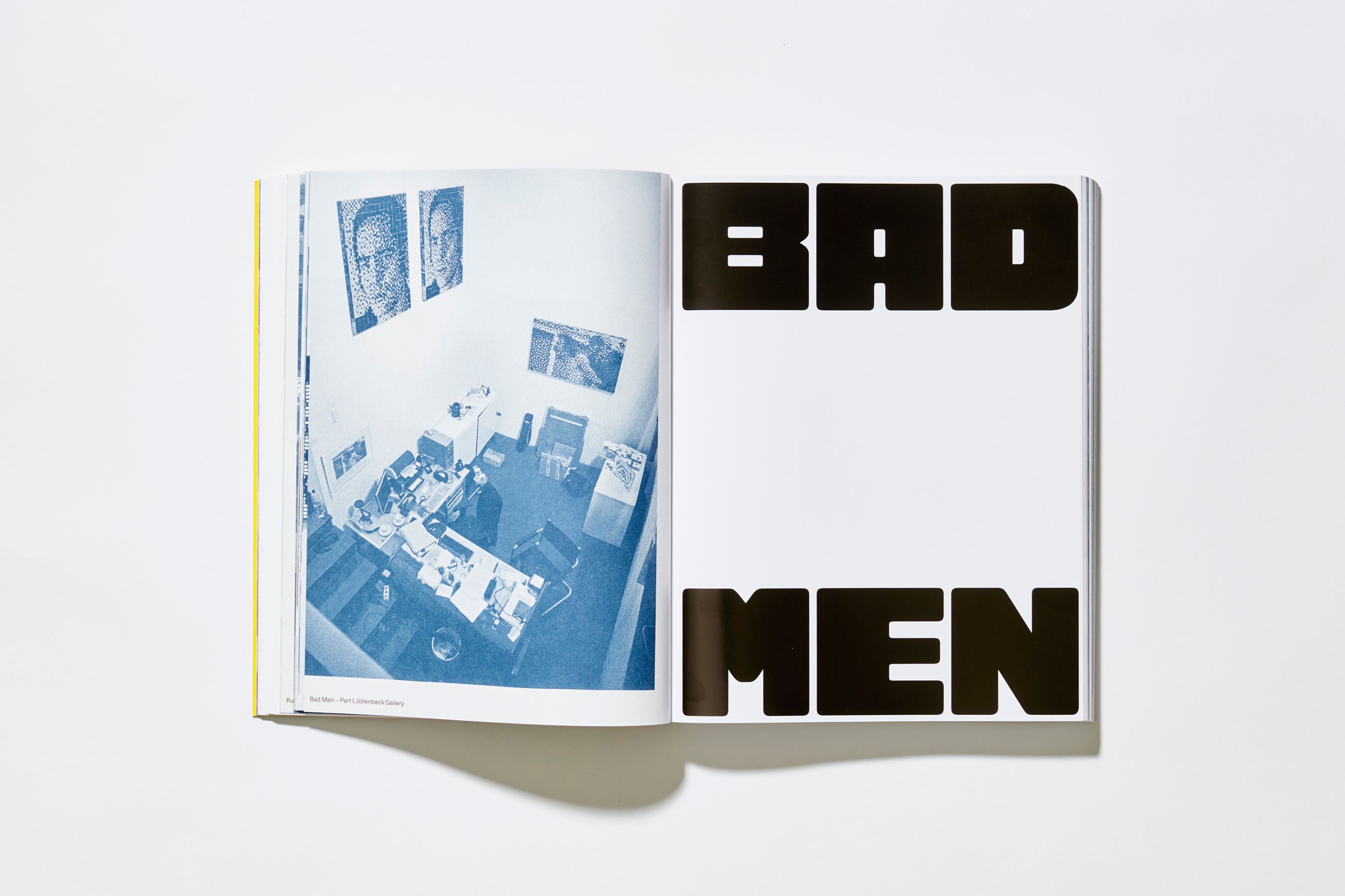
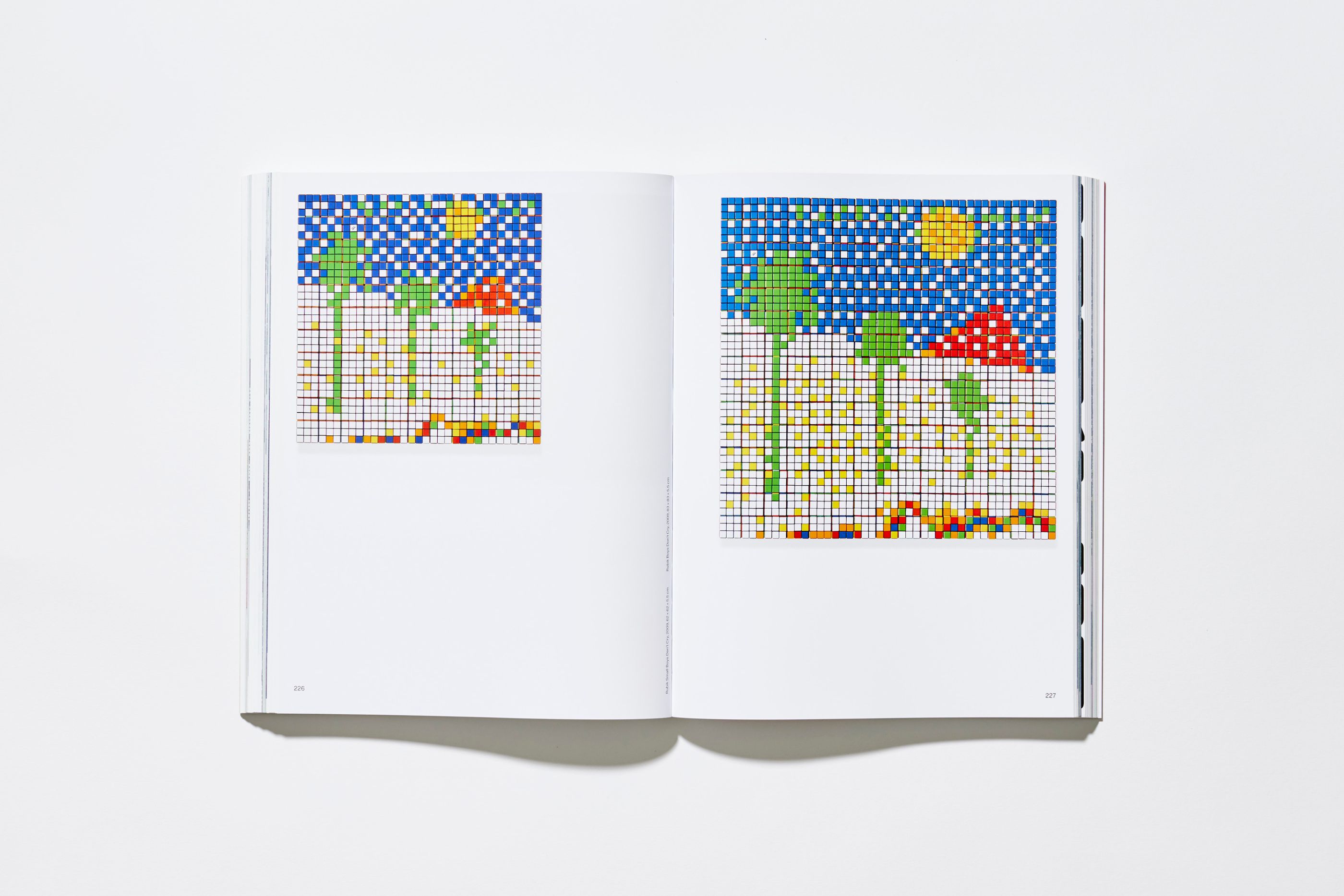
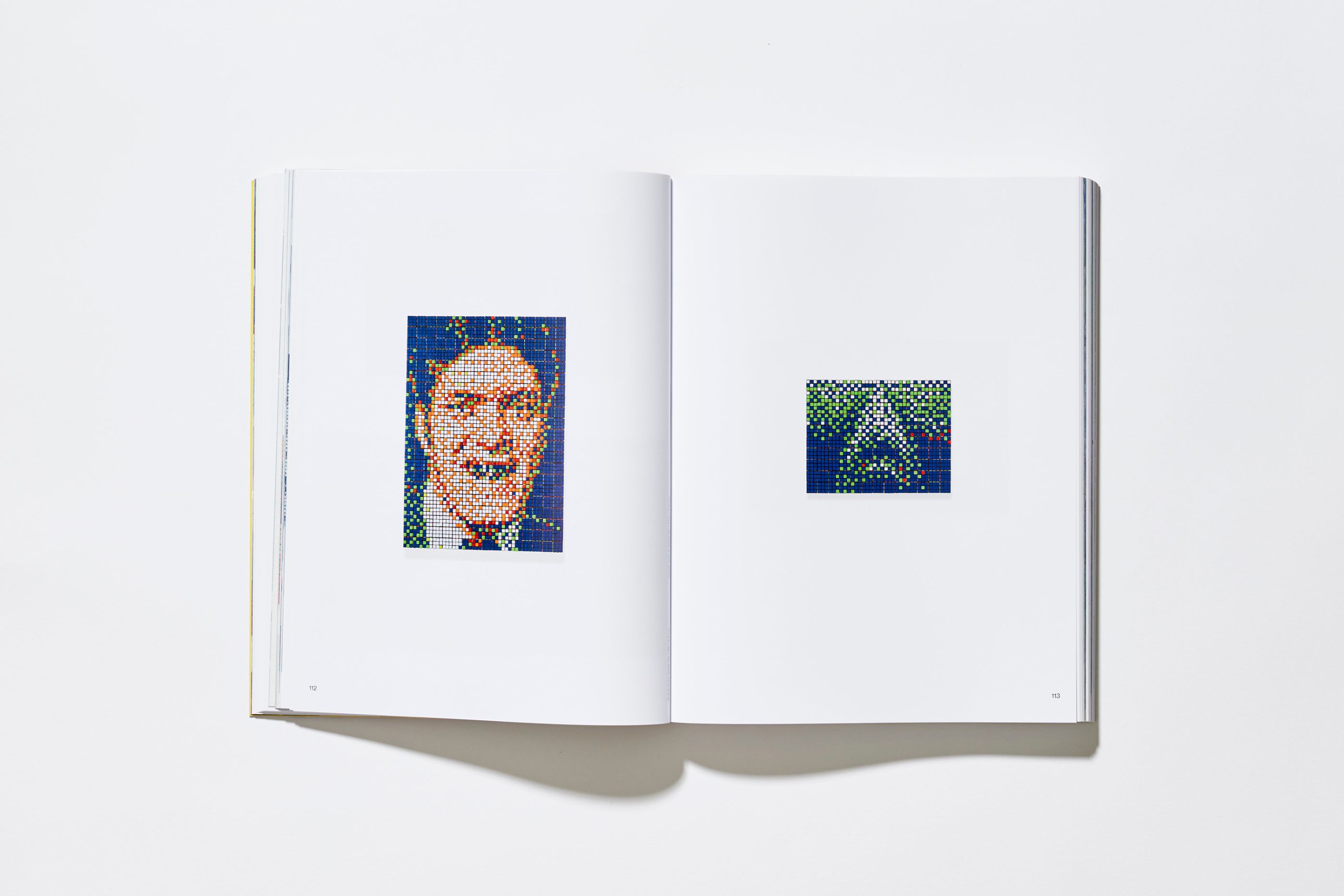
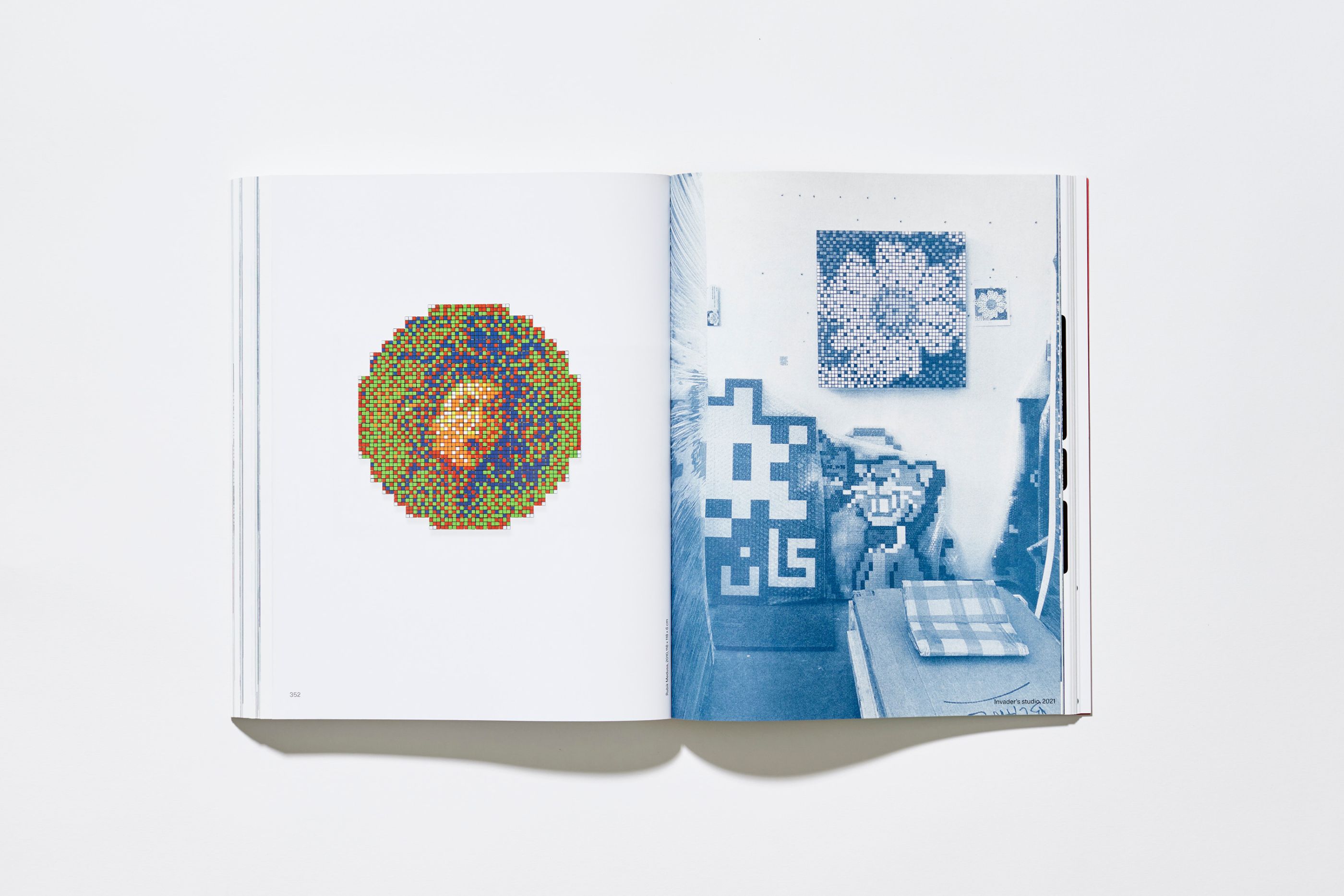
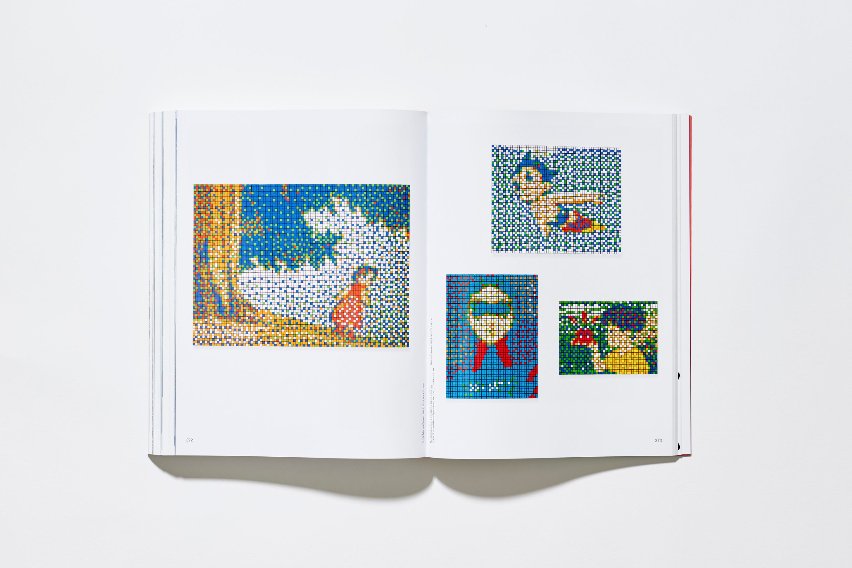
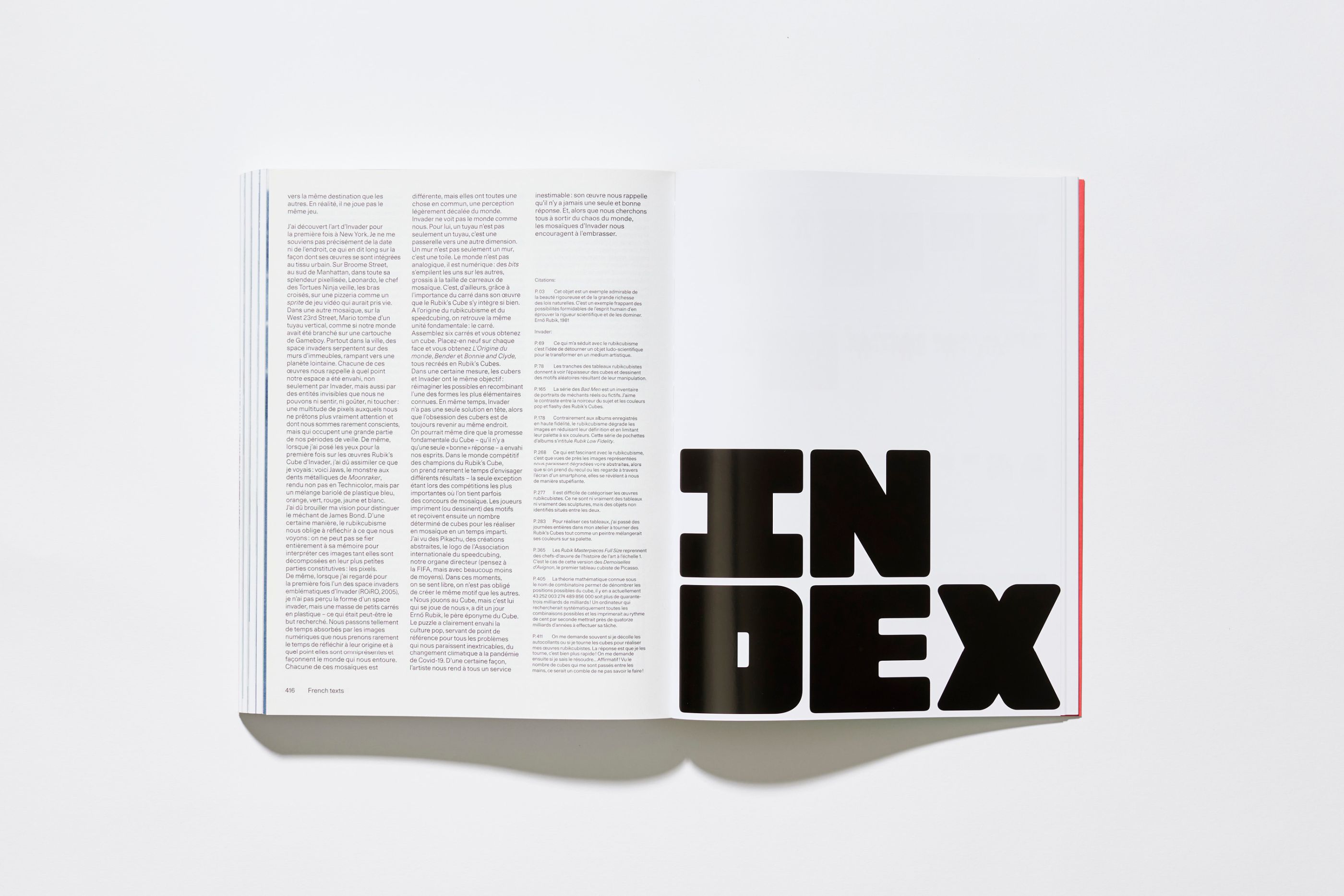
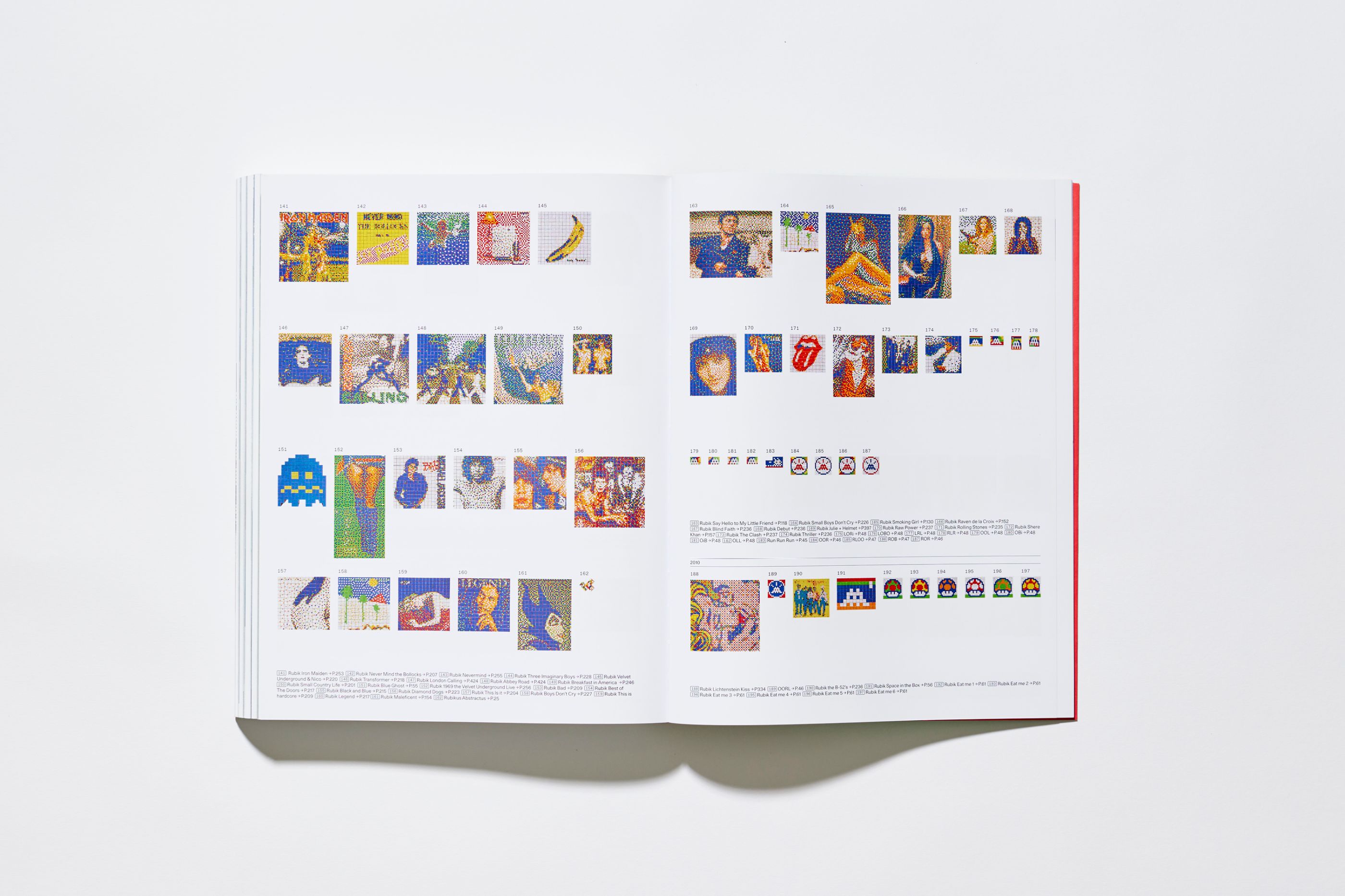
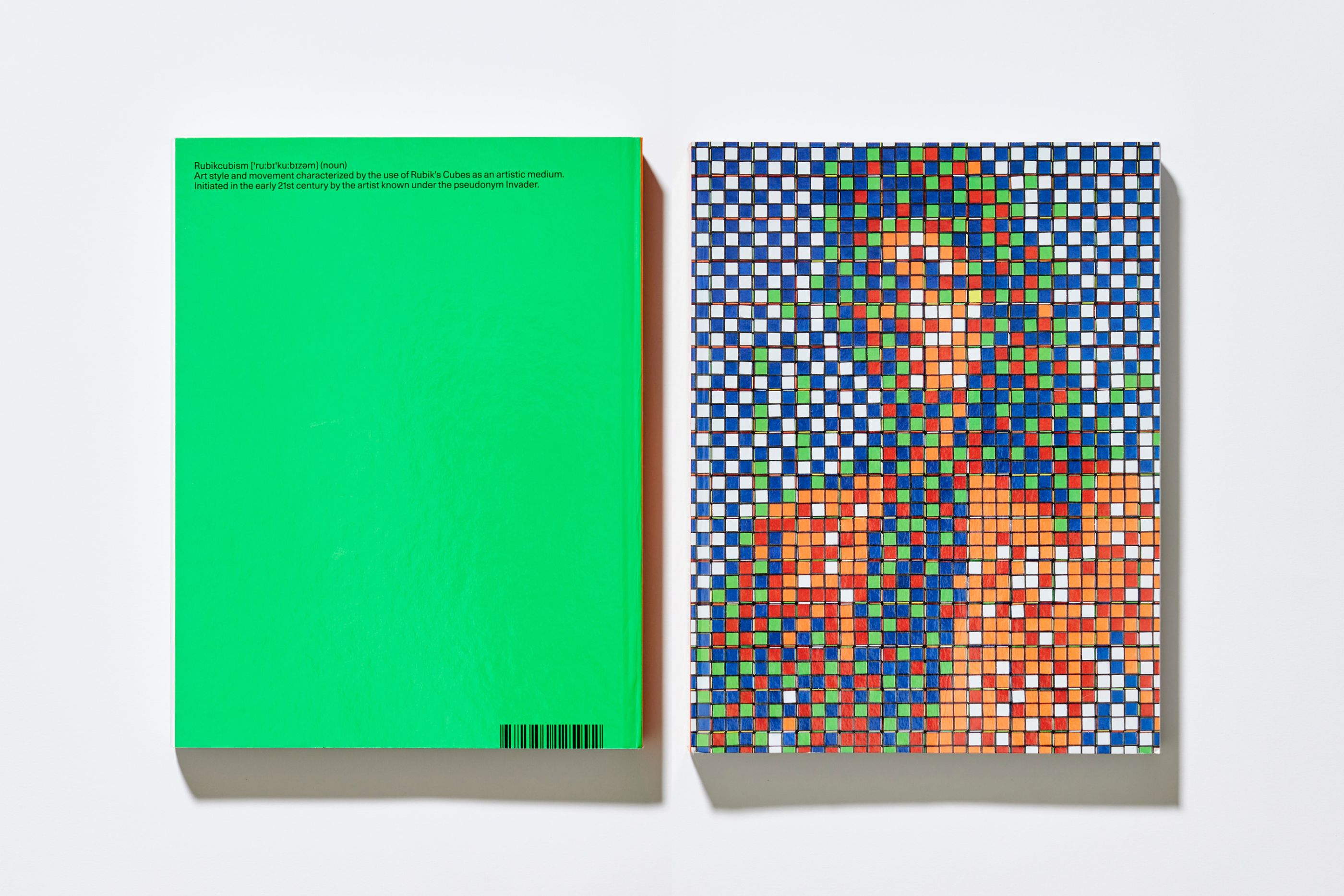
Invader, Rubikcubist
/
Invader
2022
Book, exhibition catalogue
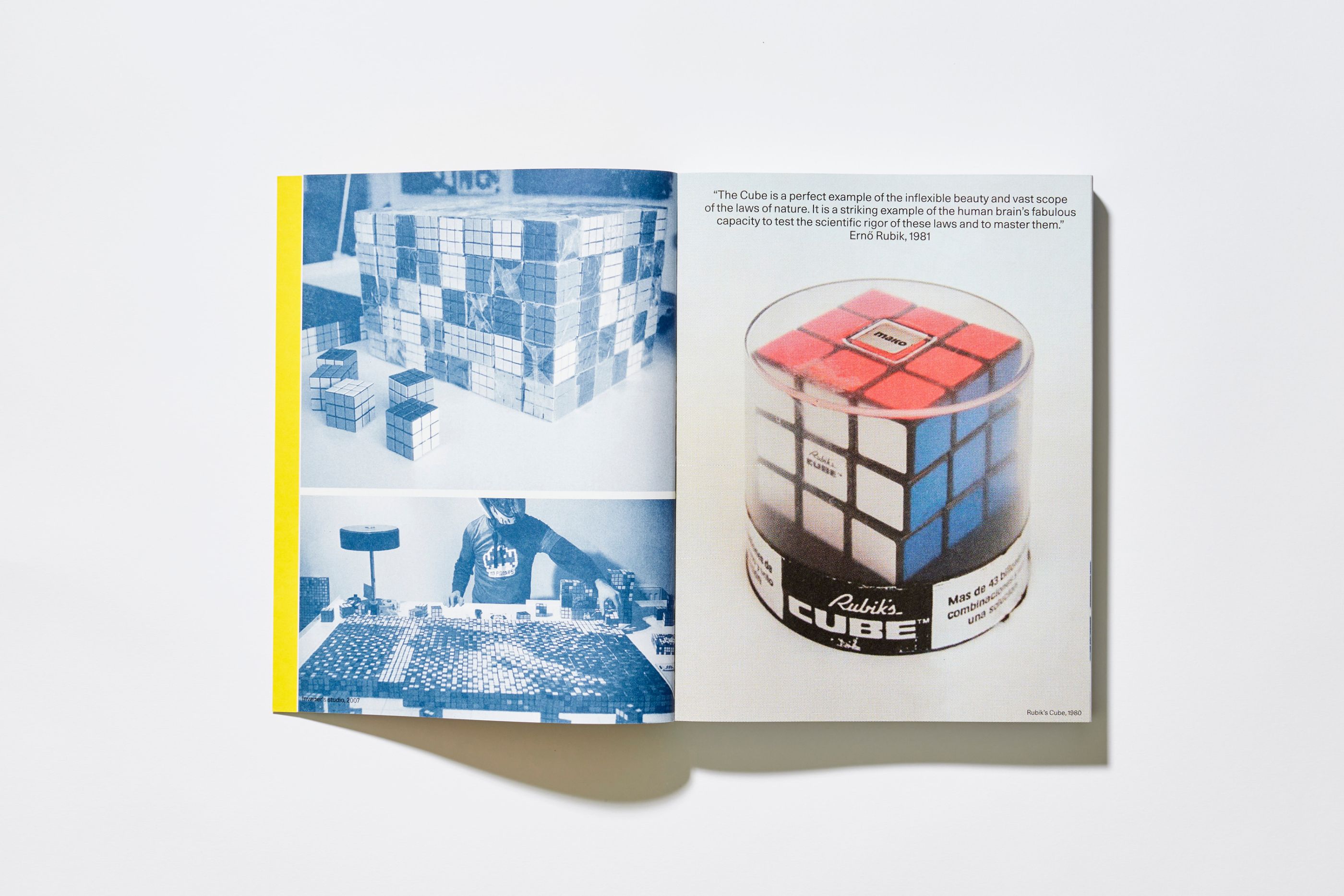
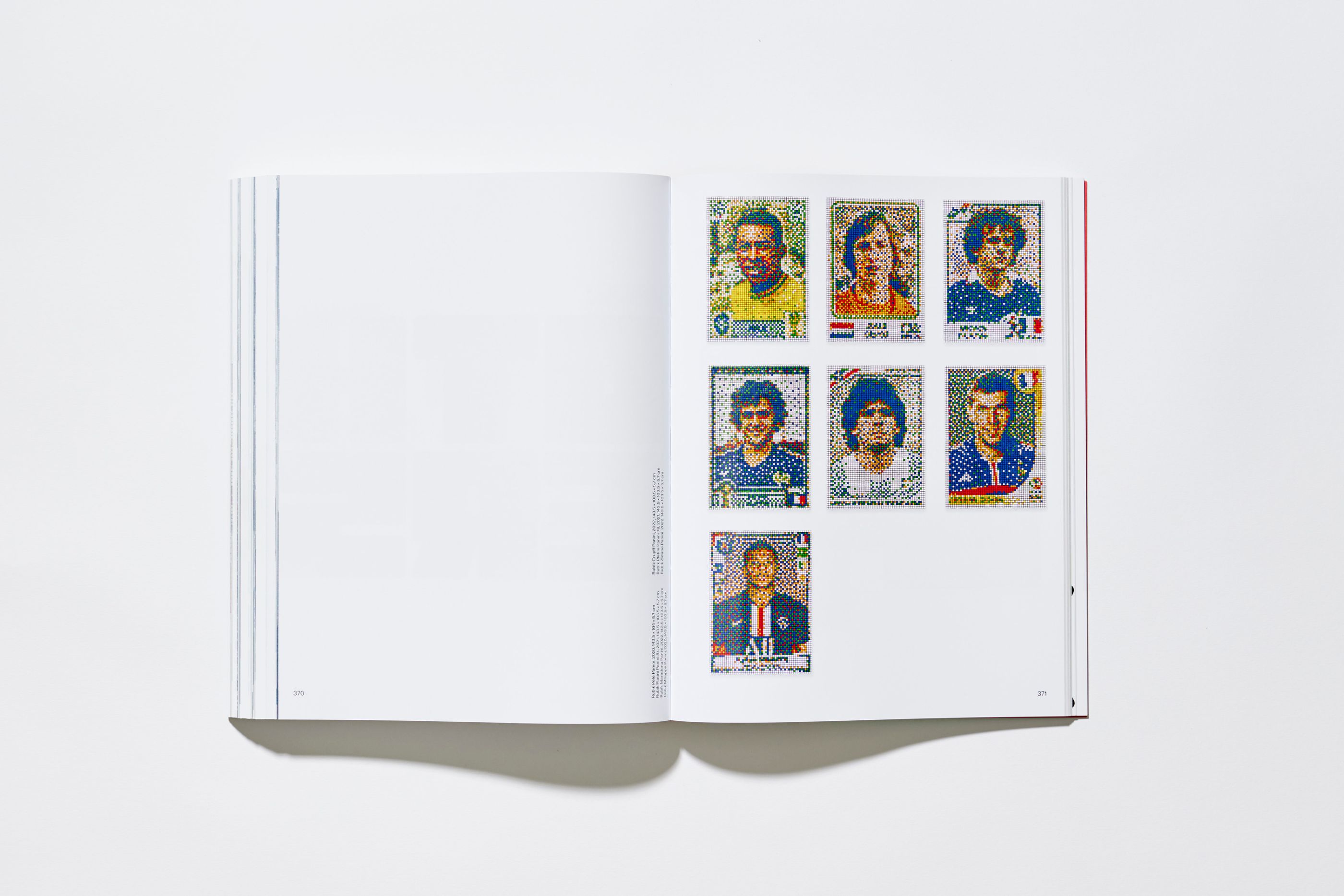
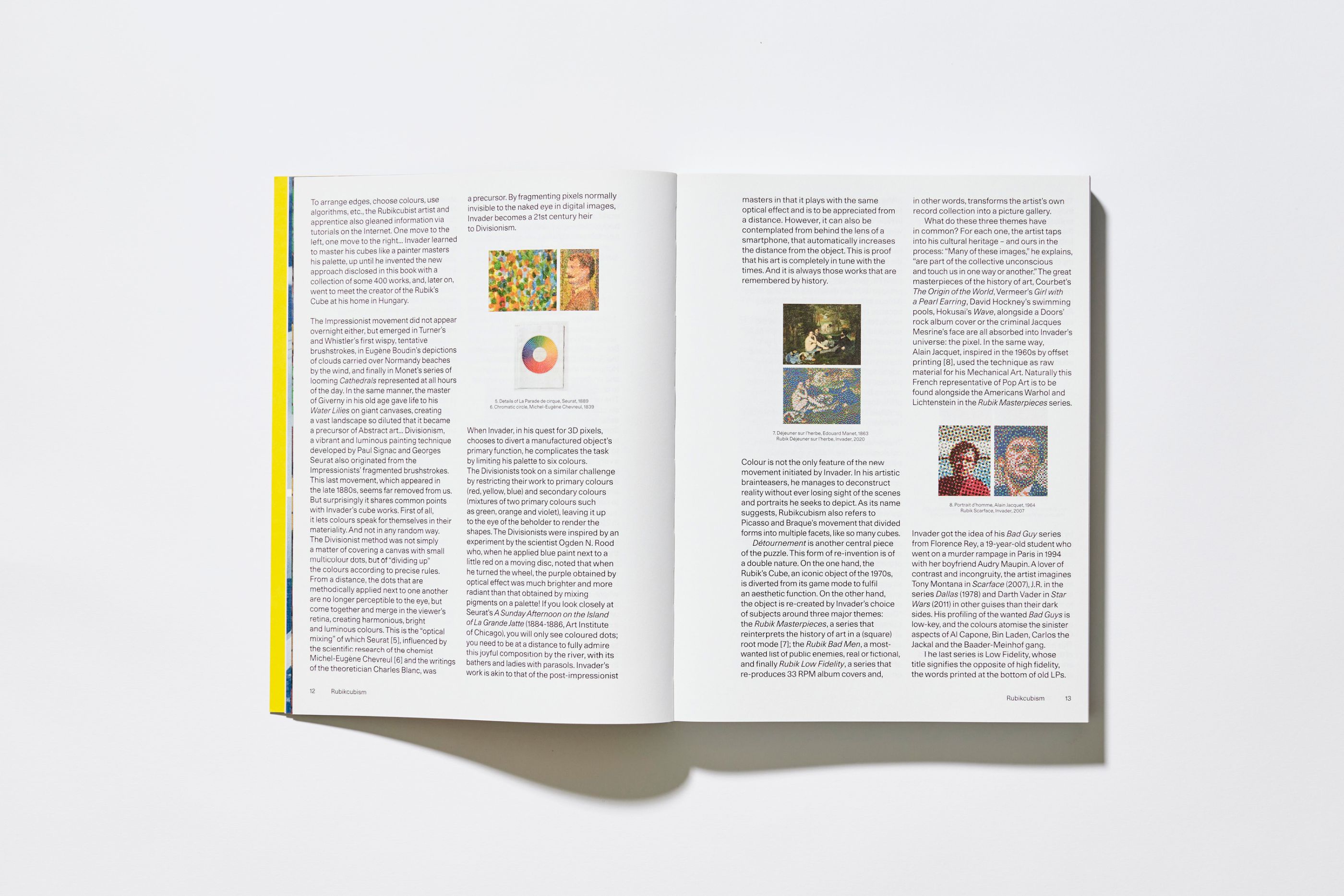
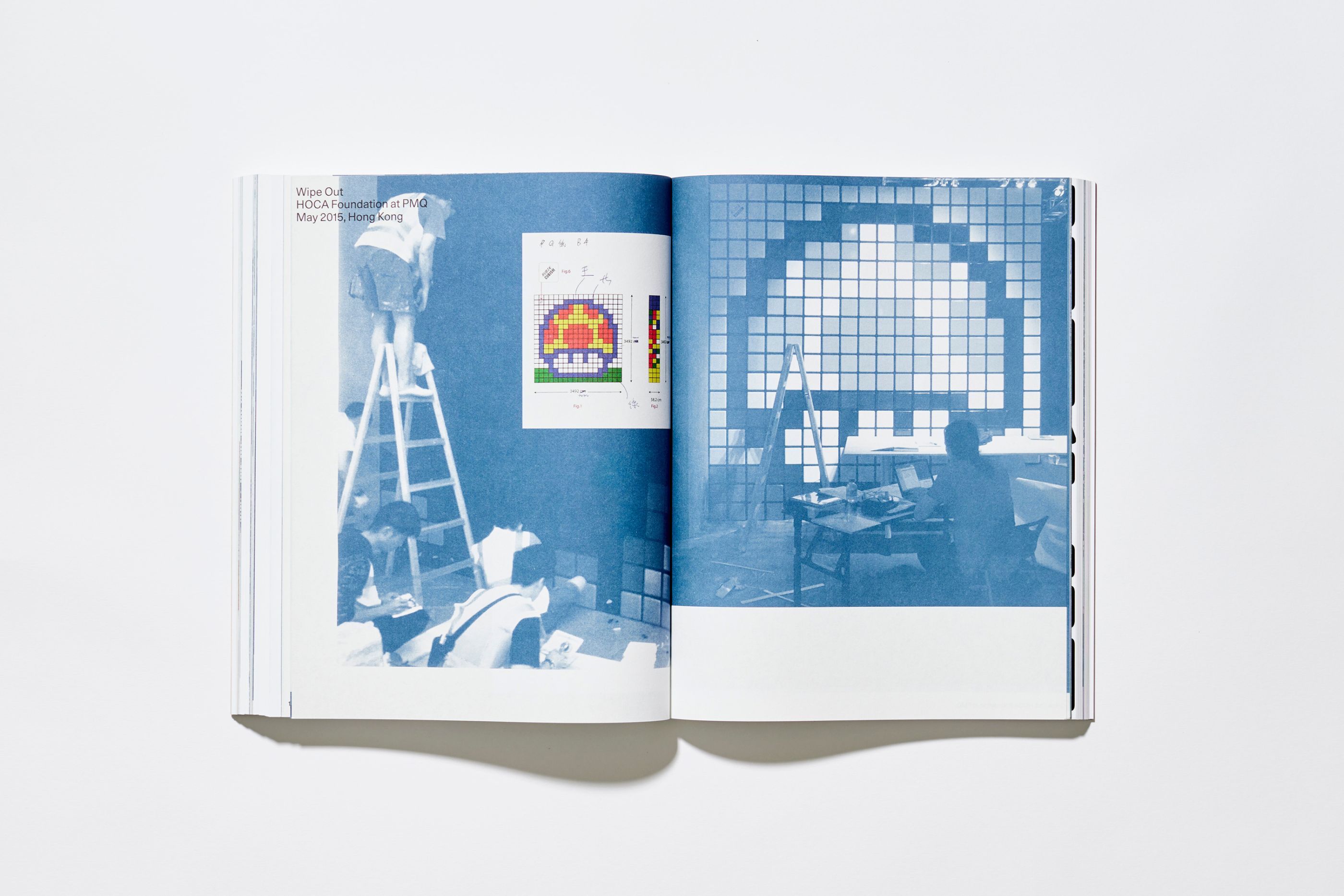
Comprehensive catalog for the Invader Rubikcubist exhibition at the Mima museum (Brussels), dedicated to a lesser-known part of the artist's work. This 440-page work presents the entirety of his protean work with the famous Rubik's Cube. We designed a titling typeface inspired by the cube, which we used for the opening pages and the exhibition signage.
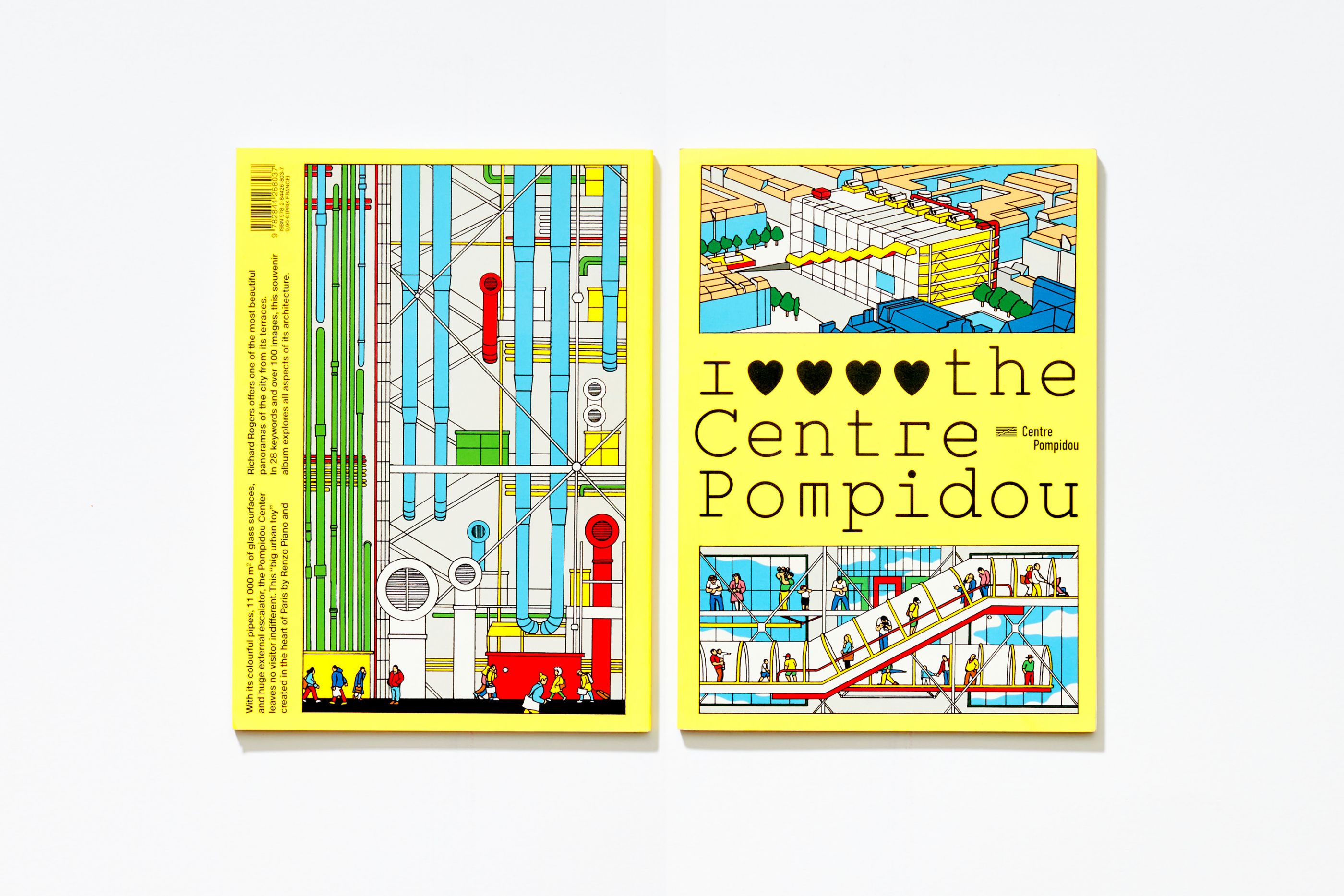
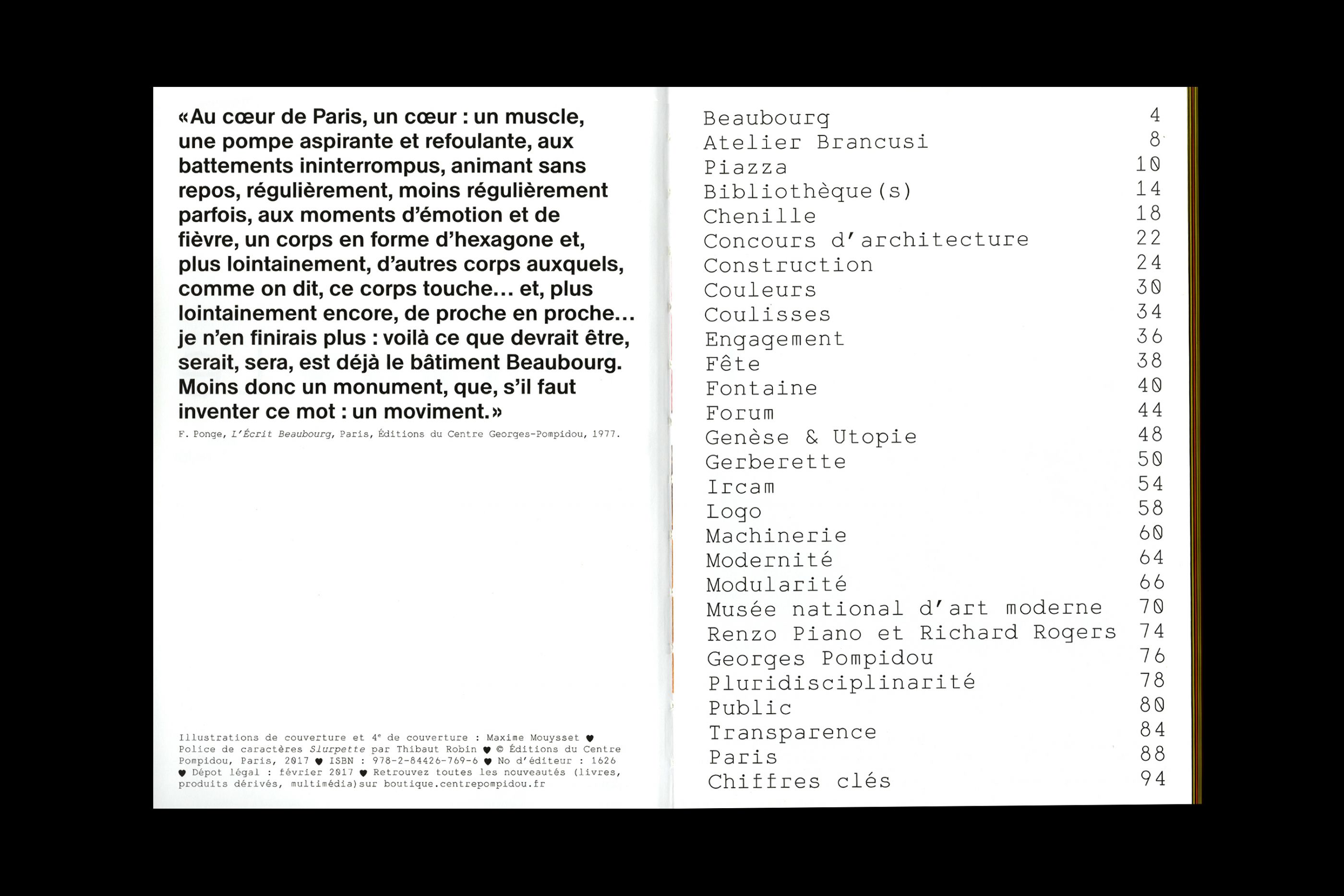
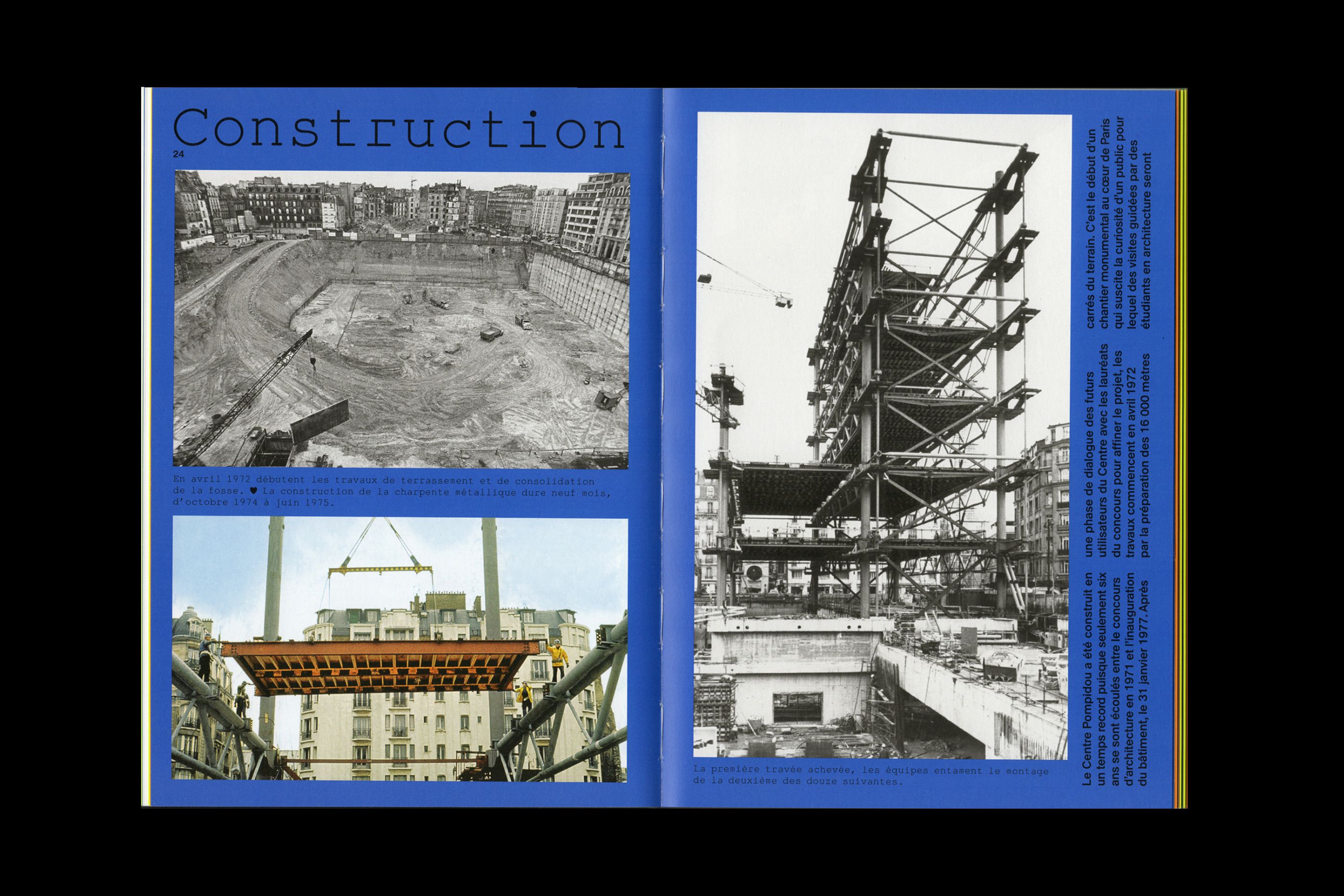
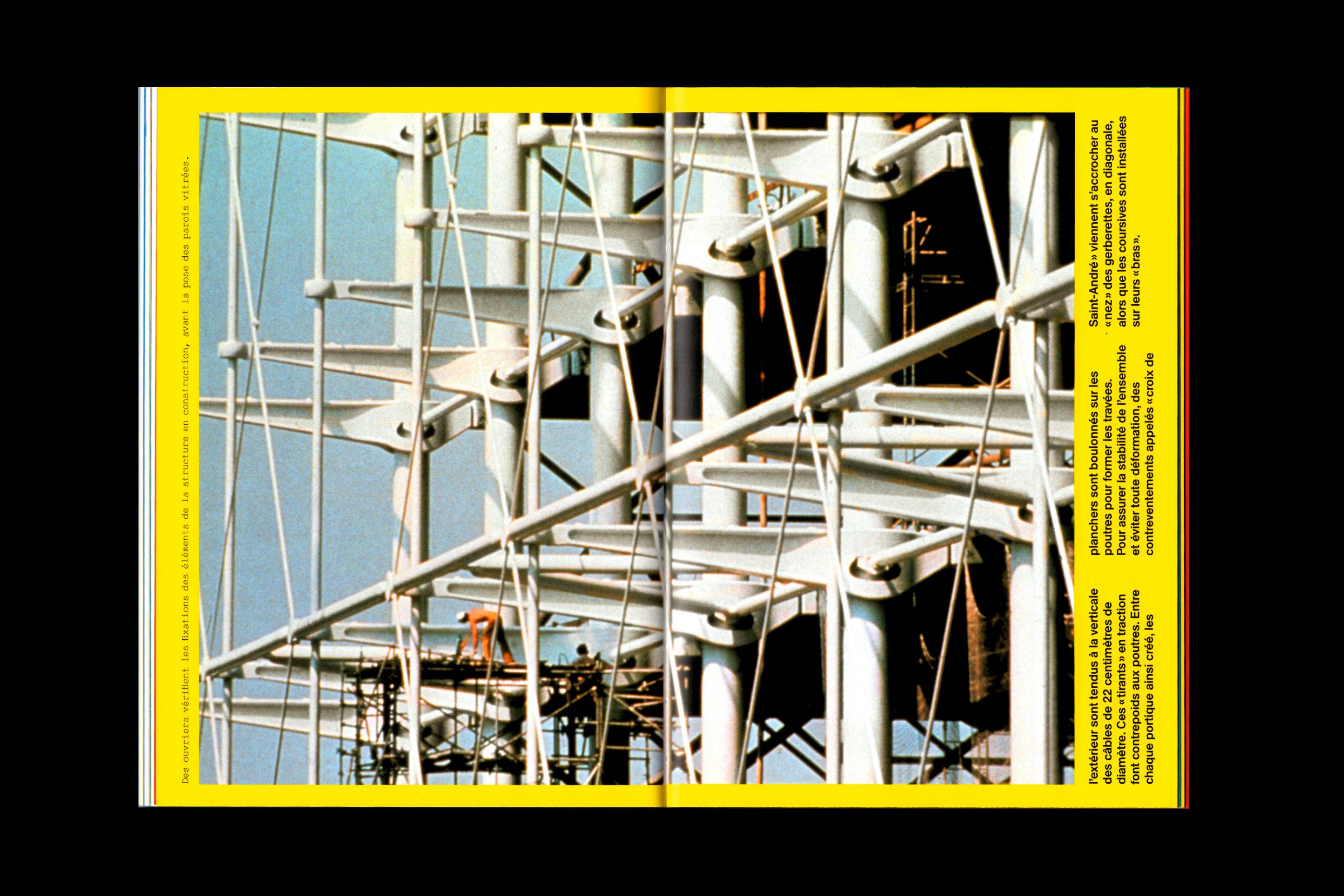
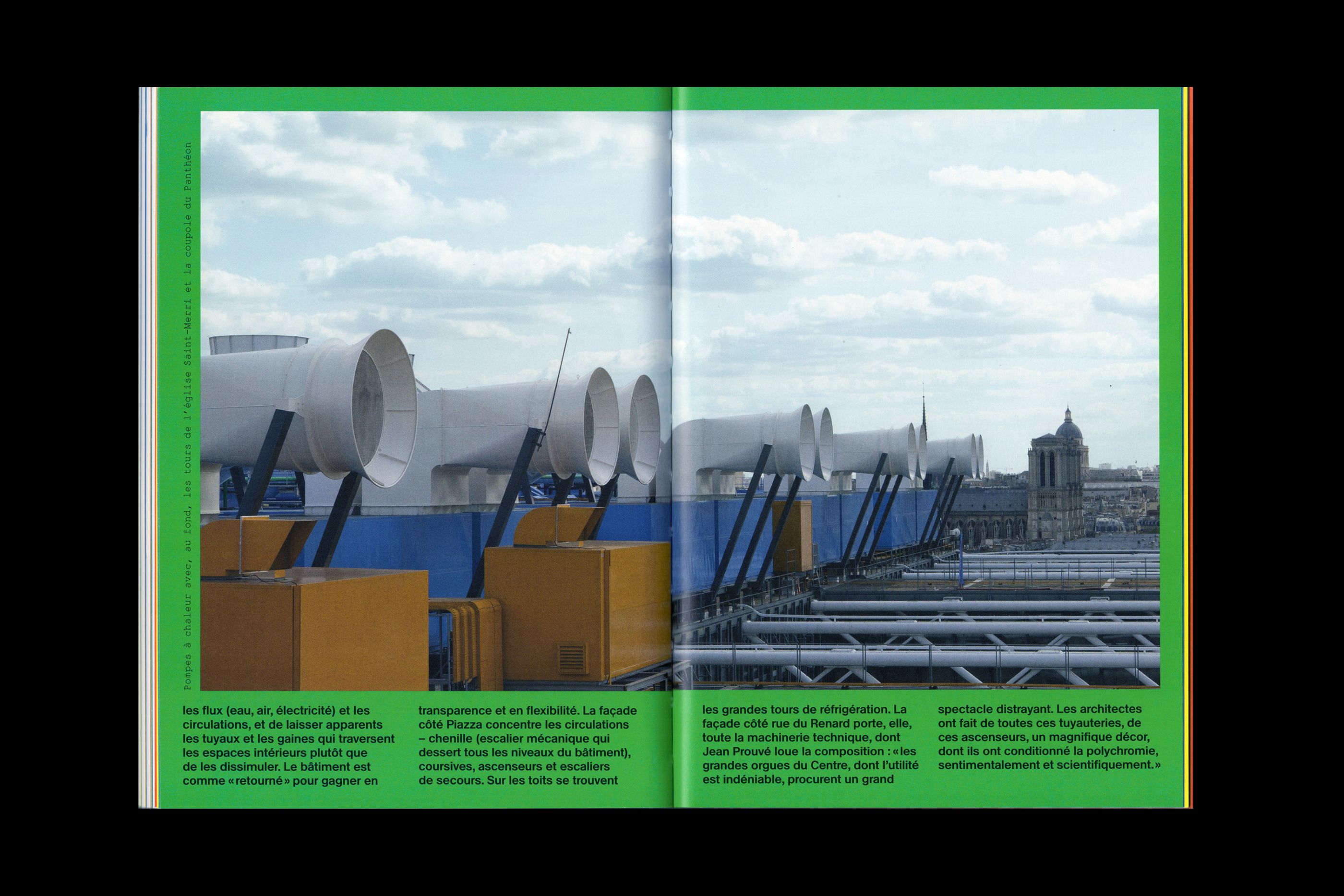
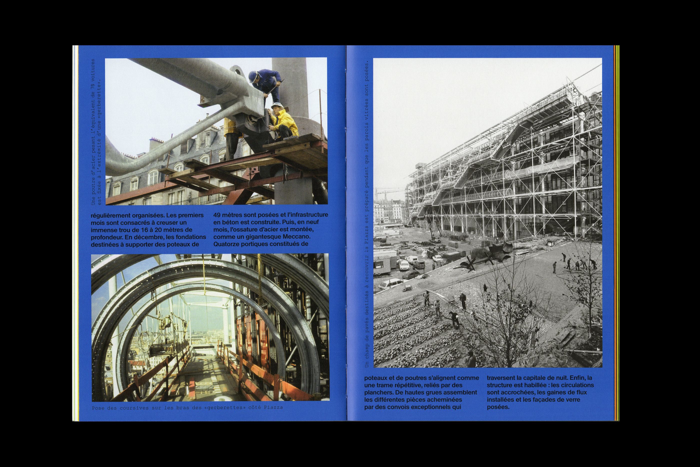
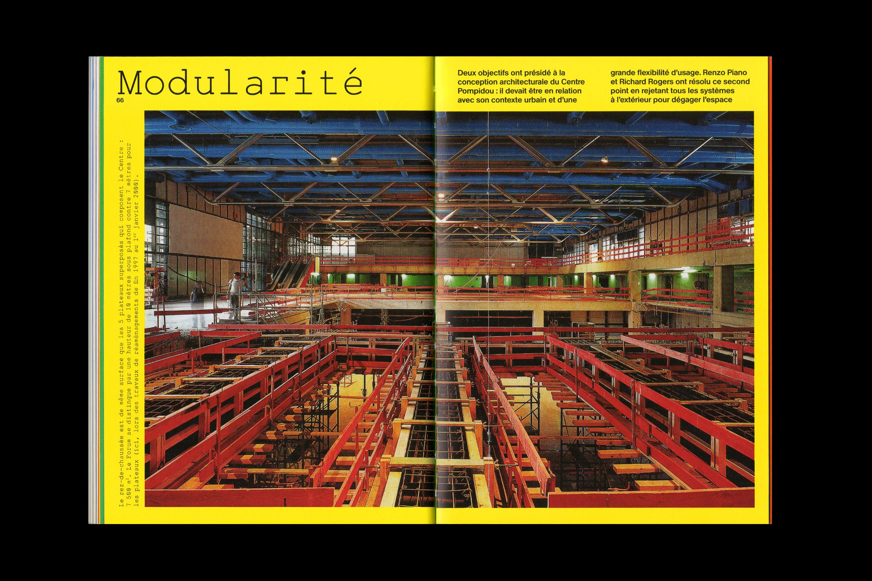
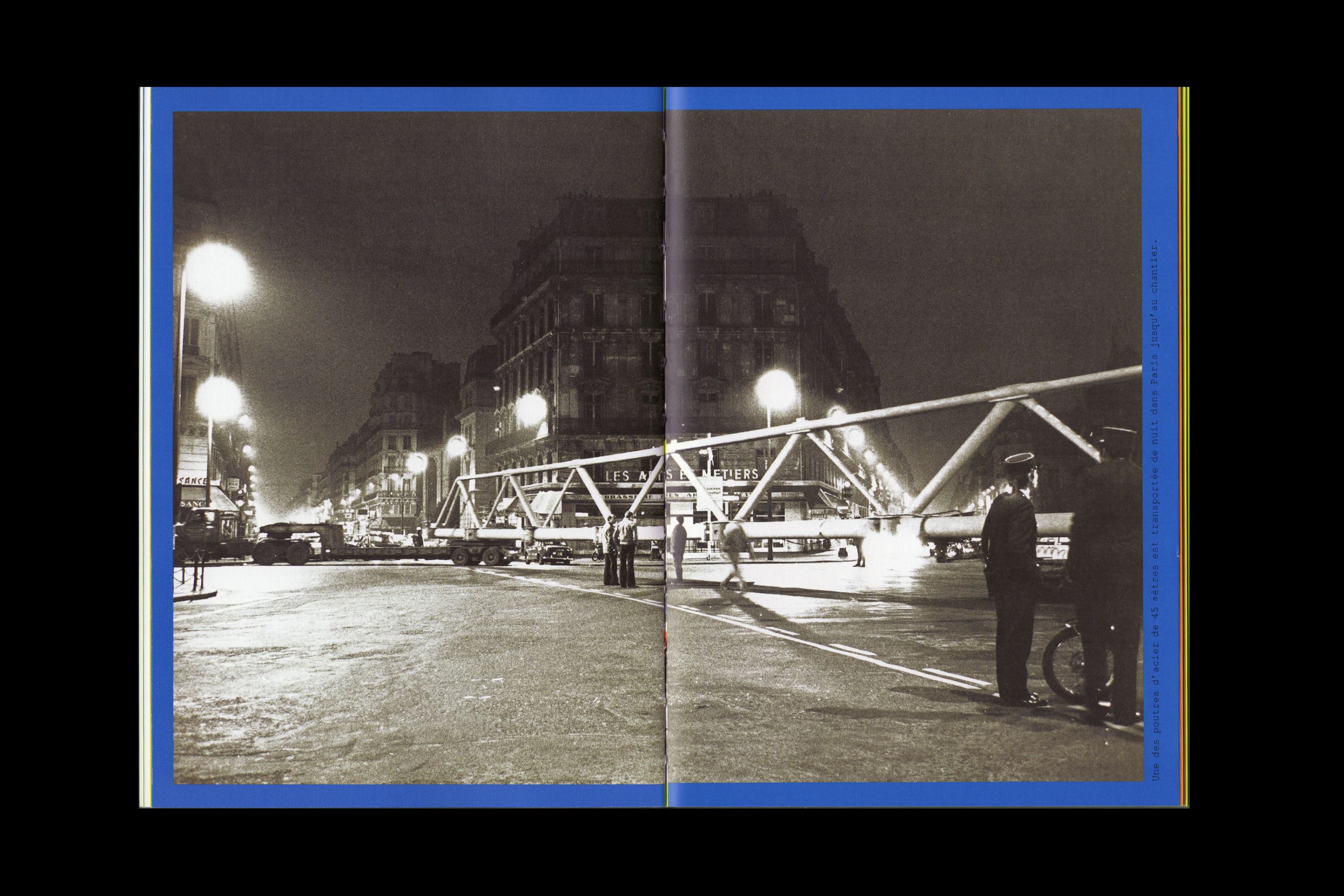
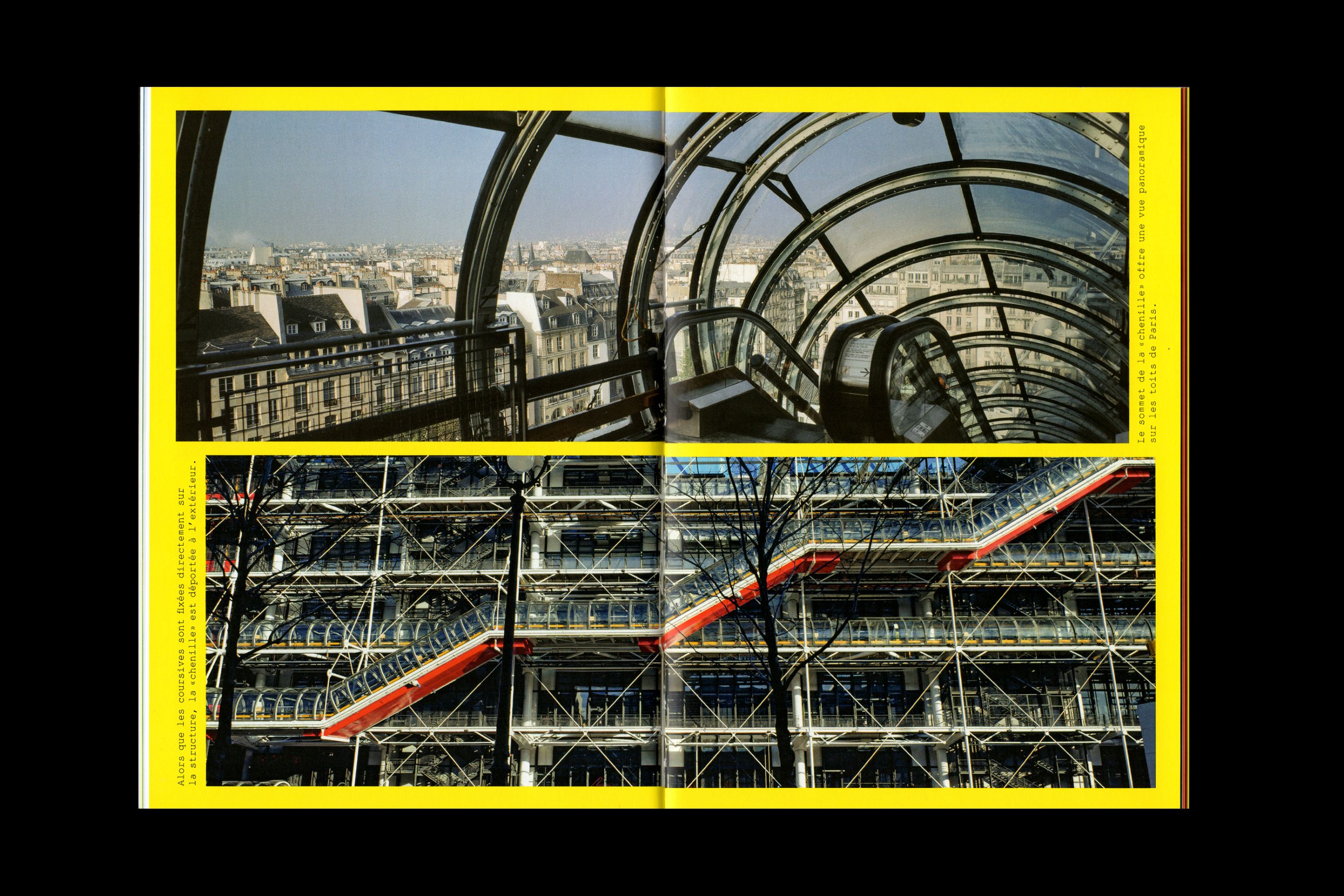
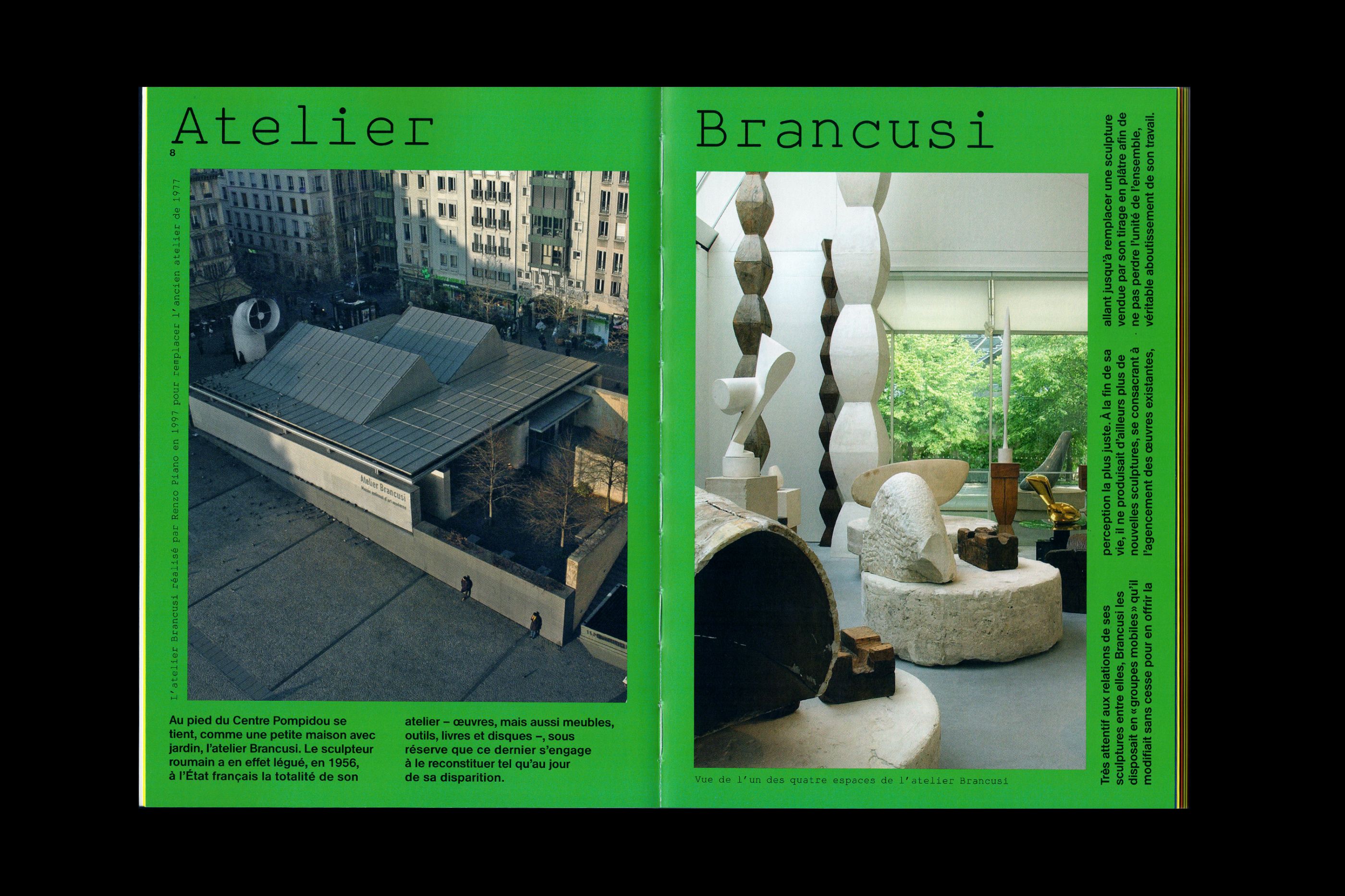
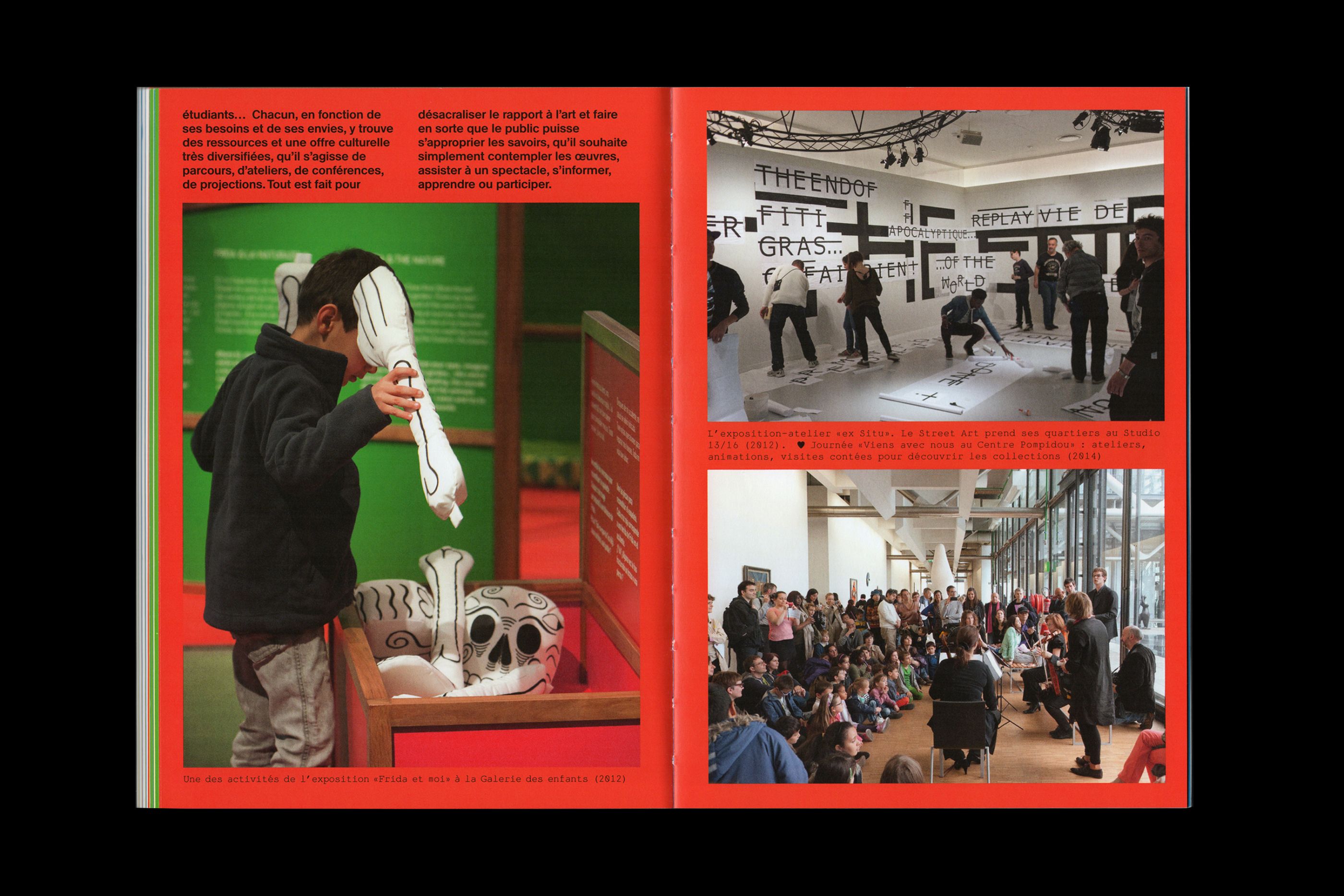
I love the Centre Pompidou
/
Centre Pompidou
2017
15 x 21 cm, 100 pages
To celebrate the Centre Pompidou’s 40th anniversary, we were commissioned to design a book dedicated to the different architectural facets of this «big urban toy», created by Renzo Piano and Richard Rogers.
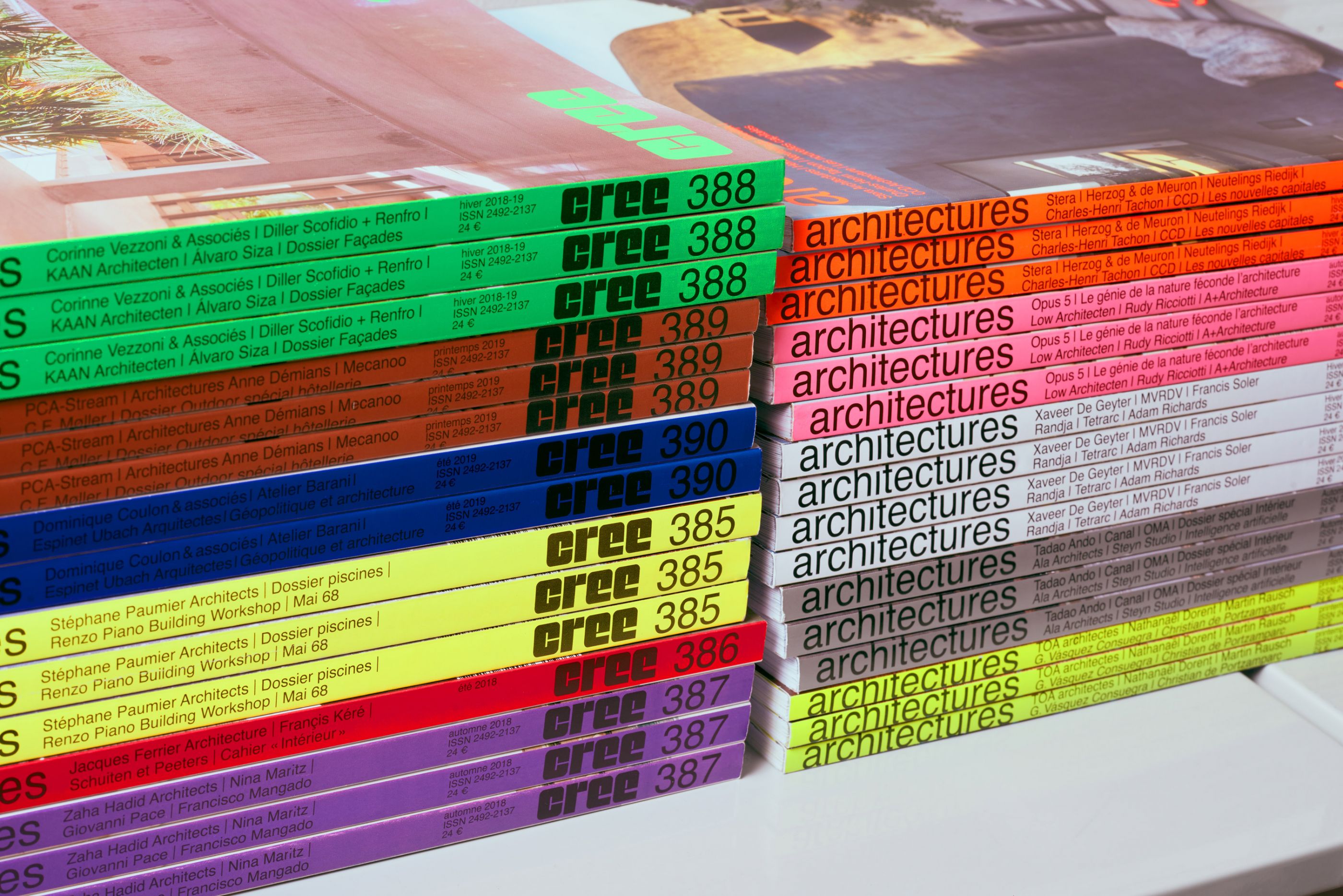
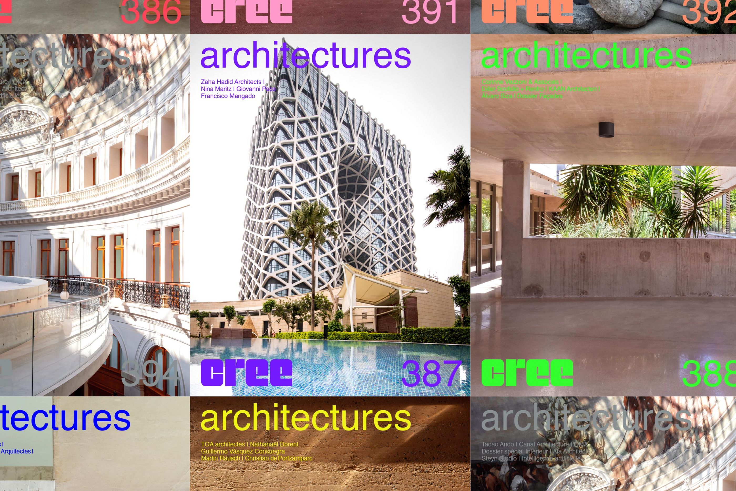
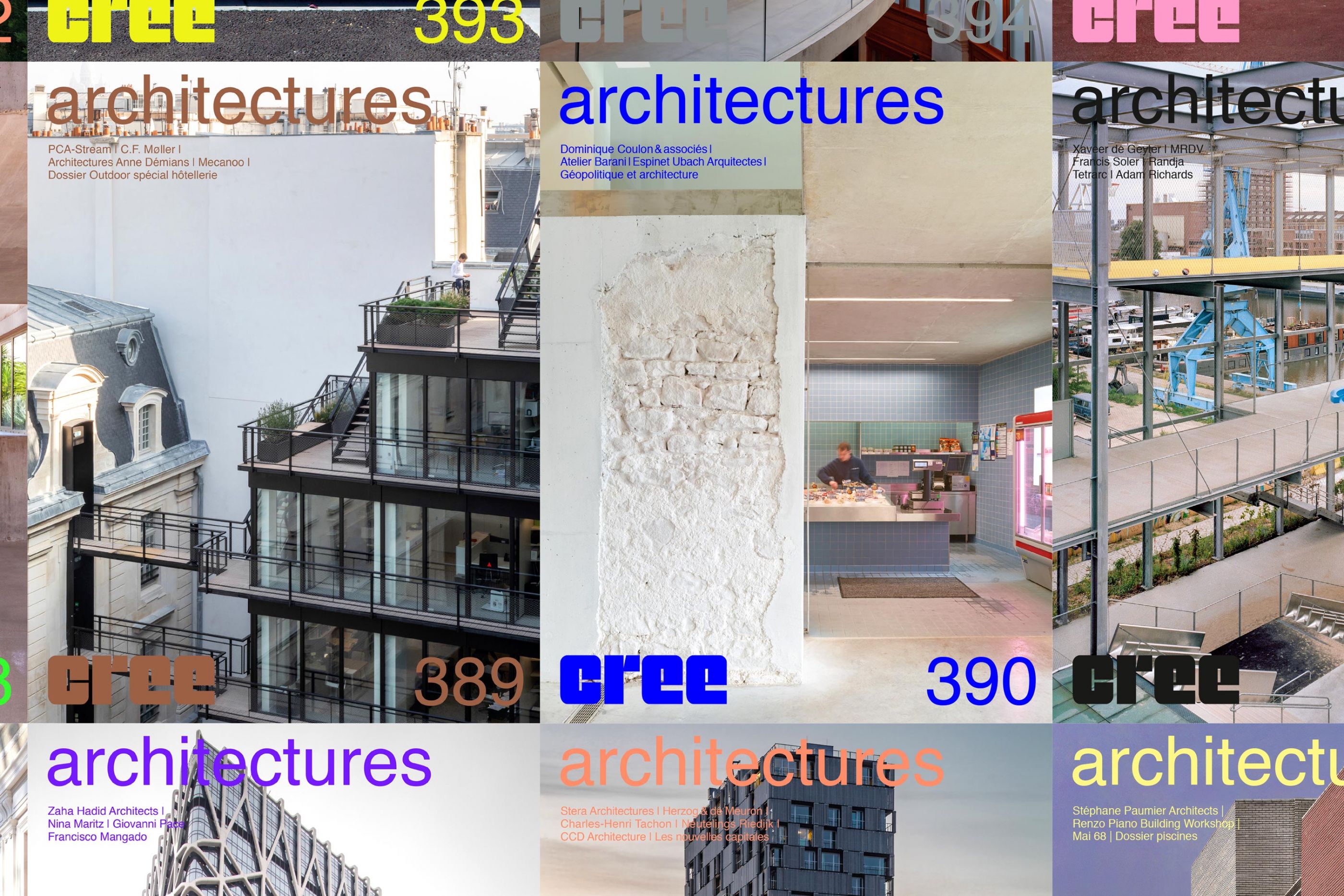
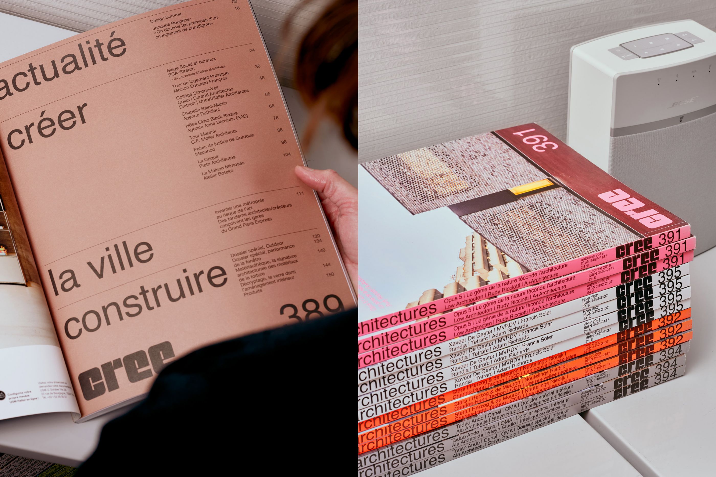
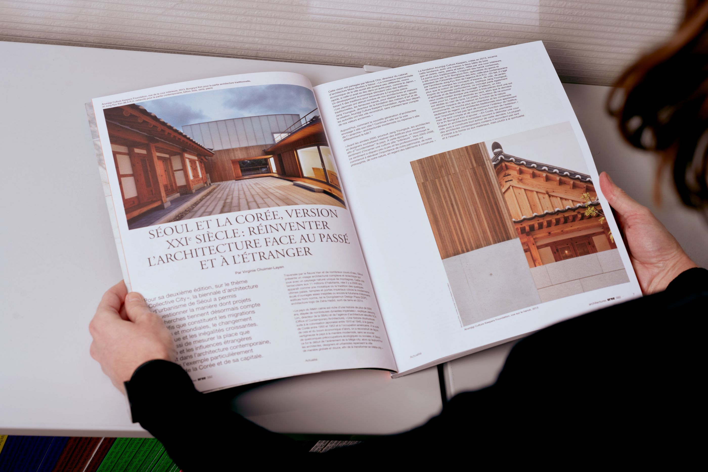
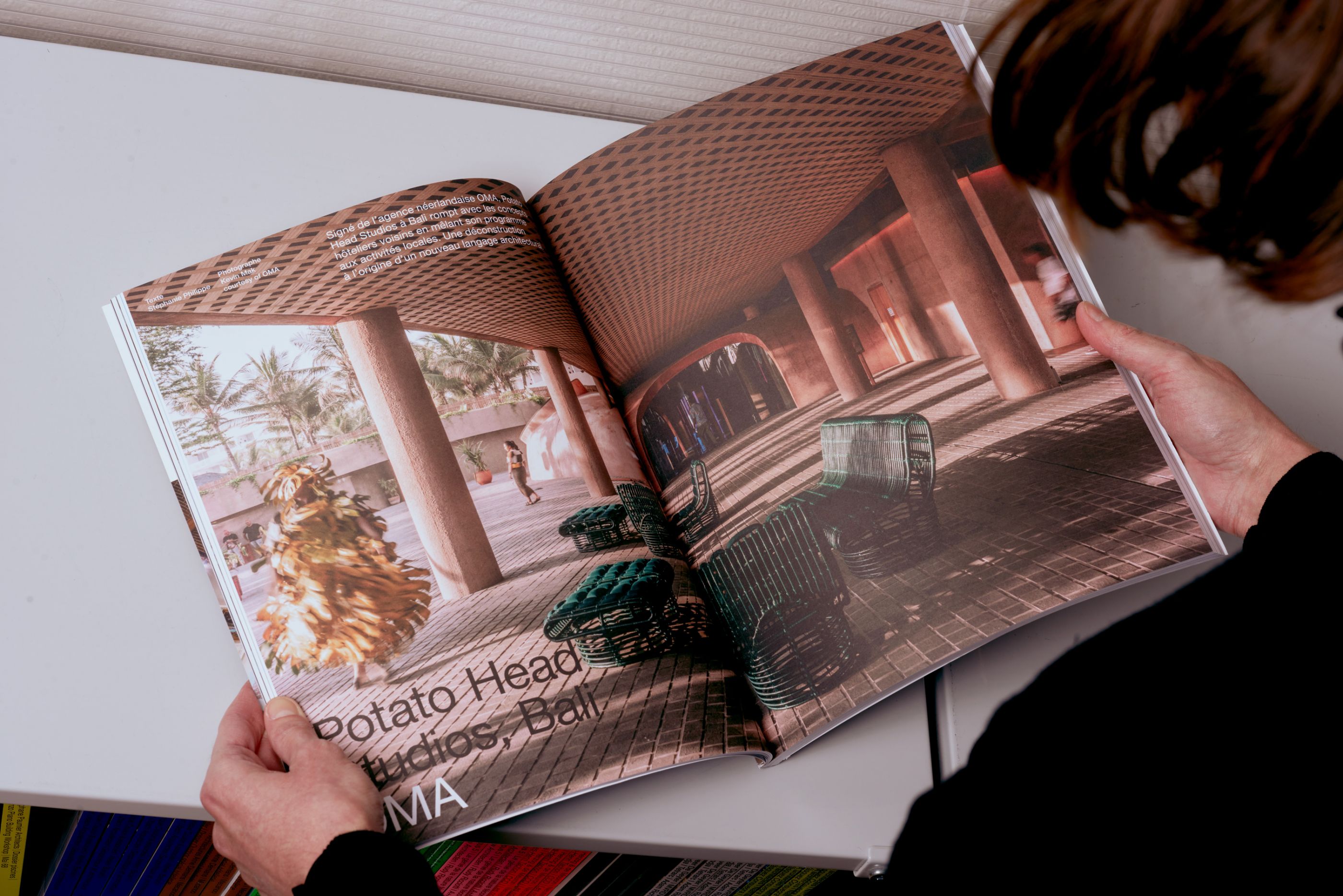
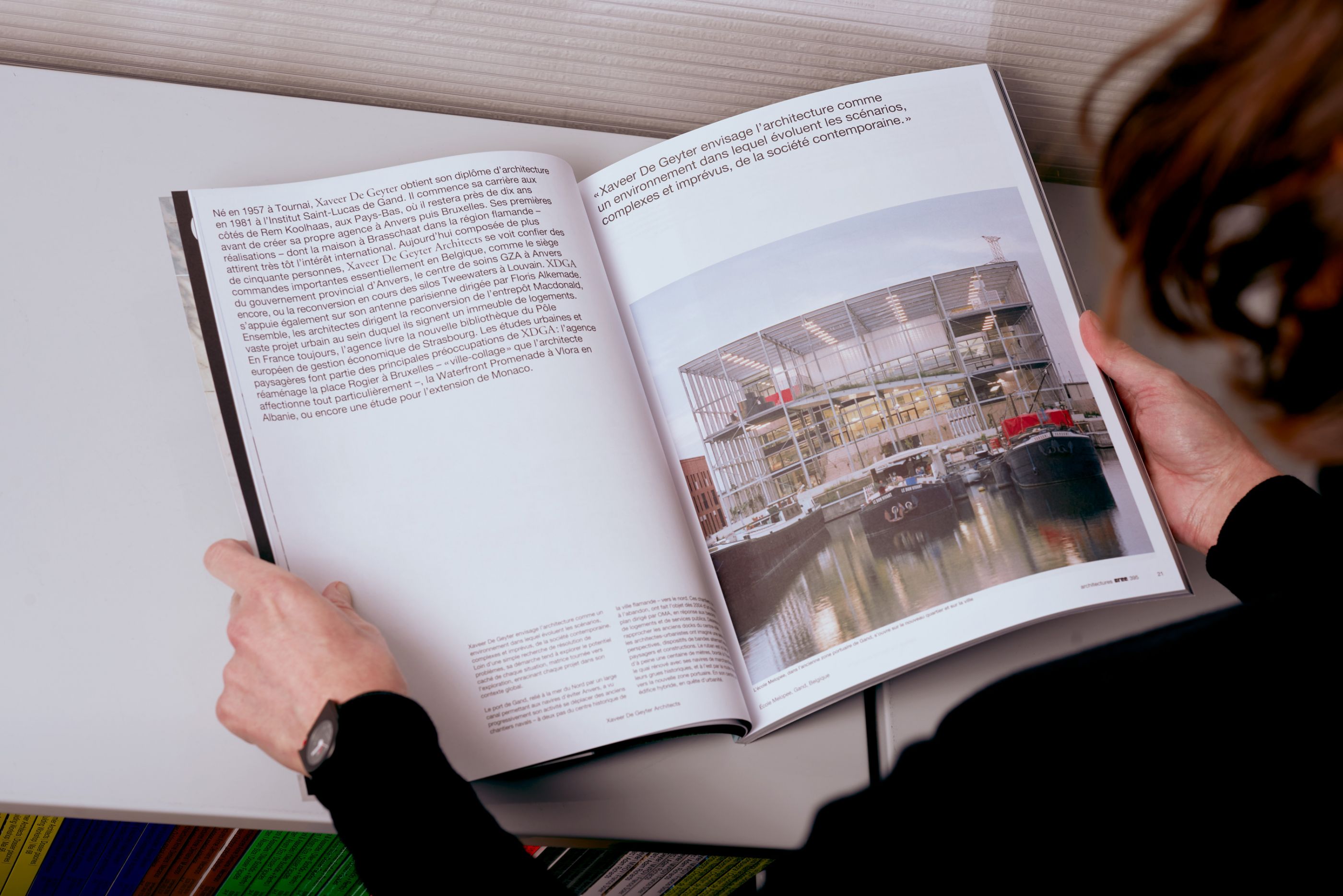
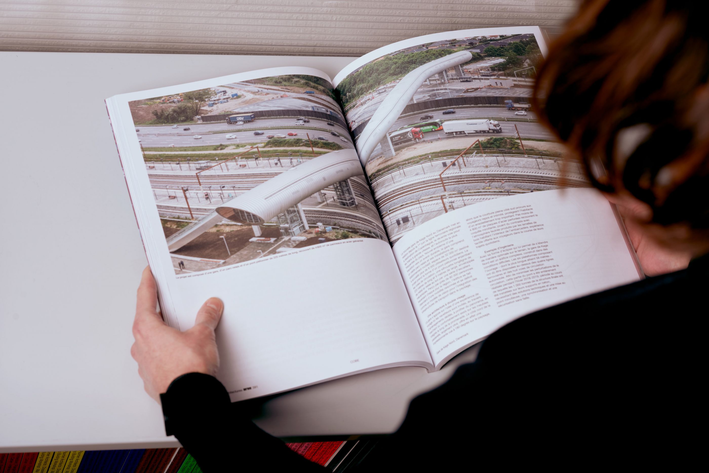
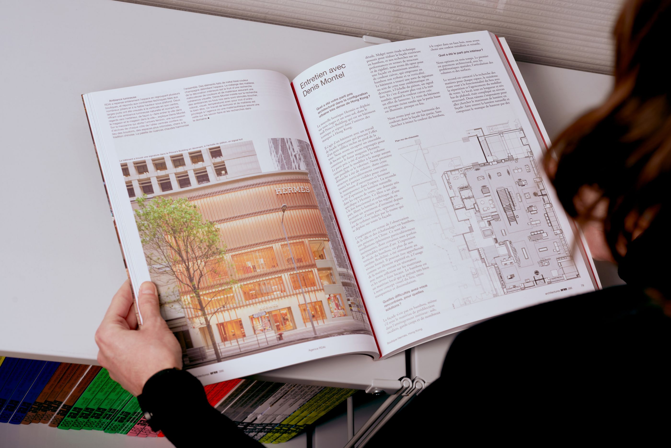
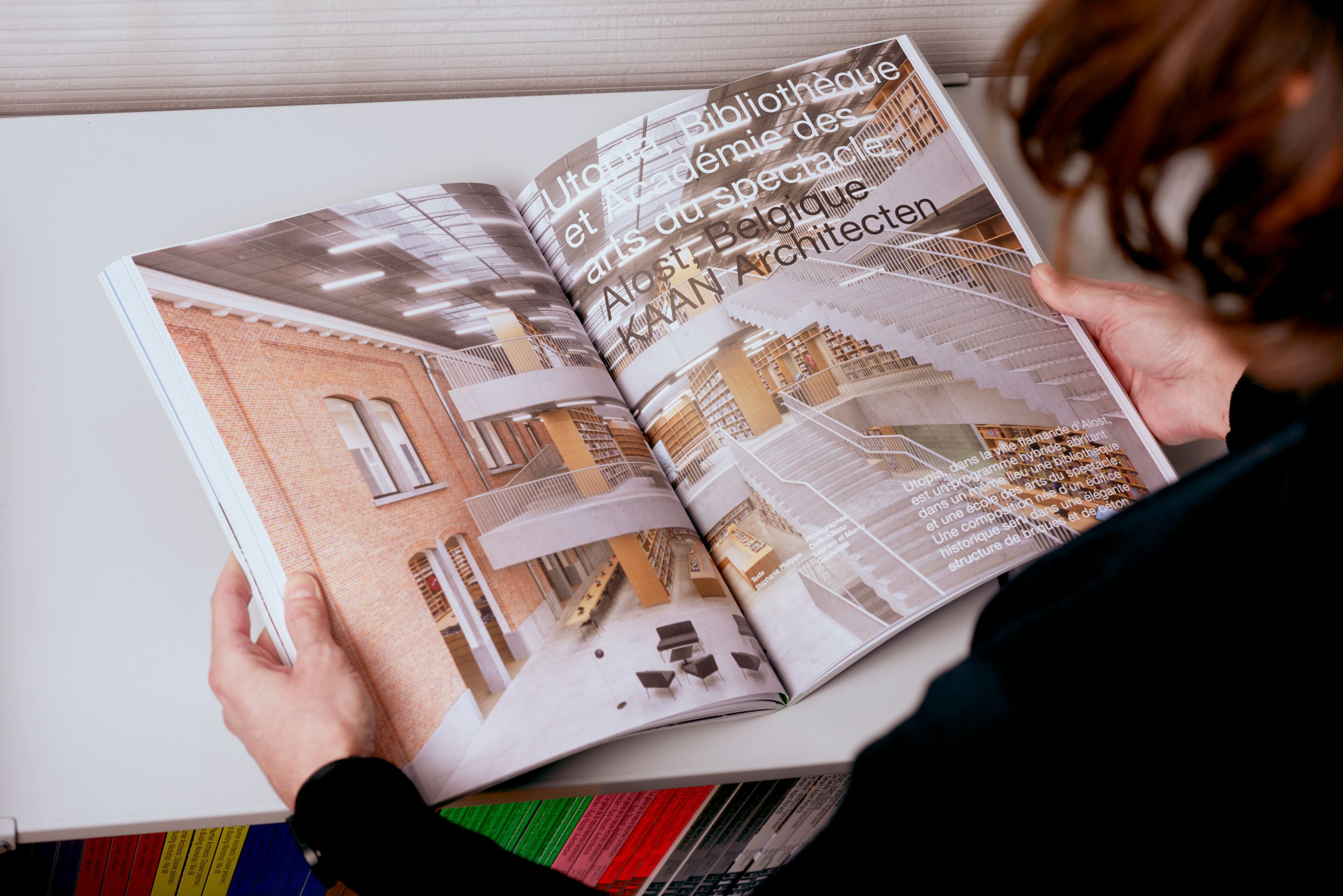
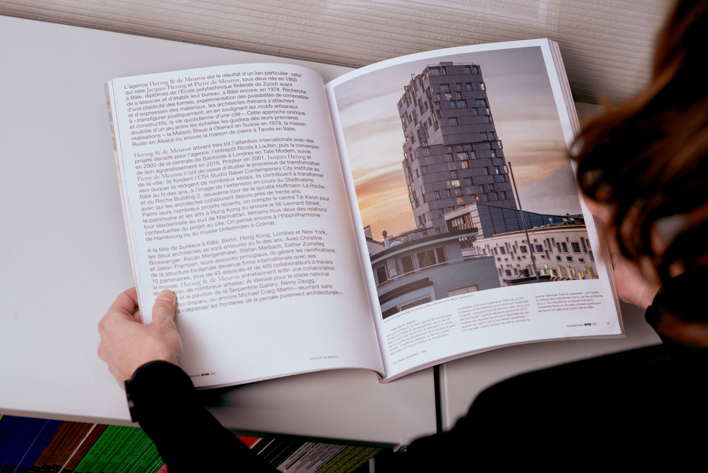
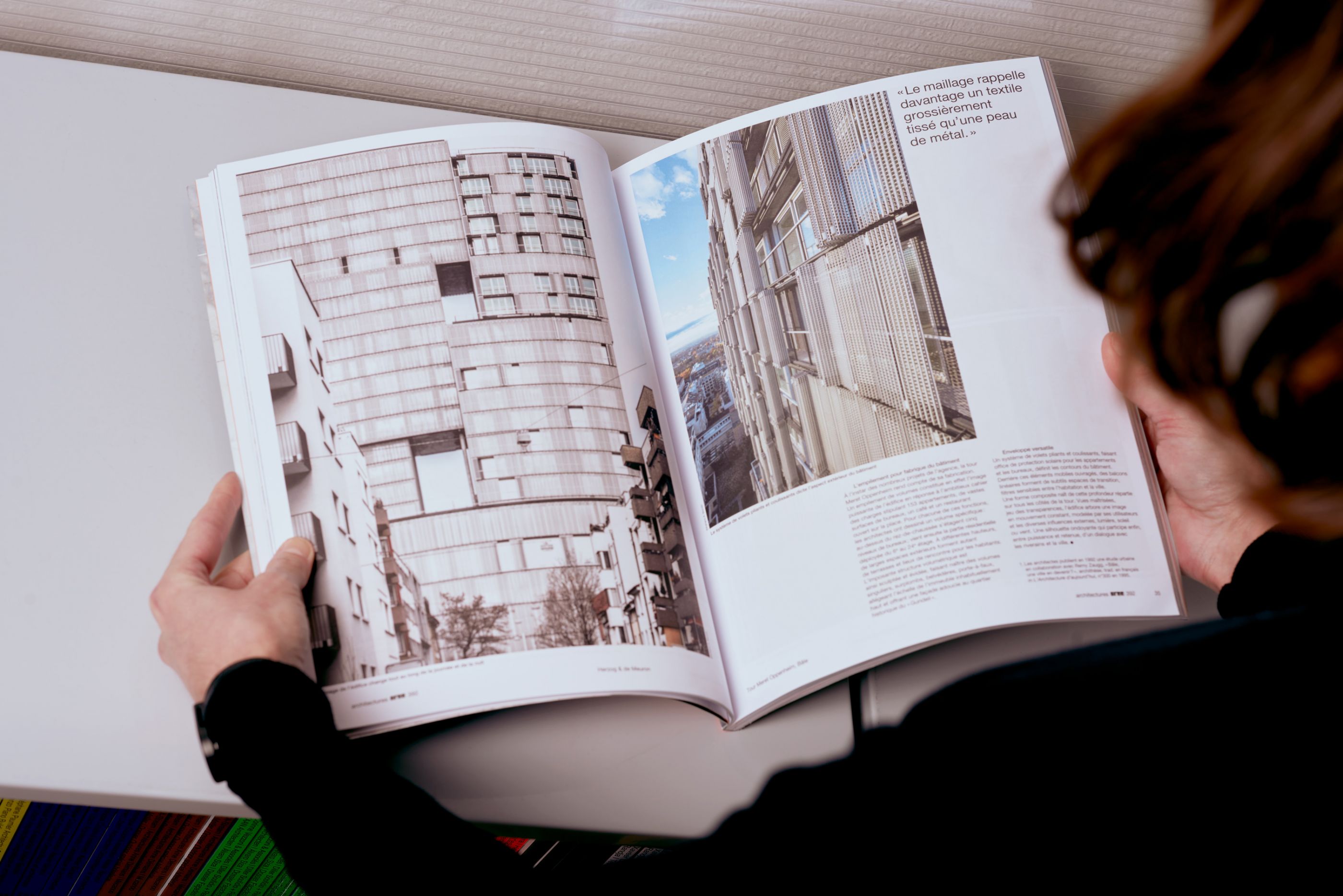
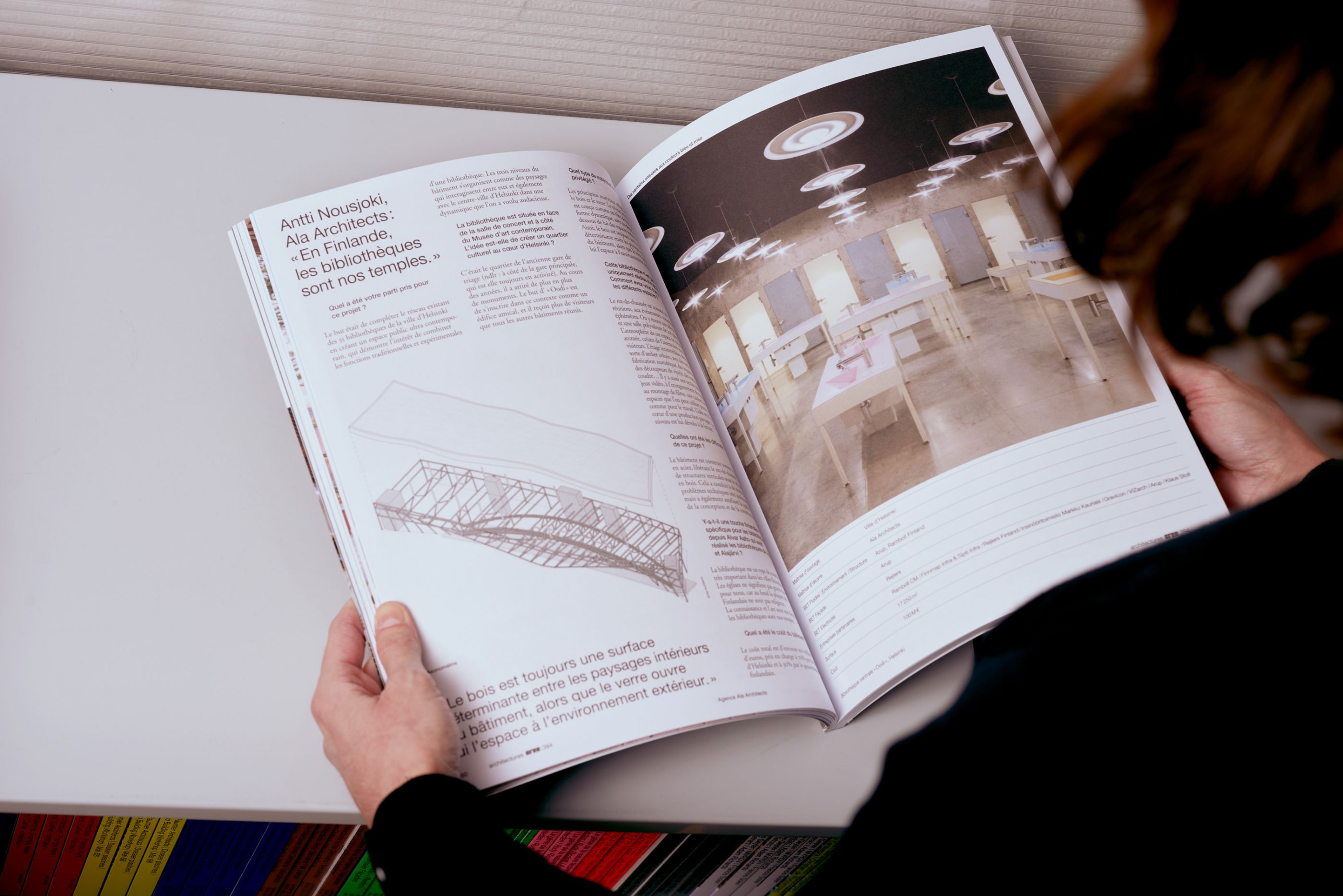
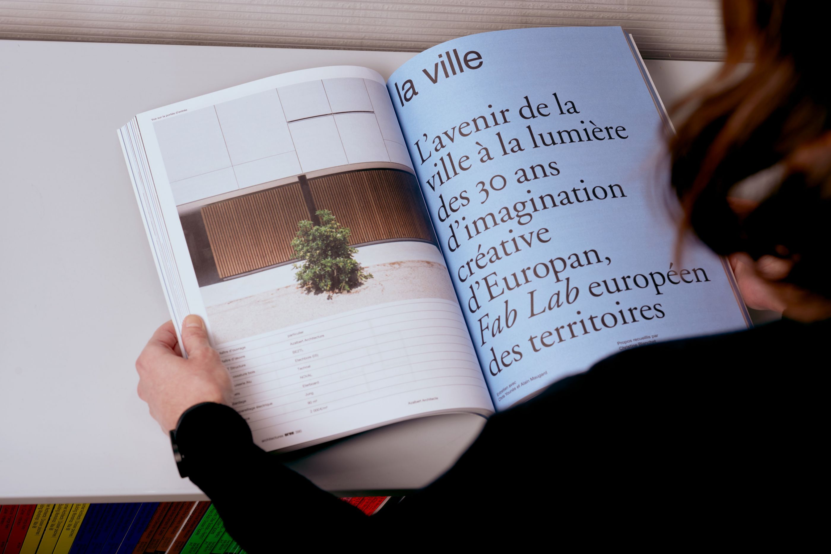
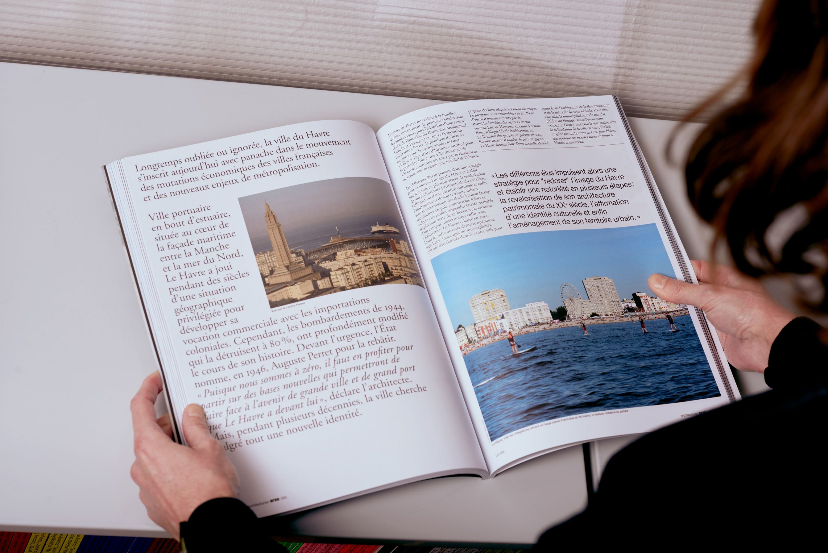
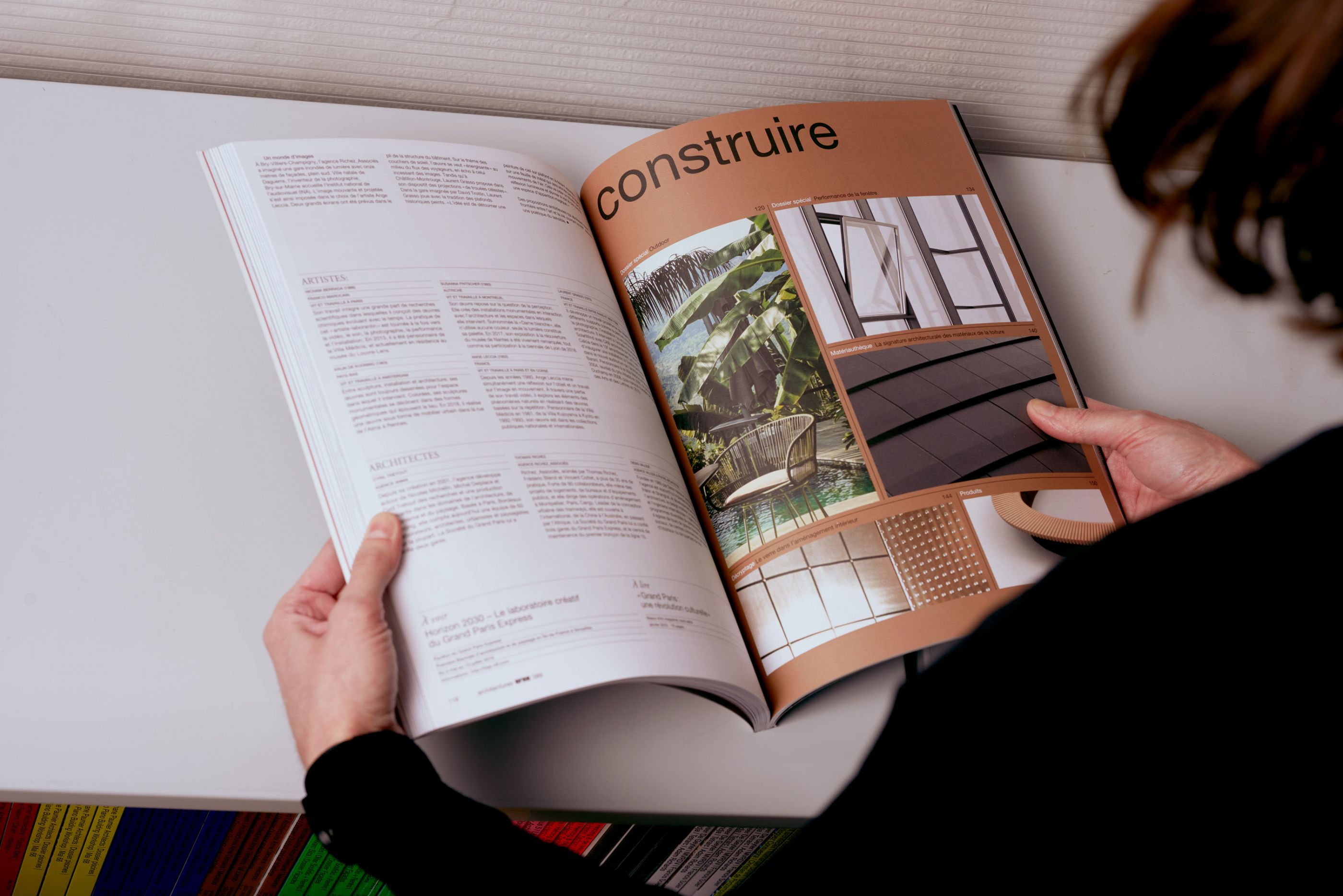
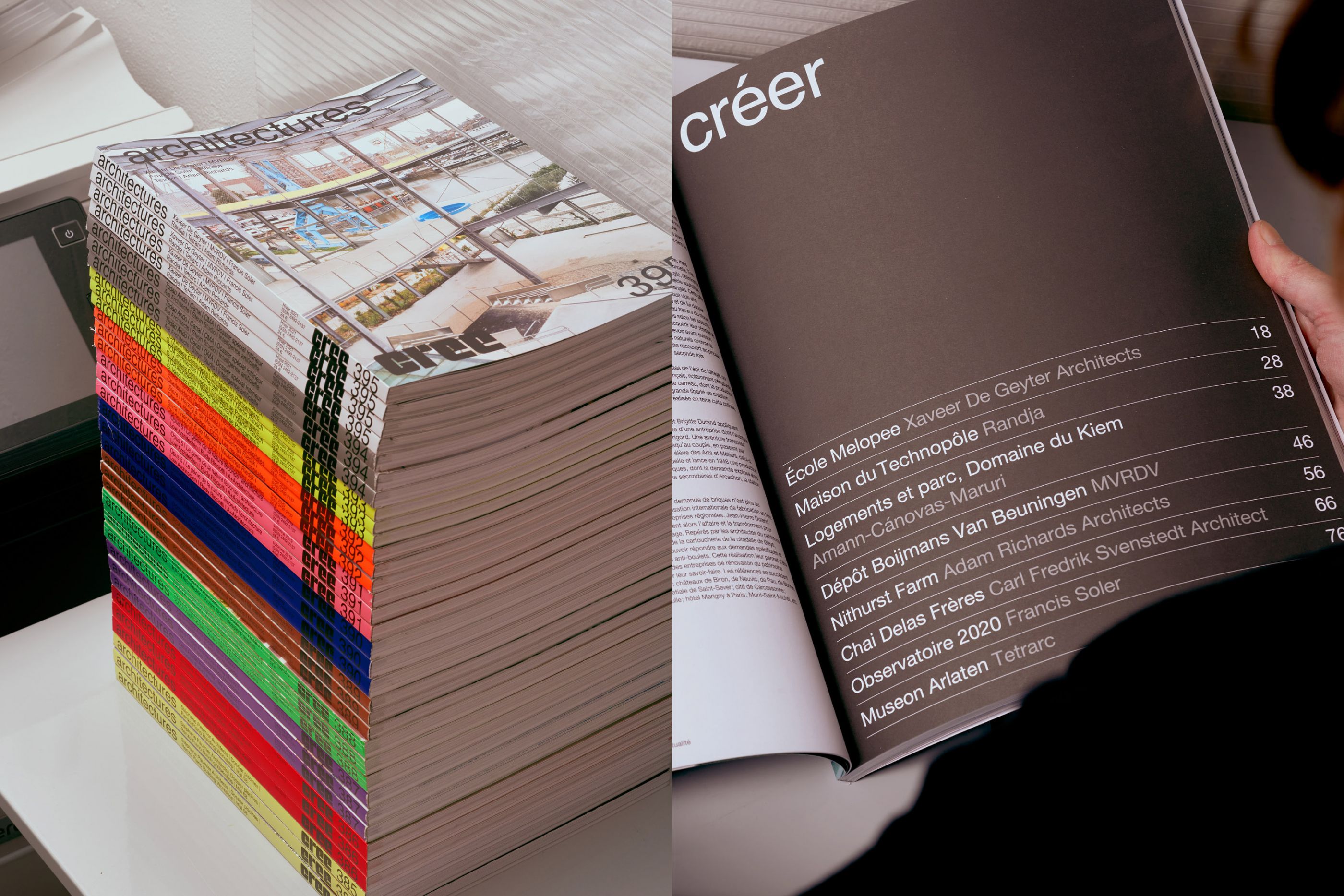
architectures CREE magazine
/
CREE éditions
2018 - 2021
24 x 31 cm, 210 pages
We have given pride of place to the images in the redesign of architectures CREE magazine, of which we assure the continuing art direction.
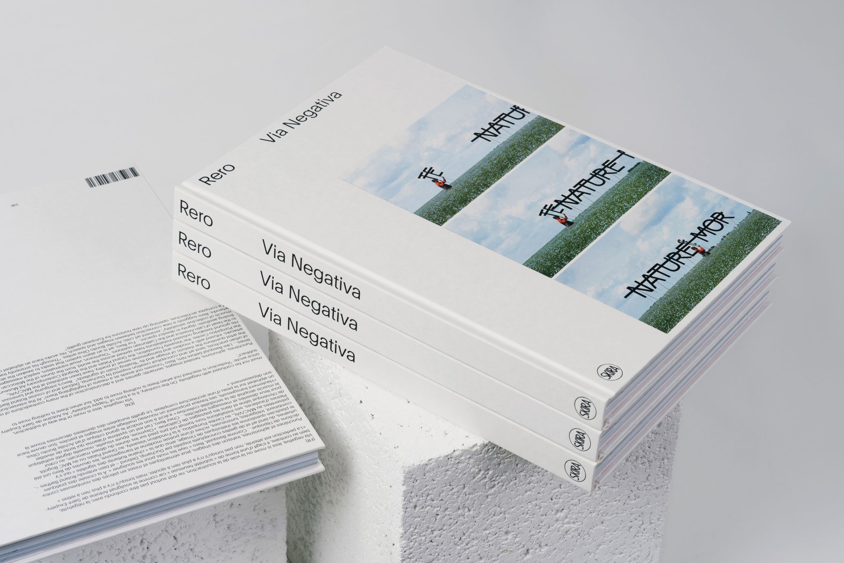
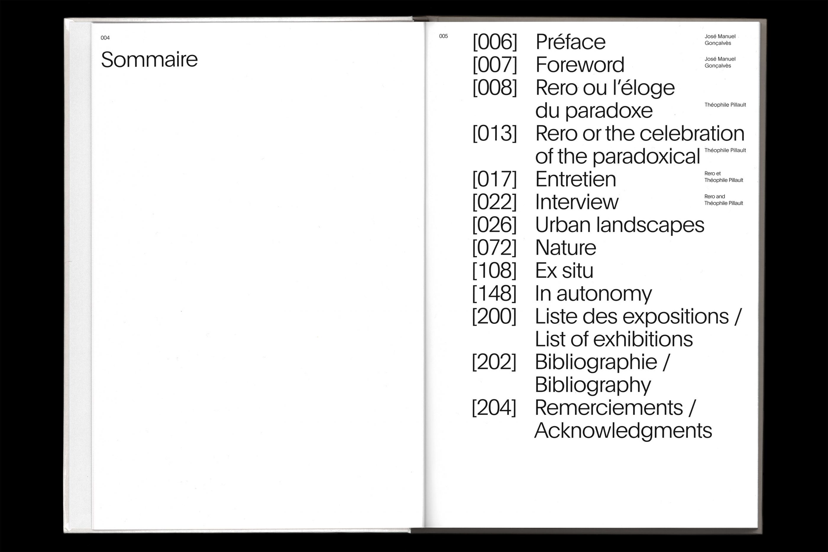
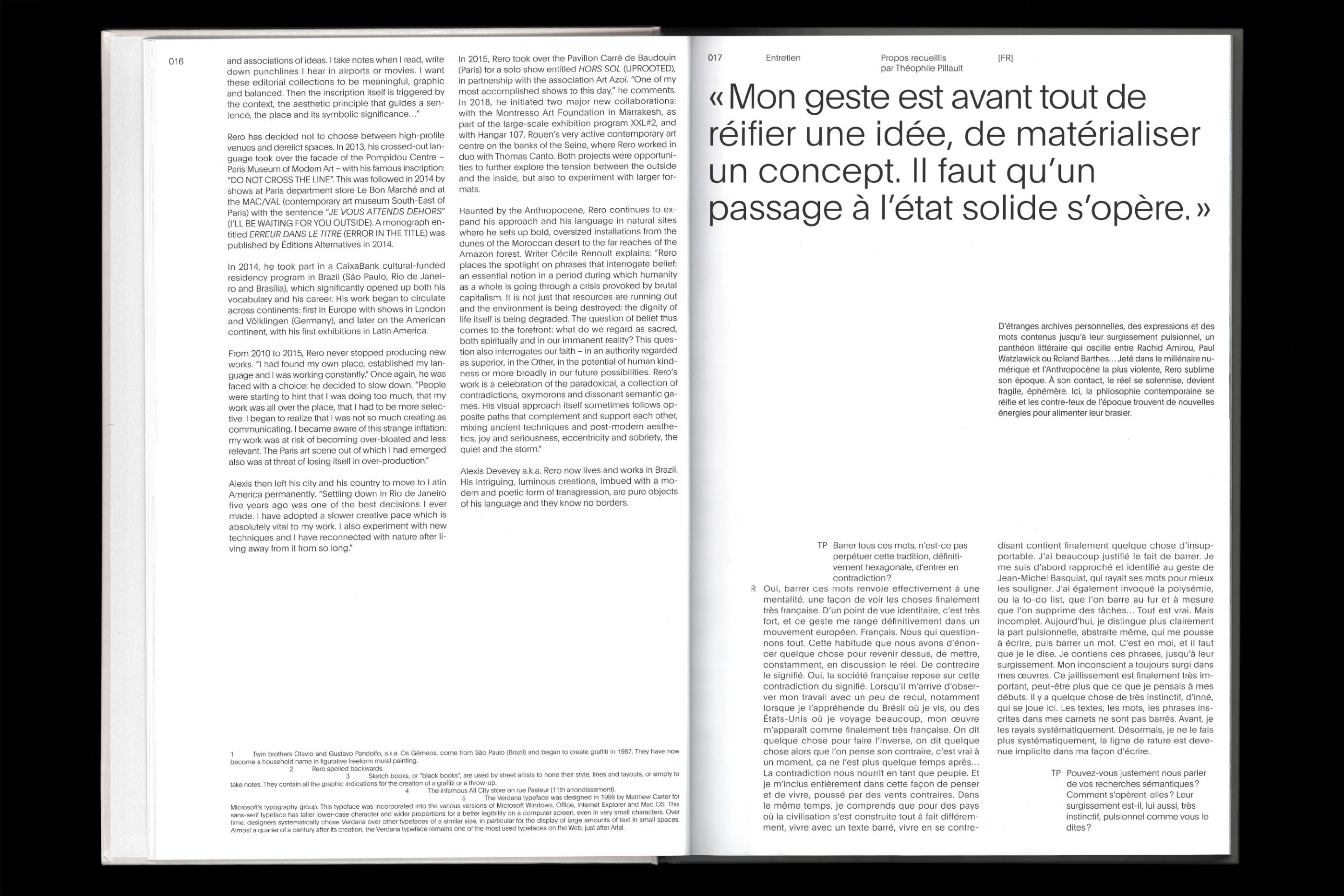
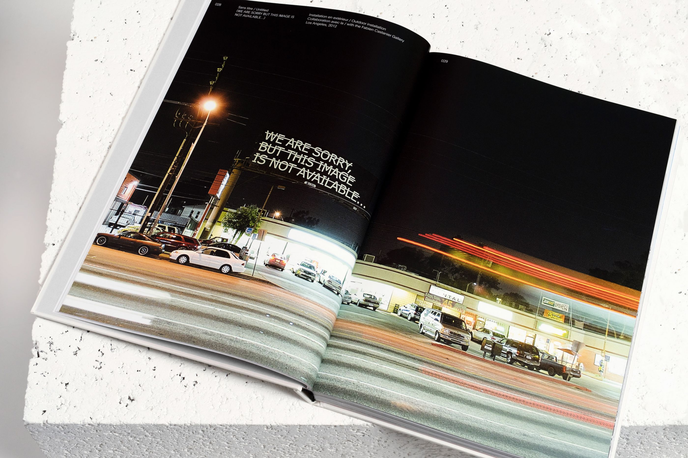
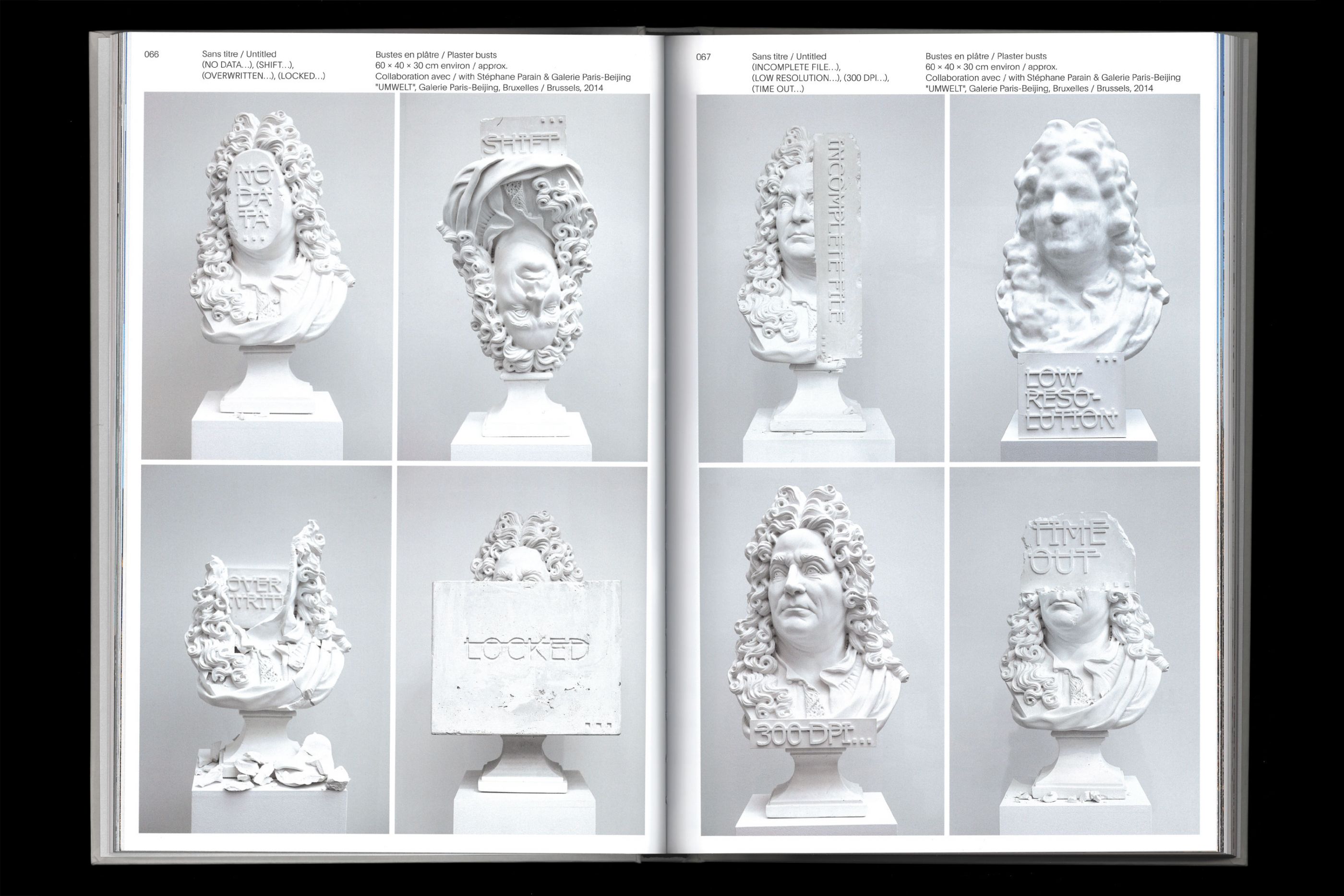
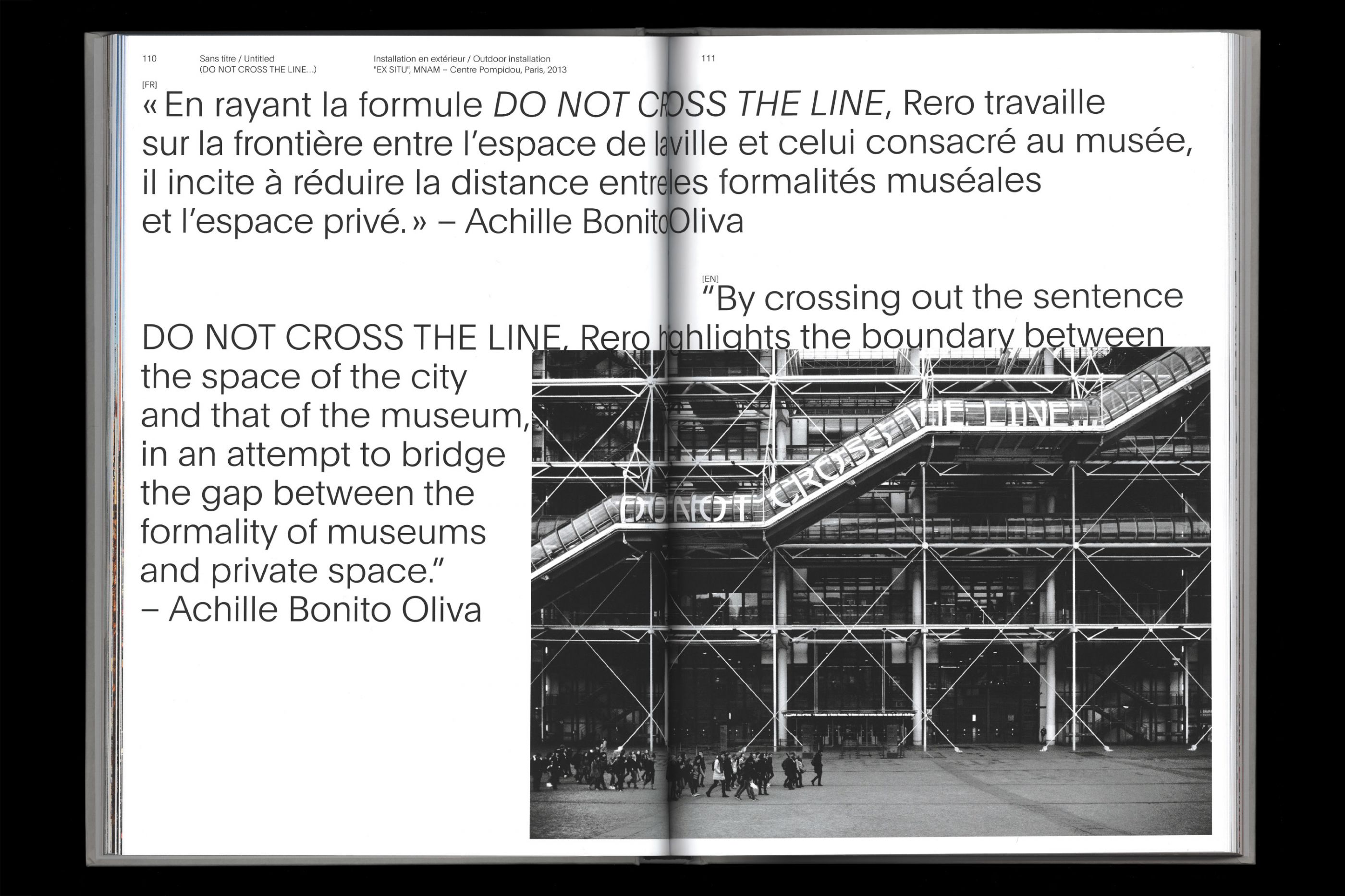
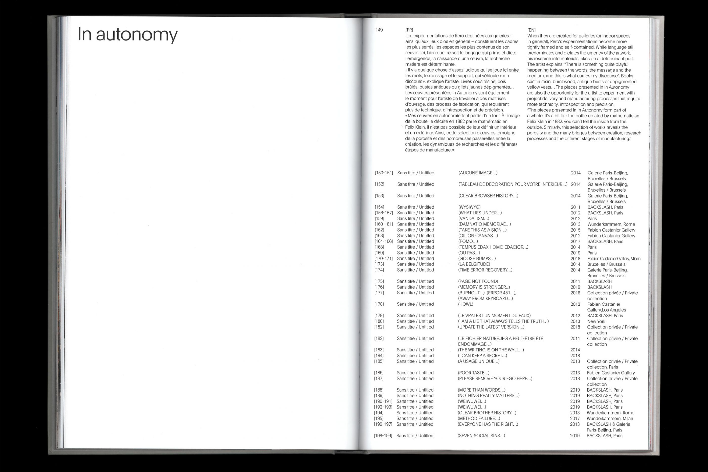
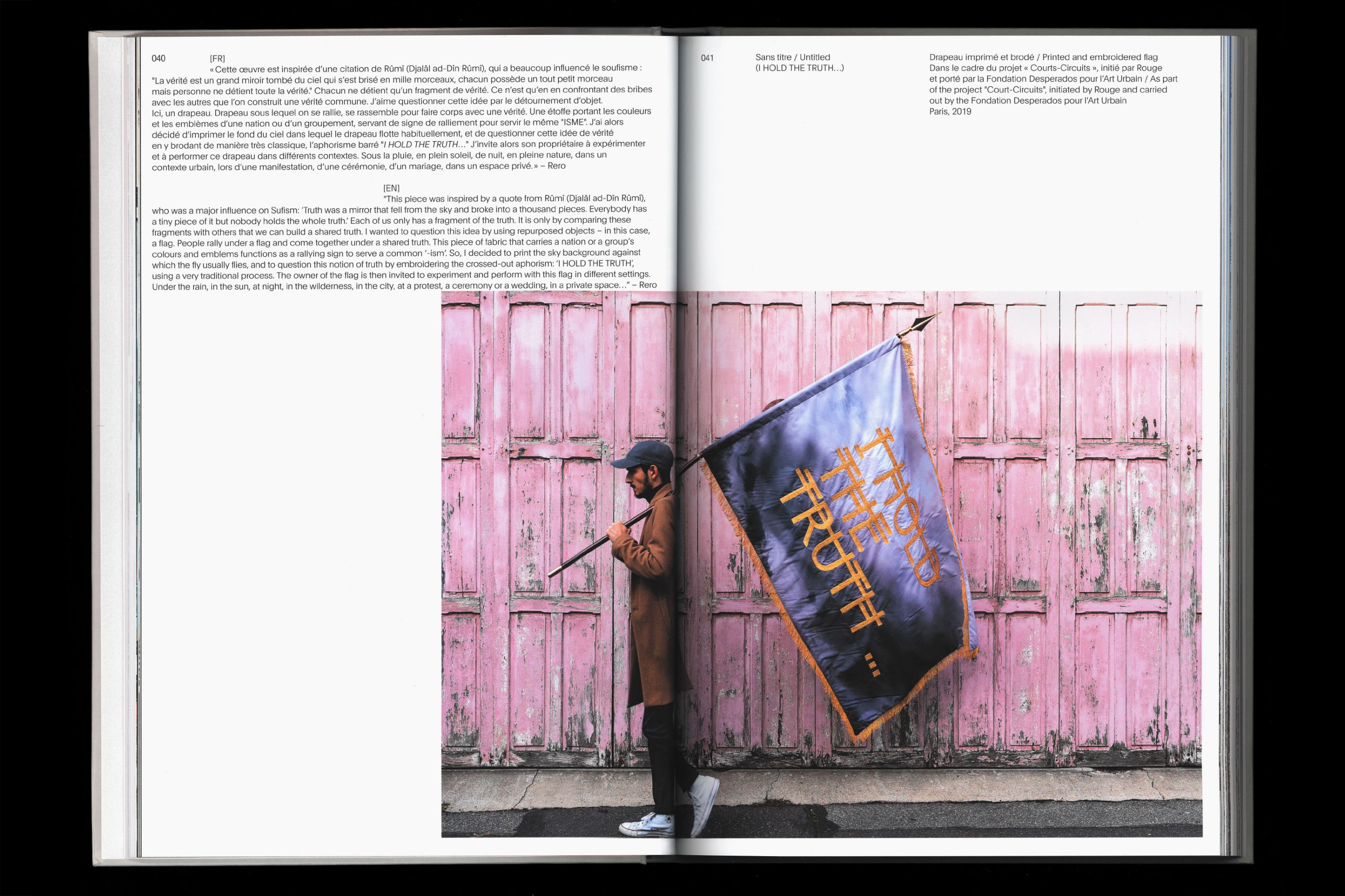
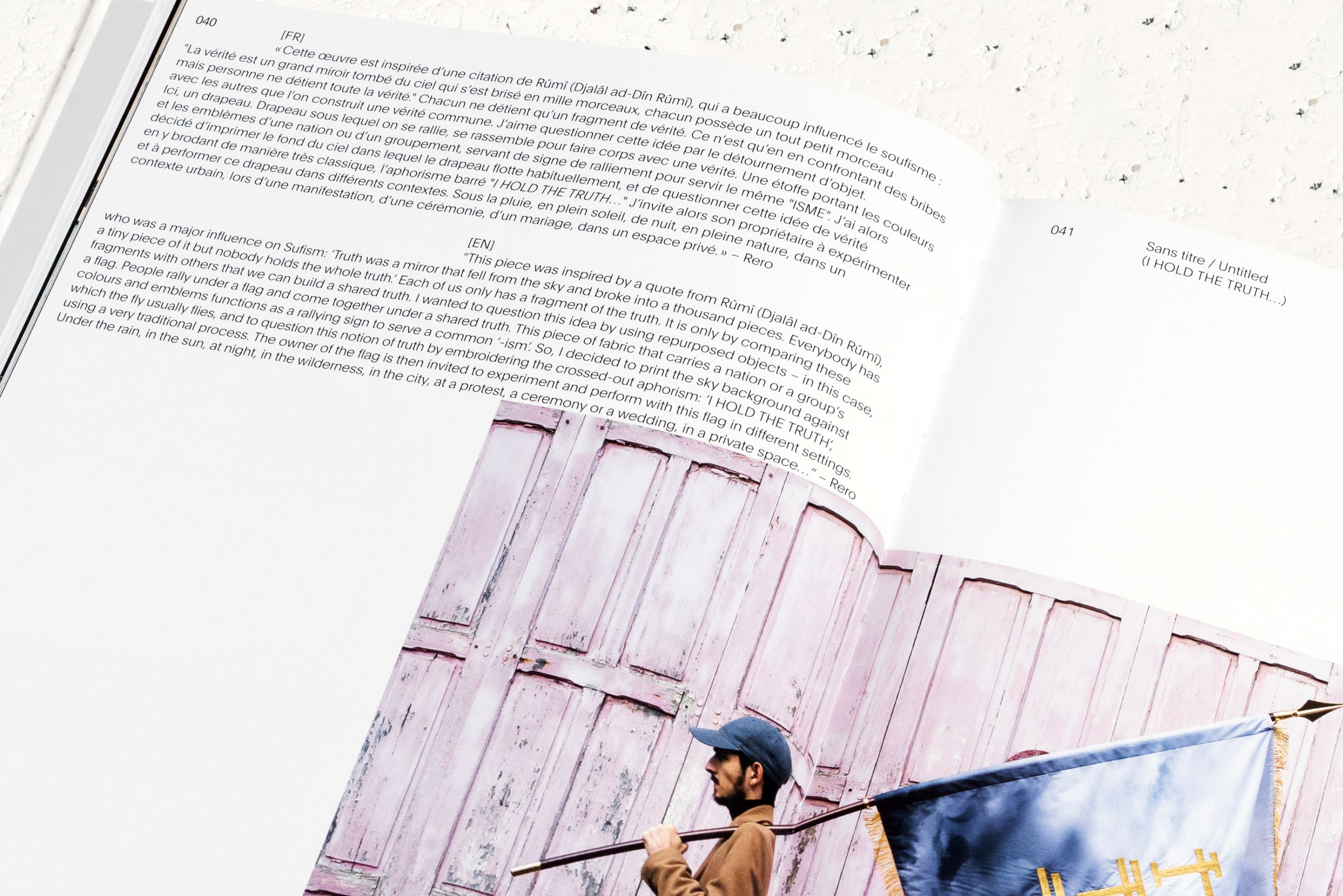
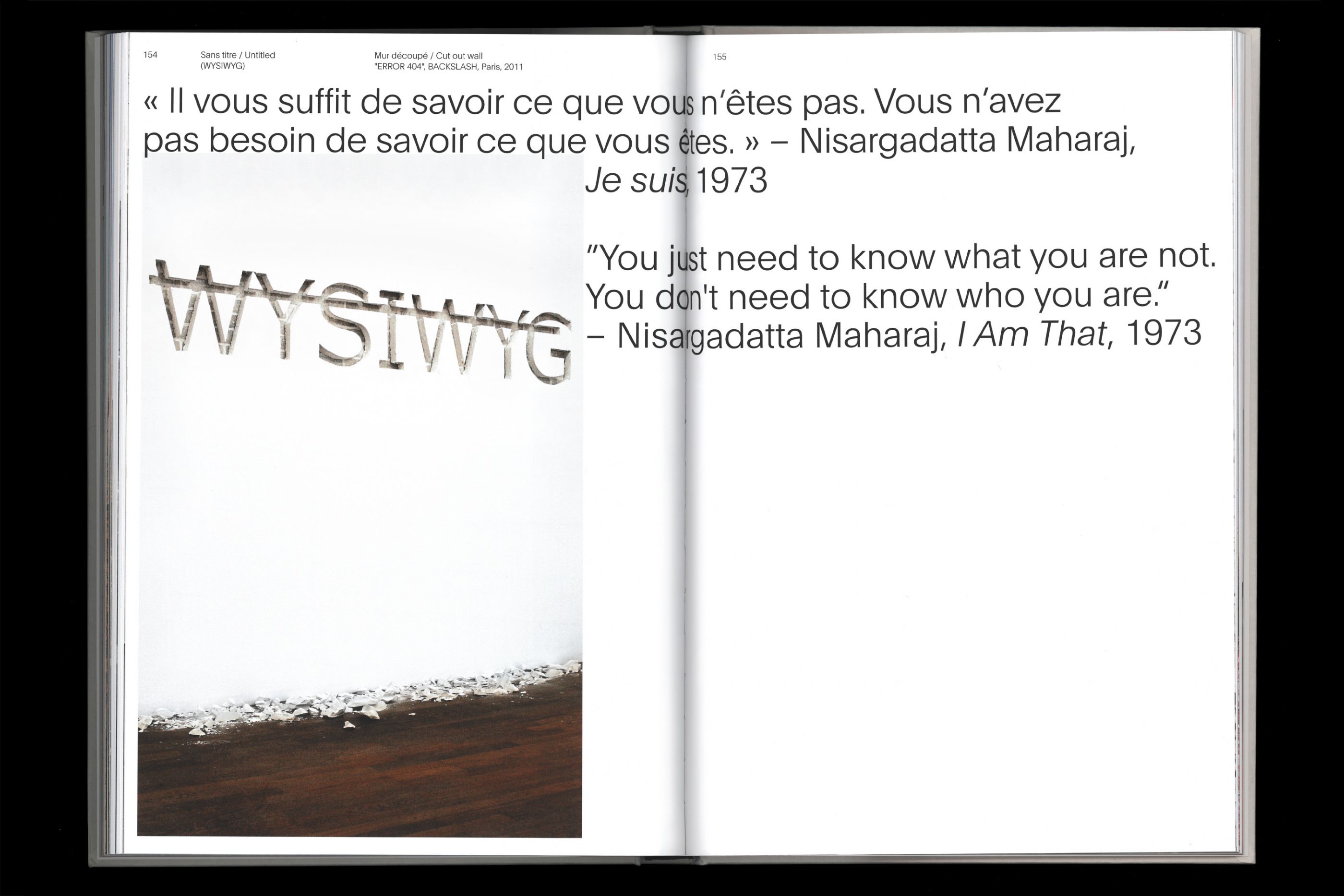
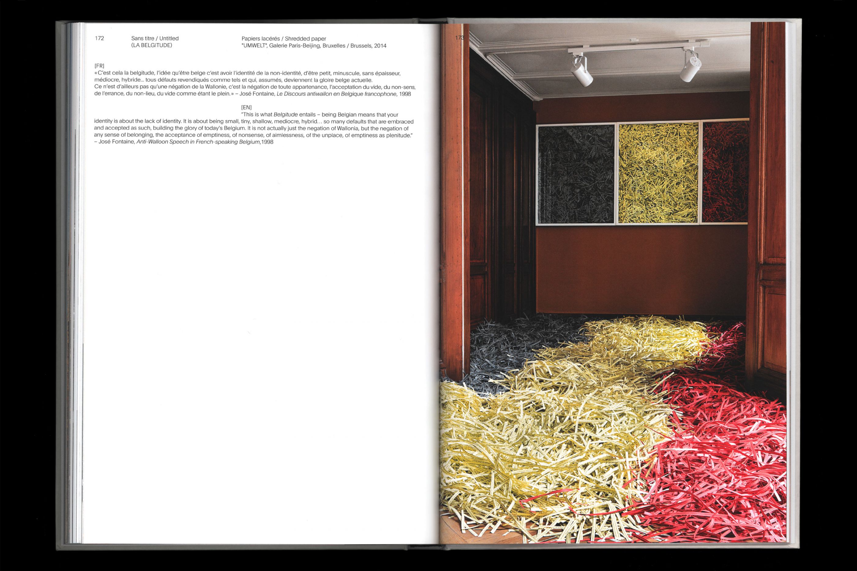
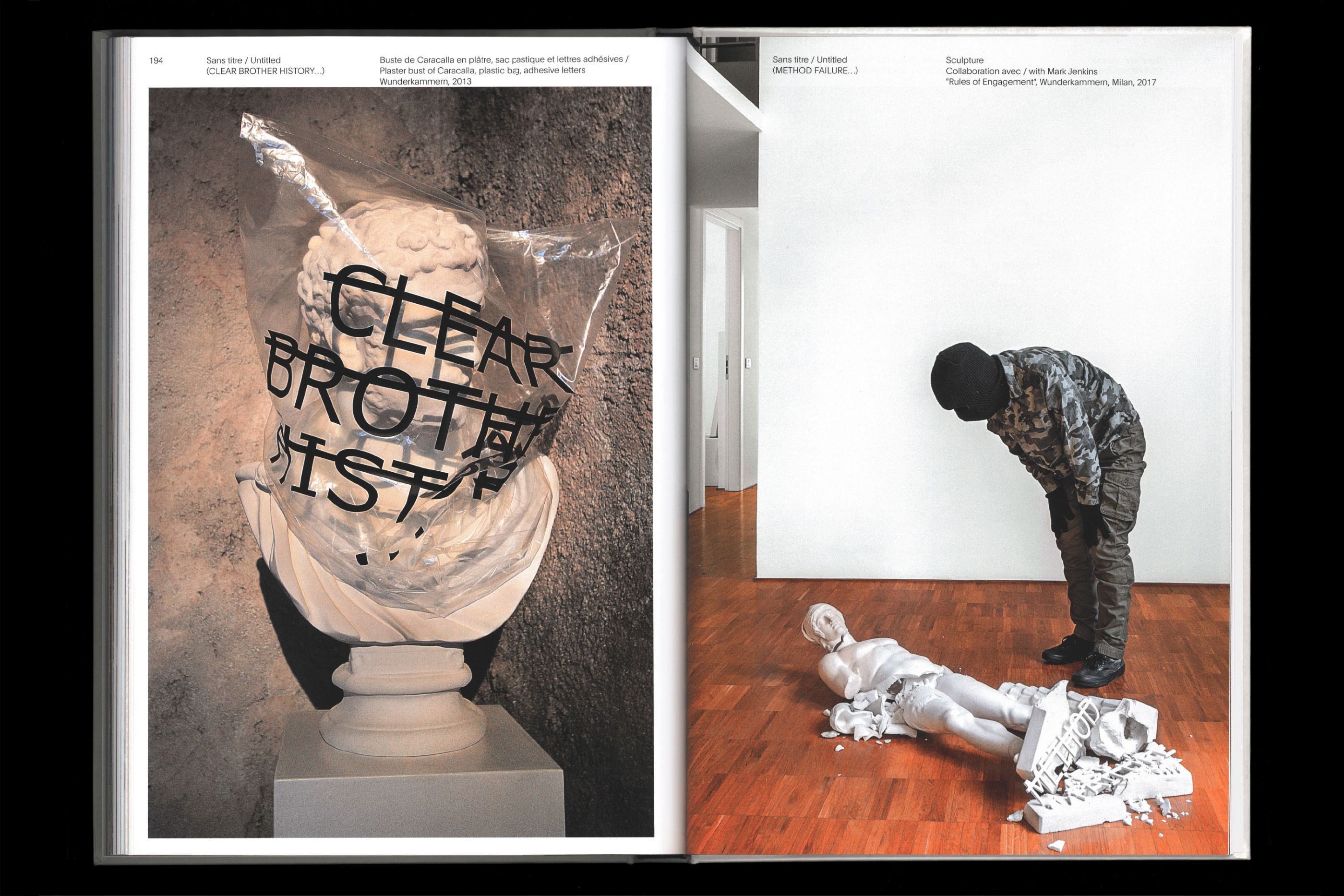
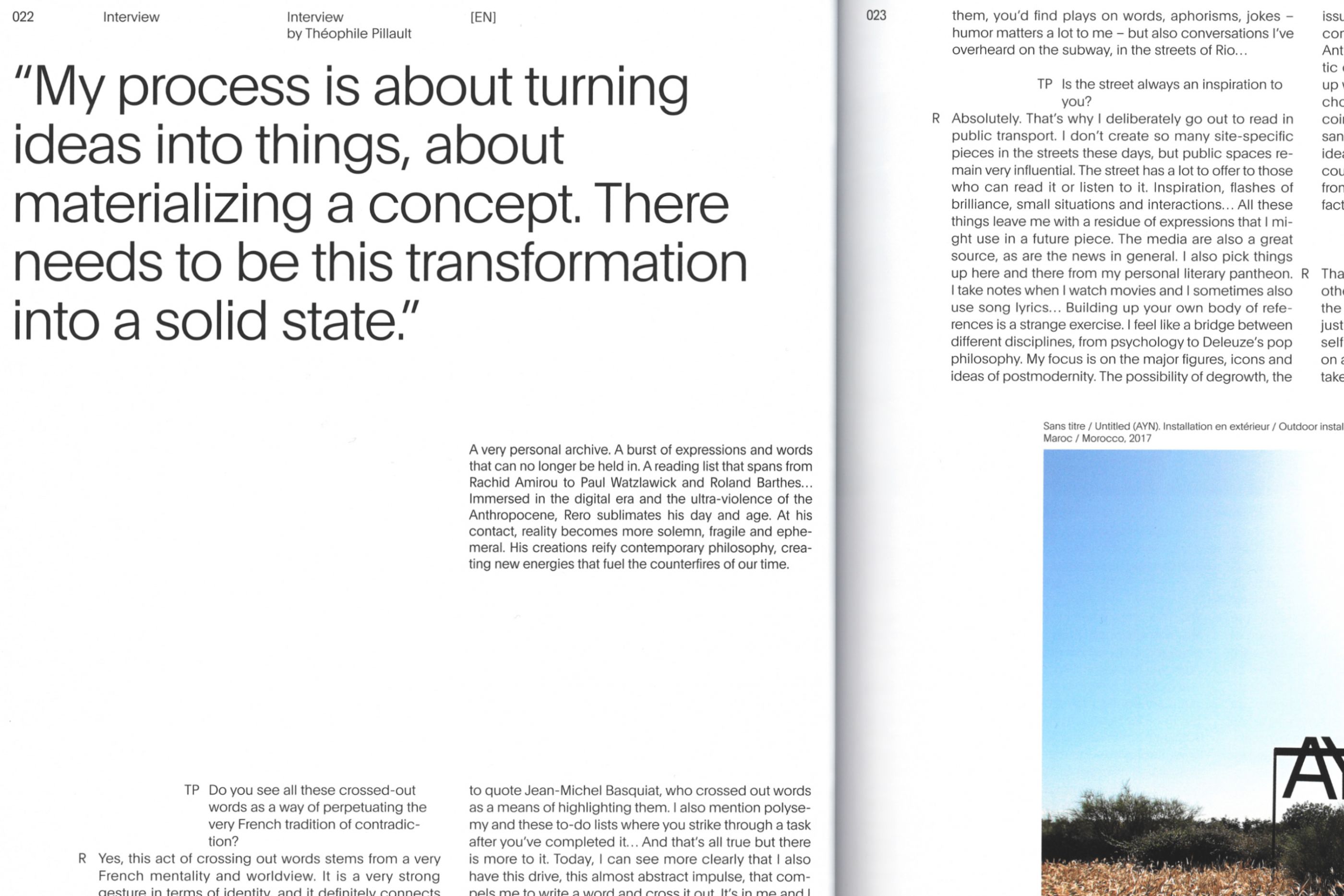
Rero Via Negativa - Skira
/
Skira Paris
2020
22 x 32 cm, 208 pages, preface par José Manuel Gonçalvès. Hot foil, embossing, natural coton paper.
Intriguing, luminous, rich in modern and transgressive poetry, Rero's works have been presented at the MAC / VAL, the Center Pompidou, the Vasarely Foundation, the Grand Palais and the MAC Bogotá.
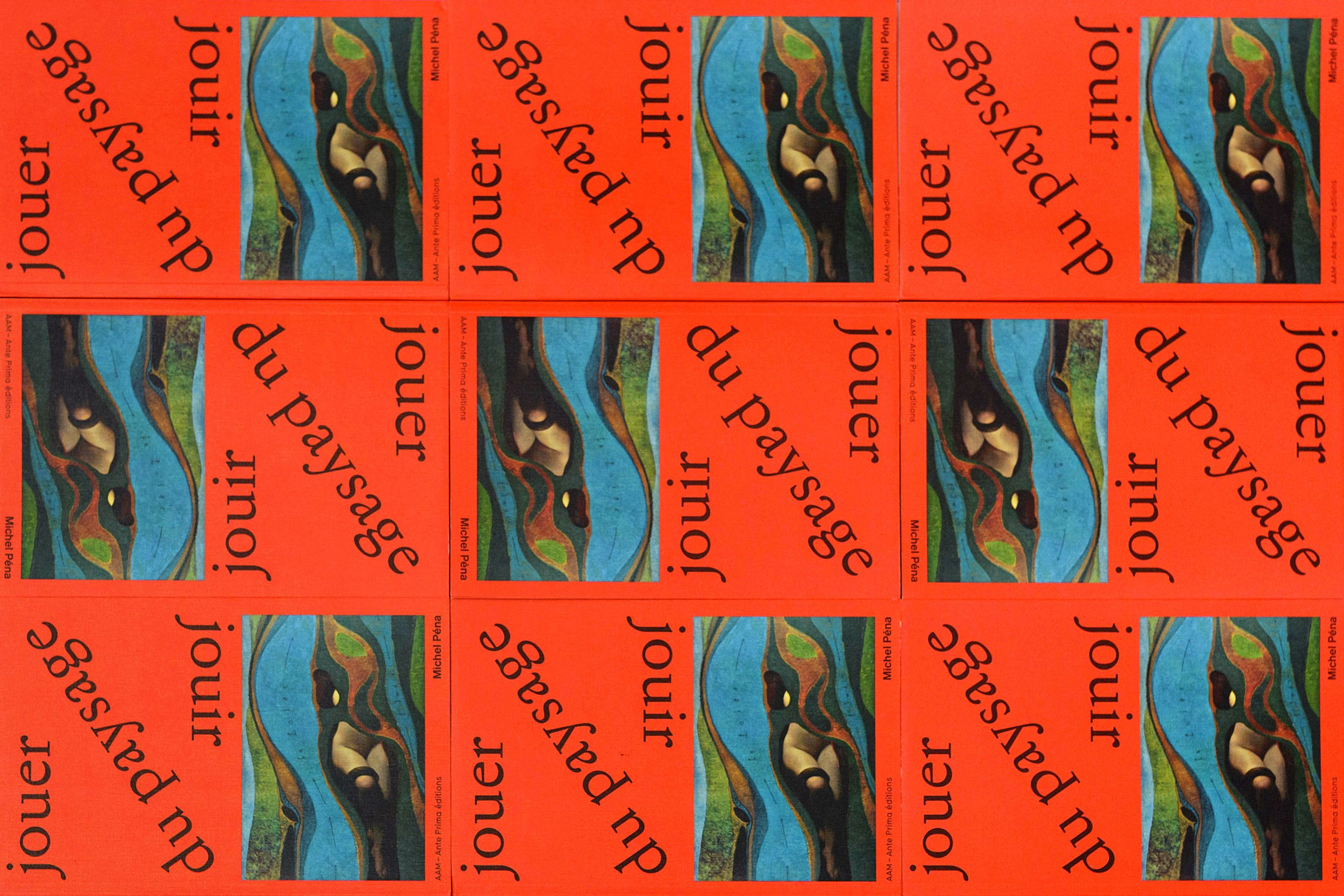
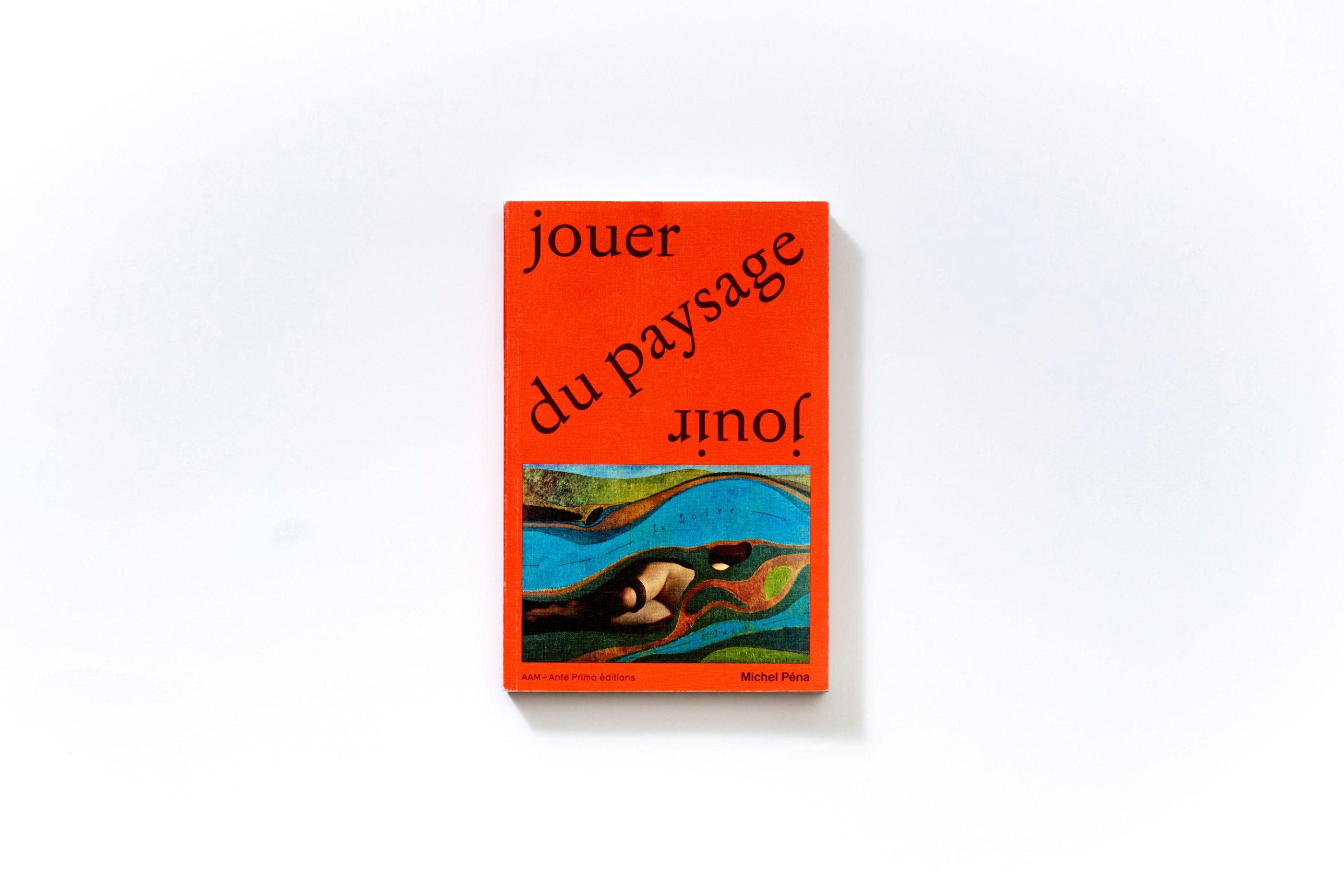
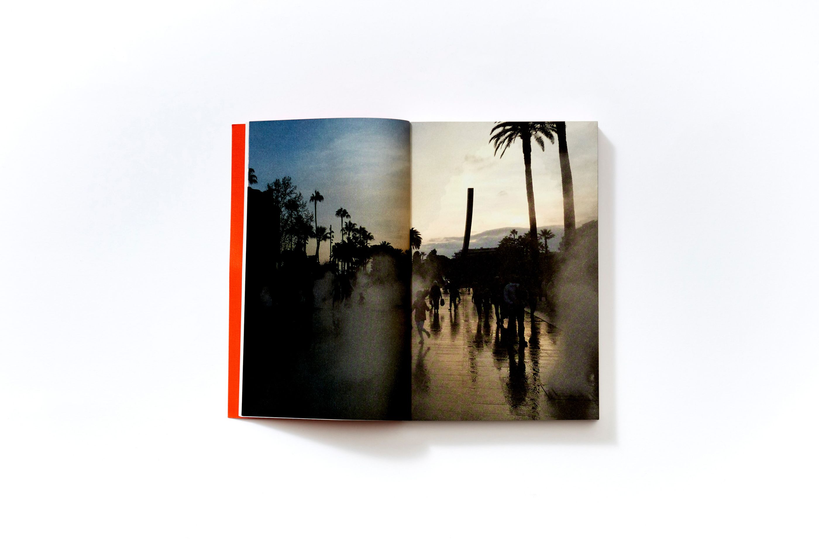
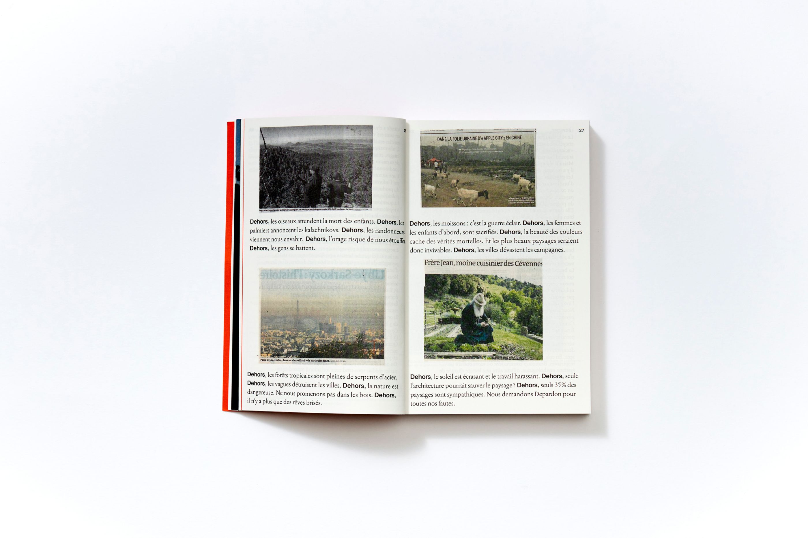
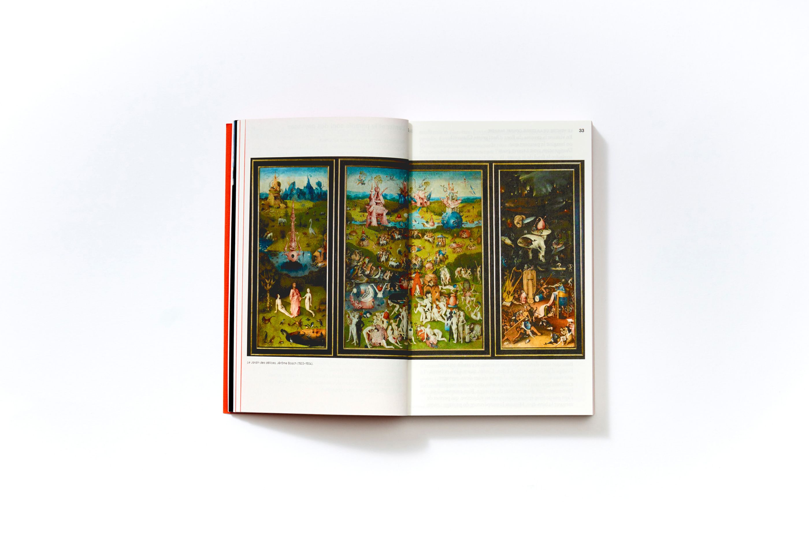
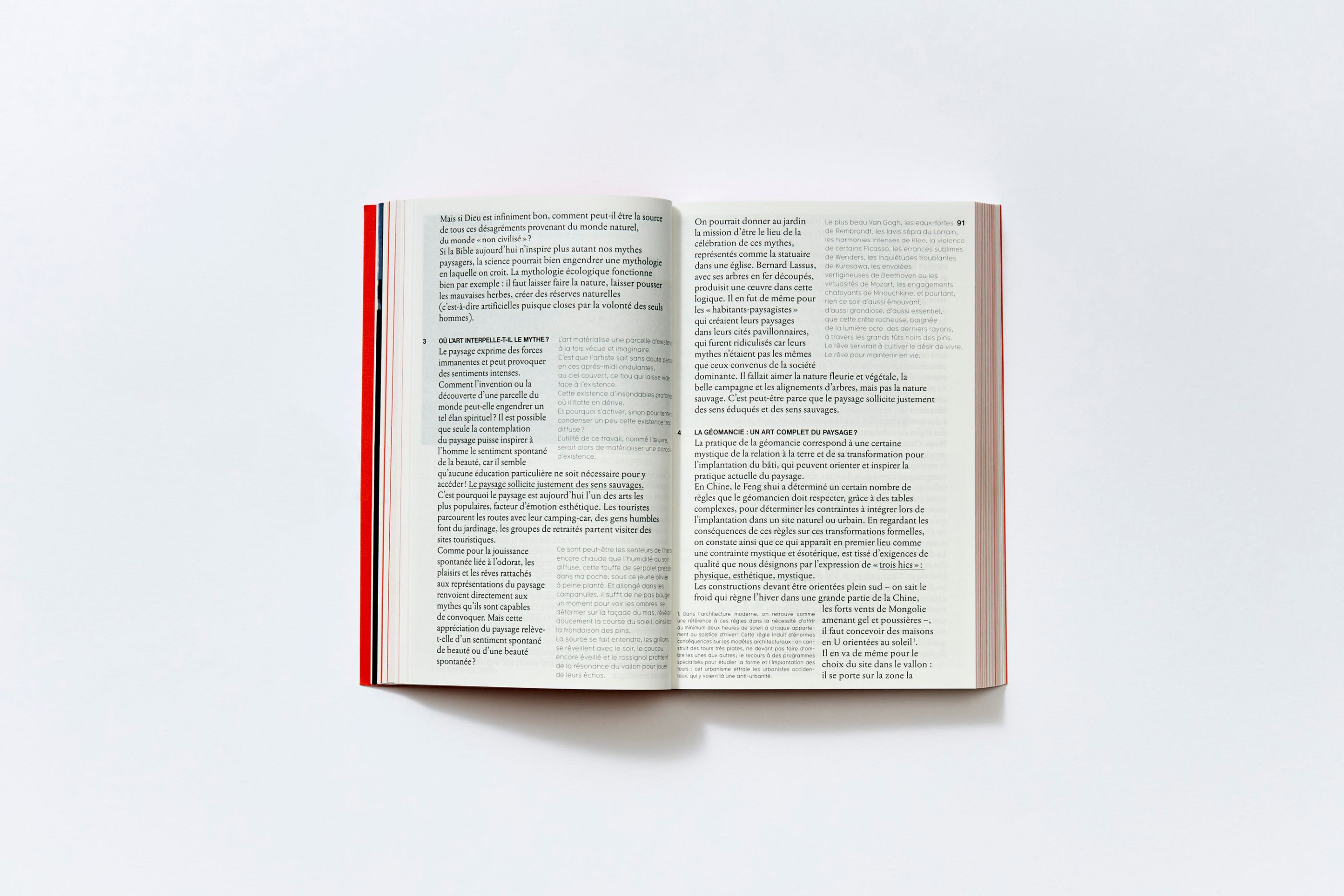
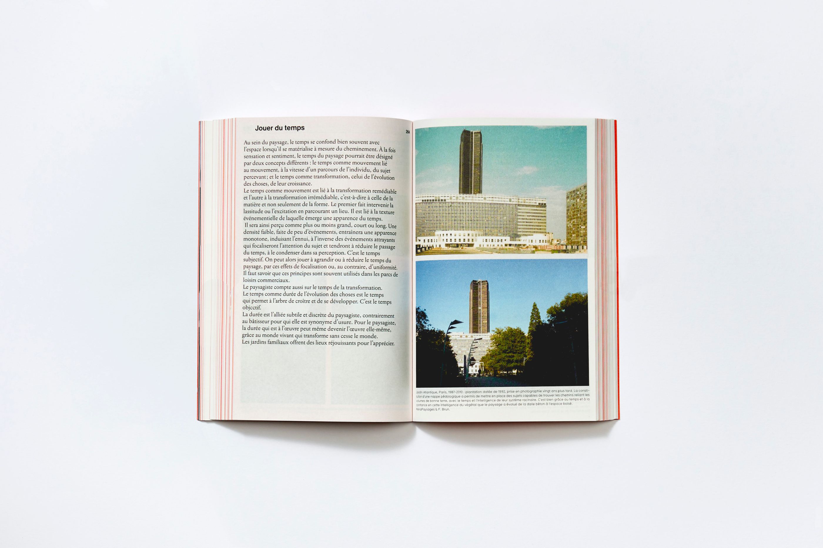
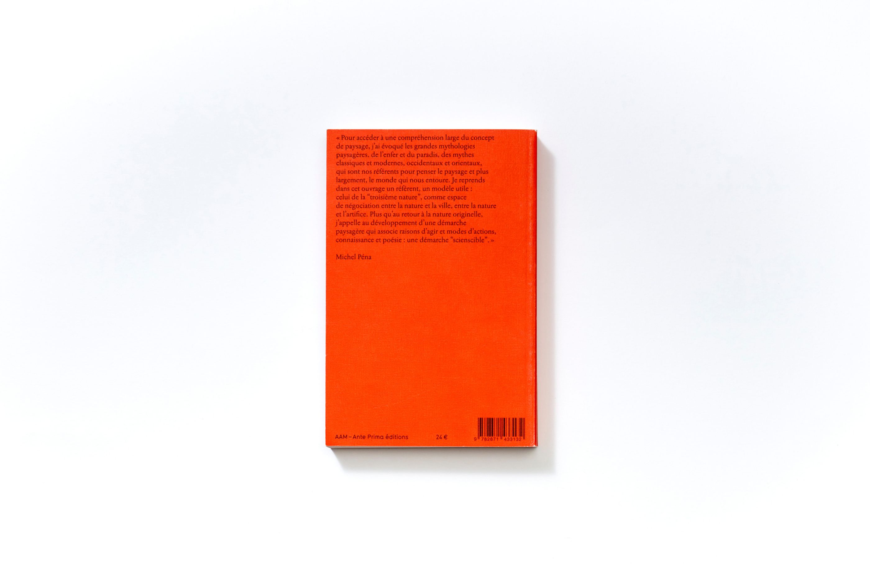
Michel Péna, Jouer/Jouir du paysage
/
AAM - Ante Prima éditions
2016
138 x 210 mm, 444 pages
We designed a reflection book as generously illustrated as a handy guide. Michel Péna being one of the most important French landscape designer, this book relates his general reflection about landscape ever since the beginning of his activity.
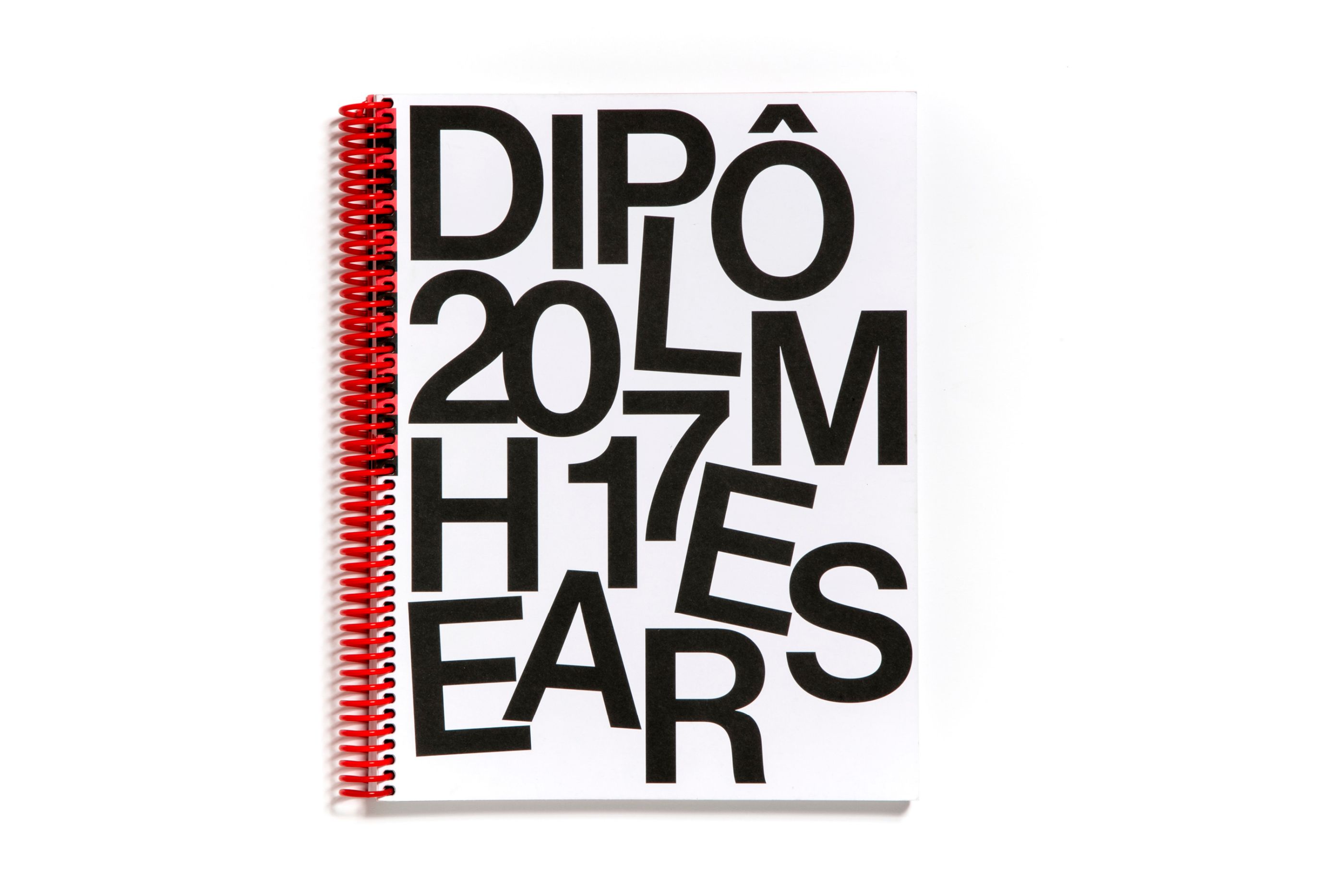
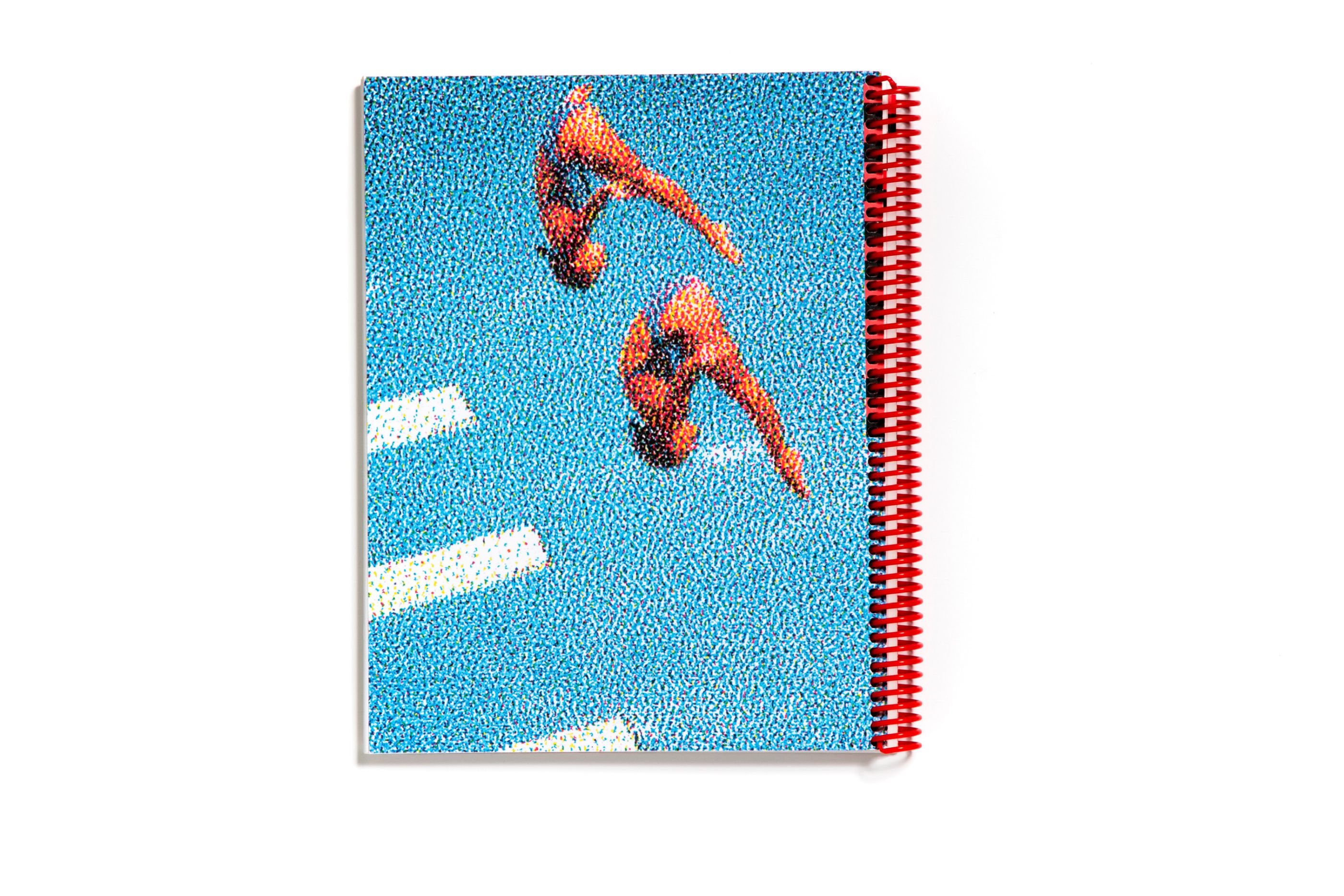
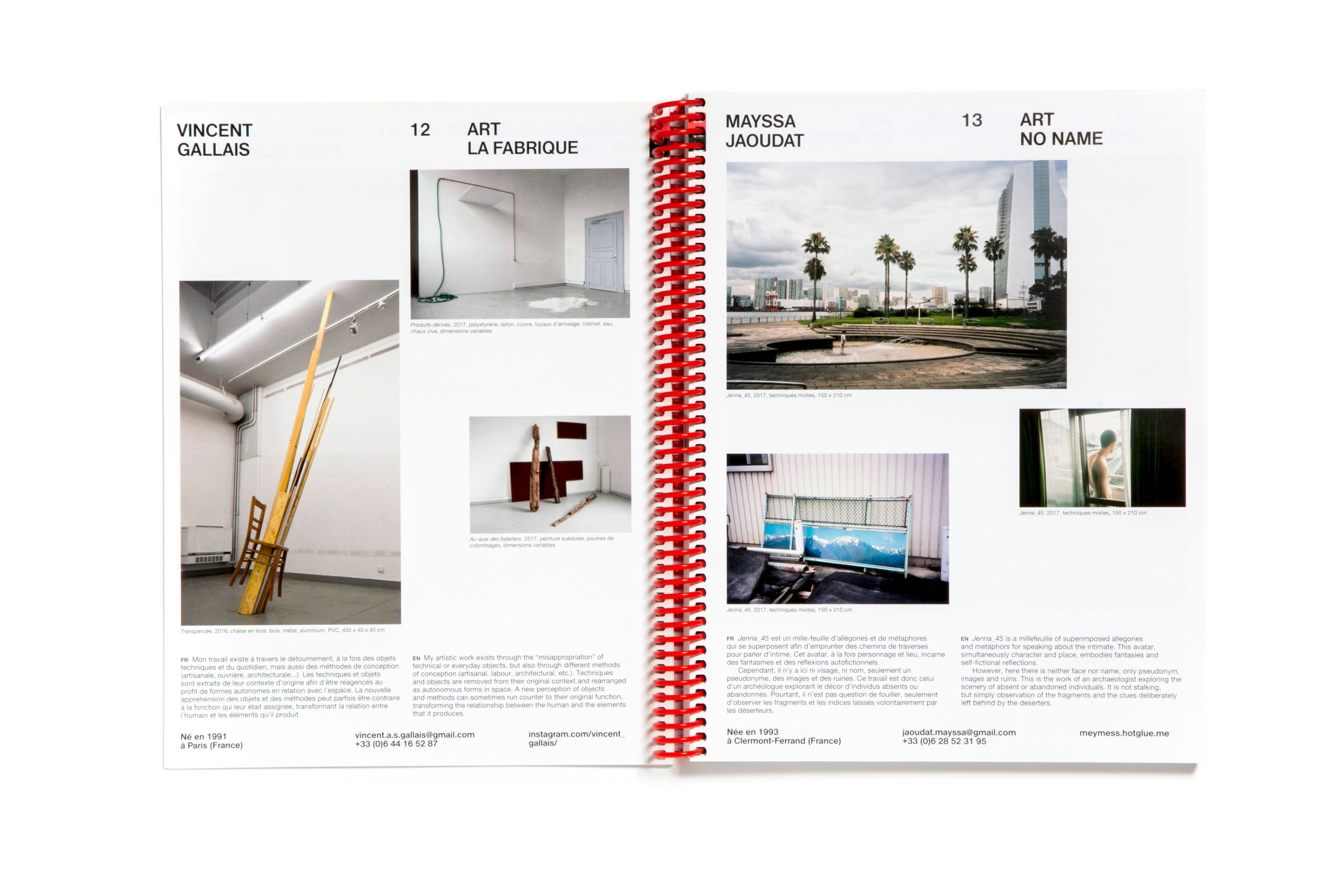
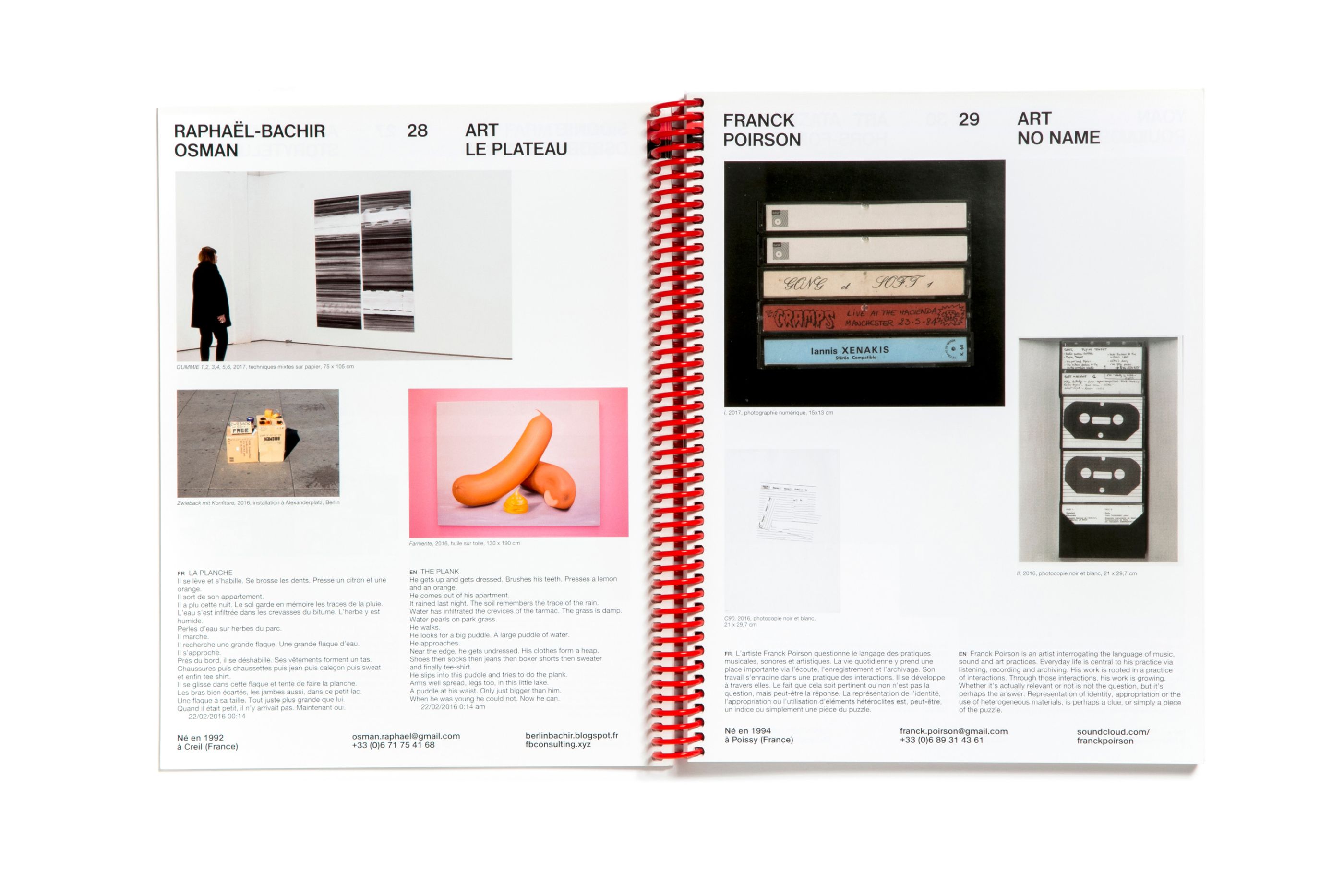
HEAR DIPLOMAS 2017 catalog
/
Haute école des Arts du Rhin
2017
22,5 x 29,5 cm, 192 pages
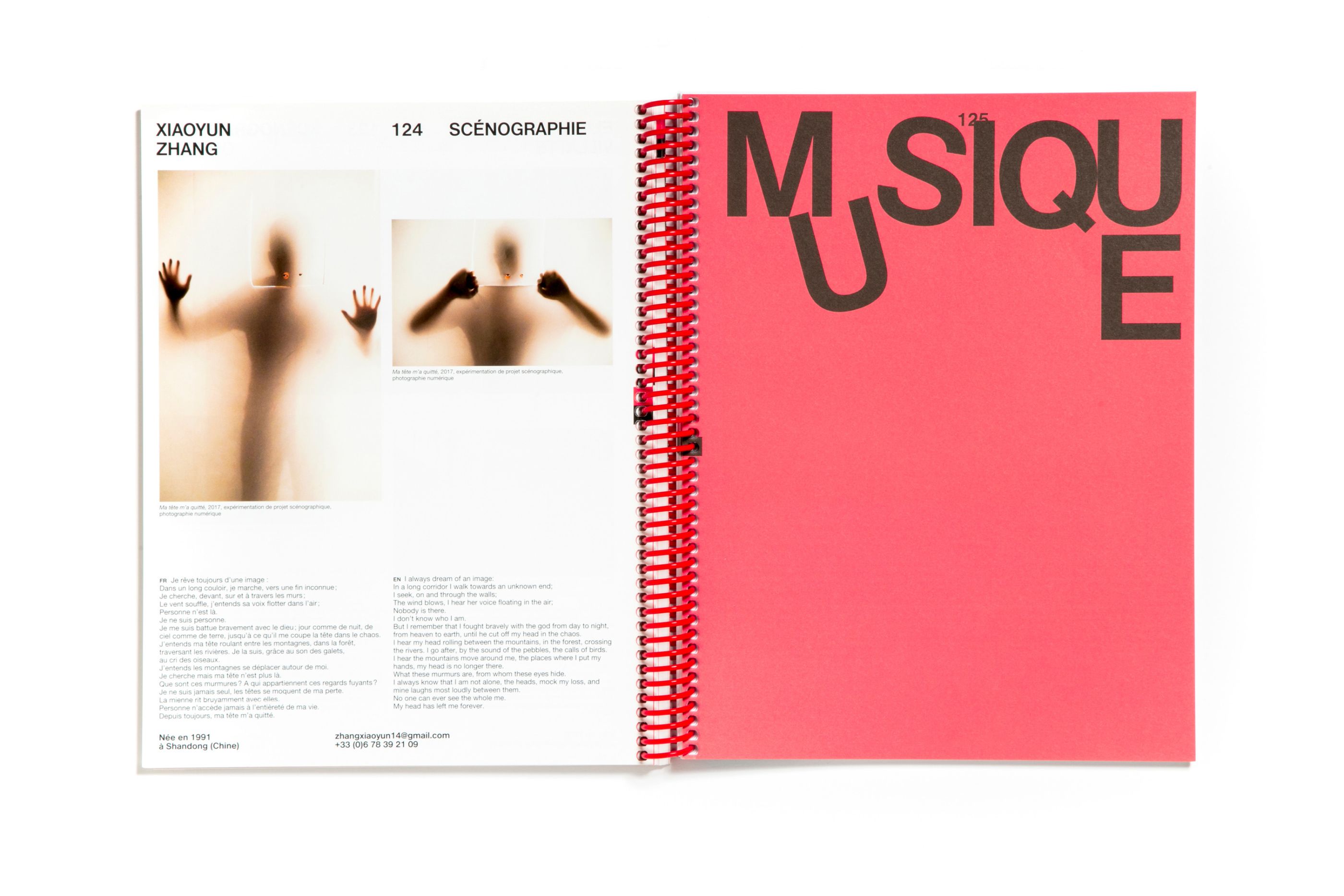
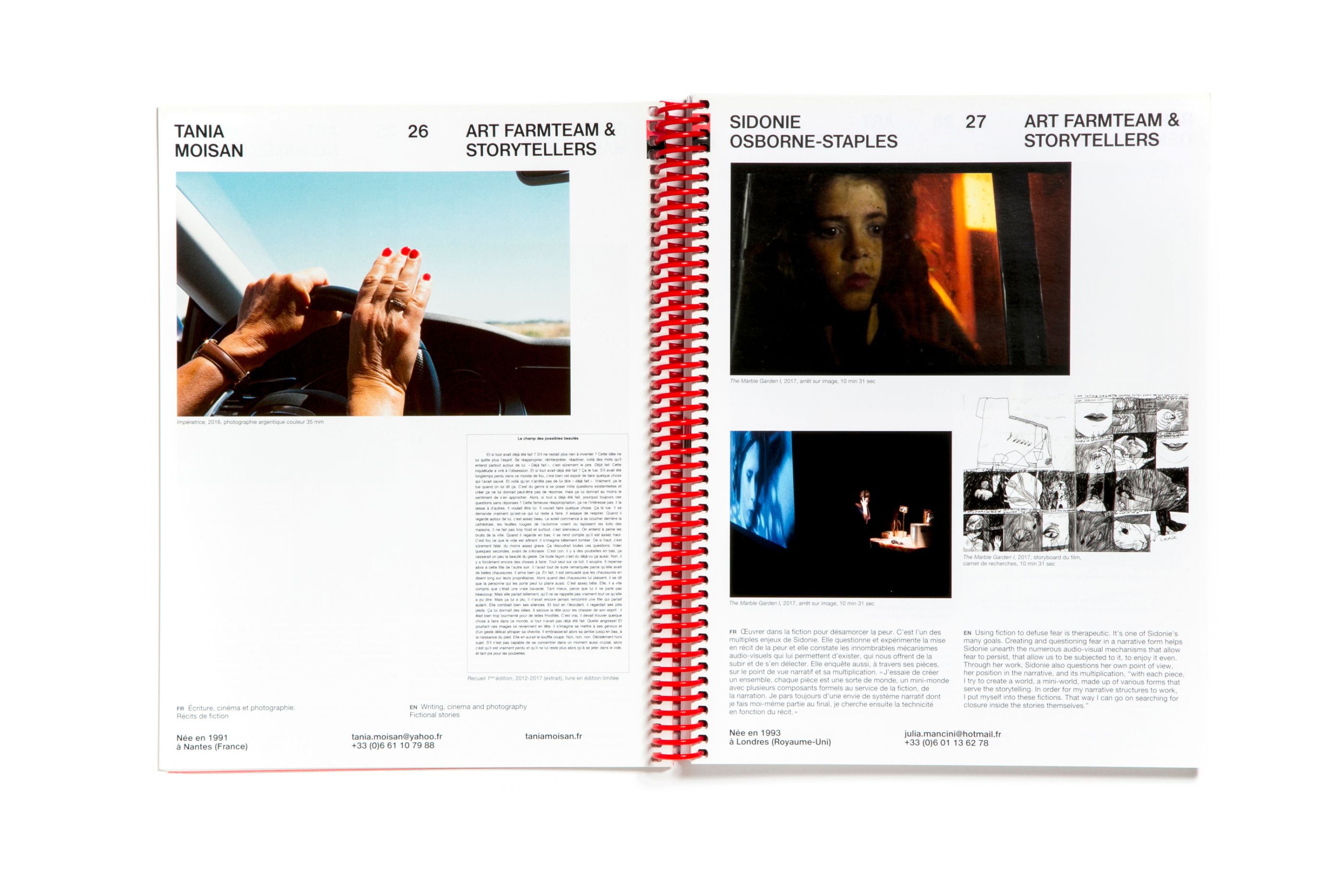
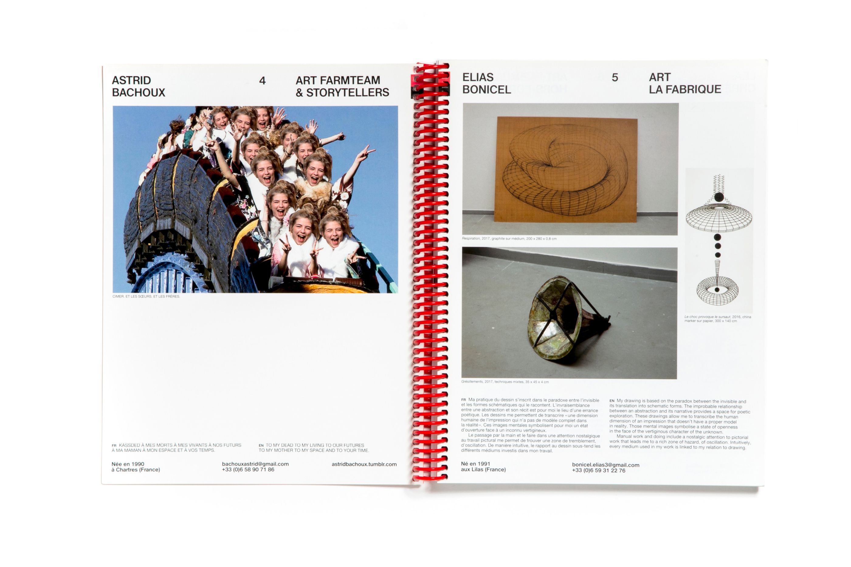
Every year, HEAR opens its doors to the public to present the graduation projects of its final-year students. We created all the communication materials for the event, including the catalog. We chose three different papers, a soft offset, an ultra gloss coated and a soft white card for the cover. The wide spiral binding gives the object a flexible, all-terrain dimension.
