Zoo is a Paris-based design studio founded in 2013. We provide creative and art direction in the fields of art, design, cultural institutions and brands. We believe in strength of plain ideas and in necessity of a clear language. Feel free to contact us, it will be a pleasure to meet you.


MOCO Montpellier Contemporain
/
CLIENT
MOCO Montpellier Contemporain
YEAR
2019
FEATURES
Logotype, stationery, gtemplates, guidelines manual, signage, website, posters, leaflets, goodies, etc.
MOCO Montpellier Contemporain is a pioneering artistic project led by Nicolas Bourriaud. It is an artistic ecosystem bringing together the School of Fine Arts - ESBA MOCO -, the contemporary art center MOCO Panacée and the MOCO Hôtel des Collections, new location dedicated to international collections exhibitions. We have designed a global identity system including full graphic guidelines, the signage of the three places, the website and the campaign creatives - local and national - dedicated to the launch of this new artistic institution.


Courants Verts
/
CLIENT
Fondation EDF Group
YEAR
2020
FEATURES
Posters, flyer, display, motion, etc.
For the first time in France, a large-scale exhibition that brings together international artists committed to the ecological fight: Joseph Beuys, Barbara and Michael Leisgen, Lucy and Jorge Orta, Sarah Trouche, Nicole Dextras, Jéremy Gobé, Nathan Grimes, etc.
We designed the communication campaign for this manifesto exhibition, which reminds us that art plays a role in this climate change by acting on the imaginations and proposing new stories. Curator: Paul Ardenne, image ©Sarah Trouche.


La Colline des Arts
/
CLIENT
11 museums in Paris 16th district
YEAR
2021-2023
FEATURES
Visual identity, logotype, Print, pictogram
Following the example of Berlin's Museuminsel or Vienna's MuseumsQuartier, eleven cultural institutions located on the Colline de Chaillot have joined forces to form La Colline des Arts network. We designed the logotype and the cartography of this network, as well as various communication campaigns.
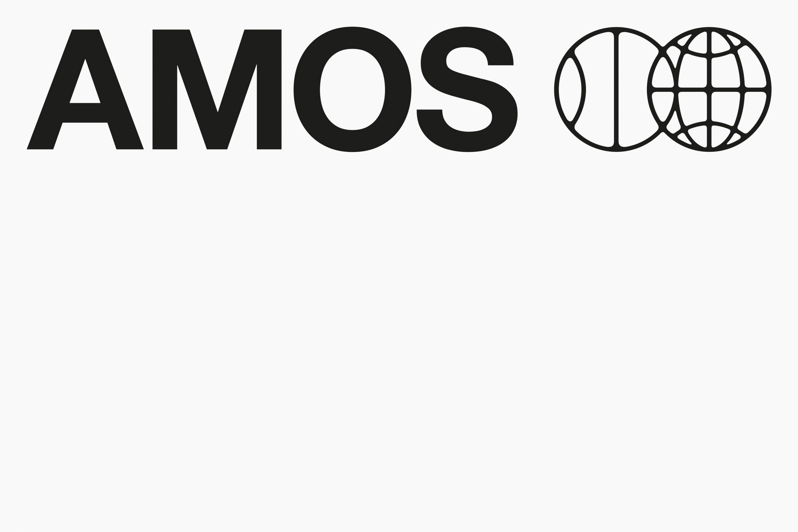


Amos Sport Business School
/
CLIENT
Amos Sport Business School
YEAR
2021
FEATURES
Logotype, typeface, templates, guidelines manual, posters, leaflets, goodies, etc.
Global redesign and graphic identity of this business school specializing in sports, which has 12 campuses in Europe.
We have developed an exclusive typeface as well as a set of adapted and dynamic communication tools. Our challenge is to redefine an institutional and dynamic tone, in the service of an approach focused on the international scene and aware of the major sporting challenges of the world of tomorrow.


37 Quai Branly, Paris
/
CLIENT
Musée du quai Branly - Jacques Chirac
YEAR
2020
FEATURES
Restricted consultation, proposal not retained.
The musée du quai Branly - Jacques Chirac asked us to think about a communication campaign that will give new impetus to this prestigious cultural institution. We have decided to refocus communication on the privileged setting of the museum: the garden and the architecture specific to the identity of the place, in the heart of Paris. We proposed to keep the emblematic hook "Where cultures dialogue" by associating it with the address of the Museum "37, quai Branly, 75007 Paris", as an invitation, a reference to travel and dialogue. Associated with images from five continents, the lush garden, works and objects from all eras, the Parisian address of this institution creates a powerful contrast.
In a more convincing, more human and more lively visual spirit, we have chosen a more transversal approach by showing the incredible richness and diversity of the collections: contemporary art, photography, everyday objects, etc. The idea is to create new links with the contemporary world and current creative disciplines in order to reach a wider, younger and more connected audience.